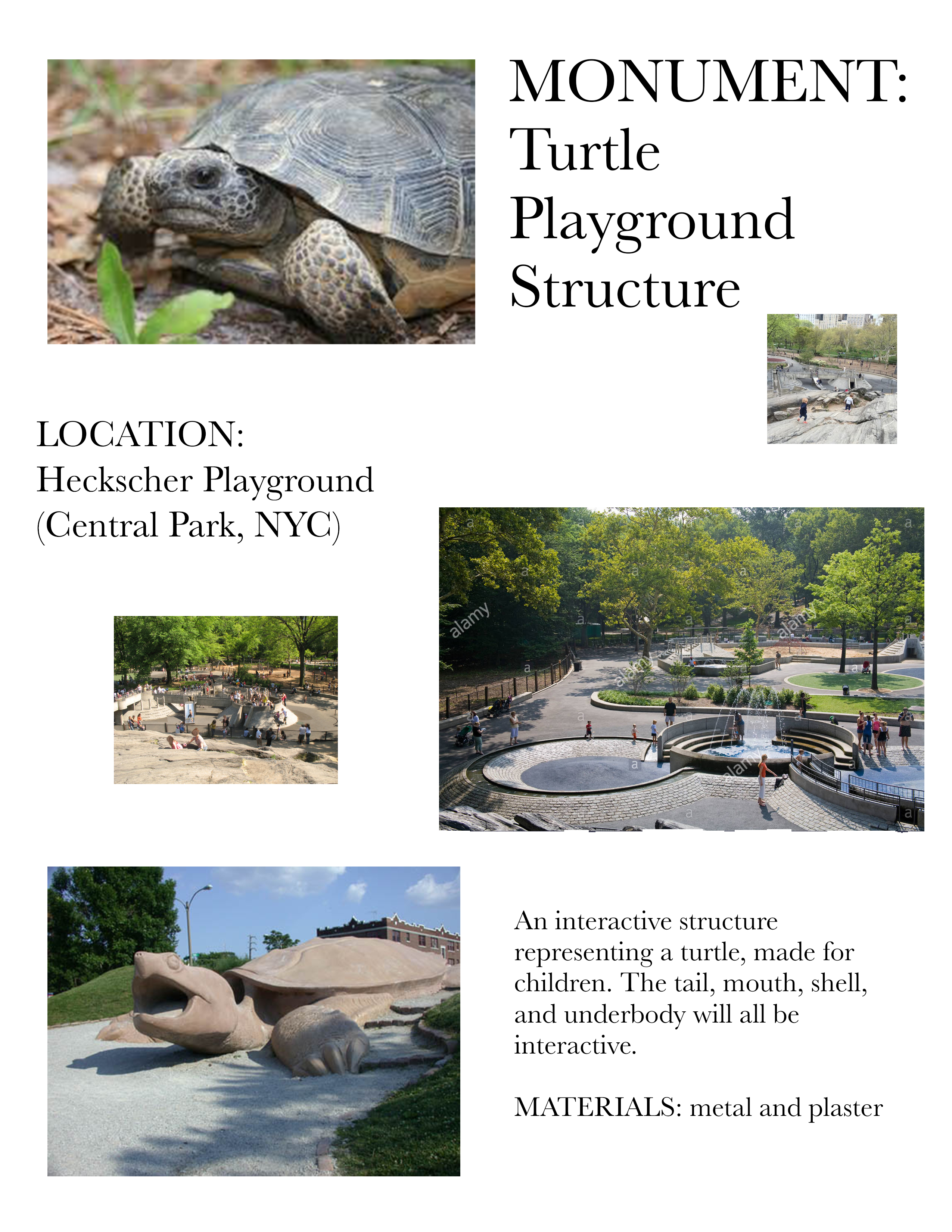
Space/Materiality: Monument

VISION:

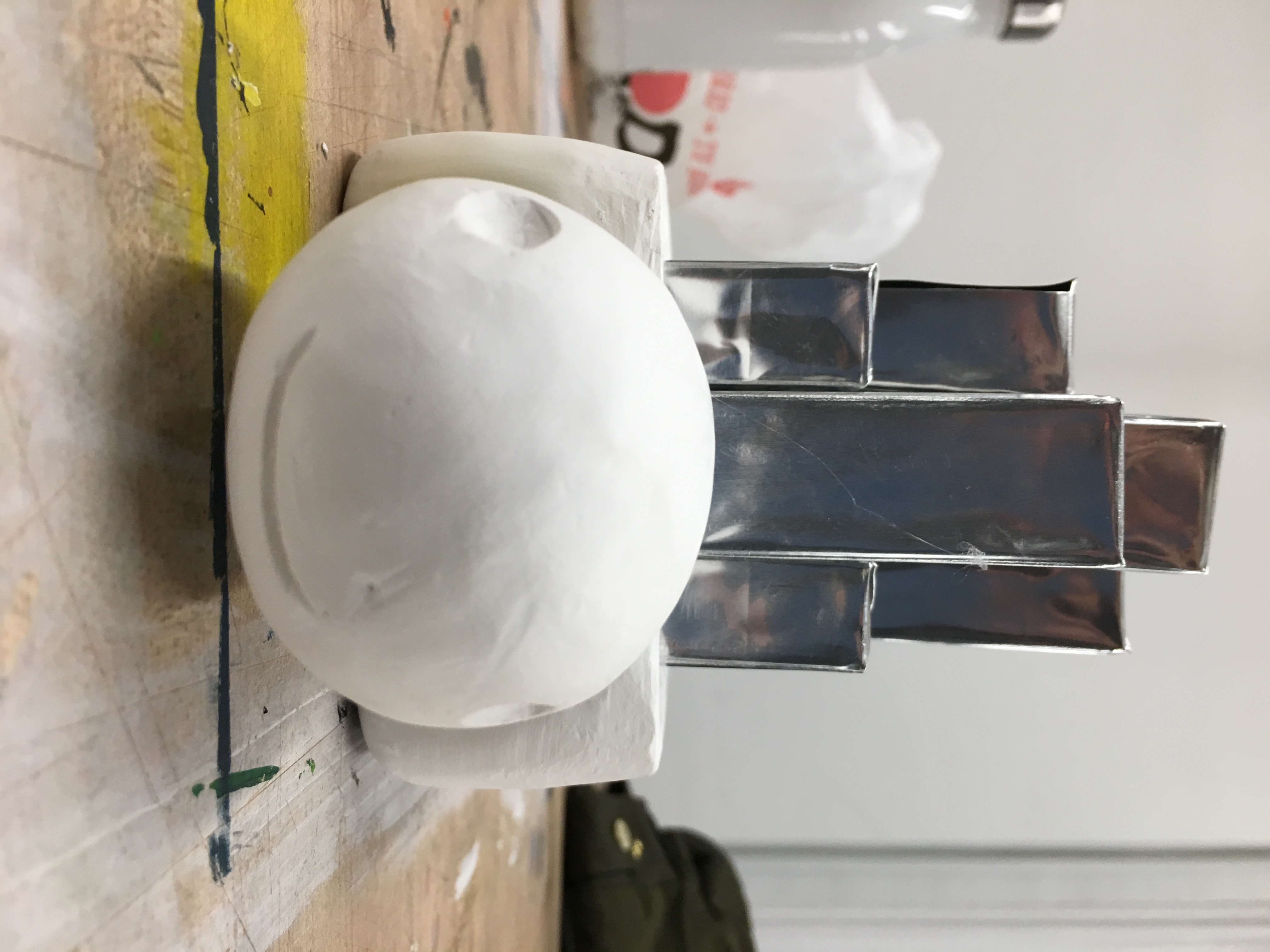
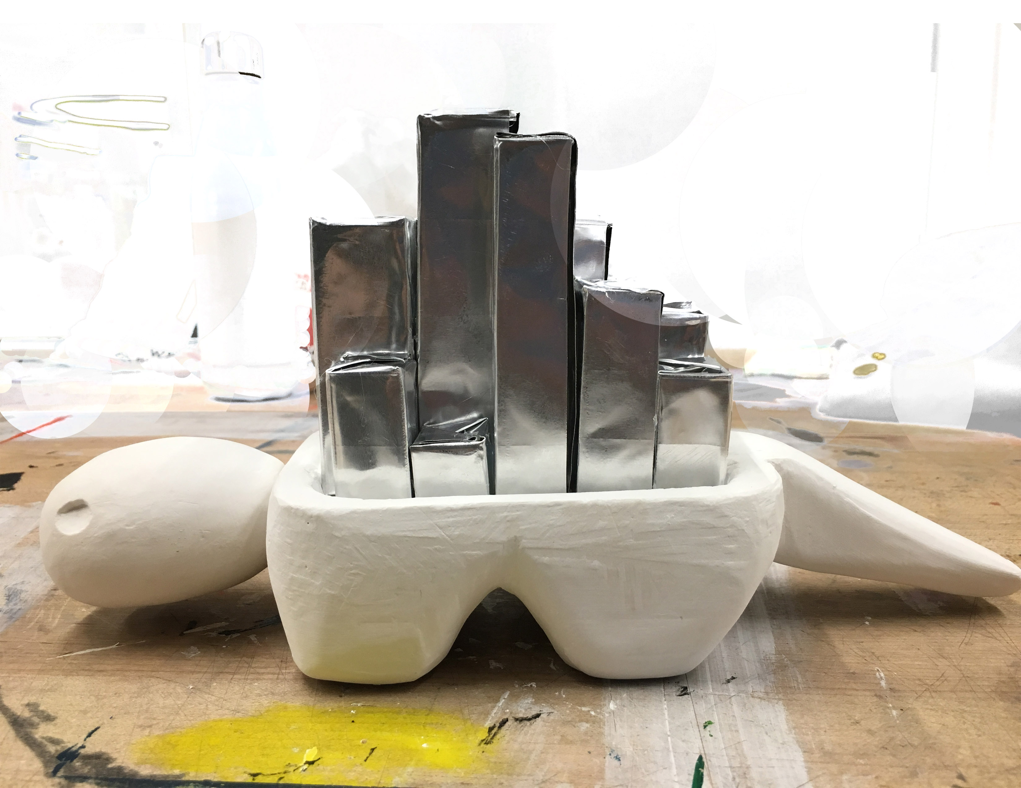
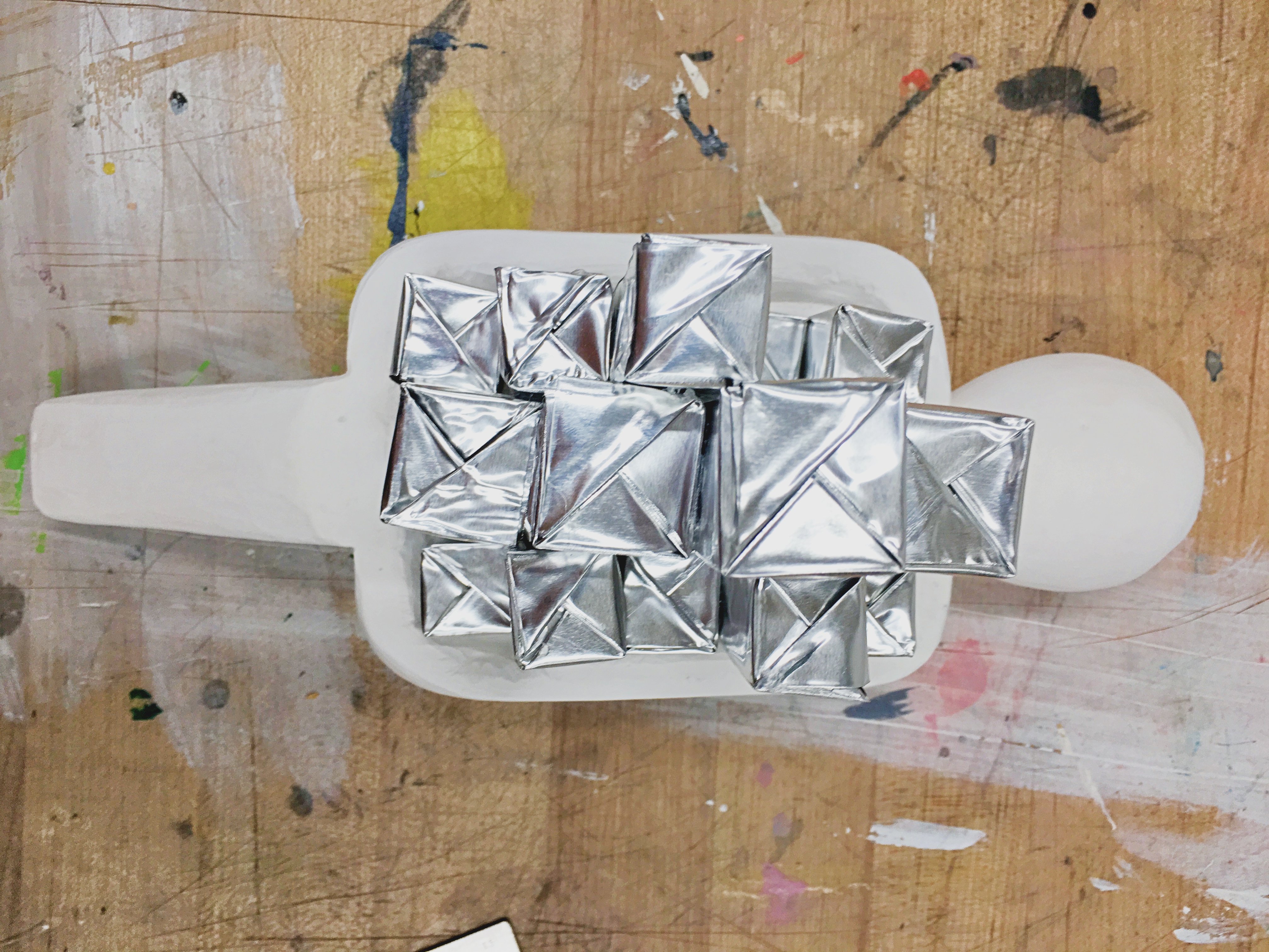
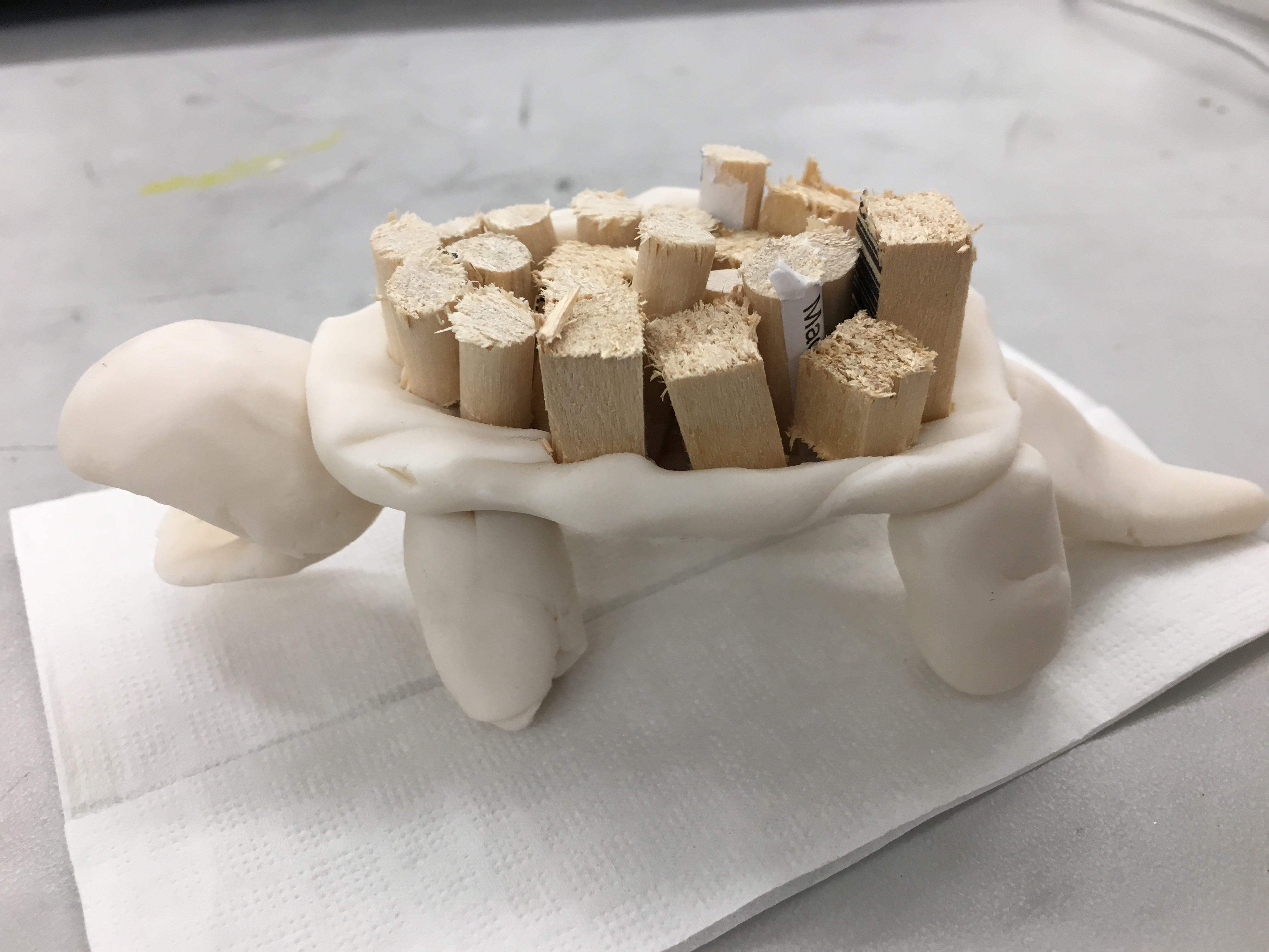
My monument will be in the form of a turtle. It will appeal to children and function as an interactive element of the playground. The legs, head, tail, and a portion of the shell will be made of plaster. The detailed part of a turtle’s shell will be made out of pieces of wood, they will be different sizes and allow children to climb the shell. The tail will be a sort of ladder to get up to the shell and the head will be how they get down. They will also be able to crawl under the legs of the turtle. The purpose of my monument is to further stimulate a child’s imagination and sense of wonder, to explore and have fun. In this society, the length of “being a kid” is getting smaller and smaller because of growing vulgarity they are surrounded by. I want my monument to help bring back the innocence and fun in childhood for children living in this time.


LOCATION:

The site of the monument will be Heckscher Playground, located in Central Park, New York. It was Central Park’s 1st formal playground, and it was founded by August Heckscher, a philanthropist, park commissioner, and advocate for parks and the arts. He was also a chairman for The New School. I chose this location because the atmosphere and overall appearance fits well with my vision for my monument. The landscape and environment also complements my monument. The location is fitting because the monument will appeal to families and children, who are my intentional audience.


MAQUETTE:


EXECUTION:

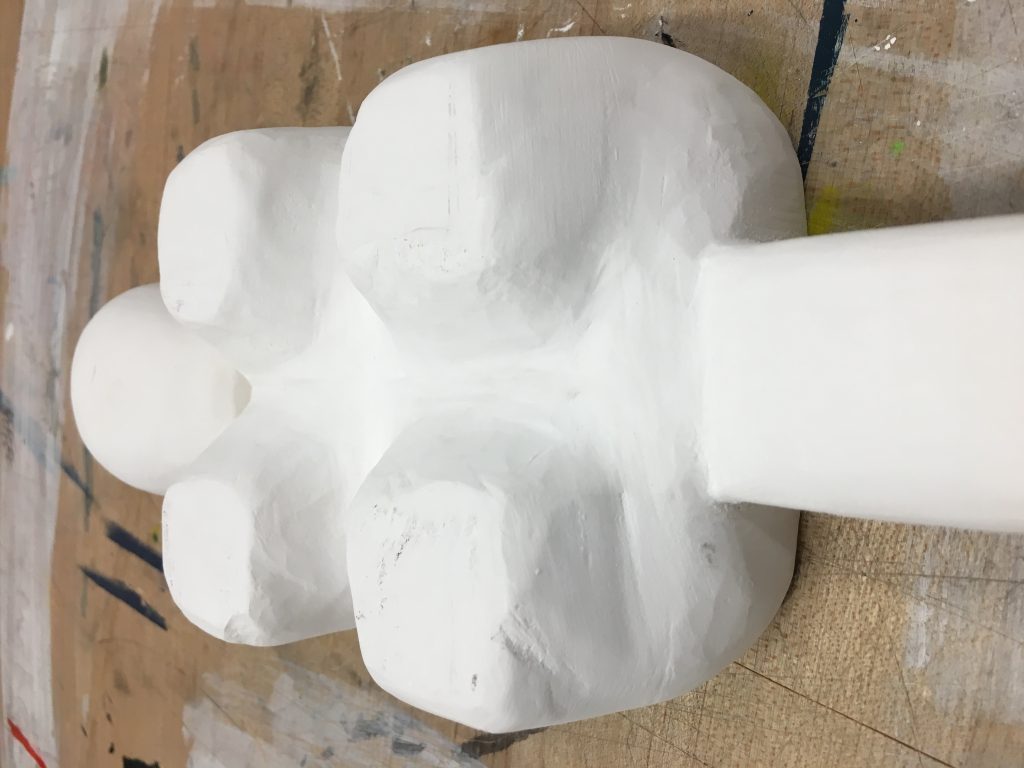
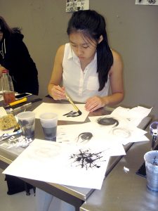
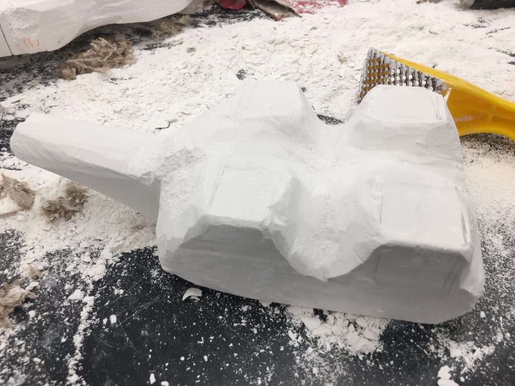
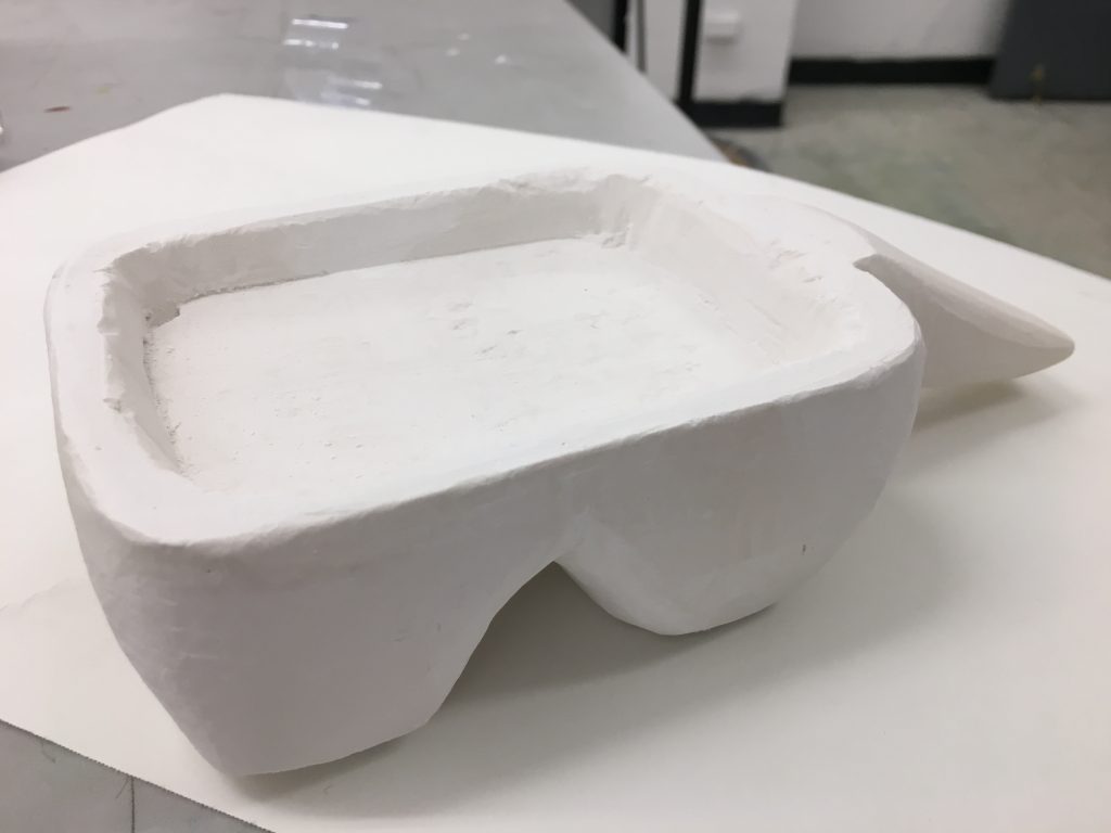
First, I constructed a mold to pour the plaster in out of duct-tape and chipboard. I duct-taped the entire inside of the form to give the chipboard more support. This turned out to be a good idea because when I took the plaster out of the chipboard mold, there was no moisture or mold on the plaster.

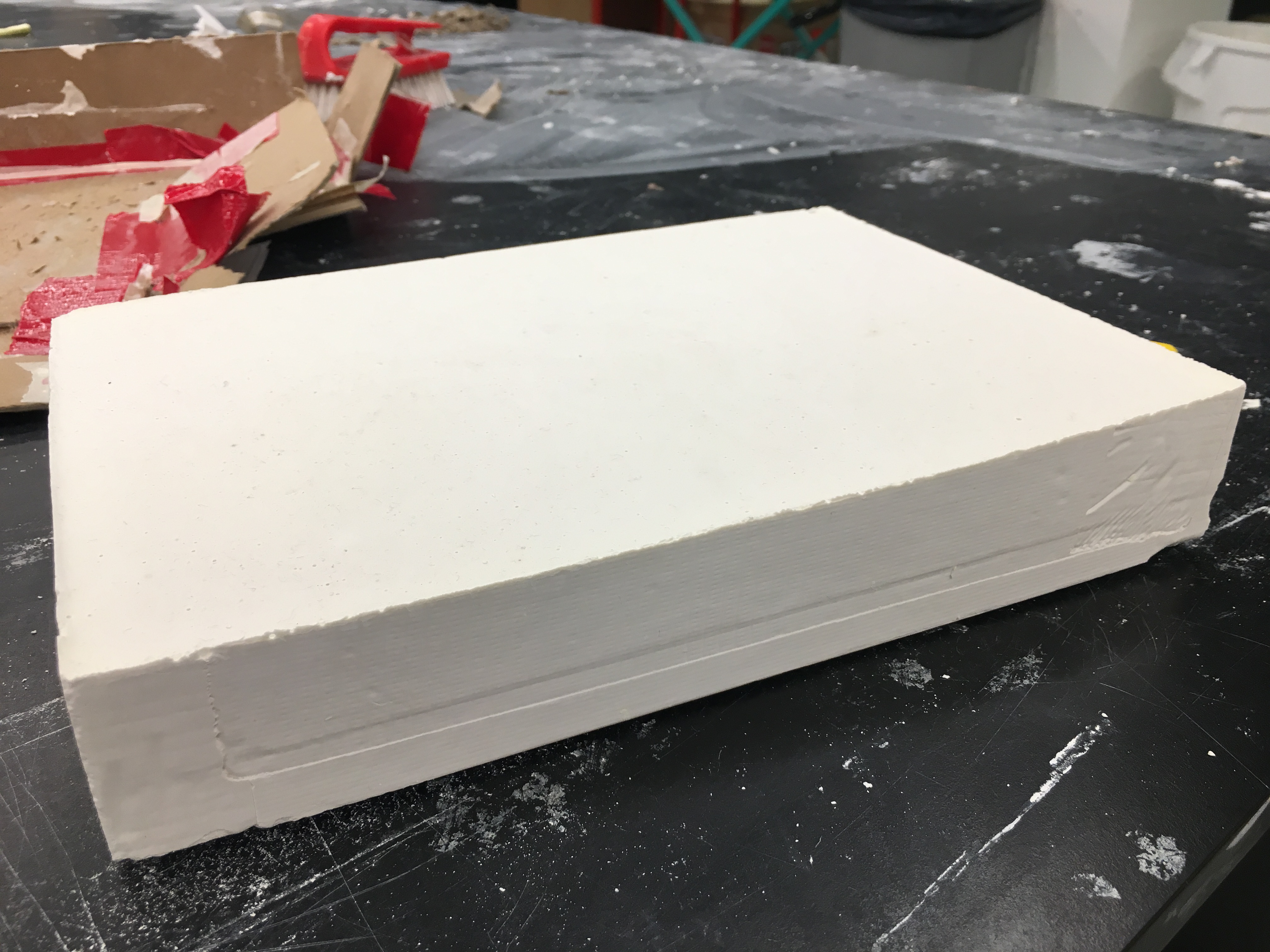
Since the mold turned out to be much more shallow than I had planned for, I had to make the turtle’s head separate from the legs and tail. I also had to make an inlet that would be the base for the shell. I used the plaster bandsaw to cut the plaster into more manageable pieces.


Next, I started to form the legs and tail. I made the head separate from the body, so I later drilled two 1/4-inch holes; a 2-inch hole into the head and a 1/2-inch hole into the body. I used a 1/4-inch dowel to connect them.

The metal shapes were each made individually with a bone-folder and theirs sizes range from 4-.75 inches tall, and .75-1 inch wide.

Int Seminar 1: Bridge 5 – Realizations/Moving Forward Artist Statement

         Common threads I have found between my art and writing during studio and seminar include connections to my culture, interests, and home. Without realizing, most of the subjects of my pieces fall under things relating to my experiences, what is honest and what is true. That being said, my writings are blunt reflections of what I believe is true; and since I am a very visual thinker, they also tend to be visual descriptions. I also realized that some of the subjects of my studio pieces focused on reflective surfaces and objects. This relates to my writing style because a reflective surface is often a visual representation of truth and transparency.


          My creative processes mostly take place in my head, so I usually don’t physically sketch out my plans. I will only write things down if I need it for reference because I have a bad memory. However, I carry out the picture I have in my head and work on it until I am satisfied with the product. This semester has also made me realize my interest and tendency in creating work related to my cultural background, more specifically Chinese character calligraphy. This connects to my broader interests as an artist because I like to do calligraphy and work with typefaces. In terms of my art, I am interested in learning and practicing Chinese water calligraphy and incorporating it into pieces that will concern my major, Communications Design. In terms of writing, since I know Chinese, English, French, and have self-taught myself Korean, I would like to further research how language shapes thought and cognitive skills for poly-linguals.

Drawing/Imaging: Draft

Mark Making Project

This was one of our first projects, we first explored the ranges of various mediums including ink, charcoal (vine), and graphite, using unconventional utensils, such as sponges, forks, and folded paper. It was a study of form, line, space, and other principles and elements of design.

First, we had to make a page of twenty-four 2-inch blocks using various mediums, attempting to display the most variation on a page. We also had to make two sheets of six, 4-inch blocks using the same methods.

Later, we explored how line and shape can induce and bring forth different emotions. For the final project on this topic, we had to make 2 sets of pairs of 6-inch blocks that showed opposites of each other.

The first of these pieces depicts the emotions anger and calmness in ink. The left shows anger, being represented in the form of an angry flame, using deep values. The right shows calmness, expressed with a light and soft ink stroke. The circular shape represents wholeness and peace.

The second of these pieces depicts velocity and languor. The left shows velocity, bring represented in the form of a comet, again using deep values. The right shows languor, represented with carefree, relaxed, and random ink strokes.


Stool & Figure White Figure Ambiguous Illustrator Collages

We spent many weeks practicing with gesture drawings, and drawing the figure. Later, we drew a set of stools. We scanned the drawings, and incorporated both into a document with interesting use of composition and space.

Afterwards, we used tracing paper to transfer the large shapes onto bristol. The shapes were cut out, and placed onto black charcoal paper. We had to create two 10″x 10″ collages; one collage with a white figure, and another that was ambiguous. However, they had to use the same shapes in each piece in different ways, for different purposes.

Later, we used the pen tool on Illustrator to trace the larger shapes made by the white space in the composition. For the final product, both collages were transferred to Illustrator. The first shown is the white figure, it depicts a dragon-like form. The head is in the top left of the piece, and his neck bends across and down to the body in the lower left.