Packaging: Project 02

My object was a Funko Pop! Guardians of the Galaxy Baby Groot mug. To represent Groot, on two of the outer-facing panels, I created bark-like texture using the Guardians typeface with variations of the phrase “I AM” because “I am GROOT” is the only thing Groot says. The front has its description in the shape of a cup shape, representing the mug form on the inside. On the back panel, the eyes on the cup are represented through typeface (Benton extra bold condensed, Marvel’s typeface) that also describe the product. There is also a line that represents the outline of baby Groot’s head. The inside is all galaxy to further allude to Guardians of the Galaxy. The handle poking out of the packaging allows for safe transportation that will ensure non-breakage when carrying around.

The final presentation of the product is not to my liking, Looking back I would have printed on the cardboard of chipboard natural brown color instead of using a CMYK. I would also use other, better materials than spray mount and chipboard because there were many complications and issues.


Int Studio 2: BRIDGE 2

For the 30×40″ poster design, I focused on elements of Lenox Hill that are both things I will focus on in my seminar research paper and that are well known. That being said, I focused on the subjects of: medical building amount, subway and bus routes, and sushi places. There is a white grid consisting of 102 blocks that represent the entire neighborhood. The furthest left line represents Park Avenue, Manhattans border is on the far right and the line closest to this represents York Avenue. In progression from left to right, the white vertical lines represent Park, Lexington, Third, Second, First, and York Avenues. Horizontally, the furthest white line to the top is 77th Street, the bottommost is 60th. The layer of various values of blue represent the number of medical-related buildings per block. Refer to the graph in the key located at the bottom right. To gather this data, I went to Google Maps, zoomed in the furthest it would go, and counted the number of medical symbols in each block. While doing this, I also recorded when there was a bus stop and what number bus it was, any subway stations, and sushi places. The highest number of medical buildings per block is 27, there is approximately 500 total medical-related buildings in Lenox Hill. The tan color lines and squares represent subway routes and stations, the darker tan represent this for buses. The overlay of gray color are representations through line of the specimens found in the neighborhood, if the entire 30×40″ was split into thirds the locations of the specimens on the page are representative of their approximate location when referring to this map. 

The typeface used in the map that I chose to represent the feel of Lenox Hill is Cinzel. The color palette can be referenced by the analogous art board below. The art boards as a whole were explorations of different elements of design that inspired the 30×40 poster.


Int Studio 2: Bridge 1

Our Space of Power was meant to be for children the ages of 5-17, and form of power we chose to use was height. The dome is raised with poles to represent the lofty-ness of the structure that would allow the kids to look down on the buildings surrounding them.

Int Seminar 2: Informed Walking

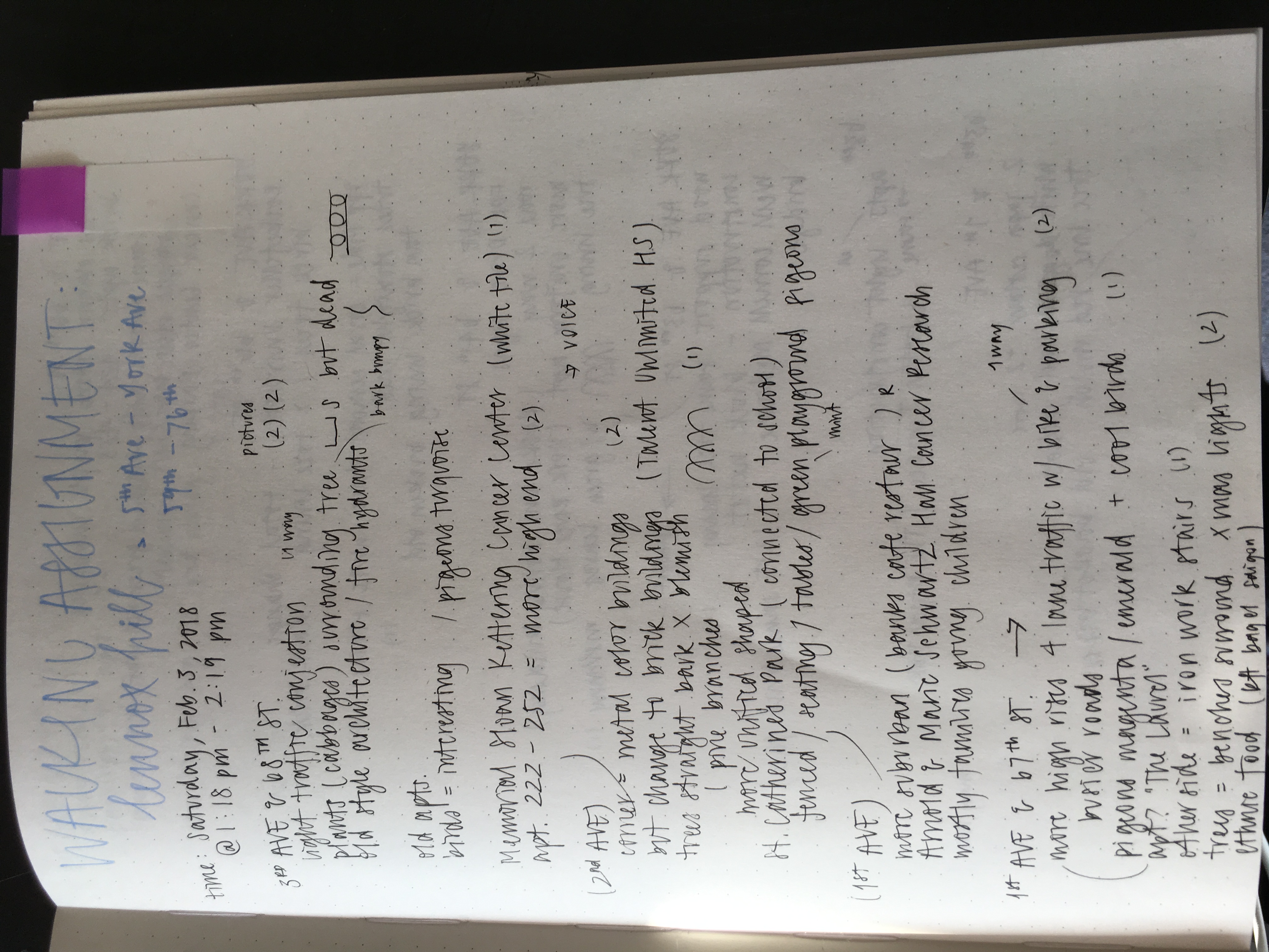
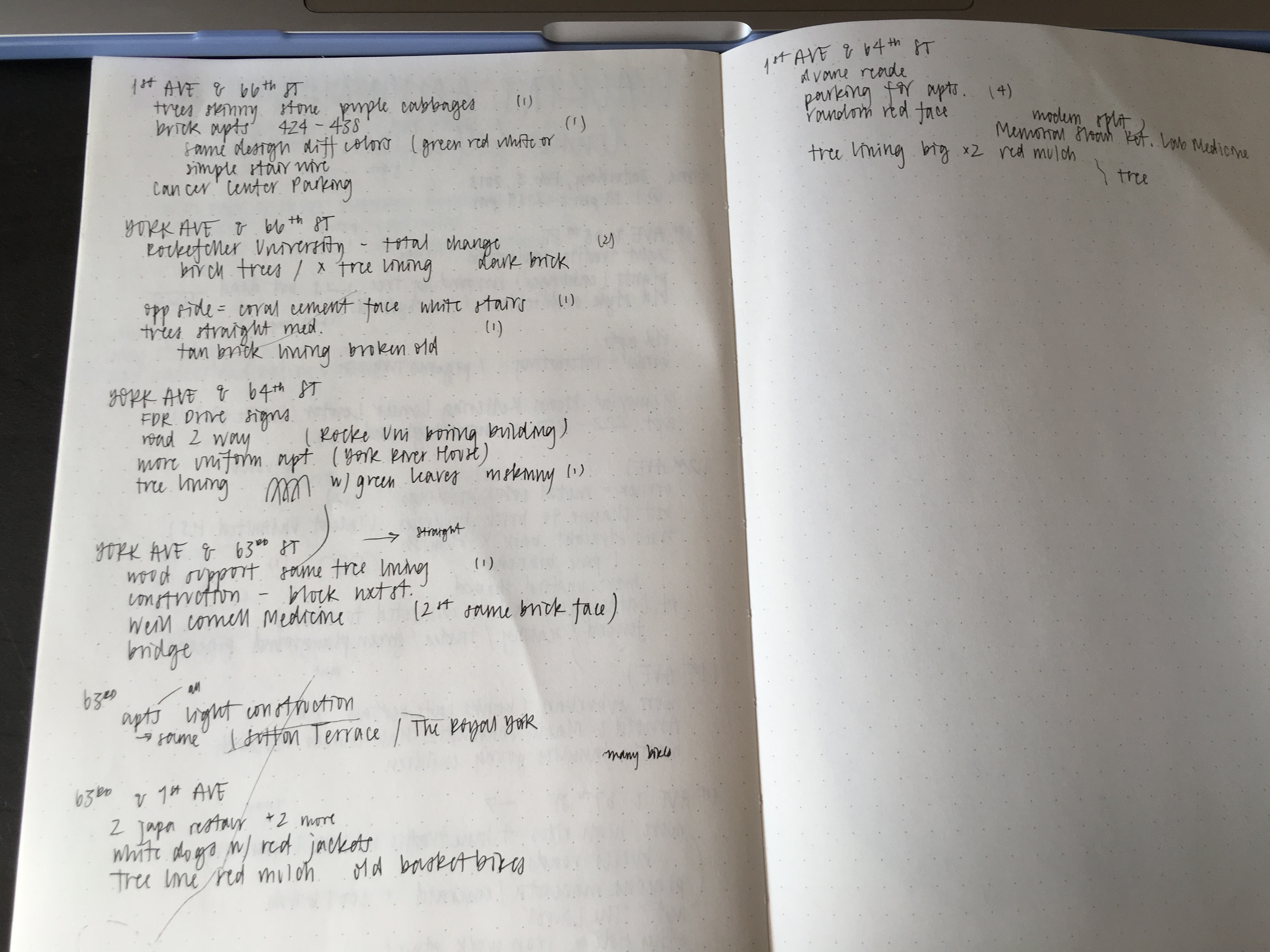
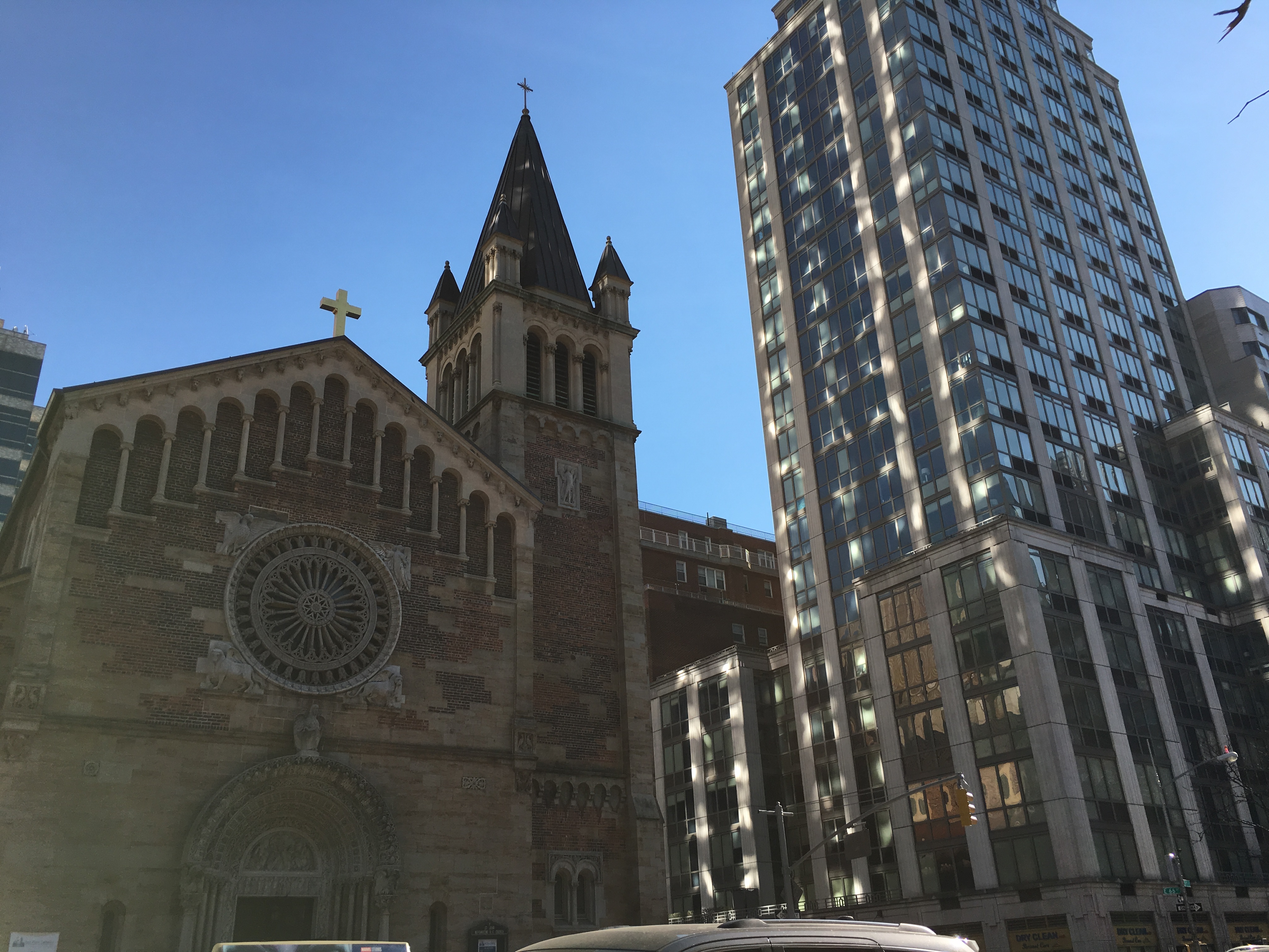
A thing I mentioned from my walks from last week was that there were multiple medical buildings in Lennox Hill.

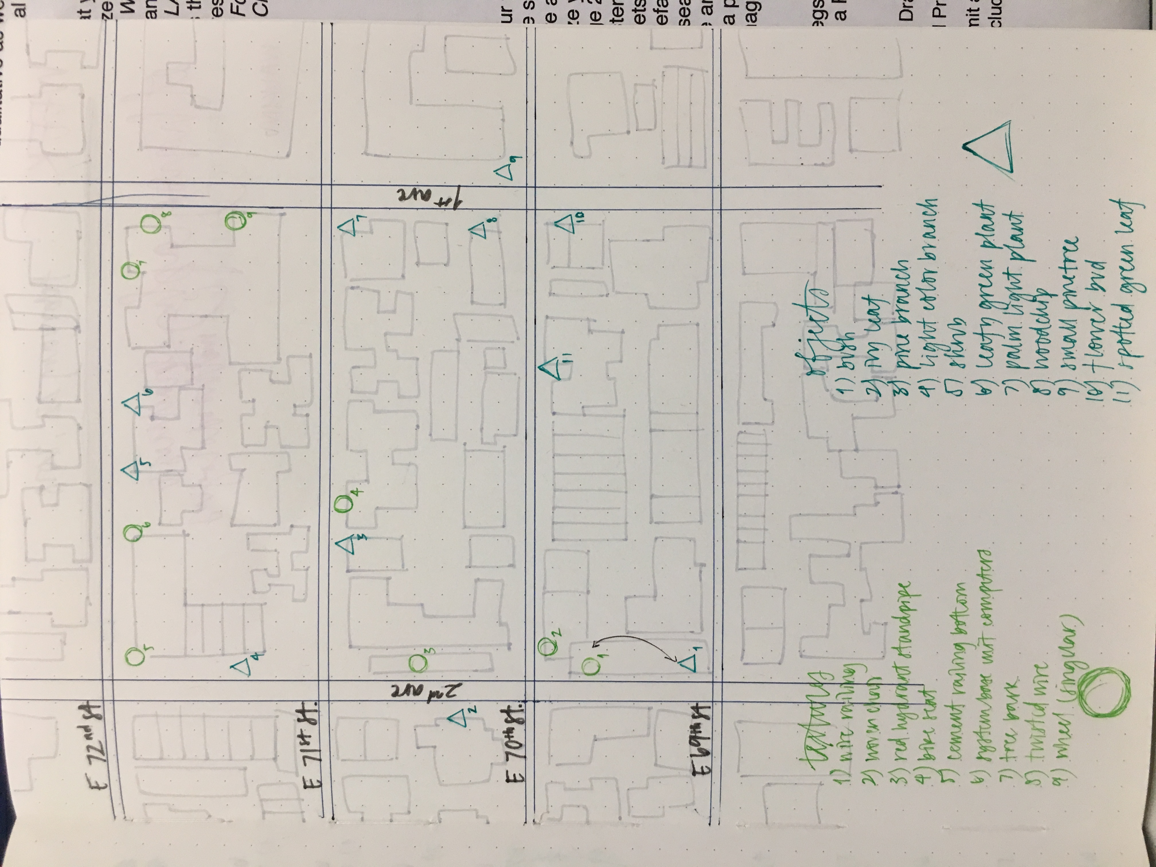
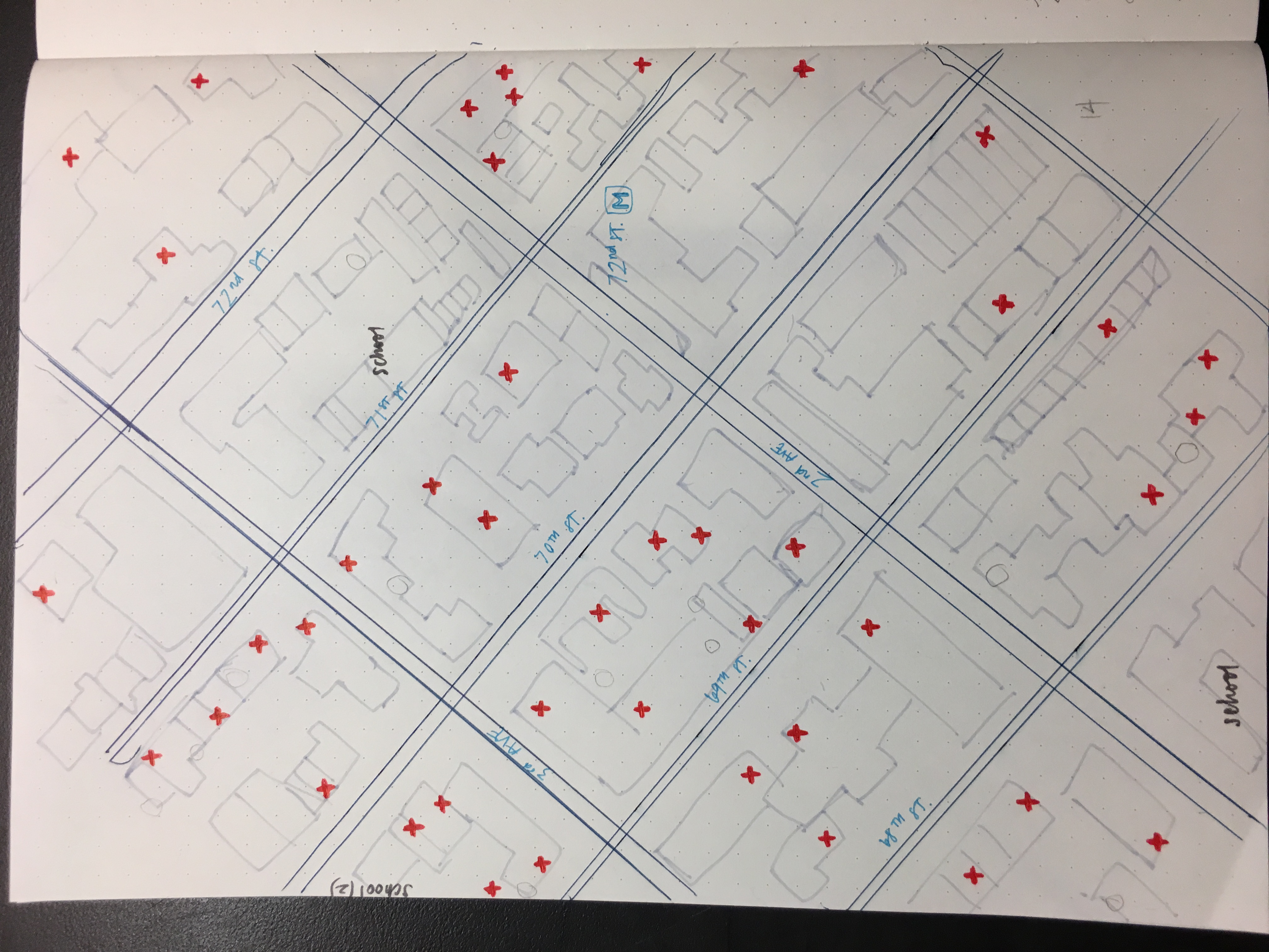
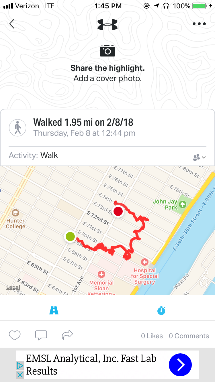
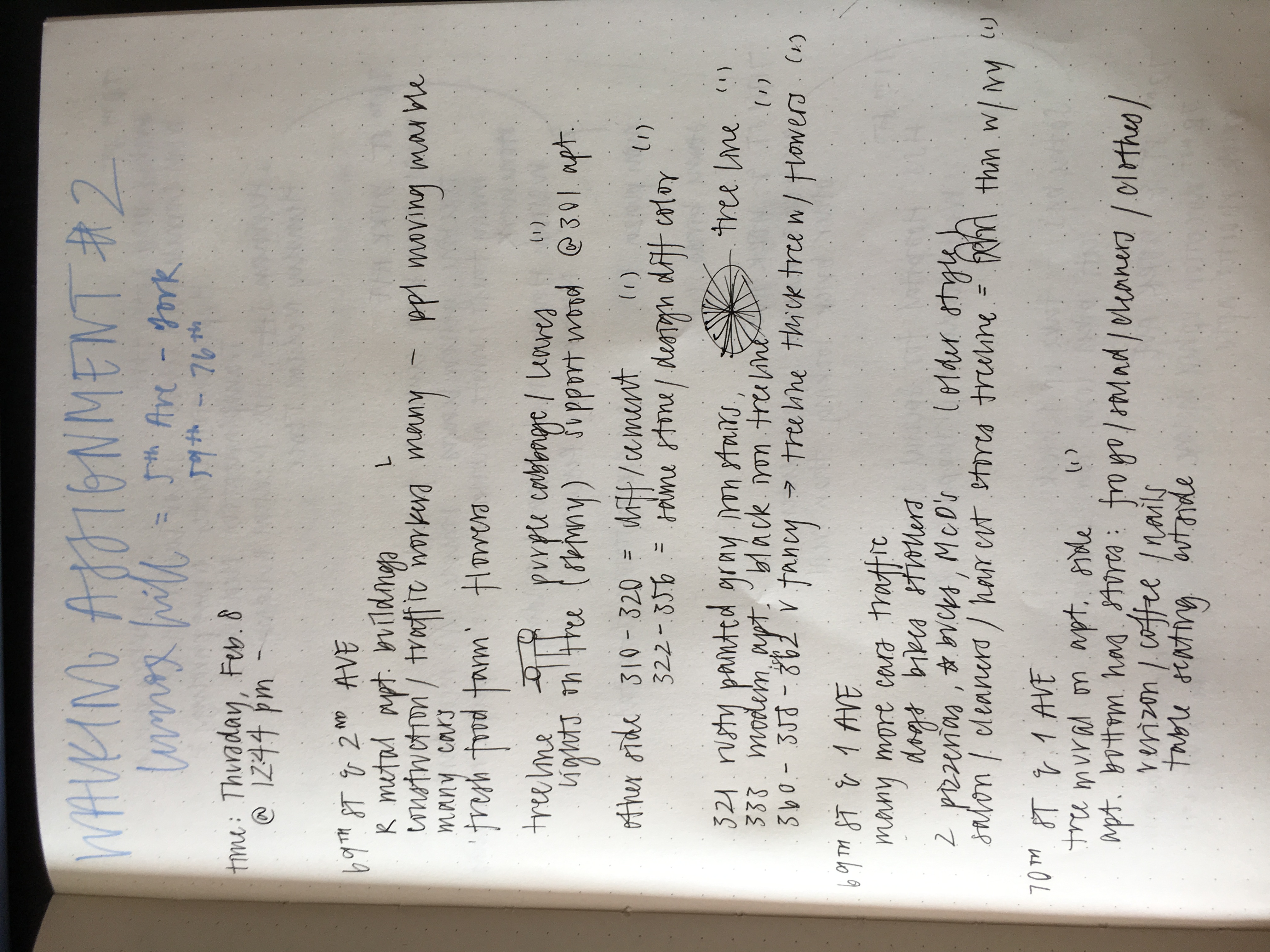
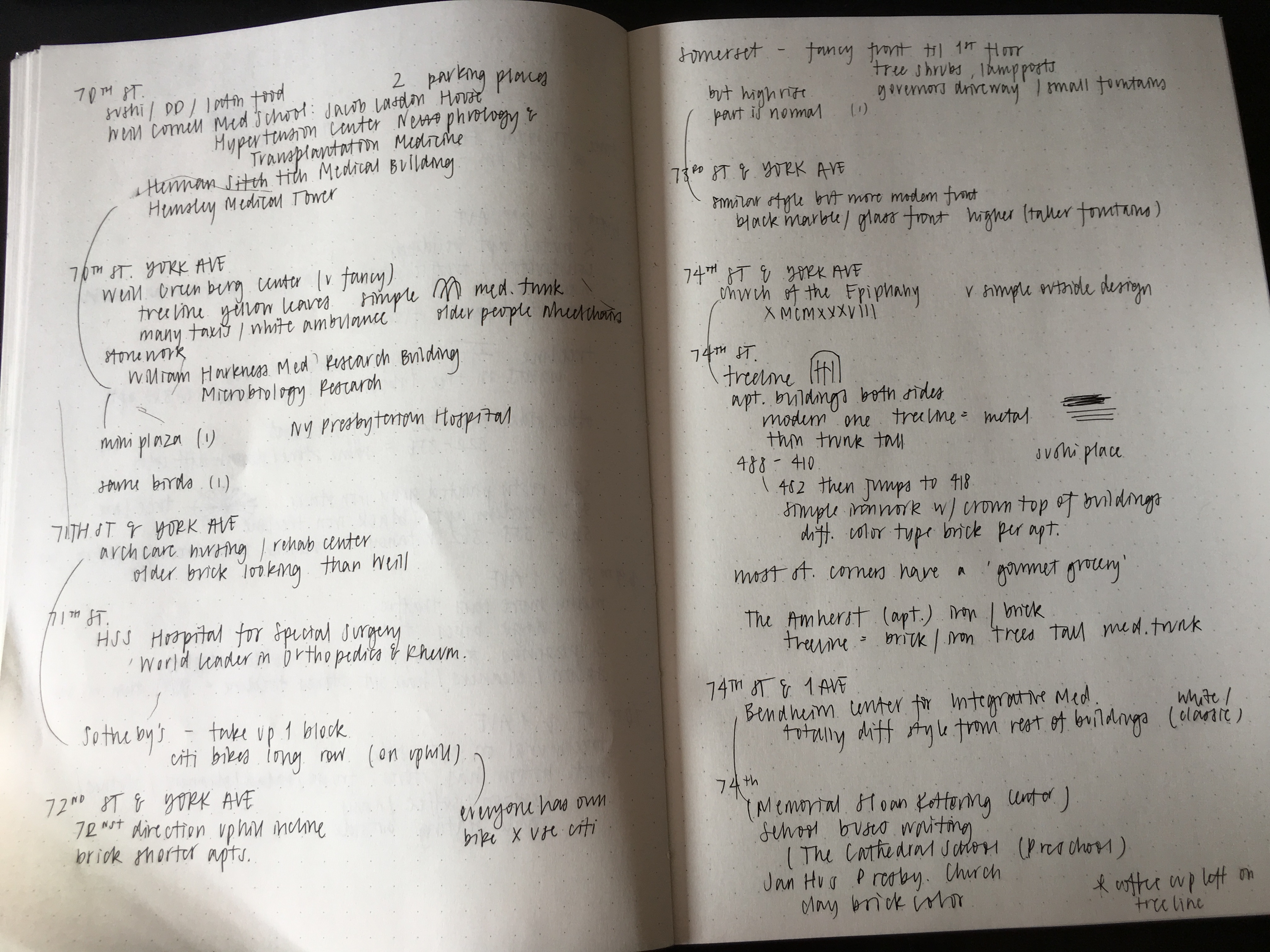
For studio, we were supposed to create a map of an area in our neighborhood. I decided to create my map based on a portion of the area I explored, specifically from 3rd to 1st Avenue and 73rd to 67th Street. After referring to google maps for a more accurate compilation of medical-related buildings, I started to make the map. I first created outlines of the buildings and streets, then I marked every medical-related building with a red cross symbol.

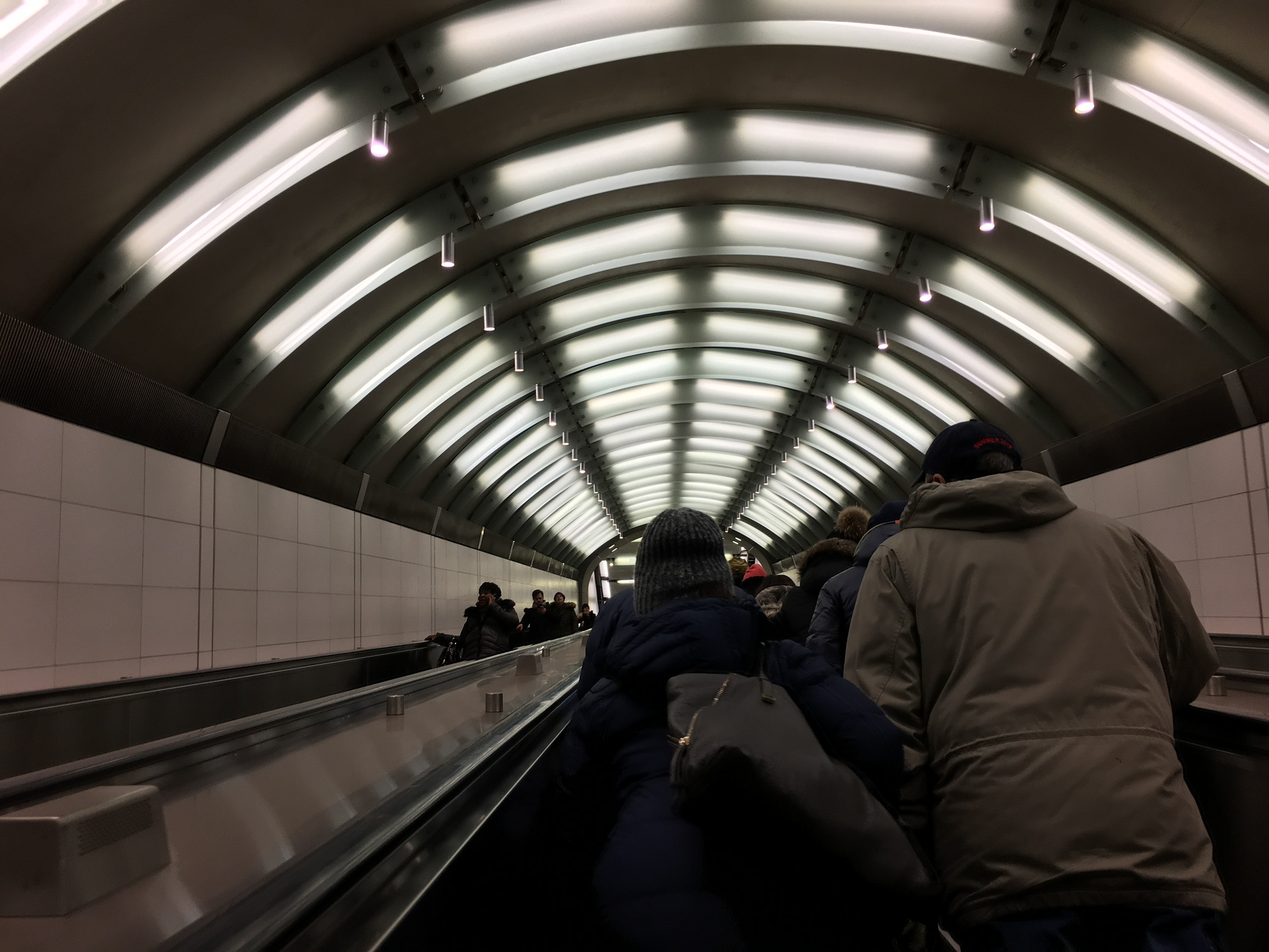
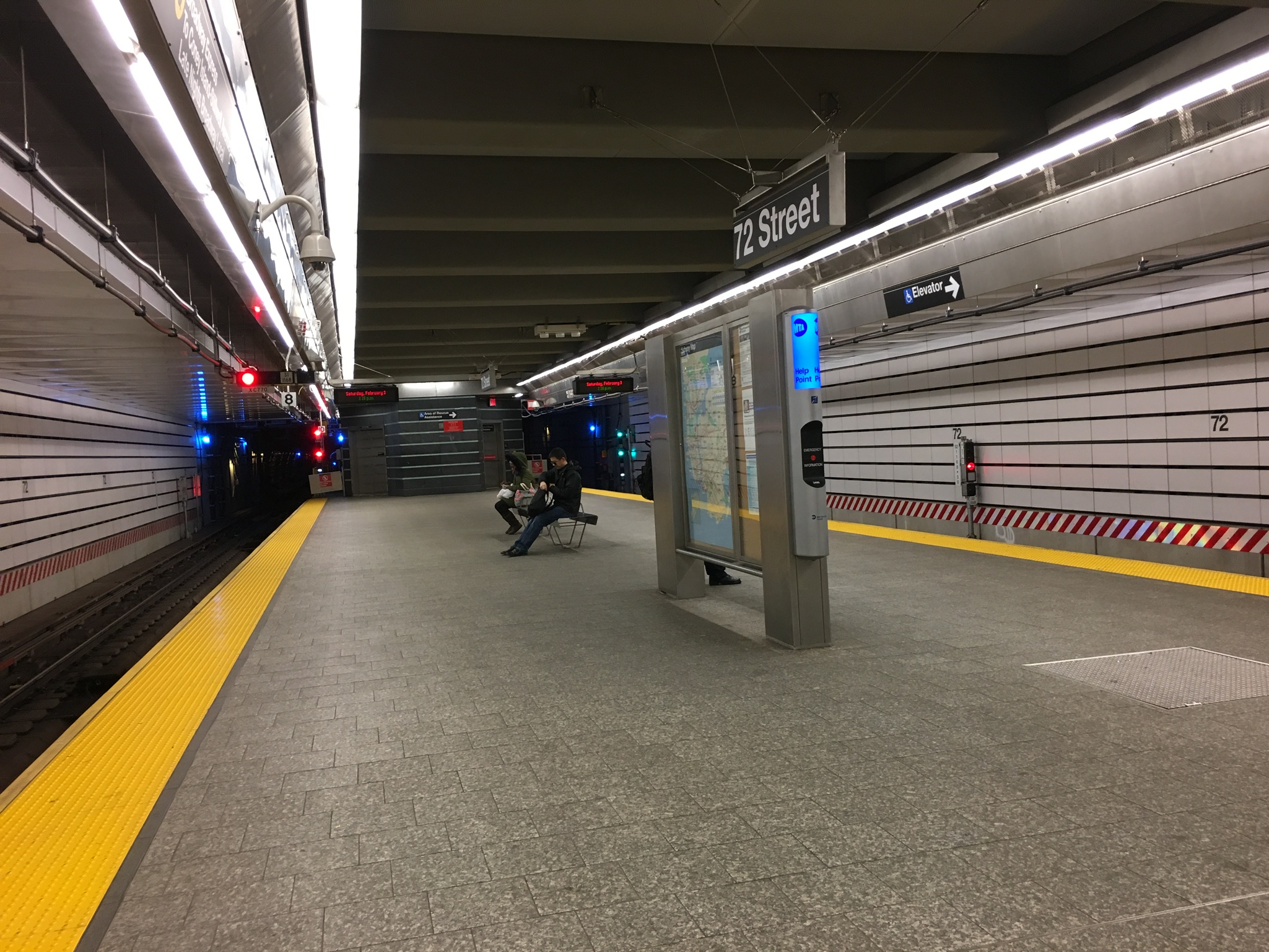
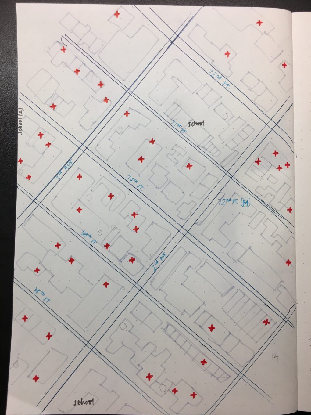
When referring to the map, the average number of medical buildings per block is about 4.2, and the most number in one block is 9. In total, there is 59 medical-related buildings within these 14 block. For the blocks with less of these buildings, I noted that there were schools in the block. Another case was, the 2 blocks near the 72nd Street subways station had little to no medical buildings surrounding it. This is logical because when I traveled to and from this station, it was obvious that a lot of money went into making it. There was a long escalator to get to the surface, and in general, everything was very spacious. I had never seen a subway station this big before, so I was relatively impressed. There was no presence of the normal crowdedness of people because it was such a big space. On the surface, I also noticed that there were more food places around this subway station rather than medical buildings.

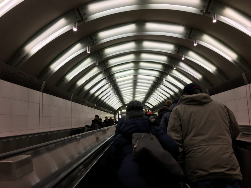
After doing some research, I learned that the idea of this station was proposed in 1919, and design for this subway station started in 1972. They even demolished the 2nd and 3rd avenue stations in preparation. There were 2 phases of construction, costing $431 million and $253 million respectively. In total, it cost about $700 million to fully construct. Given all this information, it is highly possible that they either restricted the types of buildings allowed in the surrounding area. This would allow for more food options near the station for travelers and commuters, giving more business and helping the surrounding economy.

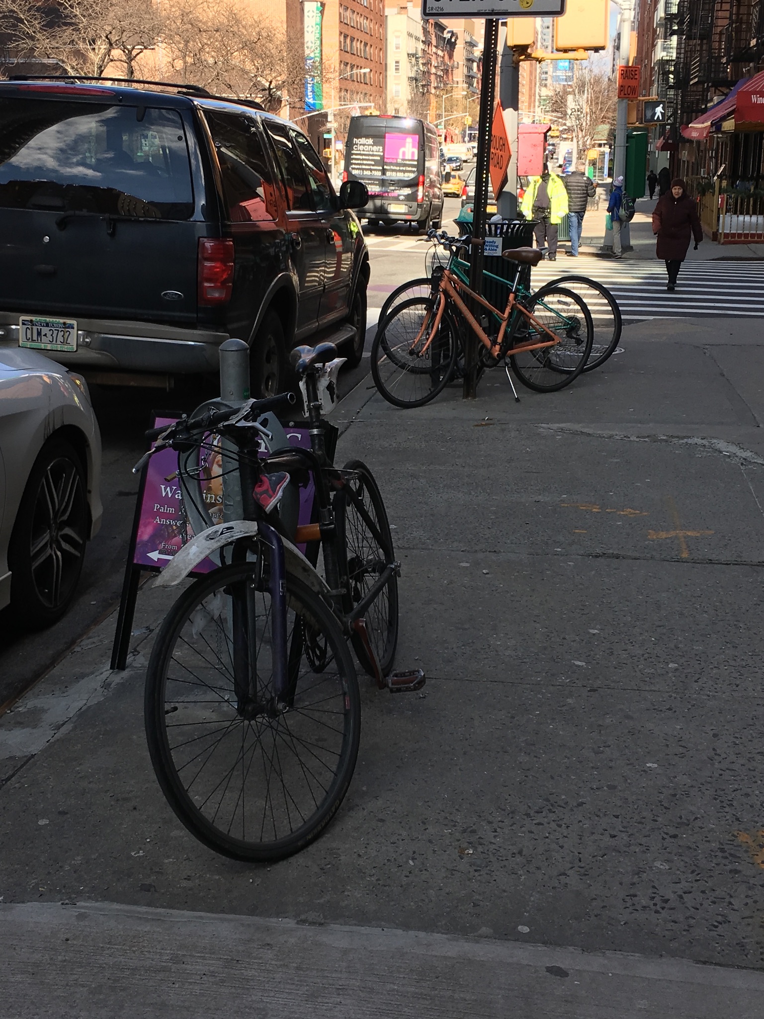
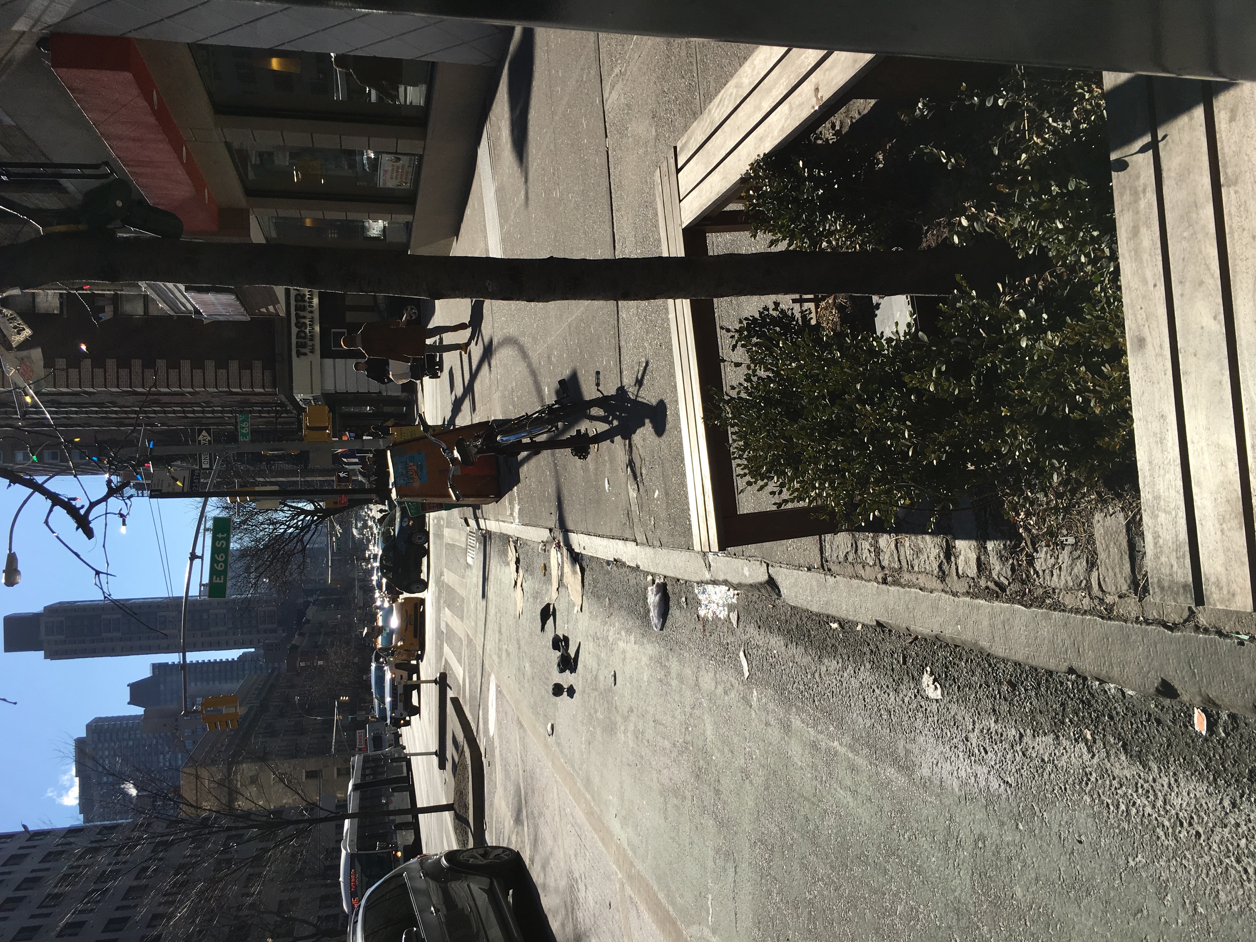
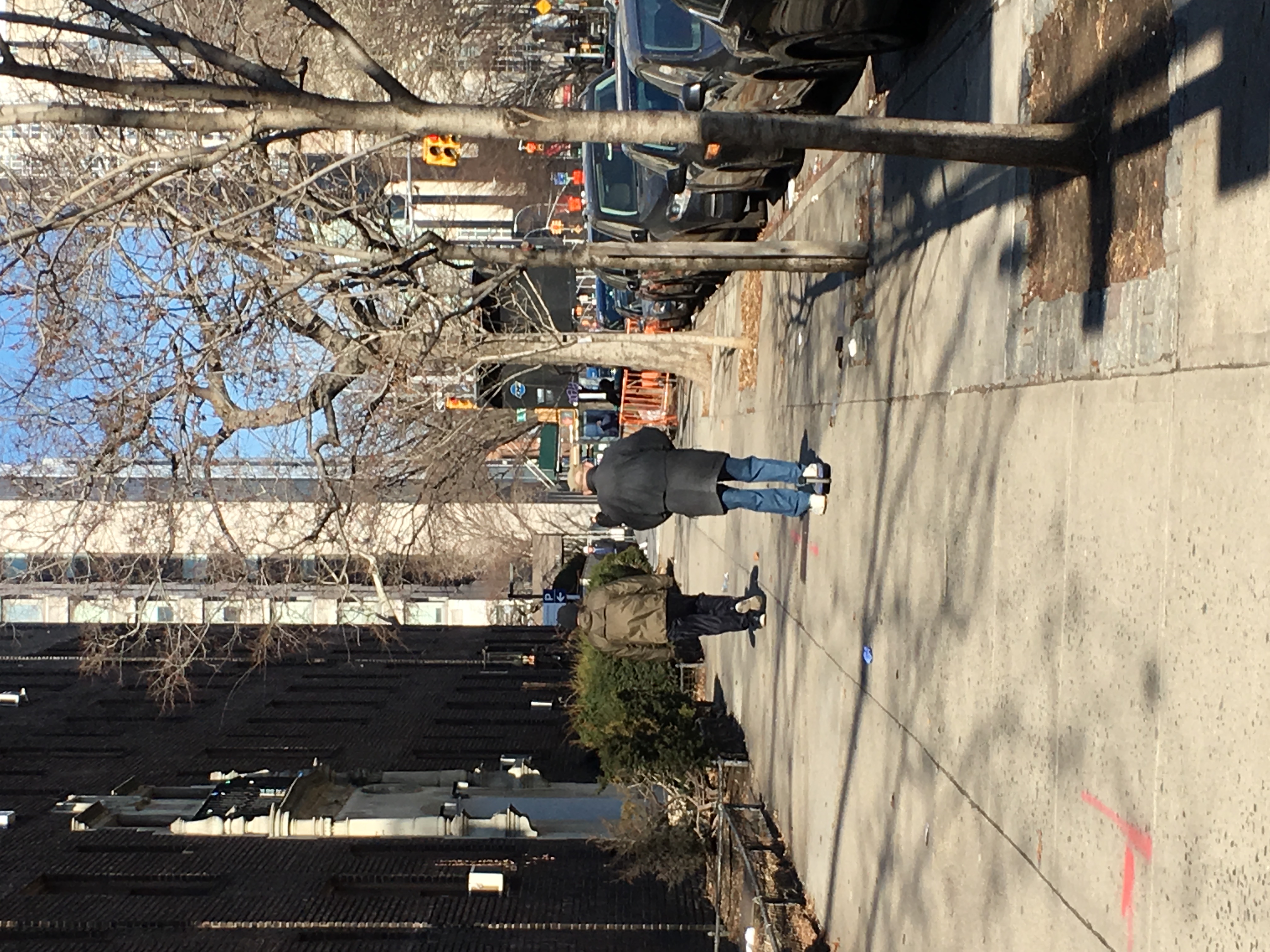
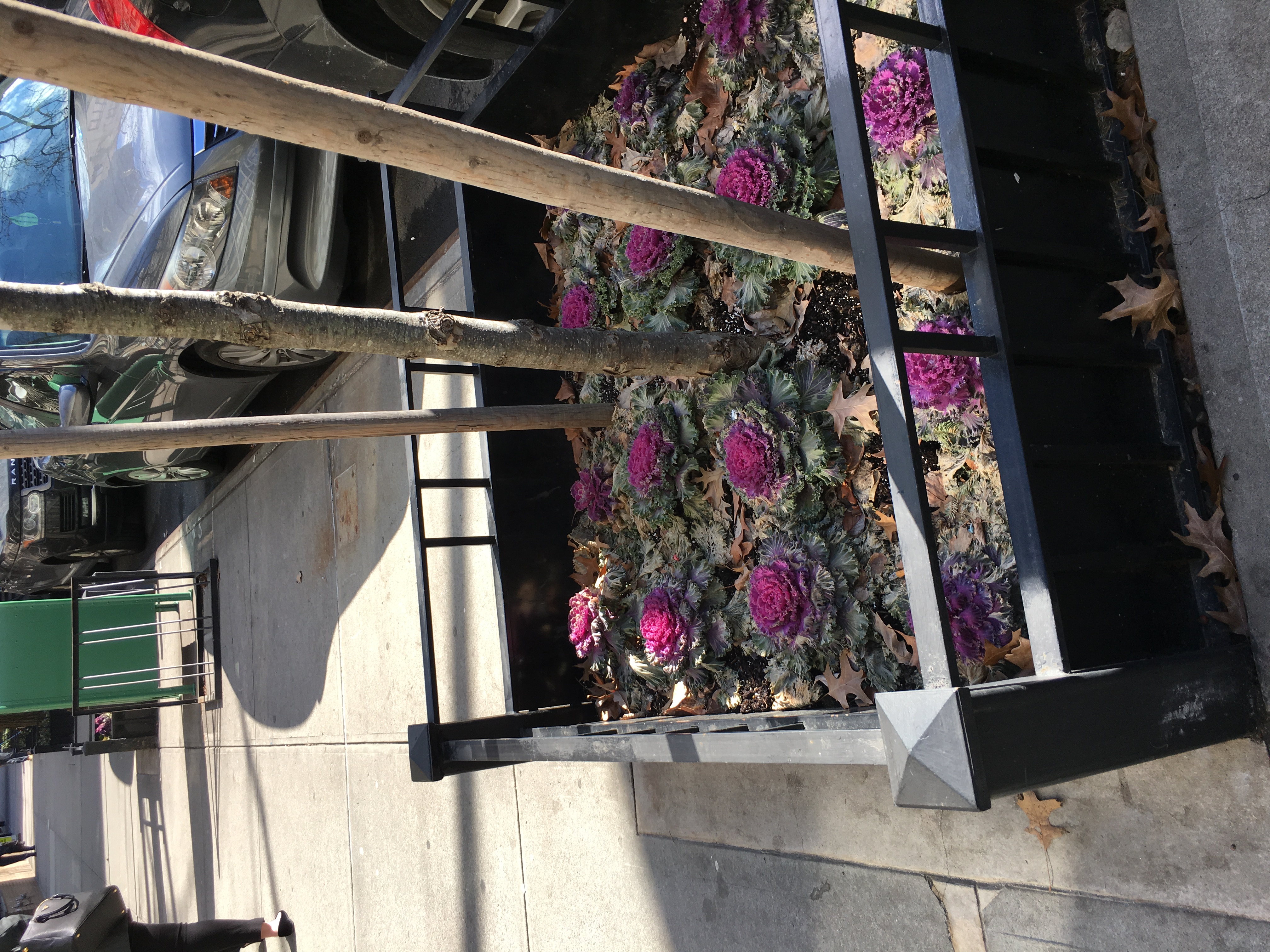
Because of the incredible amount of medical-related buildings I saw, you could assume that the area had a relatively older-aged community. However, I was also observing the types of people I saw on my walks. Yes, there were many old people walking their dogs, but because there are also many schools in the area, I saw many children and parents with strollers. I also found that there were many bikes. Bikes were resting by every tree line and pole(I included a bike in one of my neighborhood sketches for studio). What was interesting was that there were large areas with citibikes to access, but no one was using them. The bikes were not seemingly expensive or new, it just seemed like everyone biked around with their own bikes.

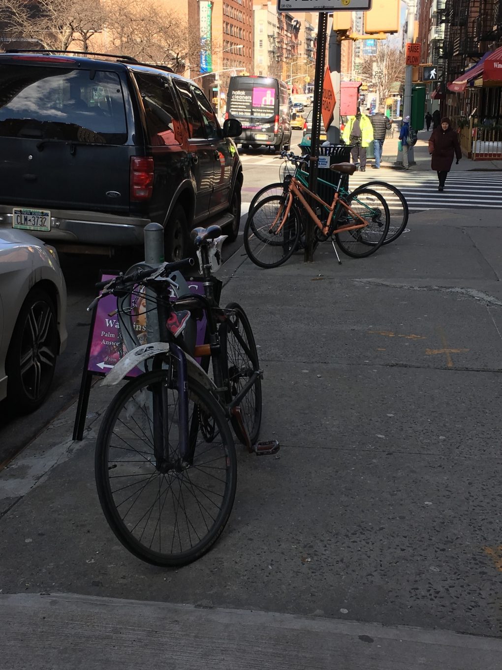
This could also be due to the fact that in every avenue, which had 4 lane wide streets, had an additional bike lane on each side, painted green. Or it could be likewise, the residents saw that there were big bike lanes, so they decided to invest in bikes.

Int Seminar 2: Walking Assignment

WALK 1: Saturday, Feb. 3 2018  1:18pm – 2:19pm

The route


I started at 3rd Ave & 68th St.

Below are observations made, separated by cross st. and ave. names.

Things I noticed was that every sections of tree linings (tree lines in my notes) were different, according to the property they were technically under. Tree lines on the avenues tended to be more simple, and ones on the streets were more intricate/had nicer plants. However, the nicer tree lines mostly came from middle class apt. buildings, higher class apts. could either be nice or not maintained. (above is on an ave., below is on a st.)

Also, there were multiple cases where completely different styles of architecture stood right next to each other. There was no cohesion of style, the buildings were completely different in variation.

A surprising thing was I saw an 80-year old man (possibly) riding a scooter down the street (the Razer kind). I can also account for seeing 3 different people with 3 different dogs at 3 different places but they all had small, white dogs, with a red little coat.


The 2nd walk was on Thursday, from 12:44pm-1:44pm. This is the route.

I saw the same occurring themes as the last walk. (in order: a street apt. tree line, an avenue one, variation of building architecture)


There were also multiple medical buildings, specifically including branches from Weill Cornell college and the Memorial Sloan Kettering Cancer Centers.

A surprising thing on this was that there was a random mug left on a tree line with a half drunk coffee.

Int. Seminar 2: Mindmap

This map focuses on common themes between 8 works, more specifically Formal/Conceptual interpretation of the notion of home, and the relationships of Location, Legislation, Culture, and Community that exist in the works.

Blue = theme

Dark Gray = Title of work (Key Abbrev. letter is bolded in each)

Purple = example in the reading

Light Gray = positive (+), negative (-), and neutral (%) effects between the theme (blue) and work (dark gray)

(curved light gray lines connect similar ideas in different works)

Int Seminar 2: 46 W 16th

The Church of St. Francis Xavier

My preconception was that it would have stained class and light colored stonework, as well as look like a cathedral like St. Patricks.

The interior looked ornate, expensive, and vast, pretentious, and meticulously designed. The atmosphere invoked a sense of reverence through the stonework and tall ceilings. The atmosphere and design work gave me a sense of peace and also made me respect the place. The actual appearance of the inside of the church didn’t surprise me because it is set up very similarly to how typical catholic churches look. There are wooden pews on each side with a narrow pathway between them that lead to the pulpit. The architecture surrounding the pulpit is also the standard half-dome like shape with arches and statues. The outer sides are lined with corinthian columns that are emerald colored marble. These accent the space because the majority of the rest of the church is in neutral tans and browns.  However, the exterior surprised me because it does not look like the traditional front face of a church. It has similar design elements as the interior, but the face is more narrow and it also has a pediment, which you would normally find on legislative buildings, banks, or ancient greek architecture.