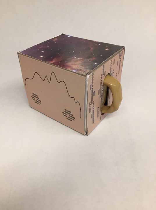
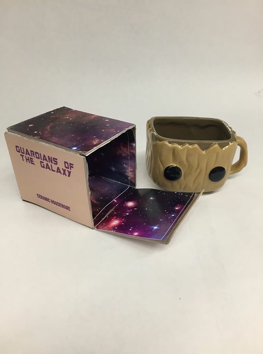
My object was a Funko Pop! Guardians of the Galaxy Baby Groot mug. To represent Groot, on two of the outer-facing panels, I created bark-like texture using the Guardians typeface with variations of the phrase “I AM” because “I am GROOT” is the only thing Groot says. The front has its description in the shape of a cup shape, representing the mug form on the inside. On the back panel, the eyes on the cup are represented through typeface (Benton extra bold condensed, Marvel’s typeface) that also describe the product. There is also a line that represents the outline of baby Groot’s head. The inside is all galaxy to further allude to Guardians of the Galaxy. The handle poking out of the packaging allows for safe transportation that will ensure non-breakage when carrying around.
The final presentation of the product is not to my liking, Looking back I would have printed on the cardboard of chipboard natural brown color instead of using a CMYK. I would also use other, better materials than spray mount and chipboard because there were many complications and issues.