Time: FINAL

My project is a both a visual representation of types of galaxies and nebulas through chalk pastel, and a linguistic study using Chinese, Japanese, and Korean, through watercolor calligraphy. It is based on the book “Galaxy, Mapping the Cosmos,” by James Geach.

There are four visual illustrations of nebulas and galaxies in the cosmos: the star-burst galaxy, Orion’s nebula, barred spiral galaxy, and tarantula nebula, respectively.

STAR BURST GALAXY


ORION’s NEBULA


BARRED SPIRAL GALAXY


TARANTULA NEBULA


I used white watercolor paint and a paintbrush for the calligraphy in the chalk pastel pieces.

There is also calligraphy in Chinese, Japanese and Korean, respectively (in order of the cards to the right). So, this is a linguistic study of sorts. The cards show more information on the image it corresponds to, like their name and NGC and M numbers (classifications of deep sky objects in space).

Unlike English, where the letters themselves don’t have meaning, each character in Asian languages have their own meaning. The cards show the rough translations of the character’s meanings, and they can be compared to the English word they correspond to. It is interesting to see the contrast and comparisons on how each culture interprets different words and phrases.


Time: Movie Trailer


GENRE:  Action/Scifi

My main character will be Wonder Woman, played by Gal Dadot. The movie starts with her growing up on an island that is hidden from the human eye, with an overprotective mother. Ever since she was small she has always had a heart for others. Later in her life she discovers that she has this inhuman ability, and decides that it is her duty to protect humans from evils that are unknown to them.

She travels to different dimensions, where the fabric of reality is put into question. She also faces an enemy that can turn back time, and she travels to different worlds to protect them from dangers only she is aware of. Despite all the challenges she faces, she persists because she believes her duty is to defend.

I used clips from Wonder Woman, Doctor Strange, Thor: Dark World, Black Panther, Thor: Ragnorak, Batman vs. Superman, Guardians of the Galaxy Vol. 2. I decided to use the music by Led Zepplin – Immigrant Song because it is the music that appears in many Marvel/DC movies during action scenes.

MOVIES USED:

Wonder Woman

Doctor Strange

Thor: Dark World

Black Panther

Thor: Ragnorak

Batman vs. SUperman

Guardians of the Galaxy Vol. 2

Time: Book Project – Wings


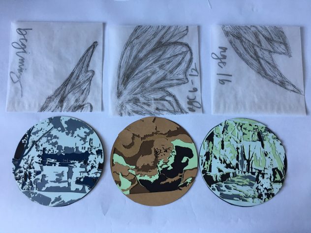
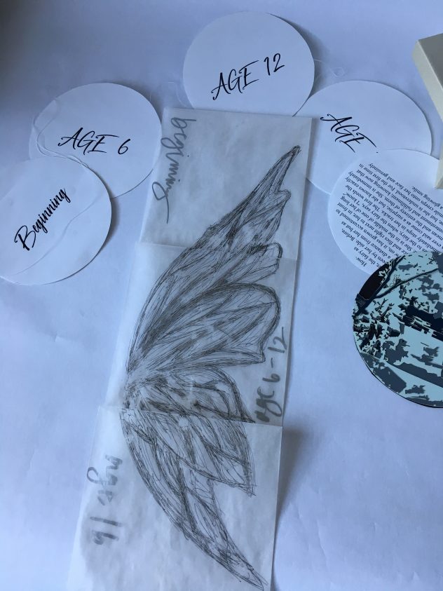
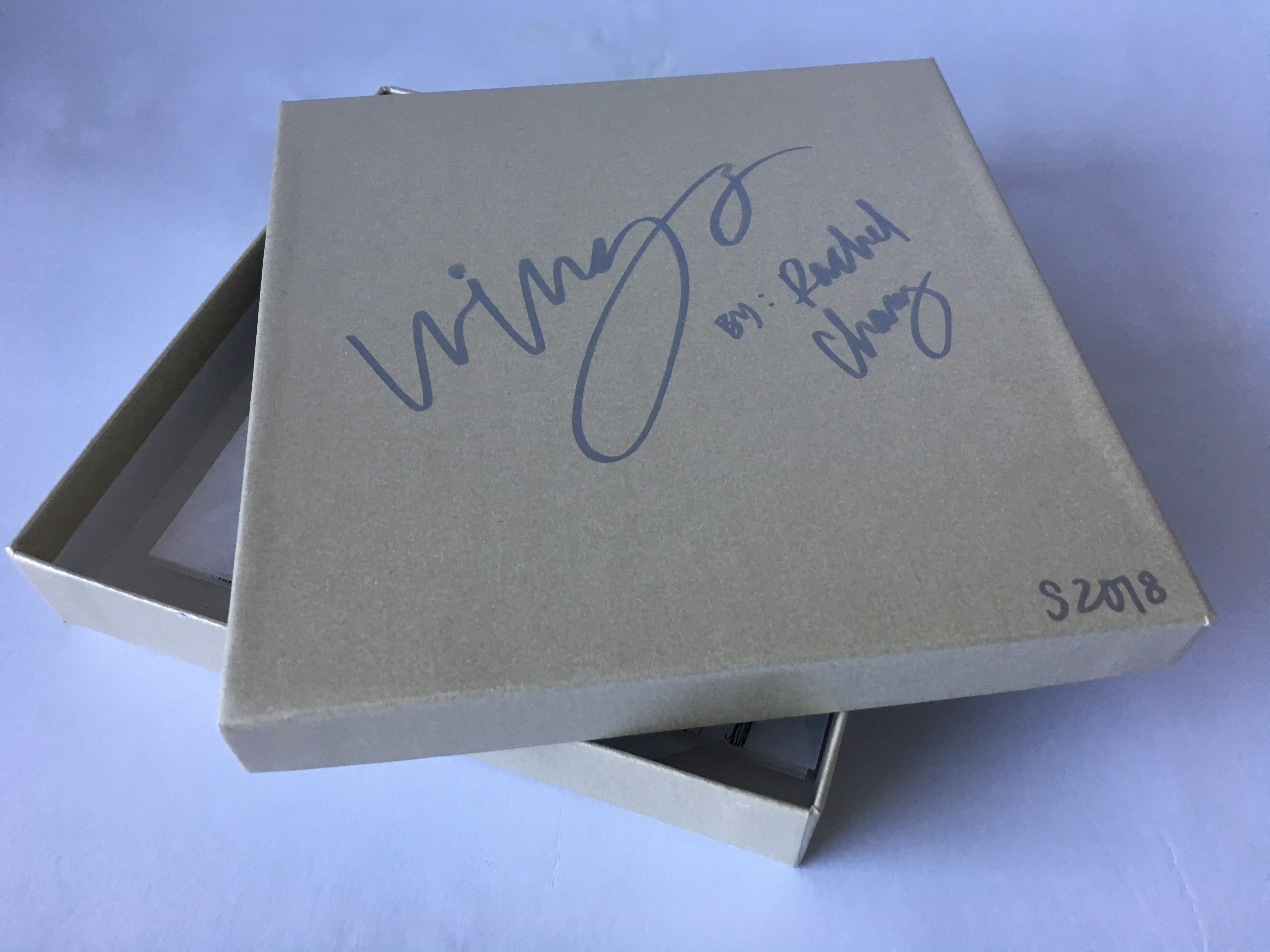
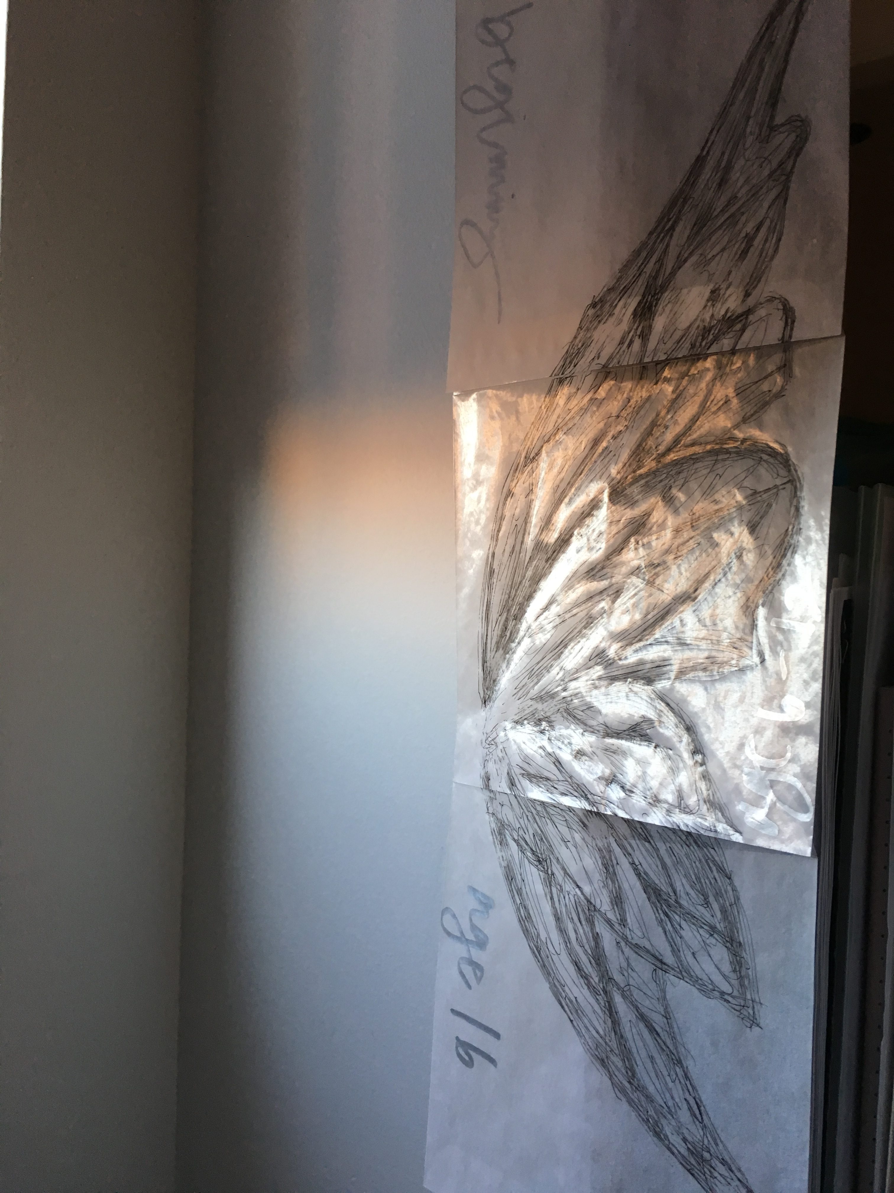
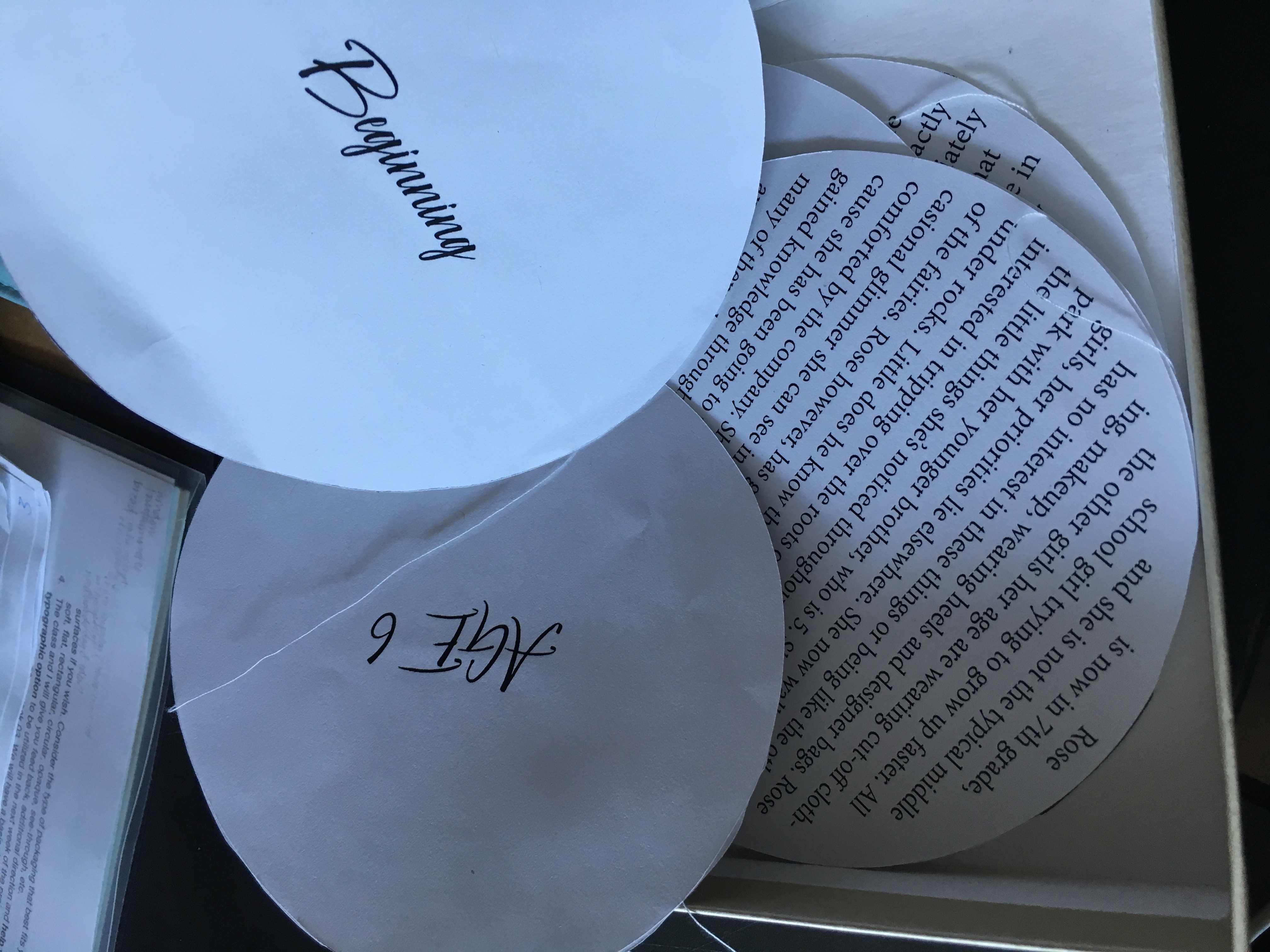
PROCESS: Each circle piece (3) consists of 4 layers of colored paper on top of other to create a single scene, they were laser cut. Each piece is placed in a glassine envelope with a part of a drawn wing on it. When put together vertically they create one full wing (hence the title of the book, “Wings.” Each envelope also has a time label on it, “beginning,” “age 6,” and lastly “age 16.” These also correspond to the line of circle panels that are labeled with the same times; if you flip them, they have the story on them.


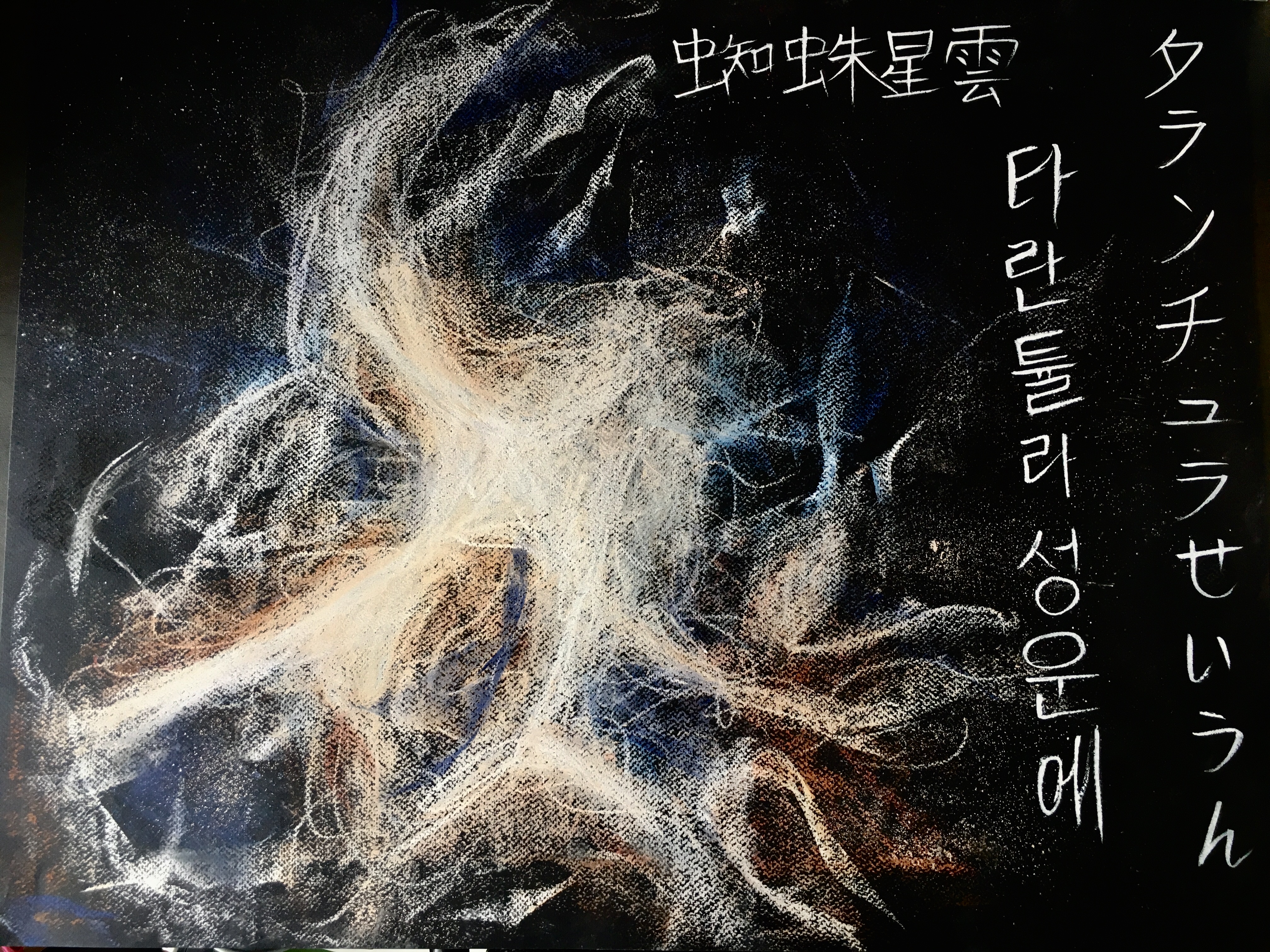
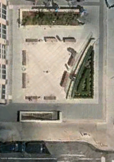
STORY: To the average human eye, one would mistake them for delicate-winged butterflies. Thus, they could go to and fro as they pleased, freely and without worry. For if they were perhaps mistaken for a moth or fly, they would be swatted away. They were a whole village of tiny fairies, living in the heart of Central Park, the Ramble and Lake. Despite being small, they made it their duty to serve as guardian angels to the people that visited. In the fairy village, each fairy was assigned a particular family; these families made visiting the park part of their weekly routine. The fairies sought to protect their family and be like their guardian angel: interceding if needed, but never fully disturbing the balance of time. For years could pass without the fairies noticing, they were immortal after all. They always found human’s mortality and short lives fascinating and subject to observation. This is the story of a girl named Rose and the fairy that watched over her.


AGE 6

Rose and her parents are walking around the lake on the trail, the sun is peeking out through the leaves of the tree branches. Her arms are raised up by her parents, each holding one  of her hands. Rose keeps bumping into them without noticing because her head is down, her little feet following the acorn that has been rolling around on the ground below. Her parents gently warn her to be careful. The fairy, smiling, moves her finger slightly to the left and the acorn suddenly changes its winding course, now directly rolling directly straight in front of Rose. After a few moments however, her attention has shifted to elsewhere. Her head is now pointed directly up, chin in the air; she is looking in awe at the light-illuminated leaves from the trees overhead that line the pathway they walk on. The fairy, noticing, moves her arm to the right and brings in a light gust of wind to slightly move the branches of the trees. Rose is delighted. She is always looking around, mesmerized by nature’s details. She lives in moments: never looking straight ahead, her eyes always darting from one place to another.

AGE 12

Rose is now in 7th grade, and she is not the typical middle school girl trying to grow up faster. All the other girls her age are wearing cut-off clothing, makeup, wearing heels and designer bags. Rose has no interest in these things or being like the other girls, her priorities lie elsewhere. She now walks around the park with her younger brother, who is 5. She shows him all the little things she’s noticed throughout the years. He is more interested in tripping over the roots of large trees and what lies under rocks. Little does he know that he is peeking into the lives of the fairies. Rose however, has grown accustomed to the occasional glimmer she can see in the corner of her eye, and is comforted by the company. She knows about the fairies because she has been going to the park for so long and has gained knowledge through observing. She has seen many of them doing completely normal tasks, and flying next to humans without them having the slightest clue because they simply do not see.

AGE 16

Rose comes to the park still. She has seen the trees grow into wide branched, thick trunked trees, remembering when they were planted when she was little. The park is the only place where she feels that she belongs. People don’t seem to understand Rose. Her mind works differently from their’s and people do not accept what is different. For years now, her fairy has been accompanying Rose, listening to her spill her widely spread and seemingly random thoughts, slowly starting understanding her. People passing by her are convinced she is talking to herself.

The fairy has lived long enough to know that Rose is not a typical human. By now, her classmates have almost convinced her that she is just strange, and that she will never fit in. The general weight of the world is on her shoulders, she is about to collapse. The fairy that accompanies her has never spoken to her, she is unsure if the fairy knows her language. However, the fairy as always been by her side. Before, it would fly a distance from her but as the years grew on, it has grown accustomed to Rose’s presence and flies right next to her, in front of her left ear. She is in the middle of one of her long monologues to the fairy, when the fairy says, “I know.” Rose immediately stops in her tracks. The first words the fairy has ever said come as a surprise, but she knows exactly what they mean and the entirety of them. She is immediately filled with contentment and fulfillment; knowing now that she is not alone, but she is understood. For the first time in a long time, a smile creeps onto her face and genuinely transforms into a glowing smile.


Product, Promotion, Packaging: FINAL

For this project, we were assigned ACDC – Highway to Hell.


To begin, I drew out the ACDC letters to use as the main typeface for all our promotional packaging. 

I used sumi ink and a calligraphy brush to make the “Highway to Hell.”

After, I used Adobe Capture and converted these to vectors. To get the distressed look, I used a large point brush.

In terms of the box, I used Fabriano black paper for the slip for the box. There is also a pocket for the transparent papers. There are three separate layers of transparent paper placed on top of each other, “Highway to Hell,” “ACDC,” and the artwork (layers from bottom to top). I printed at Village Copier. For the artwork I mixed together Michelangelo’s The Last Judgement, blue fire, and stage lights.

For making the box, I used the back of my drawing pad because I didn’t have large enough spare chipboard pieces, and I didn’t have enough black paper so I painted the whole box with charcoal black acrylic. It worked out well because the chipboard was thick enough and I put a thin enough layer so the box did not warp.

For the poster and cd cover, I purposely used slight variations of the main colors because we wanted there to be continuity, but not so much that it got repetitive.

Int. Seminar 2: BRIDGE 5

Some things I learned this semester are that “research” and data include much more than just articles and academic sources, which was basically what they teach you in high school. For papers you get all you information from these things, but for this semester, we spent most of our time collecting our own data and experiences, rather than using things just found in articles.

Many topics that our readings were about, for example just public space in general or atmosphere, I never realized that essays on these topics existed just because I never had to read any of them. I was also happy to see that some of the topics were about things most people don’t know about or that there aren’t articles about, such as Taiwanese mountain villages. Reading this article gave me inspiration and I hope to explore and focus on more untold stories as subjects for further projects. Another thing I want to find out more about is how knowing multiple languages shapes thought processes and how the brain works.

A technical thing I learned was how to read readings quicker but also more effective and better, so I’m better at summarizing and knowing which details are actually important. Also forcing myself to take notes is helpful or else I’ll just forget it afterwards. An effective thing I do is to use a color to note keywords, it is effective when writing the notes because you have to choose what is important and summarize, and it is helpful when looking at it after because you only need to look at key words in color.

Also, before I wanted to become a nurse because I thought it was the best way I could help people. However, after some unfortunate events, I ended up pursing art, graphic design. From reading the readings, especially the article by Peter Hall, I realized just how big of an impact design has on the world in general, and that as designers we have the power to influence peoples thoughts, so it can also be used for good.

Int. Studio 2: BRIDGE 4

How might we both challenge and accommodate for a range of cultural and economic experiences through interventive design of community space, in spite of class disparity in Lenox Hill?

The location of my design intervention is 1313 York Ave, situated in the middle of three different brands of hospital (view site model). My design intervention is a VR dome, that is seen as a hemisphere on ground surface. The entrance is accessible with an underground stairway, it will lead to the inside of the dome to view the VR 3D experience. The diameter of the dome is 24 feet, so when standing on the inside of the dome, the highest part of the dome will be 18 feet. If the user is standing in the middle, then there will be 12 feet of space on each side of them (view site plan and dome graphic). I want it to be this size because it will be the fullest immersive experience it could be. To scale, the final model of the dome is 8 inches in diameter, so the scale is ⅓ inch. It is made out of 20 gauge copper wire to show the reflective and aesthetic quality of the dome.

An example of the inside projections of the dome are visually displayed by the 3D hologram I made. The trapezoid shape was made out of polycarbonate, and I made the hologram video in Adobe Premiere.

dome hologram video-225i03b

The dome construction infrastructure will be in geodesic form (see moodboard). This structure will be made of Multi Color Metal Sheet, that will be die-cut into connecting rods. This material is UV/water/wear resistant, is meant for outdoor use, and has sound reflecting acoustics. The covering of the metal on the outside and inside of the dome will be Transhield Shrinkable Fabric, a lightweight stretchable film that is meant for outdoor use, that is highly water, wear, stain, and tear resistant. The outside of the dome will have a spotted layer of covering of Lunabrite New Neon Illuminating Resin, specifically the blue color because it symbolizes security and stability. It is photoluminescent, so in the nighttime the dome will glow, this adds both a playful element and a symbol of hope in the dark. Lastly, the projection surface for the 3D views of the locations around the world will use Screen Goo, which is a type of acrylic paint that is designed for video projection.

The architectural replicas of the houses from around the world will be from Japan, India, Spain, Nova Scotia, Uganda, and Peru. I chose these specific locations to give a widest range of types of houses around the world, as well as styles.

Int Seminar 2: Conceptual Framework

WHAT DILEMMAS/PARADOXES/TENSIONS are explored in your research?

Paradox: Chinese people opening Japanese sushi restaurants

Tensions: Many Chinese people dislike Japanese people because of historic events

Paradox: Lenox Hill residents (wealthy) don’t know what an adjective is.


WHAT “BIG ISSUES” serve as a BACKGROUND to your research, and HOW DO YOU APPROACH THEM (why are they in your narrative and how do they contextualize it?)

Japanese restaurants: what are they selling (commodity value of Japanese culture) [I studied this through the interior design of Chinese vs. Japanese owned restaurants.)  Chinese owned use a lot of bamboo decoration as dividers because they think their customers associate this with Asian food. Japanese only use wood in their interior design because it is the custom in Japan.]

How views of a culture are influenced by their experiences in restaurants of that culture  [I approach this by interviewing people in Lenox Hill about 5 different culture categories of restaurants, and asked what are the first 3 adjectives that come to their mind when they think of each. – this indirectly compiles their experiences with those types of restaurants into the 3 adjectives they list.]

“authenticity” – how important or irrelevant [There is an imbalance between the importance of this because Chinese people are opening Japanese restaurants, some Japanese owned restaurants are compromising tradition to appeal to western tastes, and moresome, Japanese restaurants continue to serve traditional omaske in the correct setting and for a price that matches the quality.]

How stereotypes influence a person’s decisions and how to act. [The interviews also reveal stereotypes, more specifically the different views of Chinese and Japanese restaurants. These could’ve possibly lead to Chinese people deciding to open Japanese restaurants instead of Chinese.]

Gentrification: sushi restaurants can be a sign of how gentrified and “wealthier’ a neighborhood is.


WHAT HAVE YOU LEARNED ABOUT THE “BIG ISSUES” to your research? What are you more AWARE of now?

Chinese vs. Japanese interior design (what people interpret it to be vs. how it actually is)

I am more aware of the views of different cultures and how others appeal more than others. These views in turn influence business direction decisions: what will sell better and accommodate residents of a certain area. Regarding authenticity, there is a wide range of opinions of the importance of this. Some refuse to do anything outside of the original Japanese customs, others attempt to comprise the lack of this through a deeper connection through the community.