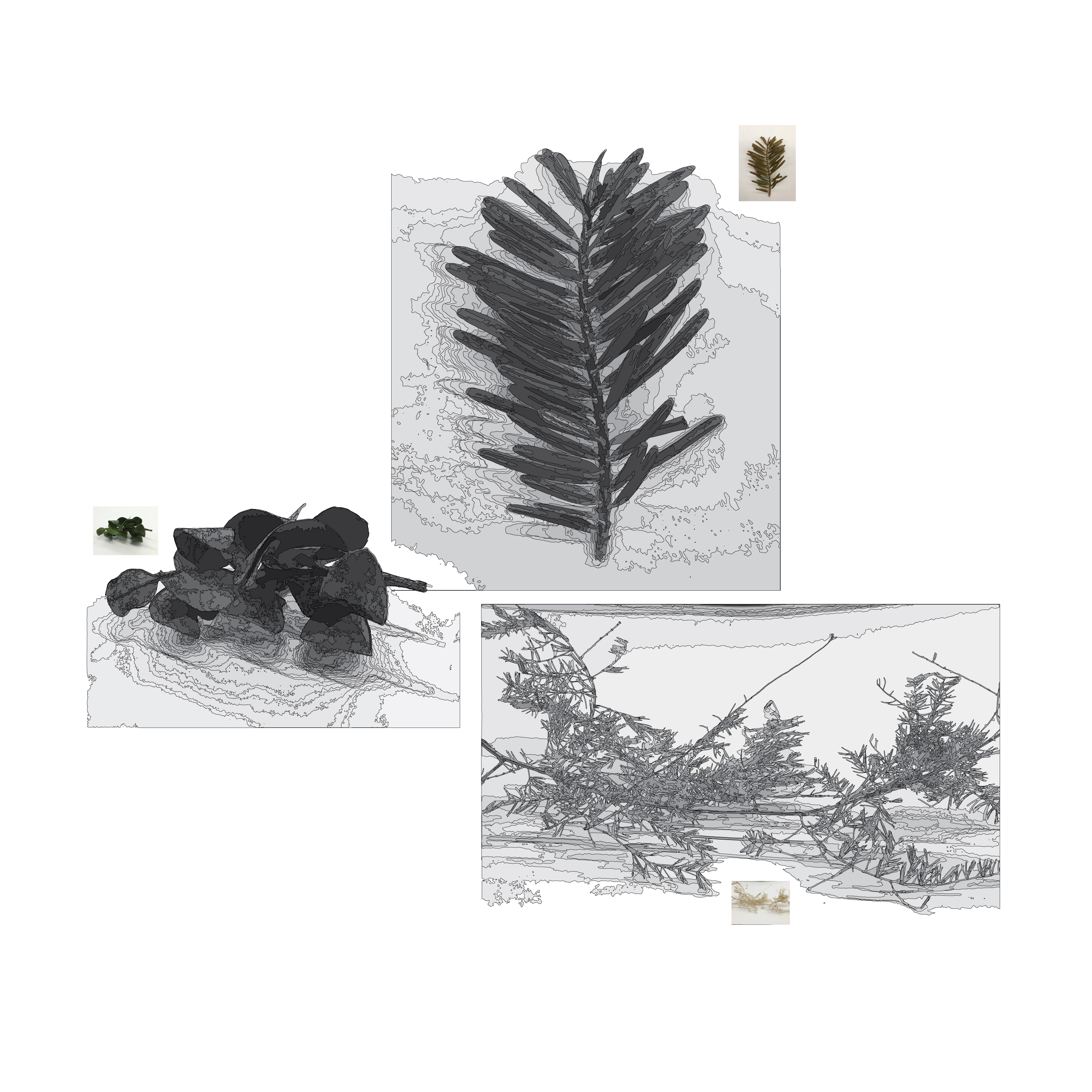
For the 30×40″ poster design, I focused on elements of Lenox Hill that are both things I will focus on in my seminar research paper and that are well known. That being said, I focused on the subjects of: medical building amount, subway and bus routes, and sushi places. There is a white grid consisting of 102 blocks that represent the entire neighborhood. The furthest left line represents Park Avenue, Manhattans border is on the far right and the line closest to this represents York Avenue. In progression from left to right, the white vertical lines represent Park, Lexington, Third, Second, First, and York Avenues. Horizontally, the furthest white line to the top is 77th Street, the bottommost is 60th. The layer of various values of blue represent the number of medical-related buildings per block. Refer to the graph in the key located at the bottom right. To gather this data, I went to Google Maps, zoomed in the furthest it would go, and counted the number of medical symbols in each block. While doing this, I also recorded when there was a bus stop and what number bus it was, any subway stations, and sushi places. The highest number of medical buildings per block is 27, there is approximately 500 total medical-related buildings in Lenox Hill. The tan color lines and squares represent subway routes and stations, the darker tan represent this for buses. The overlay of gray color are representations through line of the specimens found in the neighborhood, if the entire 30×40″ was split into thirds the locations of the specimens on the page are representative of their approximate location when referring to this map. 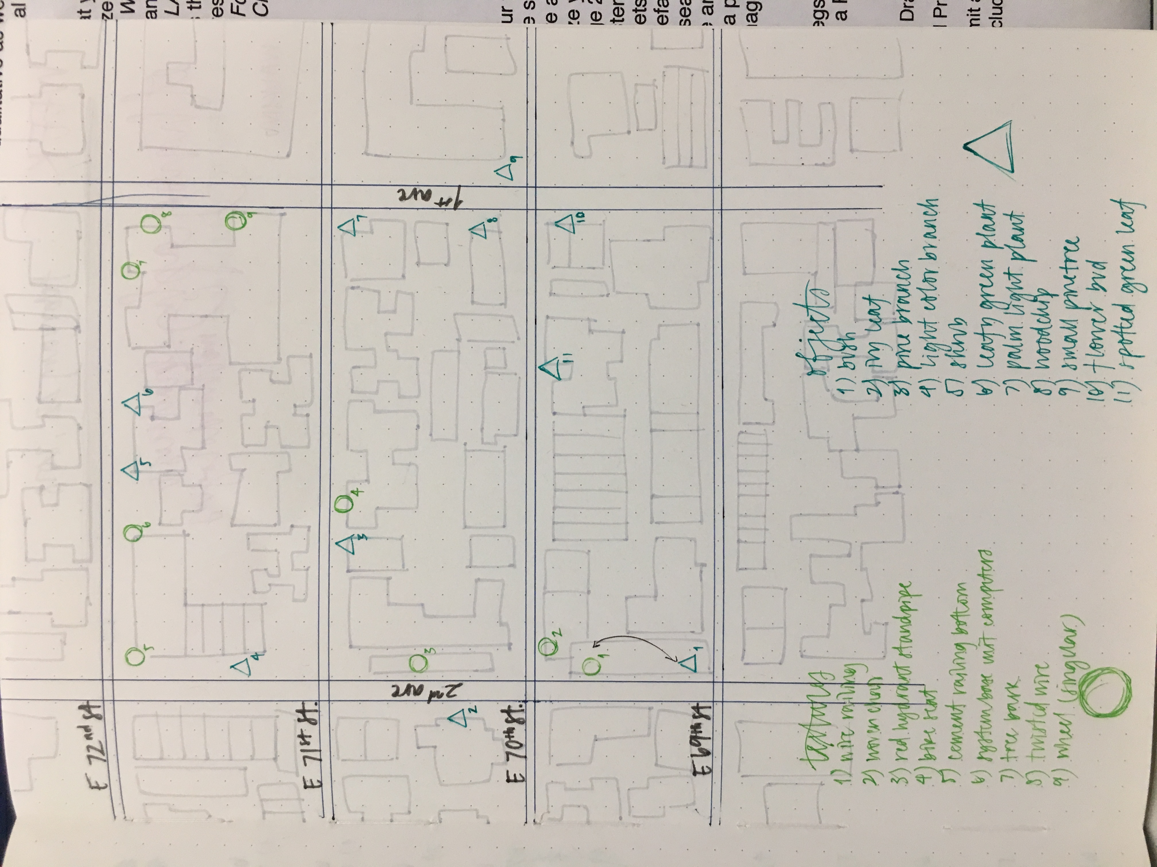
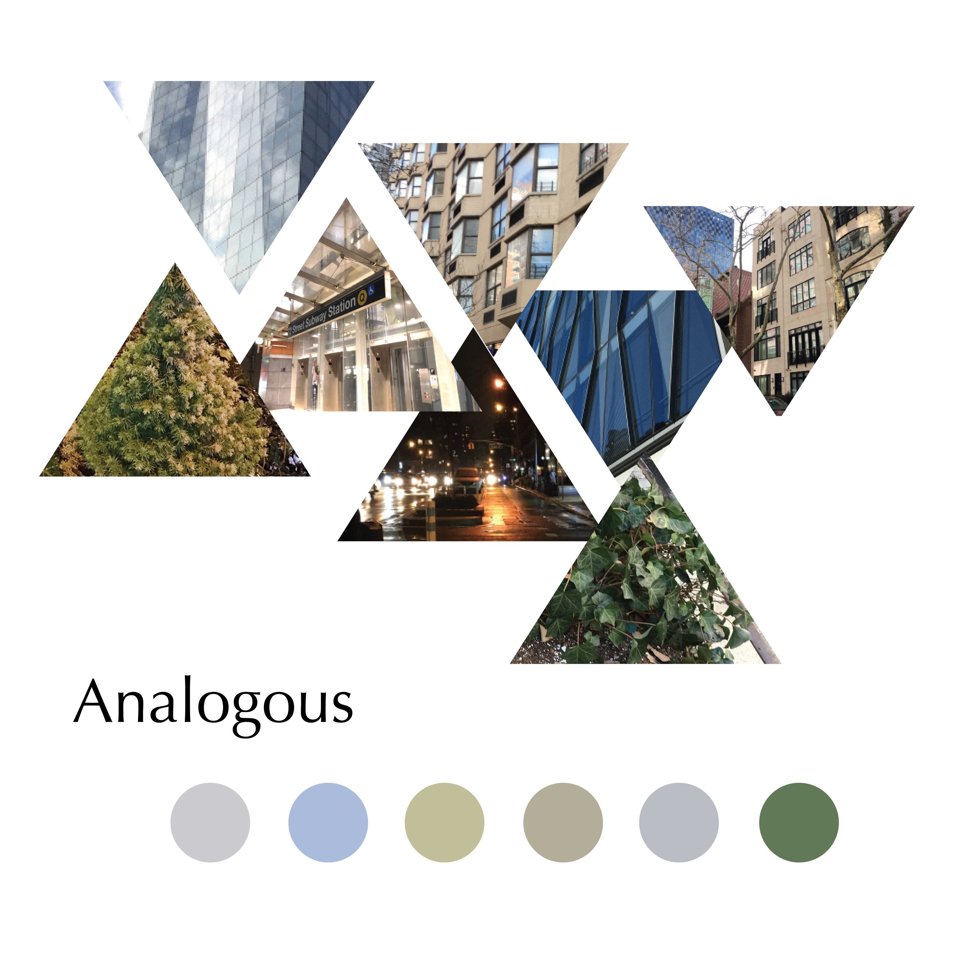
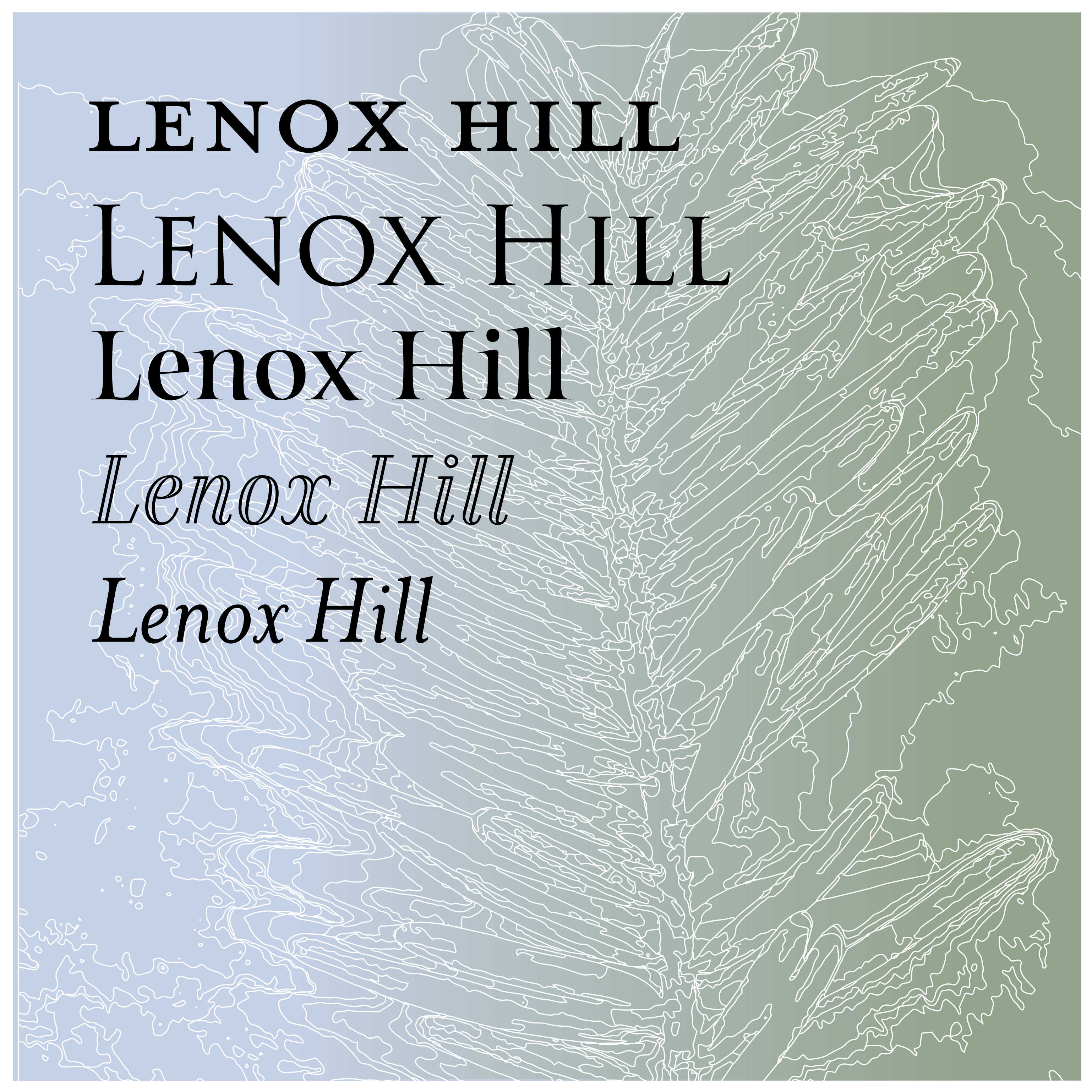
The typeface used in the map that I chose to represent the feel of Lenox Hill is Cinzel. The color palette can be referenced by the analogous art board below. The art boards as a whole were explorations of different elements of design that inspired the 30×40 poster.