Category: Uncategorized
Final Paper Topic/Image Choices
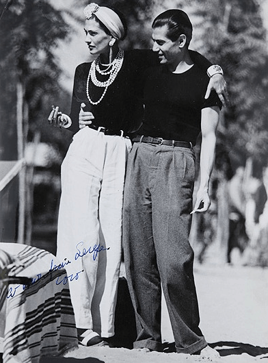
#1 Coco Chanel & Serge Lifar
Background Information:
- 1937
- Gabrielle “Coco” Chanel (both artist & designer pictured on the left), Serge Lifar (dancer and friend, pictured on the right)
- Vintage photograph dedicated to Lifar by Chanel as a token of their friendship. The two had met during the production of the Le Train Bleu ballet production in 1924 (Ballets Russes) and became acquainted due to similar artistic interests.
Explanation for Choice:
- I find this image to be interesting as it frames Coco Chanel in both the aesthetic and reputation she is known for: simplistic chic and a sense of assertiveness and independence. I think this image in particular is successful in conveying this carefully crafted image because Chanel is taller than her friend and is dressed almost identically to him, a flaunt (albeit deceptive) of androgyny. Her arm is also around his shoulders as opposed to the other way around and she is holding a cigarette, which gives me the impression of intensity and dominance on her part in their relationship. This transparency in tone coincides with both my personality and taste in aesthetics: I love the attitude alongside simplicity, contrasting black and white colour scheme, and unisex style.
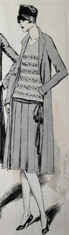
#2 Chanel Ensemble Magazine Illustration
Background Information:
- July 1926
- Drawn by Soulie
- Found in Delinator magazine
Explanation of Choice:
- I believe that this illustration portrays the quintessential garçonne girl of the 1920s, capturing her personality, expected-body type, hairstyle, and attitude. Her pose is relaxed and somewhat haughty.
- The garçonne style/archetype is historically one of my favourites. The androgynous style and body type are what I appreciate in that the silhouette is unassuming of the wearer’s “femininity” (curves) and holds quite a baggy and comfortable application of materiality in construction.
Time: Composition – Linear Narrative (Video)
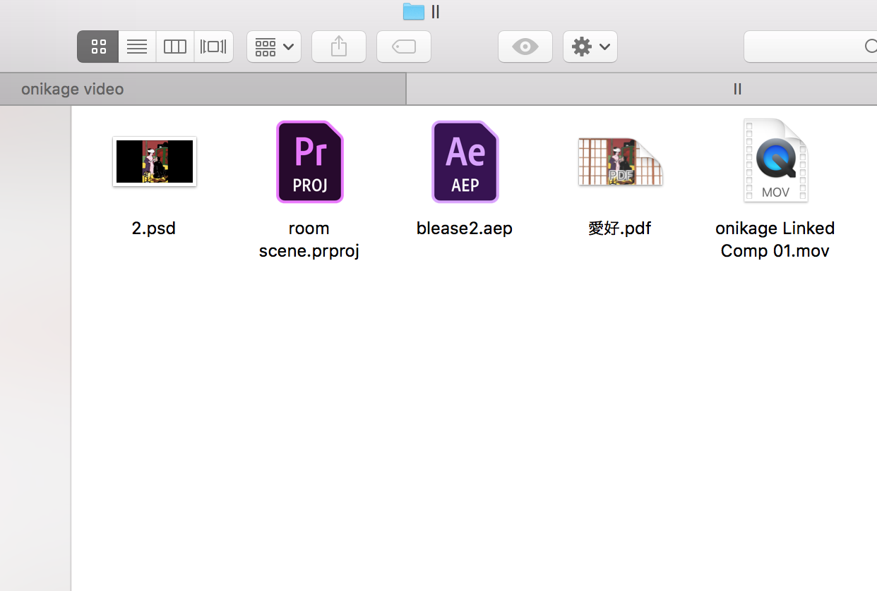
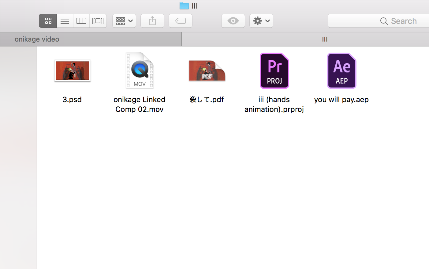
This project proved to be quite difficult for me, as I have never extensively edited videos or worked with manipulating sound before. I further made this harder on myself as I decided that I wanted to make an animation. I sampled artwork from Japanese erotic horror artist Toshio Saeki; specifically from his Onikage collection (hence why I titled the video under the same name). I digitally coloured in the lineart featured in this collection, and they came out as follows:

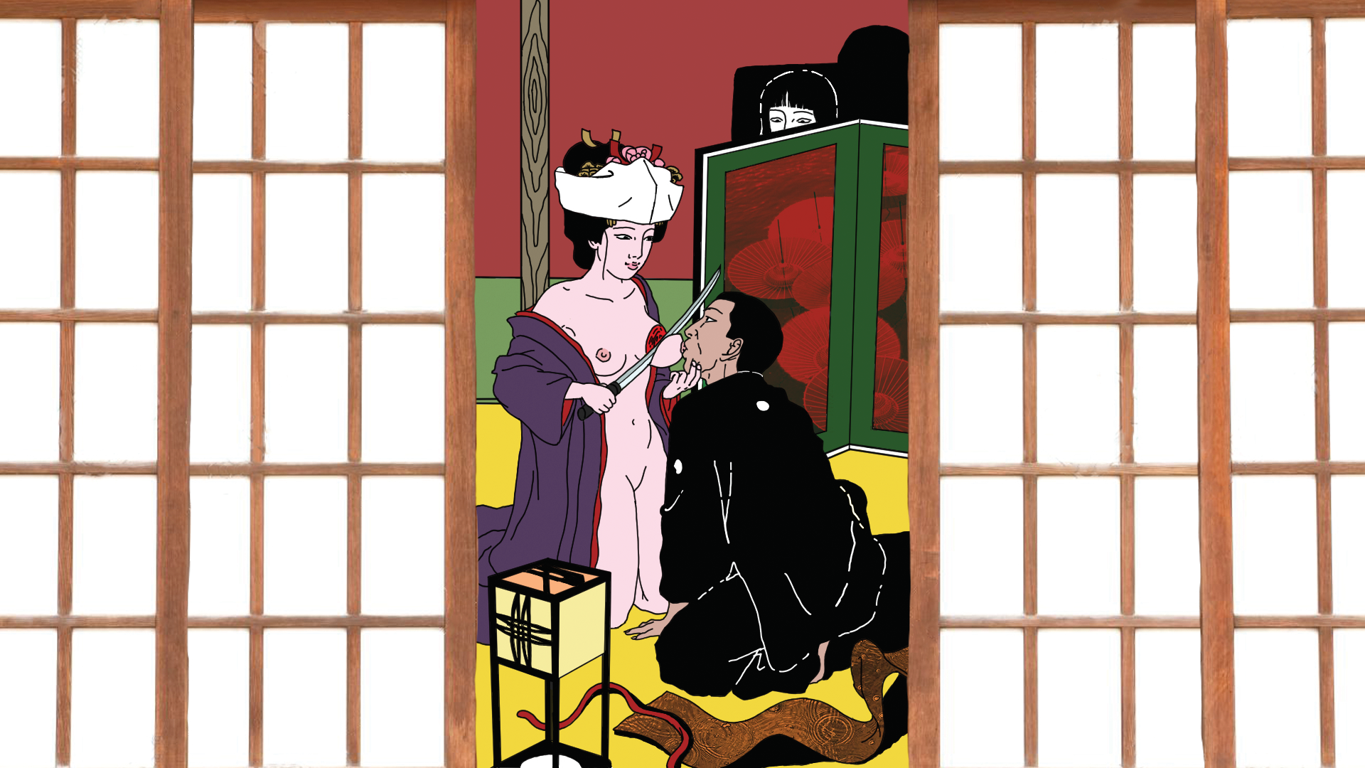


The video was divided into four segments, respectively titled “死亡 / Death,” “愛好 / Love,” “殺して / Killing,” and “お仕置き / Punishment.”
Animation / Movement
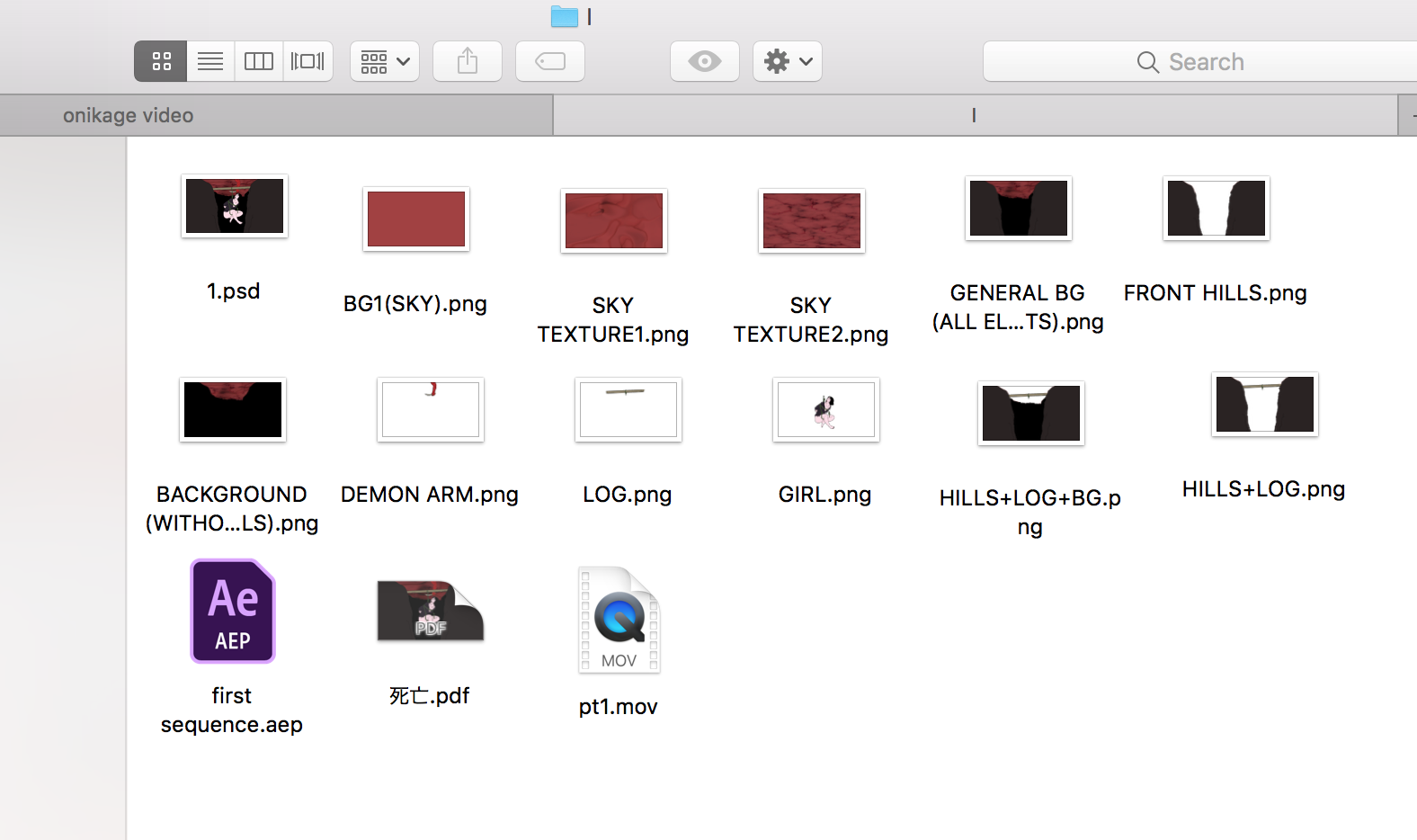
The first scene was made by creating separate .png files from my original .psd file and putting them into Adobe After Effects. AAE was fun to work with; I animated the separate layers to create sequences of motion to put into Adobe Premiere Pro.

For the second sequence, I created individual .png files which I would just put into APP and adjust the speed for, for a traditional animation method. The individual files depicted a sliding door opening and closing, with the main character blinking in between.

The third sequence focused primarily on background animation, which was a pair of hands throwing an eclipsed sun back and forth like a ball. I traced each individual slide off of screenshots of a video I took of my hands, tossing a pot of eyeliner back and forth.

Finally, for the fourth sequence I used AAE for layer animation. Like the method I used for the first sequence, I exported this animation into a .mov file and put it into Premiere Pro to add sounds and zoom effects.
Sound
I sampled audio from the following sources:
Linear Progression / Storyline
The storyline follows a girl who falls to her death by the hands of a demon, turning into a ghost after the fall. She had fallen into a fault in the earth leading to a surreal world – a Japanese folklore/horror inspired limbo. She lands in a room to see a traditional bride and groom playing dangerously with a sword; the camera zooms into her point of view and the door closes on the scene. Now a ghost, she ends up on a path in the purgatory and is approached by a boy who begins to crawl up to her. This third scene depicts this as she hits him in the head with a hammer (through her own ghostly hand) as a pair of ghostly hands tosses the moon back and forth in the background horizon. The fourth part of the video, now in a more distorted environment with telephone poles and wires looming the background as she pokes the boy with a bamboo stick. The video ends with a zoom into her smirk.
I did not intend for a developed storyline, so the ultimate storyline is up to the viewer. The assignment was to show a clear visual progression, and the description above is my own interpretation of the transition between Saeki’s plausibly relatable scenes.
Time: Composition Final: “Experimental Future”
For our Time: Composition final we were given our first open ended project prompt, How do you envisage The Future, your future, or a future? This came with the following questions we were to answer ourselves as well:
- Can you integrate this project into your major area of study (ie: fashion, illustration, design management, etc.)
- Generally, do you consider yourself an optimist or a pessimist? Can you envisage having some impact, even if very minor, on the betterment of society or some aspect of it? How does this attitude affect how you approach this project?
- Do you generally engage with or withdraw from the challenges of our times? How do you address larger conceptual, political, philosophical issues and beliefs through your creative work? Or, conversely, how do you avoid them?
- Can you find a balance between imposing control according to a preconceived idea or plan with the internal, evolving demands of the project itself? How much flexibility can you manage to satisfy both needs? How much uncertainty are you willing to tolerate during that process?
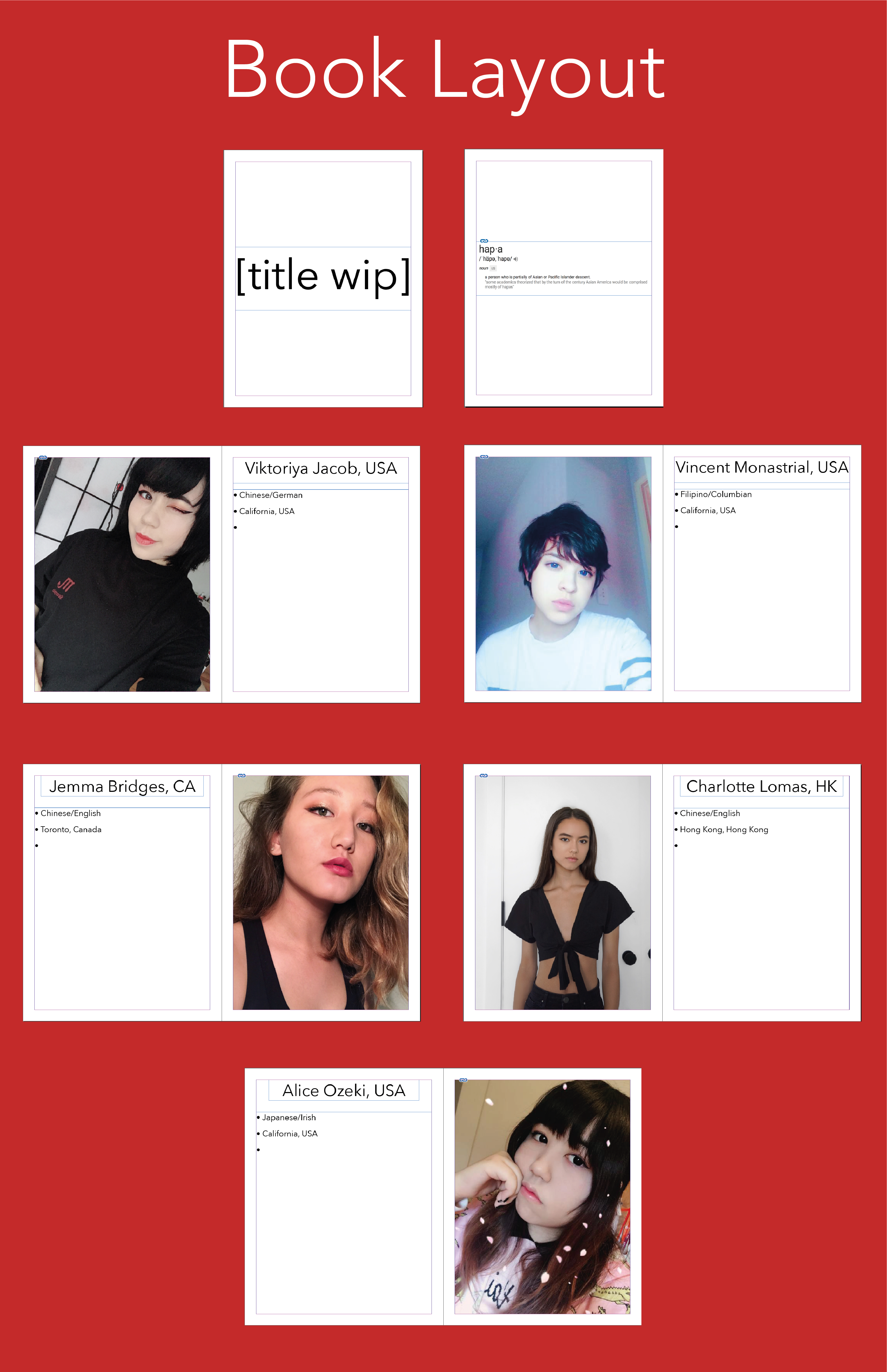
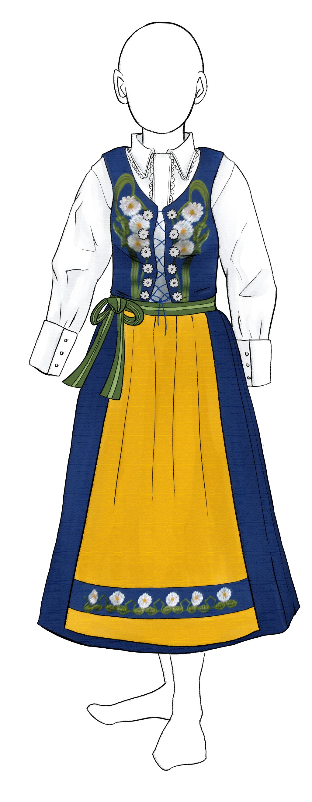
I immediately knew that I wanted to make or design a garment for this final, as I had just gotten my major switch approved and was officially a Fashion Design BFA major. I also knew that I wanted to incorporate multicultural inspirations into its overall theme as well, as that is a huge portion of my personal identity. As we were shown examples of other projects in the class that this was designed, I knew that I would be focusing on the hapa experience specifically: honing in on half-Asian people and culture.
Despite how negative I can find myself being, I consider myself fundamentally to be an optimist. With my focusing on biracial people similar to myself, I believe that my contribution (albeit small and somewhat shallow considering the timeframe we would be given for this project) is still important in that it gives acknowledgement, voice, and some visage of character towards a topic which people generally may not be too familiar with. This motivated me to stay motivated and excited for the final outcome of my project throughout the process, no matter how stressful or overwhelming it got.
In general, I think I usually tend to withdraw from the challenges of our times—i.e. I am not someone who enjoys constant banter or competition, nor do I enjoy confrontational situations such as protests or activism. However, this does not mean that I will shy away from voicing my opinion when it is called of me. I like to be educated in whatever I am talking about, so the visual and informational research processes involved with this project were quite interesting and engaging to me overall. I like to remain very thorough in how I present my arguments and explanations of the subject matter in which I am talking about.
Finding a balance between the realistic and unrealistic expectations I had this project was definitely the main issue I encountered throughout my final. Initially, I had hoped to create a book containing interviews, informational written portions explaining historical facts and sociological observations, followed by fashion illustrations AND a fully designed, patterned, and constructed garment but in the last few weeks to days of this project I realised that this was simply not doable in the allotted time given. If we were given about six weeks for this project, I am sure that I would have been able to meet my initial expectations, but I soon learned that human collaboration, InDesign formatting, printing, and cross-media drawing, scanning, and editing are quite time consuming. My planning was helpful in setting up what I wanted to do, but being pushed to make improvisational changes to this internalised schedule is something I learned that pushed my creative and executive functioning process.
Brainstorming


Free Working Period (4~5 weeks)

For the first portion of my book, I wanted to include interviews from other hapas to gain perspective on what it is like to be one. I talked to a few of my friends and acquaintances, but wanted to reach out to strangers as well so it would not seem biased. I printed out ten copies of the flyer shown above and hung it in various locations around The New School: the University Centre and the Stuyvesant and 13th street dorms. I got a few email responses from other hapas on campus, but only one ever reached out to me and completed my survey.

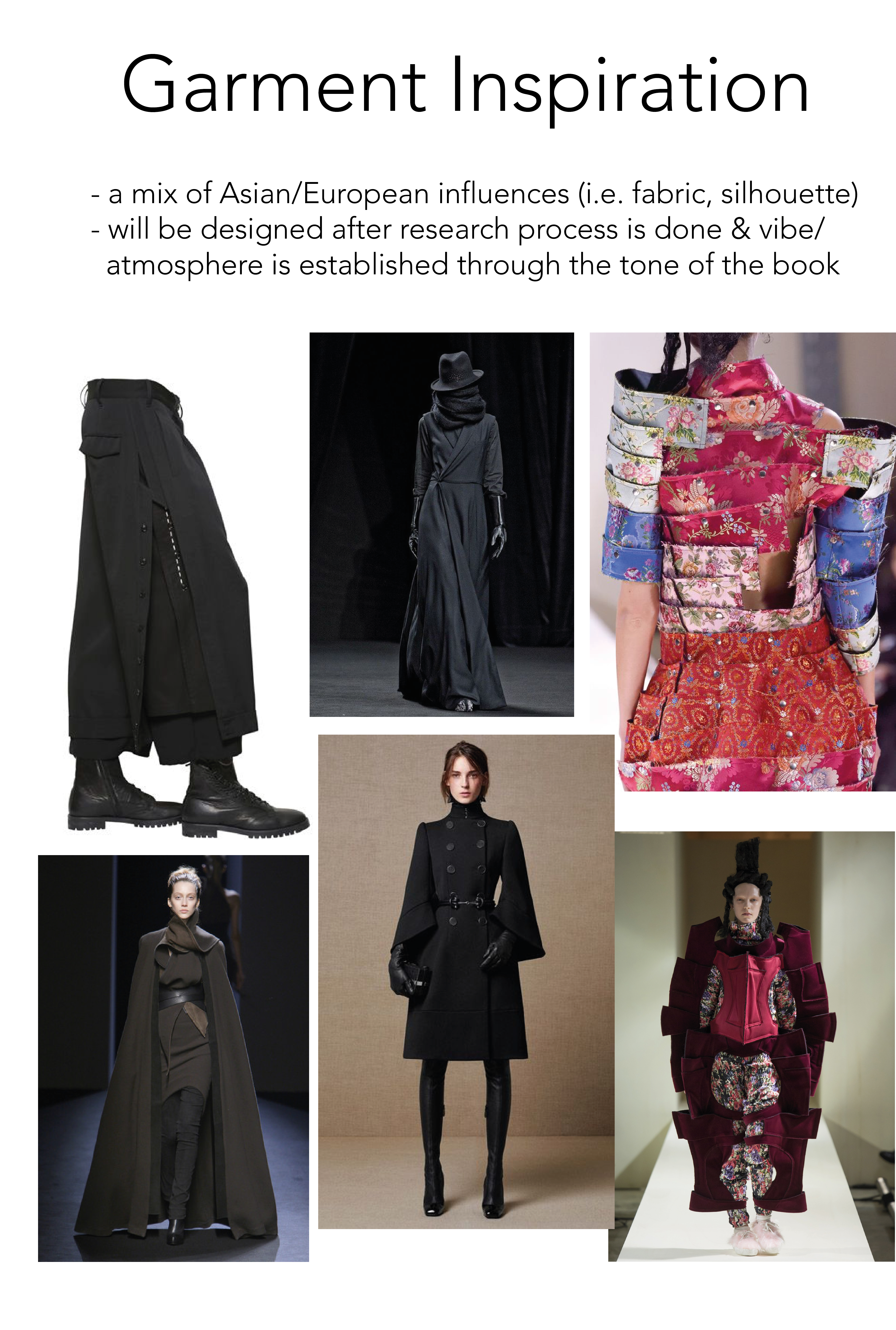
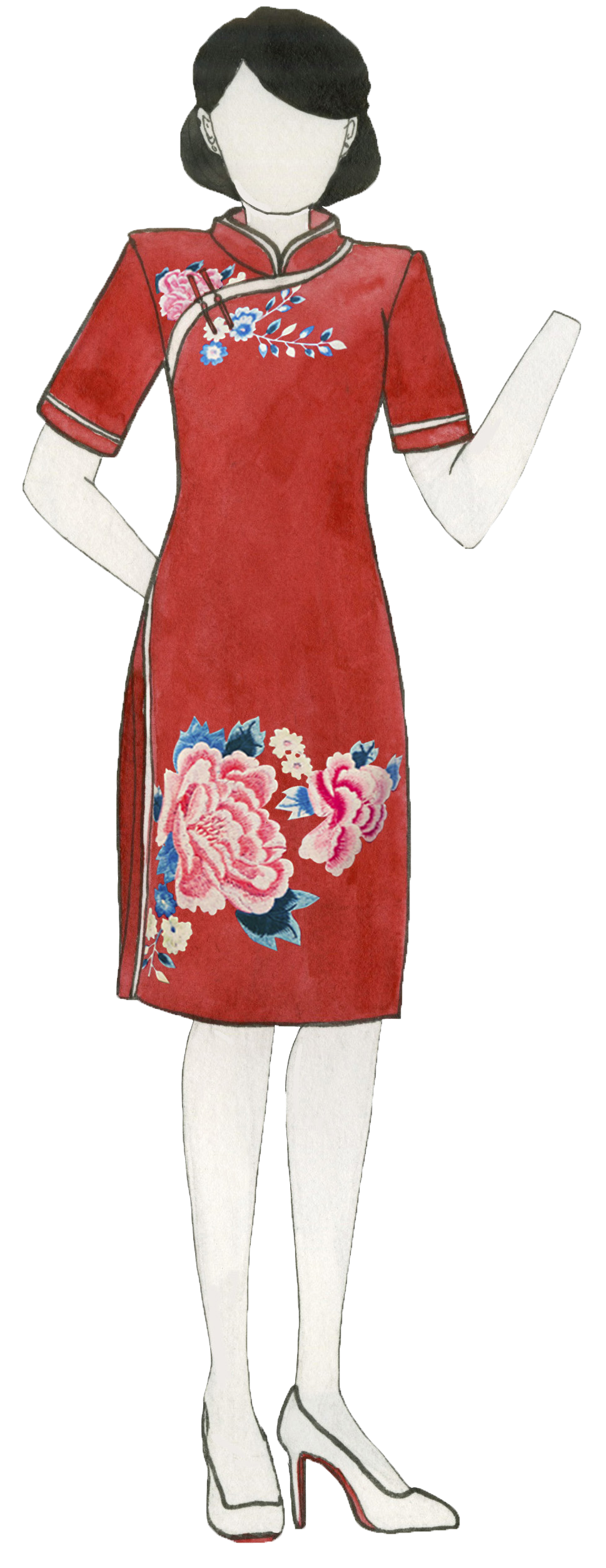
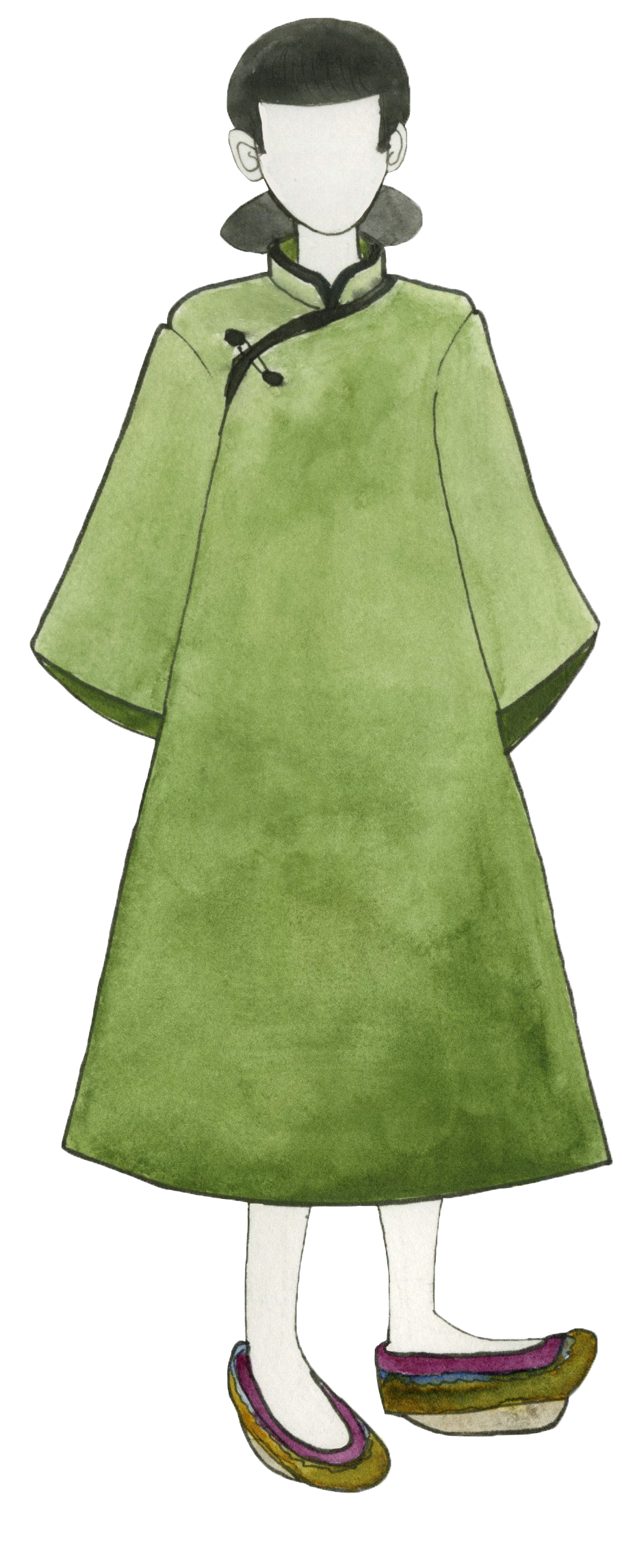
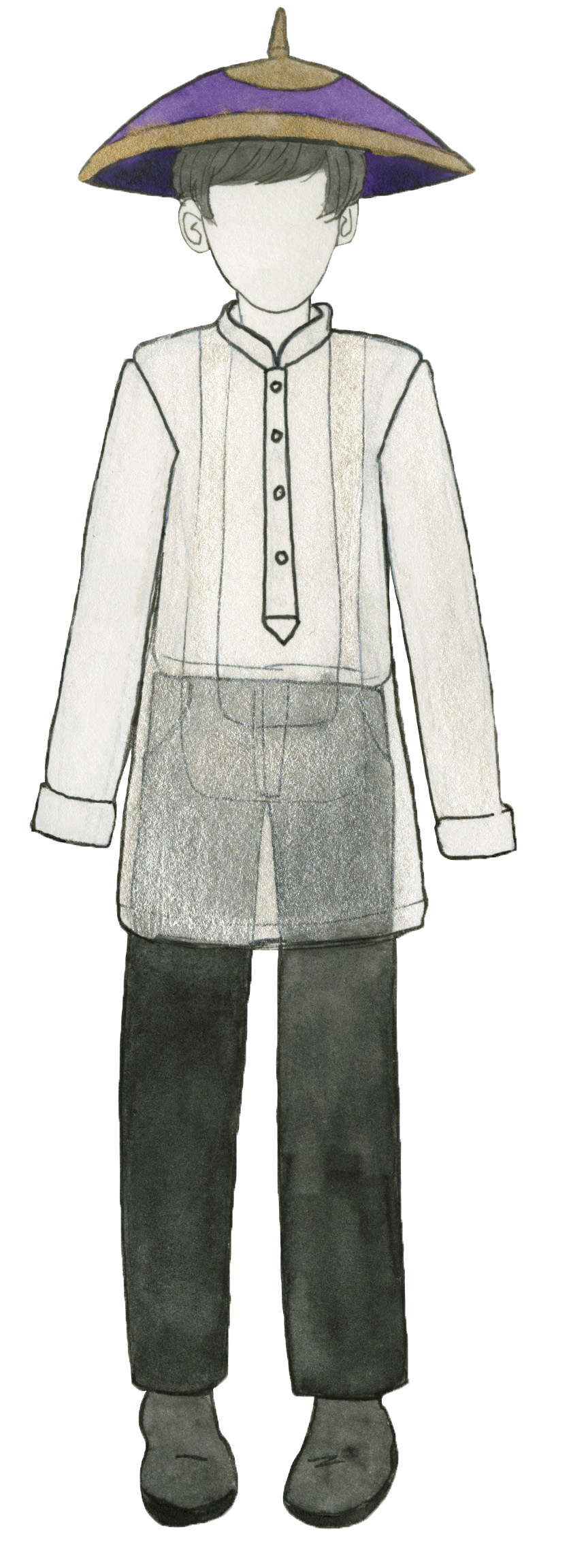
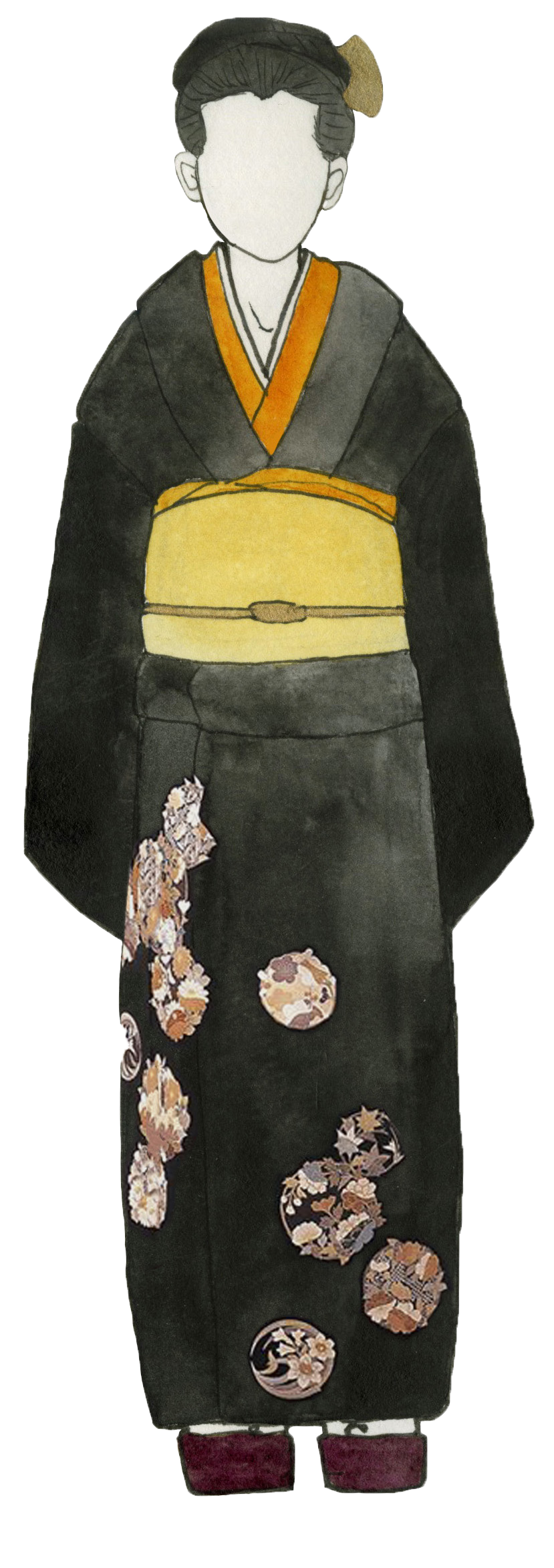
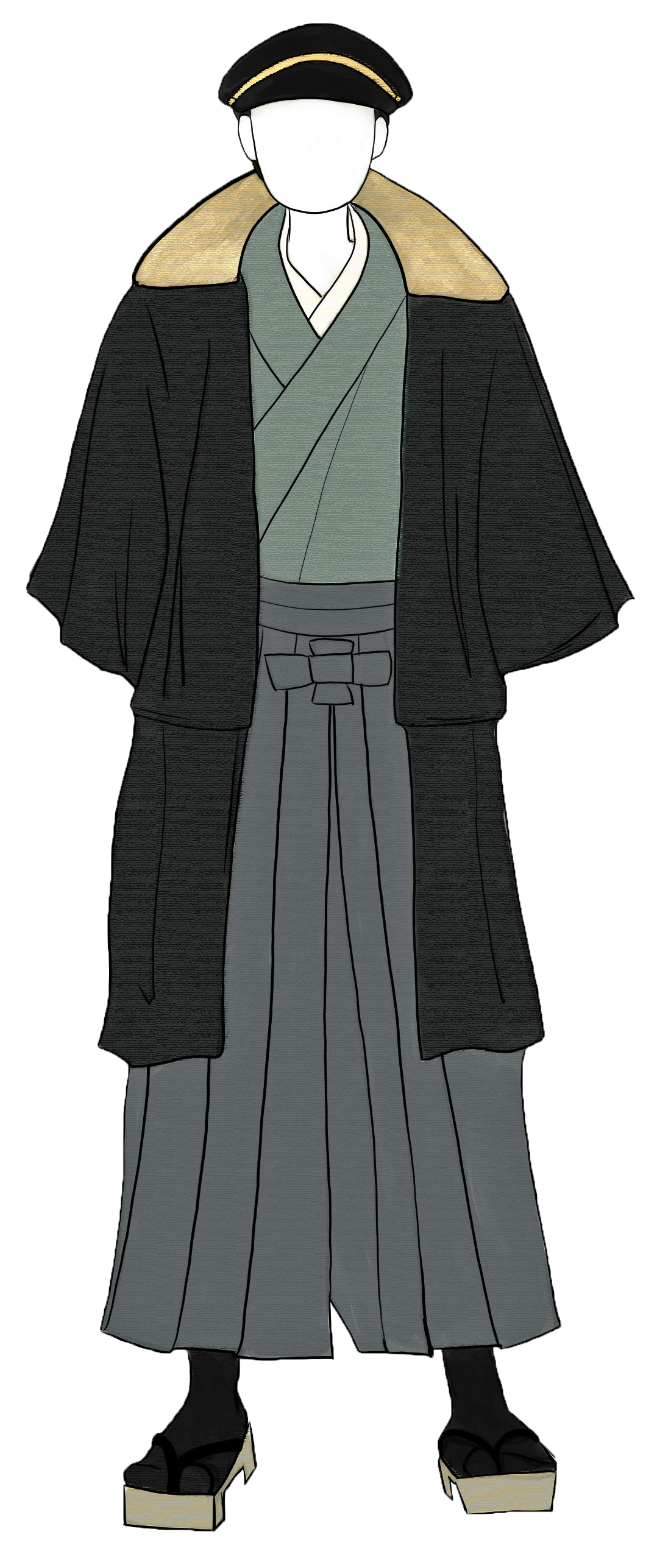
Asian garment drawings: China, Hong Kong, Philippines, Japan, Korea, Vietnam, Mongolia


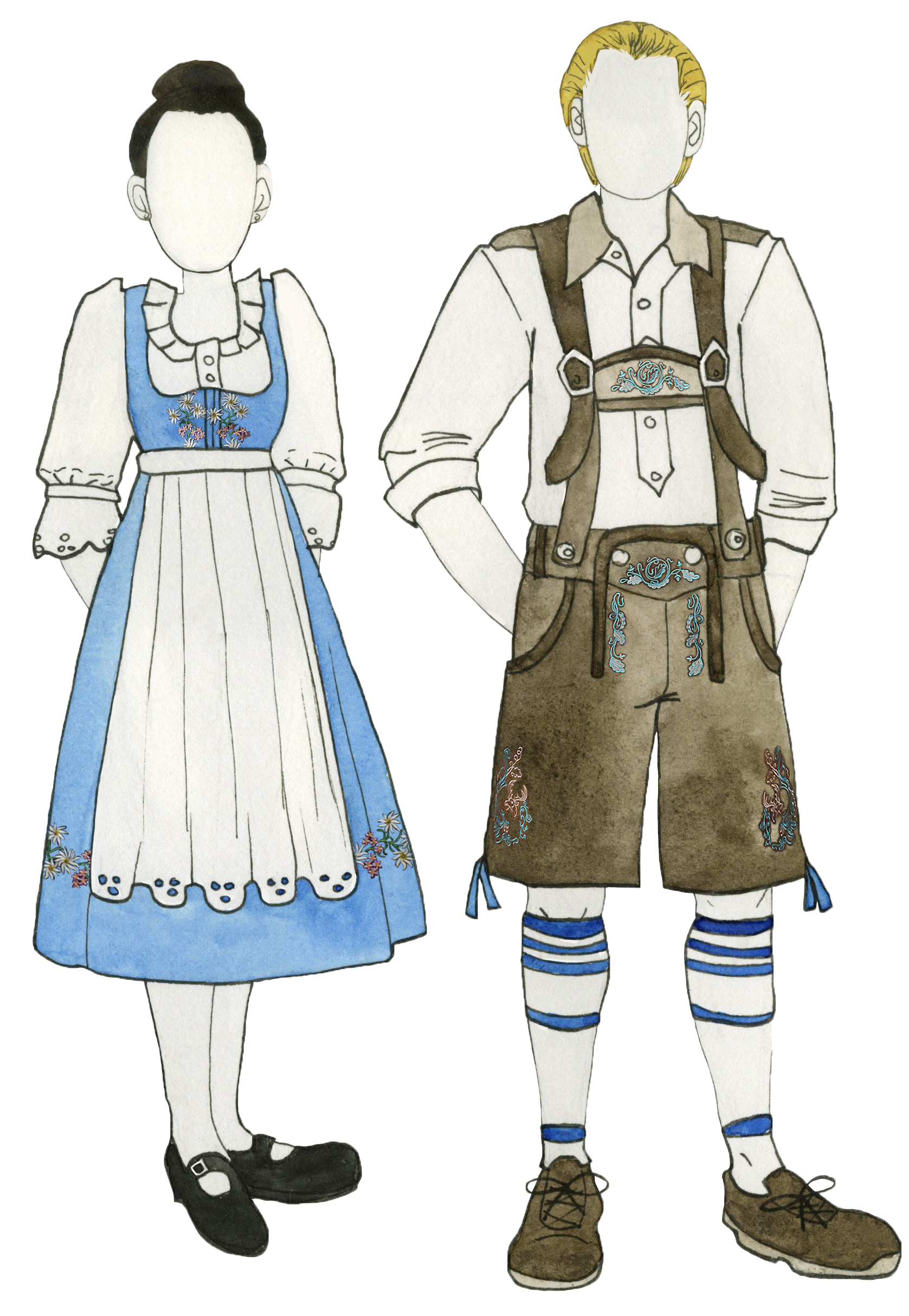
European garment drawings: Germany, Russia, Sweden, Ireland


Modern garment drawings:


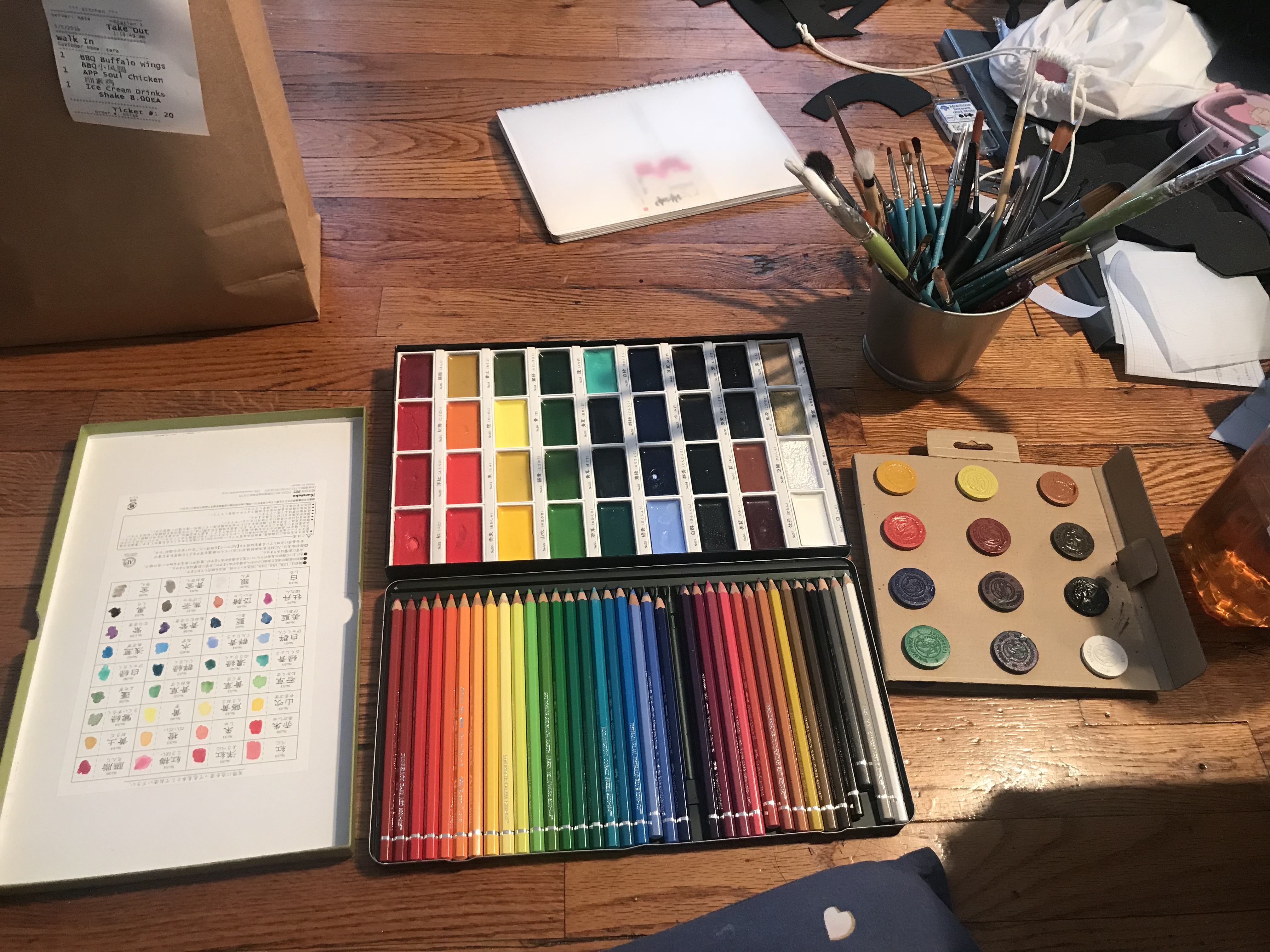
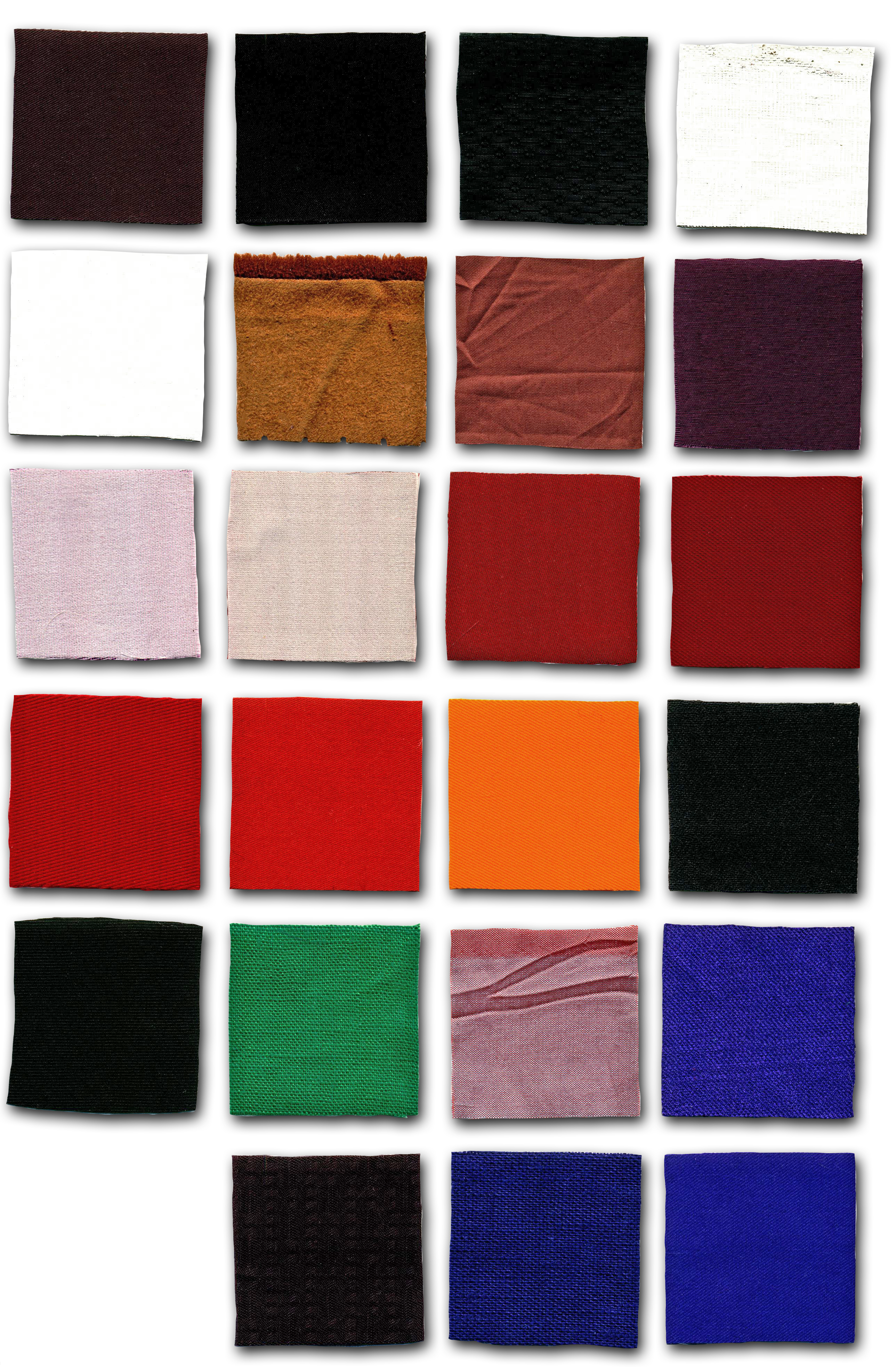
I drew a variety of historical garments from Europe and Asia (and technically Eurasia) in my sketchbook; they were inked and watercoloured and scanned so that I could fix them up digitally and put them in my book. I also drew a few modern garments from both European and Asian designers as well, to get a contemporary aspect in as well. Additionally, I went to Mood Fabrics and got swatches of fabric which the featured garments (historical and modern) would be comprised of. I scanned the swatches as well, and put them next to my drawings in my InDesign file.

My cover page illustration features a Greek theatre mask and a Japanese Noh (kabuki) mask. I thought it was a clever take on how people choose to present themselves (i.e. a social “mask”) to the world. The title “What Are You?” is a question I am commonly asked when people do not immediately know what race/ethnicity I am, and is something that many other hapas I have met have experienced as well.
The Final Project: Book & Mockup Garment
[LINK TO PDF] – 40 pages, printed in Pro Colour on (glossy) photo paper


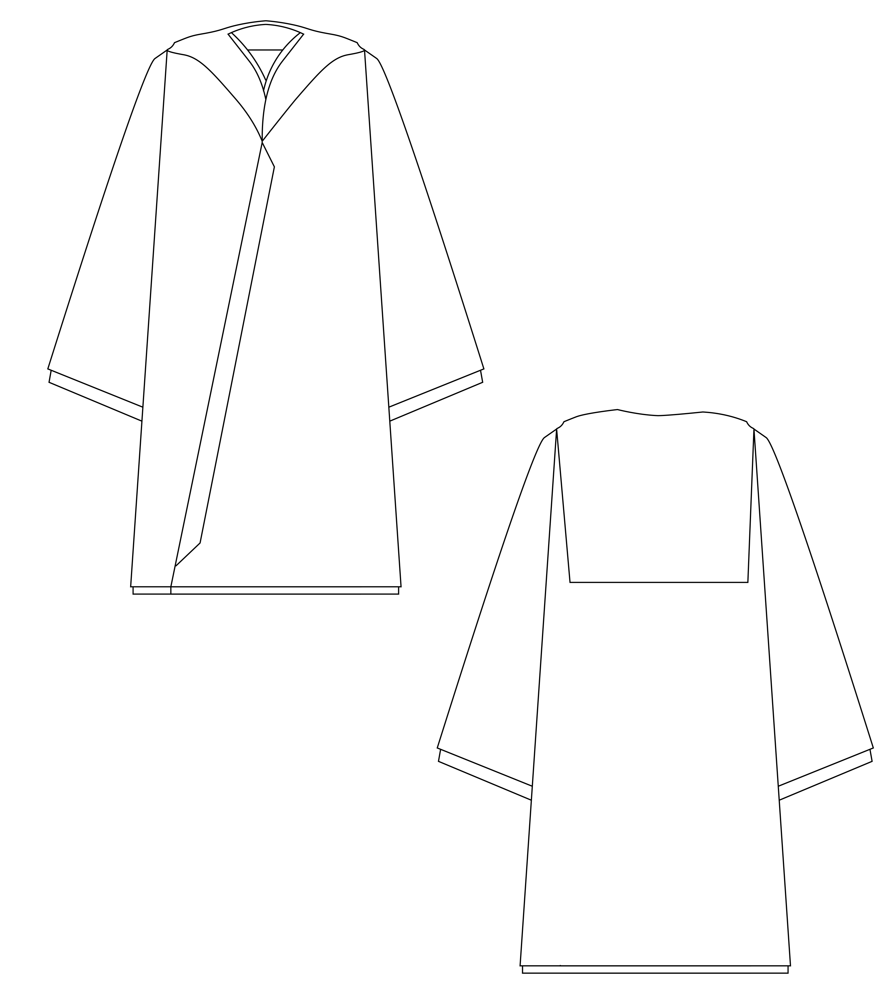


Muslin mockup of my modern “hapa hoodie” design.
Systems & Strategies
“What I’ve made for the final bridge project in studio and seminar is not what I would have made on the first day of either of these classes.”
At the start of Studio/Seminar, I felt especially nervous about the direction of the class as I felt that it would not relate to my major or interests. The concept of “systems” seemed vague, and initially I did not know what to make of the assigned material. The assigned prompt rings true to this very sentiment: I had no idea what I would be creating in this class, nor did I think that the final project would impact how I would conduct research and formats towards other projects in different and future classes.
In one of the assigned readings by Joan Didion there is the quote, “The impulse to write things down is a peculiarly compulsive one, inexplicable to those who do not share it, useful only accidentally, only secondarily, in the way that any compulsion tries to justify itself.” Didion’s quote resonates strongly with me as I am the type of person who must, in a way, translate material into written words on solid paper in order to really make sense of it in my own mind. Keeping my own journal helped me immensely with my thinking and planning processes throughout these courses.
For example, in the planning stages of our final project, sketching up page layout designs helped in how we would go forward with creating our InDesign file, as well as the content which would go in it. We decided to use photography, visual infographics, statistics and text to come together and make a visually appealing and interesting way to present important content to the reader/beholder of the book. Additionally, each of the segments we chose to incorporate into our book related to our respective majors, interests, and strong-suits including and not limited to graphic design, photography, and writing.
Other material we were told to read up on/interact with (i.e. the Future Farmers catalogue & Harlem field trip) did not make much sense to me at all, and I feel was overall ineffective to this learning experience. Performative works such as the one we went to in Harlem especially were confusing to me especially. Collaborative projects like FF did however introduce me to the potential of integrative projects I might later be interested in attempting, however: combining scientific, cultural, and art-based research ties into the work Charlotte, Tealoni and I did for our sexual harassment awareness pamphlet and essays. I think it depends on the effectiveness of the finished project in getting its message across that determines the success of the work, which definitely involves an active balance of each integrative aspect.
Going forward from this project, I would definitely like to make more informational, research based pamphlets, books, and zines as the InDesign and printing portion of this process was quite enjoyable to me. The work for the final Studio/Seminar bridge definitely influenced my work towards my Time: Composition final in the same Spring 2018 semester, as I found myself relying heavily on visual and informational research as well as utilising people’s opinions through class critiques. It is quite satisfying work to make books that people can hold in their hands and take in for themselves, and an effective way of sharing my (developed) concepts and ideas, as well as design work.


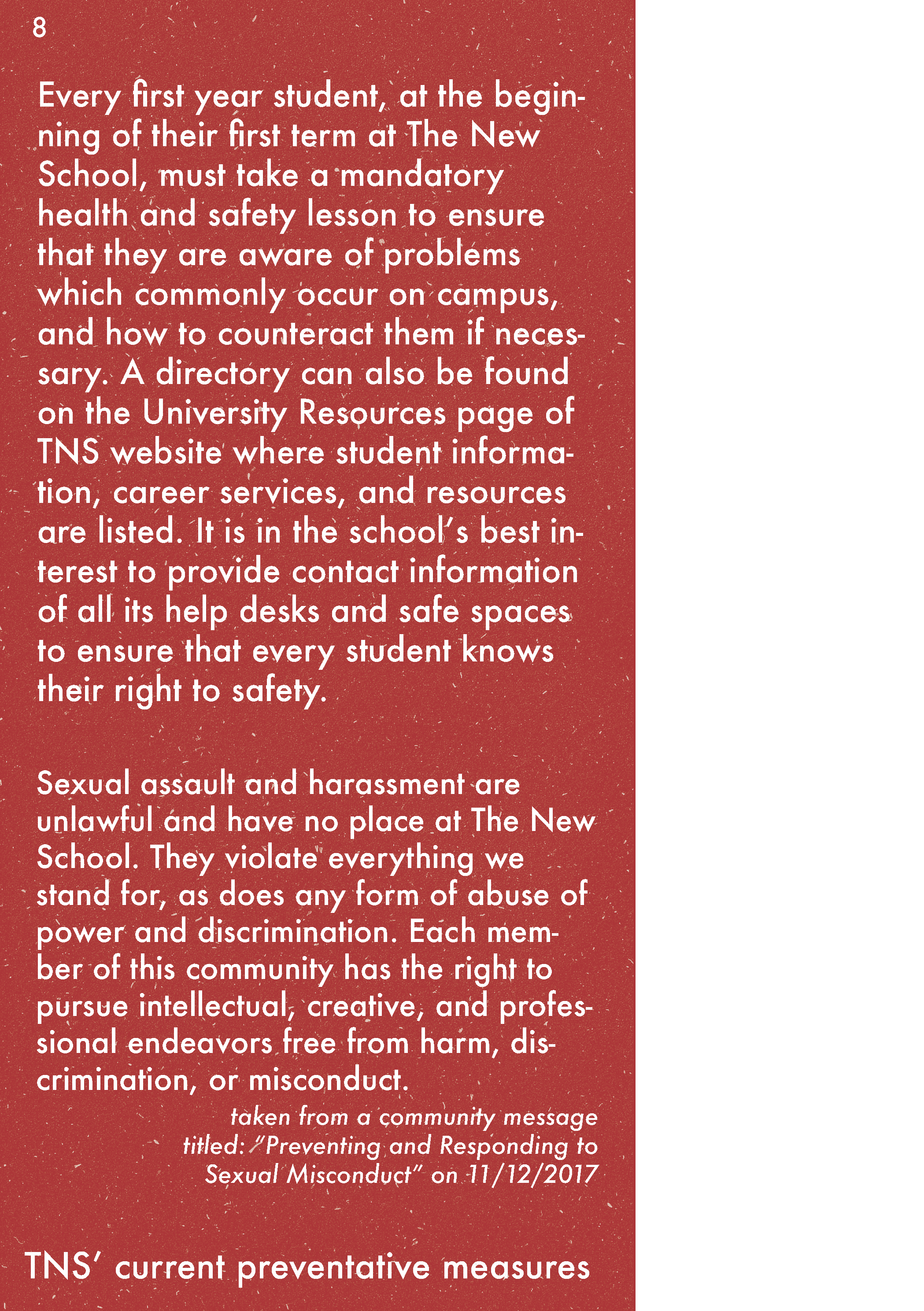
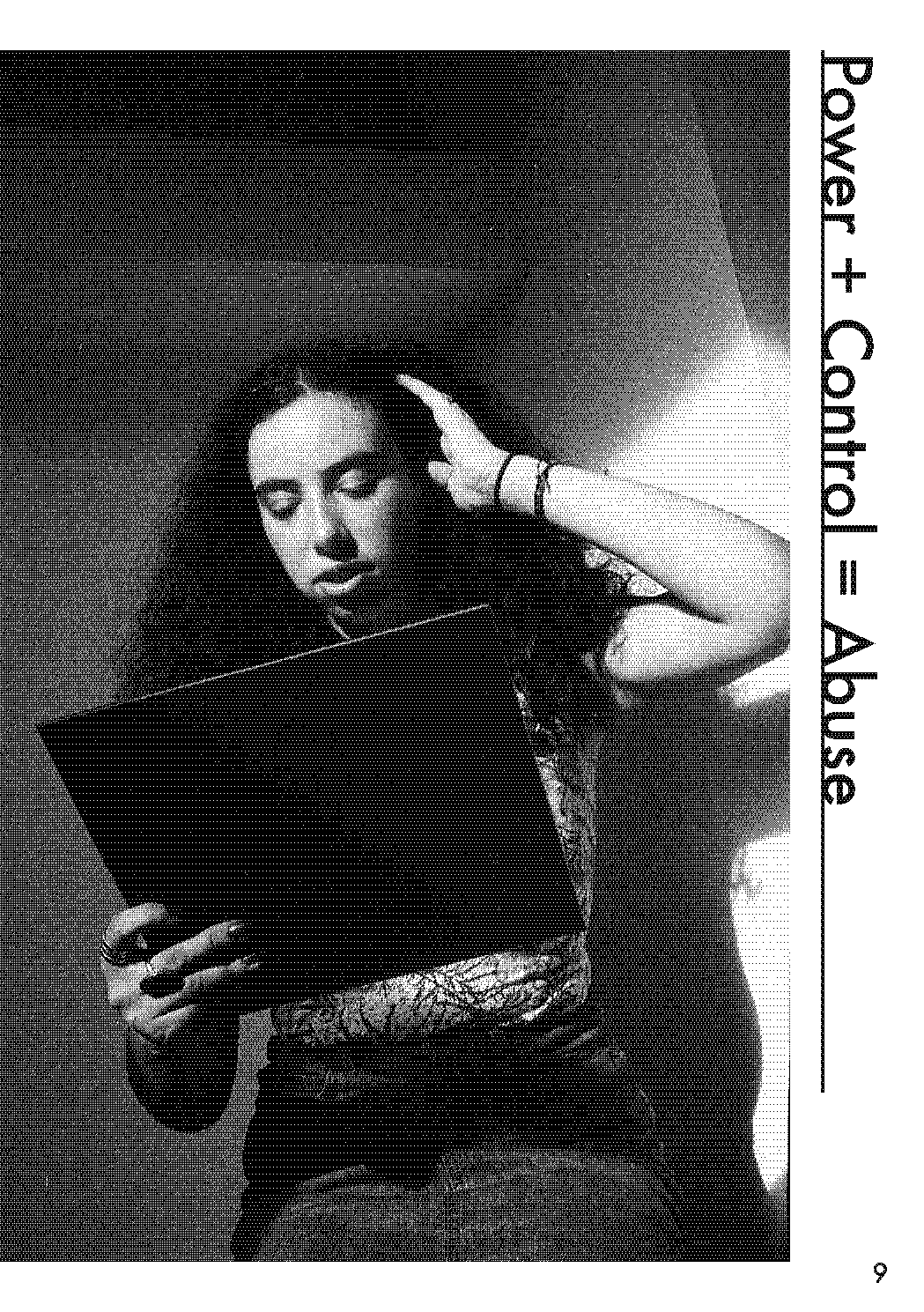


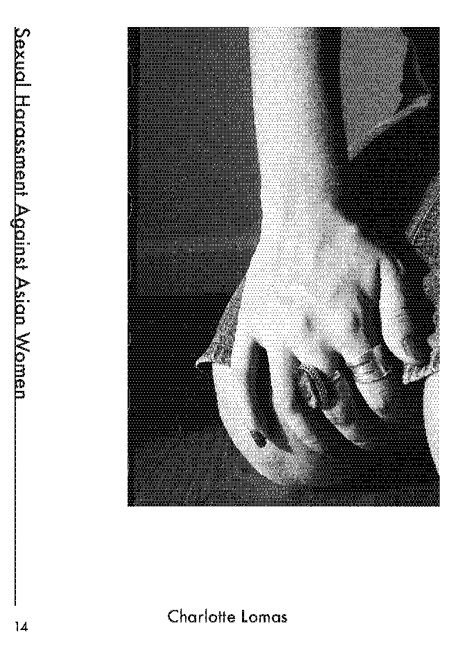

Graphic Design: Charlotte Lomas
Writing & Text Editing: Viktoriya Jacob (sans #MeToo, Sexual Harassment Against Asian Women)
Photography: Tealoni Butler
Graphic Narrative
1st Iteration – First Sketch + Moodboard


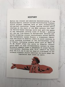
My first idea of telling a story was that of a character who had a secret, leading to a visual revelation which would speak for itself as a story. I decided that I wanted to portray a historical yet fictitious moment in time; specifically that of the Russian Revolution, and the figures who lead it (albeit a precursor event/setting such as a Bolshevik rally).
2nd Iteration – Developing Sequence (multiple page sketches + character development)

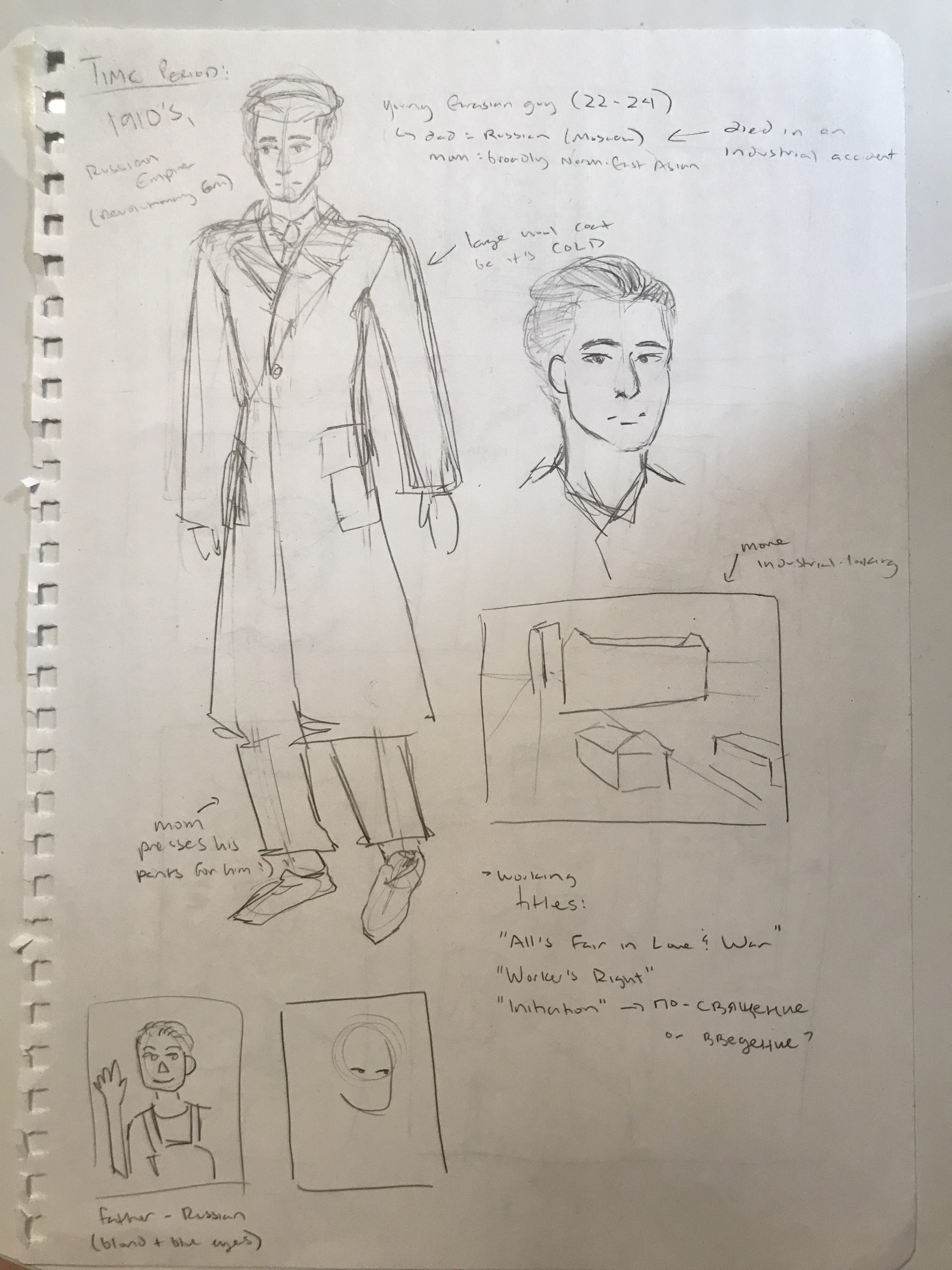
My character would of course have to be middle/working-class – I decided to make him Eurasian too, since I feel as if that is an underrepresented group of people in media (being Eurasian myself).
3rd Iteration – Digital Illustration

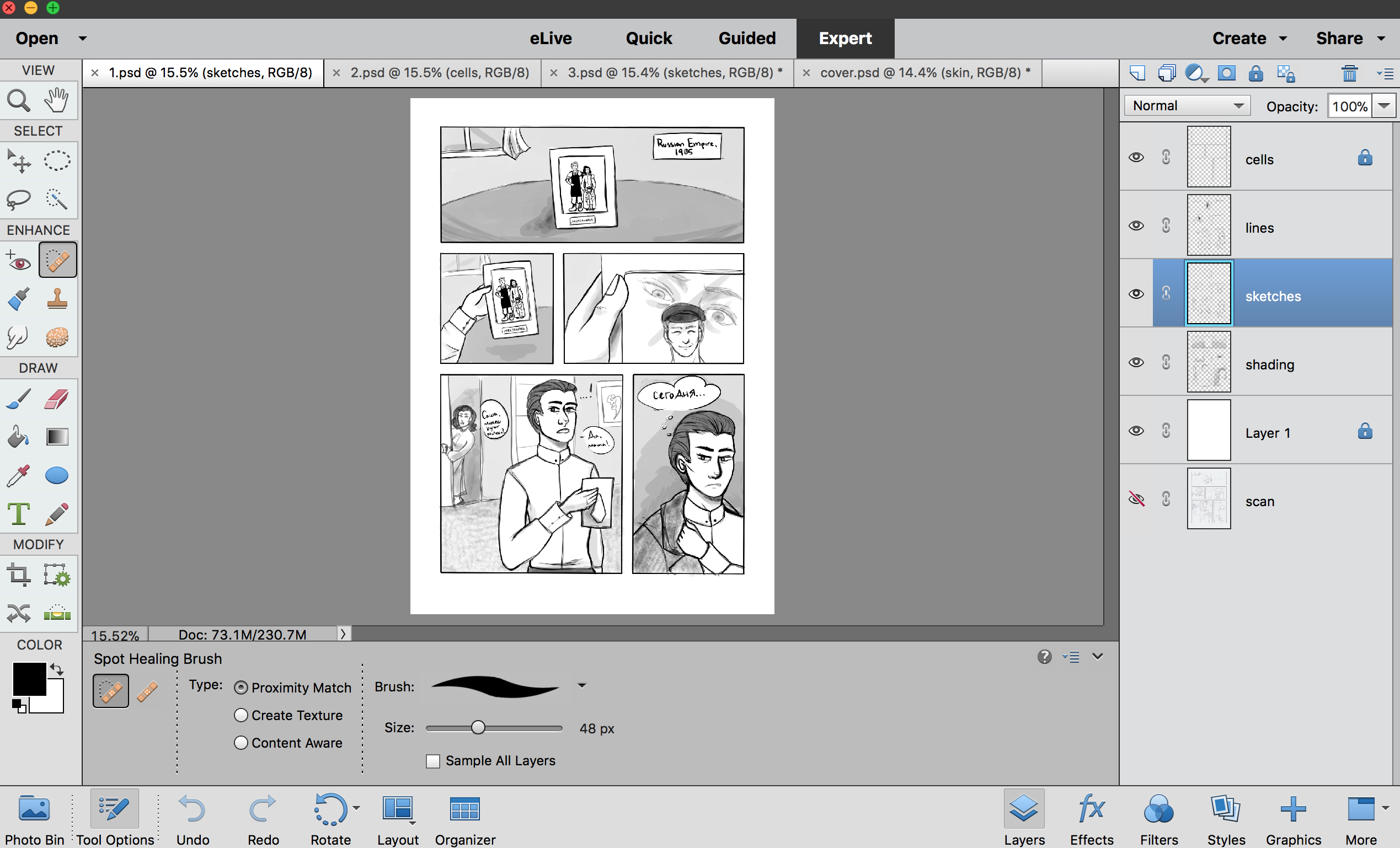
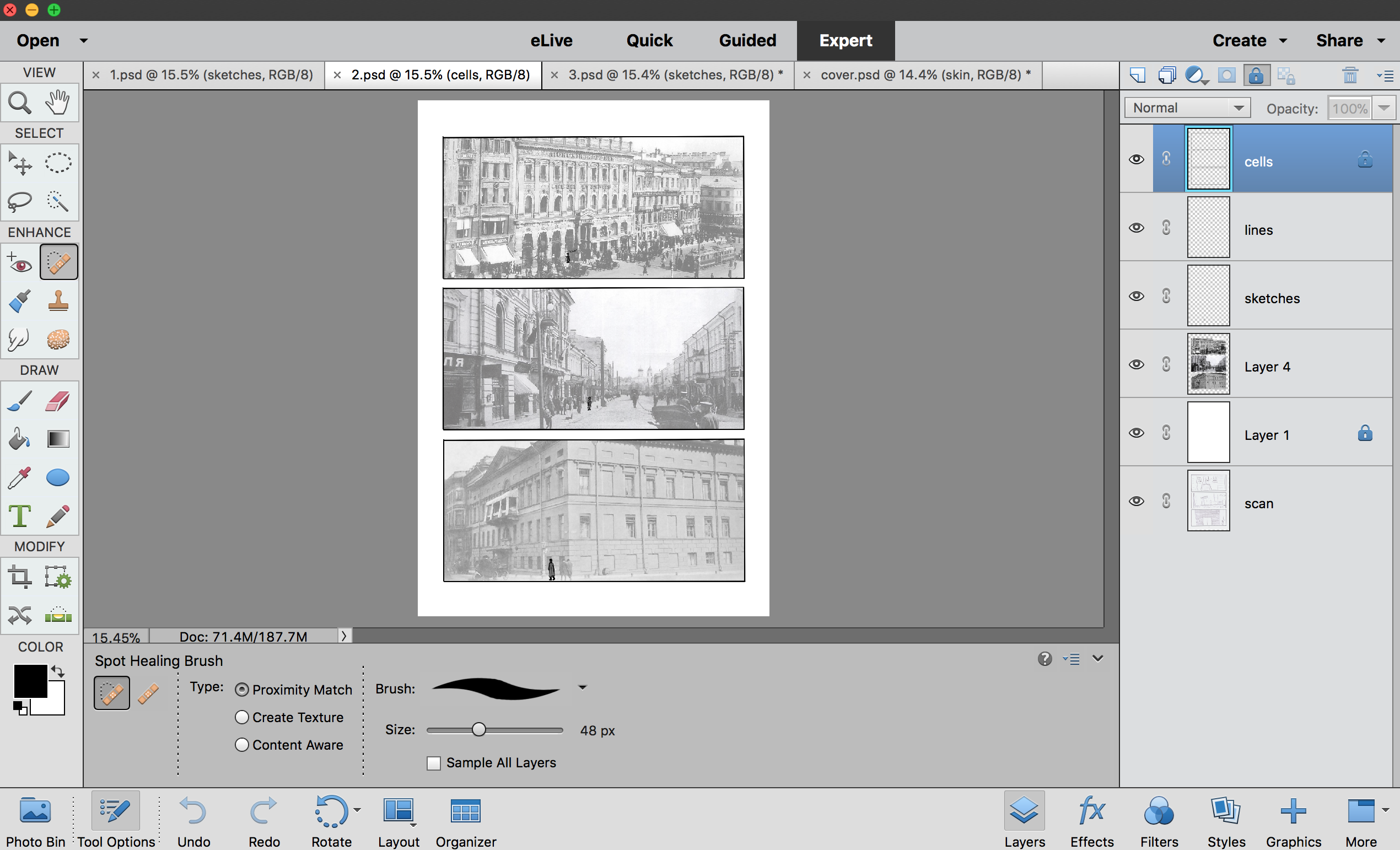

4th Iteration – Final Printed Book


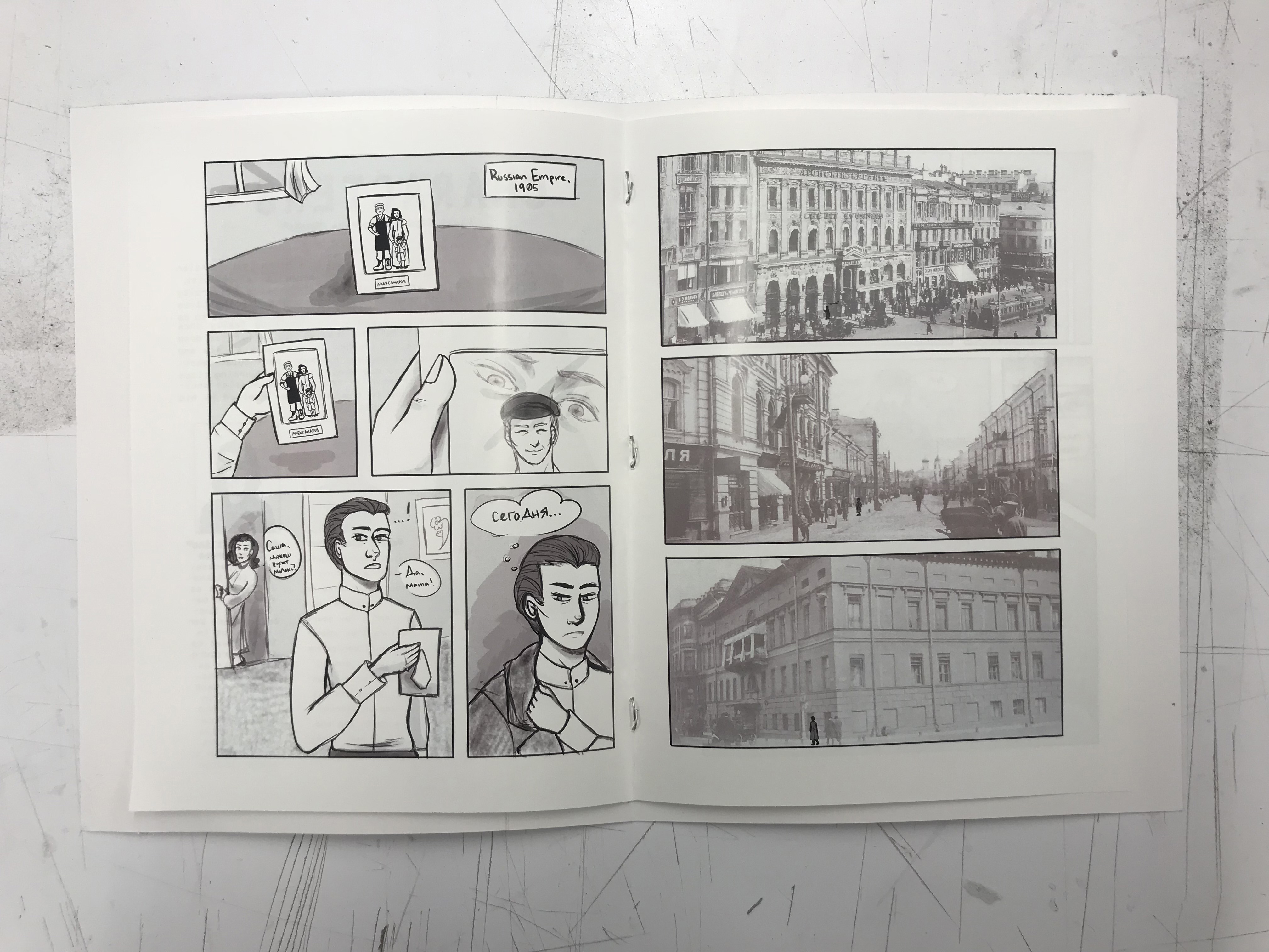

(Digital pdf: 4TH ITERATION-10ne96h)
I included a character info page at the start of the book, and a brief summary of the historical context in which my narrative took place on the back cover, just in case the reader/viewer was not familiar with the setting I chose to portray. Additionally, this would hopefully clarify why I set the dialogue in Russian and make it easy to assume what was going on.
Polyhedron Project – Space/Materiality: Culture (2017)
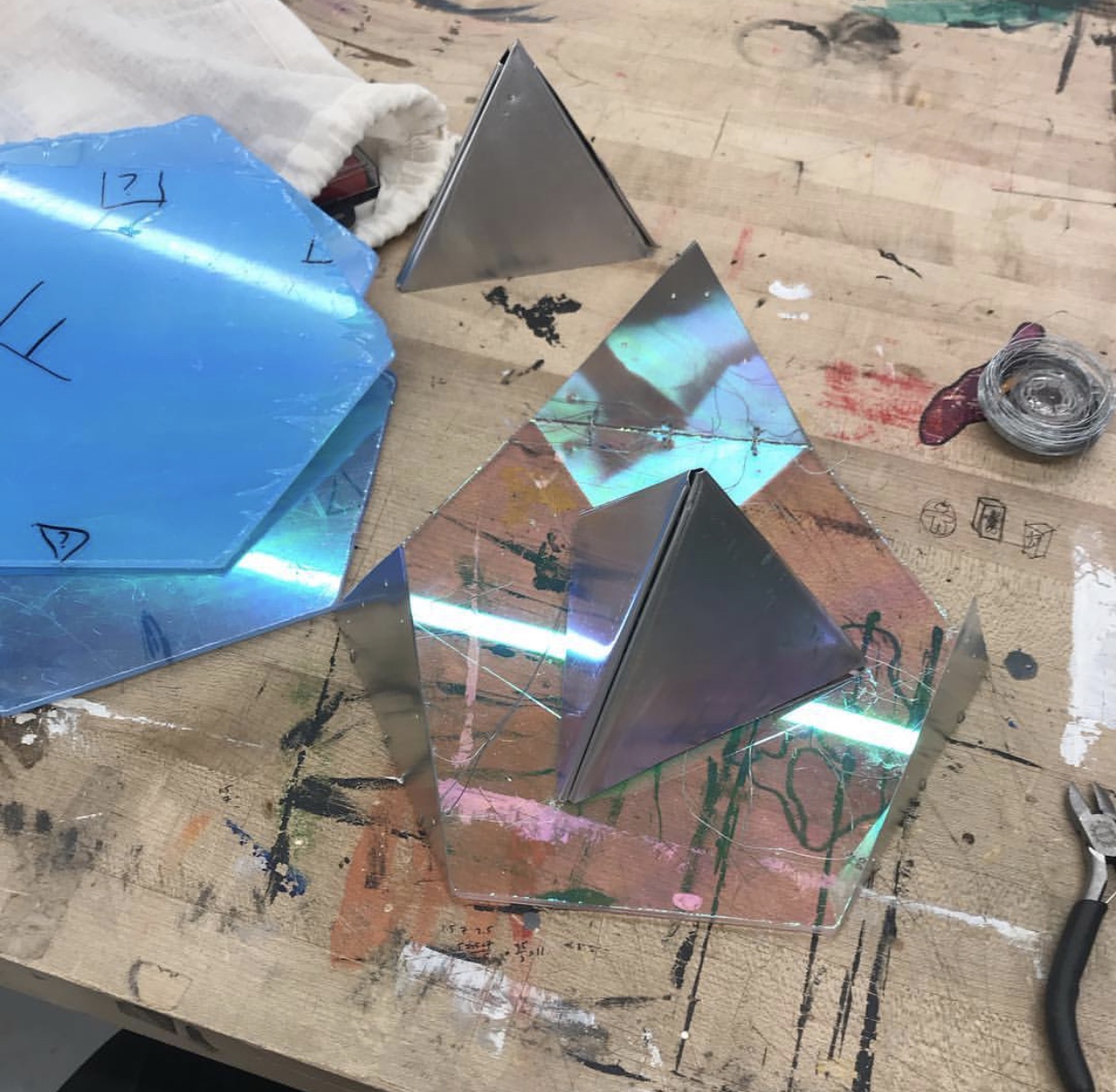
In Jim Osman’s Space/Materiality class, our biggest project/midterm was to construct a three-dimensional polyhedron after a succession of architectural and shape studies. The materials we were permitted to use for our final iteration included plexiglass, wood, and metal – held together only with rivets, nails, wire, and hinges. No glue or “easy” methods of material binding (i.e. nail gun) were allowed to be used in order to help develop our work ethic and skills.
The first step of this project was to study real-life architecture: we visited the New York financial district, specifically buildings such as the Lever house, Citibank, etc. This field trip was to help us visualise how objects are constructed and how they both take up and interact with the space around them. Additionally, the specific Modernist style of architecture observed helped us visualise the emphasis on working, practicality, and spacial relations in an American city context.


After this field trip, we did a series of paper folding activities in class to help us get used to constructing various polyhedrons. These bristol paper models could not be glued together either, and had to only be connected via tabbing/cutting of the material (which would also stay true for the final project). Our most complex paper assignment was a dodecahedron.


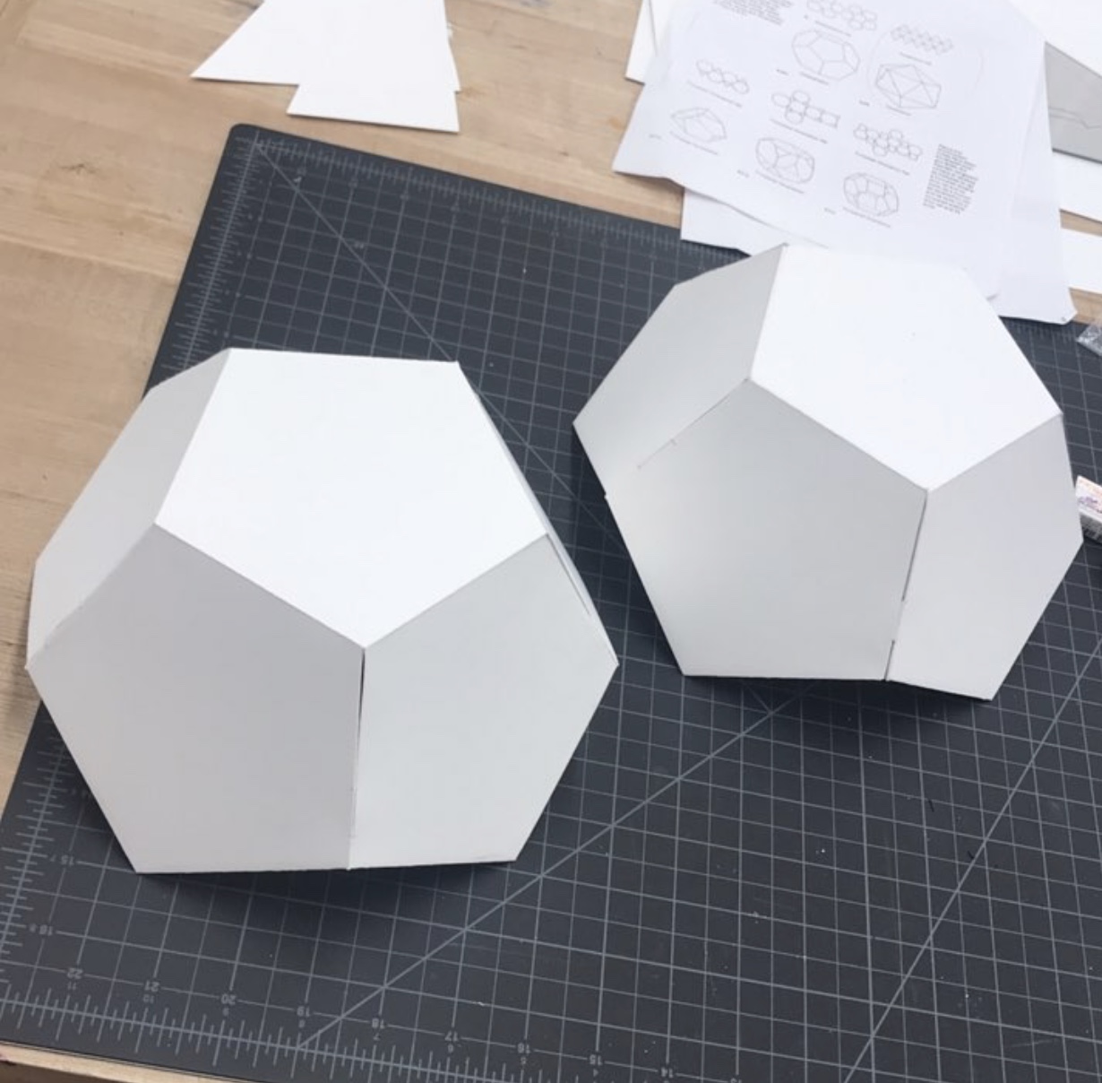
The next step was to construct our own polyhedrons based off of the shapes we had already folded (pyramid, cube, etc.) and constructed in class. This unique paper model was to serve as a pattern for the next and final iteration, which would be the polyhedron created out of solid, planar materials.

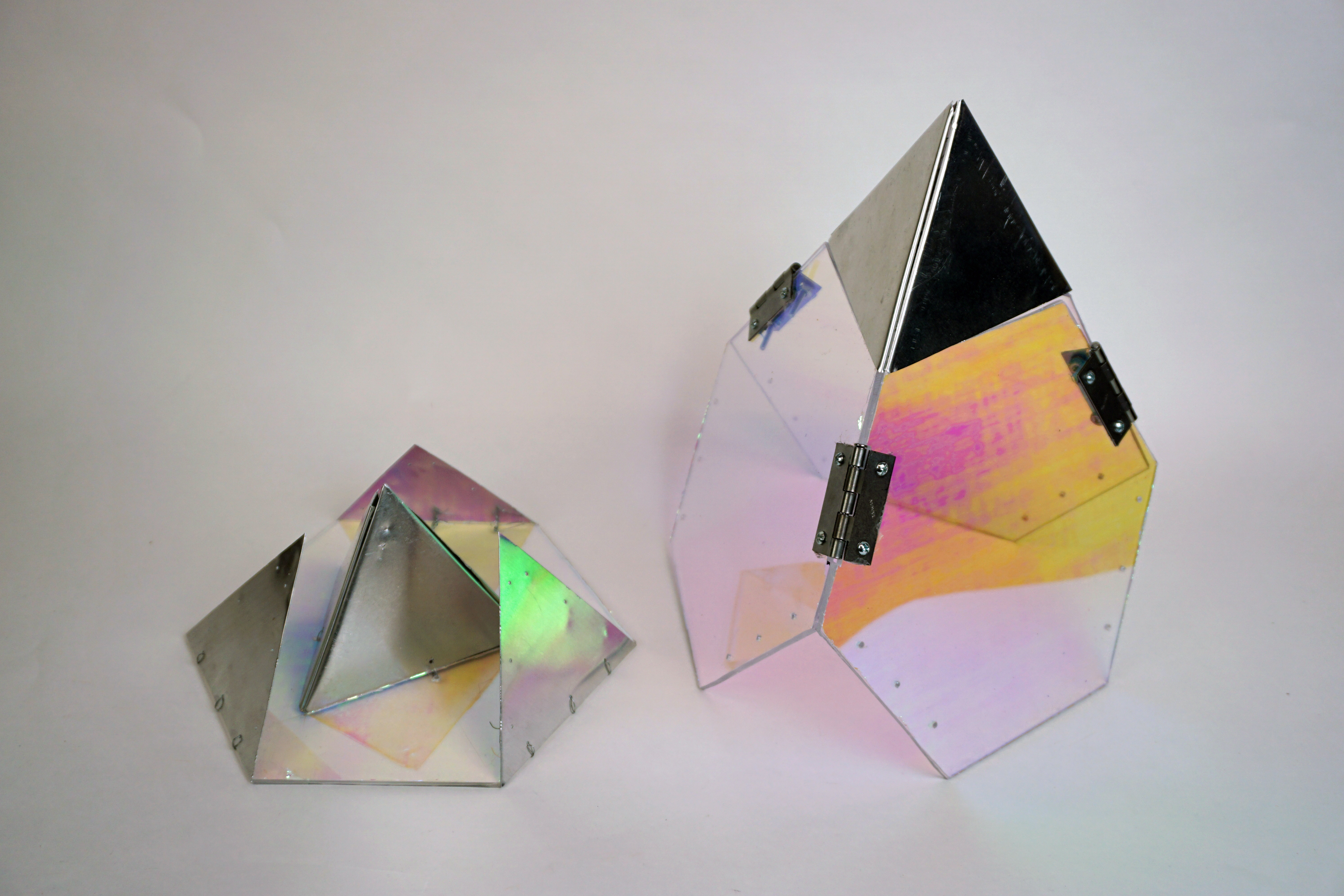
The materials I chose to use for my polyhedron included iridescent plexiglass and sheetmetal, held together with metal hinges and a wire “sewn” method.
Additionally, we were only allowed to use tools in the making centre to cut out our materials – laser cutting and nail guns were not allowed to be used. Those of which included:
- Plexiglass – plexicutter, olfra knife, drill bits (for attaching nails & incorporating rivet holes)
- Metal – metal cutter, tin snips
- Wood – table & industrial saws (wood shop), Japanese saws (tool carts/checkout)

My inspiration for my polyhedron was that of a succulent terrarium, and thus by extension plants and their relationship with light. When patterning my own shape I also considered the buildings in the financial district that we had seen, and how they had negative space in which people can go into and interact with (though ultimately closed off/largely inaccessible in the case of Citibank). The polyhedron project introduced me to various building techniques I had not yet developed fully or even heard of – methods of cutting, bevelling, and assembling material, as well as a vast improvement in my work ethic and efficiency. After weeks of planning and long days (and nights) in the making centre with my fellow classmates, this was definitely one of the most rewarding projects to see completed through proper construction methods.

Previous Work: Costuming
Cherche – Fire Emblem: Awakening (2015)

Sewn garments:
- smock
- pants
- boot covers
- lace headdress
- gloves
Armour (thermoplastic + craft foam):
- neck piece
- breastplate
- tassets
- pauldrons
- gauntlets
- knee guards
- shin guards
- shoes
Wooden prop:
- hand axe
Tharja – Fire Emblem: Awakening (2016)

Sewn garments:
- cape
- bra
- mesh bodysuit
Armour (thermoplastic, EVA foam, brass):
- neck piece
- loincloth guard
- crown
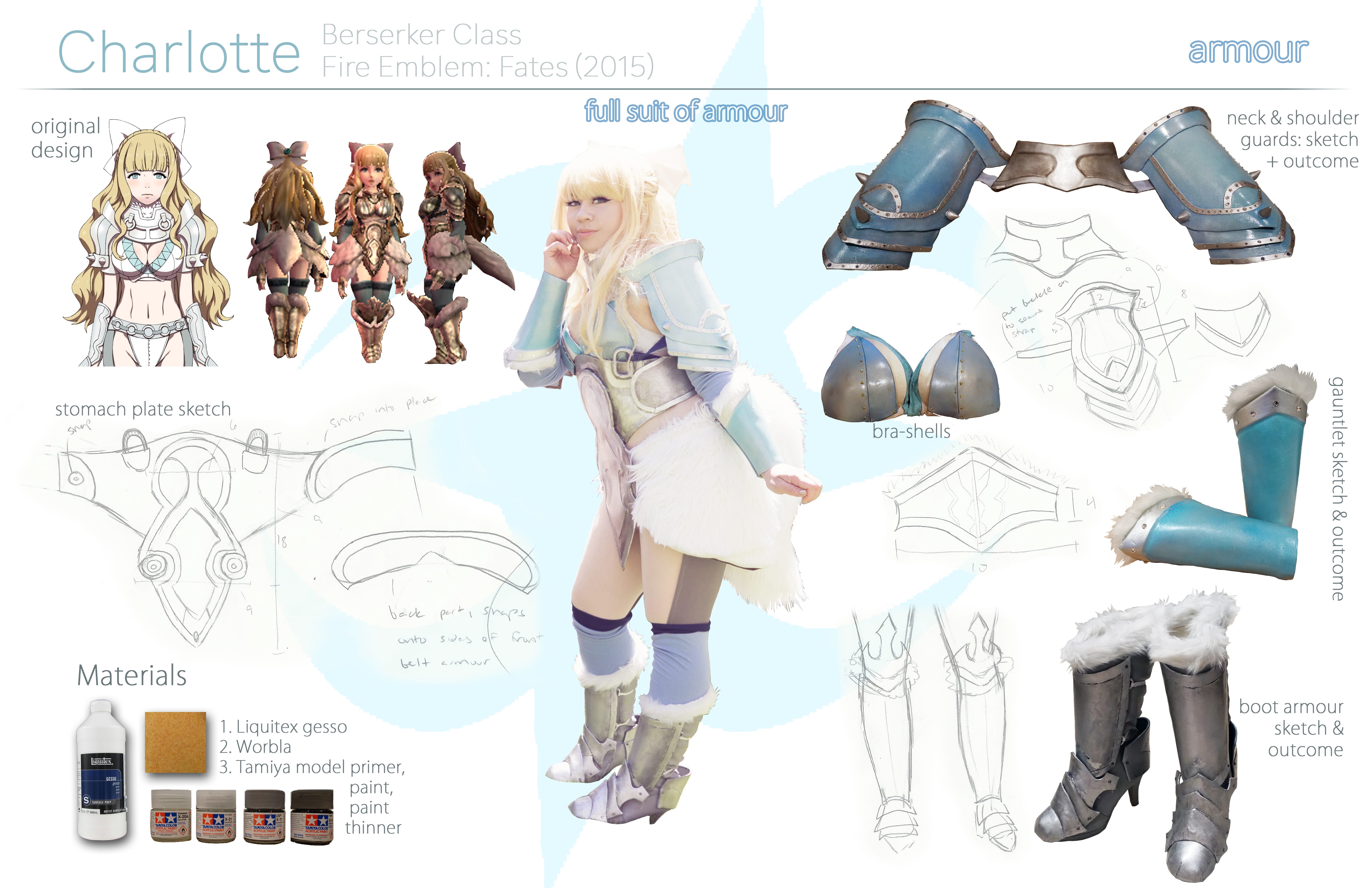
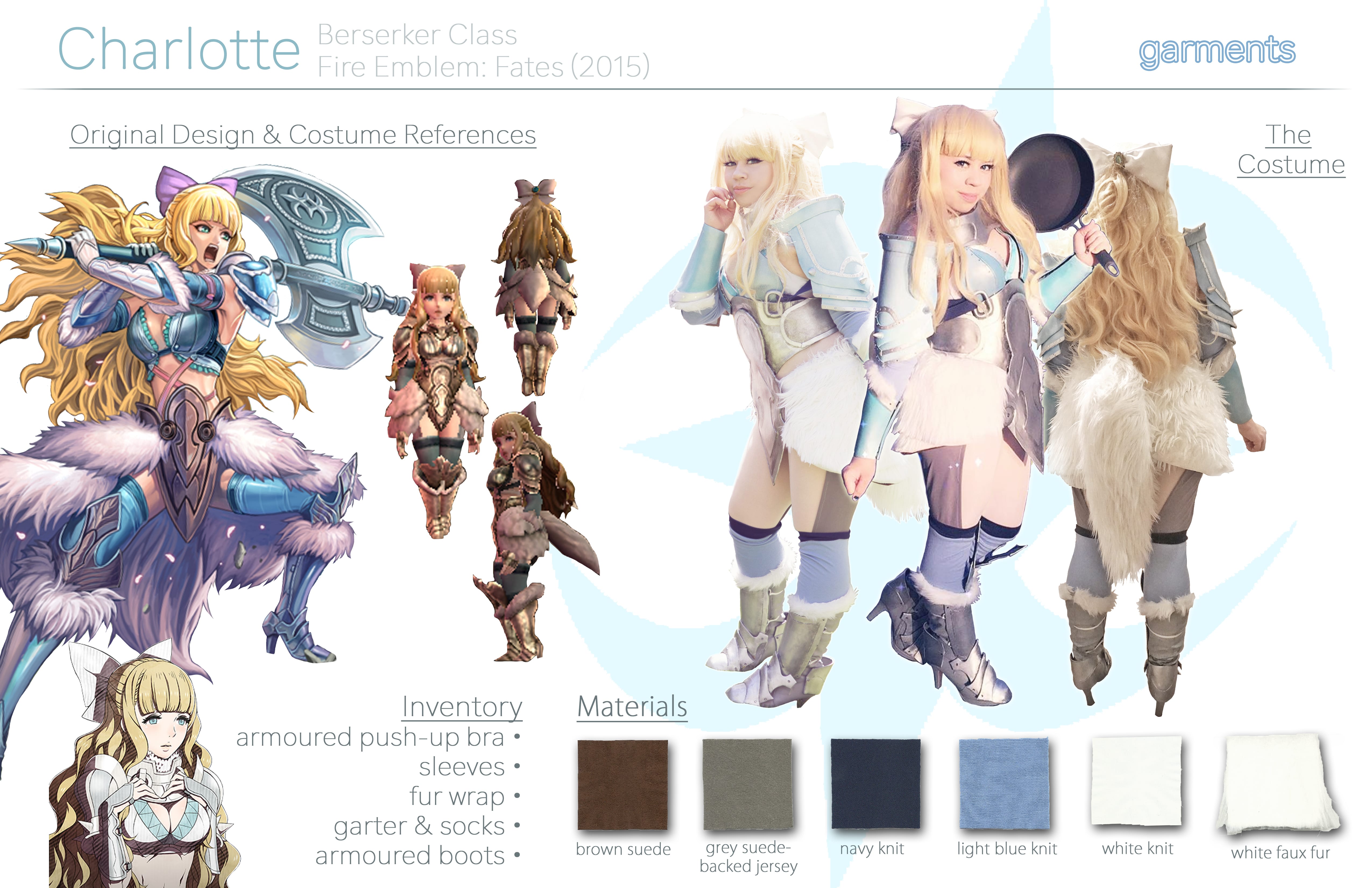
Charlotte – Fire Emblem: Fates (2016)
Sewn garments:
- bra cover
- pelt
- arm warmers
- socks
- garter
- bow
Armour (thermoplastic):
- pauldrons
- gauntlets
- bra shells
- midsection piece
- boots
Orochi – Fire Emblem: Fates (2016)

Sewn garments:
- kimono crop top
- pants
- arm socks
Accessories (clay, thermoplastic, EVA foam, beads):
- hair clips
- comb
- bracelets
- loin guards
Asuka Langley Sōryu – Neon Genesis Evangelion (2015, beta) (2017, remade)
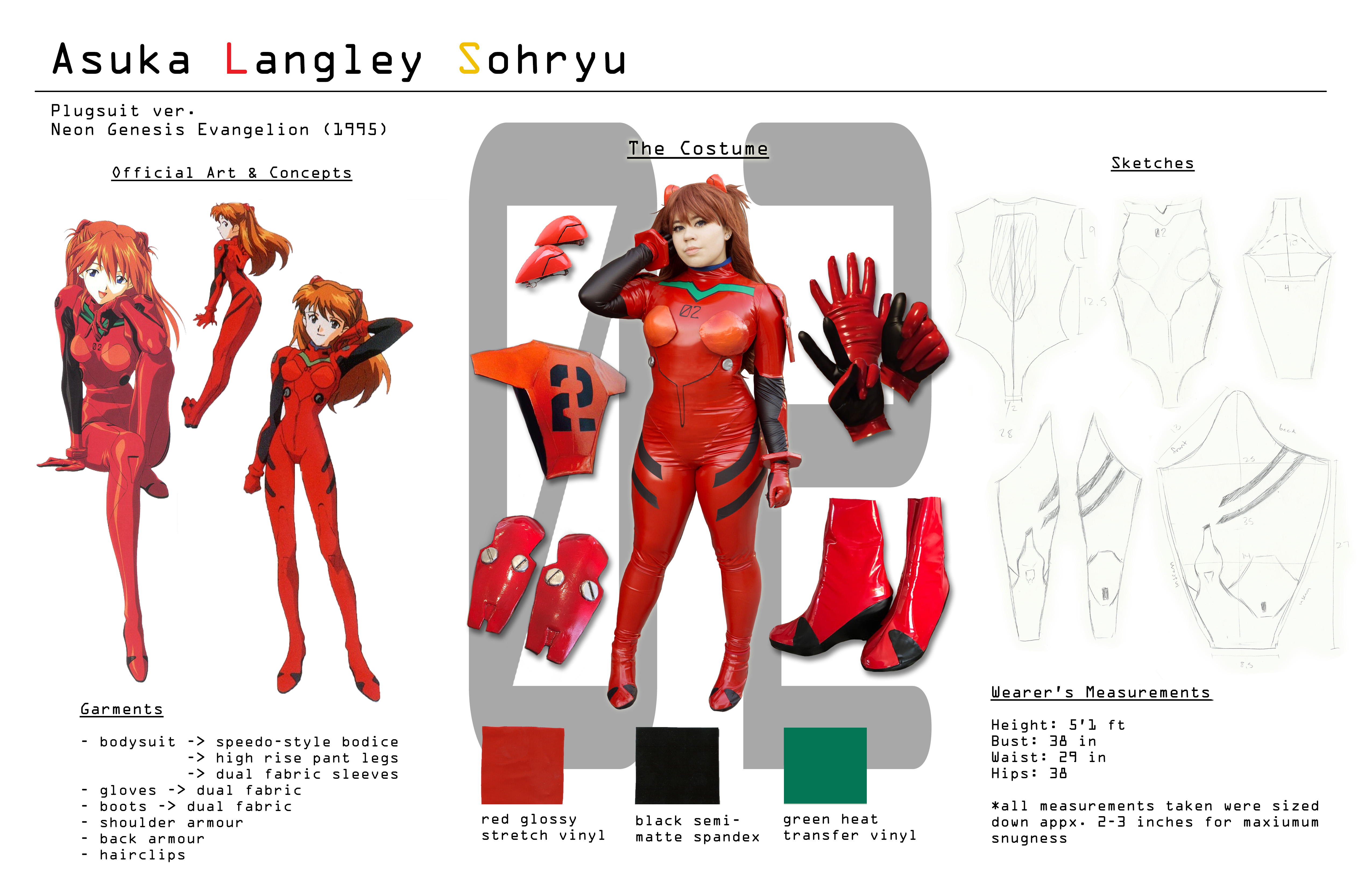
Sewn garments:
- bodysuit
- gloves
- boot covers
Armour (thermoplastic):
- pauldrons/shoulder guards
- back piece
- bra shells
- suit nozzles
Time Map Project
Original Planning
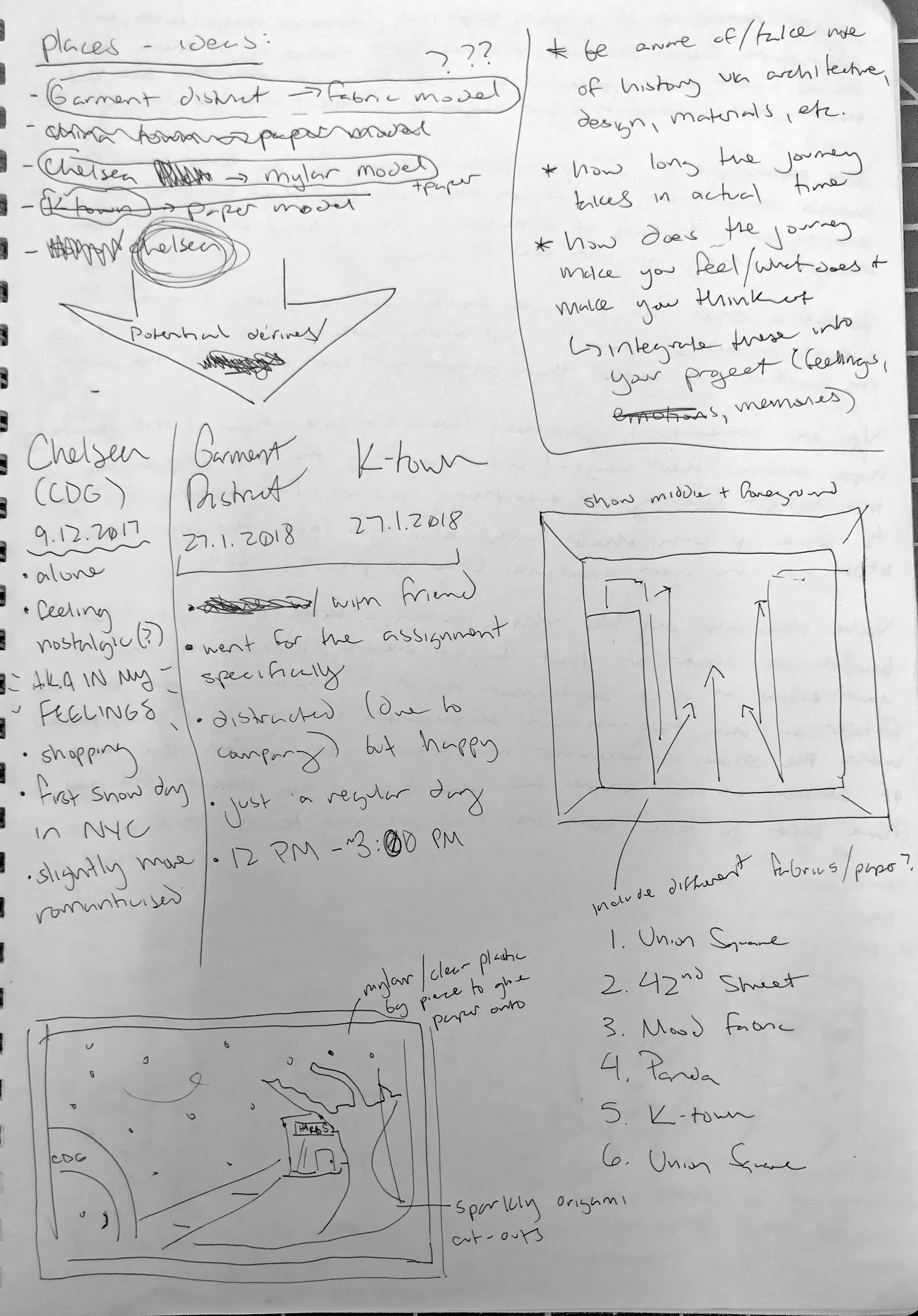
Initially, my plans were to explore a number of locations around Manhattan that interested me; those of which included the Garment District, Korea Town, and the Chelsea pier. I ended up only going to the Garment District with a friend the day after the time map was first assigned, and collected unique fabric swatches from Mood Designer Fabrics. Ultimately, however, I scrapped the idea of exploring fashion/retail as it did not resonate with me personally.
After this, I instead thought about how I could incorporate decorative paper instead into my time map:
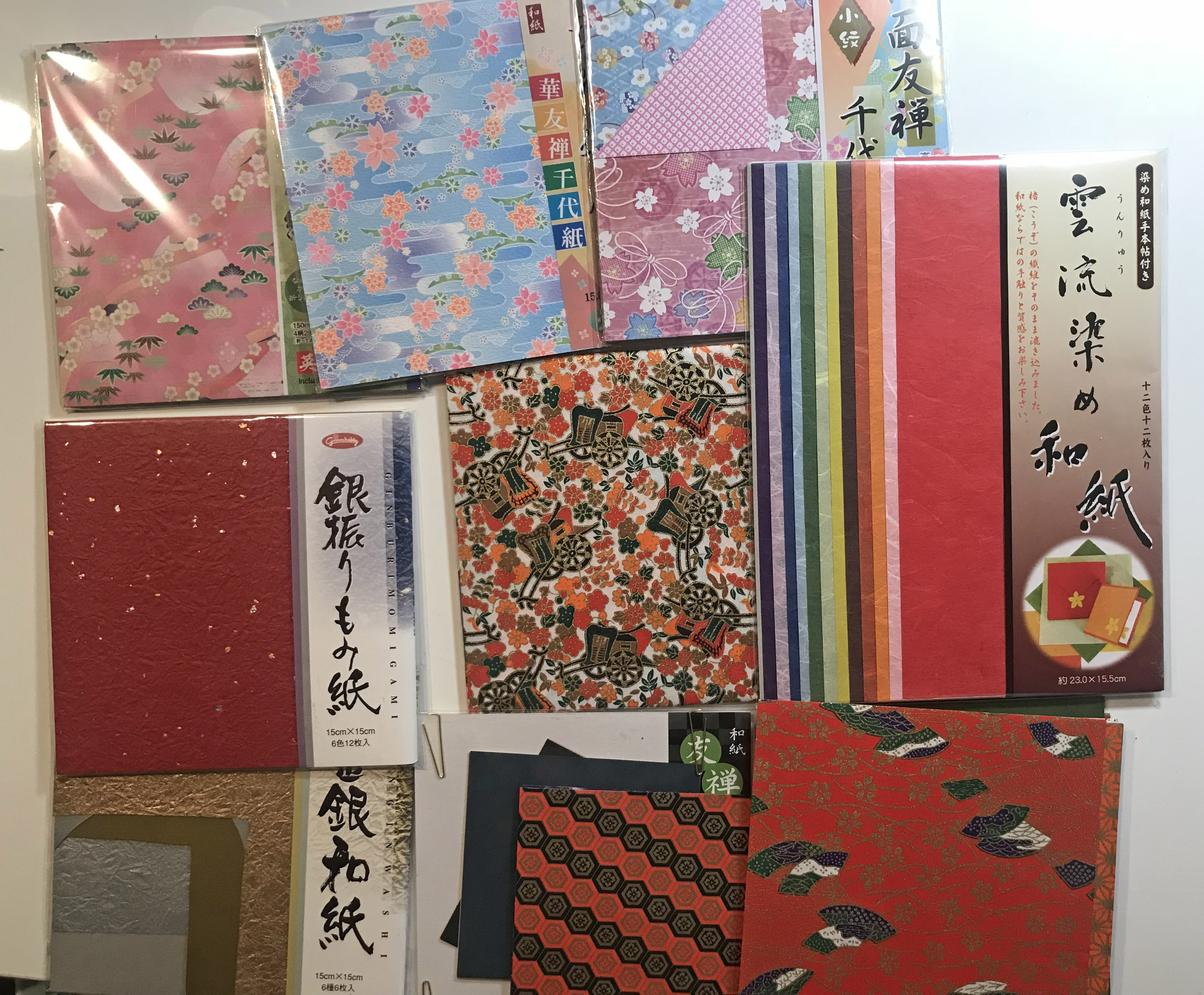


These packs of origami paper inspired me to think of more personal connections I had with Asian cultures and influences in my life, specifically Japanese. I began to build upon the idea of all the [Japanese] places I’ve grown up with, visited, and now frequent in my life – specifically restaurants. All the locations which I thought of that have sentimental value to me included Little Tokyo in Los Angeles, CA, 9th Street and St. Marks in NYC, and Kyoto, Japan itself. I wished to combine all these places in one street scene which would be ambiguous as to a definitive location, but would be definitely Japanese in theme.
Beta Mockups/Progress


I had planned to make a mini theatre-like contraption with four layers of the four locations I settled on, each made out of origami paper cutouts to create a three dimensional street scene. When I realised that this would be too complicated to complete in the allotted amount of time, I turned to a 3D collage alternative of my chosen locations with photos I had taken myself but this didn’t end up working logistically either, and the whole box concept was scrapped.
The photo of my friends (top middle cutout) that was taken in Little Tokyo last summer, though, brought up all the good memories I’ve experienced with friends leading up to college (where I would move away from everything and everyone I knew). I then decided that I would do something with photographs and some other analogue medium instead.
Final Concept + Layout
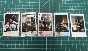

Choosing polaroid pictures spanning from March-August 2017, I’ve selected some of my favourite moments to incorporate into a scrapbook/memory map compilation. I purposefully titled each piece with familial language because I think of my friends as my family, and they have been there for me no matter what like a real family would.
Completed Pieces

Albeit this result being drastically different from my original planning, I feel as if it is more successful in its outcome compared to what it could have been. The moments I’ve chosen to memorialise are as follows:
- “Sleepover,” 15 March 2017 – My favourite convention hotel experience, spent with my friends in San Diego.
- “18,” 15 May 2017 – My 18th birthday party.
- “Family Dinner,” 4 July 2017 – A picture of all of my good friends whom I do not get to see often at my favourite ice cream shop in Little Tokyo, Honeymee (during Anime Expo, one of the biggest summer conventions in California).
- “Mom & Dad,” 6 July 2017 – One of our friends from San Francisco came to visit for a week.
- “Family Reunion,” 16 August 2017 – The last time I got together with my friends before moving to New York from California.
“Expansion into Space” Project Process
Step 1: Mood board
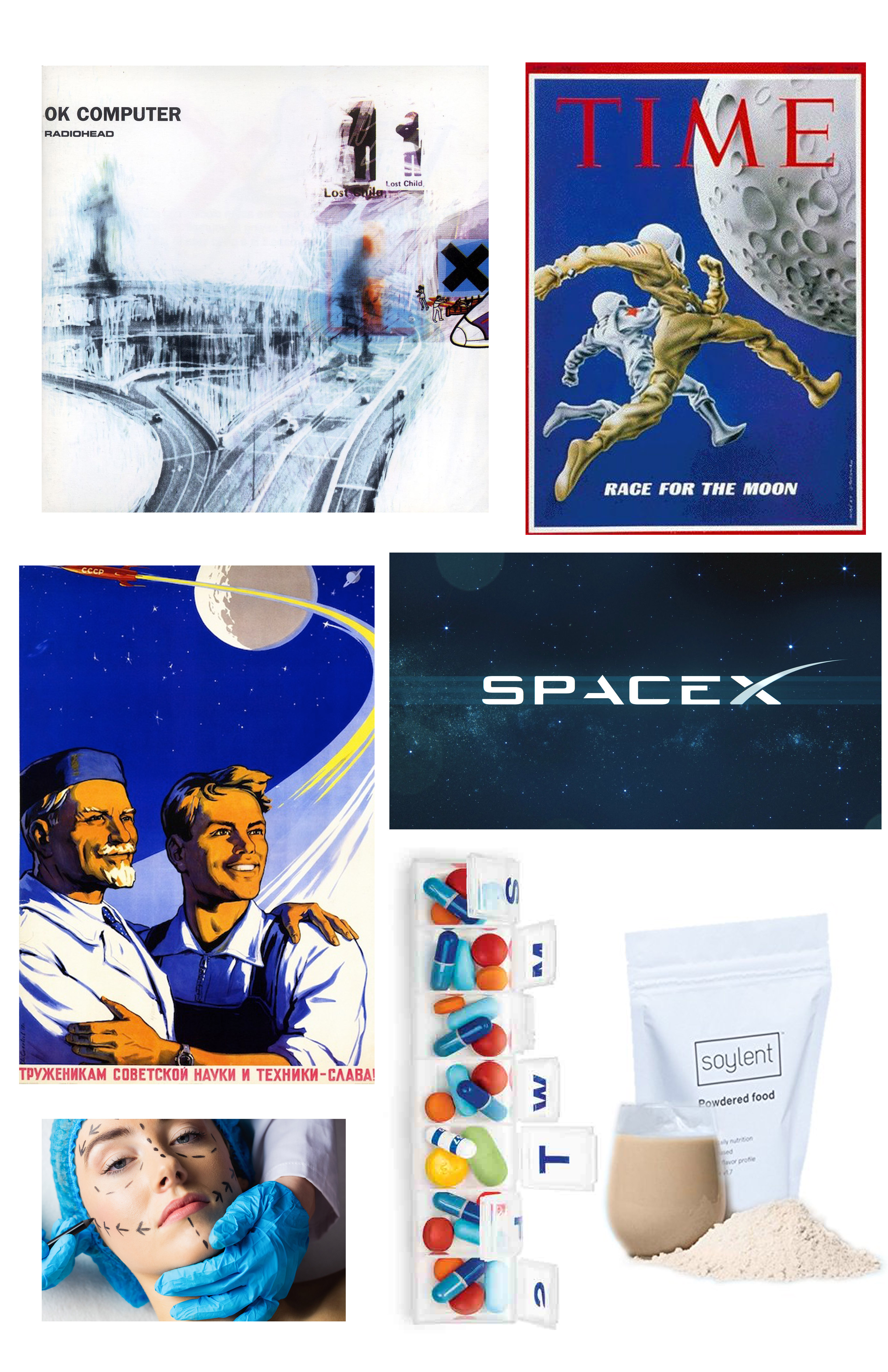
Upon hearing the prompt of “expansion into space” I immediately thought of the future and where humans are headed, both literally and figuratively. Initially I wanted my project to be (visually) gloomy and dystopian, with a colour palette of greys and blues.
Step 2: Inspiration material
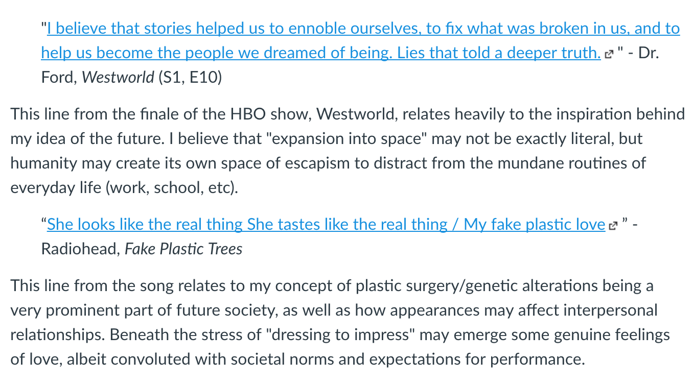
Many of the inspirations for this idea came from Radiohead songs, the HBO show Westworld, and a Haruki Murakami short story about a doomed plastic surgeon. All of these sources of inspiration dance around the idea of society becoming an increasingly boring, unhappy place in which (wealthy) people may indulge in many luxuries yet continue to live emotionally/spiritually unfulfilling lives. When I think of the future of “accessible” space travel, I can only see this being enjoyed by the 1% population.
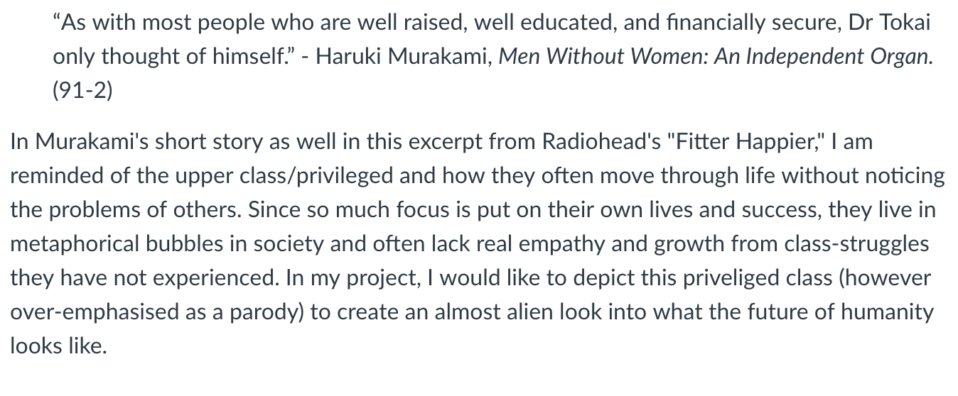
Step 3: Sketches + colour palettes
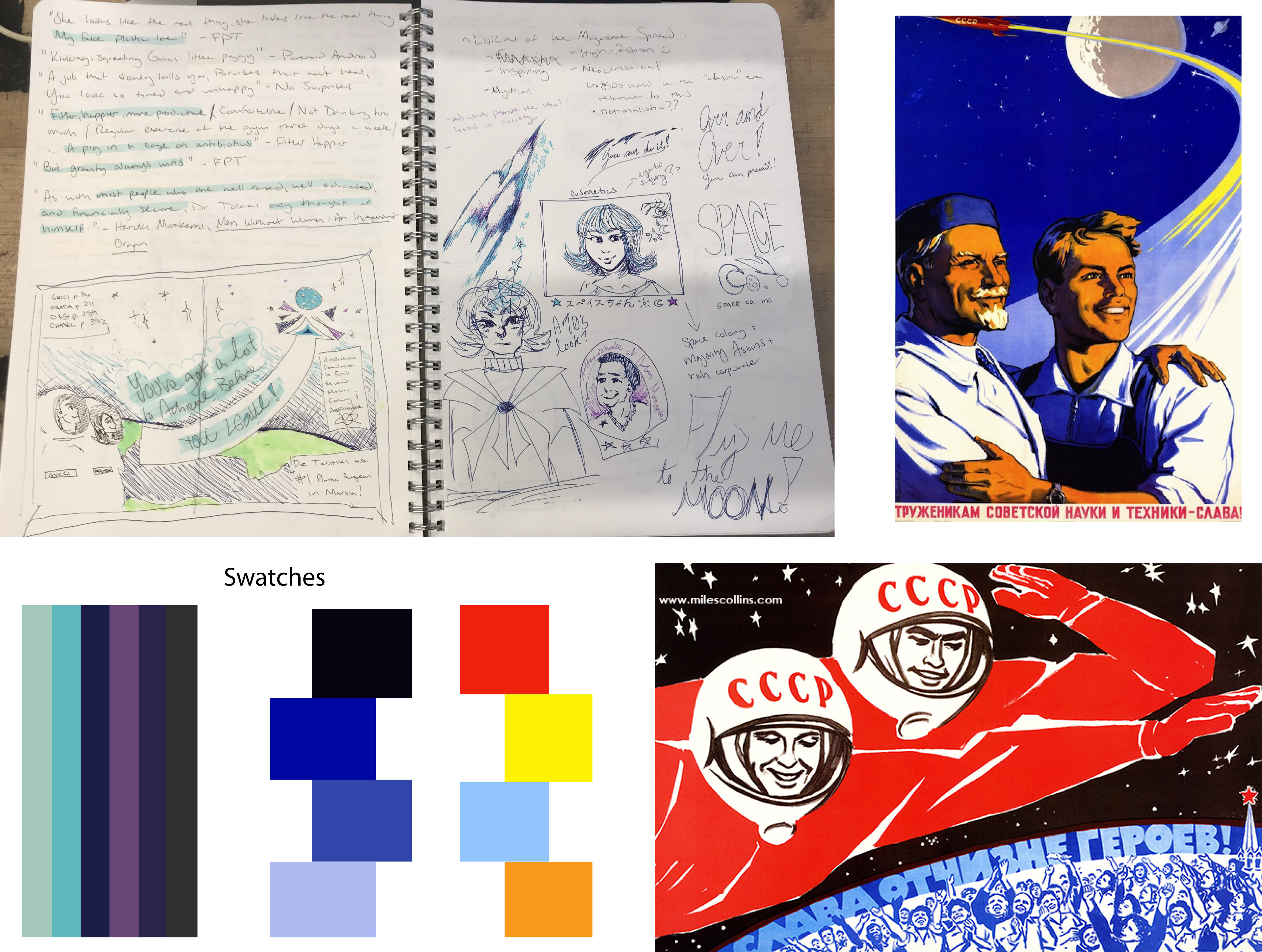
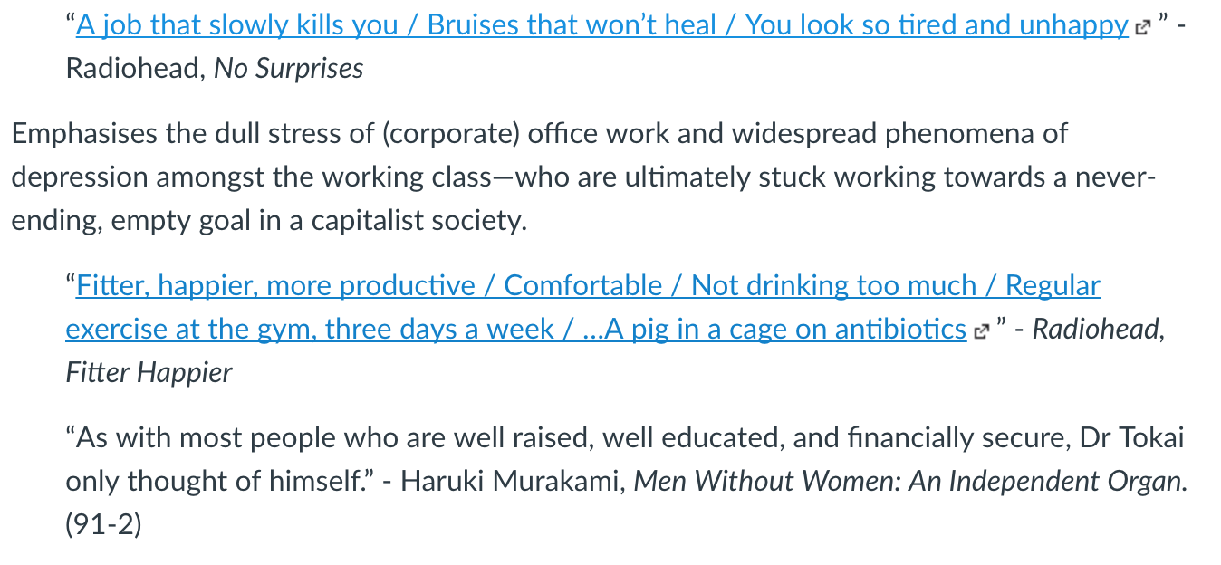
I looked at old Space Race propaganda from the 60s for further development of this idea, and started trying out content and layout concepts in my sketchbook. On Illustrator I arranged a few potential piece palettes from these pictures.
As I started working towards the actual piece, however, I deviated pretty far from these initial plans. Instead, I looked up “space fashion trend” on Google Images and eventually stumbled upon Gucci’s 2017/18 Star Trek-inspired photoshoot, and decided to go for a more editorial look of the piece.
The Final Product

My concept is that these are what (fashion) magazines will be in the future, when space travel/interplanetary colonisation has taken place. On Photoshop Elements, I’ve created three beta-magazine spreads that would perhaps place an emphasis on the “new age of exploration,” physical luxury and perfection. In a futuristic beauty/fashion industry, I also see an emphasis being placed on plastic surgery, dieting, and more thorough health precautions due to advance in technology. Specifically, for the plastic surgery ad, I chose to use the tragic character “Dr. Tokai,” a plastic surgeon, from Murakami’s short story.
Bridge 4: Intervention with a Monument
The monument I chose to “intervene” with is the General Grant National Memorial/Grant’s Tomb, located in Riverside Park in New York City. My aim was to create a commentary piece separate from the mausoleum itself out of respect and an educational context.
Planning/design process:

Materials used:
- white, gold reflective, and white plexiglass
- Olfra knife (for letter engraving)
- MDF board
- bristol paper
- Photoshop + Illustrator (collage)
- nut-backed screws
Finished result:

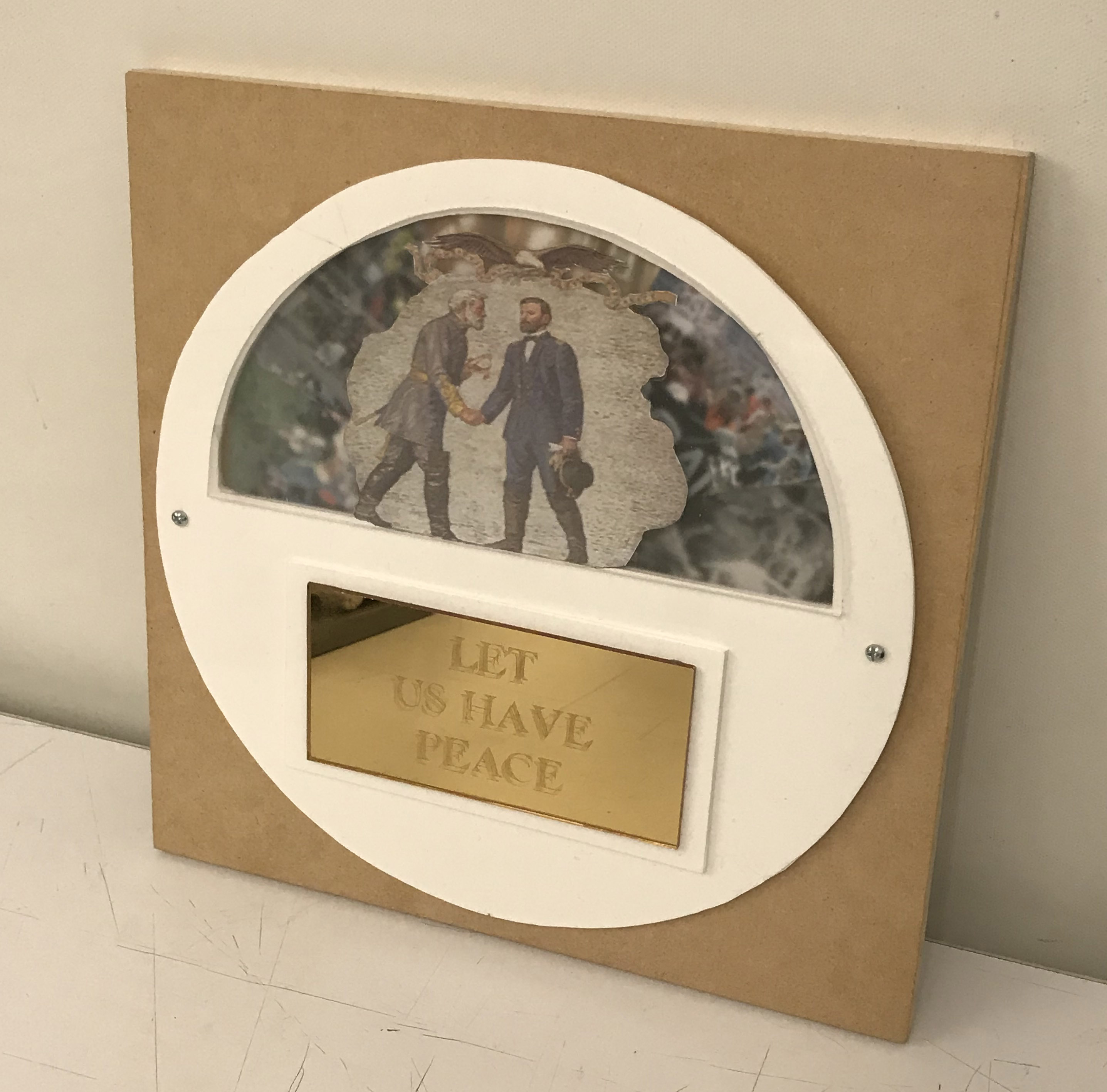

The placard, taken as inspiration from the very same quote etched on the outside of Grant’s Tomb.

The original painting inside Grant’s Tomb.


The interactive spinnable collage inside of the wheel. Pictured are roughly 150+ years of protest history in the United states, including the Women’s Suffrage Movement in the mid 1800s into the 1920s, the Civil Rights Movement of the 1960s, the Black Lives Matter and student protests in 2014, and the Alt-Right rally and Antifa protests in August of 2017. Using both historical and contemporary examples of rally and protest illustrates that this power dynamic between minorities and their oppressors is not a new phenomena to the US, nor is it showing any signs of ever going away or dying down.