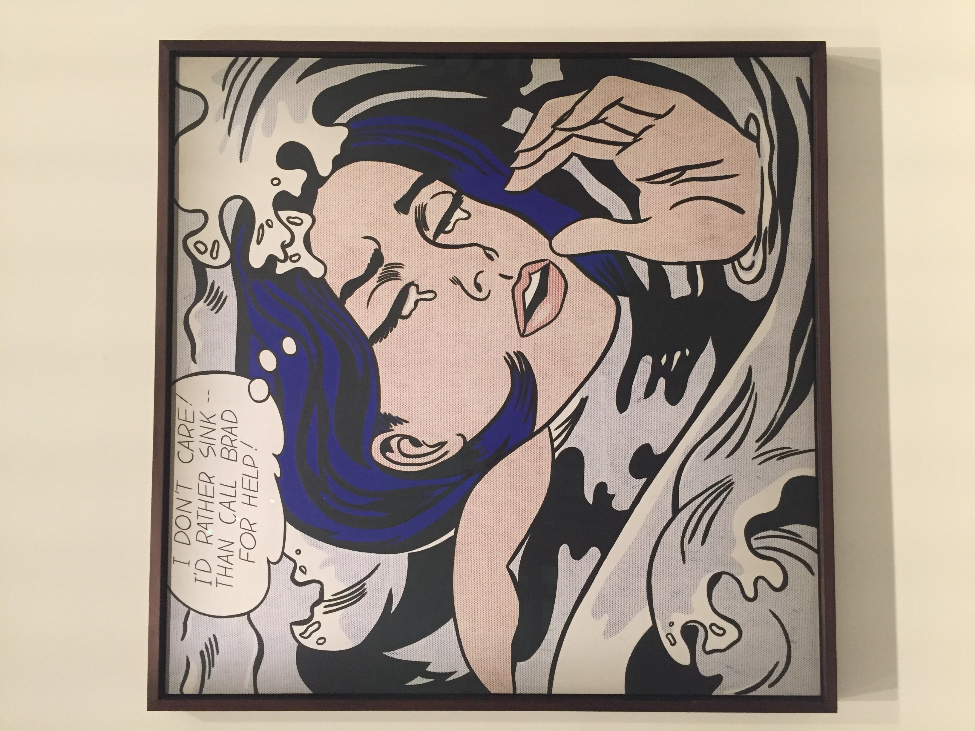
Drowning Girl, 1963
by Roy Lichtenstein
This is a commercial print that consists of a cut image of a woman that is almost drowning. There is tears falling out of her eyes and a thought bubble above her head that says, “I DON’T CARE! I’D RATHER SINK — THAN CALL BRAD FOR HELP!”. Comics-based women who “look hard, crisp, brittle, and uniformly modish in appearance, as if they all came out of the same pot of makeup.”
This artwork is a commercial print that consists of many images cut from a comic book and attached together to build a short story. The colours of this art piece are quite dull except for the woman’s hair colour that seem to be the only vibrant colour standing out the most amongst the other subjects in the print. It is installed as an oil and synthetic polymer paint on canvas that is life size. It is framed and installed in the MoMa exhibition.
Drowning girl for purely a depiction of Lichtenstein’s cartoon artworks. It was made during the departure of the abstract expressionism period. When Lichtenstein made his transition to comic-based work, he began to mimic the style while adapting the subject matter. He applied simplified color schemes and commercial printing-like techniques. The style he adopted was “simple, well-framed images comprised of solid fields of bold color often bounded by thick, stark border lines. The borrowed technique was “representing tonal variations with patterns of colored circles that imitated the half-tone screens of Ben Day dots used in newspaper printing”.
I feel I connect with this artwork through the style of the presentation and the story that is brought in a form of a comic characters. I am intrigued by the colour composition and the detailing in the painting. This painting provides a strong meaning and history.
After researching about the artist, I found out that he was married to a lady and they had 2 children but unfortunately the marriage lasted for a short amount of time. It brought him to a phase full of depression but then that lead to the creations of his artwork from 1960’s. The strong part about this artwork seems to be its way of presentation through the colours and the message that is being brought to us, although, the weakness is that is not giving out much, it seems to me as if it is unfinished but not unintentionally.