I adopted the perspective of looking at navigation through narrative. More specifically through telling a story about navigating through the secret gardens of Paris. In the style of children’s 18th century book, thats both factual and visually interesting. Through our extensive experimentation’s of gardens of Paris , we collected Manny illustrations that we then incorporated in the book named ‘key to the secret gardens of Paris’. So for our final project we would present the completed book along with a map to accompany it.The map ideally would be stored in the back of the book as a fold up map, adding another component to it. I believe to navigate through narrative is a efficient and interesting way to map a place or city. A children book was a efficient way of exhibiting our illustration and a fun and engaging also factual way. Thats both engaging and informative to the reader.
The children’s book allowed us to use narrative to navigate the way through the secret gardens of Paris. The narrative of the book also helped make it factual and fun. As the book is set in 18th century some of the gardens were owned by the king, so to ‘enter’ some of the gardens you have to sneak in. This aspect of the book helped make it more engaging for the reader. We also made some of the illustrations in black and white so we could also make the book a colouring in book , and we incorporated ink jet translucent photographs in the book of the gardens illustrated to add another layer to the overall book. As its a children book it was important for us to keep it fun factual and engaging. At the same time documenting place in a fun and beautiful way. I believe our illustrations documented place and helped the reader navigate from garden to garden. For the graphic language of the book being a 18th century children’s book I researched children’s book as well as 18th century graphics. I found two fonts to use that suited the theme of the book the main font being Fredericka the great and the secondary font being RM Victoriana. Both fonts are inspired from the Victorian era and helped achieve the overall aesthetic for the book. I also included 18 the century motifs and borders in the book.
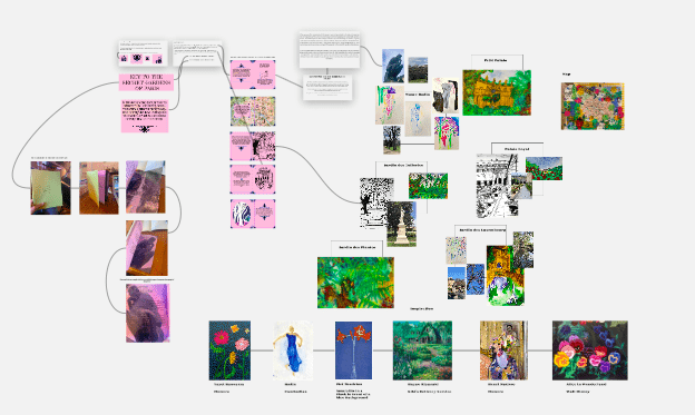
Through the use of the tool Miro it helped me and Natalie document our own research and experimentation and use them together in a collaborative collective way. Carto helped me better see other way of documenting place and navigation, through the use of technology in both a visual and factual way.
A potential blind spot was the fact we did not manage to incorporate Natalies map in the book at the back, I think this would of made the project more cohesive. Also deciding to make a children’s book made me have to keep the narrative very simplistic and not to factual so the reader wouldn’t feel overwhelmed with information.


