In Bridge 2, students were asked to create three re-designs of a particular advertisement chosen by themselves. However, aspects like the advertisement’s audience, platform, and location must be taken into account while designing the advertisement.
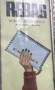
Figure 1: My original ad #is2b2
Through my research on this particular advertisement, I have decided to take three different approaches.
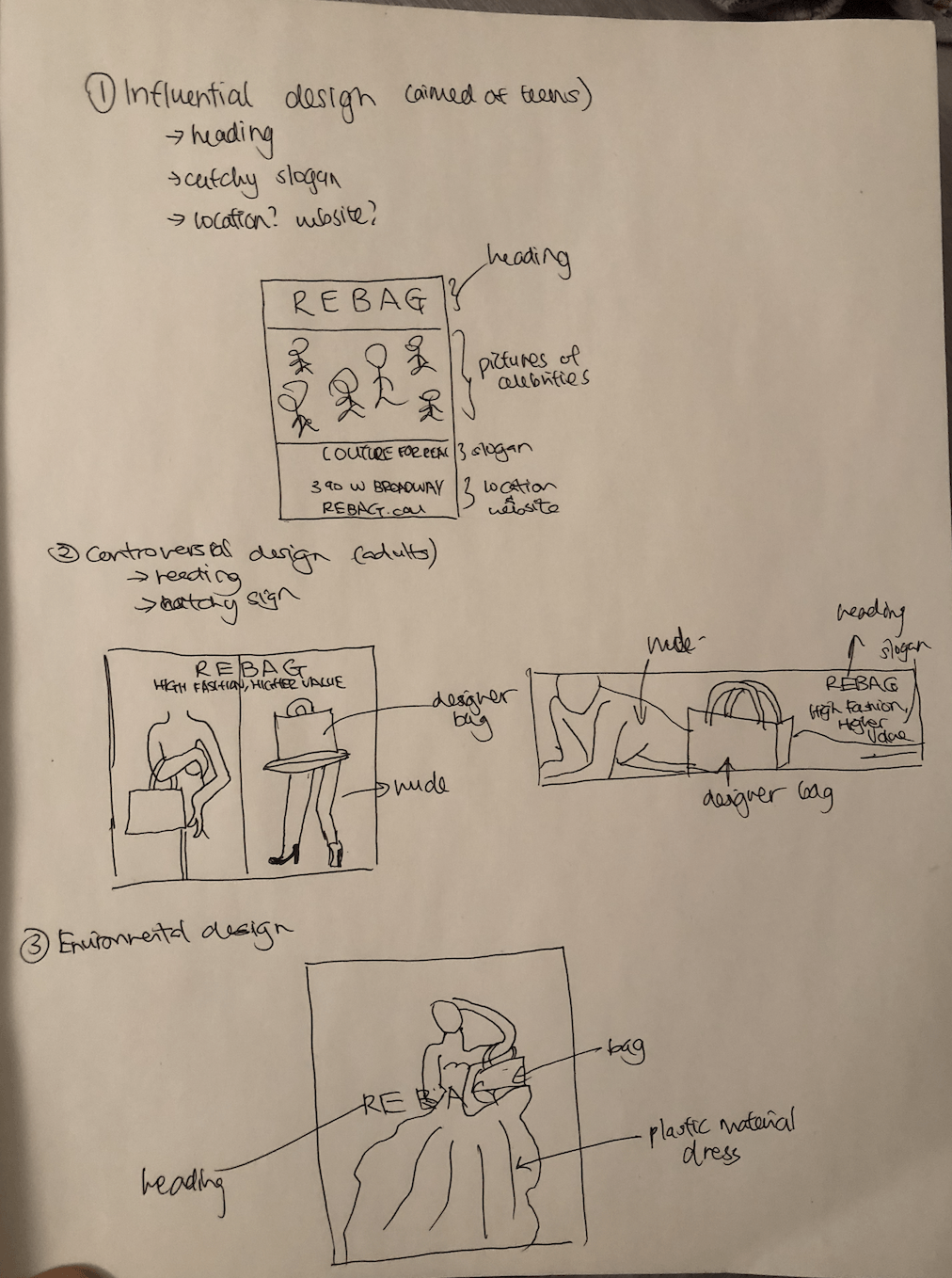
Figure 2: Storybook Sketches
Approach 1: Celebrity-approach
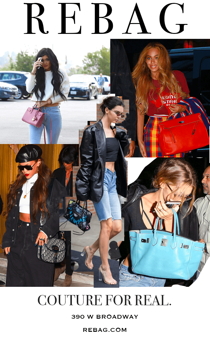
Figure 3: First Approach
Target Audience: Younger adults (age 18 to age 28)
Location: Close to school areas or in the subway
Research and Decisions:
While I was researching, I have found out that nowadays, people’s choice of buying goods are highly affected by celebrities. One example is the Dior Saddle bag. As most of the celebrities and influencers have posted the Dior Saddle bag online, it has attracted numerous attention and since then, its demand has soared up. Therefore, with this ad, I have decided to use pictures of major fashion icons in our generation and the bags that they wear on a daily basis to attract consumers.
Target Audience:
Through my research, I have found out that the highest percentage of consumers who are influenced by these celebrities are young, and that they have a higher chance to splurge on fashion. Thus, I have decided to limit my target audience to age 18 to age 28 to maximize this ad’s exposure.
Heading:
I have also decided to change the font of my heading ‘REBAG’ to an identical font of a very popular fashion magazine, Vogue. According to my research, Vogue is the highest selling international magazine and therefore I wanted my advertisement to create an allusion of a vogue-cover magazine to attract more customers. Another research that I found was the inclusion of a catchy or humorous yet concise slogan in an advertisement could lead to effective messaging. This is because the slogan will stay in the consumer’s mind for a longer period of time, as the slogan would make a bigger impression on them. For the word ‘REBAG’, I wanted to stay with the color ‘black’ as I want the consumers to look at the pictures before looking at the heading.
Layout:
The layout of the design is to have the pictures take up more than half of the page. This is because it will make it more visible to consumers and therefore they would be more attracted to its contents. I have also decided to combine The scale of this advertisement will be in A4 so that it would be easier to be placed on things like a pole.
Location:
The location of my advertisement would be around school areas or in the subway as it is a commonplace that young adults go to for most of the time. As teenagers nowadays highly consider fashion as one of the main ways to express themselves, through witnessing this ad around their school areas, it would make them want to check out the website.
Approach 2: Controversial-Approach
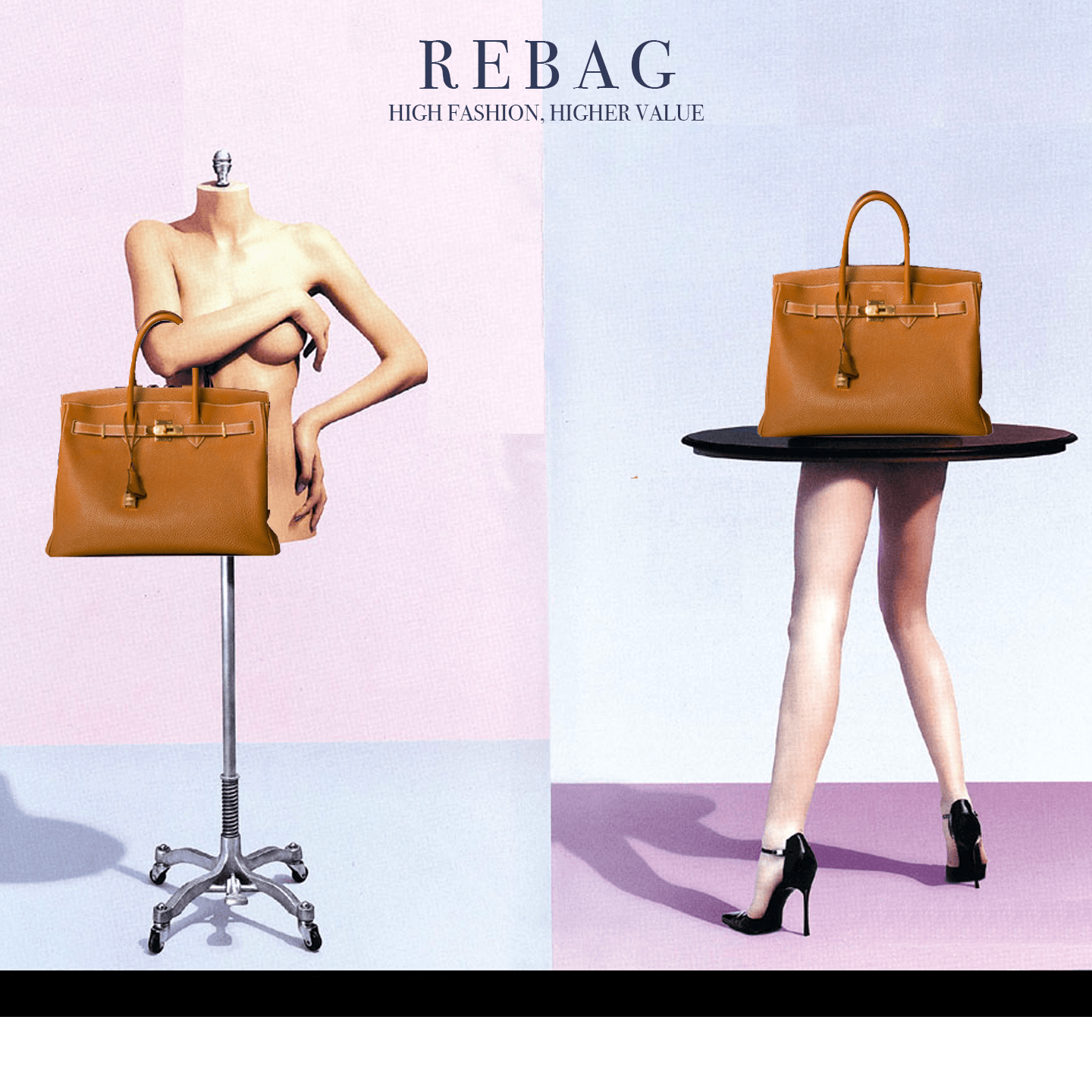
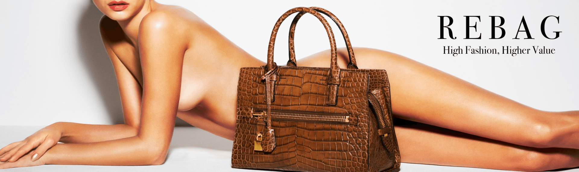
Figure 4: Second Approach
Target Audience: Adults (age 25 to age 40) and tourists
Location: Media (online), Times Square
Research and Decisions:
Another research that I found that is helpful in effective messaging is through word-of-mouth, and through researching, I have realized that nowadays a lot of controversial advertisements have increased the sales of a particular product due to the fact that the portrayal of the advertisement on media has made the advertisement stuck on one’s mind, or has made the consumer curious about what the brand is originally about. However, there are a lot of consequences that could result from this design, but sometimes, it could turn out to be positive. Thus, I have decided to create two controversial advertisements that attract consumers and they both have different color tones.
Target Audience:
As this is a highly controversial ad due to the bareness of a human body, I wanted my target audience to be adults, as adults may see and like how the bag looks on the body and therefore this would create the mindset that by buying this particular bag, they would own the same qualities and look the same as the model in the picture.
Heading:
For my heading, I have also decided to change the font of my heading ‘REBAG’ to an identical font of a very popular fashion magazine, Vogue. According to my research, Vogue is the highest selling international magazine and therefore I wanted my advertisement to create an allusion of a vogue-cover magazine to attract more customers. Another research that I found was the inclusion of a catchy or humorous yet concise slogan in an advertisement could lead to effective messaging. This is because the slogan will stay in the consumer’s mind for a longer period of time, as the slogan would make a bigger impression on them. Therefore, I have chosen the word “High Fashion, Higher Value” and in this case, value signifies a person’s value. This will make consumers think that by buying a good handbag, they would appear to have a higher value. For my other higher-contrast approach, I have bolded the word “REBAG” to follow along with the image’s theme – which is boldness and sexiness.
Layout:
For my first picture, I have incorporated pastel colors as the background and this is to make the advertisement appear to be more fun and feminine-like, and its aesthetics will also attract more consumers as an advertisement’s design is also a crucial aspect of effective messaging. The two body parts of a human body will take up more than half of the picture, acting as the main focus. This is because I want the audience to be able to witness the body parts and the bag that the body parts are holding before realizing the title. The heading will then stay in the middle of the two pictures so that it would be clear to the audience that that is the company’s name.
For my second approach, I have increased the contrast of the image of a naked woman to make the photo appear to be more bold and sexy, as there are obvious contours on the human body. The body will also take up more than half of the canvas, and a bag is used to cover up the lady’s private part. This is to attract consumers to check out the ad more and find out what the ad is about, as they would be attracted by the model’s sexy form.
Location:
The location of my advertisement would be in Times Square and online as Times Square is a place with a lot of lights and crazy things so this advertisement would not feel out of place and it could potentially avoid some of the negative consequences that the company might face. Not only that, Times Square is where most of the working adults and tourists are at and therefore it would be a good way to stir up some conversation within them and hence it would make them have the urge to check out what the company is about.
Approach 3: Environmental-friendly Approach
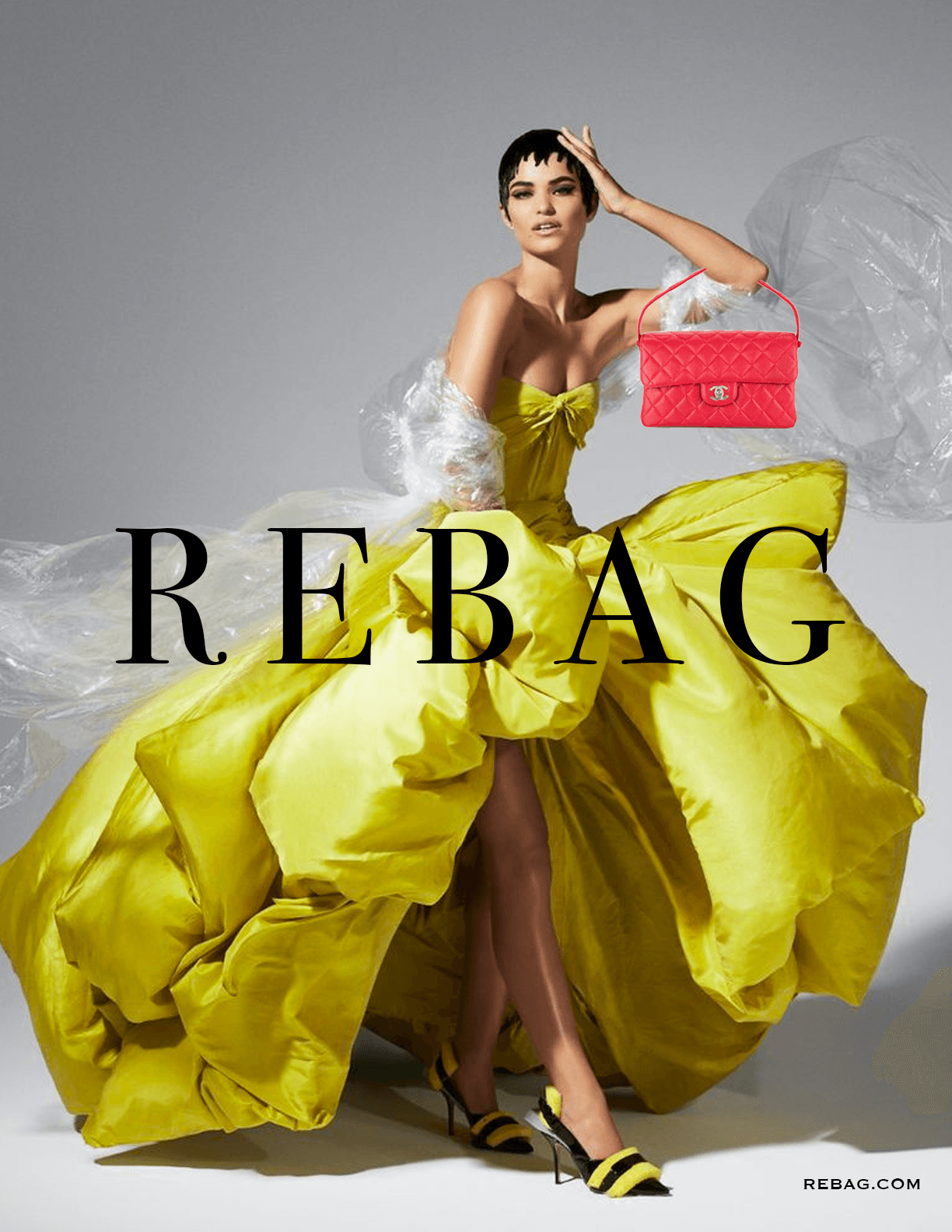
Figure 5: Third Approach
Target Audience: Adults (age 25 to age 40)
Location: Media (online), Bus and MRT station
Research and Decisions:
This research finding is the one that shocked me the most – and it is that 81% of consumers would make self-sacrifices to tackle current world issues and therefore I wanted my third approach to the design to appear more environmentally-friendly. As world issues is a big factor in most of the people’s mind, through this advertisement, consumers might be tricked into thinking that this ad is more environmental-friendly, and therefore they will want to find out more about the brand.
Target Audience:
As this advertisement focuses highly on being environmentally-friendly, I wanted my target audience to be adults with age ranging from 20 to 30, as they’re the generation that is most aware of the pollution happening in this world. Therefore, they will have a higher chance of wanting to do something better for the world.
Heading:
The font of my heading ‘REBAG’ would be changed to an identical font of a very popular fashion magazine, Vogue. According to my research, Vogue is the highest selling international magazine and therefore I wanted my advertisement to create an allusion of a vogue-cover magazine to attract more customers. The heading is also superimposed on the lady, therefore, it acts as a focal point of the advertisement and people would immediately witness the heading from far away, and this is helpful as it is an effective way of direct messaging. The color of the heading would also be in black, as it creates a high-contrast against the color of the dress (which is yellow) and therefore this would allow the consumers to see the heading better.
Layout:
The layout of the design is to have the model take up more than half of the page. This is because it will make it more visible to consumers and therefore they would be more attracted to its contents. However, the most important feature of the model would be the poofy dress, as it appears to be plastic-material and therefore through that, the audience would be able to realize that the company is being environmentally friendly. There is also a high contrast in colors between the pink bag and the yellow dress and this is used so that the consumers know that the main purpose of this advertisement is not the dress, but the bag itself. The beautiful contrast will also allow the audience to witness the importance of a bag in an outfit, as in this picture, the bag has spiced up the picture completely. The background of this advertisement would be white with some black shadows. This will make the picture appear to be more professional, and therefore consumers would have a higher chance of believing the legibility of the company.
Location:
The location of my advertisement would be by the bus stop or in the subway, as it is a common setting for working adults, and therefore this will maximize my exposure.