

-
- “Wipe Out”
-
- Just the piece
-
- Title and info about piece
-
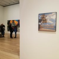
- Picture of how hidden “Wipe Out” is
-
- Detail shot
-
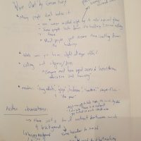
- Notes taken while lookig at piece
-
- First page of packet
-
- Searching for article
-
- Printed article
-

- me in the stacks at the UC
-
- Book I chose
-
- First page of chapter
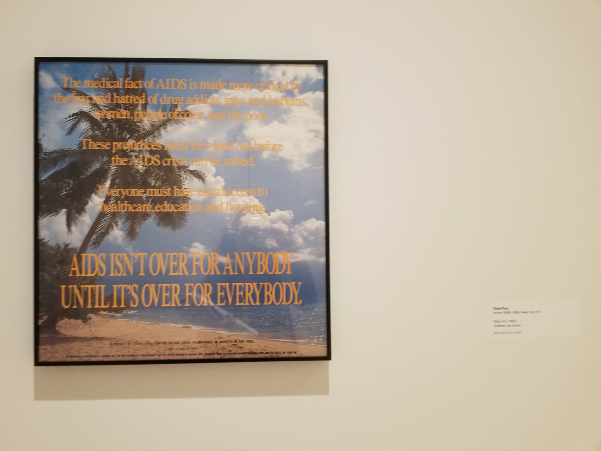
2a. Observations on the details:
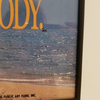
- The background of the work is a very bright beach scene
- The letters written over the scene are a light tangerine color that does not contrast much with the background
- The words give the piece a slight collage-esque feeling
- The last sentence is larger and in all capital letters
- There is a boat in the background over where the period is
Initial impressions of the work:
- The background looks very postcard-esque, more perfect than real-life
- I immediately want to love LGBT+ based work more than non LGBT+ work because of how important LGBT+representation is but it may cause me to be less critical of the work.
2b. There were no materials listed for the work other than “Subway-car poster”, so I assume it was simply printed on a coated paper or adhesive vinyl. It shows that the piece was made to feel commercial and affect a large group of people, a PSA in the style of an advertisement.
3a. I feel that the font and the graphics work well together but I do feel that there was slightly more contrast between the color of the color of the text and the color of the background. I can assume Gran Fury did want the text to be more difficult to read, and it does imply the idea of metacognitive fluency (people pay more attention to what something is saying when it’s harder to read), but I wish the words were just slightly more legible. A lot of the case study on ‘Mourning and Militancy’ has a more commercial art feeling, some of it is pop art and some of the other pieces also employ text and the feeling of an advertisement.
3b. The piece was made in 1990. It wasn’t the only subway ad at the time talking about HIV and AIDS. In the New York Times article “AIDS Message in a Subway Comic Strip: New York City Health Agency Teaches About the Disease in a Soap With a Sober Focus” published in 1993, James Baron talks about a comic strip being published alongside regular subway ads that talks about HIV and AIDS.
4a. How well does the piece work as an advertisement? Do the colors, form, font, and background all work together or is there a way the piece could have been more effective? I want to know if the colors used in the piece were helpful to the work and the way that people received the work or if different colors could have made the impact of the piece stronger. The colors in this piece are so strong and the effect of the piece was to reach a wide audience so it’s important to see if those two things worked together. It could better help me understand advertisements which could be a source of heteronormativity that I address in my work.
How were sex, sexuality, and gender represented in art throughout time? Though “Wipe Out” by Gran Fury isn’t explicitly sexual it hints towards sex and sexuality because HIV is a sexually transmitted disease. I want to look at the way that sex and sexuality were shown in art and the media throughout time and the way that it changes. I can look at not only the way that sex has changed in art but the way sexuality and the way heteronormativity has changed in art throughout time.
What other work was made regarding HIV at the time? Gran Fury wasn’t the only artists at the time talking about HIV and AIDS at the time. I could look at work done by other artists to compare and contrast the way that the other artists looked at HIV and AIDS and the way that people reacted to them. It would help me see if LGBT+ rights were being talked about at the time and how the public reacted to it.
Studio specific questions:
-

- Cover (when book is closed)
-
- Cover when it’s pulled out
-
- Blurb from when cover is pulled out
-
- Title page
-
- Copyright information page
-
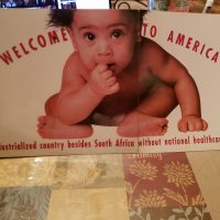
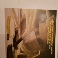
- Page 10 “Welcome to America” Billboard sponsored by The Whitney
-
- Page 13 “Control” 1989
-
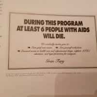
- Page 37 “During this Program At Least Six People With AIDS Will Die” 1988
-
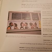
- Page 54 “Kissing Doesnt Kill” for Art Against AIDS on the Road 1989
-
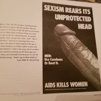
- Page 67 “Sexism Rears Its Unprotected Head” 1988
-
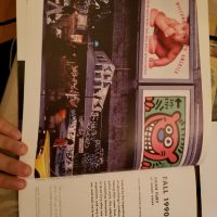
- Page 75 “Wipe Out” 1991 (the piece I analyzed at the Whitney)
-
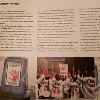
- Page 30 “Bloody Hands” poster and demostration 1988
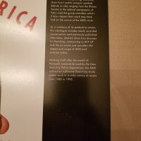
4c. Gran Fury is an artist collective active from 1987-1994. The collective acted mostly anonymously and was composed of almost entirely queer men, with one female member who was also the only heterosexual member. The group was formed by members of ACT-UP, AIDS Coalition to Unleash Power. Since the group formed from a desire to spread awareness about AIDS and fight for an end to the AIDS epidemic, all of their work centered around AIDS.
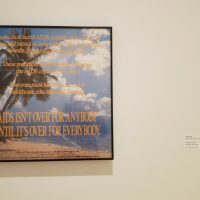
What drew me to “Wipe Out’ by Gran Fury over the other pieces in the exhibit was firstly where it was placed. Since the piece was placed so out of the way many people didn’t notice it which immediately made me want to pay closer attention and figure out why it was placed separately from the other works in the gallery. Though I couldn’t figure out why “Wipe Out” was placed separately from the other pieces, the time I spent looking at it made me really appreciate the piece. There is such a high contrast from the feeling of the beach scene and the words yet they blend so perfectly. I was also intrigued by the fact that they chose a text color that was hard to read at the top of the piece but became clear at the bottom of the piece. I can’t be sure what was going through Gran Fury’s minds when they made that choice, but I immediately thought about metacognitive fluency and how when something is written in a font that’s hard to read you process the information more in-depth than if it was easy too read. “Wipe Out” in itself seems like such a simple piece but once you start to really look at it you notice the ways in which the various aspects compare and contrast to build a concrete message.
Link to the document talking about my research: https://docs.google.com/document/d/1_9VHbPklTMdMePC6tN34-DyePR5y59__nZpPSP3yQ10/edit?usp=sharing
The document has the typed answers above as well as the typed answer to the first question, part 4b, and a work cited