
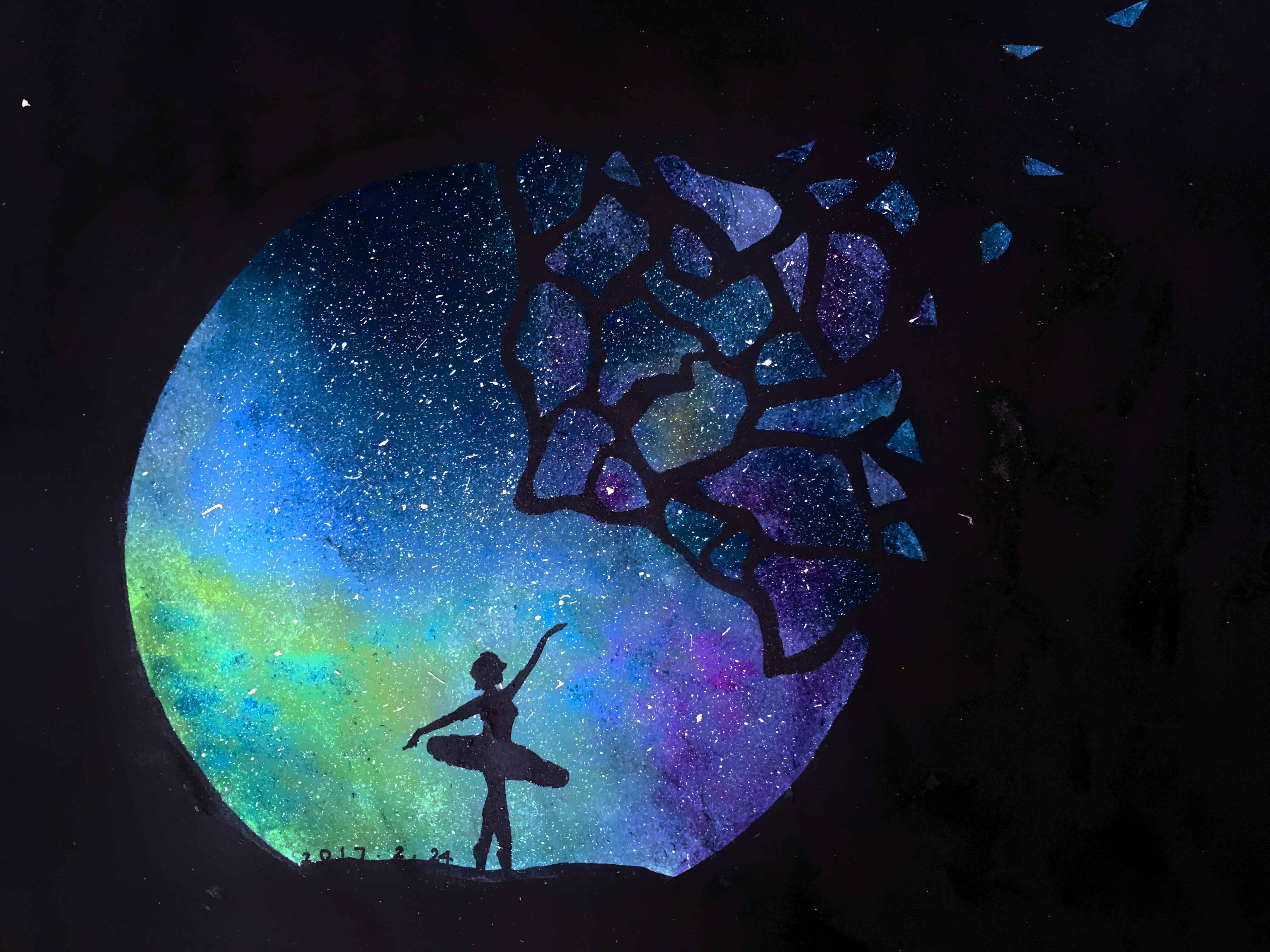
Month: February 2017
[Sustainable Systems] NYC Plastic Bags
At first we thought about choosing the NYC water sewage system for the project but then the system turned out to be way more complicated than we anticipated.
After some further research and discussions, we decided to talk about the plastic bags in the city. We looked at different sites and learned about how plastic bags are made, where do the resources for making plastic bags come from, where they end up and what impact it brings to the environment.
- http://www.newyorker.com/magazine/2016/05/02/saving-america-from-plastic-bags
- http://www.bankrate.com/finance/smart-spending/paper-plastic-whats-environmentally-correct-choice.aspx
- http://www.healthguidance.org/entry/14901/1/The-Effects-of-Plastic-Bags-on-Environment.html
- https://greeningforward.org/plastics-the-non-renewable-component/
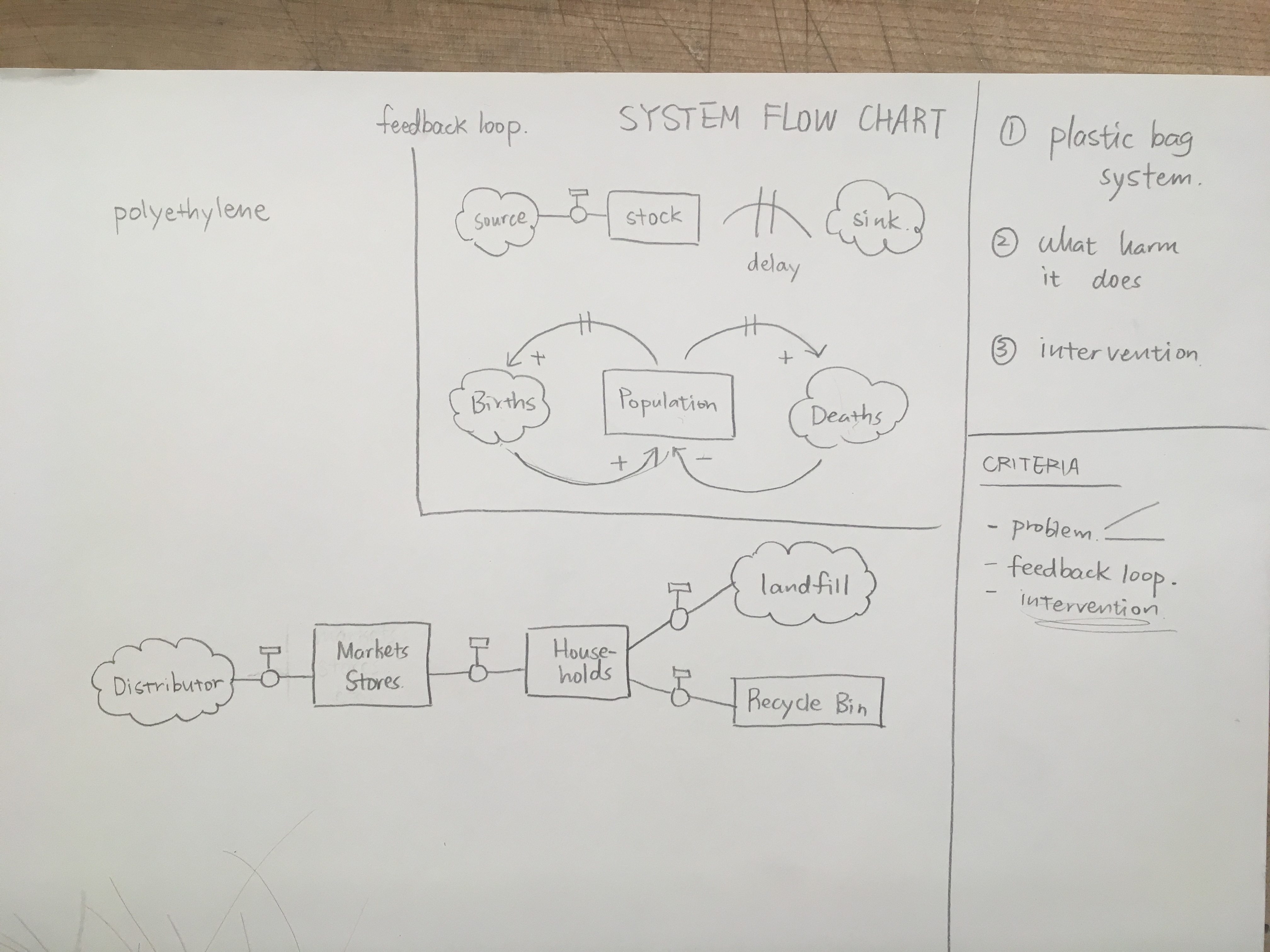
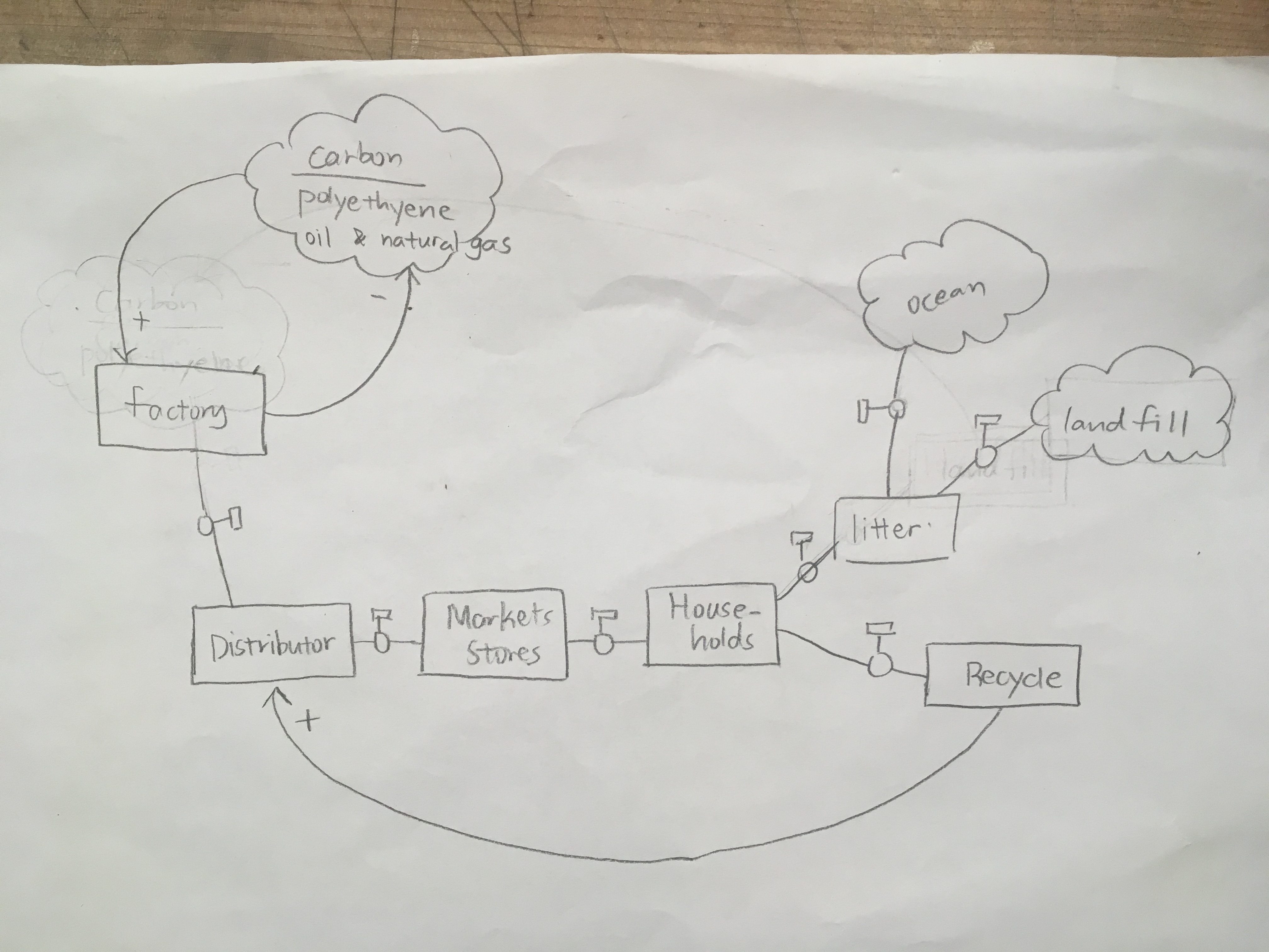
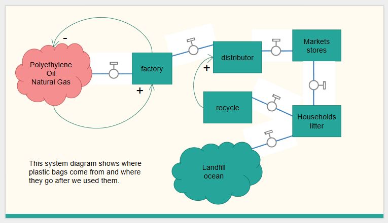
After carefully studying the symbols of a system flowchart, we eventually came up with a system flowchart displaying positive and negative feedback loops
Then we spent a lot of time talking about possible interventions. (To cut down the usage of plastic bags)
We came up with many ideas, and we realized not many of them are both very practical and effective. In the end, based on the success ban of plastic bags with plastic bag fees in other regions, we believe that this is by far the most viable intervention.
FINAL PRESENTATION PDF LINK
[DIGITAL TOOLS: LAYOUT AND DESIGN] GESTALT POSTER
General Description:
The aim of the project is to create a poster which explains five of the Gestalt Laws of Organization with both text and images using Adobe InDesign, in my case the five laws are: simplicity, similarity, nearness, good continuation and figure ground.
I’ve made a lot of posters in my high school and I always try to make something different and interactive for viewers. Therefore while sketching for ideas, I decided to abandon the tradition style of poster and came up with something more different – more 3-dimensional.
Preliminary sketch:


the sketch on the left is only around 2 by 3 inches big, roughly providing me a sense of space usage
the one on the right is more specific and clear, done on 17 by 22 inches bristol paper
First Digital Draft

Final Digital Poster

Link to Final Digital Poster PDF file:
Ming (Ameily) Chang Gestalt Poster-v7jtu1
Self-assessment:
Printing the poster out in full size and showing it to the class really helped me assessing my work. I like my idea of abandoning the traditional style of posters and it did take me a long time to plan out the composition and where to put my information – it is a poster, disregard the design, information should be clearly delivered to the audience.
I did not think that the title of the poster “GESTALT” was difficult to find until I was told by my class. Therefore in refining my poster, I added dots on the word “GESTALT” hoping that it would help navigate the viewers’ eyes.
I also changed the background color from white to black to give the poster a sense of steadiness because I thought, and I was told as well, that there’s no “starting point” for viewers when looking at my poster, which is what I kind of intended for and, as my class said, is not a bad thing because it lets the viewer interact with the piece.
Over all, I believe my poster stands out for its uniqueness and in the mean time successfully delivered required information to the audience. However it is not a poster suitable for bustling areas for its text being not big enough for people to read from a distance. The three-dimensional design is intriguing but may be slightly confusing for some people.