
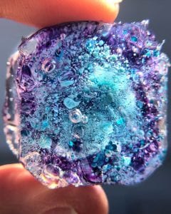

Water color droplets in cured resin
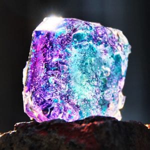
Water color droplets in cured resin
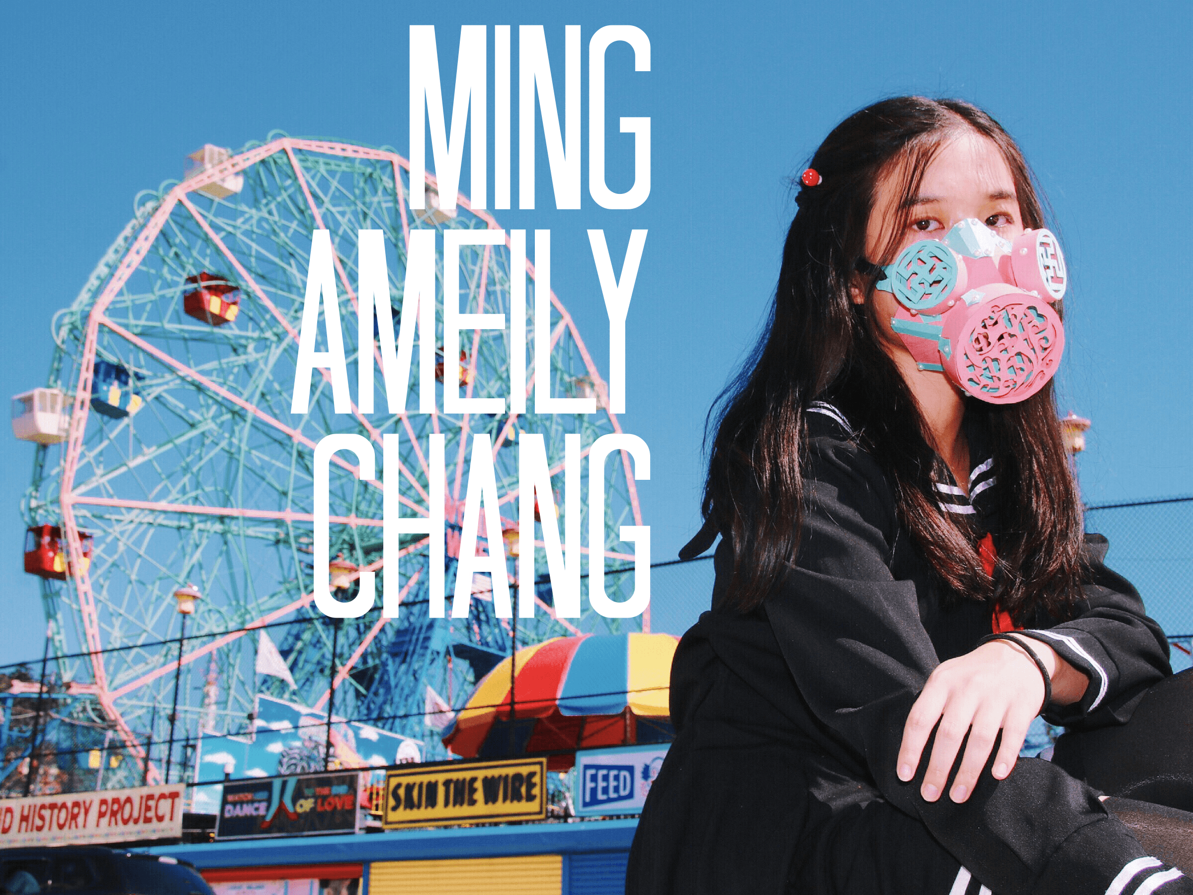
While most of my classmates started this project with thinking what mask to make, I started by thinking where I want to shoot my photos. There was not much thinking process, I really just stayed with the very first thing I thought of – amusement parks.
For the shoot I had two locations in mind, one is Jane’s Carousel at Brooklyn Bridge Park, you can get really good shots of the carousel even when it’s not operating, along with the Manhattan cityscape; the other one is Luna Park in Coney Island.
From that point on, I decided to make a very industrial mask, but with playful, vivid colors. Initially I wanted to make something that resembles a pair of pilot goggles, because goggles were what I immediately thought of when associating with the word ‘industrial’. I then came up with a color pastel color palette consisting of blue, pink, yellow and green. I sketched out the goggle with these colors. However, I did not like the sketch, as if something was missing.
Fortunately, in one of the seminar classes, the gas masks shown in the slide show opened another door for me. Since one of my goals is to make what strongly contradicts with each other coexist harmoniously and gas masks have a much more intense symbolization than goggles. Gas mask symbolizes industrialization, wars, pollution, evilness, and apocalypse. While the colors and detail design of my mask would be more childlike and playful, I felt like a gas mask would be perfect as a contradiction to that.
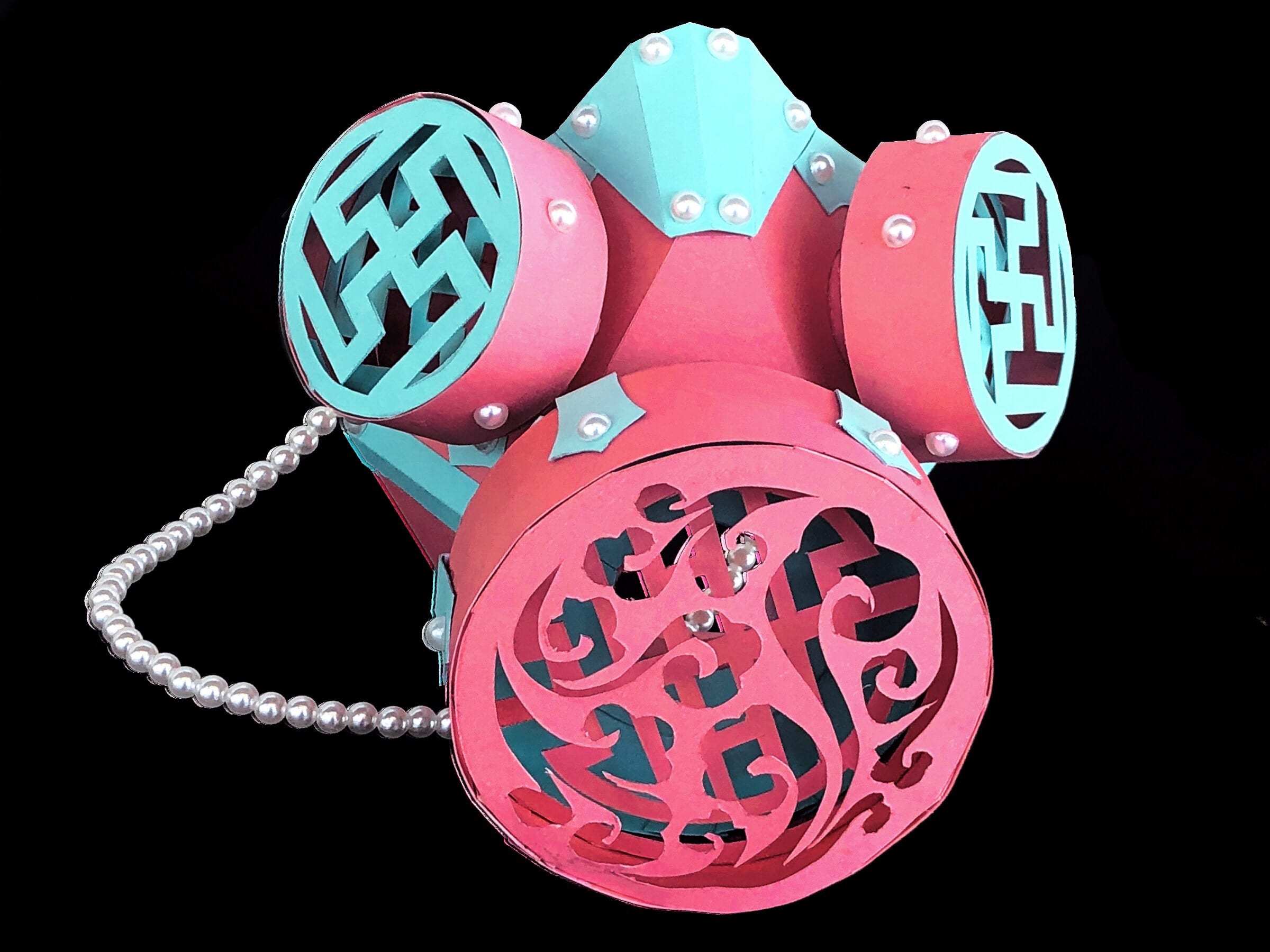
I narrowed the color palette down to two colors only, for aesthetics and simplicity. I used pearl beads to replace the bolts to give the mask value and a sense of delicacy. As for the vents, I used organic patterns to contradict with the industrial element of the mask.
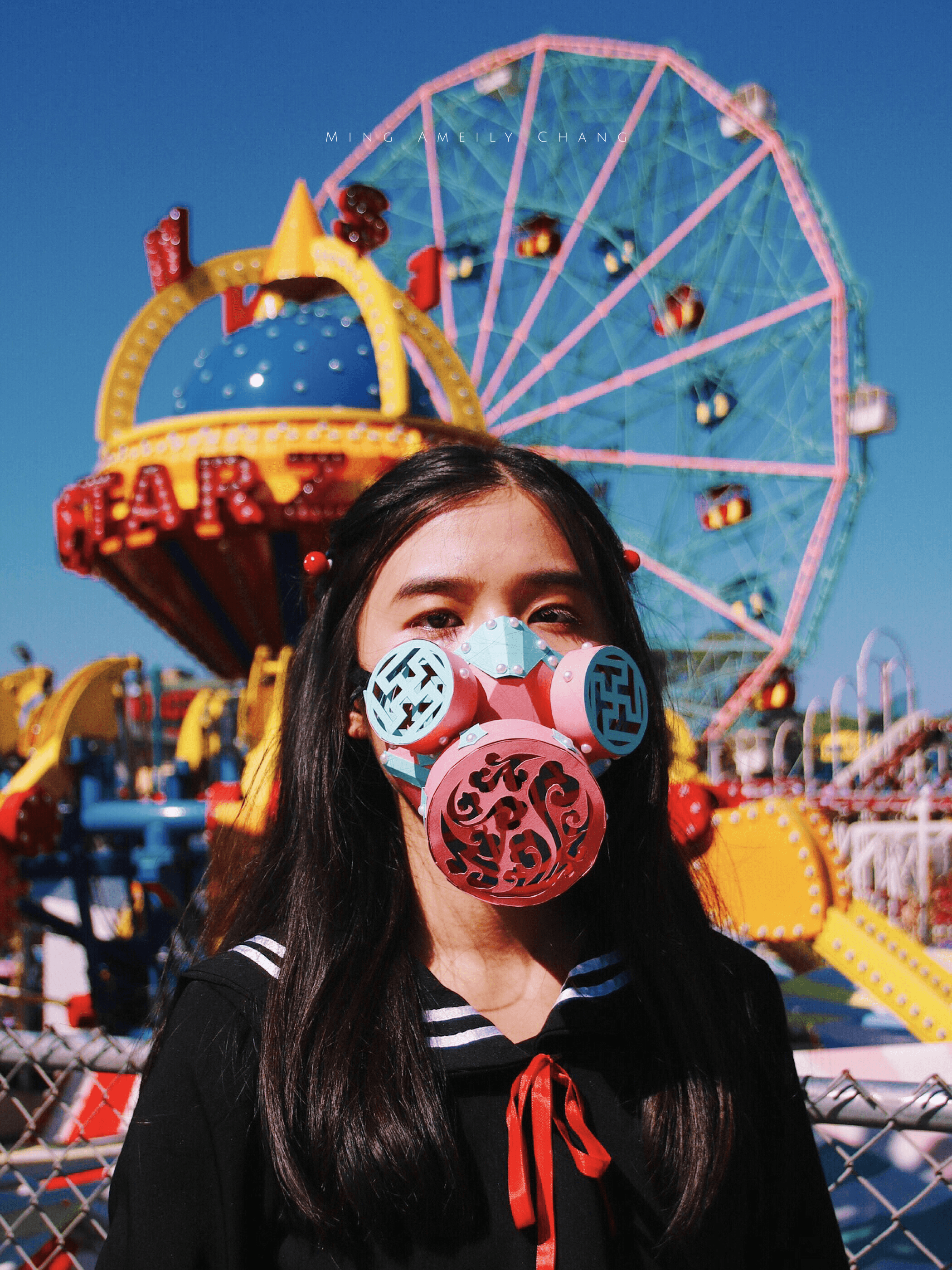
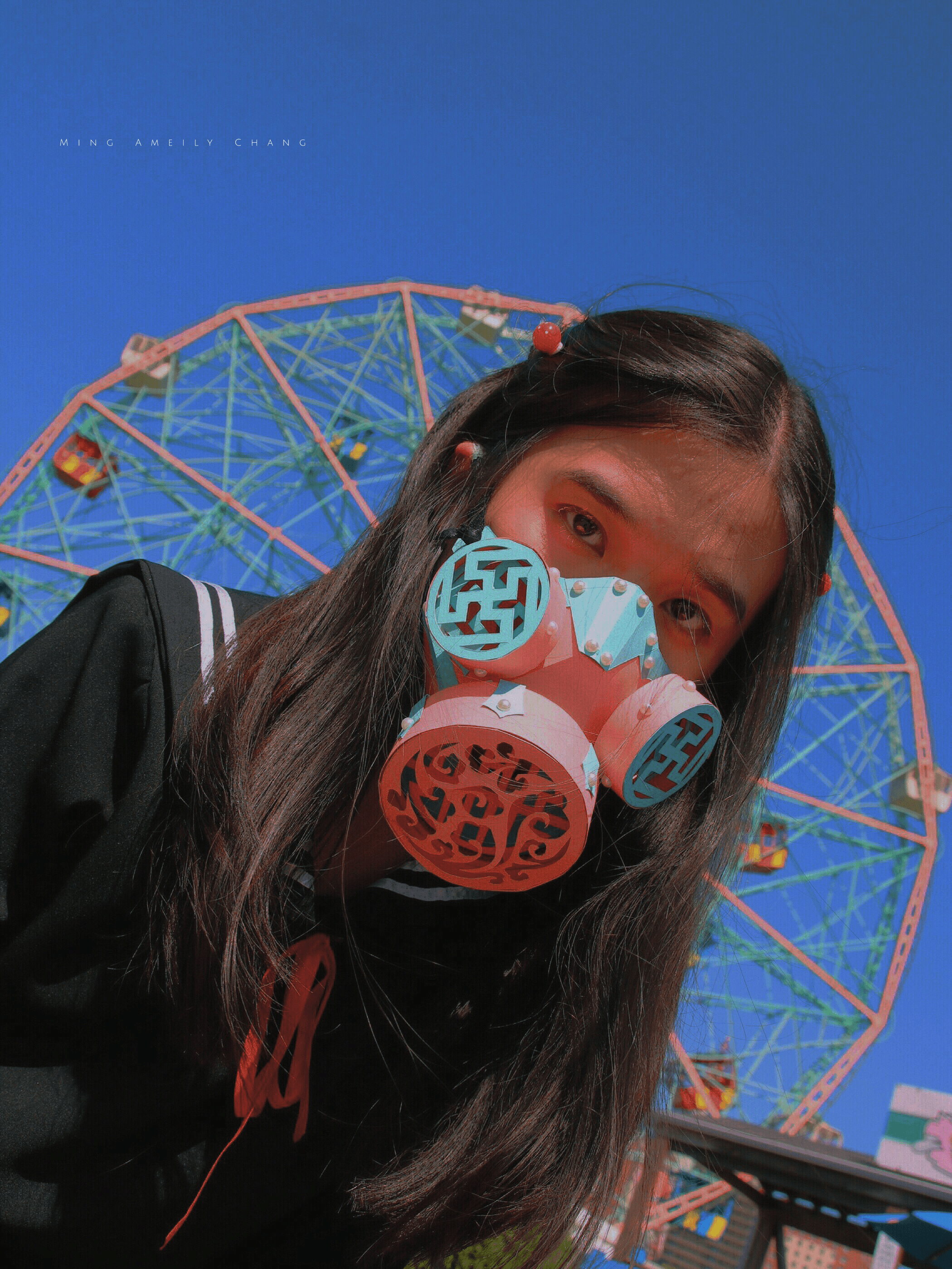
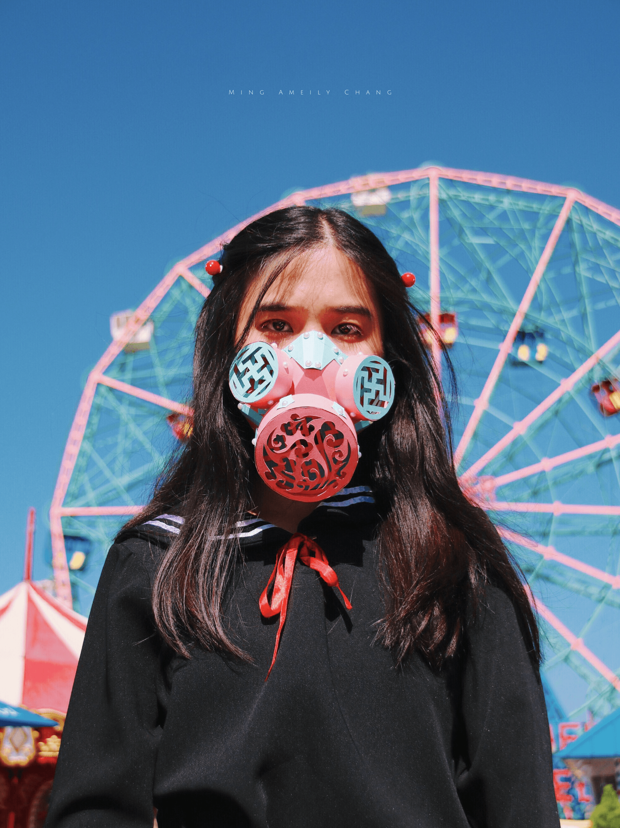
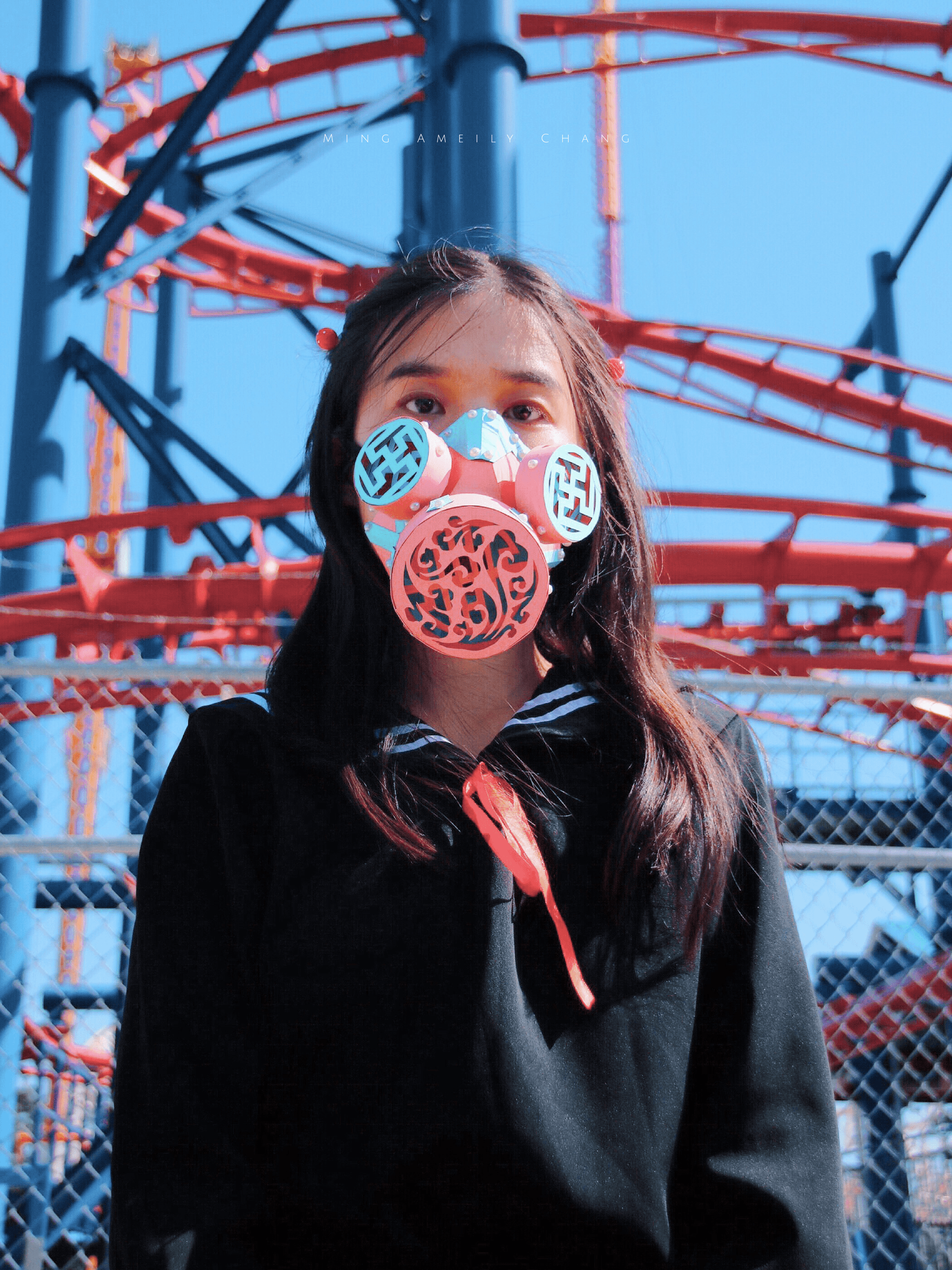
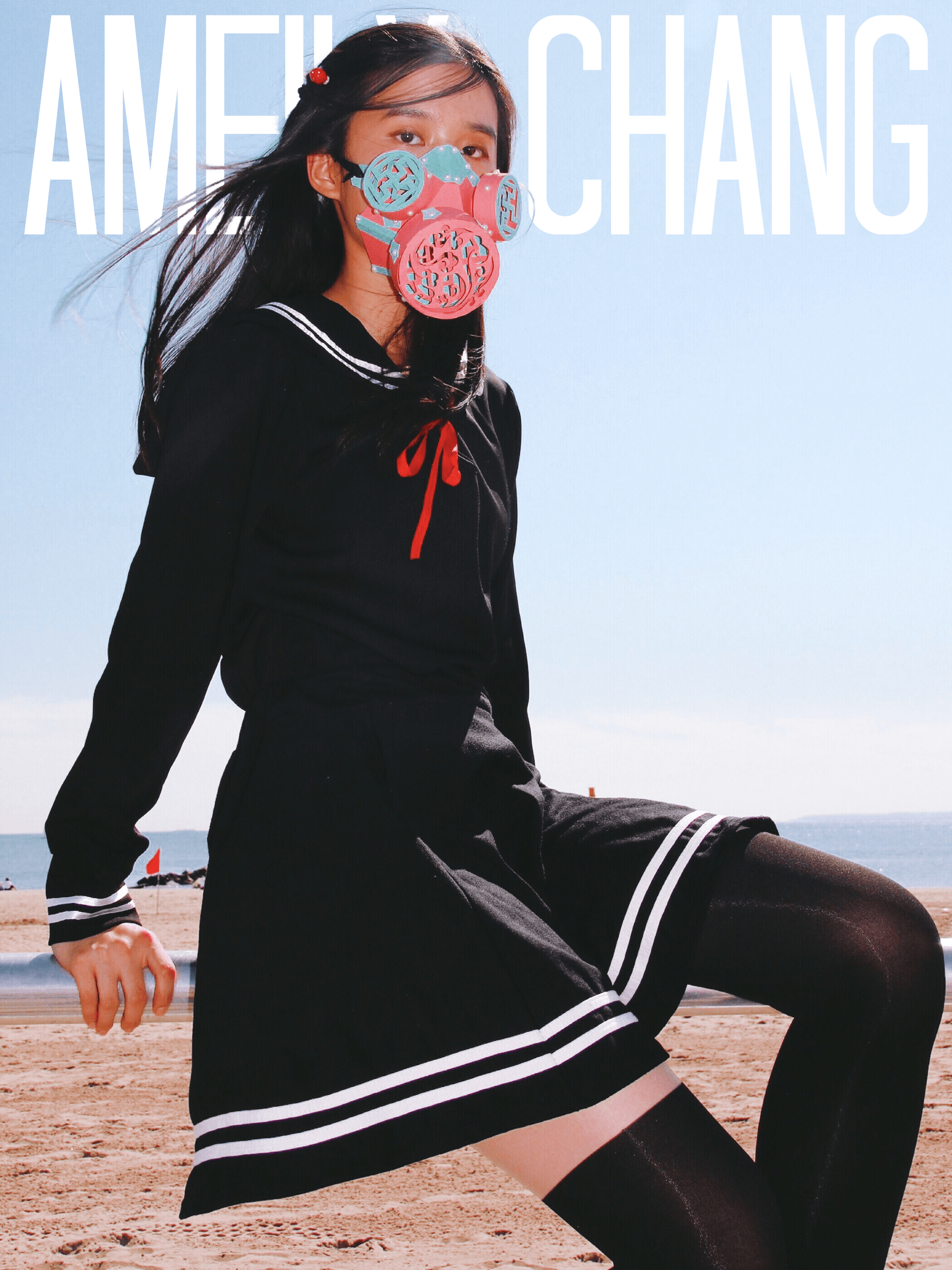
Amusement parks are where you find laughters and happiness… but really they are just lifeless, cold, steel bars, programmed to move in the same route over and over again. They are probably super exhausted, they just want to take a break from hearing people’s exhilarating screams… but no people don’t see that, because of the beautiful colors they are being painted over with. Aren’t they, in a way, also wearing a mask? It is as if no matter how lifeless, or even evil something is, as long as you paint it over with beautiful colors, they can seem totally different…. wait, isn’t that what masks are for?
The 2018 exhibition of the Costume Institue was held at The Met, featuring the connection between modern fashion and medieval arts and Catholic elements. The exhibition is up for around 5 months from May 10th, 2018 to October 8th, 2018.
As the introduction at the entrance to the exhibition says, most of the designers of the costumes displayed were raised with Catholic backgrounds. Even though “their current relationships to Catholicism vary”, I found a very obvious consistency across the costumes, in terms of the style. All of the costumes, at least the ones I saw, have this very Catholic feeling to them. From this, I could tell how influential their religious backgrounds were to these designers.
The more casual costumes are all rather conservative, they do define the contour of the wearers’ bodies very well – most of them are rather tight and fit, but there isn’t much exposing of the wearers’ skin.
Then there were the more cermonial ones, like bridal dresses.
This one shown below is an autumn/winter wedding dress.
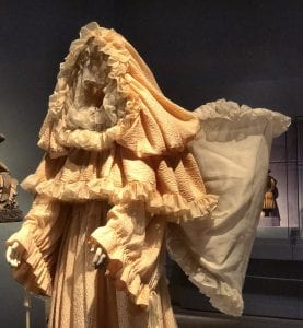
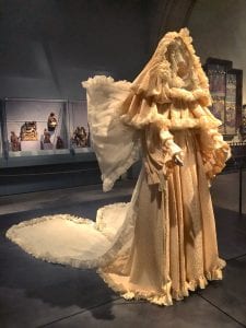
“The three pilasters depicting trumpet-blowing angels by the workshop of Giovanni Pisano provide the context for this wedding dress by Yves Saint Laurent. It’s angelic ‘wings’ echo those of the John Galliano wedding ensemble also in this gallery. Like Galliano’s creation, its connection to God’s celestial messengers is heightened through its ethereal materials. The dress and train are made of silk from the textile manufacturer Abraham, while the embroidery was completed by Madison Hurley, an atelier also known for its exquisite textiles, especially lace and tulle.”
What really caught my attention about this piece was that, it is VERY heavily layered. I did not expect it to be a wedding dress, I thought it is more like a stage costume for an angel or something. And it turned out it was trying to create an angelic image.
This one shown below is an autumn/winter dress.
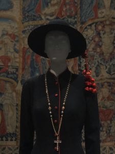
“The ‘IL Pretino’ (Little Priest) dress was popularized by the actress Ava Gardner. Included in Sorelle Fontana’s autumn/winter 1956-57 collection as part of their ‘Cardinale’ line, the dress is in fact based on a cardinal’s formal shout and trimmed with red silk.”
This dress was displayed along with a series of other similar dresses but what popped out to me about this one was the chemistry between the right dose of red reacting with the very calm, low key, stern black. This is the outfit I’d expect to see at churches. It reminded me of my mom’s childhood stories she used to tell me. My family has always been a Christian family, so going to church was a weekly routine for my mom when she was a kid. Women and girls were not allowed to wear skirts or dresses that go above their knees. They were told that the darker the outfit the better. So many of them started to really put effort into the accessories, like necklaces, bracelets, earrings, and headpieces…. I’m not sure about what the Catholic life is like but from these costumes I assume it’s not very different from the Christian life.
Overall, I realized most of the costumes had something like a hood, a hat, or something that resembles a pope’s mitre. The music played at the exhibition definitely illustrated the Catholic atmosphere well but having it on loop can become a little exhausting for the viewers.
I personally am not interested in fashion at all, but it is always a good thing to look at things I don’t usually deal with. I would only recommend this show to another person if the person is interested in this field of study.