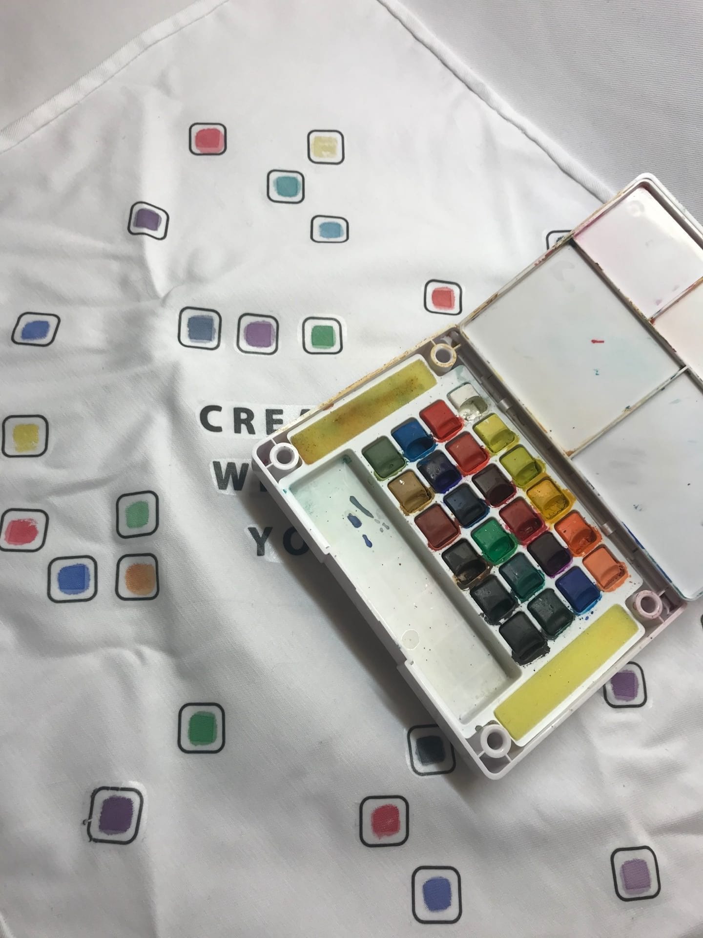
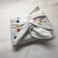
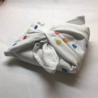
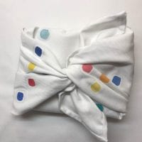
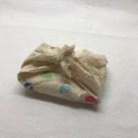
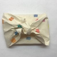
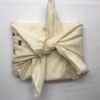
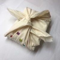
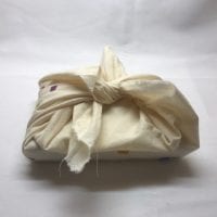
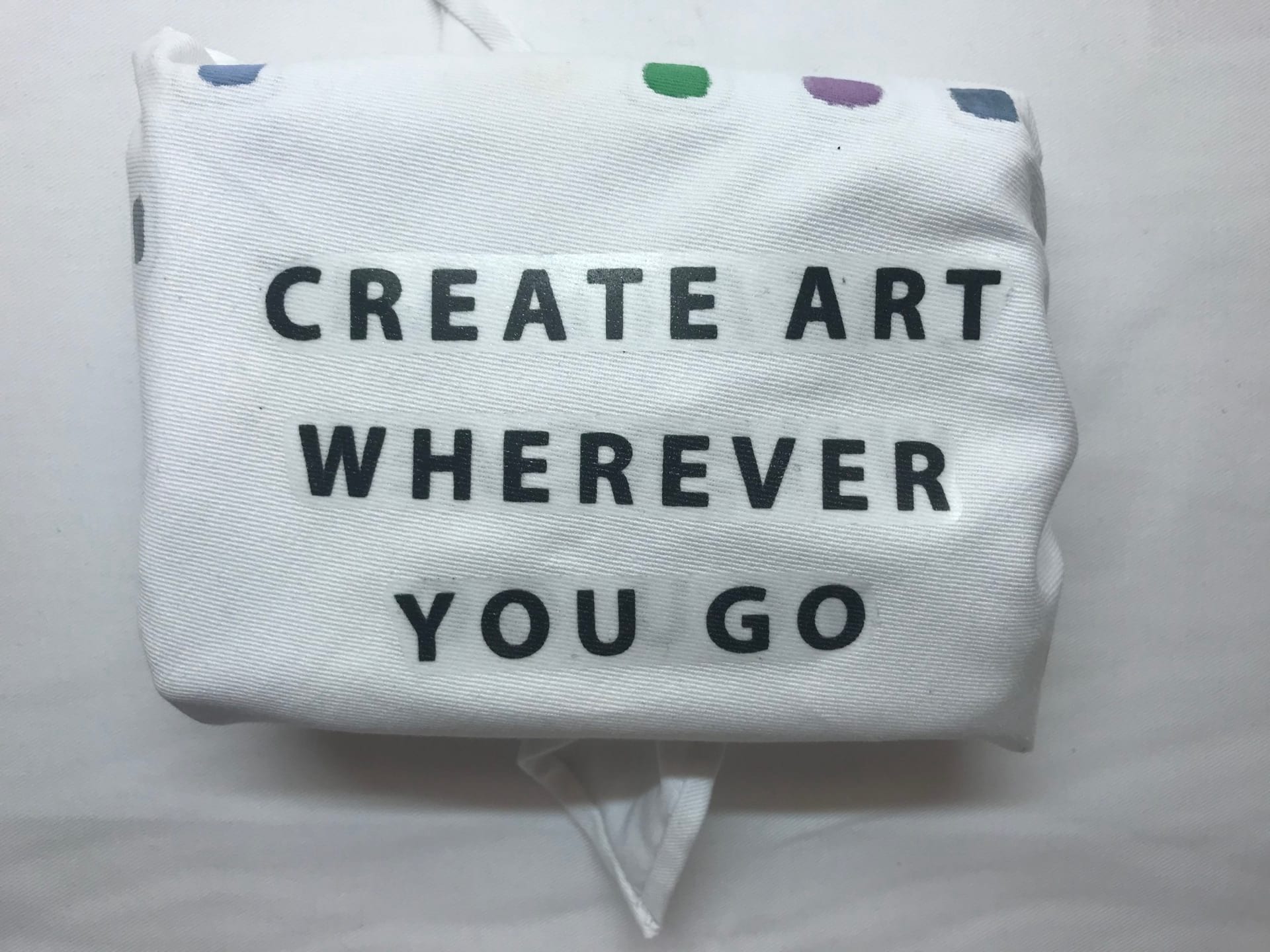
Here is my final packaging design for the first assignment. It is a painted fabric piece that is meant to wrap around and carry a travel watercolor set. The design went through many stages and this is the final outcome
Initially the packaging was supposed to be made out of a fabric like paper material that would be able to hold watercolor paint like paper and be able to tie like fabric. In order to test out some paper that I found, I created small boxes in 1/2 scale and painted the papers. Both papers were able to hold color and were able to tie but the paper became weak where it tied and the colors bled through a lot. So instead it was decided to use fabric instead.
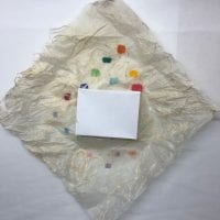
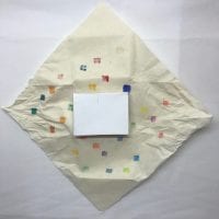
In order to test out the fabric idea, a scrap piece of muslin was used. The fabric tied a lot better and the knot was a lot sturdier. The paint however still bled through but instead of trying to find a solution to prevent bleeding, the quality was used as an advantage. Looking at the graphics idea, the one with squares on one side and the swatch on the inside could explore the quality so that the bleeding of paint could be seen from both sides of the fabric.
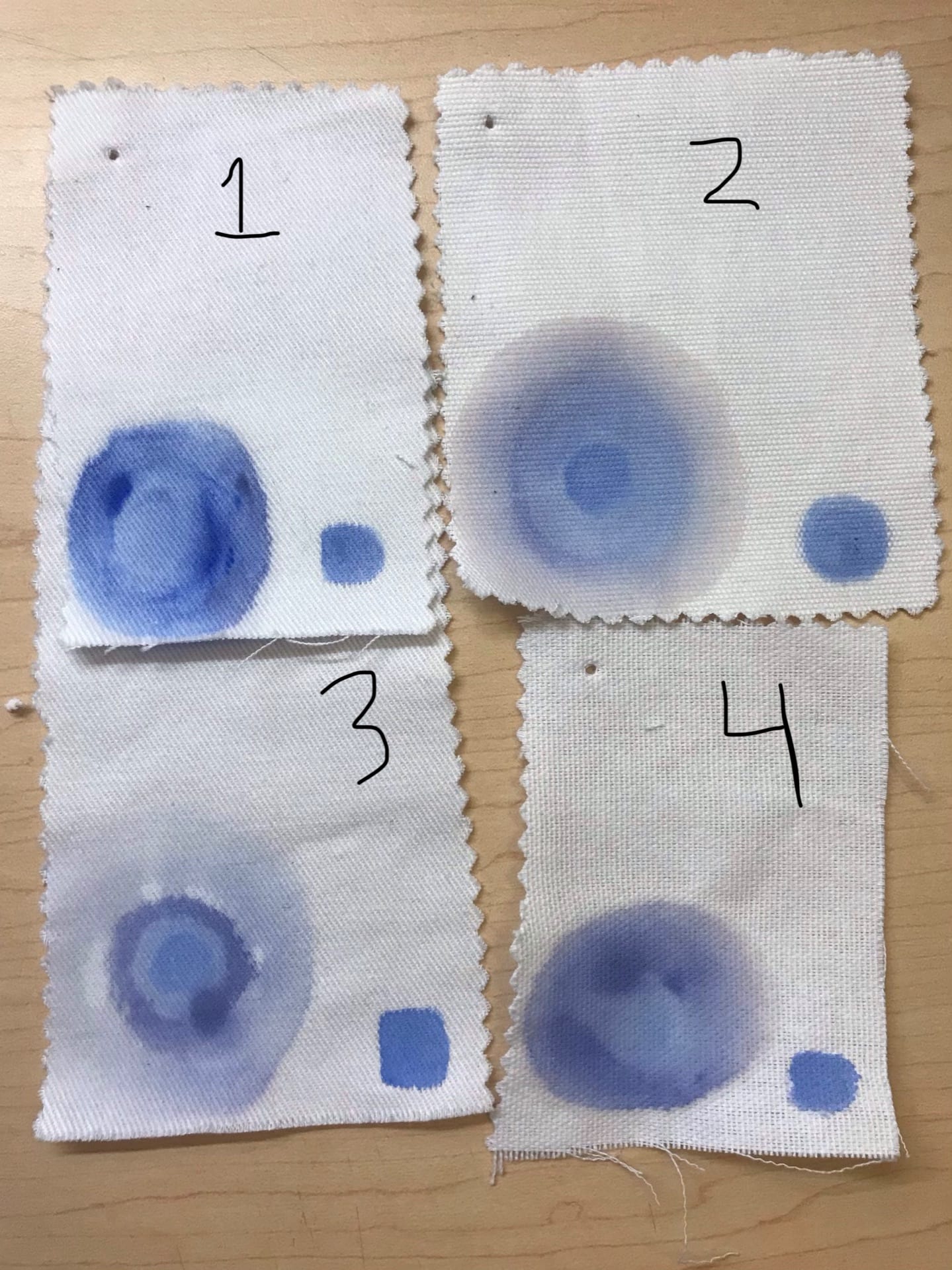
Before purchasing fabric from the store to make the packaging, I got a few samples and tested out the paint on them. I chose white fabric samples because throughout my designs, the background has always been white, unlike the muslin prototype. For the paint, I used a watered down acrylic instead of watercolor paint because it would be more permanent and it would be easy to manipulate in order to try and make the paint gradient design from my graphics ideas. After testing out the different fabric swatches, I went with number 3 because of the way the practice swatch of paint looked. And after doing these trials, it was decided that the paint gradient would be too difficult to achieve on a larger scale.
After testing figuring out which fabric to use, I had to figure out how I was going to put the typography onto my packaging. The initial idea was to screen print the fabric but because I hadn’t done screen printing before, I decided to use iron on transfer sheets instead for both the typography and the squares. This way, I could make sure the font was perfect and because it wasn’t done in paint, it wouldn’t be able to bleed through. In the end, I printed out two sets of the typography, one for the inside and one for the outside, and several squares for my swatches.


After all the trials and decisions were made, the final product was created. The fabric was purchased and cut to size and because it was fraying, the edges were hemmed with a hidden stitch. The squares are painted on the outside so that when the package is untied, the bleeding colors are revealed in the center of the different squares. When tied together in a double knot, the loops can be treated like a handle to carry the palette around. Or the fabric can be worn as a bandana or used to clean up water or spilled paint. These functions besides being packaging is what makes this design sustainable.
As for the previous week’s works:
Week 1 Typography https://portfolio.newschool.edu/breannachin/2019/02/01/typography-ideas/
Week 2 Color https://portfolio.newschool.edu/breannachin/2019/02/09/color-ideas/
Week 3 Graphics https://portfolio.newschool.edu/breannachin/2019/02/21/graphics-ideas/