Part 1: Variable Lines
- Idea Sketch:

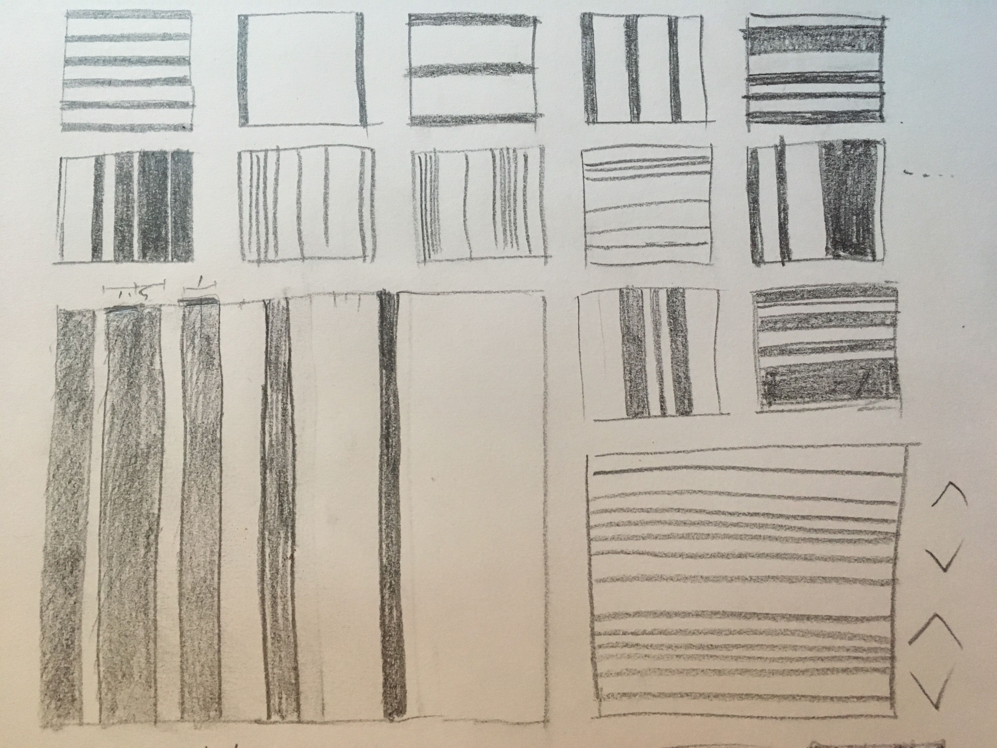


I wanted to see how lines interact with one another depending on their width and the gaps in-between.
- Completed:

It was interesting to see how the lines and the background take different roles in the whole image, depending on their widths and distances from one another. For example, in the square of the second column, the white lines are thick and closely placed on the black background. Due to the thickness of the white lines and the smallness and evenness of the black gaps, white lines seem like the background and the thin hints of the black backgrounds look like the lines. The lines and the background seem switched at some parts also in the first and last four photos of the third and fourth columns.
More importantly, the design—composition and placement—of lines created even greater variety of interpretation. For instance, let us look at the third photo of the first column. The black strips of background, individually, look more like lines than the actual white lines, due to their thin widths and orderly placement on the square. However, as part of the whole square, the white think lines look more like the lines despite their thickness, because they are located closer to the center than the black strips. Because the black background take place at the edges of the square, they have clearer impression as the supporting role, letting the white lines to be the center of attention.
Part 2: Permutations
- Squares on Illustrator:
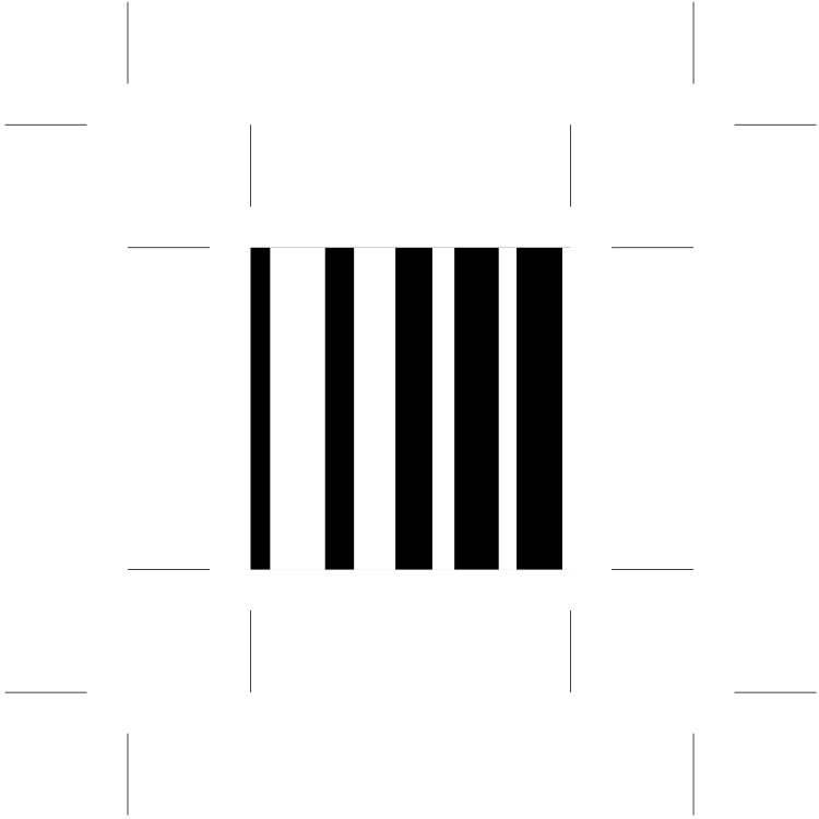

I chose the one in which the ratio of gradual diminution for the lines and the gaps are similar, but directing the opposite. I chose this one because both the white and the black evenly look like lines and backgrounds depending on their positions, widths, and relations to one another.
And then I edited the widths and lengths of the white lines to create a variation of the original square. It was interesting to see how the four thin lines coming from the opposite ends create an invisible, non-existent line in the middle.
- Mop Copy on Tracing Paper:
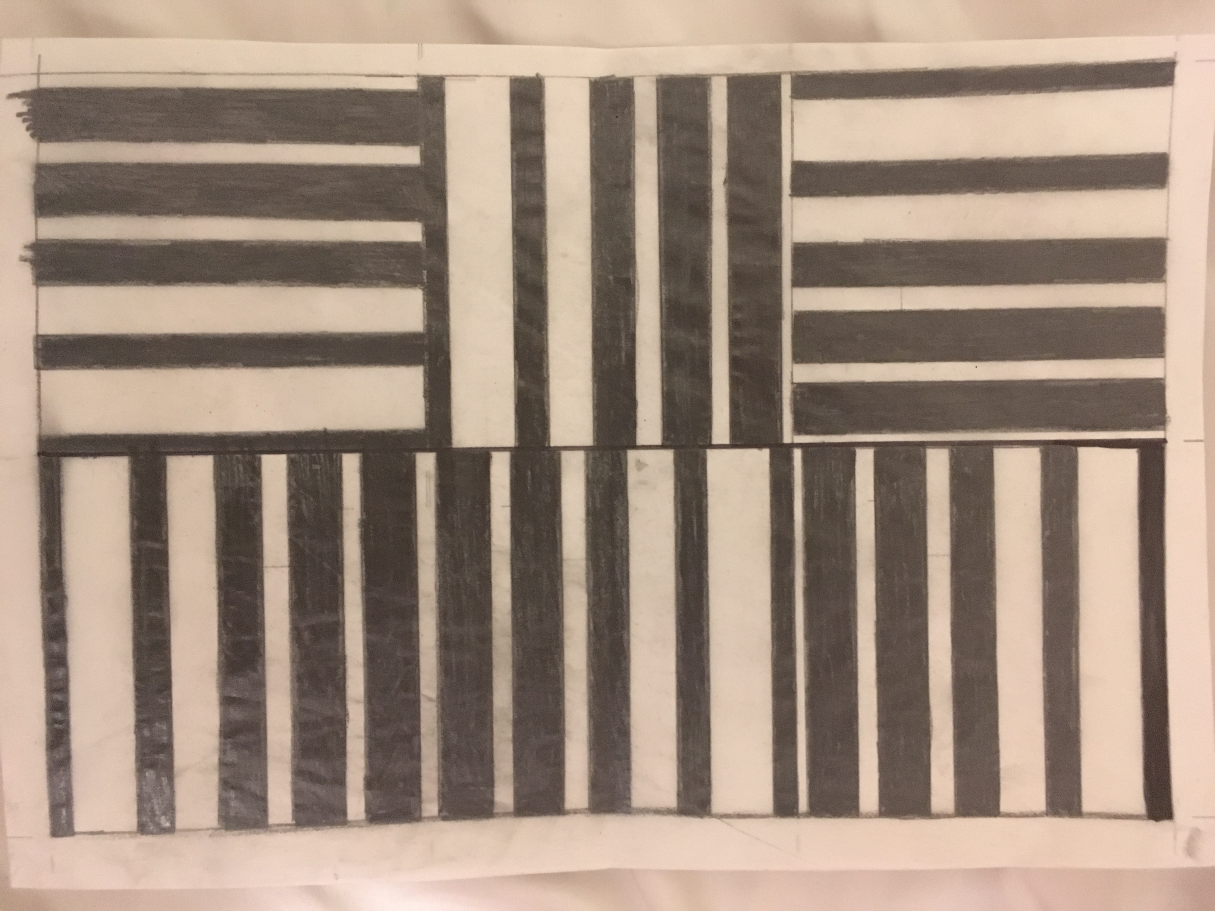
I made the first column of my grid into a pattern, the second column one connected shape.
Part 3: Parameters
- Original:

- Variation:

I shortened the lengths of some lines to create more layers to the pattern, including gradual changes and mosaic/computer-related images. But I lost the connectedness of the second column instead of connecting the two middle squares of each columns. I created more images to see what other variations can take place.
- More Square Variations:

I divided the lines and added colors to them. I used white-black palette that includes different tones of gray. I also tried a completely different method outside the dynamics of lines and used ellipses instead. But I ended up not using any of these new squares!
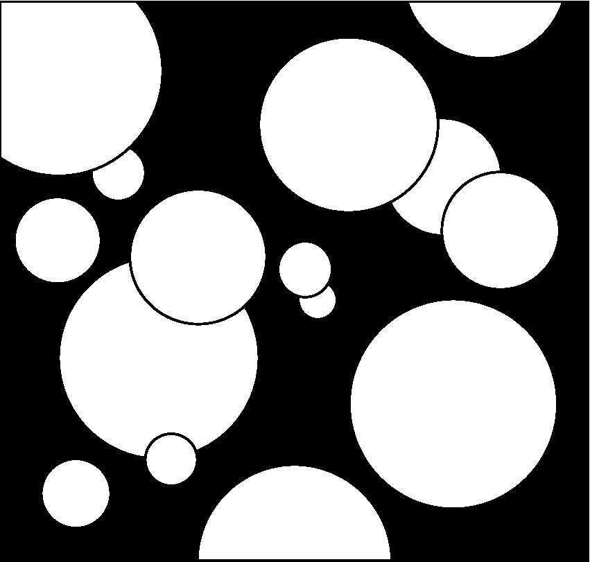
- Final:
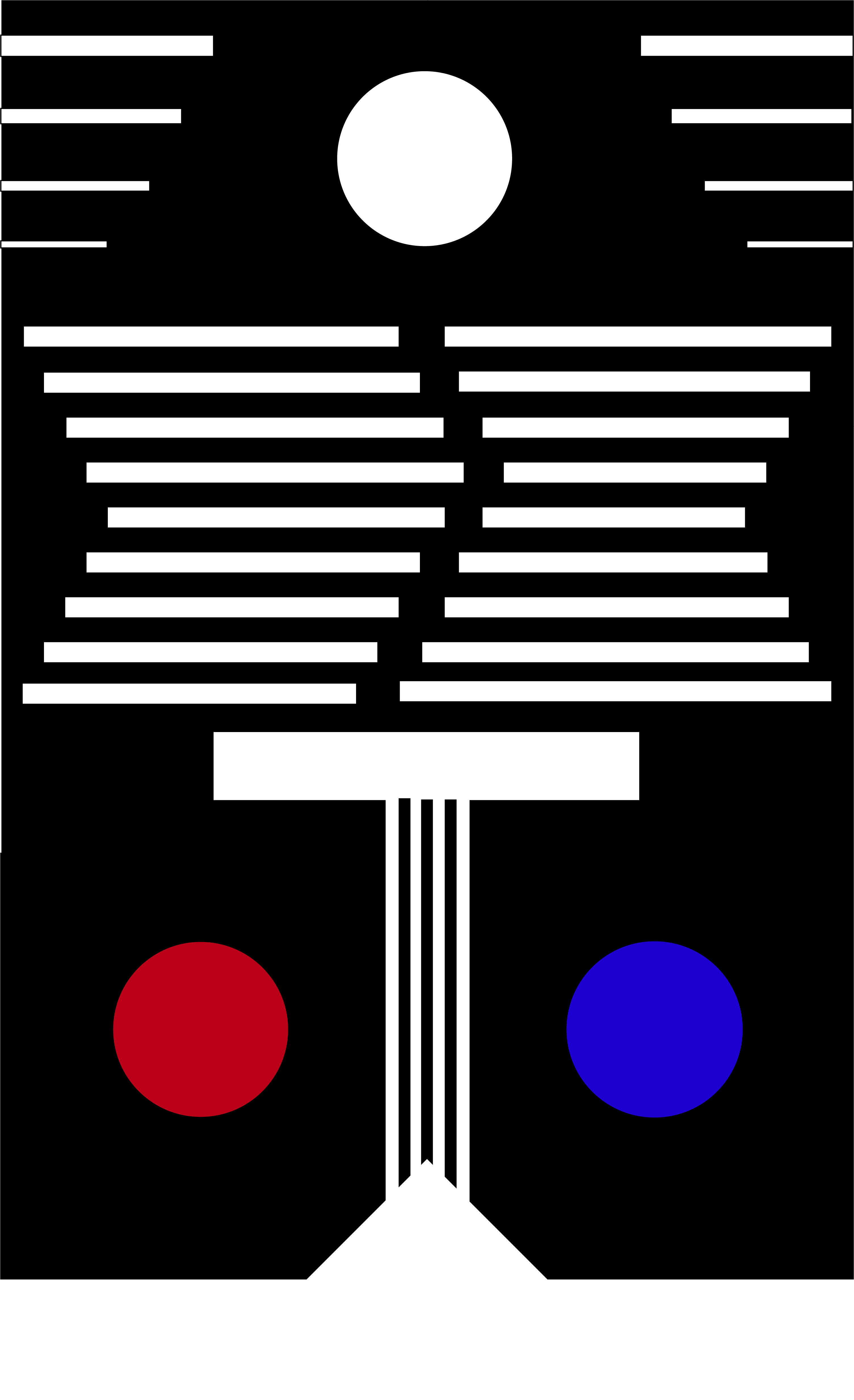
My final piece became a pixelated altar in a temple. I wanted a story or narrative that would evoke the viewer’s imagination, so decided to make my piece one picture. Seeking for a theme, I played with the lines of my grid. After changing the lengths and positions of the lines for a while, I created the main part—the standing altar that has thin columns for its body. The lines above it represents the energy coming from the altar as well as the walls of the temple. They claim lots of space in the image, and create a visual confusion due to the imbalance created by the middle gap in relation to the overall balance of the two crooked columns. The red and blue circles represent fire and water, two of the basic elements, balancing next to the altar. The white circle and the gradually decreasing lines on the top may represent either the night sky looking down on the temple or part of the decorations in the temple.
I am surprised by how the simple lines in the initial stage could transform into one picture with stories in itself. It was valuable to see the progressions, decisions, cancellations, and changes I made during my process. I’d like to improve the final image by spending more time to learn better Adobe Illustrator skills, so I can adjust the sizes of each shape to create better balance of the overall picture. I’d also like to get rid of some lines in the middle and make the altar a little bigger, to emphasize the theme. I’m excited to learn how to use Adobe Illustrator better and create my own image with narratives.