
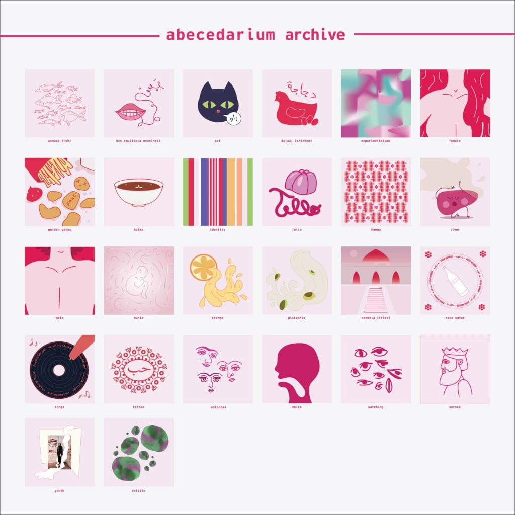
Objective:
“[To] create an abecedarian obsession archive. Beginning with the letter A and going to the letter Z, name 1 obsession or curiosity for each letter of the alphabet.
Example:
A is for androgynous apparel.
B is for botox.
(The phrasing of each one can vary. The main idea needs to begin with the letter of the alphabet)
For each obsession you name or label, create an image (digital or analog) that represents that obsession. Make sure the visual representation captures the tone, mood, and spirit of that obsession.”
Archive List:
Final Archive:

Reflection:
Unfortunately, I was not able to attend the class critique as I had some personal matters to attend to, however, I asked some of my friends about what they thought. They mentioned two major points. The first being that they liked the color scheme and the overall aesthetic, but it could do with a bit more consistency as some of the illustrations were multicolored while others only included with red and pink. The second point was that the work was more simplistic than most of my other work.
In regards to the color scheme and aesthetic, I understand where they were coming from. The colors are not consistent, but should they have to be? I prefer the more intricate and disjointed harmony that the piece created. I will mention, however, that there are a few points where the colors almost seem to be grouped, namely between A to B and T to X. What I could do to benefit the composition would be to spread the multicolored and monochrome pieces more evenly. This would mean that I would need to add color to certain pieces. If I had another week to complete this project I would work on that.
As for the style of the piece, I agree that it is very different from my normal work as it is softer, cuter, and light-hearted. Although true for some aspects such as “cat” and “jello,” this is largely untrue for other letters that relate to darker or more personal themes. Regardless, as an art and design student, am allowed to experiment with my work and develop it.
The three obsessions I feel most curios about are “identity”, “golden gates”, and “watching.” The reason for this is because I am mostly interested in how people identify themselves and how others perceive who you are. Growing up as a biracial Omani citizen, where one lineage is completely foreign and the other is of immigrant background, I always felt disconnected to all of my identities. Furthermore, I am also interested in the other (the society, populace, etc.), where their role can be a force of validation and acceptance as well as judgment and arrogance.