For this Bridge assignment, I had to choose an object and create five visual artworks that reflected my reactions to this object. My object was an 8×4 inch notepad.
I purposefully made all the negative representation torn and chaotic and all the peaceful pieces smooth and whole. How they were executed aided in the messages I was trying to tell.
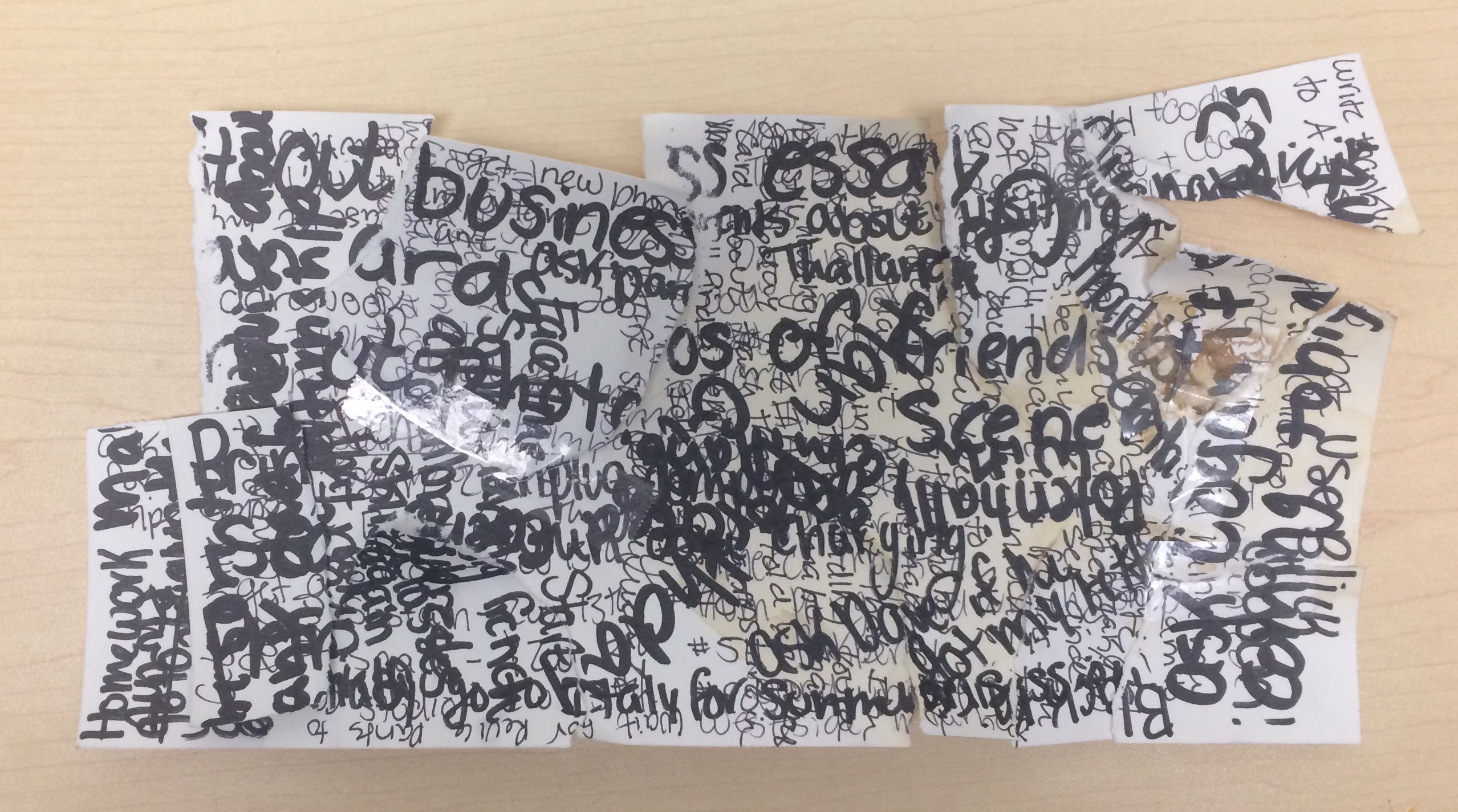
“Ironic Chaos”
I wanted to create a piece that reflected the chaos in my head when I don’t write notes or lists down on my notepad. The word I chose for this piece is chaos. I asked myself “What does chaos in my brain look like?” My idea was to write a lot of notes down on one piece of paper so that they were all overlapping and it was illegible. I then tore off pieces and messily taped them back together. Next, I spilled coffee on top so that parts of the piece were stained an ugly brown. I chose to make the piece using Bristol paper because I wanted it to be stiff. I then chose to write the words in different sized sharpies because I wanted some sentences to be big and bold, and others to be thin and small, hidden in the background. I used clear tape because I wanted the imperfections under the tape to be visible. I named the piece “Ironic Chaos” because it is a visual representation of what my life looks like when I don’t write things down. However the piece is ironic because I had to write things down to make it.
This piece is a reflection of my brain. I become unorganized and my mind races when I try to remember lists and tasks instead of writing them down. It’s a mess and I unsuccessfully try to keep everything together. Also when I’m stressed I either sleep a lot or try to stay up so I drink coffee. This only happens when I don’t write things down that I need to do soon. I don’t need to write everything down that I need to remember. I actually detest keeping journals or diaries because I find it exhausting writing every detail of an event down. That makes the piece ironic too because somethings drive me crazy it I don’t write them down and others make me crazy if I do.
“Place on the Rocks Drawing”
For the next piece I wanted to make a representation of the place I visualize when I’m trying to destress and bring myself to a state of calm. My question to myself was “Can I reflect this utopian place accurately when I don’t have a photograph to base it off of?” I knew I wanted to create a drawing that was peaceful and accurately reflected my vision. I made it cartoon like because this place is a state of mind, it isn’t real. If it was drawn supper realistically that would defeat the purpose. It’s not supposed to be a real place. Again I used Bristol paper because I wanted the piece to have some rigidity. I used oil pastels because I like the smoothness of them and they are easy to blend. The word I chose for this piece is serenity.
First I took a photo of my hand holding the notepad so that I could accurately depict this part of the drawing. I decided to include this in the final piece because I thought the imagery looked too vague without it. I wanted to show that writing things down on this notepad allows me to enter a state of calm and therefore transports me to this place on the rocks where I look out over the ocean.

I then sketched the image out with pencil and filled it in with oil pastels.

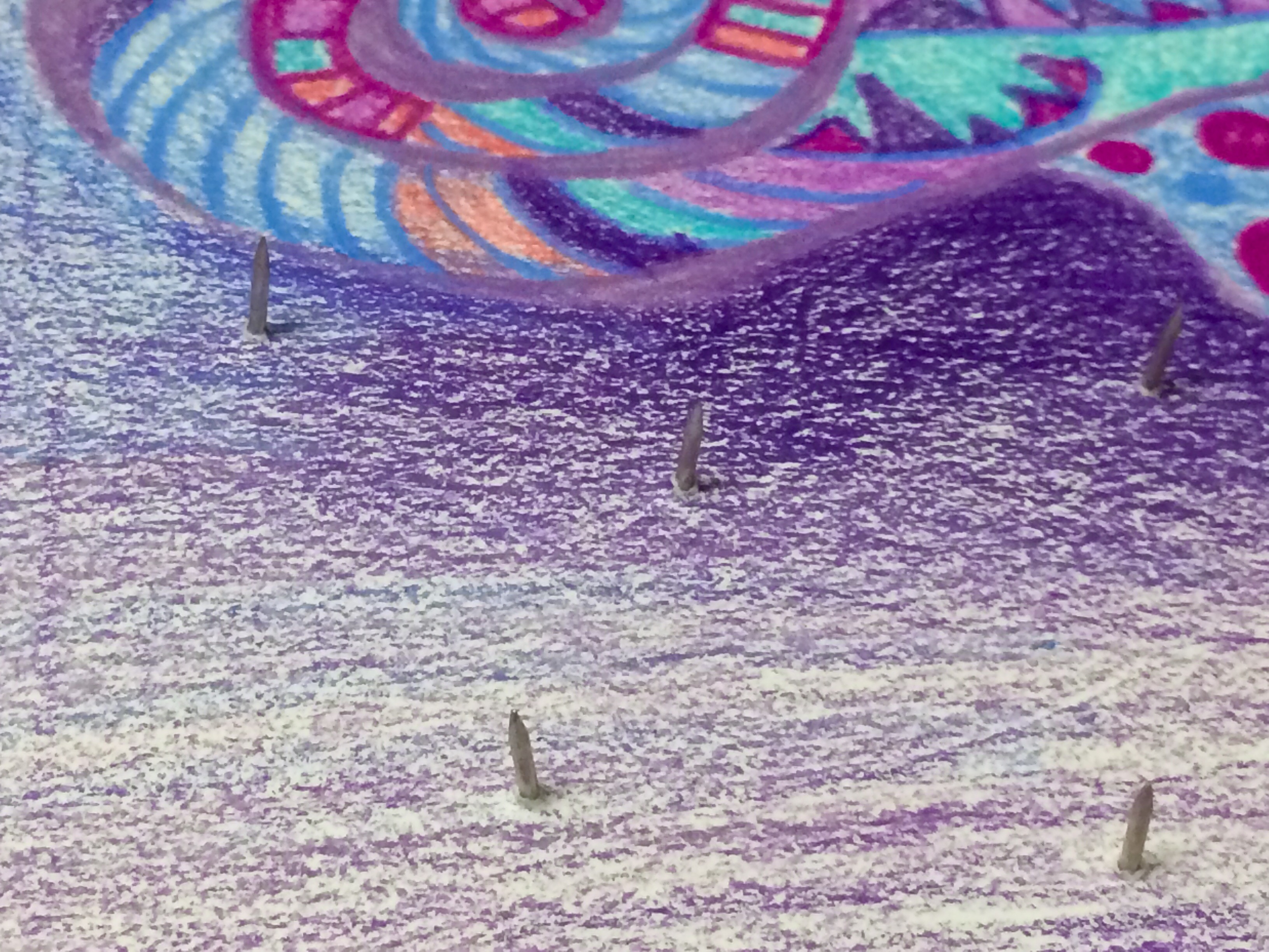
“Vulnerability Through Self Expression”
For my third piece, I had initially made what a piece of scrap that hangs around the bindings of my notepad looks like. However I found the finished product to look cheap. Also I didn’t like the concept and explanation I had strung to it. Therefore I thought the idea out and started again.
“Vulnerability Through Self Expression” incorporates a design that I often create with metal hardware representing the vulnerability that someone is exposed to when they genuinely express themselves. When I write something down on my notepad or anywhere else for that matter, I’m often being fully honest and therefore exposing myself to any harsh critiques. However people’s comments or reactions don’t stop me from doing what I love. The word I chose for this piece was vulnerability and my question was “How can I physically express vulnerability in this art piece?” I answered this by making the viewer vulnerable to the spikes on the paper. I made this piece out of Bristol paper and colored pencils. I added a metal gage and push pins. First I drew the designs. Then I added the gage in the corner by using a push pin to puncture the paper. I then added four layers of paper to the back of the drawing so that the push pins would be more secure after they broke the surface of the drawing paper. I then taped the pins to the back so they wouldn’t fall out.

“Place on the Rocks”
For the fourth piece, I had initially wanted to scan the messages in cards I had received and then arrange them in Adobe Illustrator. On top of them I was doing to write “In 2018, it’s a different kind of communication.” I then scanned the letters but after arranging them on my computer I realized I didn’t want to go through with this piece. I liked the idea however it wouldn’t be that visually interesting.
I wanted to write out and describe the place I visit when I’m alleviated of stress after writing down the lists of things I need to do. This piece fully explains the importance of a notepad to me. I thought “Place on the Rocks Drawing” described the scenery that I envision well but I wanted to add in more of my opinions that couldn’t be conveyed through the drawing. The word I chose that represents this artwork is utopia. My questions was “How can I fully express this fantasy?” I decided to write out what I experience when I’m calm. First I wrote it out on my laptop so I could refine my ideas and make sure my spelling and grammar was correct. Again I chose Bristol paper and I wrote my thoughts down with a thin sharpie.

After I finished writing it, I added little drawings on top to better convey the meaning. I used colored pencils to add a bright, warm sun, clouds, ocean waves, and the cliffs.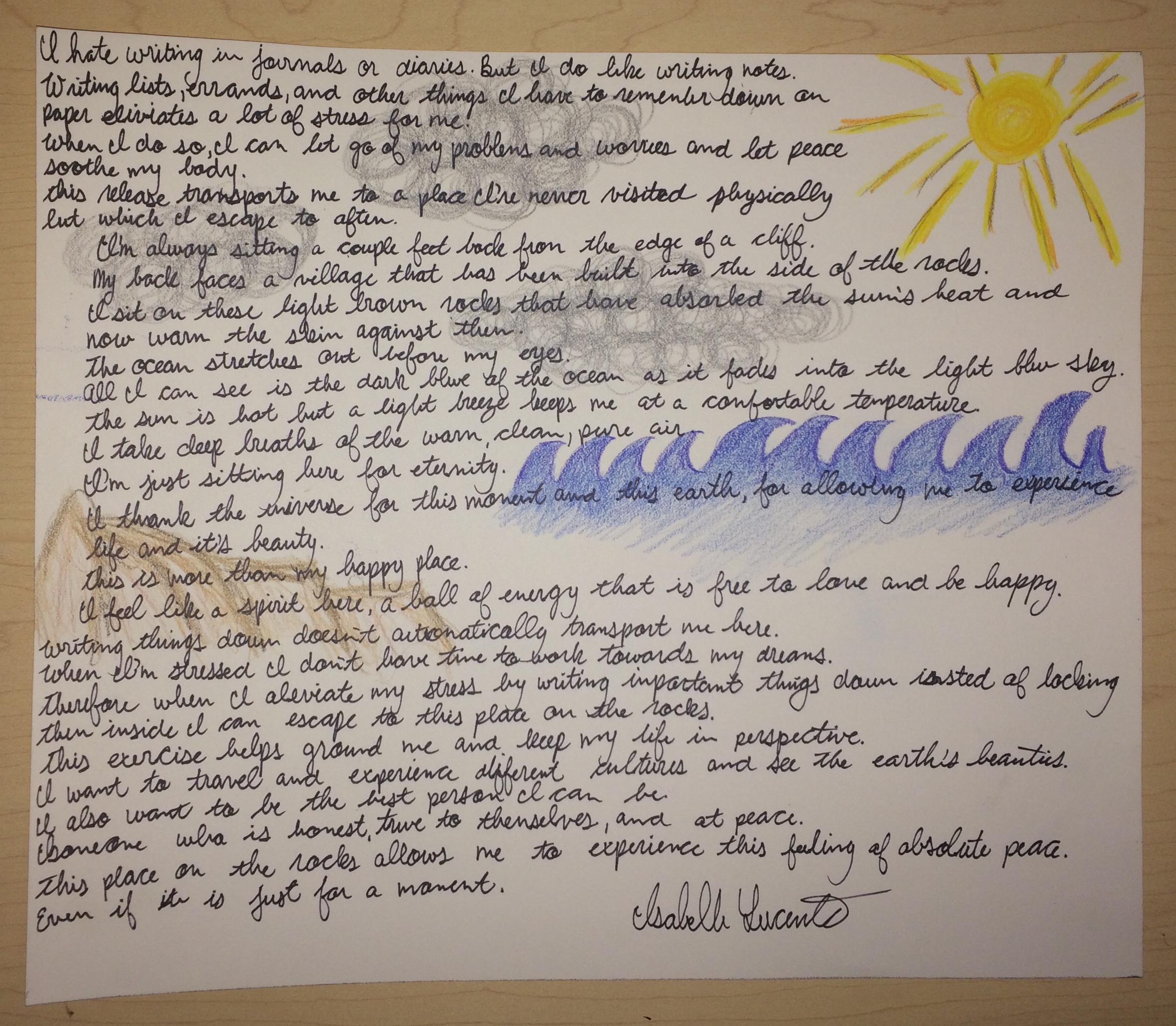
“Flashing Chaos”
For the final piece, I wanted to make another, different representation of what happens when my mind is filled with lists of things I need to do. I questioned, “How can I visualize the same concept as ‘Ironic Chaos’ yet use different mediums and techniques to give the viewer a better understanding of what I’m trying to convey?” Again I used Bristol paper. I colored to background black with thick sharpie. I then printed out some of the photographs taken during this school year. I cut them into fragments and pasted them around the black paper. I then covered the piece with tracing paper so the people and places were blurred. Finally I cut shapes and designs into the tracing paper to reveal snippets of the images. This piece is meant to reflect the chaos experienced when I can’t artistically express myself by writing and making artwork. I loose track of my goals and plans and past thoughts, ideas, and actions get blurred as I become stuck in a purgatory where I can only think about the lists of tasks I need to do before the day or week is up. A barrier presents itself in my mind when I’m stressed that prohibits me from seeing the good in my life. The word I chose is purgatory.

Overall I enjoyed this project. I equally enjoyed doing the written explorations and descriptions of my object in seminar as I did working on these visual representations of my internal feelings associated with my notepad. I think write about artwork and actually making artwork go hand in hand and allow me to fully express what I’m trying to get across. This series enabled me to express my thoughts and feelings of stress and calm in different ways and has definitely made me more introspective and aware of feelings inflicted by objects around me. This project has also taught me about the importance of the objects I surround myself with and what they reflect about me.