PROCESS:
We first explored different mediums through experimentation…
When I first started the work, I was surprised at how long it was taking– I completely underestimated how much thought would have to go into making each field unique and purposeful. Even though I enjoyed the graphite/charcoal element because I always lean towards graphite in all art I do, the ink page was the most helpful. In fact, if it weren’t for this assignment, I probably wouldn’t have introduced ink into my diptych project. I did have difficulty with the charcoal since I found it to be too uncontrollable, especially since I like to exclusively use “tight” mediums.


FINAL PRODUCT:


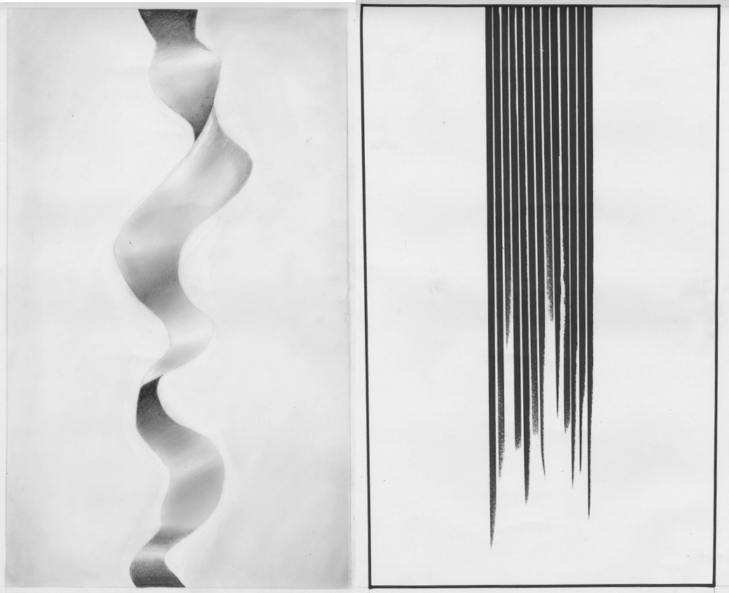
This piece deals with two different forms of nostalgia. The first panel is made up of a thin ink border and several thick ink lines uniformly drawn side by side that fade towards the bottom, leaving a white space. By drawing the lines quickly, and making sure to lift the pen off of the page gradually towards the bottom, I incorporated an element of texture at the end of the lines. The second, however, is done with graphite and has a soft, winding, ribbon-like form flowing vertically down the center. Here, I wanted to emphasize the smooth nature of the form through shading. Aside from one of the lines in the first panel coming out slightly curved, the final product matched my vision perfectly.
The first panel represents a more harsh and unhealthy form of nostalgia in which people stay stuck in the past, constantly reminiscing and usually romanticizing a past phase of their life. The second side still has moments of darkness– which I don’t intend to criticize– but the ribbon still flows on and finds light, which represents newfound opportunities, happiness, and gratefulness.I chose these because I’ve moved around a lot throughout my life so far and I’ve seen both forms in myself and in others, but I only realize my unhealthy habits one I graduate to the state that the second panel illustrates. My parents did too, and no matter how hard I pushed, they wouldn’t let me visit the city I just moved away from until I was happy living where I had moved to. Although I was mad at the time, it kept me from staying stuck in the past. In both panels, the downward movement was intended to represent the passage of time, and the incomplete and jagged end to the lines in the first panel indicate a reluctance or inability to move on. This contrasts the flowing and complete form in the second portion of the diptych.
With this piece, I engaged continuance, direction/orientation, axis, and density. My mark making grids forced me to experiment with the thick sharpie, which ultimately ended up being instrumental to the diptych even though I never really use much other than graphite. I rarely do abstract works that aren’t of a specific subject, so for this I didn’t have a particular artwork in mind but I did want to make it very clean and minimalistic.