PROCESS:
We first selected an image of a painting from the museum trip, and a still life line drawing to manipulate.

Piero D’Argentina, Michelangelo

Museum Card

My still life line drawing
We then used photoshop to create the digital collage after an in-class tutorial.

Screenshot of the process

Color Palette
FINAL PRODUCT:
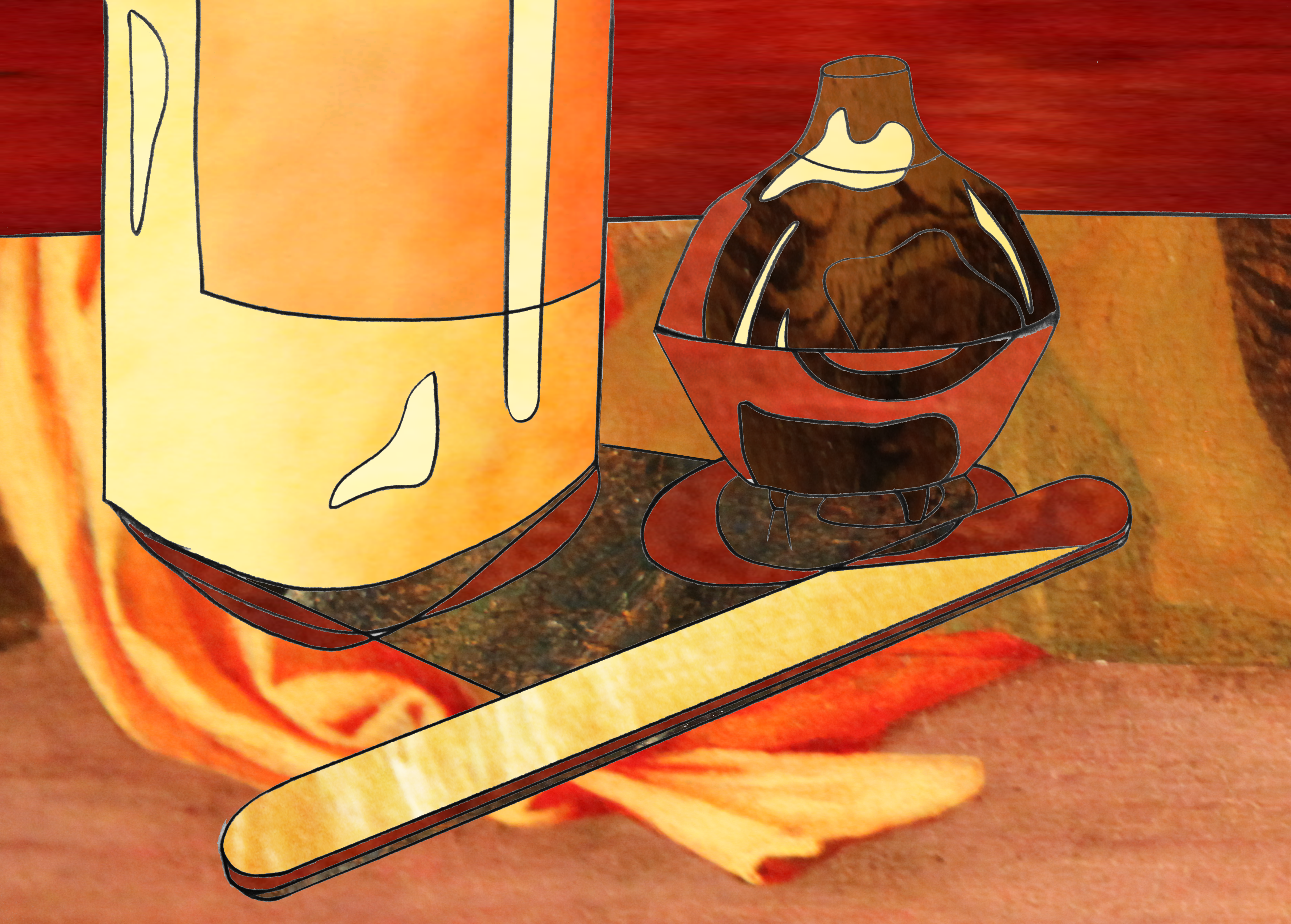
First Iteration: Fill in using swatches

Second Iteration: Fill in using solid color

Third Iteration: Combination of both color and swatches
STATEMENT:
By using the siting stick technique we learnt in class, I created a line drawing to define both the shapes and the value groups within and around them using graphite. I then photographed and manipulated the photo in photoshop. Both in high school and last semester I had to use photoshop in various classes, so I felt comfortable creating masks and playing with color. I found that creating the palette before I began collaging significantly optimized the process, making it much quicker. As well as this, I had never split my screen in photoshop, and I will use that aspect heavily in the future– this also saved me a lot of time. Due to some experience with photoshop, I felt that I could comfortably use and experiment with adjustment layers and altered opacity to create a slightly larger range of value to make the pieces seem more complete. For example, in the third iteration, I used a swatch from the painting but decrease the opacity, and placed a bright color beneath it. This way, the color below was still translated well, but was essentially made more interesting with the texture of the painting.
However, I did struggle with finding different hues because I only used a close up image of the painting rather than the entire work. Because of this, everything was very warm toned with little variation. In order to achieve a high key collage, I made a piece of the painting black and white, and I only had one main dark area. Although it makes the finished product slightly less consistent, I feel as though the darker brown adds just enough contrast to make it interesting without losing the overall lightness. Aside from this, the sheer amount of layers involved started to become overwhelming as I progressed through the project. Overall, I enjoyed the process of making these pieces.