Bridge 4- Write 3 letters hinging around significant moments in history from the artist’s perspective. Illustrate, embellish, create works to accompany the letters and bind them in a book form. Use images of the artists work and your own images that you think the artist would have made, collected or seen. Use archival images, works of artists in their circle, etc. You can use quotes both by and about your artist, but they must be footnoted.
My chosen artist is Vivienne Westwood.
Planning-
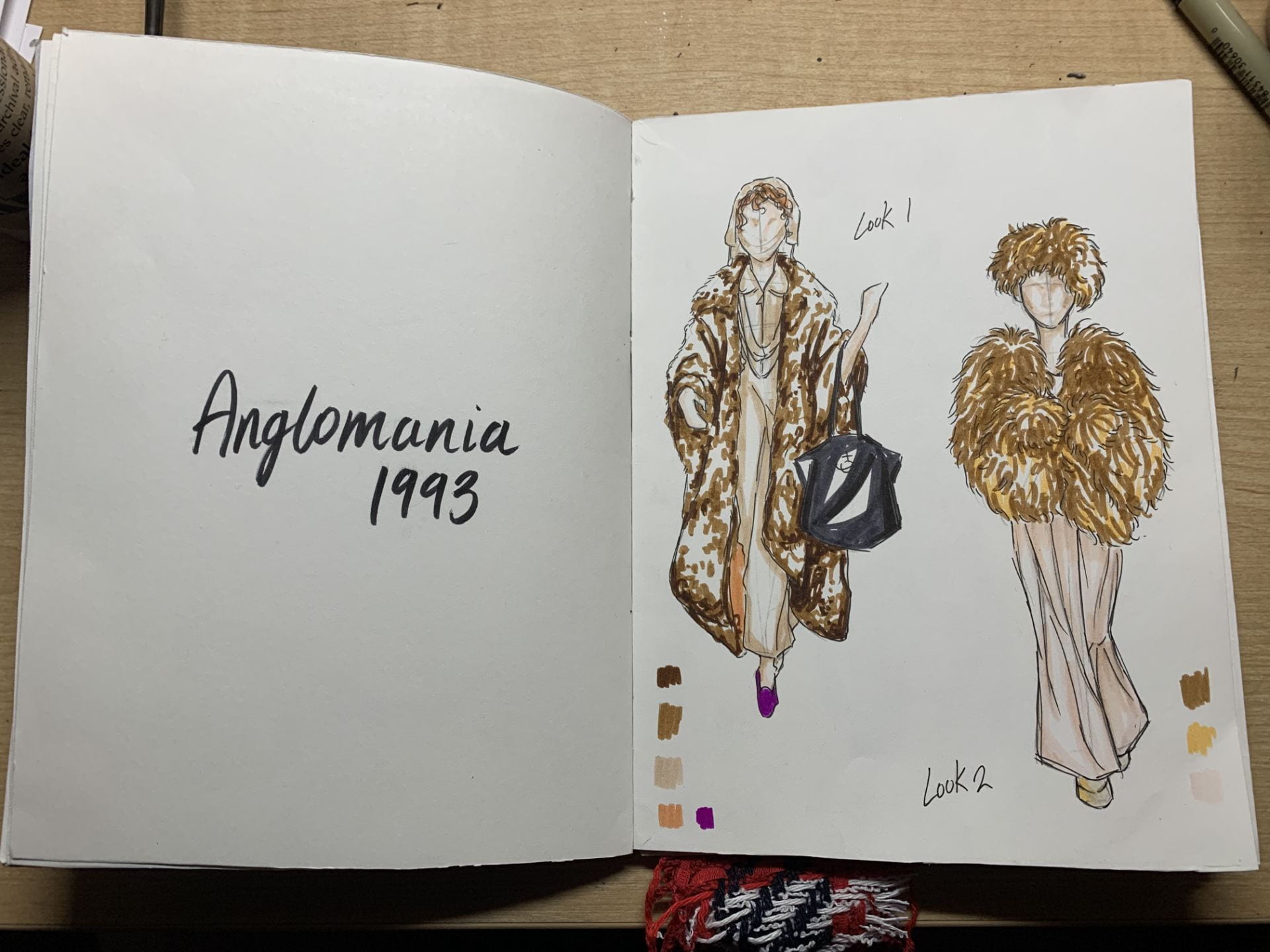
The first thing I did was plan out the book, thinking about the time period I want to base the book in and how I want to bind my book. When I think about Vivienne Westwood, I think about fashion because that is the essence of who she is, she expresses herself through fashion and she expresses others through fashion too. Thus I wanted my book to focus on her fashion sketches and designs as an independent artist after the London Punk era. I drew mindmaps to visualize the facts and knowledge of different important collections Westwood has and how different events and people can be linked to each collection. Westwood has many iconic collections but I decided to go with Anglomania AW 1993 because it began a trend that is iconic to Vivienne Westwood today, her use of tartan in her designs. It was also her first collaboration after marrying Andreas Kronthaler. It was also a collection that featured one of the most gorgeous bridal designs worn by Kate Moss- someone who became a close friend to Vivienne.
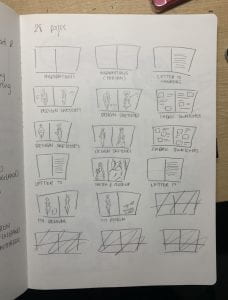
I then planned a rough idea of what I wanted to include in the book and drew how each page will likely look like. I wanted to create a sketch book/ journal type book where Westwood would record her inspirations and design sketches for the collection.
Book cover and binding-
I was inspired by this flip book at Blick that had a hard supporting back cover and a flexible/ flippable front cover. I decided to create something similar but my binder will be on the left side not top.
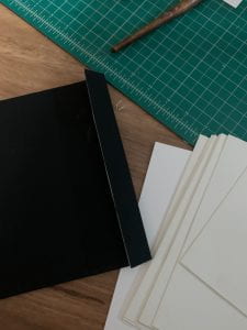
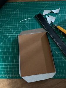
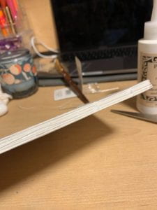
I started by cutting drawing paper into rectangles that can be folded into roughly A5 size and made around 8 signatures. For the soft cover I used bristol paper that was a bit more sturdy, I measured the size of a page and added the thickness of all the signitures and an extra flap to stick to the back cover. I creased the lines with the end of my olfa knife and used the bone folder to fold the edges. For the back cover, I deconstructed the flip book I bought from Blick in order to used the back board.
For wrapping, I used black book cloth which had a similar effect to leather (punk aesthetic), I measured the covers onto the cloth. The front cover was exactly to size whereas for the back cover, I cut out a smaller rectangle and a larger rectangle (one for each side of the cover). I glued them the on with PVA glue.

For the stitching, I used normal sewing needle but a thicker one and white linen thread. On the fold of each signature I had already made 4 holes for the stitches. I used a kettle stitch to sew each signature together and applied PVA glue on the binder to stick it to the front cover. I put heavy objects onto of the book to flatten and keep the parts together.
Contents of the book-
The pdf above includes most of the content in the book, I began by doing everything in pencil, sketching out the designs and writing the quotes and notes. I experimented between a brush pen and a calligraphy pen. A brush pen was safer and easier to use whereas the calligraphy pen was able to create interesting effects with the writing and ink splatters.
I outlined each fashion sketch with a fine liner but left some pencil sketches/ lines to add to the ‘sketch’ like effect. I couldn’t really find any of Vivienne Westwood’s actual design sketches online so I did not know what her style was like for her sketches so I just did them how I think she would. I then used these Blick water-based markers to add the colour and details- I thought it looked cool with colour swatches so I added those too.
And what is a fashion sketchbook without fabric swatches. So I went to Mood Fabrics to get swatches and silver studs. I tried to find fabric that looked as similar to tartan as possible and fabrics that would match the colour palette of this collection. I hung a piece of the fabric out because I thought it added to the look of the book- like Scottish kilt that Westwood was inspired by- and also glued studs to the front cover to give the 1970s Westwood punk feel.
Reflection-
Overall, I really enjoyed this project. It was challenging but it taught me a lot of new things such as book binding, I watched a few Youtube videos on book stitching. It was also really interesting to put myself in the shoes of my artist and think about how the artist would make it themselves and what they would do in it. My favourite part of my book would probably be the designs, I think it is the highlight in my book. On the other hand, it was very time-consuming to make a whole book and I found it difficult to understand and find personal information on my artist, I would’ve liked it if I was able to discover more about Westwood’s thoughts on designing this collection and why she did it. Bridge 4 also connected very well from Bridge 3, having done research on Westwood already I was able to approach this project much easier than if I hadn’t and it allowed us to see our artists from a different and more personal perspective.