

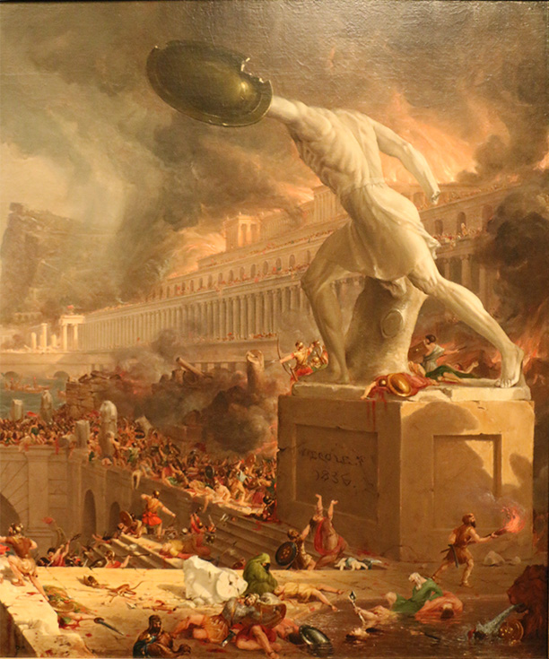
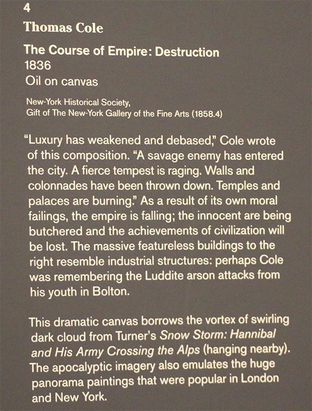
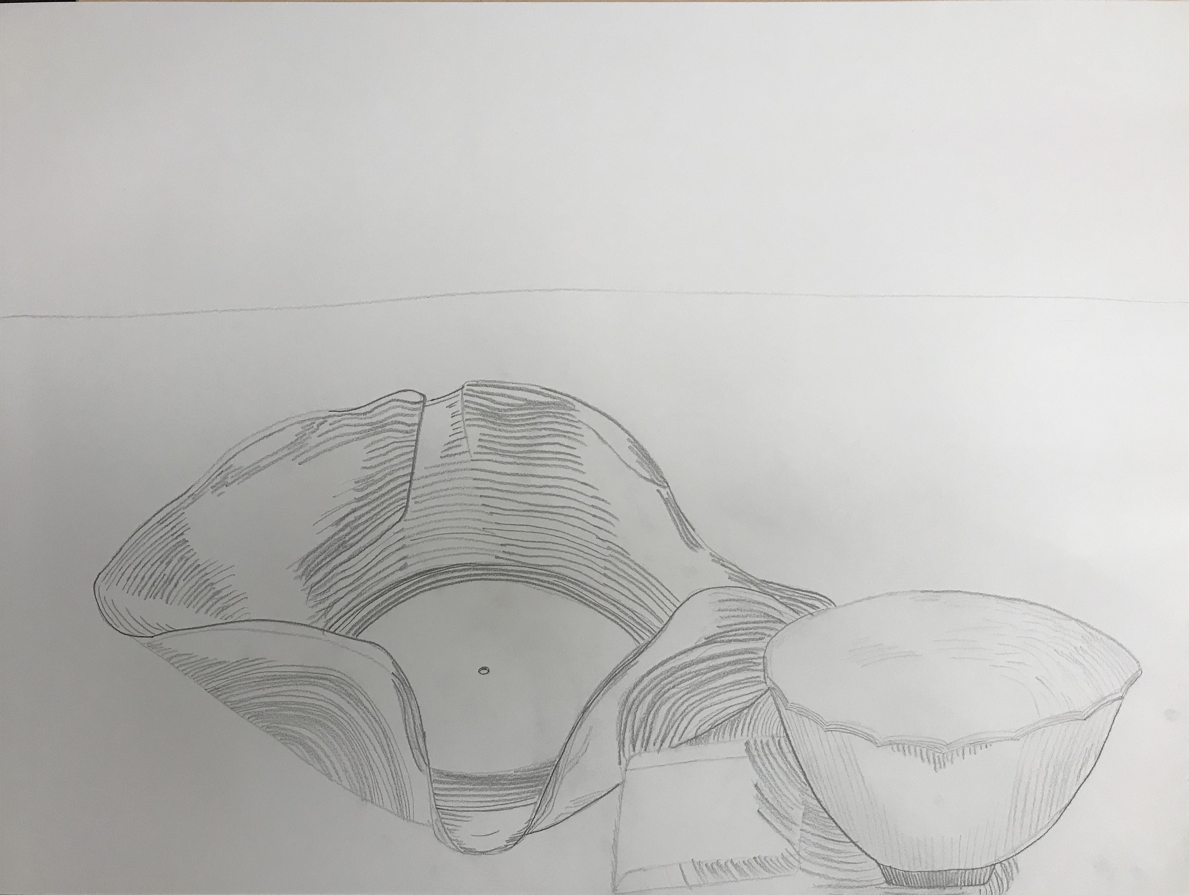
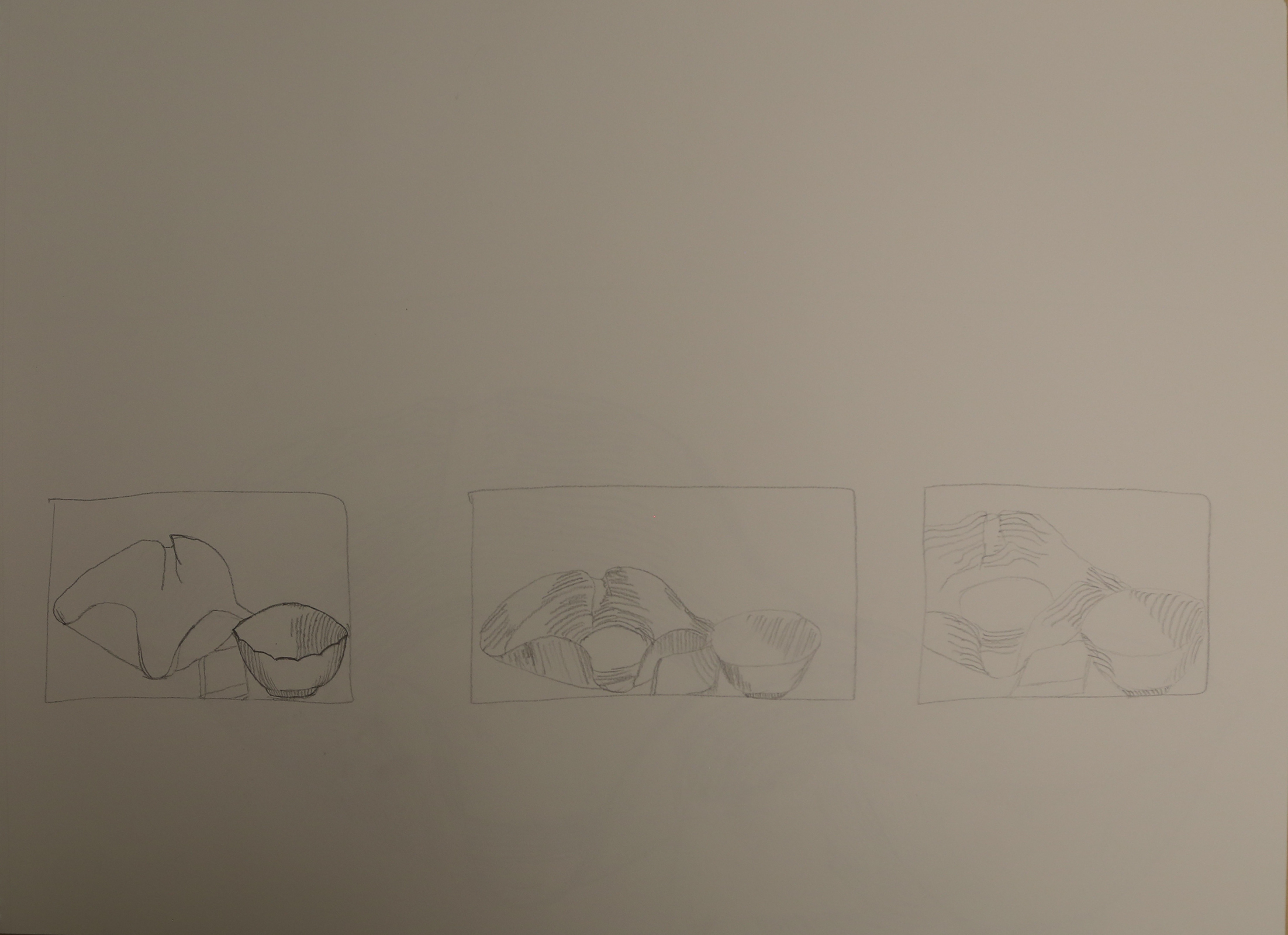
First we chose a painting we liked from our visit to the Met and drew a still life drawing.
Next, I made a version using both in Photoshop.
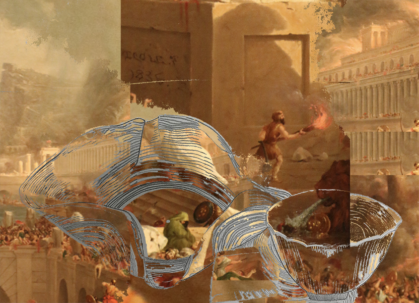
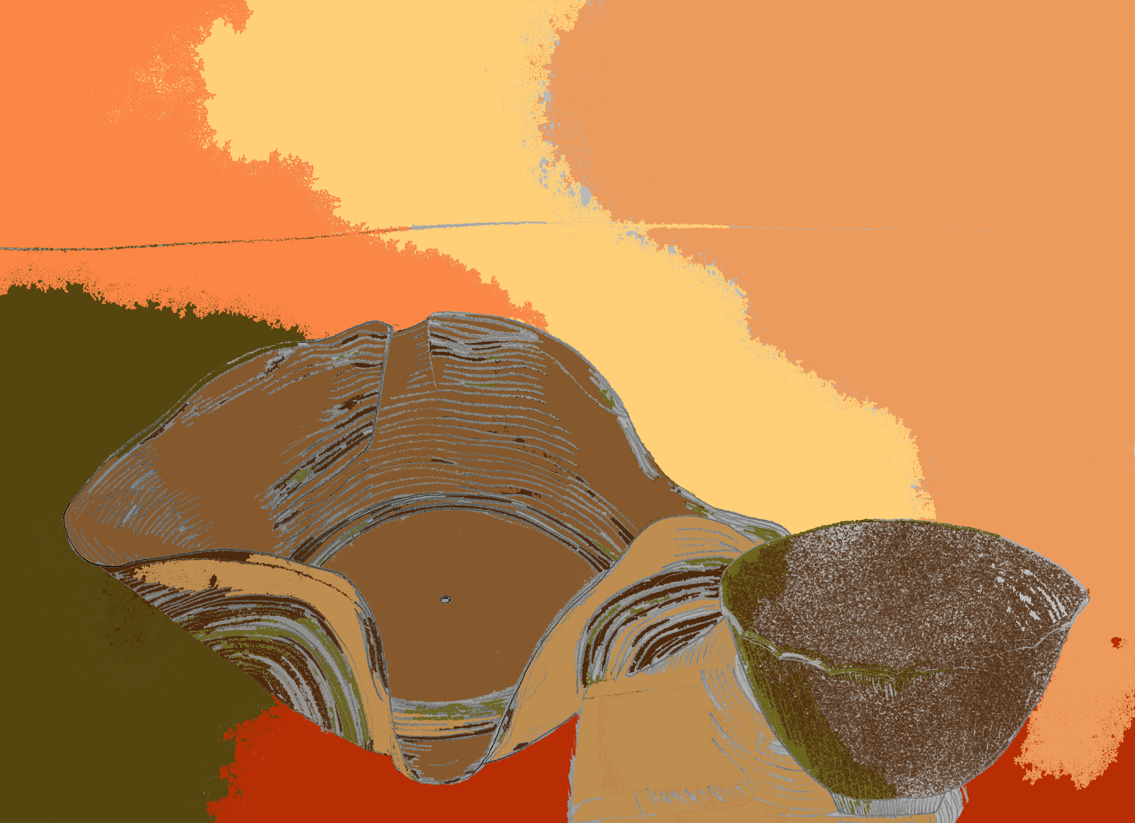
And an iteration of my line drawing using the painting’s color palette.

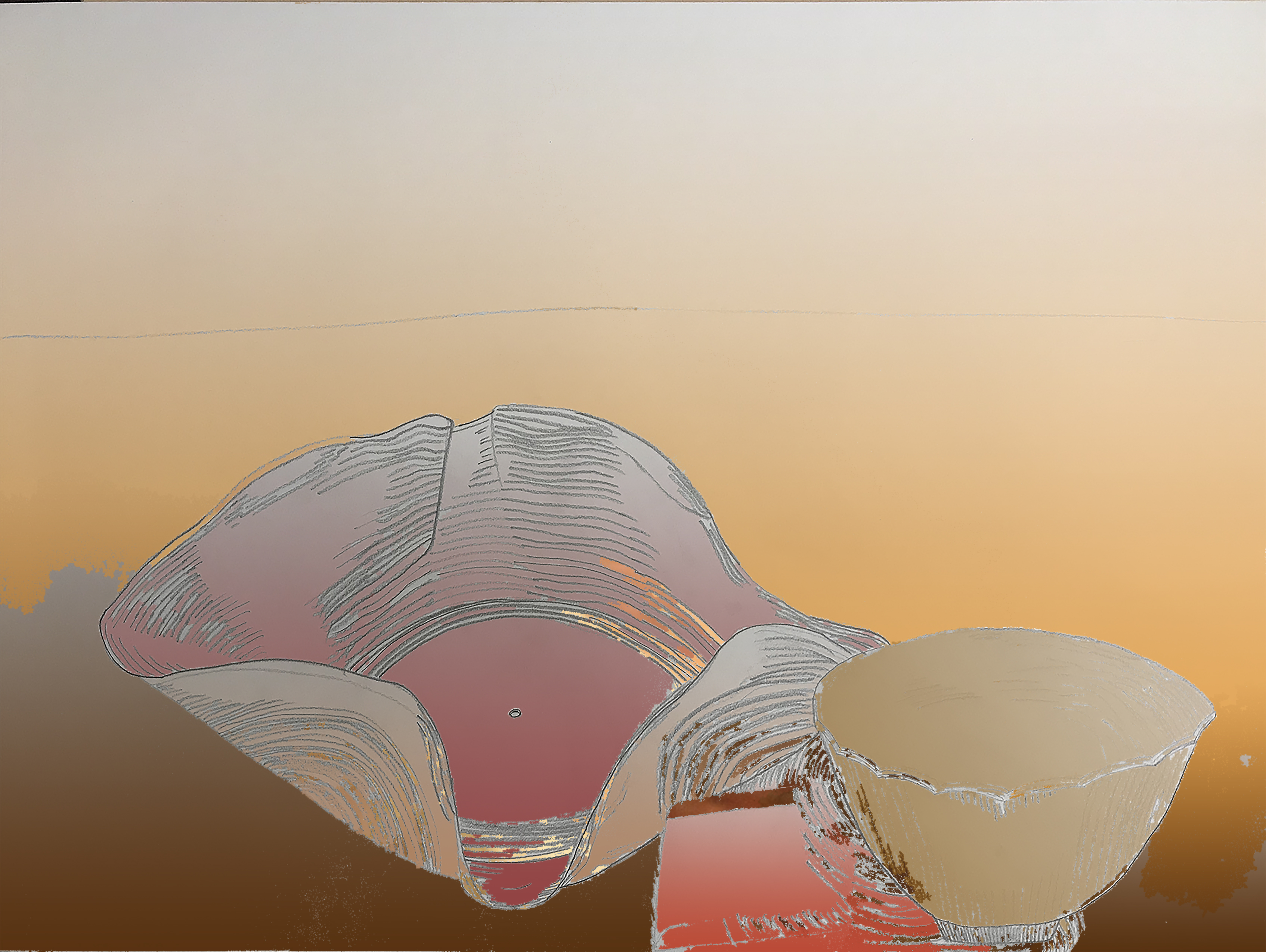
And lastly one using the gradient effect.
Reflection:
After using Photoshop, I realized I could have made my line drawing more simple with less lines. Doing this would have helped me fill the entirety of my drawing in the Photoshop exercises as it was hard to fill each small white area. The first assignment was to fill my line drawing with collaging the painting of my choice was a good refresher on how to use layers and layer masks but it was troublesome at first to follow the necessary steps in order. The practice helped nail in the process necessary to fill the image’s white space to the best of my ability.
The second part of the assignment to create a color palette was new to me but taught me how to make perfect squares, make swatches, use the eyedropper tool and paint bucket tool, and shift between different Photoshop tabs a lot easier. I liked how that iteration of my drawing came out because the magic wand tool picked up interesting sections that I could make a tie dye effect with using the rich colors from the painting. Although I would have rathered more distinct lines and areas to be filled, I was pleased with the final product as it’s aesthetic made me think of myself and especially my dad, who wear tie dyes often.
Lastly, I made a version of my line drawing using collaging and the gradient effect from the color palette of the painting. I got to play with value and shading using the gradient effect which I feel is a practical tool for later projects and was relatively easy to use. This version was the most visually pleasing because the value scale was most cohesive and clean looking. By this time, I had become more comfortable using the tools and felt confident in each thing I did to complete the assignment.
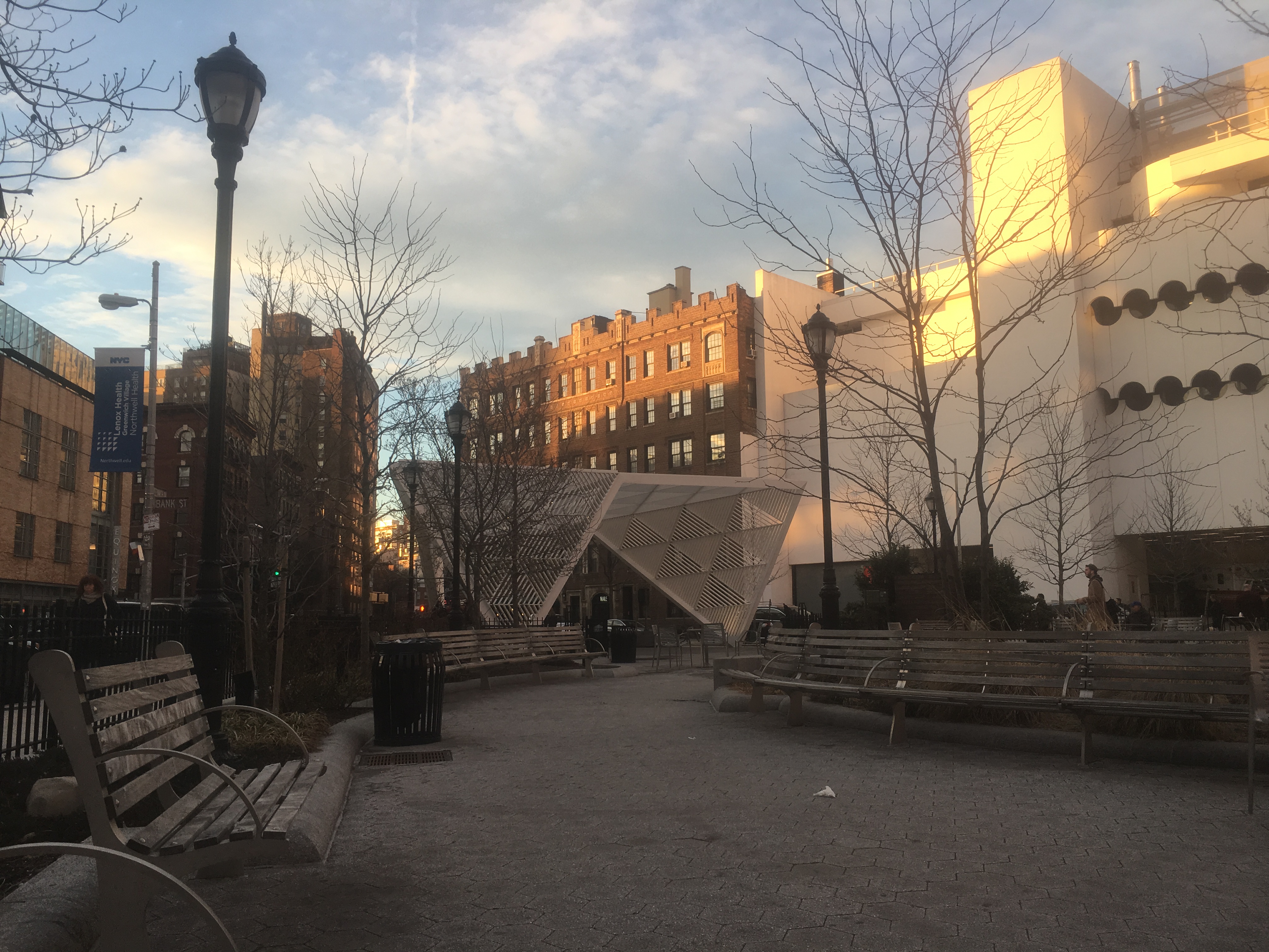
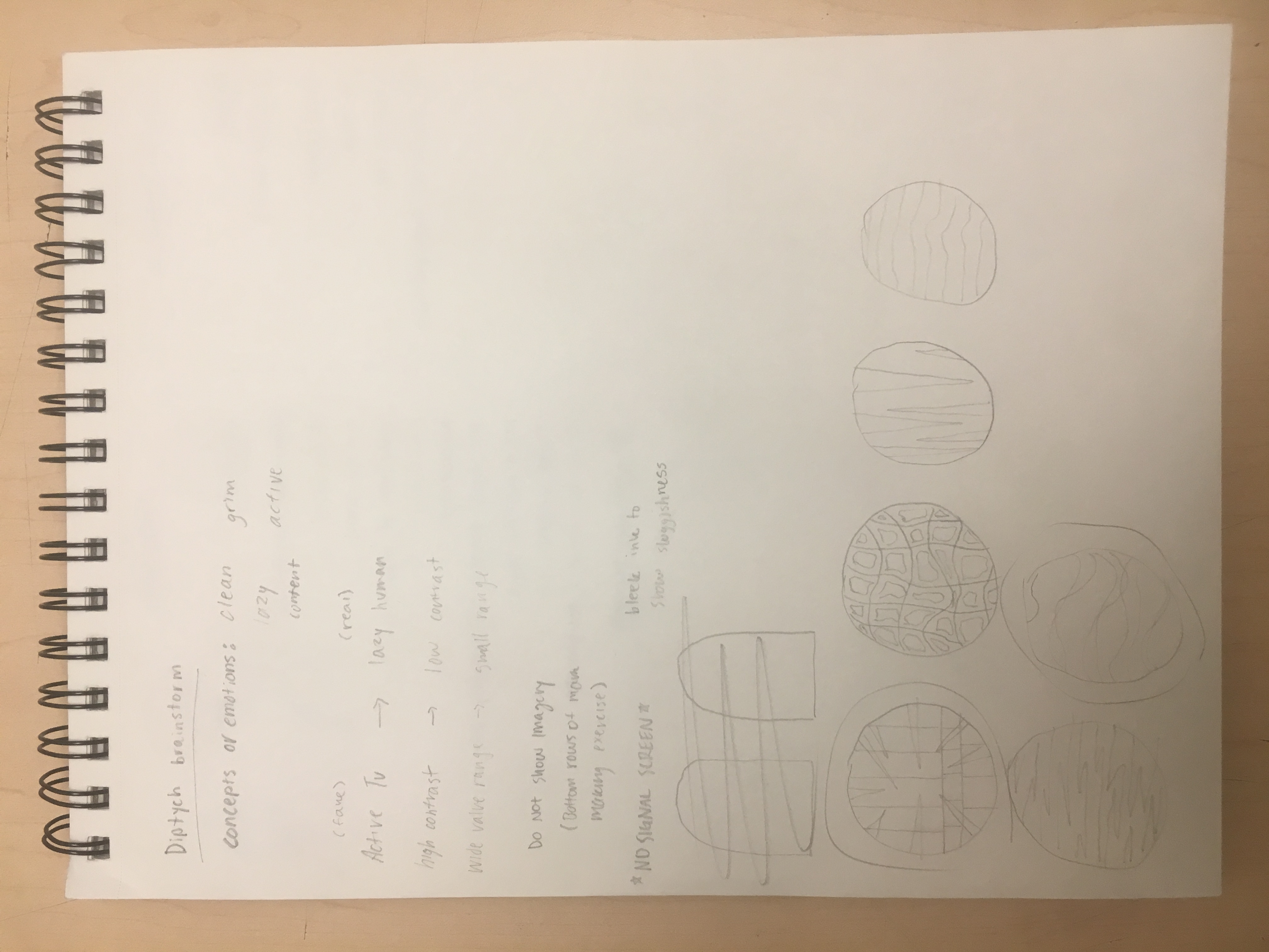
The Dichotomy of Gaming: Action versus Reality

Process:
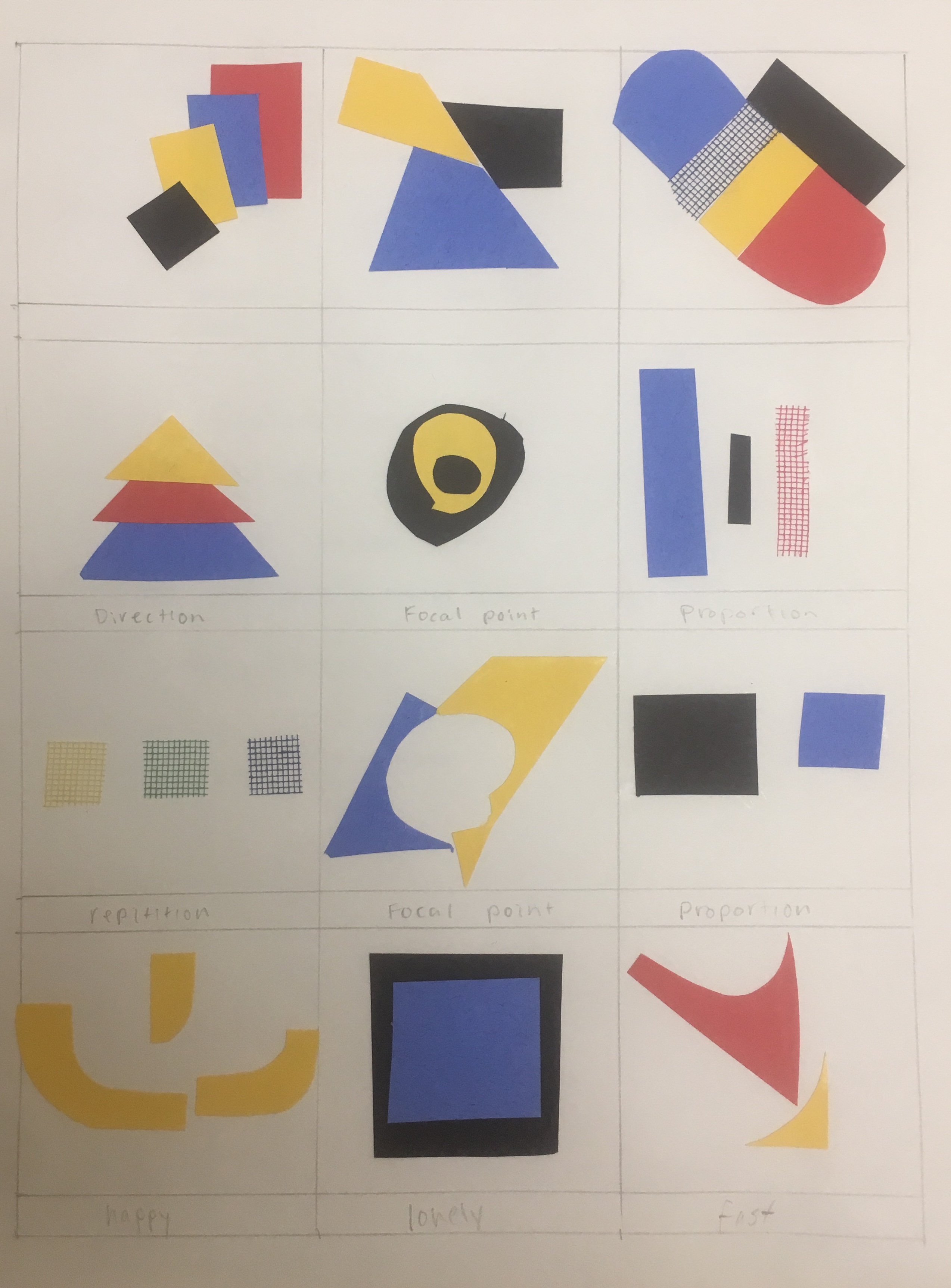
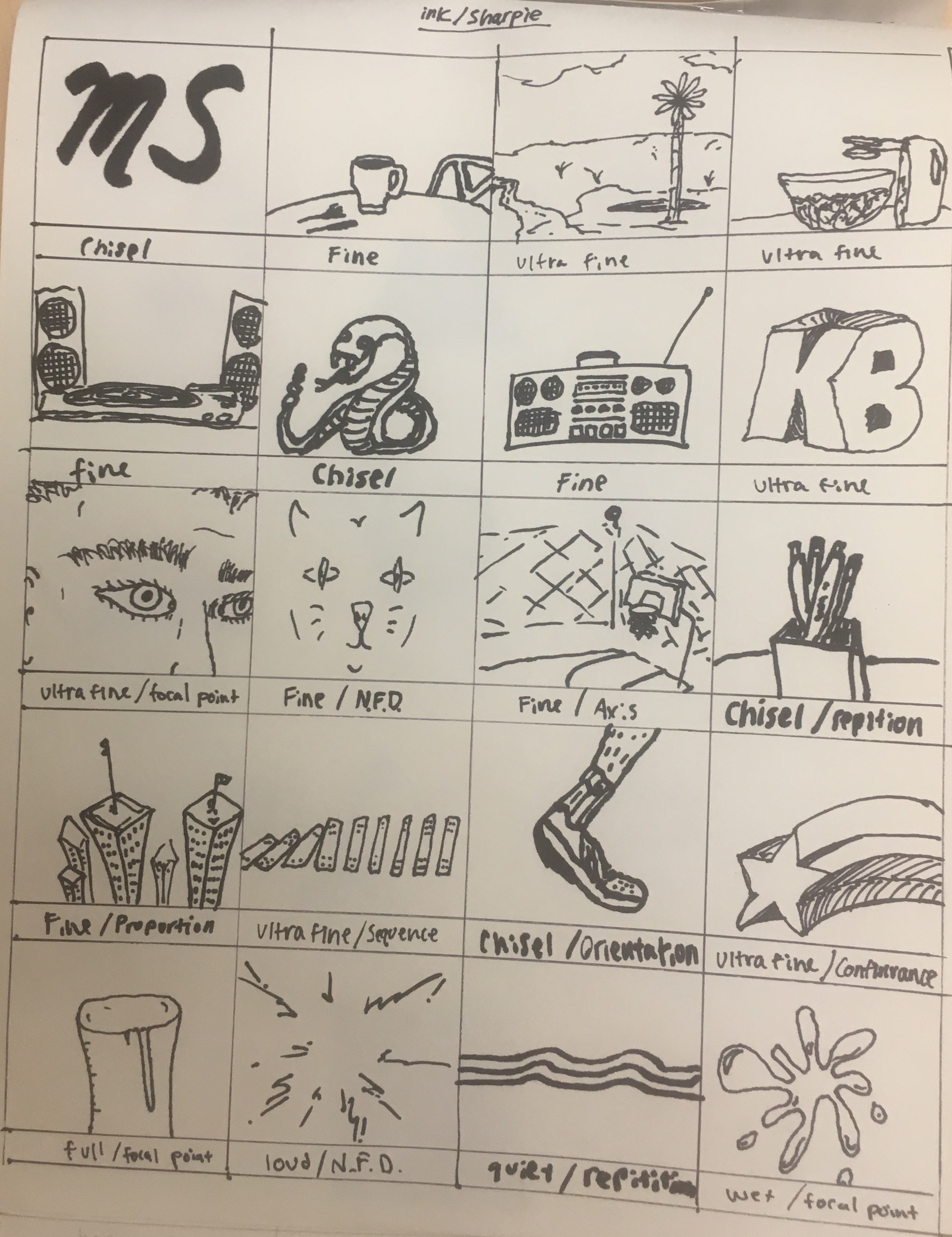
The mark making process was one that took longer than I would have thought. I enjoyed pencil significantly more than charcoal because most of the drawing I do is in pencil and charcoal is a messy medium I typically avoid. I was unsure of exactly what to draw, so I drew the first things that came to mind without hesitation. As I progressed to ink, I was more comfortable with the exercise but it still took longer than expected. I experimented with angles of the thick Sharpie and the thinness of the smallest one. The last page using collage was my favorite because it brought more life to the exercise by using color. I had a limited amount of resources to choose from, so I kept the color scheme simple which I ended up liking a lot. It inspired me to use collaging in my final diptych piece and I found cutting and pasting more entertaining than only using a pencil or pen.

My panels are showing the dichotomy of real and virtual life that takes place during video gaming. I was initially interested in all the action that takes place within the video game itself and the lacking liveliness of the player in their physically tangible life. In other words, there is a lot of action, fantasy, and excitement that goes on in the virtual world while many times there is not much going on in that moment of the player’s real life. I chose the two concepts (action versus laziness) to delve deeper into what playing video games really symbolizes and to show it in an indirect way. I came to this idea thinking about my friends from home who are avid gamers and even got me hooked on a new game called “Fortnite.” I thought back to the wasted time we spent indoors over the break and felt this was a great opportunity to incorporate my personal life into my work. Although the two concepts are opposites, they work together and rely on each other. This relationship could not exist without a mostly stationary player and an active and stimulating television screen.
On the first panel, I indicated a television, action, and the repetition of gaming by using sharp lines, repetitive shapes, and a high contrast of colors. The colors and these sharp shapes signify television, intensity, and even time. For the other panel, I suggested laziness which was a tougher concept to execute. I used horizontal, droopy, and oscillating ink lines to imply the rudimentary behavior that one assumes while gaming. Most times, a gamer will be sitting, barely moving, and are mesmerized by the complexity of what is before their eyes. The panel implies a lost sense of time as well as a soothing and repetitious aura. The two panels alone imply their concepts, but together, it is hard to understand what they evoke as a whole. I used design elements such as color and value to show the difference in the two concepts to separate their meanings and implications. Pulling from the mark making grids, I used simple lines to show laziness and kept the panel black and white to imply the general bored feeling and laziness that comes with gaming. I was also inspired by my classmates’ examples of color use, when I considered how to depict my concept.
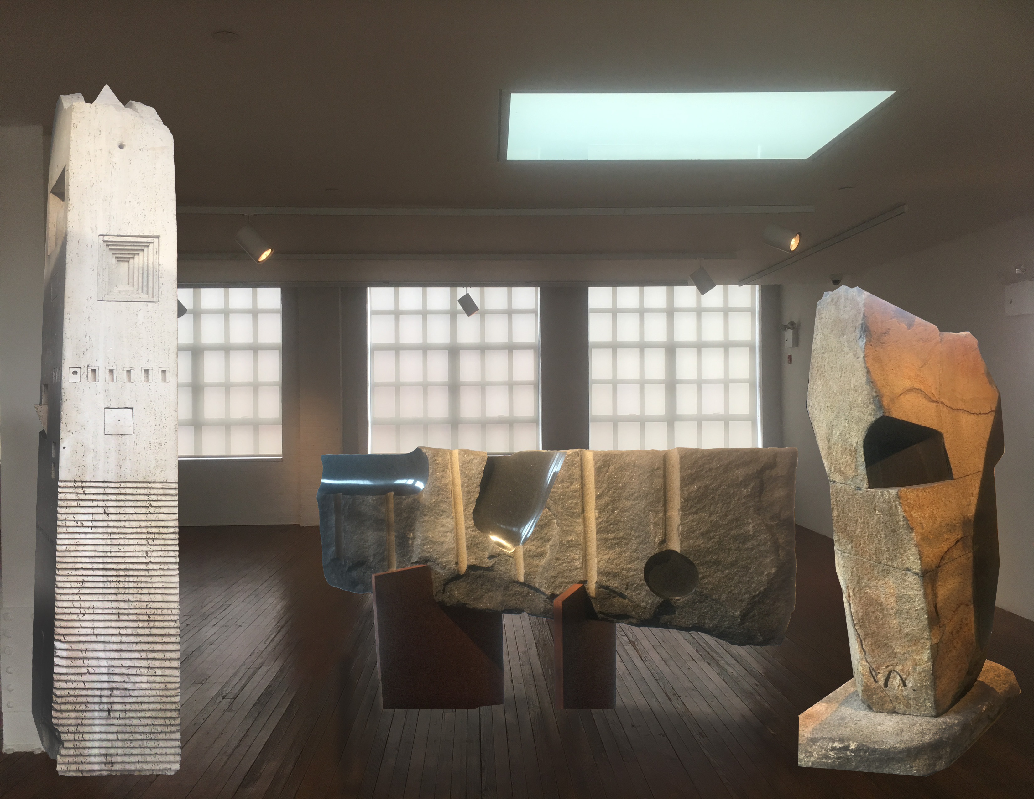
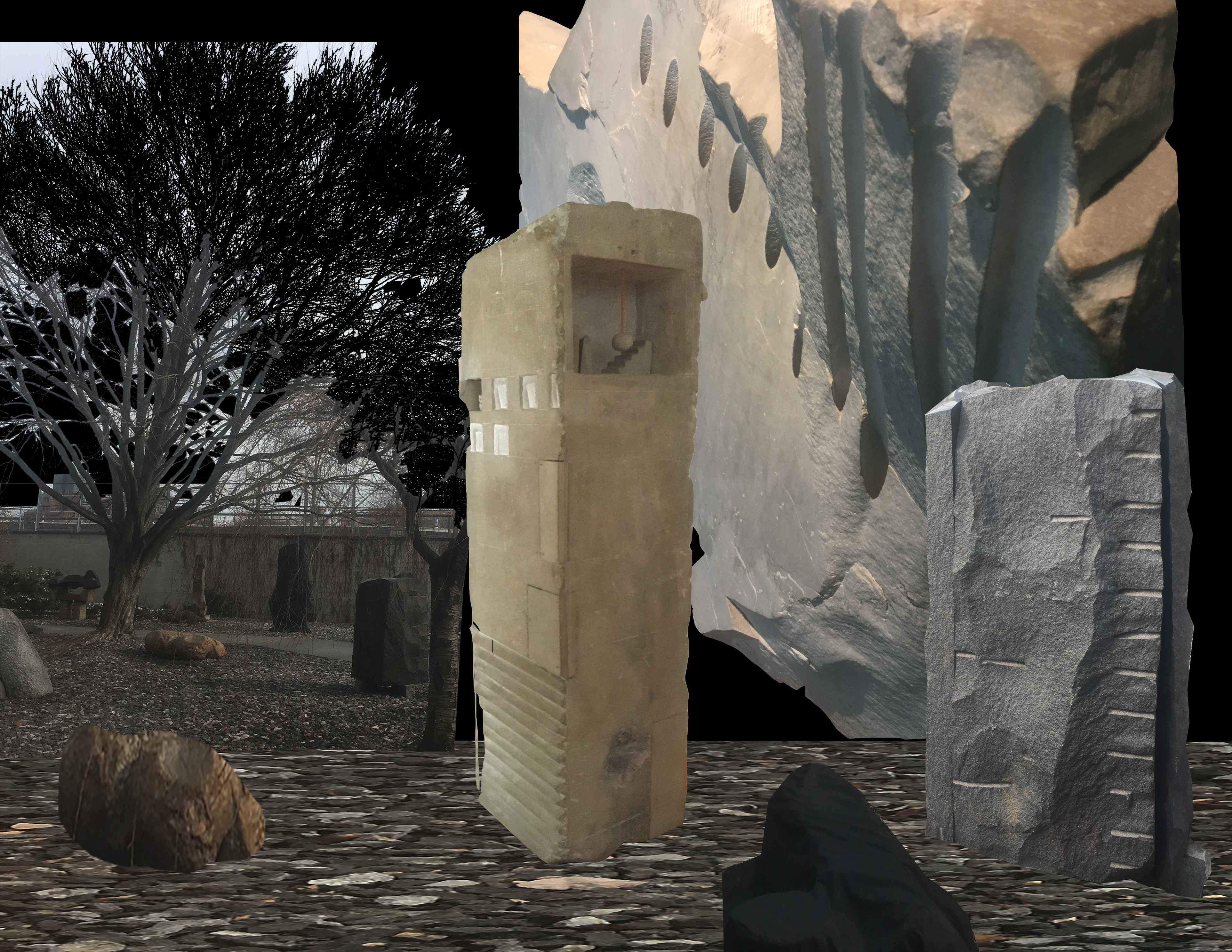
Final Product: Diptych

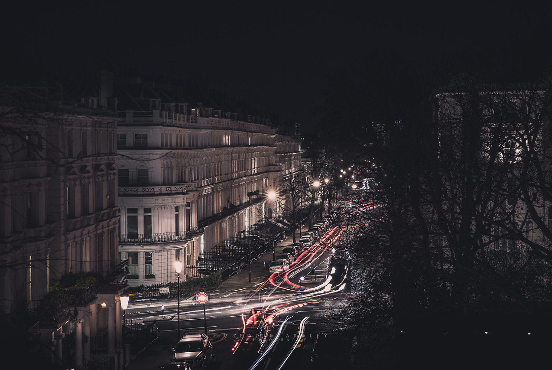
Featured Image:
Photographed by Frederick Ardley.
The diversity of images I see in my head come from traveling the world. Above is a picture of London, where I went when I was twelve. The city exposed me to magnificent art, extraordinary architecture, and a luxurious history. The following summer I went to South Africa, Botswana, and Zambia and experienced something very new to me. I admired the handmade goods, wildlife, and food and pull inspiration from both of these places. That year was a pivotal moment in which I solidified an interest in creativity because I had been exposed to so many beautiful things then.
I plan to approach this class with an open mind to all ideas and concepts. I hope to not only sharpen my skills, but to more clearly understand light, matter, and and color. Being interested in fashion design and management, I plan to apply as much as I can from this class to whatever I do in that industry. At the moment, I am most interested in honing my illustrative approach and quality. Parsons is unique in that they teach applicable practices that can help us students succeed before we even graduate. Although it was tough to decide, I came to Parsons aiming to succeed during my college years rather than have fun at a state school and wait to succeed after. I plan to learn as much as possible from both my teacher and classmates to make this goal possible.
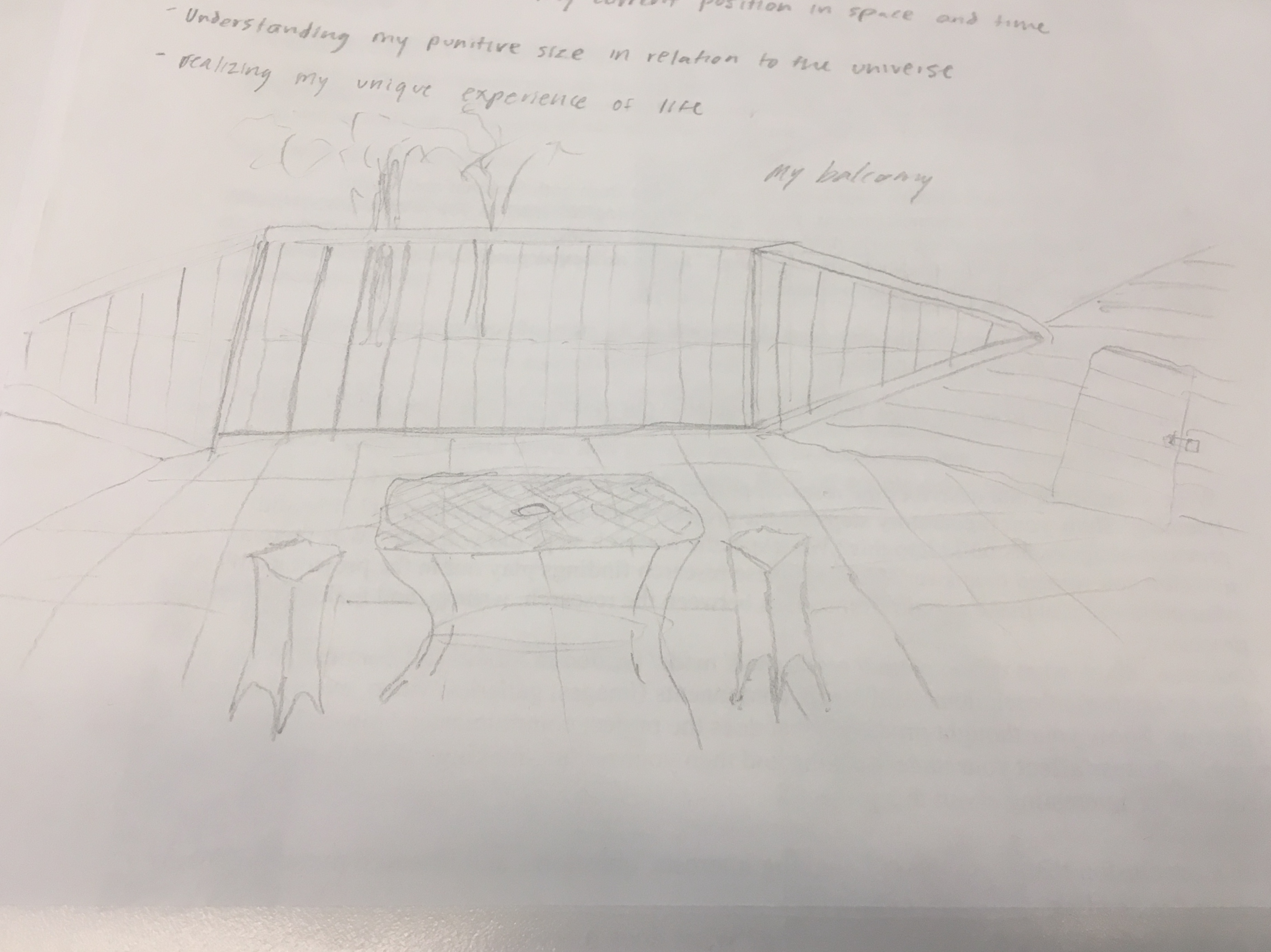
At the back end of my room are two double doors that lead to a balcony. This balcony was utilized almost every weekend from eighth grade to present by myself and my friends as we shared countless stories, memories, and had fun. I thought of all the times it was a beautiful sunny day, or raining and I had to hide under the umbrella, or so cold that I could only bear to be out there a few minutes. The balcony overlooks Lake Austin, an essential piece of my not only my backyard, but my life in my second childhood home.
When taken through the exercise of meditation at the beginning of class, the soothing and nostalgia sparking process took me back to my balcony because of the mindset I was put in. I often realized my place on earth on that balcony: on the second story of my home in the hills of Austin, Texas. There was almost never a time where tranquility and happiness didn’t engulf that space which makes it so special to me. There, I realized the special opportunity I have to be alive and the importance to utilize my existence.
My name is Mitchell Stanford and I’m from Austin, Texas. I came to New York to study Strategic Design and Management, a broadly applicable business degree. The first time I realized my talent had been inside was when I was three or four, playing with my grandfather’s art supplies, Last year, I started designing and making clothes for the annual fashion show that is hosted by the fine arts high school I attended. This ultimately solidified my interest in art and specifically design. In one semester at Parsons, I have discovered new technologies and methods of writing and creating art. My transformed understanding of art has revamped my creativity and helped me grow into a more knowledgeable creator.
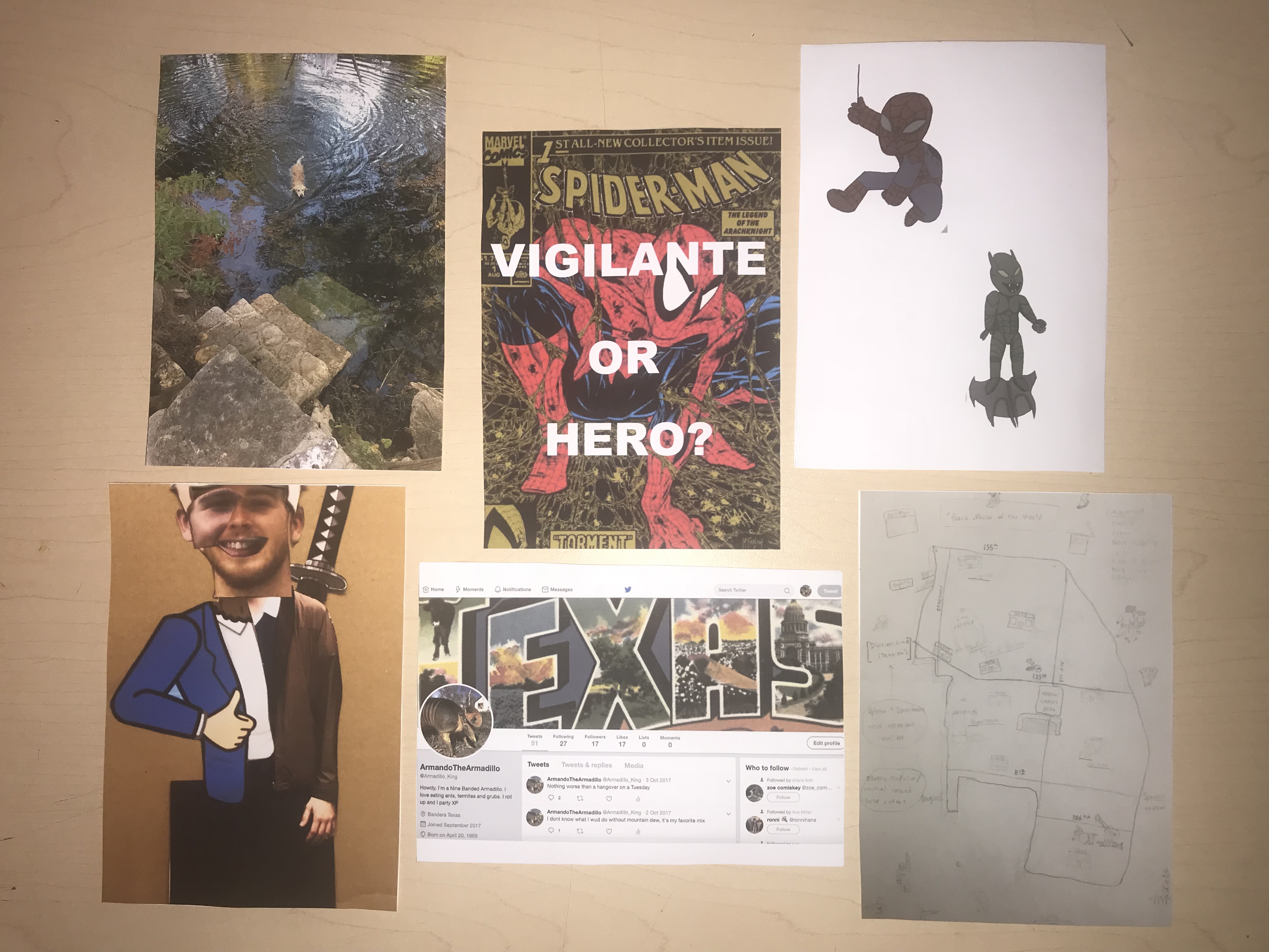
In my Studio course, we made a zine that addressed a social issue within a movie of our choice. My zine was narrated by a boy named Chuckie, who defended Spider-Man as a hero and not a vigilante. For the design aspect, I had previously made a zine and found that taking up the entire space was a successful design decision. I used Photoshop to turn my hand drawings into digitized designs and Indesign to make the booklet’s final layout. Using programs like these inspires me to keep designing and creating. For the content of the book, I had to research more about Spider-Man’s hero arc. In later Spider-Man movies, he does possess greater and unlimited power, but in the movie I watched, he had just acquired his powers and used them only for good. I told this story of the zine in the present setting of the movie to argue his heroism. I feel that the most successful part of the zine was that it relayed as a comic book, which was my intent.
When translating the material in the zine to a complete research paper, I had to tweak my argument: I couldn’t debate whether Spider-Man is a hero or vigilante. Instead, I wrote about how power can be used in many ways; whether it is for good or bad depends on who exercises it and their objectives. To supplement my position, I included how masculinity is a factor for how rulers run their government. I pointed to the definition of a hero from the Romantic Era, information about the lifecycle of a hero, and an excerpt discussing complex masculinities. From my research, I learned that superheroes and leaders alike possess more traditional masculine qualities and their behavior is based on their intrinsic character.
During my research, I stumbled upon an interesting article about how Spider-Man 2 was a movie made in response to the 9/11 attacks. Due to the scope of my research, I did not delve into this topic, but I am interested in exploring Spider-Man 2 and other Blockbuster films that were made in response to other important contemporary events. Movies are huge undertakings that often have a larger meaning than the plot, so it is important to be able to research and understand the complexity of the meanings of these productions. Through using the library and Writing Center for help, I learned how to use The New School’s resources for better researching methods.
For my final project, I created a business concept that advertises sustainably and locally sourced lifestyle products. The capsule of products features a water resistant hemp face mask, a mycelium wall mount bottle opener, and more. I targeted people in their teens to thirties as my demographic to appeal to, as the design of the booklet and the content appeal to the group. Below are my initial sketches of each design:

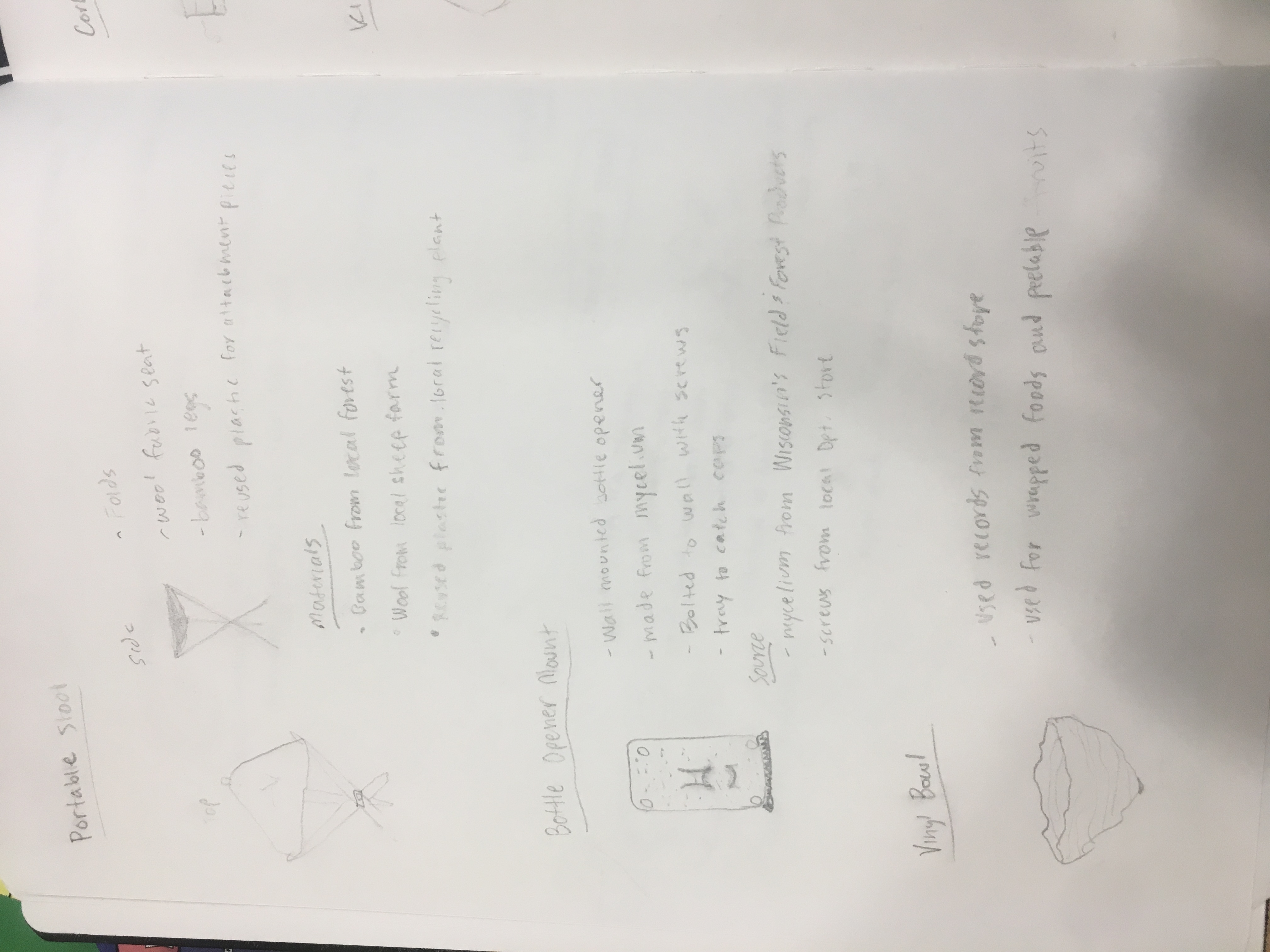
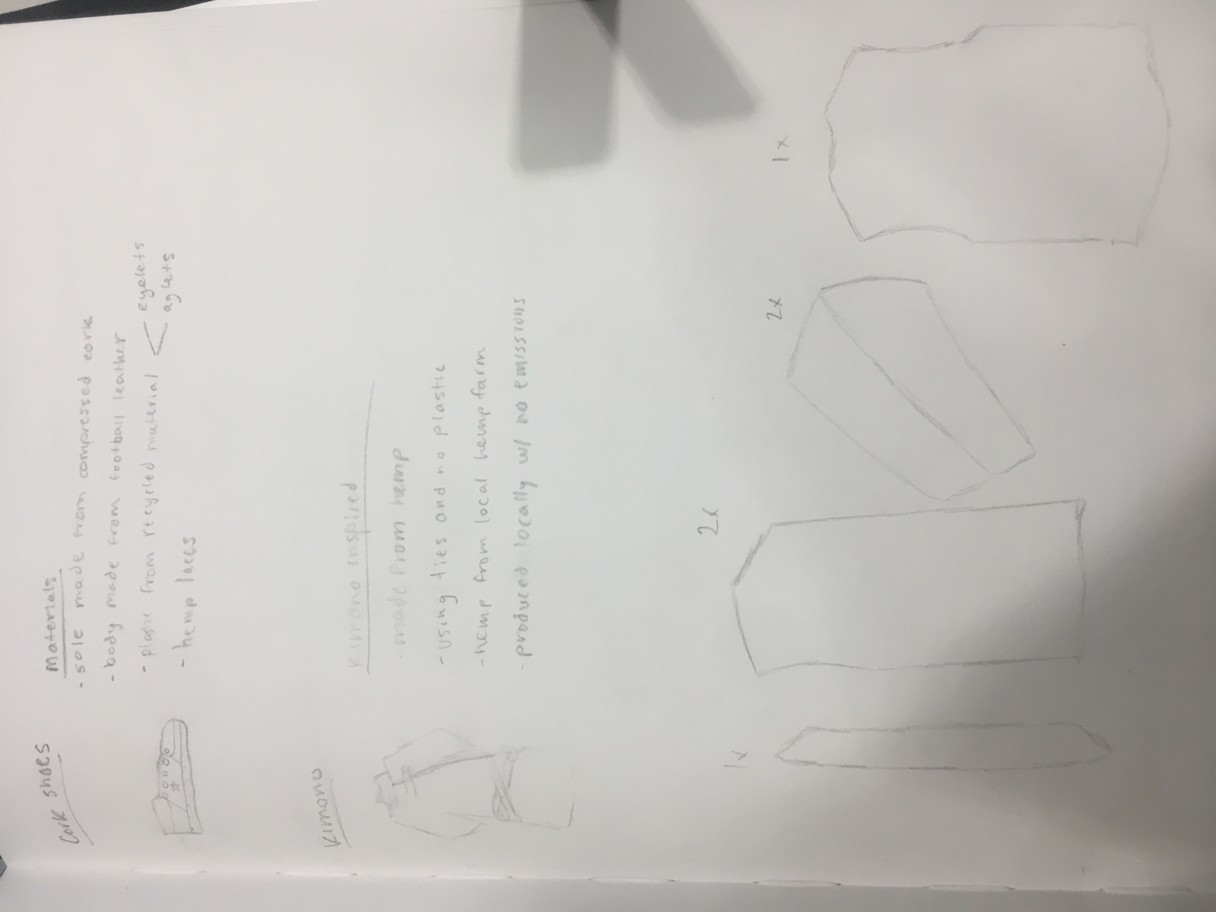
Through the course, I learned about different sustainable materials such as bamboo, cotton, and wool. It inspired me to use the materials in my capsule and create simple and interesting pieces. The project was inspired by another project I had where I made a zine. To relate the project to my major, I wanted to create a business catalog. First I created a business poster that could break down my business to it’s simplest form.
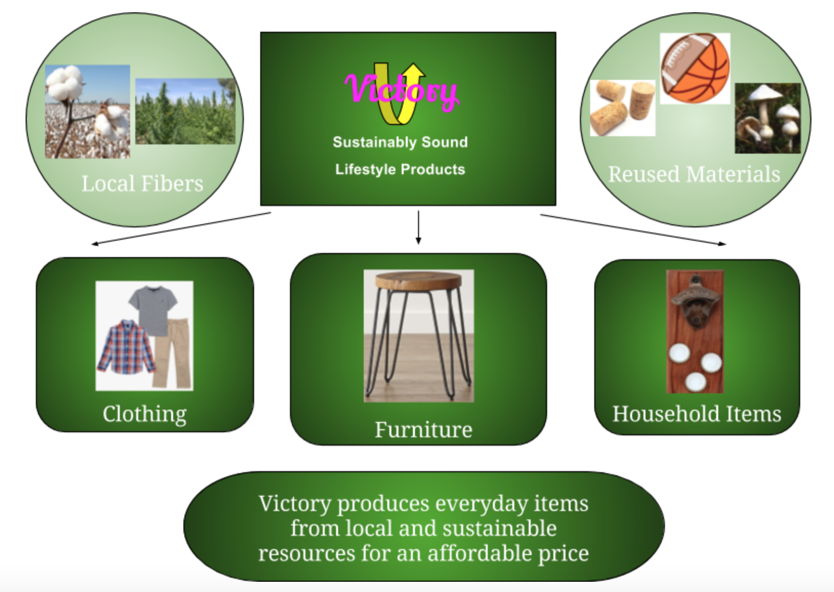
From this, I organized my products into the sub categories and could delve further into the specificities. I came up with statements for the respective departments within my business and implemented them into my catalog.
For the video aspect of the project, I created a How-to on how to make a bowl from a disposed vinyl record which was one of my products. As seen previously in my trash haul video, I am not a professional Youtuber or English speaker, so please excuse that. Below is the link to the video:
Below is my final presentation: