Culture Poster
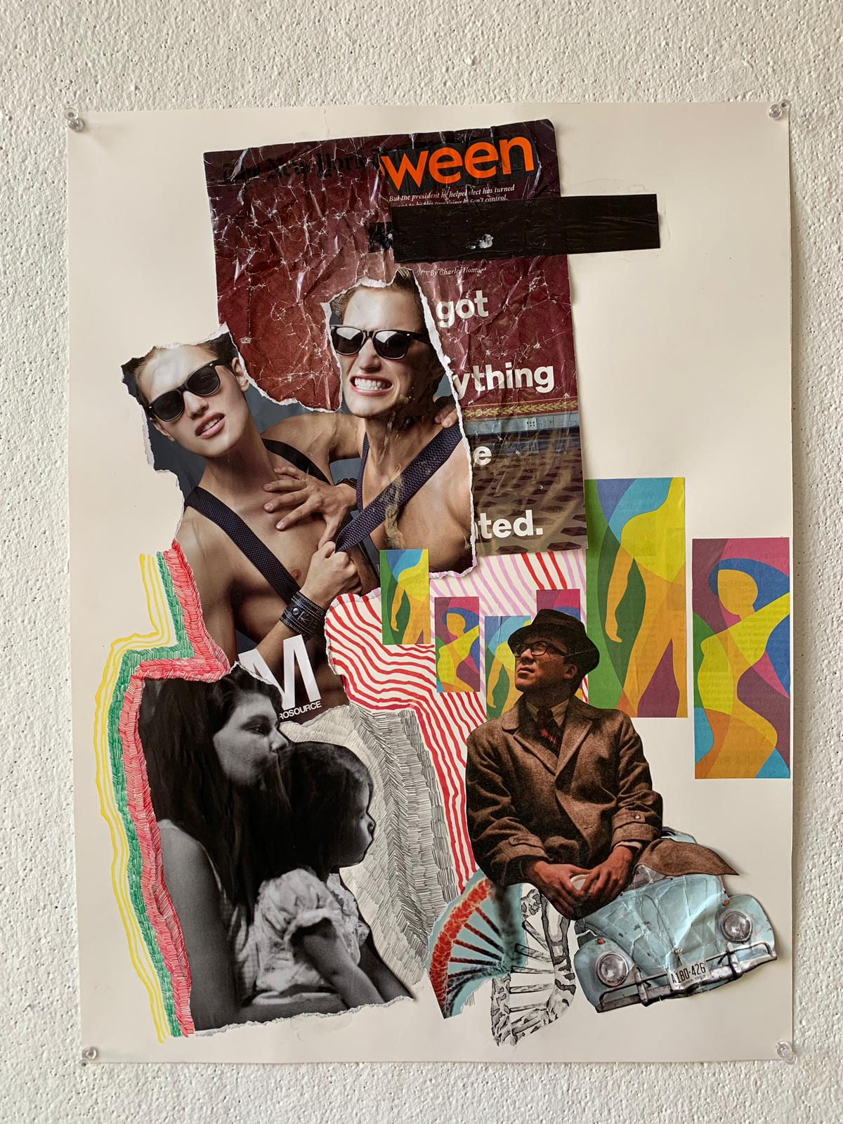
When given the brief to create a poster that reflects an aspect of my culture, I knew that it had to be one of 2 things; my South-East Asian heritage, or my Queer identity. The 2 mean the most to me and are my immediate connections when the the phrase ‘personal culture’ comes to mind. I did spend quite a bit of time figuring out how to go about the project, hitting more than a handful of barriers in the brainstorming process. This was all before I stopped thinking of the 2 as separate entities but rather as a singular one that fully represents me. One thing was certain, it was meant to be a photo montage. Collaging and working with images in a physical 2D manner is something that I’m very comfortable with, especially if I’m able to source images from the internet that link wholly to my ideas. Therefore, I wanted to give myself that extra hurdle in that I would only use images from magazines or newspapers that were supplied to me by the professor and that I’ve brought to class myself. I would have liked for the people in the poster to be of East-Asian descent but having the lack of control over that aspect did push me out of my comfort zone and make me think even harder about how to communicate my story.
On the bottom left hand of the poster is a parent raising their child, the image is grey-scale to signify a blank slate that all children have. As the story proceeds, the child starts absorbing things from their surroundings; dressing in formal western garments, dull colours, and driving a Volkswagen Mini (what I consider to be a very traditional western car). The person looks up at others that are liberated in the way they present themselves; free and with vigour, with hopes that they can one day be as open and as joyous. The crumpled up wallpaper with darker, muted tones, shows that even though they will someday reach that goal, remnants of their upbringing will always follow and be a part of their identity. The colours that are present in the poster are colours that were reoccurring in my childhood – red, green, yellow and purple.
If I may say so myself, the poster does tell the story that I wanted it to and the images and illustrations do make for an elegant image. However, if there was something that I would change, I would want for the viewers to be able to capture the narrative at first glance, which would mean having to use a much larger sheet of paper and illustrated each step in ever more detail.


Dodecahedron
There were 2 aspects of the poster that HAD to translate well into the Dodecahedron; the colours and the crumpled paper. I didn’t want to address the 2 projects as separate entities as I wanted my message to be as powerful as possible. The colours on the Dodedcahedron were done my colouring the individual parts of paper with Promarker, ensuring that the colours were fully opaque. I was going to use construction paper initially, but I had to stay away from adhesives and it would have been more work anyhow. The idea for the crumpled tracing paper came about when I was brainstorming ideas in class. I wet the tracing paper, crumpled it and unfolded it. I would have simply crushed the paper, but the effect just wasn’t the same The crumpled up paper shrank in size due to the folds and occasionally had folds due to my accidentally ripping them during the unfolding process. They were then attached to the Dodecahedron using the brass fasteners. I saw part of the story behind my poster going into the Dodecahedron in the sense that I’m the crumpled up tracing paper that stands is backed my my culture (the colours) and with me and my culture, something new emerges; new colours that are seen through the tracing paper. As a whole, I’m happy with the project, but I wished I went a step further in engulfing the entire interior with crumpled up tracing paper so that the viewer would be able to fully understand the story with my explanation.


Poster is engaging in imagery and asymmetry. The weight of photomontage is mostly on the left side of frame, but the two colorful figures on right middle pulls composition back into balance.
I see the relationship to dodecahedron with the flat colors on interior. You use the crumpled tissue as surface texture which plays well to echo the surface colors as planes, even if irregular.. It works best for me looking through the pentagons at uneven look of tissue disrupting pentagons.
Would there be a way to create volumes with tissue on interior, so it echos better the structural form of dodecahedron?