Artist Statement – file:///Volumes/Work%20In%20Progress/Artist%20Statement%20Zein.pdf
When the brief was handed to me, I didn’t particularly know which route I would be taking, would I be interpreting a designer in an artist’s vision or showcasing an artist in a designer’s vision. This was the main dilemma for this first part of the project. I started by shortlisting designers and artists that I was considering for the project.
The shortlisted designers were
- Yu Han Wang
- Stefan Cooke
- Issey Miyake
The artists were
-
Huang Yong Ping
-
Grayson Perry
-
David Hockney
Biographies and Information – https://cpb-us-w2.wpmucdn.com/portfolio.newschool.edu/dist/0/25861/files/2020/02/Self-Portrait-Project-Artist-Designer-Research-Doc.pdf
With the designers, I had consciously chosen them due to loving their garments and aesthetics personally. With the artists however, I really had no solid idea going into it. I did however, find myself naturally gravitating to artists with distinct appearances. It was thus settled, I would be dressed up as an artist and have the poster be an interpretation by the designer. I chose to go with Stefan Cooke, due to me being most interested to find out more about his work. Grayson Perry arguably has the most striking appearance for any artist when he is dressed as the opposing gender; his outfits are ridiculously outlandish with bright colours and exaggerated silhouettes.
In mmy research, I focused heavily on visuals by Stefan Cooke as it the main way that I would able to understand his visual style. Less attention was paid to works by Grayson Perry but rather I looked at the various outfits that Perry had donned. Cooke’s aesthetic was undoubtedly English and rather gritty at times, though the garments aren’t necessarily so. The manner they’re shot and communicated to the audience is with images that tend to have darker tones and carry a heavier weight.
When I did start off making my initial sketches for the project, I chose not to go with a pencil or pen but rather creating basic collages that would be communicate what the products might eventually look like. Somehow, apart from the very first one, the other 4 seemed rather joyful and light in mood. Looking back, that was not the route that I would want to go down. I had planned to work with the very first ‘sketch’ (Slide 4).
The natural progression of the project was for me to make myself look like Grayson Perry in the face. It was rather exciting, I got the help of my mates to paint bright colours with ridiculous proportions; my lips were insanely overdrawn, my eyebrows were covered (rather sloppily), eye shadow was painted on awfully high on my face and eyebrows were drawn on incredibly thin. I must say, I did rather resemble Grayson, aside from the complete contrast in facial features that we both possessed. I then photographed myself and prepared to work with the initial concept.
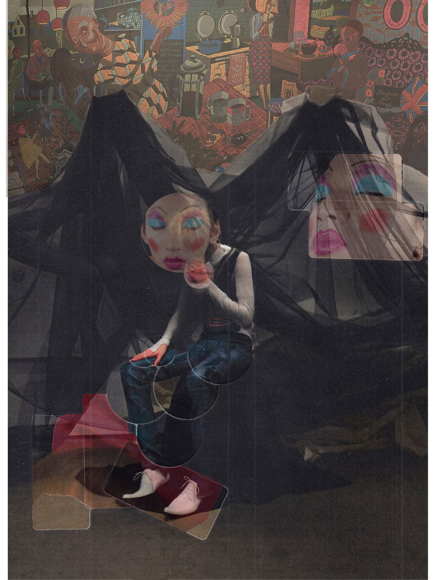
I did however, realise that I wasn’t particularly enjoying what I was doing, nor was it really sitting well with me. It seemed too bright, too joyful to the research I had done on Cooke. I thus chose to do a complete overhaul of the project concept and went the route of inserting my face and an image of Perry’s tapestry into an image of Cooke’s MA collection. The final product is the featured image.
To quote my artist statement, “Considering that the project was intended to be a projection of Cooke’s style and ideation, I would argue that it was rather successful. The tapestry and the manner in which my face was incorporated into the poster was in line with what I observe to be Cooke’s aesthetic. It lacked however, in showcasing to the viewer the visual strength that Perry’s crossdressing has. I as Perry is rather overwhelmed by the heavier tones of dark that the overall image possesses. Should the project be refined, I would tell Cooke’s story in a similar manner but a level of emphasis being placed on Perry’s distinct character.”
I don’t necessarily feel like the initial concept was any better than what I chose to go with or that it had more potential, I would say that it was due to the fact that the vast majority of my research was in line with the initial idea and when I changed the entire project, I didn’t really have the research to back it up to allow me to properly communicate both Cooke’s and Perry’s ‘vision’.
I will say though, this project has been incredibly gratifying. To be able to look at Stefan Cooke who I so much adore was rather magical. While the final product was not necessarily the strongest visual image nor did it fully check off the brief, it serves as a good stepping stone for the projects to come.