Why I…(Seminar/Bridge 5)
Reply
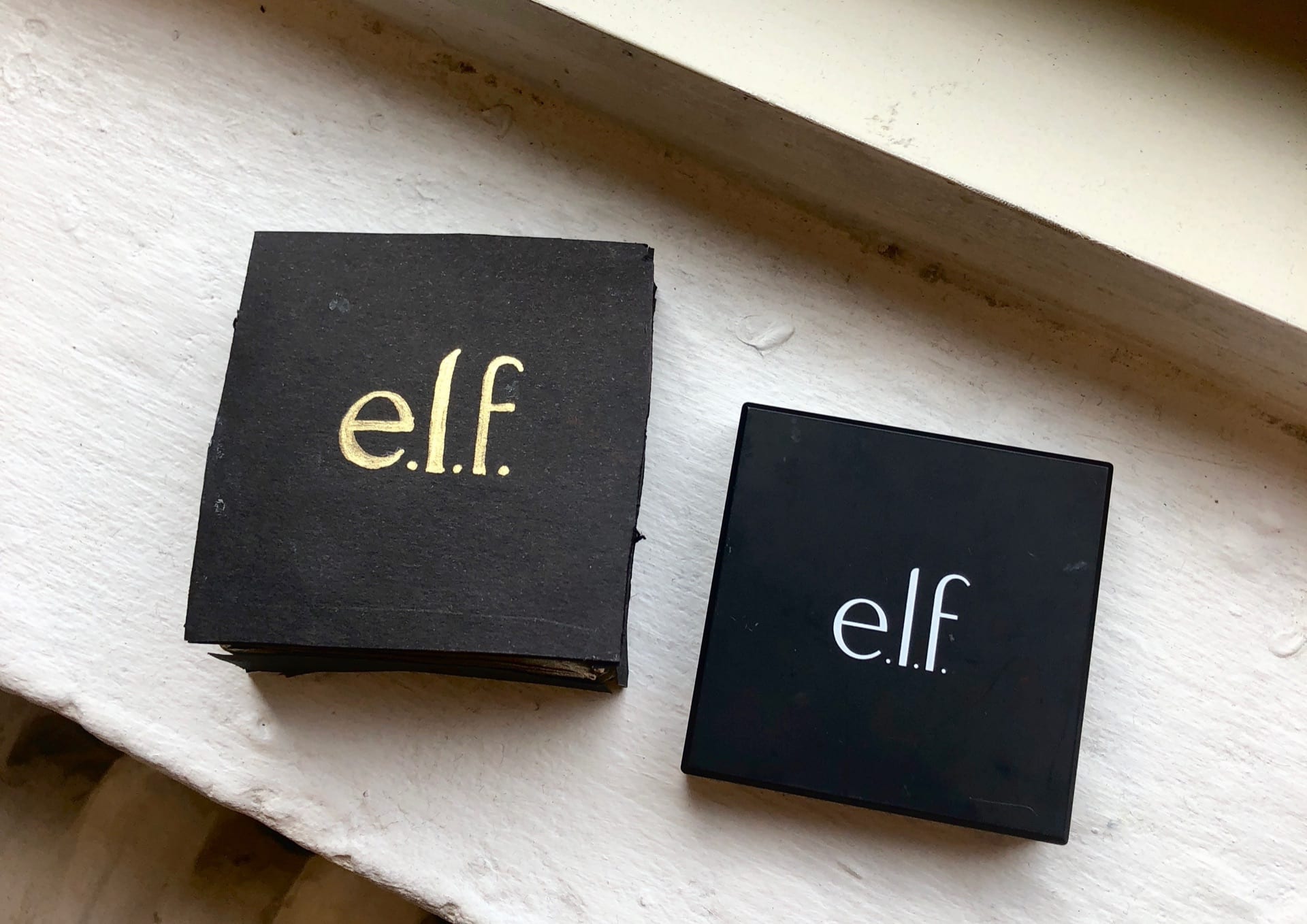
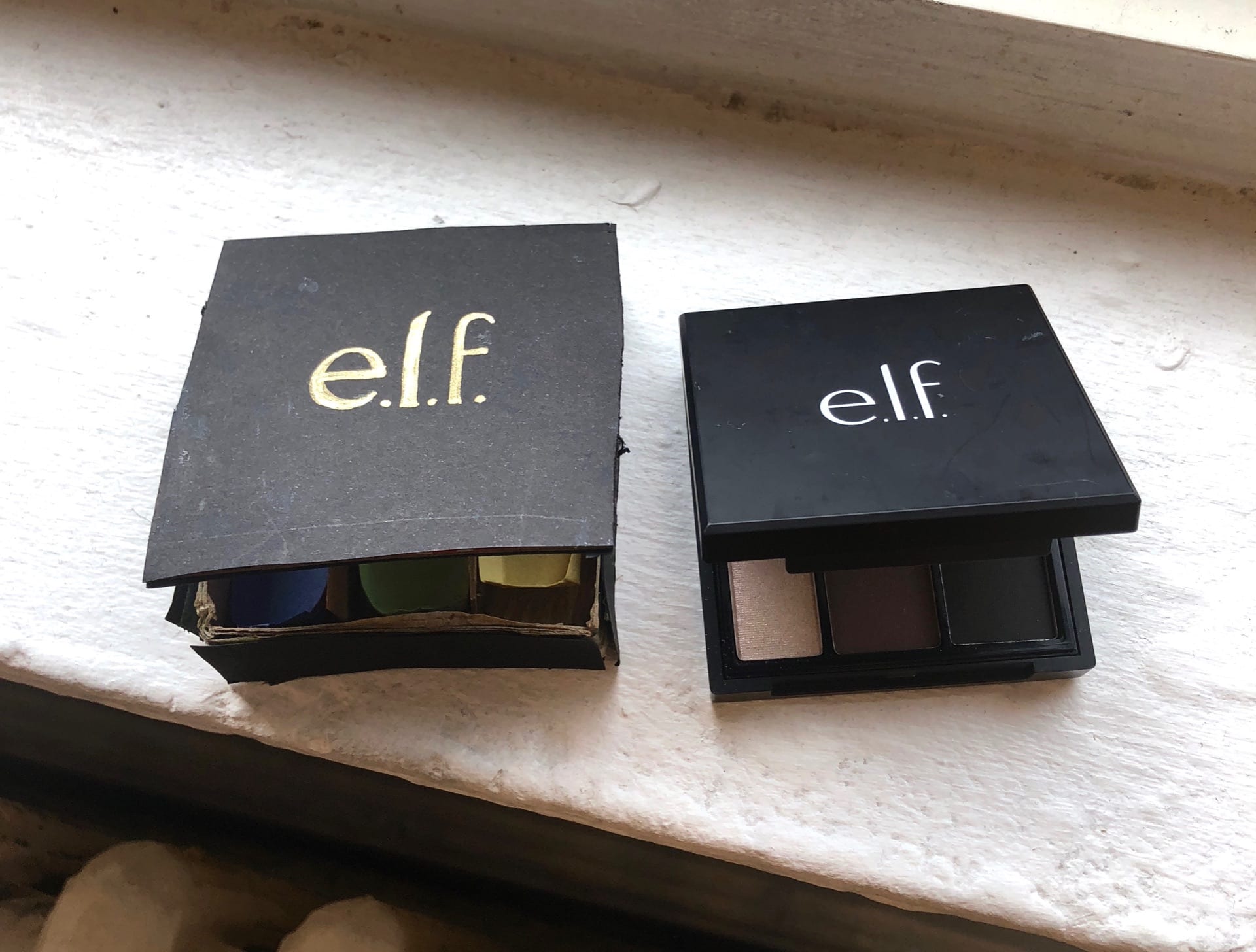
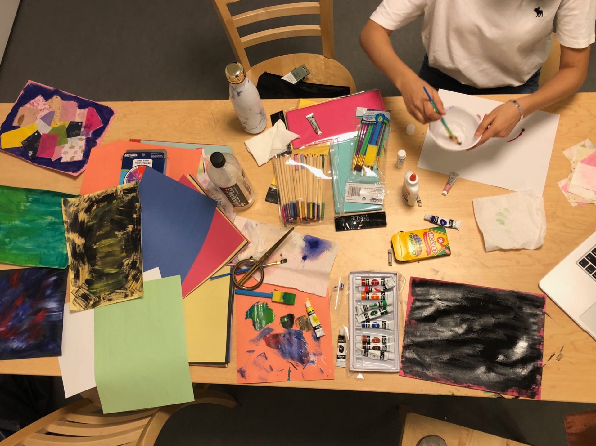
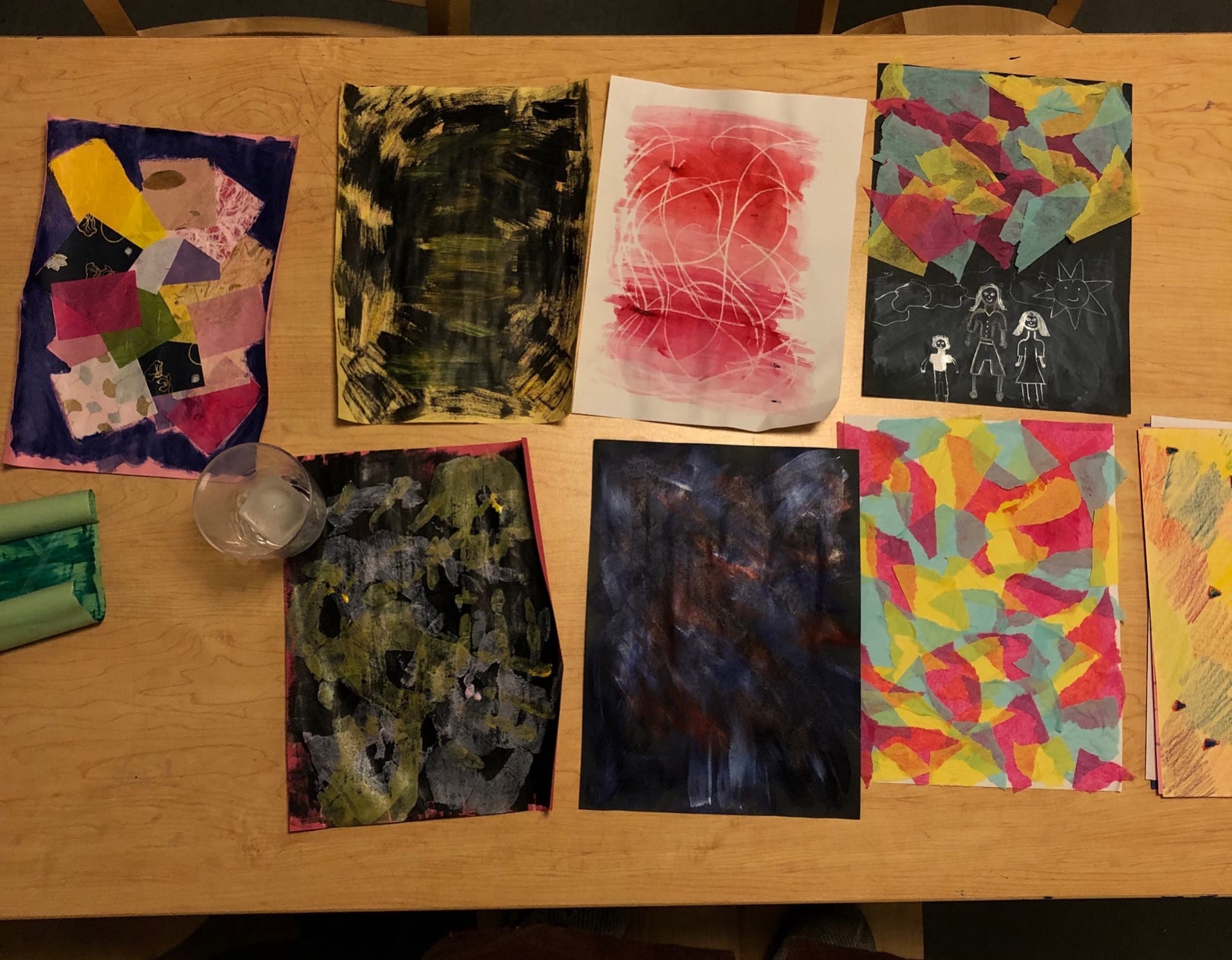
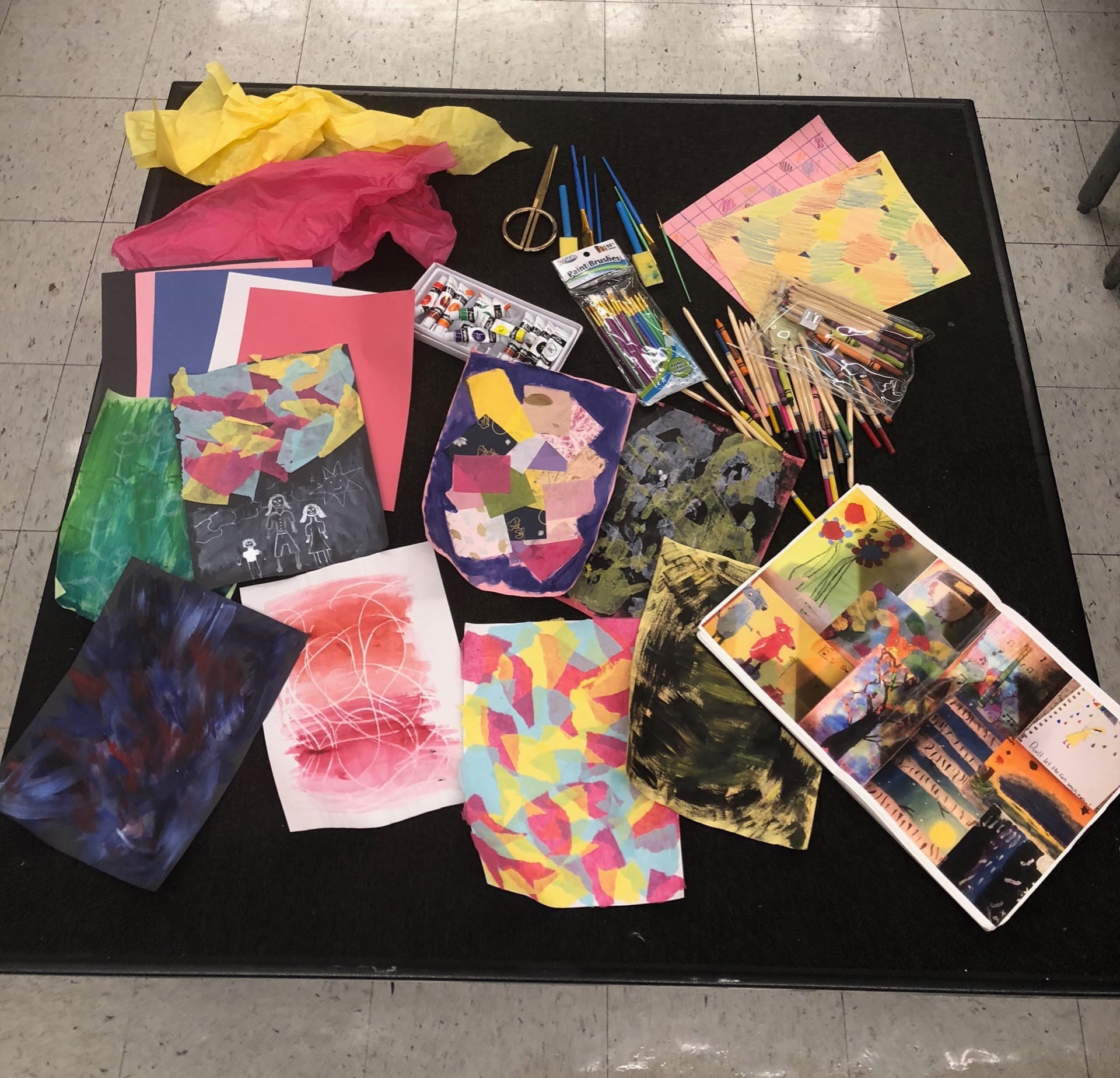
This is one of the first assignments we were given in studio class. I had never worked with paper before therefore I was quite intimidated by it. For the assignment, I had to replicate an elf makeup palette. Reflecting back to this first piece to now I feel as if I have grown a lot.
These two pieces are an insight into my contribution to my group. We created an identity, following the creation of a video, and other artifacts to strengthen the idea of her. These two links below are two pieces I made to add to her story. One is a missing person poster, as well as a letter from Hazel’s mother.
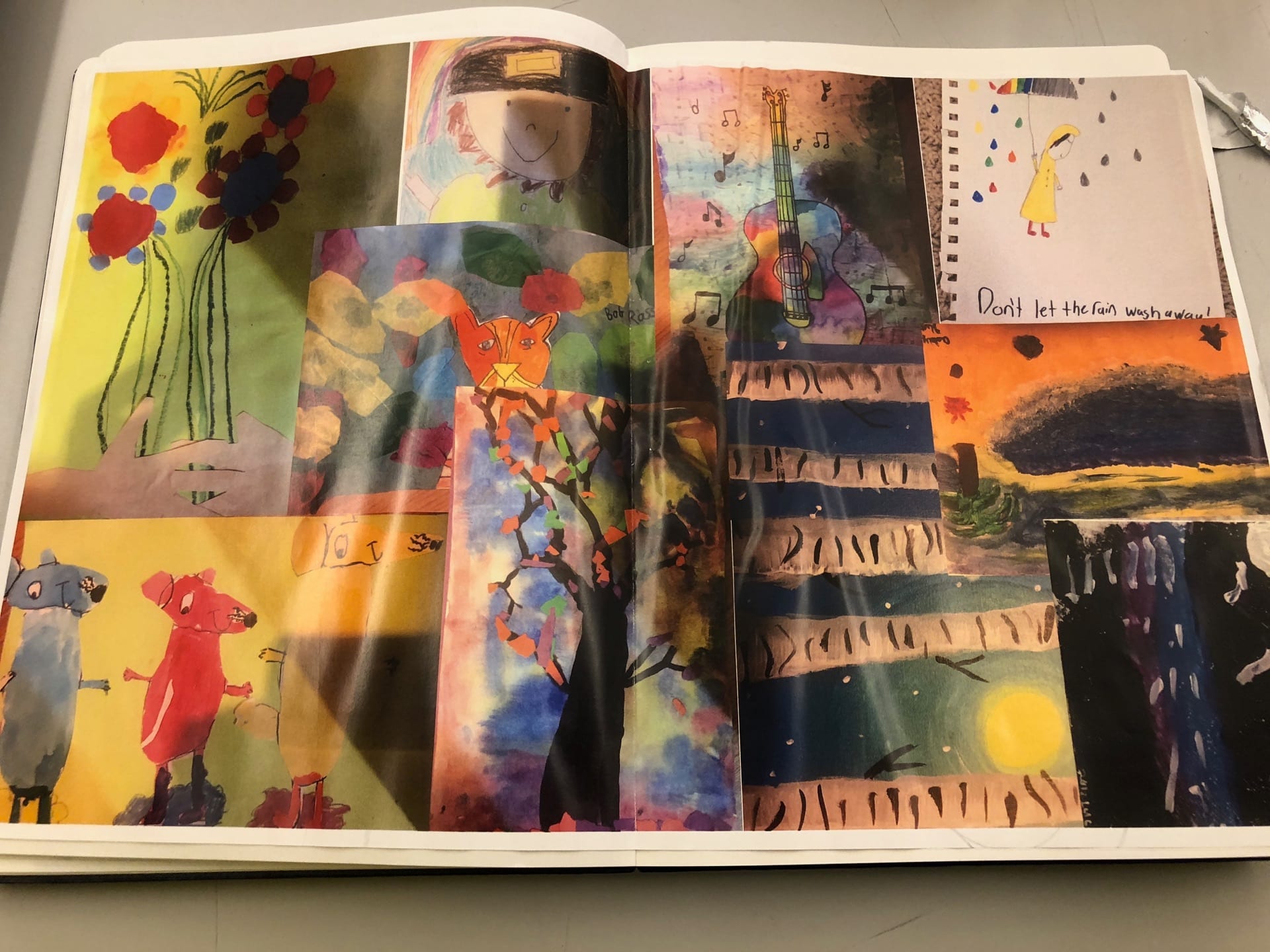
My partner’s fake story was about her trying to remember how she became an artist. She had mentioned that as a 6-year-old she had her work displayed in a museum. I decided to recreate a child’s art. I made it by asking my cousins to send me their favorite artworks then I recreated some of my own. Throughout this process, I found it interesting to try to draw like a child because when you compare drawing like a child to an actual kid there is a substantial difference. The actual child like drawing is far better because a kid does not think twice and it comes naturally because their imagination runs wild and they don’t care. However, trying to draw like kids as adults we are almost trained to think twice. Something so simple can leave you stumped and be almost difficult.
 enclothed cognition -2-2lvbybp
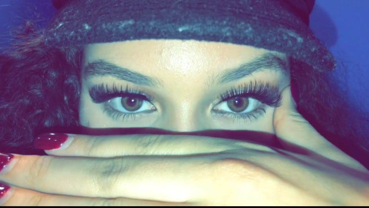
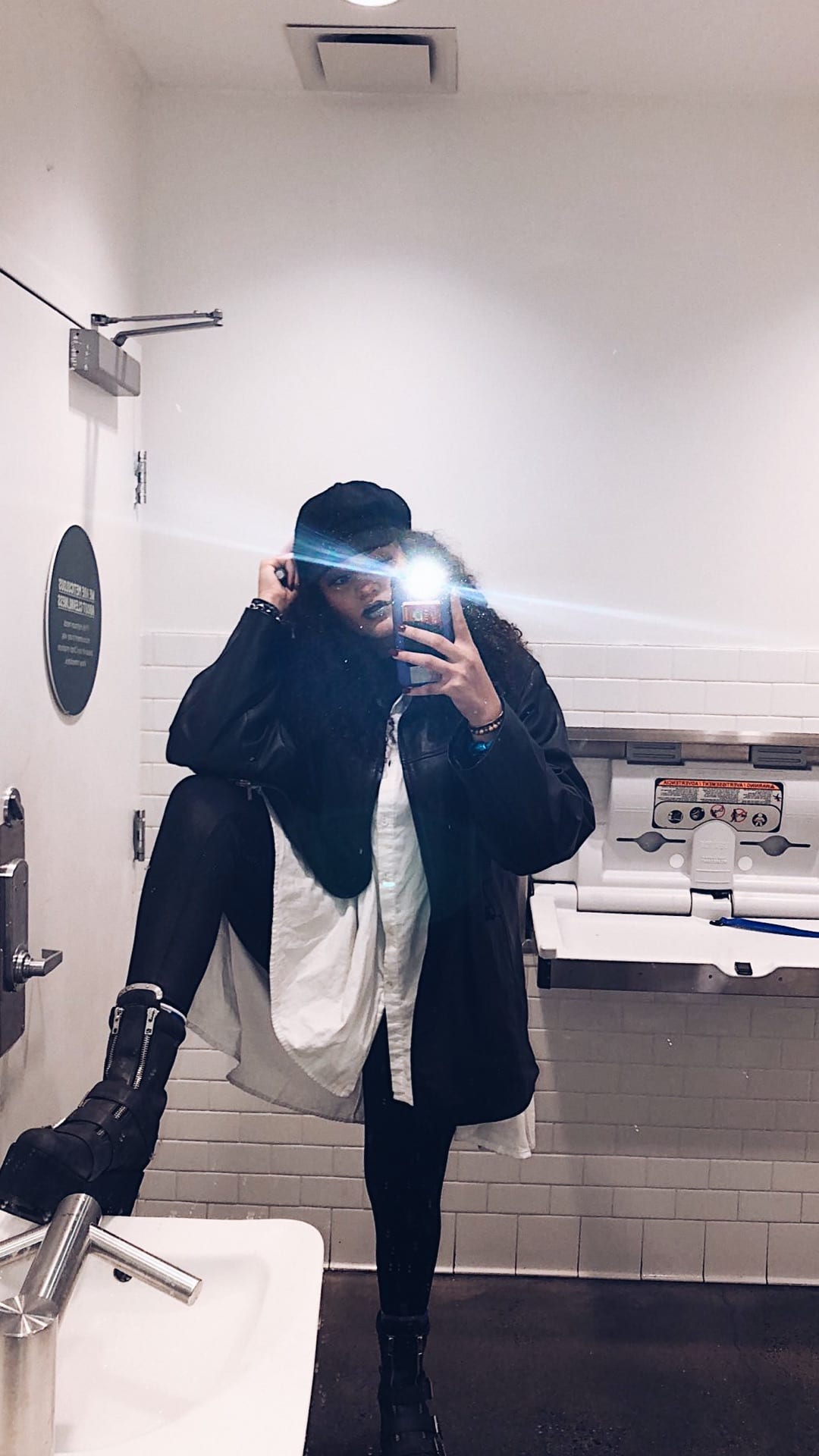
This project most definitely made one go out of their comfort zone. It allowed you to become someone that you arent for the day, but perhaps always wanted to be. It also gave you a new found confidence because it felt almost as if you had a mask on.
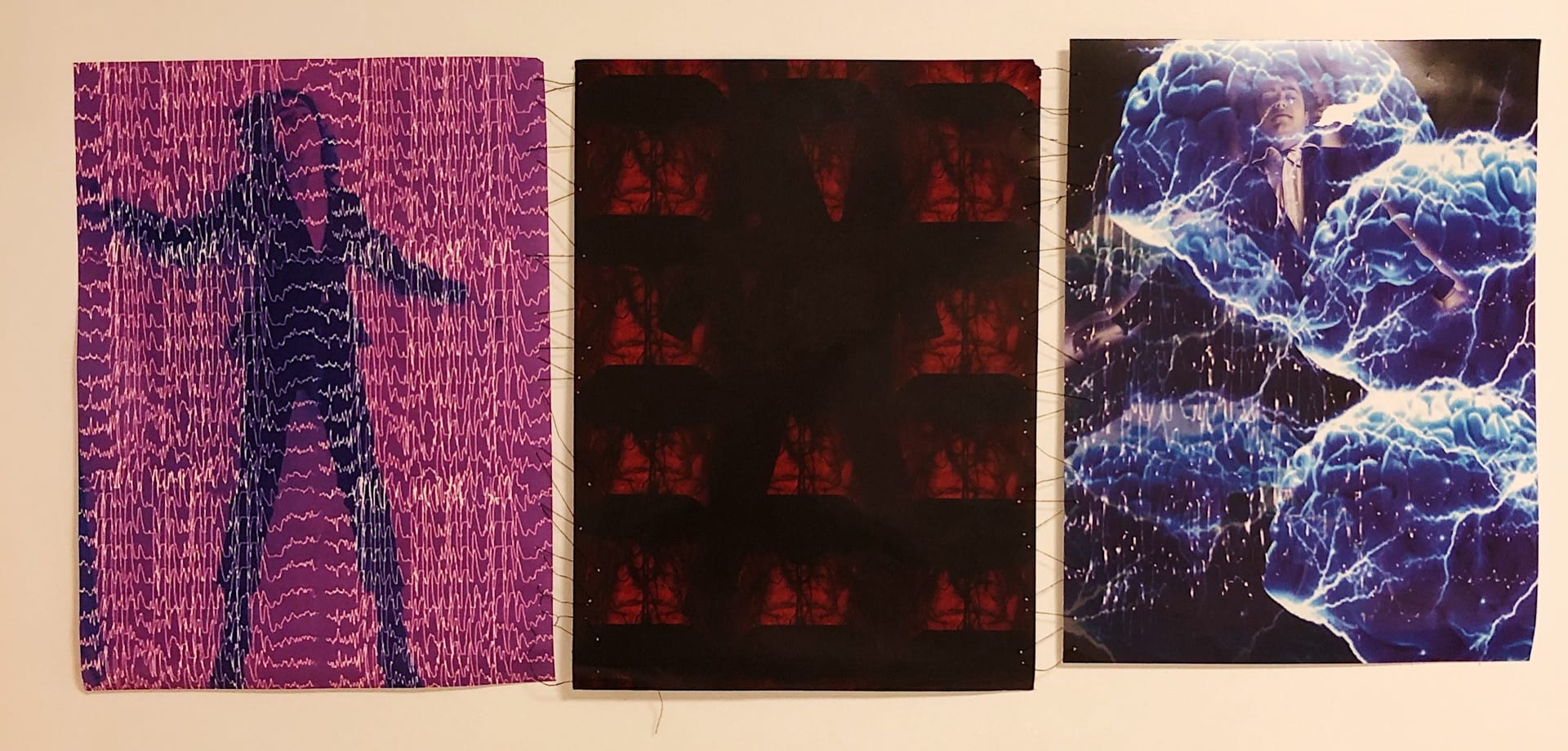
This project had a very interesting approach because we had to pair up with a fellow classmate and interview them about their life. With this new found information we needed to pick an aspect of their life that we wanted to investigate and form our ideas around. Interestingly my partner and I shared a similar experience of having seizures. This enticed me to base my project on one’s body while having a seizure, through the body’s movement, the wavelengths in one’s brain, as well as the parts of the brain it effects. This was a very personal topic for me that I related to on a whole different level, therefore I was excited to be able to use my art to give others a small insist to what seizures are like. I started by using photography to capture the way the body moves while having seizures, the movements of one’s arms, legs, chest, head etc. I used three separate images, then manipulated each in illustrator. For the first image on the left, I placed waves lengths of one having a seizure over the image, with the specific color for seizures (purple). The middle image was brain scans of one’s brain that is affected by seizures, and what parts of the brain are affected. This middle image is supposed to replicate an x-ray therefore when presented a light is placed behind it for the image appears. As for the last image (on the right ) is a mixture of the first two images, consisting of the brain as well as the brain waves. To connect the three images, I intertwined them by sewing each together with thread. The way the thread moved in between each image replicated brainwaves.
This Project was a very personal project because it was a self-portrait represented as a place. I chose to use my bed back home as my place because it is a place that I spent a lot of time the past summer and I thought of as a safe pace while dealing with health issues and the effects that came along with them. While finding my textures through the city, I chose to pick rough, sharp, rugged textures. My bed at home is all white, and looks soft gentle and “safe”. But I wanted to replicate it in a completely different perspective to reflect a dark mindset. The textures I chose to represent the feelings of anxiety, depression, and the constant painful thoughts that come along with those things. I started with my bed frame, which I replicated out of clear push pins. Then began placing a rugged dark designed texture for the wall behind my bed frame. Following I moved onto my sheets, then bedside table, and lights which I used three different designs for as well. Finally, I ended with sheets in which I placed packing peanuts to represent pills taken for things like anxiety and depression.
This project was both digital and hand drew. I picked this image that I took last summer in Little Italy that was taken on a memorable day that holds a lot of nostalgia. The left side was created in illustrator while the right was hand drawn. I started by placing the image in illustrator and lowering the opacity. Then created the mark-making tools that I used to recreate the image. I first started with the outline of the building. I drew out the miniature pizzas on illustrator and began outlining the bricks and aligning in a way to create dimension and form. Then followed with crosses adjusting the form to be suitable for each window and the street. After finishing the illustrator section, I then proceeded to the hand-drawn portion. I printed out several copies to practice hand drawing symbols on the right side. I decided to create waves as my other mark making symbol. These waves were a symbol to Italy being flooded into old and new through climate change. The left side was a more literal representation of little Italy, as for the right side was much less literal and more figurative. It was the idea that on one side this is what Italy stands for but climate change is causing flooding due to sea levels rising and climate changing destroying that past. The smoke on the top right is a representation of the past exiting Italy.
 Project #4-
 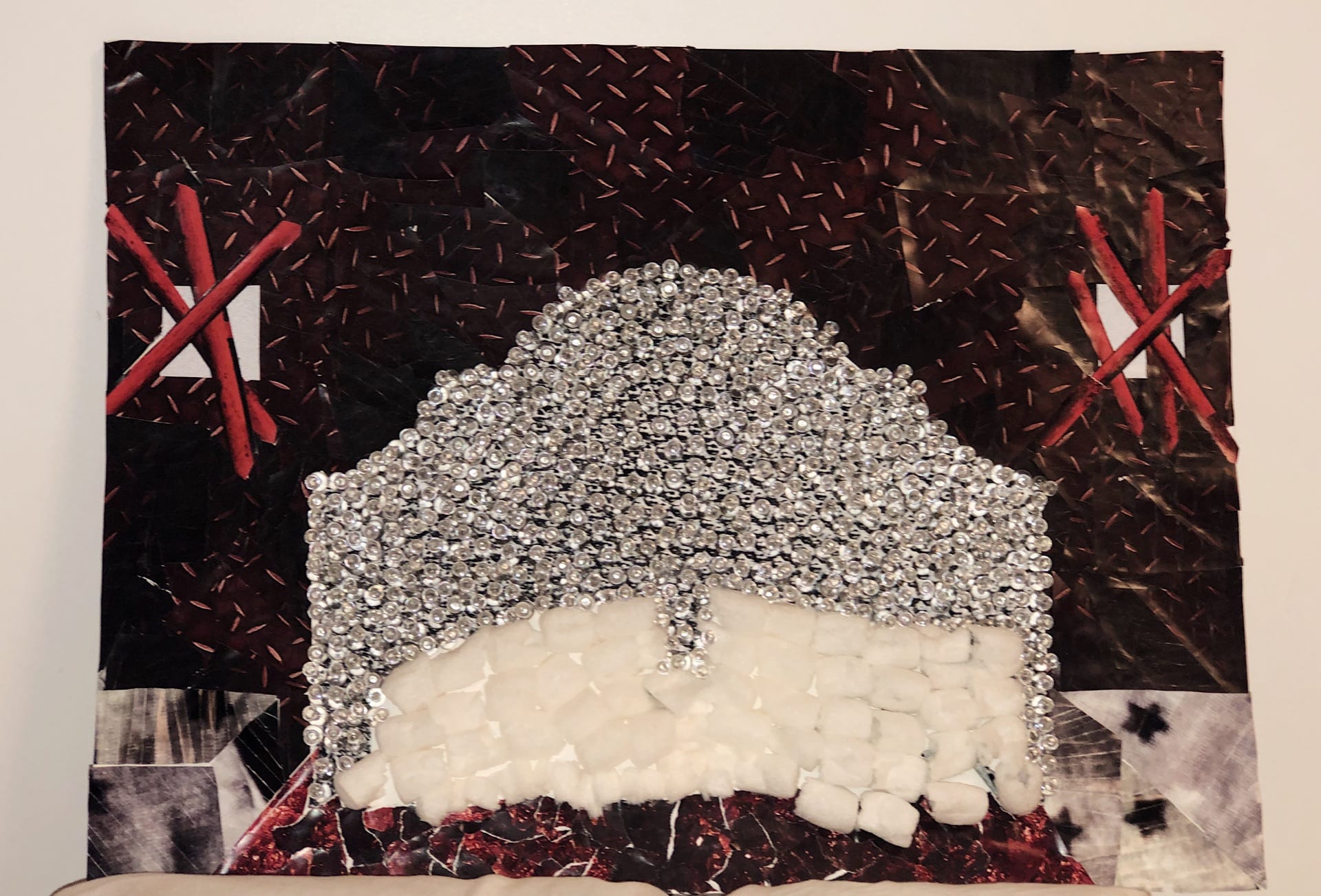 Project #3-
 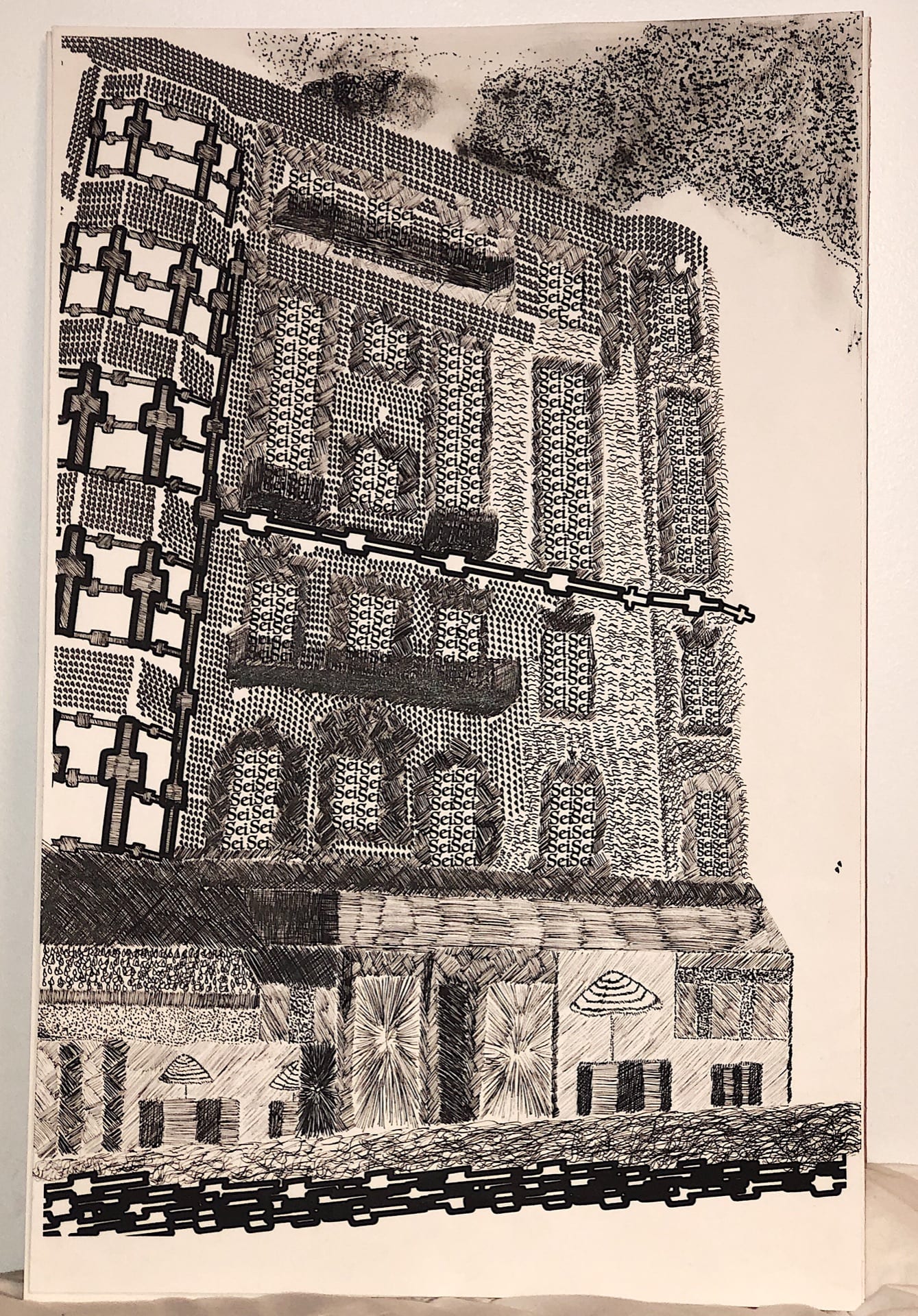 Project #2-