
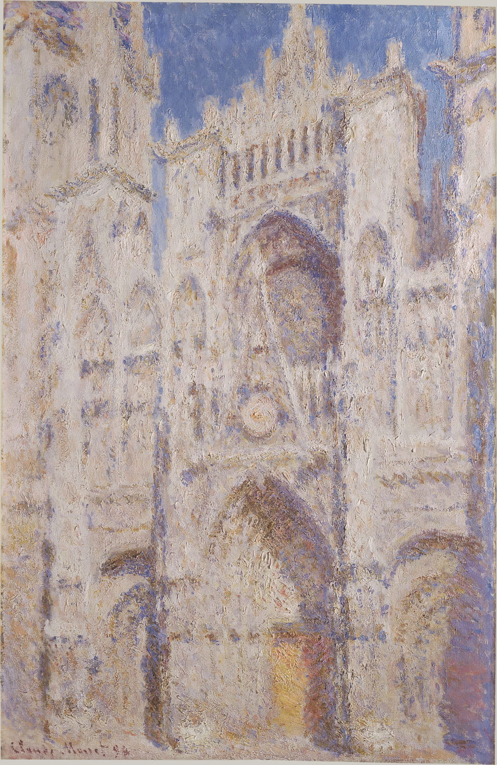
The piece Rouen Cathedral: The Portal (Sunlight) was created in 1894 through painting more than thirty studies of the Rouen Cathedral over several days. This process allowed Monet to see how sunlight or moonlight caused shadows and colors to change throughout the day. The sky behind the cathedral clues the viewer in to the time of day. The subtle gradation from dark to light in the top left hand corner brings the eye to the top right hand corner at the top of the cathedral. Flecs of the same blue found in the sky find their way into the stone of the cathedral. The sky blue tones and pale oranges allow for the cathedral to stand out against the bright sky. The use of complementary colors and their blending within the piece creates harmony. Monet uses oil paint for this piece, which allows for built up color and texture. Monet emulates the stone of the structure through his textured brush strokes. These rough and heavy brush strokes are characteristic of the impressionist movement. Monet does not only convey the time of day in this scene through the accuracy of light and shadow, but through the mood which is captured which is captured within his brushstrokes. Something which could not be illustrated through a hyper realistic piece.

The French artist Alexandre Cabanel’s The Birth of Venus from 1875 uses a similar color palette to Monet’s Rouen Cathedral. The figure in the foreground stands out from the blues of the sky and sea, along with the angels that surround Venus. There is a blue to pale yellow gradient present in the sky which reaches from the top of the piece to where it meets the sea. The main subject is centered within the piece, and her body reaches across most of the canvas. The angels fade as they go farther away to allude to depth, and they seem to be placed in an “S” shape which brings the viewer’s eye to Venus. They come close to her body, but not directly engage with her. The space left between them emphasizes Venus as being separate from them. The colors blend well together and seem to be present within one another once looking closer. The color palette utilizes complimentary colors in various tones.
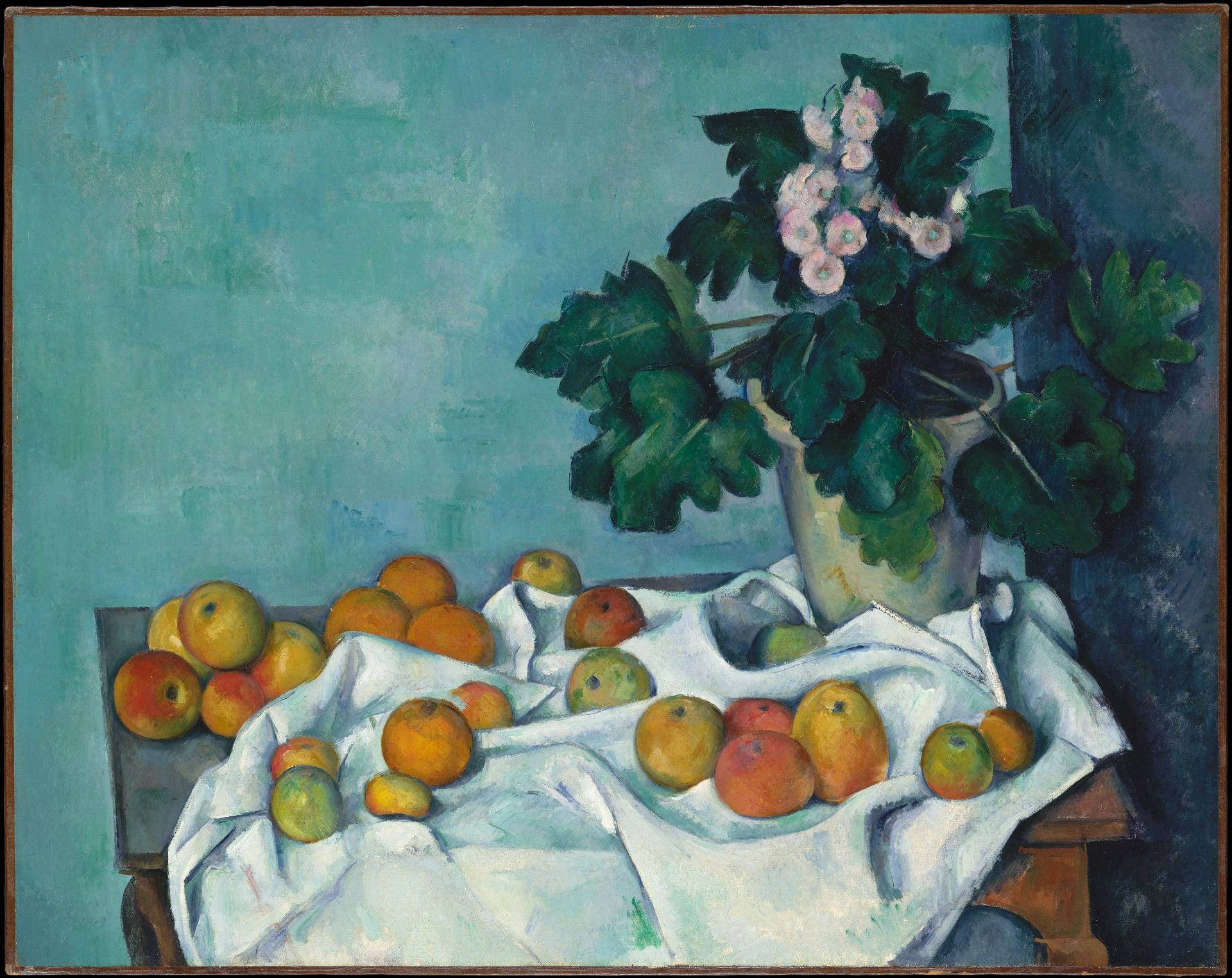
Paul Cézanne’s Still Life with Apples and a Pot of Primroses from 1890 also utilizes the similar complimentary schemes. The orange of the fruits stands out against the cool toned cloth, and the turquoise found in that cloth is present on the walls of this still life. Most of the color in the piece is cool tones, but the warm and cold find their way into each other, for example the flecs of green in the fruit, and the red in the flowers. The brush strokes help to bring across the texture of the objects in the still life.