CSS3 is only just starting to addressed layout. There are a lot of new tools in the pipeline that are changing the way documents will be laid out. Some of those properties will be covered in a few weeks.
The new tools and techniques will augment the old layout strategies, superseding many of them, but that does not mean these older properties and techniques will go away or be replaced. They will have less to do, perhaps, in the grand layout scheme of things, but the basic document will still follow the Layout Modes on which CSS was originally conceived.
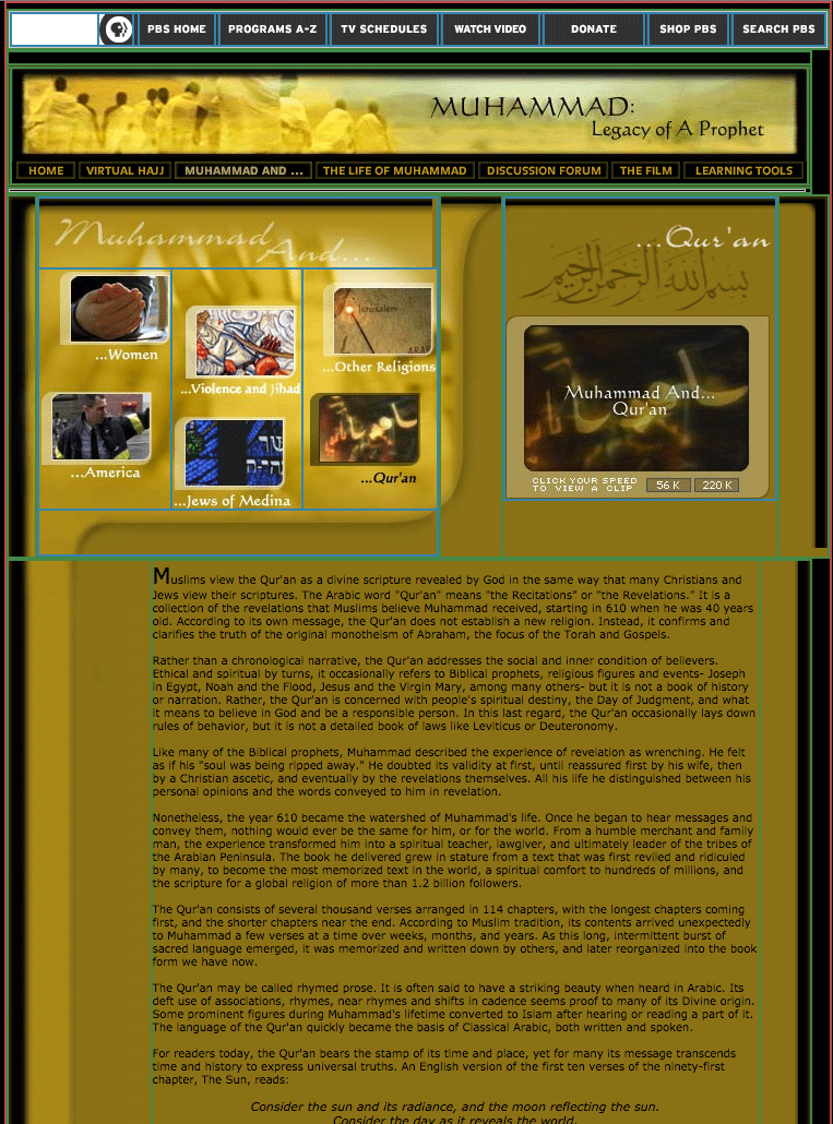
In the prehistoric age, layouts were determined by tables. This mixing of form and content locked in the structure of a web page with its content, and was never very flexible. That may not have been a problem in the early days of the web, but it would be a problem today. I recently stumbled on an old website on Muhammad, Legacy of a Prophet on PBS, which looks nothing like that anymore. Here is the page with the tables exposed. You will see that the entire page is a cut up Photoshop file, with all of the effects rendered as pictures. This no longer happens.
Instead, most websites are built with floats, and everything is created by using CSS instead of pictures. Floats are in many ways less intuitive, and more fragile than tables, but they are more flexible.
You would be correct to think that using floats as a technique is an overly complicated way to creates layouts and somewhat finicky to implement. Who could have guessed that floats, originally conceived to run text around images and other elements, would be used in grid systems to construct the majority of the web pages we view today?
I see a future without an extensive use of floats for layout purposes, but it is not quite here yet.
Down is easy
Documents will still be built as if stacking building blocks upside down. Starting at the top, you work your way down. Each block automatically fills to the width of the parent.
Horizontal is More Problematic
All of the layout strategies work to build elements horizontally, by limiting the width of one element to something smaller than the parent element , and then using one or another strategy to place boxes next to one another. It is necessary to limit the width of elements that would otherwise automatically fill up the entire width of the parent element, to something that fits within the parent element.
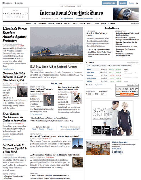
An exercise we will do in class is to look at the NY Times using Web Developer’s outline feature (this works only in Chrome or Firefox). You will see the following methods being used to determine the horizontal layout, starting with floats:
- Floats
- Relative Positioning (using negative margins)
- Absolute Positioning
- Absolute Positioning with Margins
- Display Property (block as inline or inline-block).
Layout Demonstrations
These demonstrations show how these layout properties work. Them out. Imagine how these could be used in various strategies to create a layout.
Floats
CSS Code View
Live Demo
Box A:
It is a testament to the creative problem solving of the CSS community that refined these techniques to the point where they will remain current for a long time.
This paragraph will either join the one above or clear: left; will clear the float.
Relative Positioning (using negative margins)
CSS Code View
Live Demo
Box B:
Box C: This box is positioned relative using negative margins.
Box D:
Absolute Positioning (with Margins)
CSS Code View
Live Demo
Display Property Interactive
CSS Code View
Live Demo
Box A:
Box B:
Box C:
Box D:
Creating layouts
Horizontal and vertical techniques are combined to create more complicated layouts. You will use one strategy to get the box to the side, another to populate it with content, and so on.
The content itself defines the layout.
The placement of elements is manipulated through relative and absolute positioning, floats and the display property, and given padding and margins so they fit the layout.
Absolute positioning is not a good idea when it comes to the main parts of the site. It works well for print, since once a job is printed, that’s the end of the story. Web sites are continually updated, and require a much more flexible approach. That is the key word here: flexibility.
The main elements of the document ends up being like a word processor, changing with the content, remaining flexible, while the smaller details can be manipulated in more rigid ways. That works as long as the rigid elements go along with the flow. This mixing of strategies has to be thought out in strategic terms when first staring to layout web pages.
Positioning the Page in the Window (ViewPort)
The first decision is to place the document in the window. Does it take up the whole window? What is the window is 2400px wide? Does it take up a 1000px width in the middle of such a large screen? or does it stay to one side, ignoring the size of the window once it passes 1300px?
This solution requires two blocks, the first is a div with a class called wrapper, and the second is the sections tag. The div is needed to limit the maximum width of the window to 1300px, and the section determines the width of the page as well as horizontally centering itself inside of the wrapper. This is the strategy taken when setting up the page in the demonstration.
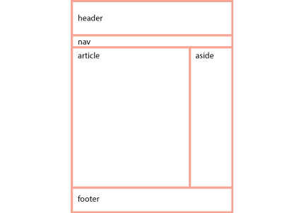
With the width of the page decided, the process now goes from the top of the section. First comes the header, then the navigation (the navigation is often nested inside of the header) then comes the main article with usually an aside to the right or left of it, and finally, a footer to define the bottom of the page.
If all of these are in the document flow, and determined by the size of the content, then the document is flexible, meaning that if something were to be added somewhere in the middle, it would be accommodated in the document flow, and everything else would adjust accordingly.
Building flexible documents is the ideal. Please aim for that, as it will make your documents much easier to manage. We have not yet covered responsive design using media queries, but when we do, the document has to remain flexible so it can adapt to different size viewports, or window sizes, from the tiny screen of the iPhone to the largest monitors.
If you think it is hard to manage a static page, just imagine how much more difficult it would be to manage various states of the same document. Lets make our documents flexible for now, and worry about responsive layouts after the midterm.
Fixed Layouts
A fixed layout has pixel-based widths for the whole page and for each column of content. Its width doesn’t change when viewed on smaller devices like mobile phones and tablets or when a desktop browser window is reduced.
Fixed layouts are easiest when first learning CSS.
Fluid Layouts
A fluid ( or liquid) layout uses percent-ages for widths, allowing the page to shrink and expand depending on the viewing conditions.
Elastic layout can use ems for both width and all other property sizes, so the page scales according to a user’s font-size settings.
There is no single layout strategy that is right for every circumstance, and you will find yourself using all of them at one time or another.