LS Studio 2: B1_Observation a Day


 Back to Mac

“Low Power mode to Fully Charged Mode “

“Back to Mac” system is a system that accepts 6 empty containers and provides one free lipstick to customers. I’ve first thought of showing the before and after image of Mac’s lipstick by demonstrating a new lipstick and smudged lipstick. However, by looking at my IPhone, I was inspired and decided to compare”Back to Mac” system to battery percentage. Therefore, I illustrated a “Mac battery” that displays a the process from going from low battery to fully charged battery. 

Sephora

“Something, Nothing, and a Penny”

Sephora has a return system where one can get a refund or exchange even though they used the product, while South Korea has a policy that one cannot get a refund or exchange after using the product. I wanted to describe the return policy by connecting cosmetics and the idea of reverse procedure. Therefore, I put a receipt that gives information about Sephora’s return policy and at the another receipt I drew an eye that first has full eye makeup, but removes the makeup as it goes on. Also, I attached a penny at the last eye to illustrate that the cosmetic that one used would later come back as a money. Lastly I colored the background with eyeshadows to give the cosmetic feeling.

The Power of Patience

“When light went off suddenly, our eyes cannot see anything at first, but when we calm down and observe carefully, we could finally understand the objects and therefore are able to see even inside pitch-dark.”

By reading “The Power of Pateince” during Seminar, which claimed that “Just because you have looked at something doesn’t mean that you have seen it. Therefore, it takes time to see every details of an object.”, the text reminded me of the situation where light went off suddenly. Therefore, I colored the background with black marker, but not completely to describe the boarder between light and dark. Then I drew an image of eyes and random object to demonstrate the situation as I mentioned above.

Cleopatra

“Inspired by the Mediterranean seductress, Cleopatra captivates the senses.” 

This is the explanation that Tocca gives about the perfume, Cleopatra. However, I thought that the packaging as well as the scent did not matched the name, Cleopatra. The packaging had more naturalistic feeling and the scent was like a flower. Because of the image that I have toward Cleopatra, which is quite dark because I heard about her suicide from snake bite when I was an elementary student, I’ve created an image only using black and white. I drew a snake that is about to bite on the left and drew a flowing paint to represent poison and death. 

Glade

“It looked like an ember, but it was a representation of candle light”

I went to Barnes and Nobles and smelt a good scent and was wondering about the scent. The scent was coming from a section where, I first assumed, air freshener was located. I looked and there was a logo of the brand and it said, “Glade” Their logo was abstract with some flowing colors of yellow and orange. After a while I realized it was an ember and I acknowledge it was a representation of candle light. I thought this was a great logo because it is simple, yet clearly delivers the message. Inspired by the candle light I’ve created texture and mixed yellow, red, and white acrylics to give a sense of fire. 

By the People @ Cooper Hewitt


Rebel Nell’s jewelry was the most outstanding piece that drawn my eye from By The People. The first impression of Rebel Nell’s piece is a fragment of an ore that is crafted as jewelry. Some of the jewelries are connected with the necklace chain, while some are presented without the chain. The surface of the jewelry have marblings and the shapes are not homogenous; each pieces are unique and have different shapes and size. Moreover, few pieces contains circular and rectangular holes that are randomly place around the jewelry.

The reason why I thought this piece was interesting was because of its choice of creative medium. Amazingly, the jewelry is not made from jewel, but it is made from graffiti, which is writing or drawings scribbled, scratched, or sprayed illicitly on a wall or other surface in a public place. Amy Peterson found a shard of graffiti on the way on the Dequindre Cut underpass, she explored graffiti, and revealed the layers of graffiti and therefore decided to use it for her enterprise. I first thought this was jewelries that I can easily find on jewelry shops, but I never imagined that this would be graffiti. Peterson is a designer who is truly aware of the surrounding and knows how to utilize the materials effectively. I thought using graffiti to create jewelry was a creative idea that no one would have thought. Furthermore, this pice contributed to make ‘A Better America’ by questioning and suggesting the existing challenges and by suggesting plausible solution addressing the problem.

The method of research that might have been necessary to create the Rebel Nell pieces would be first of all to understand the societal problems. For example, Peterson should have been aware of the problems of gap between the rich and poor and gender inequality. Secondly, primary and secondary research such as meeting jewelry experts and reading books might be essential to learn how to produce jewelry. Lastly, communicating and interviewing the people is critical to understand what their needs are and to come up with a systemic plan to effectively support the women.

LS Seminar: Memory_Self-assessment

Seminar and Studio Brain

LS Seminar and Studio were human brain for me. The left side of the brain performs tasks that have to do with logic and the right side conducts creativity, which are different but make harmony and function together. At first, I thought the subjects as black and white that would not balance each other and thought producing art is more important than writing. For me, Studio felt more about art that requires creativity and to produce an artwork, while Seminar felt like a course that requires to use objective skills to put our free-flowing subjective thoughts into writing. However, as I complete more assignments, my perspective changed: art and writing are equal because they reinforce each other by being opposite as water turn off fire and fire boils water and therefore allow students to clearly present and express their thoughts. 

I was especially satisfied by bridge 1 assignment because it allowed me to think more in depth and explore more about myself. To be specific, I realized that I’ve underwent various changes and my life had lots of fluctuations as I look back at my life and write down memories, but I was part of the changes; those changes were accumulated and made my current-self. This gave me an inspiration and contributed heavily to create the book cover in Studio, “Carousel of Waves.” Waves represent fluctuation, but it is still part of the ocean (one). I truly enjoyed writing I Remember because it was a creative writing assignment that allowed me to look back to my life and I was able to learn how to describe using our senses that gives power to the writing to make the writing look alive. Moreover, this project allowed me to find myself being interest in sensory writings and to learn my strength of exploring and understanding myself through memory.

The challenging part during the courses was to express all my thoughts on just few papers and language barrier since English is not my first language, I had difficulties on finding appropriate words to express my thinking process. Moreover, I had difficulties completing the bridge 3 short story assignment because it was my first time to work as a group and it was hard to come up with an equilibrium that satisfies everyone. Each group members had different writing style when creating story and it was hard to combine them to look like one piece. Thus, I had to change my style of writing and was placed in a situation where I had to write in a style that I was not interested. From this project, I realized I lack experience with collaborating with other people, therefore should strive to make the balance between my desire and others opinion.

The second last project, annotated bibliography, was also a new experience for me. I have written a research paper for art history final during my senior year in high school, but it was different in many ways. First of all, I did not used reliable sources because and moreover, no one taught me how to research step to step like we did during Seminar. Therefore, the research question that I’ve created, the difference between Realism and Modernism, was too broad that made me to have a hard time organizing information. However, by learning how to research reliable sources and to create more specific question, I became more confident in researching and could grasp which direction should I lead my research toward and came up with a question about work-family balance policies in South Korea and Sweden that I pursue to write next semester.

Throughout the semester, I found myself being interest in creative writing using sensory description and found that having a guideline and/or outline is effective. The one thing that I realized the theme memory of both Studio and Seminar is not only about individual, but could be a source to connect and interact with others as bridge 1 and bridge 3. Thus, Seminar and Studio allowed me to explore myself as well as opening my eye to look at the big picture by projects that first focused on oneself and further expanded to the community. For the future, I hope to create artworks and writings that connects people, culture, and environment rather than just focusing on myself. LS Seminar and Studio were brain that allowed be to go down to the rabbit hole like Alice in Wonderland, but also enabled me to broaden my perspective to look around my surroundings.

Drawing/Imaging: Language Final Project

img_3367

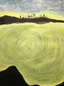
The final project for drawing and imaging, I decided to draw my memory. This drawing represents my memory that is related to my family. My family and I visited Philippines about 8 years ago. This was the first travel after I became a elementary school student. This travel was meaningful to me because each of our family member were busy so that we could not travel until 2016. I still remember the scent of the emerald ocean that reminds me of happy memories that I had with my family. Thus, I painted emerald ocean inside in the mountaintop that is far away from the city. This means my hope to enjoy the leisure and longing for family union once again. Moreover, the reason why the ocean is in a pond yet flowing is because this is my memory that happened at the past, but still stays in my mind flowing.

Drawing/Imaging: Language Pattern Design

%e1%84%89%e1%85%b3%e1%84%8f%e1%85%b3%e1%84%85%e1%85%b5%e1%86%ab%e1%84%89%e1%85%a3%e1%86%ba-2016-12-15-%e1%84%8b%e1%85%a9%e1%84%8c%e1%85%a5%e1%86%ab-7-59-14 %e1%84%89%e1%85%b3%e1%84%8f%e1%85%b3%e1%84%85%e1%85%b5%e1%86%ab%e1%84%89%e1%85%a3%e1%86%ba-2016-12-15-%e1%84%8b%e1%85%a9%e1%84%8c%e1%85%a5%e1%86%ab-7-59-24 %e1%84%89%e1%85%b3%e1%84%8f%e1%85%b3%e1%84%85%e1%85%b5%e1%86%ab%e1%84%89%e1%85%a3%e1%86%ba-2016-12-15-%e1%84%8b%e1%85%a9%e1%84%8c%e1%85%a5%e1%86%ab-7-59-33

Everyday, weather changes, even small variation in temperature. Sometimes it is sunny, rainy, snowy, windy, and so on. There might be countries that might not have weather change, but the countries that I’ve lived in, South Korea and the United States, have four seasons, which brought change everyday. Change could effect one in a positive way, but it could also bring negative effects. Because of this I’ve underwent various changes and these fluctuations sometimes lead me to feel lost and isolated. However, I later realized those changes are along with myself and I part of the change and therefore together that progresses. Thus, by connecting the idea of weather and change I came up with a pattern that demonstrates different aspects of weather, but that is one and combined. This was an interesting project as well because I was able to explore various color schemes and the effect of changing colors.

LS Studio 1: Memory_Bridge assignment#4

%e1%84%89%e1%85%b3%e1%84%8f%e1%85%b3%e1%84%85%e1%85%b5%e1%86%ab%e1%84%89%e1%85%a3%e1%86%ba-2016-12-13-%e1%84%8b%e1%85%a9%e1%84%92%e1%85%ae-12-21-33

%e1%84%89%e1%85%b3%e1%84%8f%e1%85%b3%e1%84%85%e1%85%b5%e1%86%ab%e1%84%89%e1%85%a3%e1%86%ba-2016-12-13-%e1%84%8b%e1%85%a9%e1%84%92%e1%85%ae-12-21-43

%e1%84%89%e1%85%b3%e1%84%8f%e1%85%b3%e1%84%85%e1%85%b5%e1%86%ab%e1%84%89%e1%85%a3%e1%86%ba-2016-12-13-%e1%84%8b%e1%85%a9%e1%84%92%e1%85%ae-12-13-43

%e1%84%89%e1%85%b3%e1%84%8f%e1%85%b3%e1%84%85%e1%85%b5%e1%86%ab%e1%84%89%e1%85%a3%e1%86%ba-2016-12-13-%e1%84%8b%e1%85%a9%e1%84%92%e1%85%ae-12-14-03

%e1%84%89%e1%85%b3%e1%84%8f%e1%85%b3%e1%84%85%e1%85%b5%e1%86%ab%e1%84%89%e1%85%a3%e1%86%ba-2016-12-13-%e1%84%8b%e1%85%a9%e1%84%92%e1%85%ae-12-14-25

%e1%84%89%e1%85%b3%e1%84%8f%e1%85%b3%e1%84%85%e1%85%b5%e1%86%ab%e1%84%89%e1%85%a3%e1%86%ba-2016-12-13-%e1%84%8b%e1%85%a9%e1%84%92%e1%85%ae-12-14-34

img_3379

img_3375


img_3382

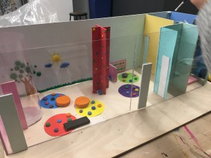
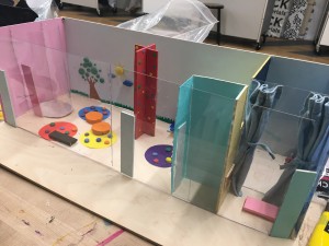
In the past, women were expected to stay at home. However, as society changes and people’s perspective changes, women in modern society express their passion about achieving one’s dream and take caring of children as well. Expanding idea from bridge #3 project, our group realized that there were several women who felt difficulty balancing between work and family. Our group got inspiration by this and decided to make a space for work-family balance that could involve the newschool facilities and students.

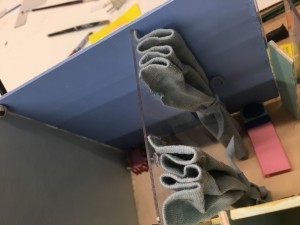
There are 3 main parts for this project: policy, child care room model, and application design. As a group, we created some policies that combines policies provided from companies that we thought was effective. We’ve first thought of using the breast feeding room at L1, but it was to limited therefore we searched for rooms at UC to find a suitable place. Our group decided to use the two fashion rooms at floor 4 since it is the most biggest room available at UC. After deciding the place, we searched for the floor plans to measure and met several times at the learning center to cut woods, layout, and decorate the child care room model. Our group planned the model to be designed by each majors of the newschool. Lastly, our group also designed an application so that working moms could utilize the application even though they are not with the child such as monitoring in real time. Furthermore, we added scheduling so that faculty members in the newschool could do work-family balance at UC.

LS Studio 1: Memory_Bridge assignment#3


21                         1221

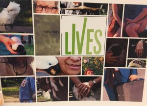
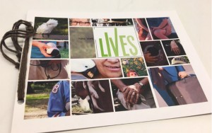
NY lives is the profile book of ten people that our group chose while doing the interview. The title itself has two meanings: lives as a plural form of life and live as to be alive.

As a class we went to Washington Square Park to interview random people. Our group have split up into two and interviewed about 25 people. At first, we planned to make a tattoo book that could utilize our team members talent, but there was no consistency with the content. Therefore, we decided to focus on the photographs and the storyline to maintain the consistency.

For the cover, we cropped people’s photographs that could represent oneself. For example, for John, who is a guitarist, we have cropped his hand and guitar. For the content, we wrote short description that could give a glimpse of their lives.

It was my first time to work as a group and interview strangers, which was challenging, but it was interesting to listen to various people’s unique life stories and to collaborate with other people and create an artwork.

LS Studio 1: Memory_Bridge assignment#2

untitled-1

The title for my Bridge#2 peer-to-peer assignment is the Freedom from black.

Na Yon Kim, who is a Korean born in 1996, is my partner for this project. I’ve once met Na Yon in the New School meeting at Lotte Hotel in South Korea, but I was only able to know her name and her major, fashion design.

However, after we went to Moma, I was able to know her favorite artists: Nan Goldin  and Jackson Pollack. Nan Goldin and Jackson Pollack have two distinct style of art that seems hard to relate, but what I noticed about Na Yon through her preference in art is that she likes abstract and expressive art.

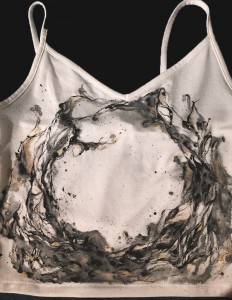
During the interview, Na Yon gave me an abstract answers to the questions, but I thought the vagueness gave me more space to explore her. I was especially inspired when she told me her favorite fashion is grunge style because it feels like a freedom in the gray and lifeless city and when she described herself in two words: black and natural. By listening to her answers, I decided to create a cloth that is just normal, but transformed as a unique cloth by painting expressive and dynamic movements that represents the freedom from being one of the pack.

I went to Forever 21 to purchase a plain sleeveless shirt and used acrylics that I’ve already purchased before at Blicks. While I was looking for white shirt, I have paid an attention to the quality of the material because there were some clothes that did not seem suitable to apply acrylics on. Some clothes almost look like ramie fabric. Even though I bought the sleeveless shirt after looking at various clothes, the cloth absorbed water quickly that made me hard to draw since the brush dries in within few seconds. Thus, I had to control the water amount, which allowed me to go back and forth between acrylics and water color paint even I was just using acrylics.