For the Branding Project, I wanted to make a photography company. I had made a company/website a couple years earlier but due to the website updating their entire format, my page ended up being deleted. So, I created Jules Luna, the photography website that offered photography and graphic services for others. In terms of my colour palette, I definitely didn’t want to go with the stereotypical white that I saw in other photography websites because to me personally, the white was always deterring my eye from the photos. In addition, because the name was Luna, I wanted to add some blues to my palette. I came up with black, white, a dark navy, navy, and dark and light gray (funnily enough my school colours). In addition, I made a bunch of different logos and icons that played with this font that I found on dafont.com that I particularly enjoyed for the symmetry of the “J” and “L”.
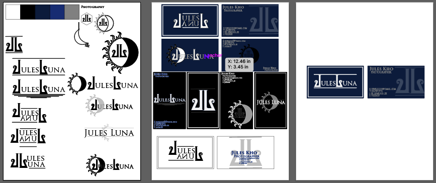

I ended up with the single icon above as well as the logo that is displayed on my final business card on the right.
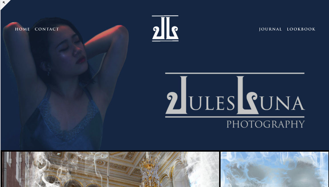
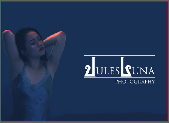
In addition to my icons and logos, I created some mockups as well as a formal website that could display my vision. I also want to use this website in the future to display my work.


Although my website isn’t fully ready yet, here is a screenshot of what it looks like: