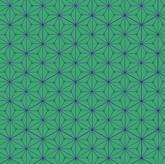
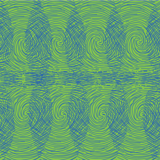
After finishing with all the patterns, we had to think about adding color. For me, this was the hardest part of all because I had to think on combinations that would match and make a statement. For the first pattern, which has hexagons, lines, and arrows, I decided to go with dark and slightly contrasting colors. I made three different combinations. The first has a green background with pink lines, the second has a blue-green background with blue lines, and the last has a red wine background with red bright lines. I made this to make a more dramatic and mysterious pattern. For the second design, I decided to use bright tertiary colors. This pattern has circles, therefore, inspired on the Japanese artist Yayoi Kusama, the colors are contrasting and rare. The first combination is a mix between blue and red, red circles in blue background and blue circles in red background. The second combination is a combination of purple and yellow and the last one is the most different one because it uses orange and pink in the slightly same tone, not as contrasting as the others. I chose these color combinations because it is something unusual and intriguing. Lastly, the third pattern is inspired on fingerprints. As this is kind of a foolish fun pattern, I decided to use adjacent colors that were inspired by the colors of Dr. Seuss characters. The first color combination is blue and magenta, the second combination is light orange and dark orange, and the last combination is light green and dark green.

 –> First Pattern


 –> Second Pattern

 –> Third Pattern
Colors in the patterns are essential to convey depth and contrasting layers. Also, they are used to convey ideas which allow the work to have more meaning and uniqueness.
Lastly, this project has been useful to learn how to play around with shapes, drawings, colors and ideas to convey different messages and emotions.