RECONSTRUCTING TIMES SQUARE – DRAWING/IMAGING

When I went to the MoMA, the pieces that interested me most were concerned with creating space out of flat looking shapes. Those are the ones I found myself looking at for longer periods of time, and I think that is because though they were so simple, it seemed as though real thought had been put into their compositions.

Two pieces I particularly remembered from my visit were The Studio by Pablo Picasso and [Composition-40-2011] by Shirana Shahbazi. Both were able to convey a sense of space while remaining extremely flat images, and both explore different shape and color combinations.


The photos I took of Times Square that I found the most interest in were photos that displayed vast walls/billboards. What I think is cool about Times Square is the fact that it is composed of a bunch of bright walls and posters that would otherwise be blank.


To help me better understand perspective, I attempted to create some perspective drawings – first from 1 point, then from 2.


Finally, I was able to create an image that is the complete opposite of Times Square: Blank walls like canvases and calm, bland colors.

PORTRAIT OF A PLACE – DRAWING/IMAGING

I wanted to create an image of a place that was familiar to me but not too familiar; since I’ve only been residing in NYC since the beginning of the school year, any place I’ve familiarized myself with since my arrival would be perfect. Within the criteria of the assignment, I settled upon my neighborhood train station: Church Avenue. I found it so interesting because the walls were ridden with graffiti and spray paint etchings – the cave-wall-drawings of today, as I see them.

Initially I wanted to recreate the image on a quilt, but because of time and money constraints I reverted to painting it across four different canvases. I remained true to my original idea of somehow incorporating graffiti into the image, by creating a vignette that is obscured by graffiti writing. The painting says “SOMETIMES I FEEL LIKE MY ONLY FRIEND IS THE CITY I LIVE IN, BEAUTIFUL BROOKLYN – YAASIN BEY” which is a quote by one of my favorite rappers and well-known Brooklyn native, Mos Def.


TIMES SQUARE – DRAWING/IMAGING

 S

MoMA POST – DRAWING/IMAGING

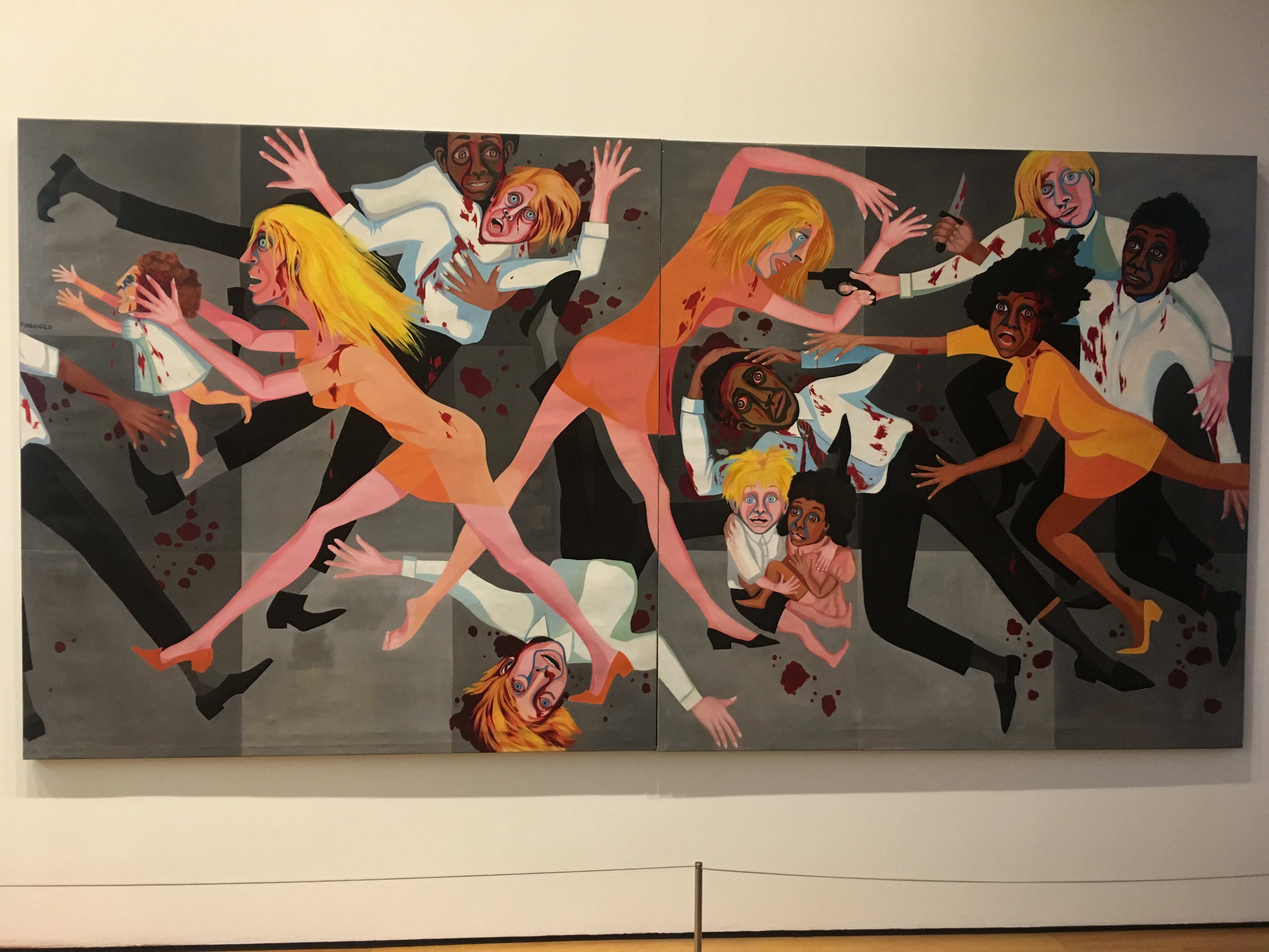
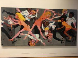
Faith Ringgold, American People Series #20: Die, 1967

Space is pretty shallow, because of how graphic this painting is and how the shapes in the painting are so defined. The composition of it is the reasoning behind why I say this; the colors are also really bright and contrasting so that adds to the graphic-ness of the overall image. It is also a large painting – so size does play a part.


Lynette Yiadom-Boakye, The Myriad Motives of Men, 2014 

This painting appears so deep because of the lack in range of colors used – they are all very dark, even the light colors seem dark in a sense. By limiting the amount of colors on their palette, the artist was about to make the viewer perceive the painting as deep although there may only be about 6 different colors used in varying ways throughout this entire piece.


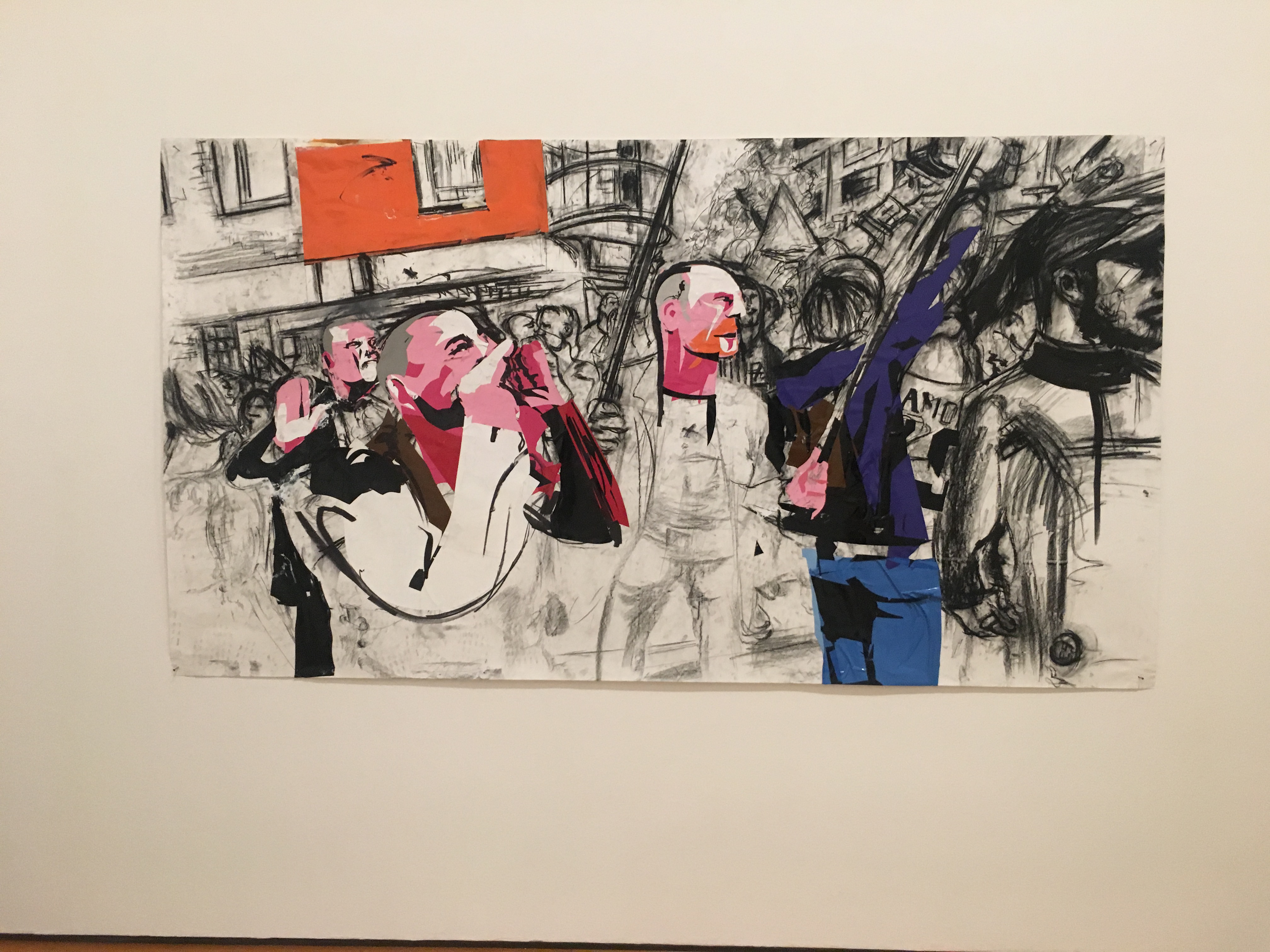
Erik van Lieshout, Untitled, 2014

This painting is shallow, because the lines and shapes in it are so loose and without real definition. It’s pretty cool/interesting, because the figures and buildings are just recognizable, with dabs of color randomly throughout it attracting the viewer’s eye.


Diego Rivera, Agrarian Leader Zapata, 1931

This painting is deep, considering the composition; it looks like the artist took his time with it and added great detail, causing the painting to get deeper with each brushstroke. There is a variation of colors across the wheel, and different shapes and shadows that draw together and make for a well-resolved piece.


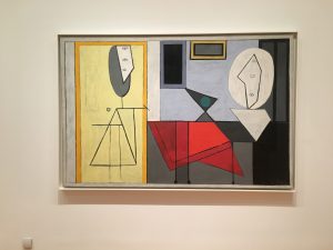
Pablo Picasso, The Studio, 1973

This piece is shallow – it is composed of lines shapes and colors in their most basic form. Abstract, it seems to be a rendition of a studio, lending hints of figures and objects commonly found in one. The perspective is head on, which also adds to the shallowness.


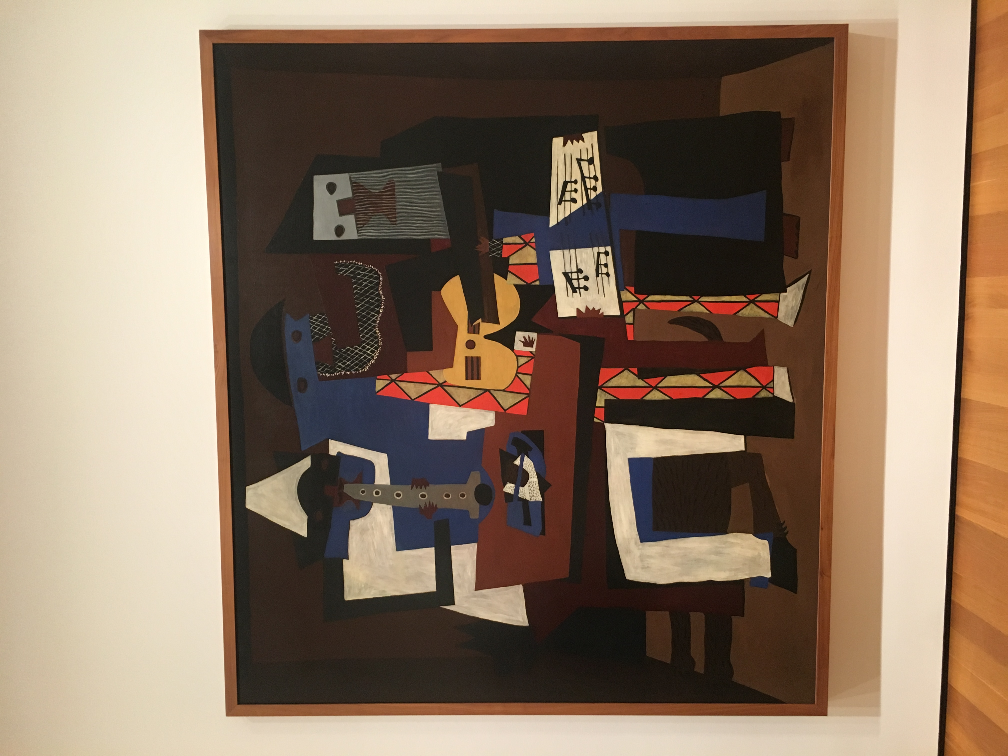
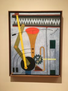
Pablo Picasso, Three Musicians, 1921

This painting is deep-looking, because of the darkness of the background and the lightness of the foreground. There is also this variation from pattern to solid colors in the background and foreground, which allows the viewer to believe the two are more contrasting than they really are. The fact that the figures are composed of shapes helps the deepness too; the painting is abstract.


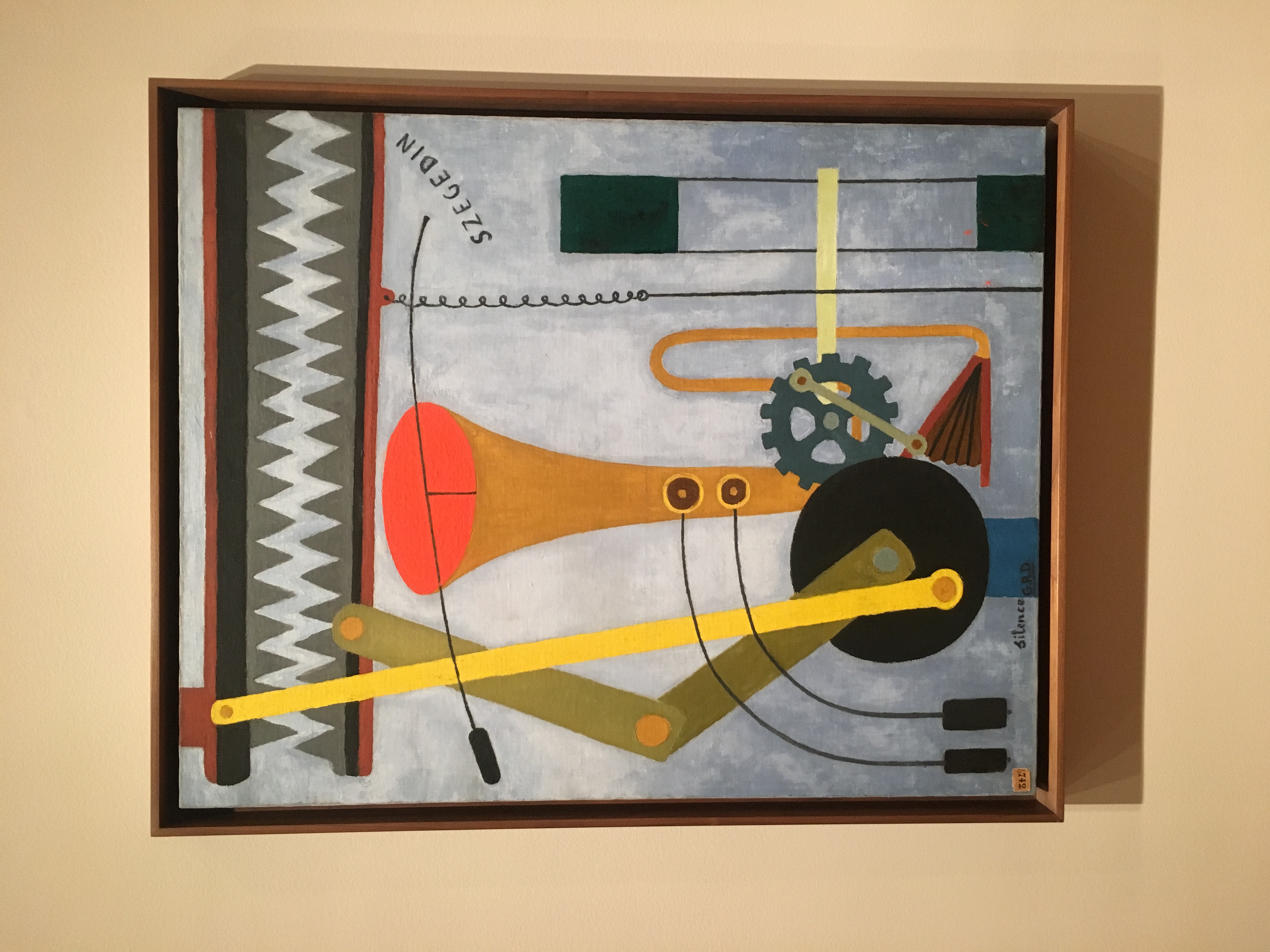
Georges Ribemont-Dessaignes, Silence, 1915

This painting is shallow, because the shapes look very light and on the surface. There aren’t any shadows really, just a contrast from the top to the bottom of the painting – sort of like a gradient grey color. The shapes are also brightly painted and viewed head-on.


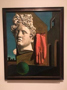
Giorgio de Chirico, The Song of Love, 1914

This painting is pretty deep, looking at the shadows and detail placed in each aspect of it. If you even just look at the glove, you’ll notice the detail in the folds of the fabric, and how it’s hanging from the wall. Though the way the objects are placed in the painting may be unconventional and not make much sense in terms of real life, the painting looks realistic because of the perspective which makes it deep.


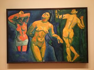
André Derain, Bathers, 1907

This painting is deep because of the shadows. The painting is really only composed of about three or four colors – orange, yellow, green and blue, and the warmer colors represent the light while the cooler colors represent the dark. Even with only four colors, the way they are used makes the painting look deep, and is also probably the reason this painting is so appreciated; it was done in such a harmonious and beautiful way.


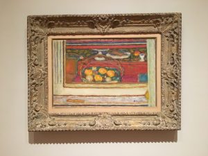
Pierre Bonnard, Basket of Fruit Reflected in a Mirror, c. 1944-46

This painting is deep, due to the layering of the paint and how the shapes are made. The brushstrokes are lose, which makes it seem like it could be shallow, but the overall composition of the painting brings it all together making it deep. It is ranging in color and shape, and the perspective is head-on with distance in the background.

FIGURE DRAWING POST – DRAWING/IMAGING


CURRENT EVENTS POSTS – DRAWING/IMAGING

Outrage Follows Twitter Joke About the President’s Young Son

To me, the initial image was slightly boring. It was just a picture of someone getting out of a car, apparently one of the Kennedy’s. I wanted to pull solely from the image and the title to create my rendition of the article, so I drew a young, white boy crying with the Twitter logo hovering his head like a halo. The young boy sports the same color hair as his father; which suggests that the positioning of the logo isn’t a coincidence in pertinence to the President’s reputation.


Hidden Nuclear Site Reborn as Tourist Draw

This picture was dark and ominous – to me, it looked like a spaceship or some kind of vessel that would be out in space, so I began to create my own Universe on the page. The image and the headline are far more interesting than the article, though. There are also a few people in the image, and the viewpoint that the photo is taken from is pretty cool too, adding to the ominous effect of the entire picture.


With Many Schools Thriving Nearby, Those in Harlem Are Left to Fail

The headline and the image were pretty telling about the article. It’s obvious that schools in less-wealthy areas aren’t well kept and barely get any care at all. The schools in these communities are targets of the School-to-Prison Pipeline, a Systemic form of oppression specific to communities of Color (especially brown and black). In pertinence to this topic, I drew a school bus and one of the buses used to transport convicts to and from prisons.


This image was of some type of laboratory, which immediately for some reason inflicted thoughts of the process the meat we eat undertakes before reaching our plates. I ended up drawing these weird images of a bull and a ram, two animals close in nature but different in anatomy. My sign (Aries) is also represented by the Ram, while the Bull is representative if the Taurus Zodiac Sign.

The image was dark and creepy looking, but the perspective it was taken from reminds me of drawings I was made to do in my architectural design course. They were perspective drawings, and you had to do them from a certain viewpoint and make them pretty realistic.


This image was of the old Penn Station Departure Board, which was taken down in late January. I often think about the fact that most New York City Train Stations are actually really old and need work done, or as my Sustainable Systems teacher told me they were greatly affected by Hurricane Sandy and are damaged beyond repair. The fact that something so significant in the culture of New York and the Subway could just be torn down so easily is weird; I’m honestly surprised no one decided to protest it. The image I drew over the two pictures is representative of NYC Subway Culture and the different types of people who inhabit it.


Trump in Meeting, Urges Automakers to Build Factories in United States

Truthfully, our current President is probably about to start some wars that we never even saw coming. I tried to deny it but it is completely true. In this image, he’s at the head of the table, running his mouth as he usually does but probably not even really saying anything. It’s so crazy to me how a man can speak so much and really not even say a word.


Civil Rights Group Rebukes Trump Justice Department Over Delay on Two Cases

The picture and the caption to me went perfectly with the images I created, because that’s what the article seemed to represent. The picture, being in black and white, seems more serious in nature and is of some man named Jeff Sessions; apparently the attorney general nominee who people don’t like. The caption seems to fit the picture, if you just think about it: a picture of an old white man in the government with a headline about Civil Rights.


FIGURE DRAWING 1 – MONDAY, JANUARY 30TH 2017.


My main struggle with this figure drawing was hands and feet. I feel pretty sure of my shading abilities but usually run into problems with proportions, which is kind of reflected here. Overall I’m pleased with the outcome anyways.