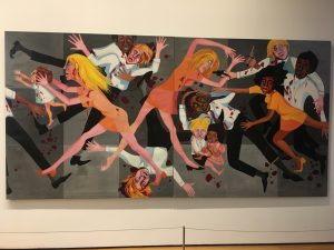
Faith Ringgold, American People Series #20: Die, 1967
Space is pretty shallow, because of how graphic this painting is and how the shapes in the painting are so defined. The composition of it is the reasoning behind why I say this; the colors are also really bright and contrasting so that adds to the graphic-ness of the overall image. It is also a large painting – so size does play a part.
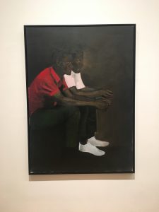
Lynette Yiadom-Boakye, The Myriad Motives of Men, 2014
This painting appears so deep because of the lack in range of colors used – they are all very dark, even the light colors seem dark in a sense. By limiting the amount of colors on their palette, the artist was about to make the viewer perceive the painting as deep although there may only be about 6 different colors used in varying ways throughout this entire piece.
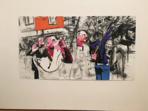
Erik van Lieshout, Untitled, 2014
This painting is shallow, because the lines and shapes in it are so loose and without real definition. It’s pretty cool/interesting, because the figures and buildings are just recognizable, with dabs of color randomly throughout it attracting the viewer’s eye.
Diego Rivera, Agrarian Leader Zapata, 1931
This painting is deep, considering the composition; it looks like the artist took his time with it and added great detail, causing the painting to get deeper with each brushstroke. There is a variation of colors across the wheel, and different shapes and shadows that draw together and make for a well-resolved piece.
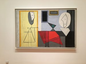
Pablo Picasso, The Studio, 1973
This piece is shallow – it is composed of lines shapes and colors in their most basic form. Abstract, it seems to be a rendition of a studio, lending hints of figures and objects commonly found in one. The perspective is head on, which also adds to the shallowness.
Pablo Picasso, Three Musicians, 1921
This painting is deep-looking, because of the darkness of the background and the lightness of the foreground. There is also this variation from pattern to solid colors in the background and foreground, which allows the viewer to believe the two are more contrasting than they really are. The fact that the figures are composed of shapes helps the deepness too; the painting is abstract.
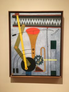
Georges Ribemont-Dessaignes, Silence, 1915
This painting is shallow, because the shapes look very light and on the surface. There aren’t any shadows really, just a contrast from the top to the bottom of the painting – sort of like a gradient grey color. The shapes are also brightly painted and viewed head-on.
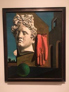
Giorgio de Chirico, The Song of Love, 1914
This painting is pretty deep, looking at the shadows and detail placed in each aspect of it. If you even just look at the glove, you’ll notice the detail in the folds of the fabric, and how it’s hanging from the wall. Though the way the objects are placed in the painting may be unconventional and not make much sense in terms of real life, the painting looks realistic because of the perspective which makes it deep.
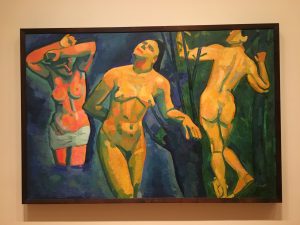
André Derain, Bathers, 1907
This painting is deep because of the shadows. The painting is really only composed of about three or four colors – orange, yellow, green and blue, and the warmer colors represent the light while the cooler colors represent the dark. Even with only four colors, the way they are used makes the painting look deep, and is also probably the reason this painting is so appreciated; it was done in such a harmonious and beautiful way.
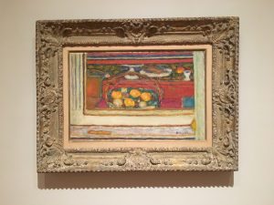
Pierre Bonnard, Basket of Fruit Reflected in a Mirror, c. 1944-46
This painting is deep, due to the layering of the paint and how the shapes are made. The brushstrokes are lose, which makes it seem like it could be shallow, but the overall composition of the painting brings it all together making it deep. It is ranging in color and shape, and the perspective is head-on with distance in the background.
