Vis Comm: MENT Movie

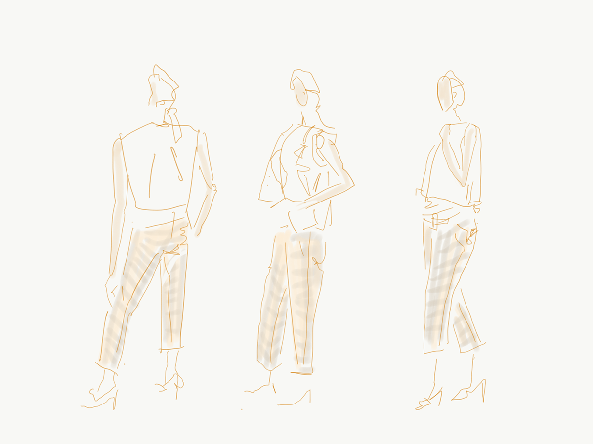
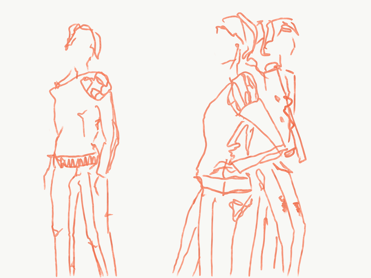
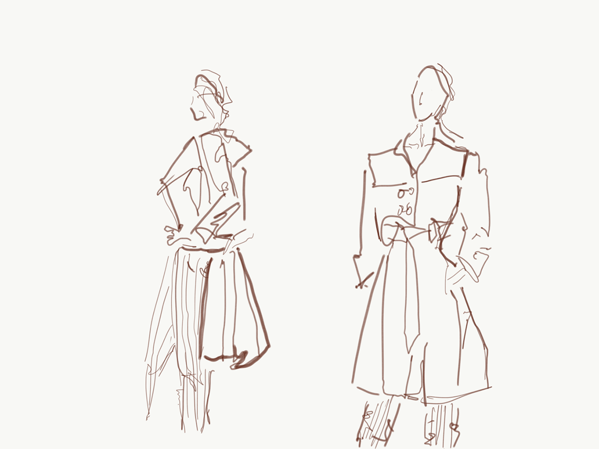
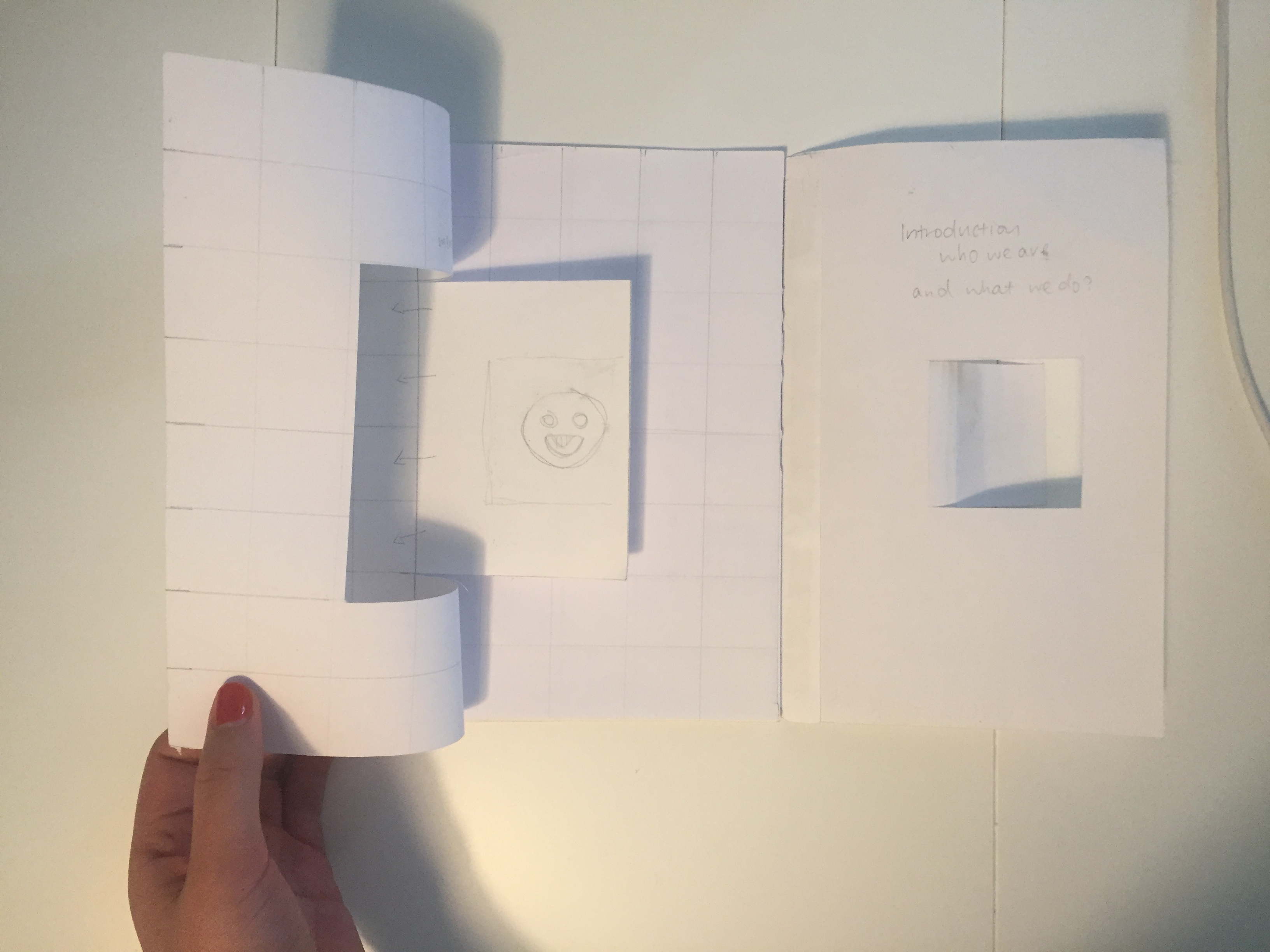
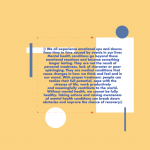
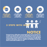
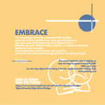
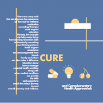
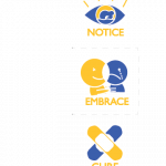
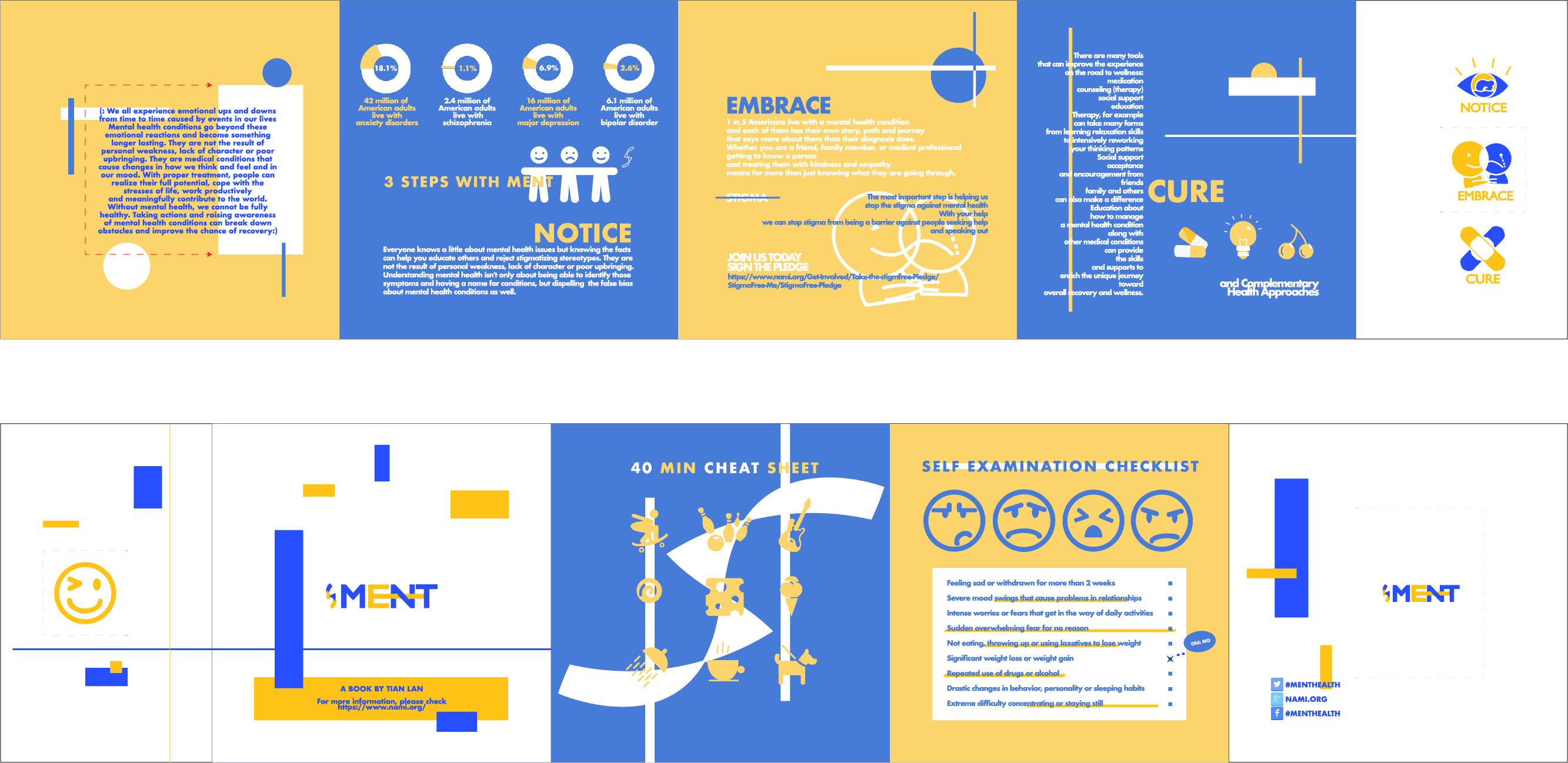
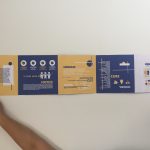
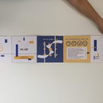
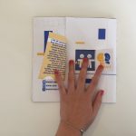
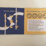
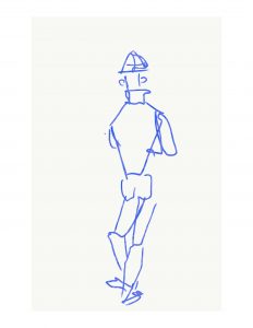
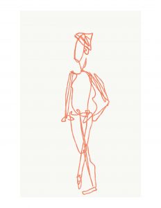
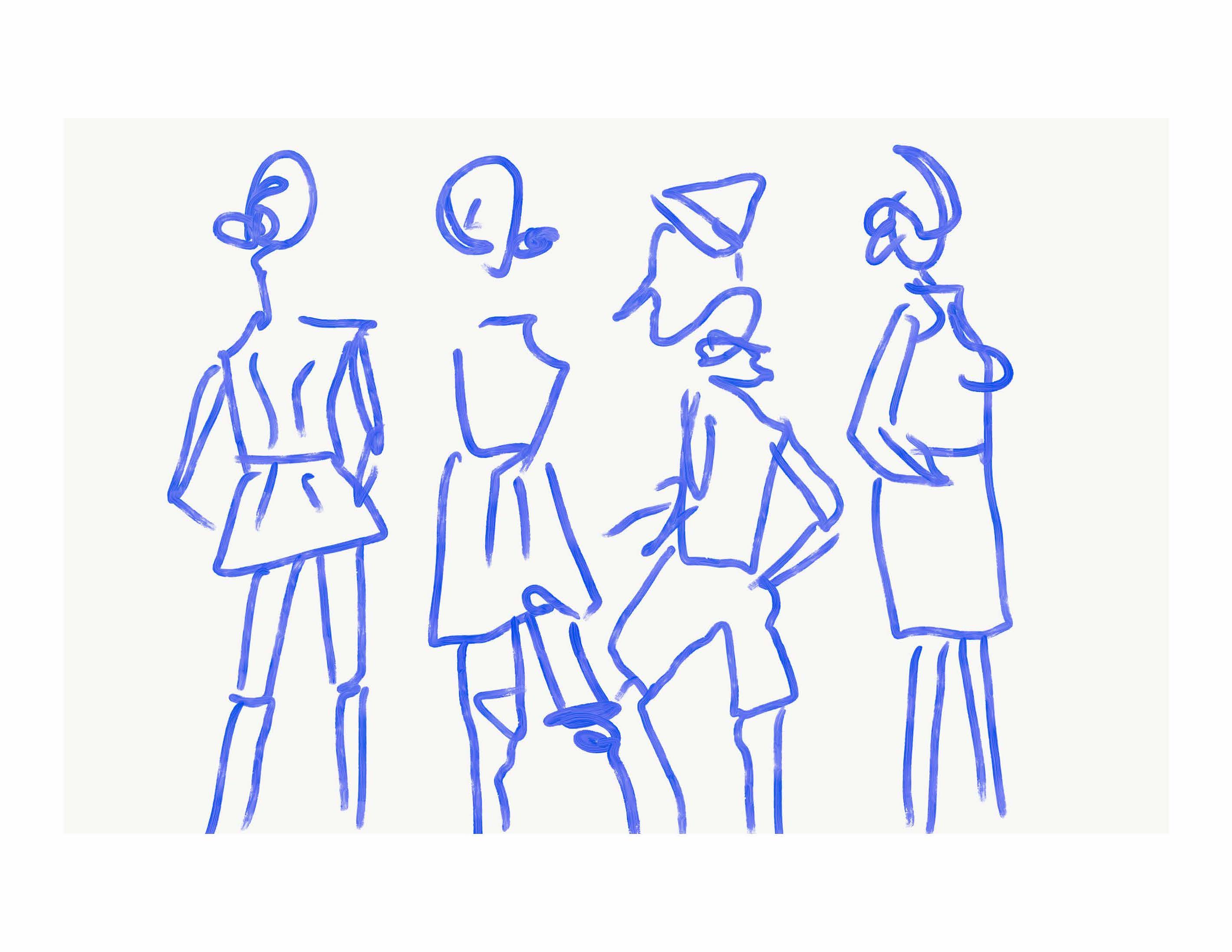
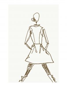
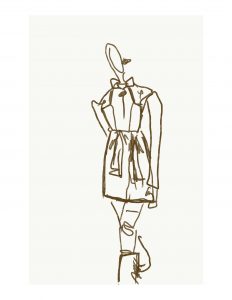
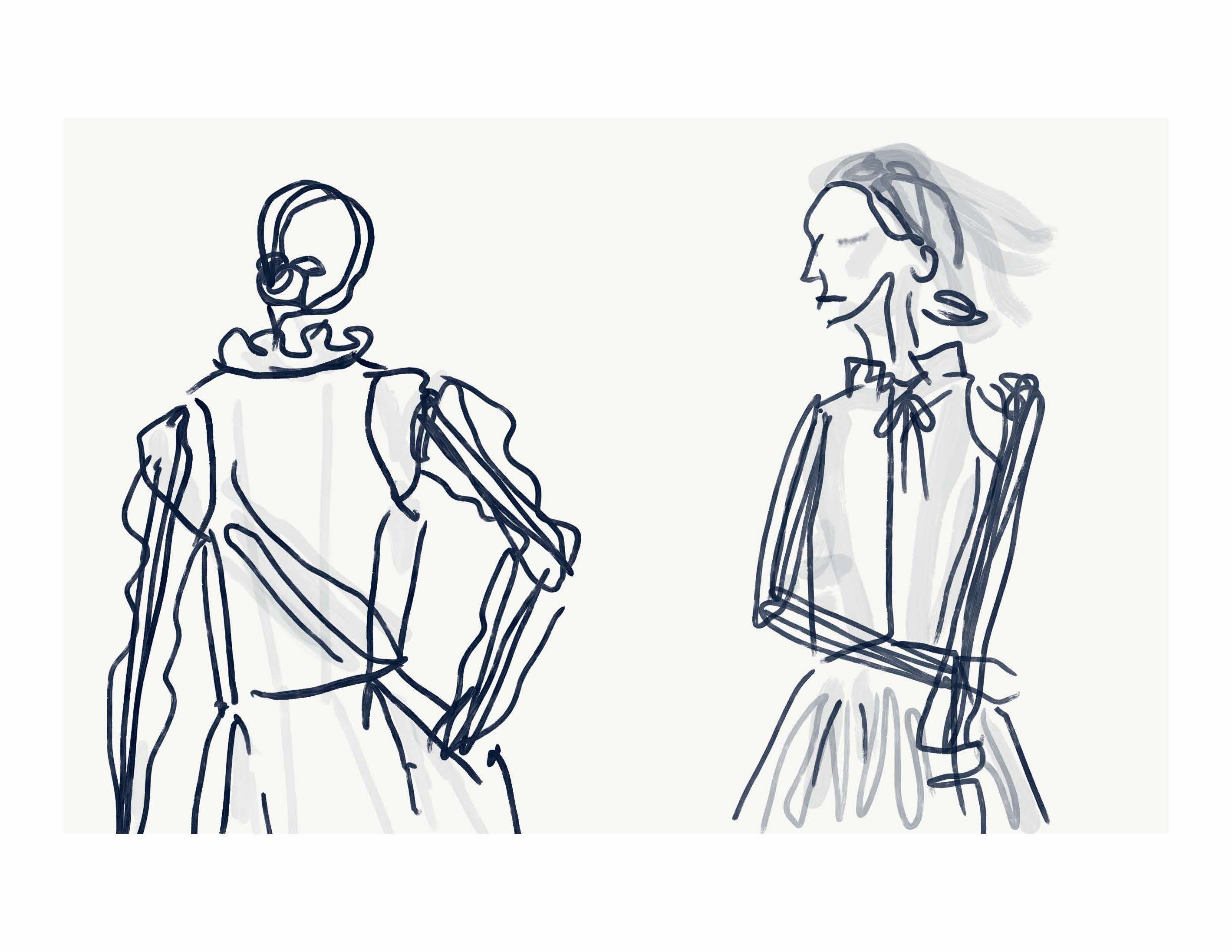
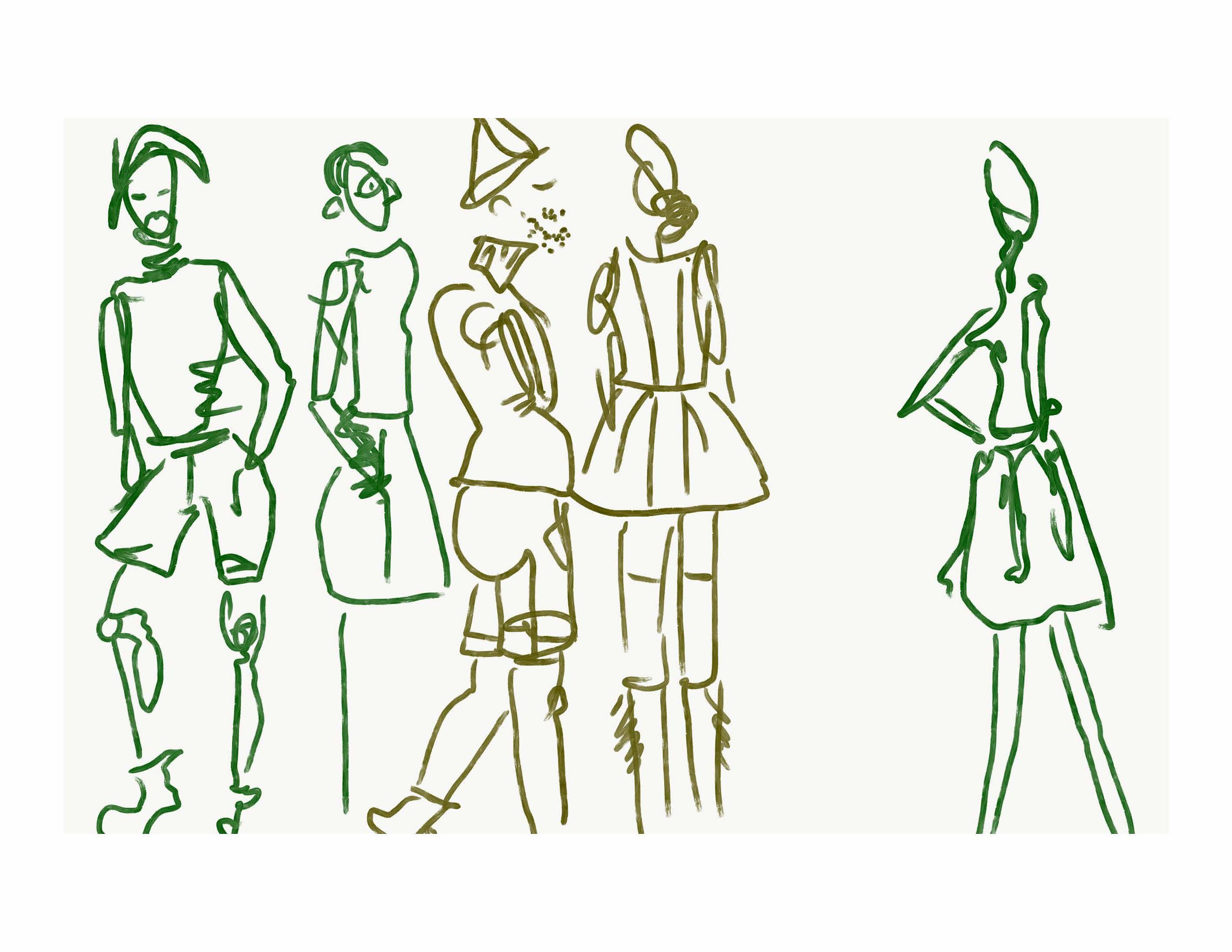
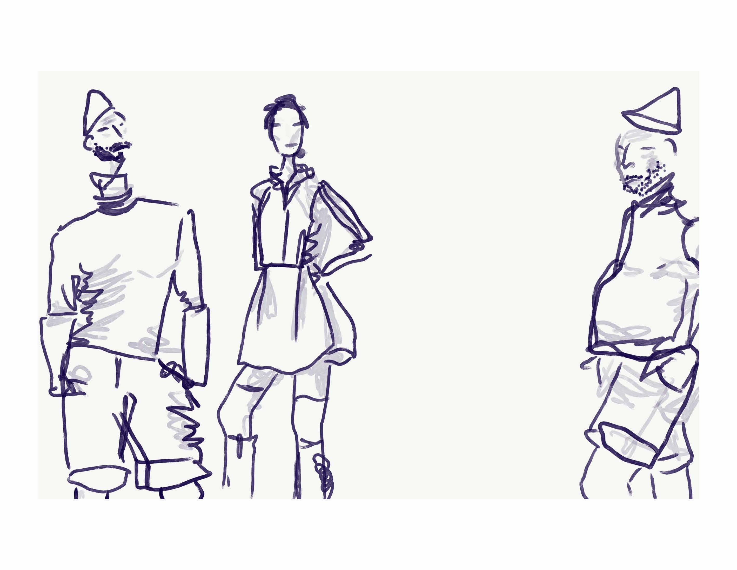
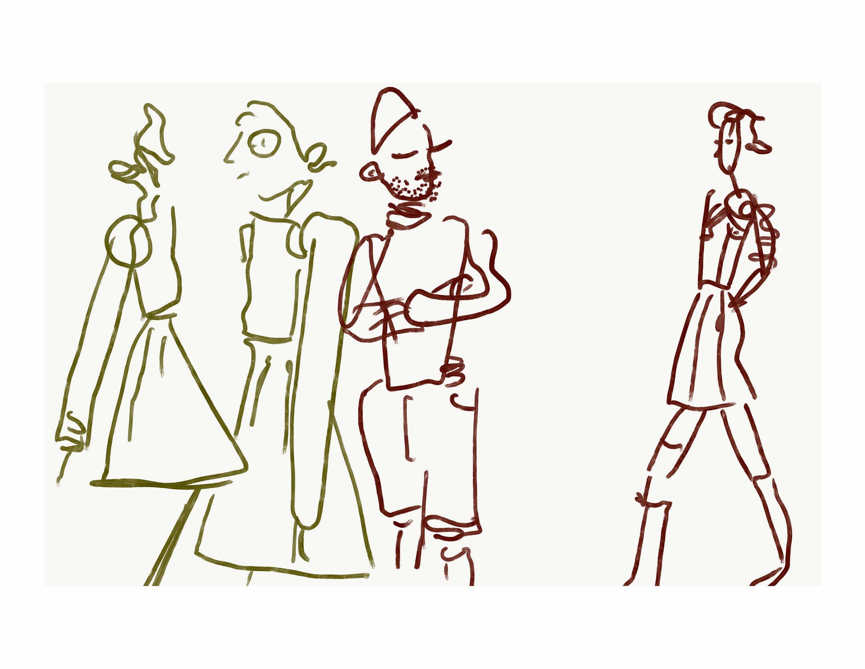
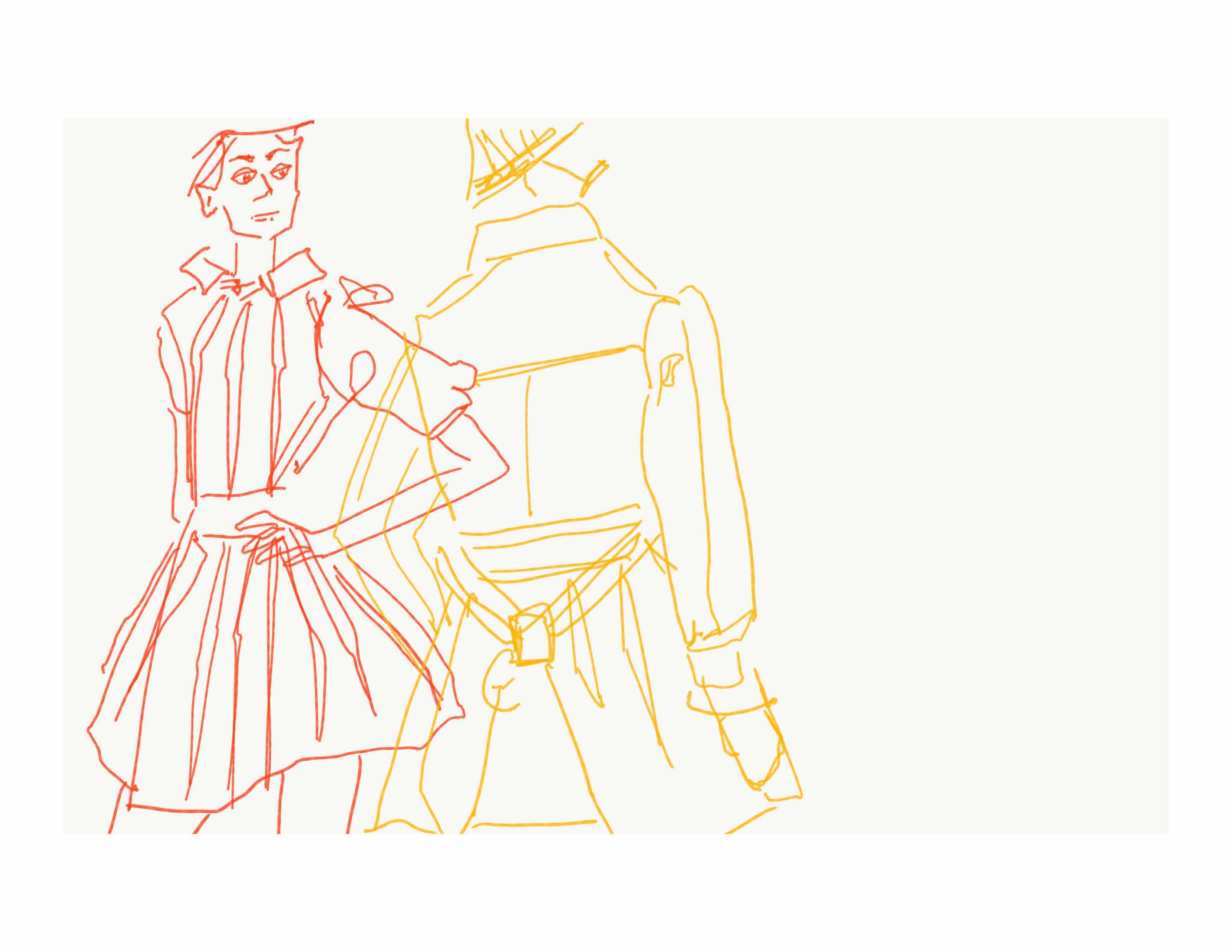
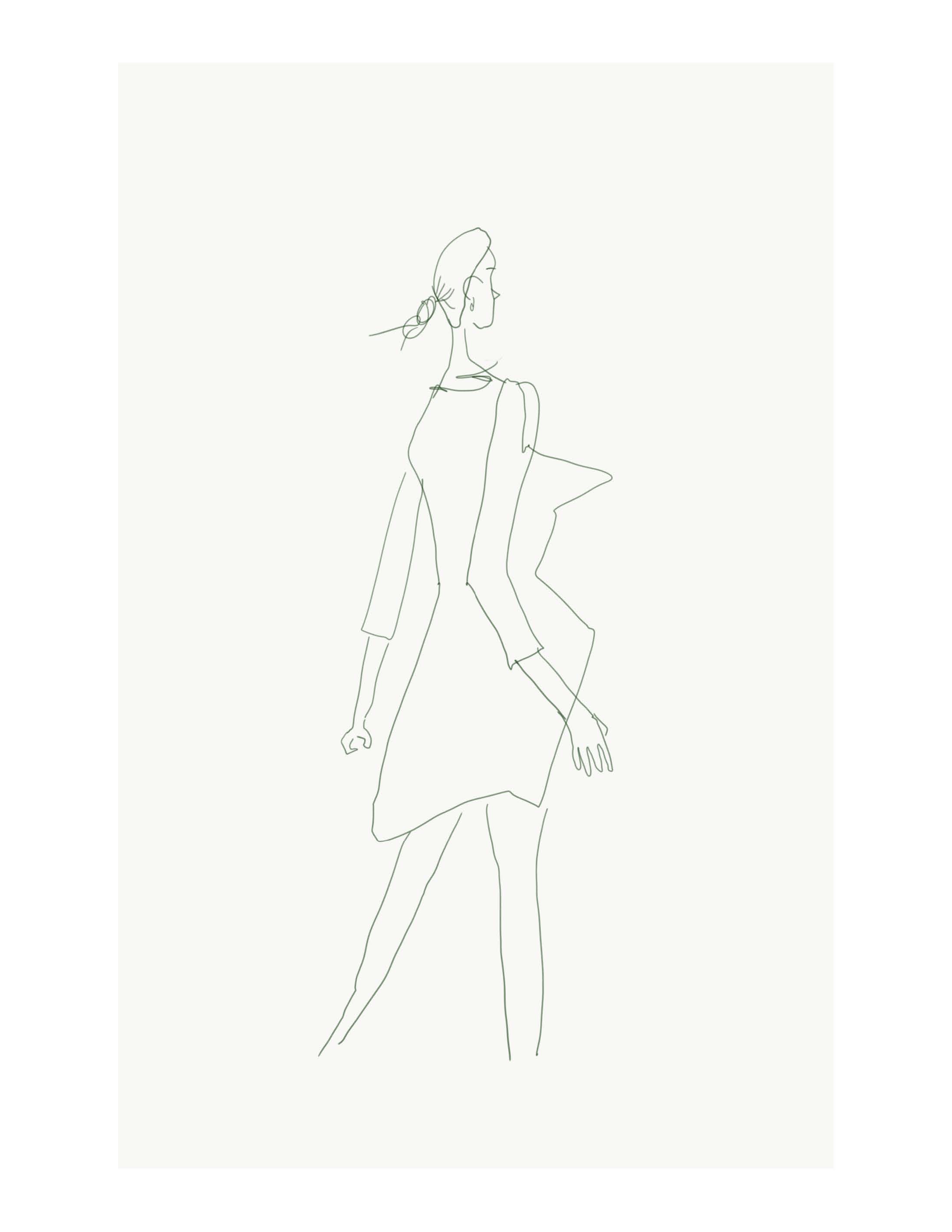
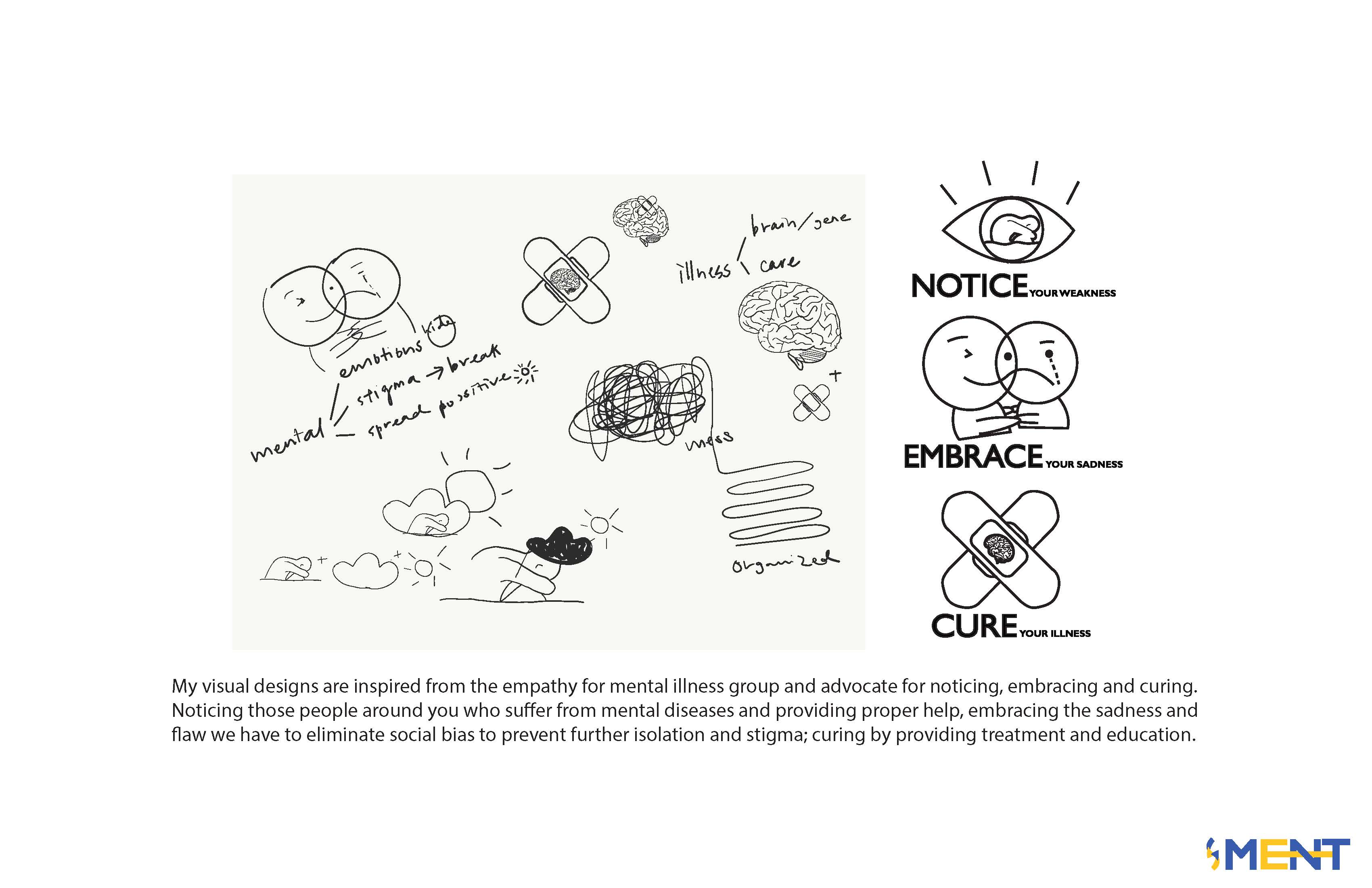
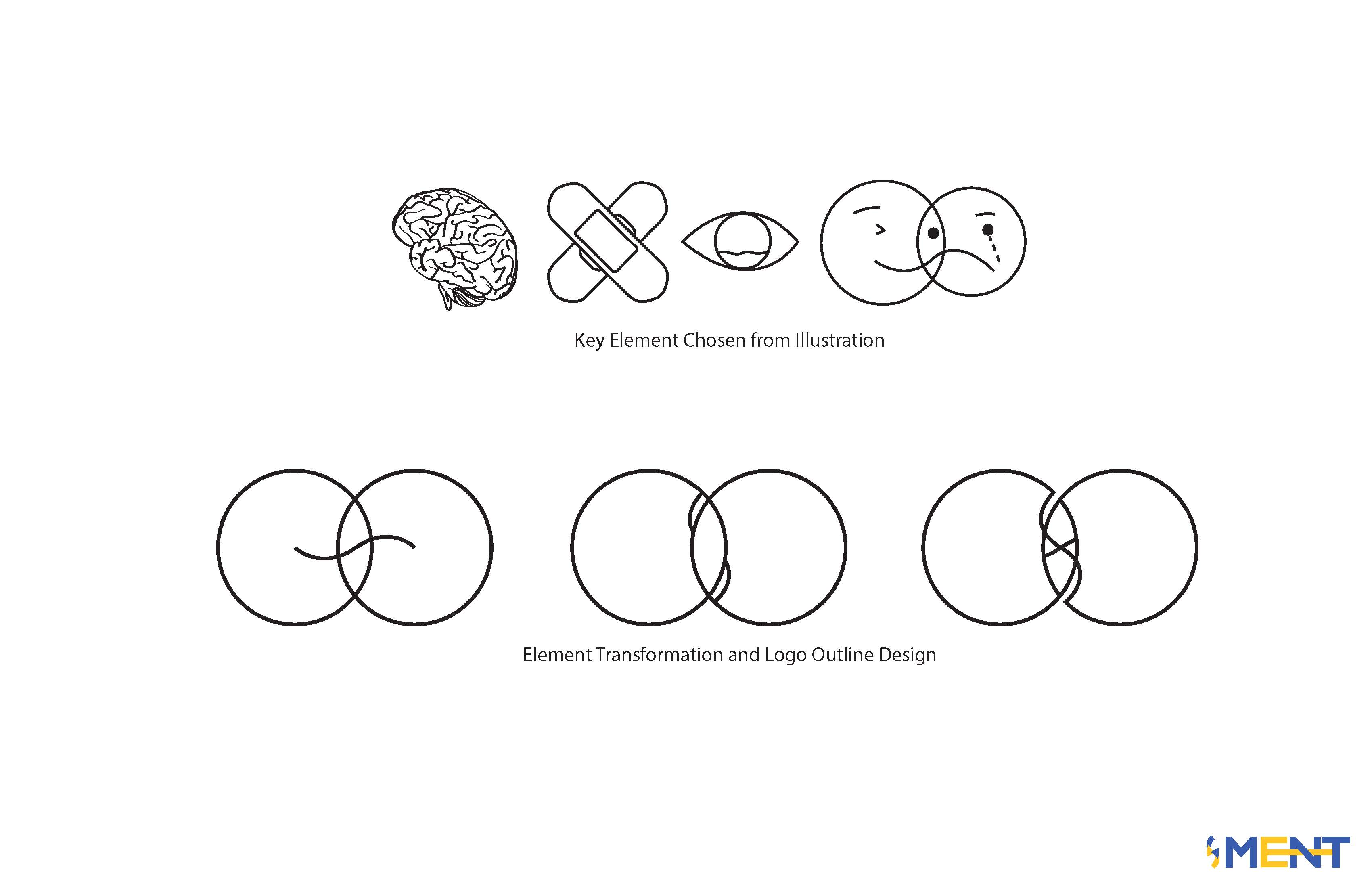
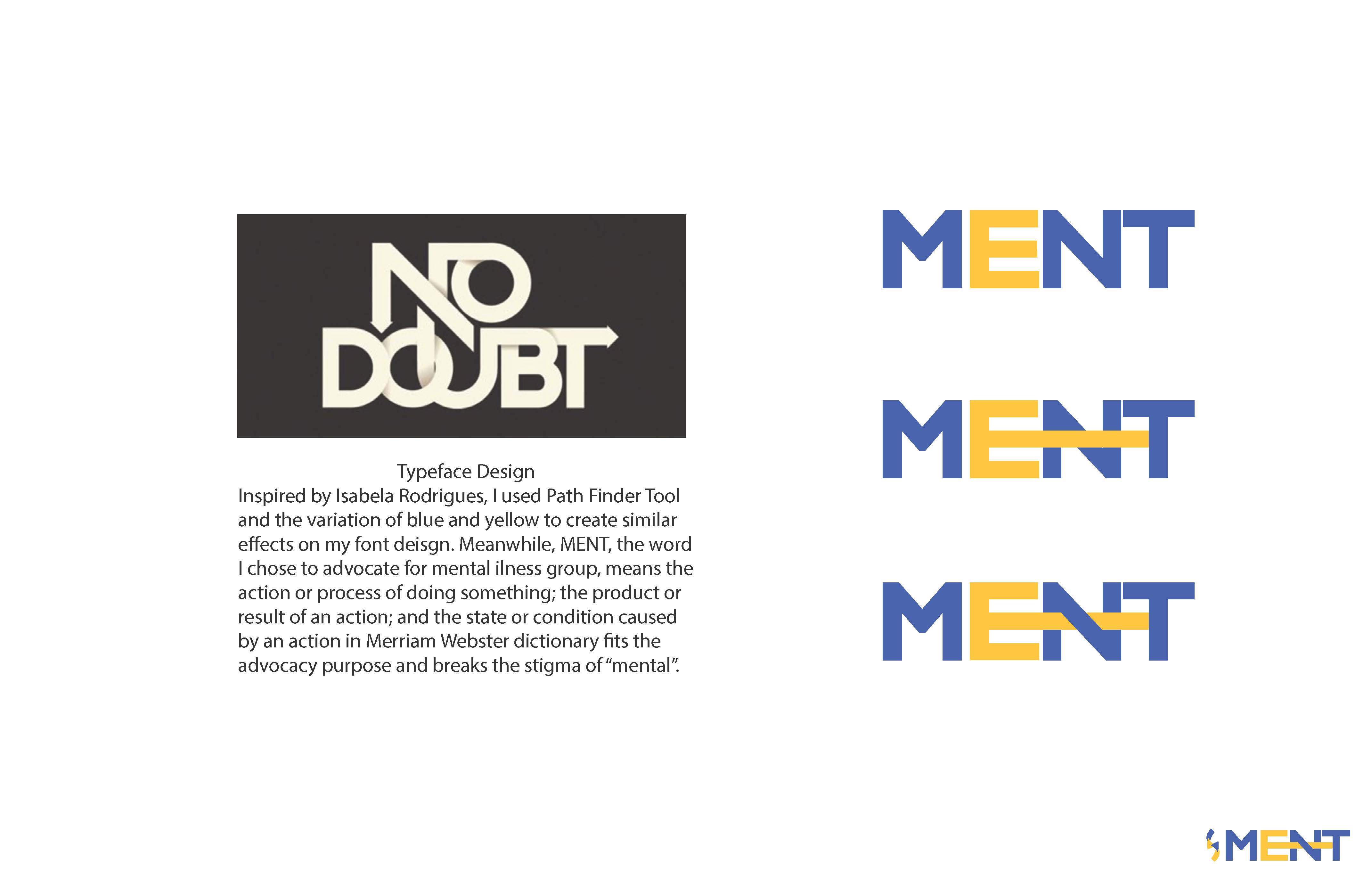
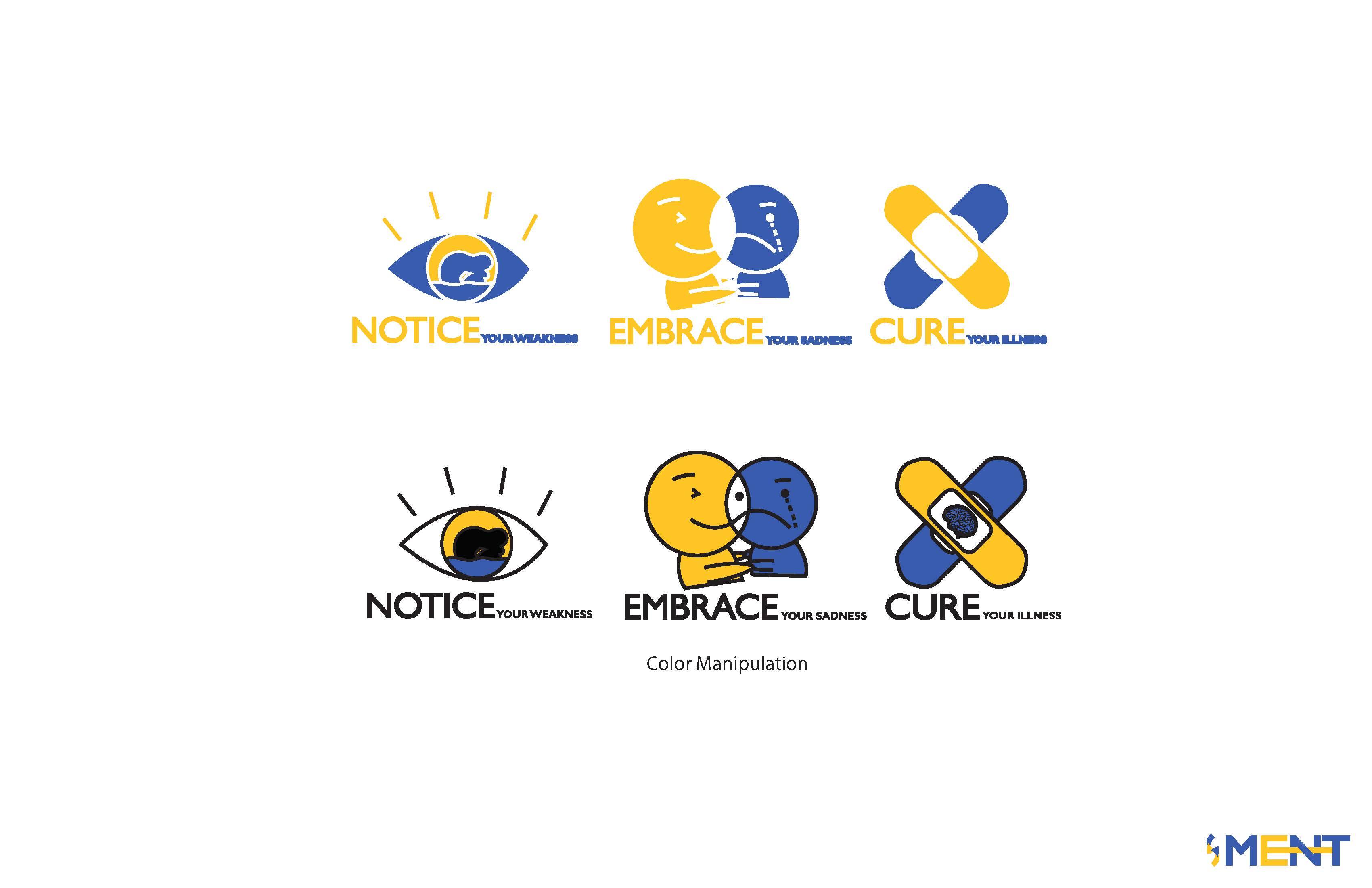
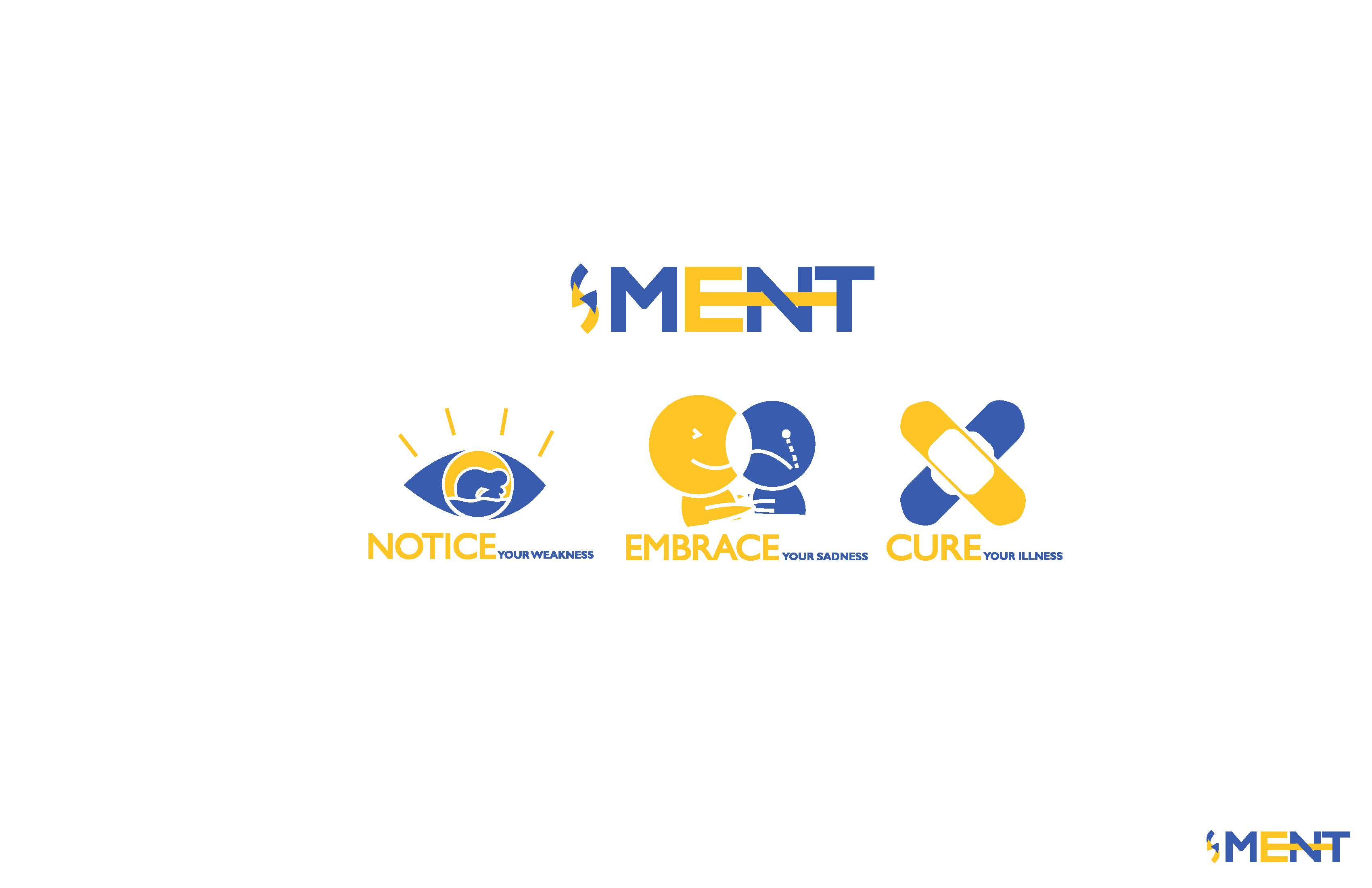
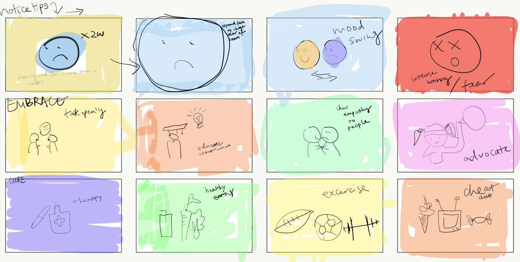
We spend this semester designing logos, booklet, and movies under the theme empathy and advocacy. My visual designs are inspired from the empathy for mental illness groups and advocate for noticing, embracing and curing. As our class has finished the logo and booklet, the last project is to design and make a film that works or reports for the association that each of us has designed.

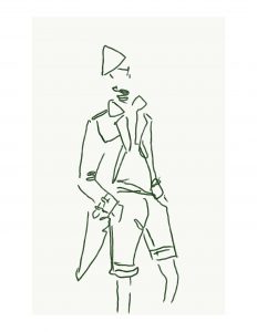
For this movie project, I structured my main frames and proposed an ideal outcome for my movie. But unfortunately, I didn’t have enough time to finish every scene from my storyboard.

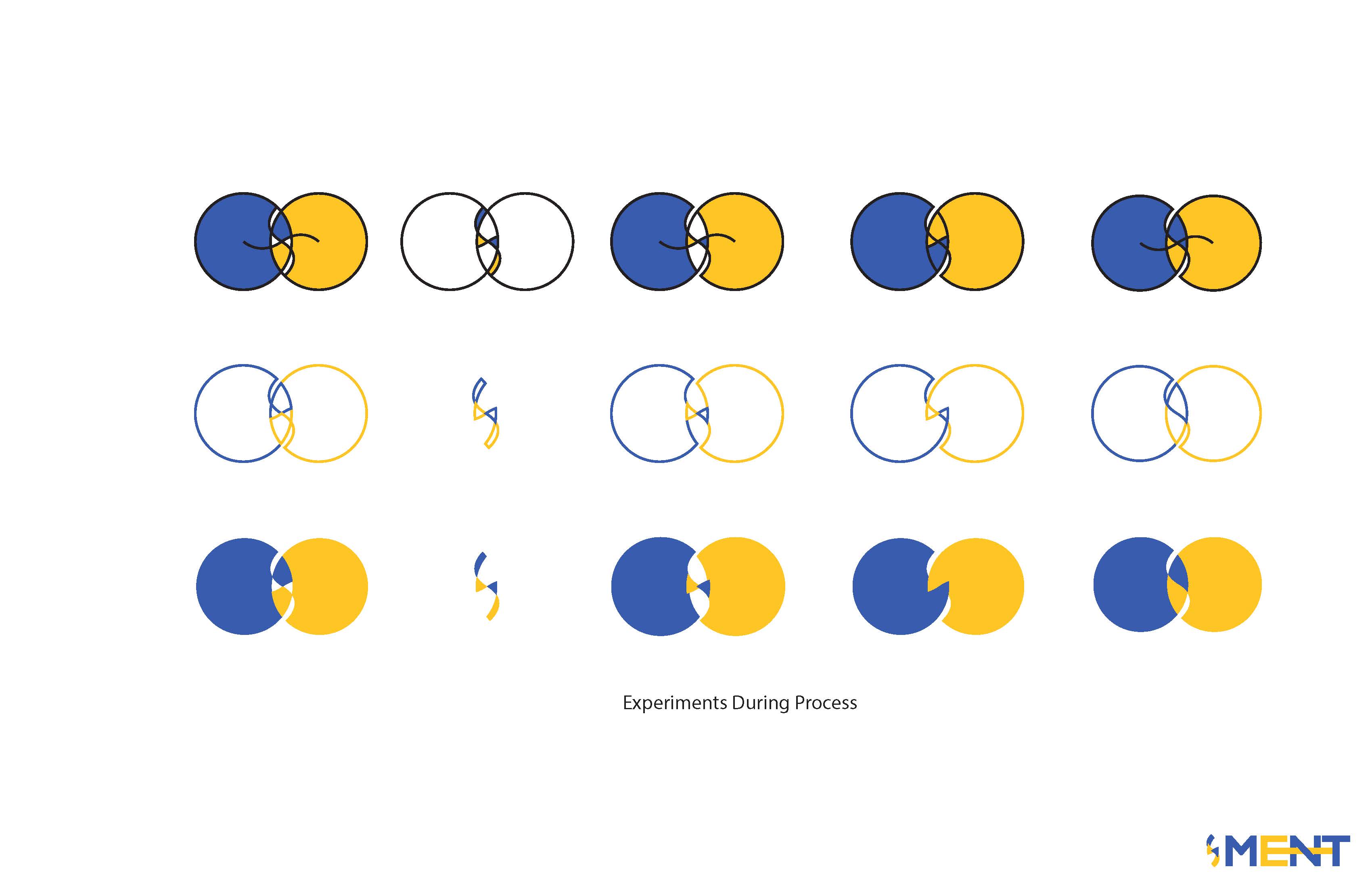
But I cut some short experiments to explore the possibility of accomplishing my initial idea as well as use as many platforms as possible. During the process, I mainly used Premiere Pro to edit the motions and frames. After finishing the structure, I exported my movie and used iMovie to add subtitles. Personally, iMovie is more user-friendly than Premiere. I wanted to create animated gifs for my frames in Photoshop, but my friend recommended me another website to create gifs faster and easier. So I used Raw Shorts.com and created 2 animated gifs.

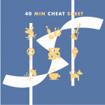
Earlier in this semester, I read an article about time and music parallel montage in filming and editing techniques. So I also made this experiment using my theme. If I have more time, I would definitely finish this whole movie and added in my work.


Vis Comm: In Class Drawing 2

Vis Comm: Book

My whole project starts with this paper mockup, by building this mockup, I have a clearer and more organized idea of how to build my artboard in Illustrator and InDesign.

The spreadsheet below is the printing layout for my booklet project. Because I designed my book’s binding as accordion style, the process of making the actual book has been more complicated than I expected. Most plotters could not support double sided printing. And regular printers were not able to print 40*24. 

Also, I met another problem while uploading my project on the canvas. As the single pages of each page of my book show the expected color. My layout file’s color has been changed a little bit after I upload the file onto canvas which I haven’t figure out how to fix this problem. As the picture below indicated that it looks normal on the regular screen.

Then I printed out the layout and glued two sides together. The process of making the actual book has been difficult. Because the two oversized sheets need to be perfectly lined up. Cut lines need to be clean. So I tried 2 times to reach the better result.

Vis Comm: Layout Research

Image

Vis Comm: In class Drawing

For 1-2 minute quick sketches, I used iPad and Apple pencil in Photoshop. Chose Acrylic Round Brush and Acrylic Paint for the lines.

For 5-10 minutes sketches, we had more time focusing on the details.

For this one above: I tried to capture all the details for the female model’s dressing. Bazinga!

Vis Comm: Empathy and Advocacy

Before starting to construct my ideas, I looked into successful organizations and firms’ logos. It turns out that, throughout time, visual identities has been more graphic and modern edited. So I decided to cohere my logo styles modern and clean.

Mental health affects our emotional, psychological, and social well-being. Its stability contributes to how we think and act, helps us handling stress, and ensures our decisions making. Mental illnesses can be caused by biological factors such as genes, brain chemistry, family history of mental health problems as well as people’s life experience such as trauma or abuse. In the United States, 1% of adults live with schizophrenia, 2.6% live with bipolar disorder, 6.9% live with major depression and 18.1% live with anxiety disorders. Worldwide, 450 million people suffer from mental health conditions but shocking only 40% of them are receiving proper care and therapy.

Traditionally, people hold negative attitudes and prejudice towards people with mental illness. “Crazy”, “Weird”, “Dangerous”, “Weak” are often used to refer them and this results in social rejection and social isolation to the group who needs actual help. And for those who sought for help often felt ashamed to admit their problems due to the stigma and judgment.

To another section of the population, mental illness is only considered as the downside of mood swing cycle which unnecessarily needs any treatment. Anyone who suffers from mental illness is either too weak to hold any stress or incapable to self-adjust from sadness. In this case, schizophrenia is considered untreatable insanity.

Recognizing the cruciality of mental health, reducing of the potentiality of mental illness and improving diagnostical consulting for the mentally ill group are crucial to the social stability. Meanwhile, it is also significant to eliminate the bias for mental illness group by implementing mental health education to the mass population.

My visual designs are inspired from the empathy for mental illness groups and advocate for noticing, embracing and curing. Noticing people around you who suffer from mental disease and providing proper help, embracing the sadness, the flaw by accepting the fact and elimination social bias to prevent isolation and stigma; curing the group by providing treatment advice and education.

Reflection:
I have encountered 3 major decisive points in my process of advocacy for the importance of mental health.
1. Whether should I call my organization ‘MENT’?
When we “usually” say someone is mental, we are indicating that the person is not emotionally or mentally stable. However, MENT is also a suffix that forms nouns expressing the means or results of an action. MENT can mean stability. So I decided to keep the MENT to break the stigma of mental illness.

2. My first design outcomes look a bit Hitlerite, should I change it?
Yes, I should. That was my first instinct. Because the logo represents the brand identity. It should avoid any negative impressions that it may possibly convey. So I change my design into a more fluent line that is constructed by trangles. Triangle also means stability.

3. Whether I should keep the black outline for my 3 sub-icons?
With the black outlines, my graphics look more classic and conspicuous. And it looks modern without the outline. I like them both, and until now, I haven’t decided yet.

Vis Comm: Gif and Animation Video Experiment

tianlan_finalgif

For the final GIF, I made two groups of contents that the background is designed to be the moving graphic patterns in green to show my tribe’s identity. And the front layers of a girl moving to give intensity of the GIF. I used photoshop to digitally trace my video and added filters on the layers. For the background, I drew in Illustrator and adjusted positions to create a moving forest.

During the process of making my final GIF, I had experimented some other gifs and exported them out as the source of my animation video. My primer sources of the gif are illustrated still pictures that were mostly done in Photoshop and Illustrator. By using the Timeline of Animated Frames, I created gifs and export them out to both gifs and rendered videos. Then I dragged my short clips into Premiere to edit my animation.

Editing key frames are crucial to my experiment animation. At the beginning of the process, while I was drawing the storyboard, I didn’t think of all the layers and interactions of each track and the clipping points of variety in motions would create unexpected effects of the animation. At the end of my video, I gave out a conceptual ritual activity of my peafowl tribe.

tianlan_ritual

Vis Comm: Muybridge Gifs