Pictoral Space in the MoMa

Louise Bourgeois, Self Portrait, 1990, drypoint, etching, and aquatint

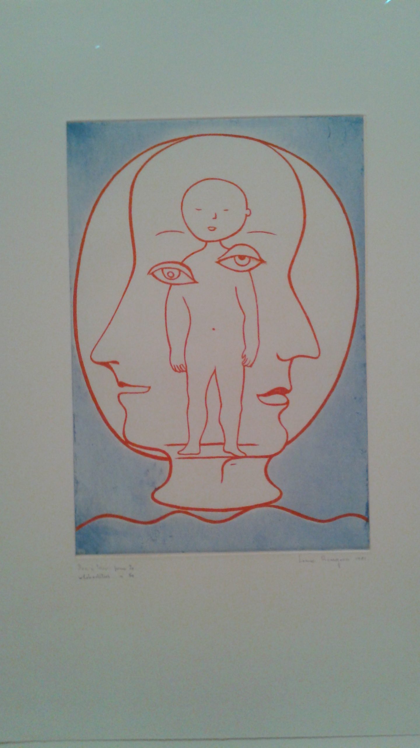
The usage of line here makes the image very flat, however, the two sides of the heads and the curvy, wiggly line almost seem to suggest movement, contrary to the figure in the center facing directly at the viewer.

László Moholy-Nagy, Constructions, Kestner Portfolio 6, 1923 (Portfolio of six lithographs)

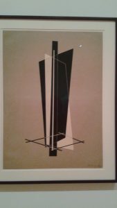
This lithograph is like a contradicting mixture of line elements and two-point perspective. Because of the flat images it contains, there’s an initial idea of it being 2D, but in reality, the intersecting shapes and different views of those shapes creates an image that is 3D and has more than one perspective.

Charles White, Black Pope (Sandwich Board Man) 1973, Oil wash on Board

The usage of White’s value here creates an incredible sense of depth and the overlapping shapes of the figure, the centerpiece and the frame within the painting adds to this effect.


Vasudeo S. Gaitonde, Painting 4, 1962, Oil on Canvas

This painting uses a multitude of colors mostly with a red, blue and yellow hue to create a murky tone, and then highlights the parts of the painting they want to stand out by using a darkish blue (?) and strikingly, vivid oranges and yellows.


Louise Bourgeois, Topiary, 1997, Watercolor, ink, oil, charcoal and pencil on paper

The red shapes placed on top of the white space and situated on the blue space gives the image a sense of depth and perspective as the tubes connected to it come forward to the larger red tube and into the blue container in the front of the image.


Max Ernst, Sun and Forest, 1931, Cut-and-pasted cardboard with oil, gouache, and pencil on paperboard

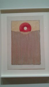
The intersection of shapes with the use of color (the intersection is indicated from the sun’s redness to a beige color) give the viewer an idea that the brown, vertical textured shape is in front of the sun.


René François Ghislain Magritte, The Menaced Assassin, 1927, Oil on canvas

The usage of color and the way objects and figures are situated in the painting with the contrasts of shadows give the image an intense depth. It looked as if the painting led to another room as I looked into it.


Max Ernst, To the Rendezvous of Friends (The Friends Become Flowers, Snakes, and Frogs) 1928, Oil on Canvas

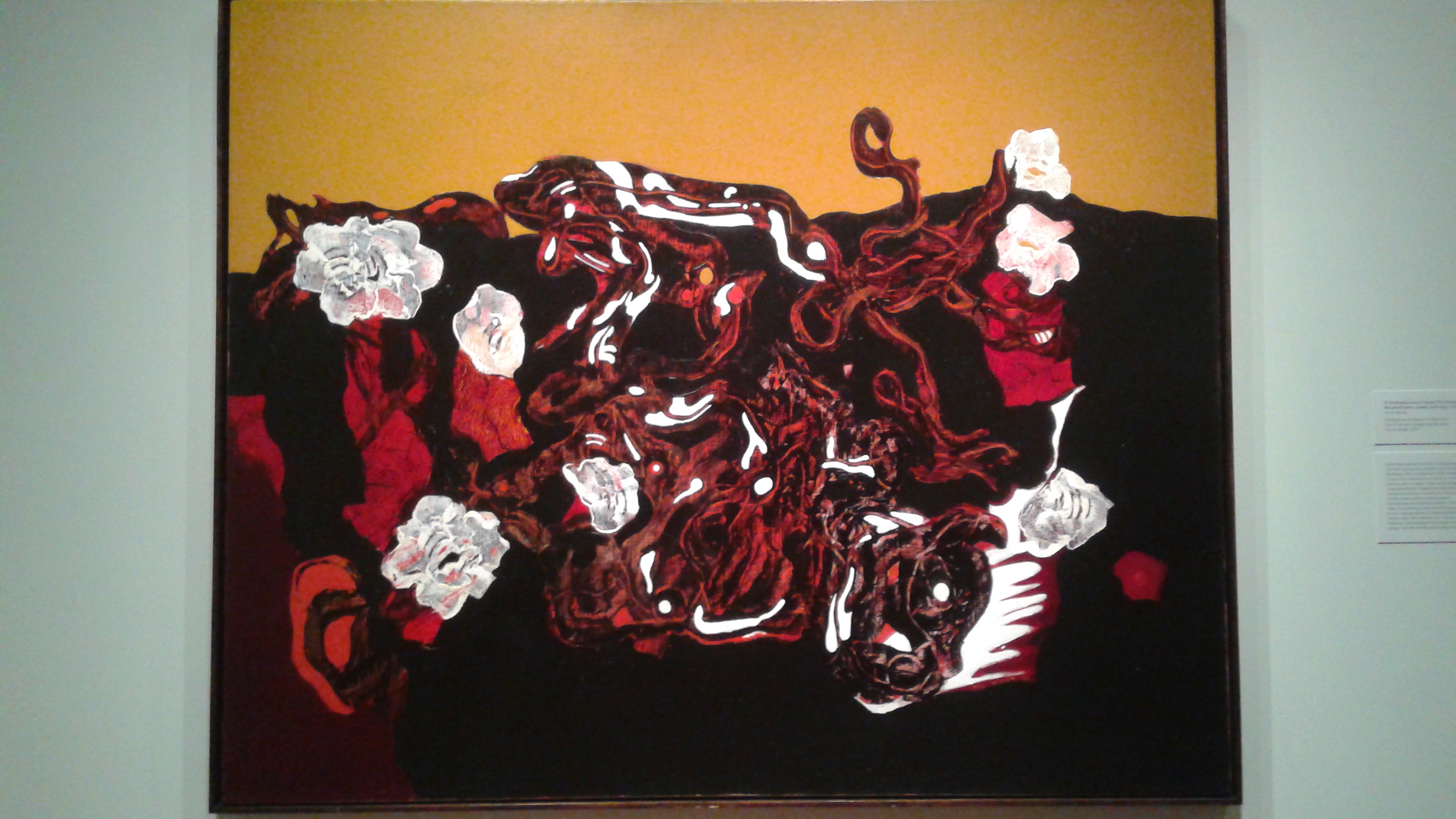
The yellow background contrast to the reds, whites and darker foreground give the center shapes a spot in the space of the painting. It is insinuated that the shapes are closer to the view because of the yellow background.


Max Ernst, Napoleon in the Wilderness, 1941, Oil on Canvas

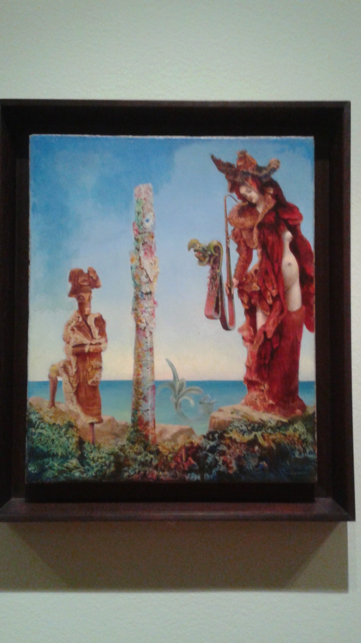
The red figures situated in the front are strongly contrasted by the blue background, giving the viewer an idea that these figures are closer.
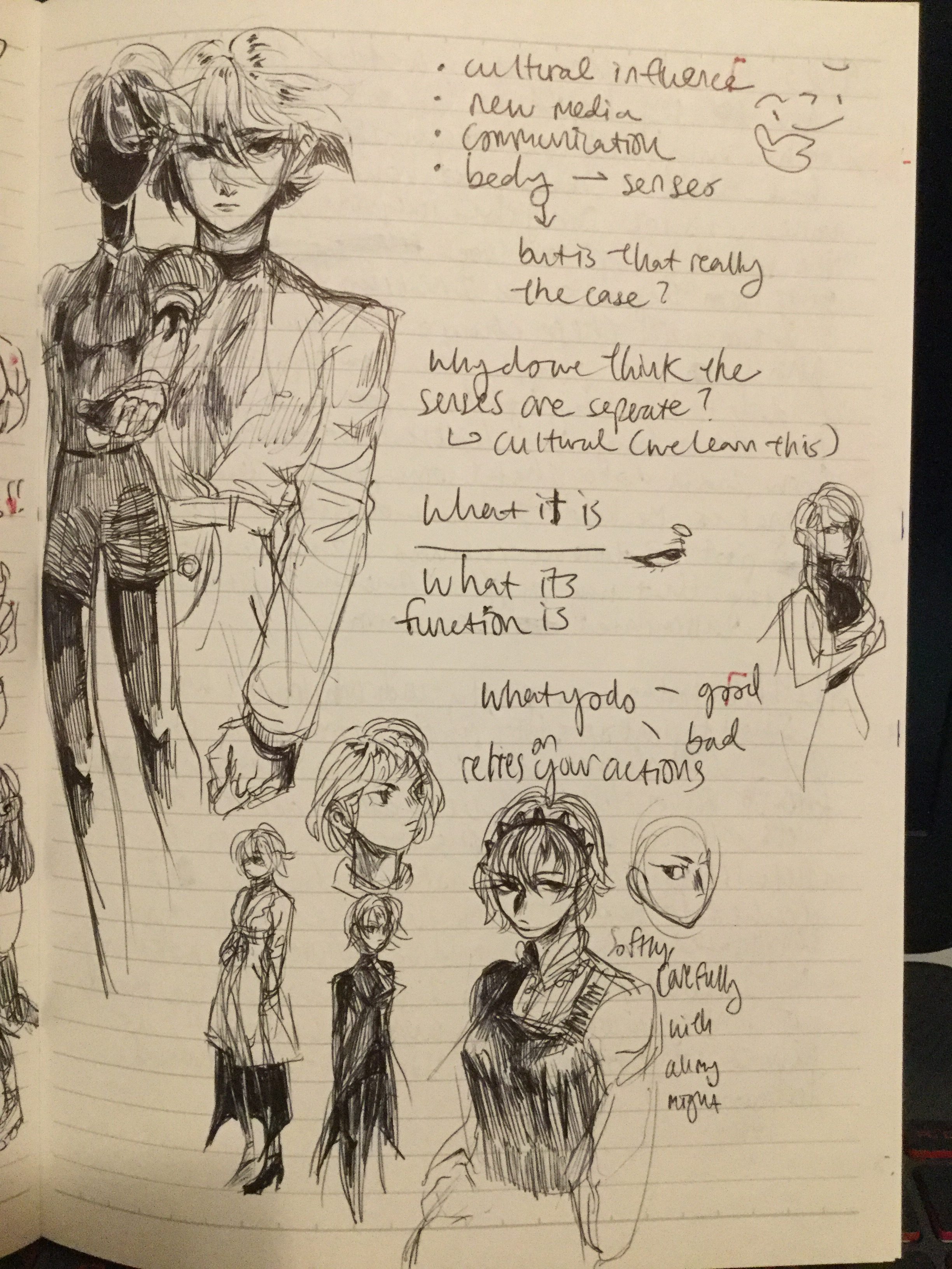
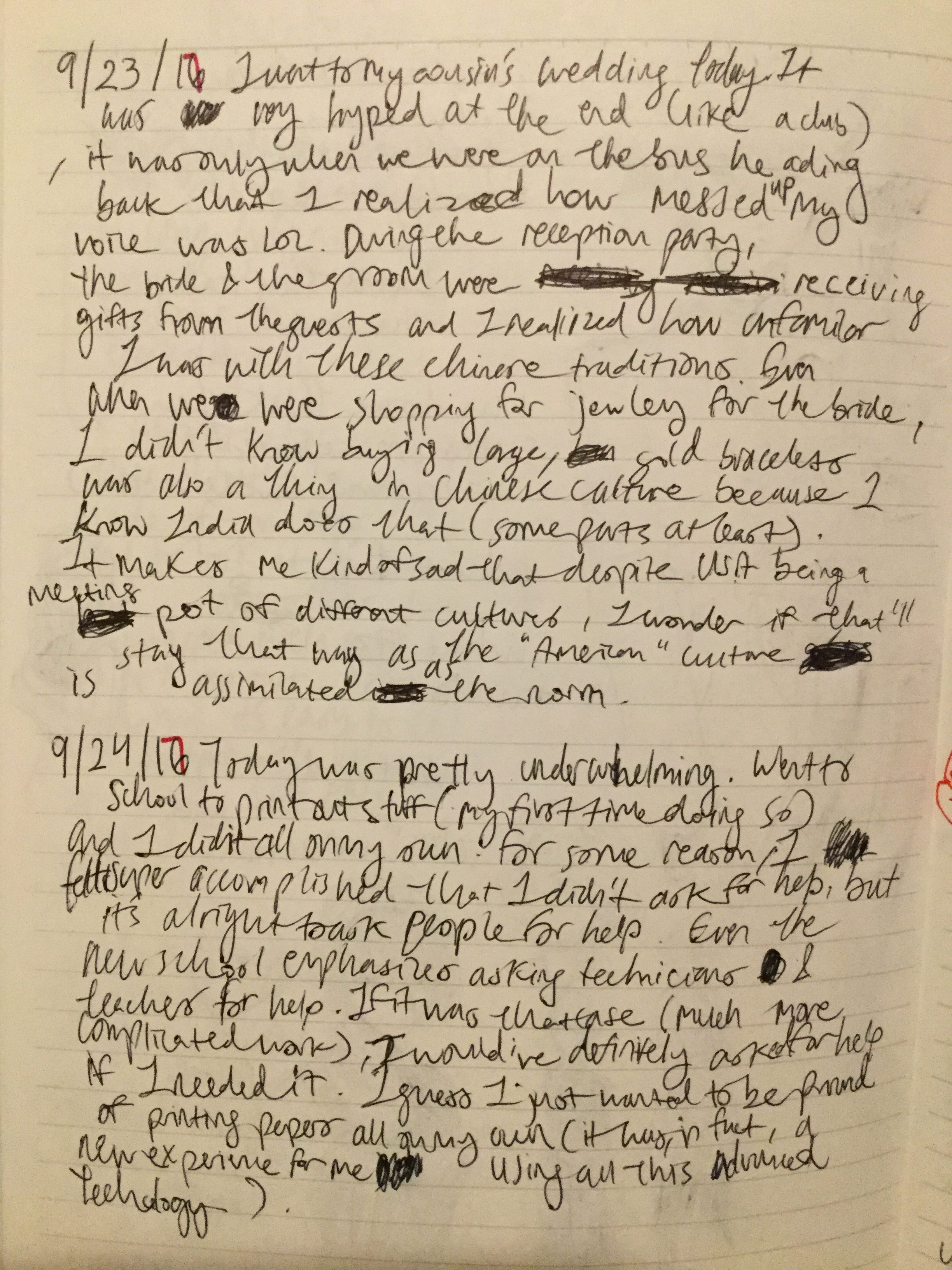
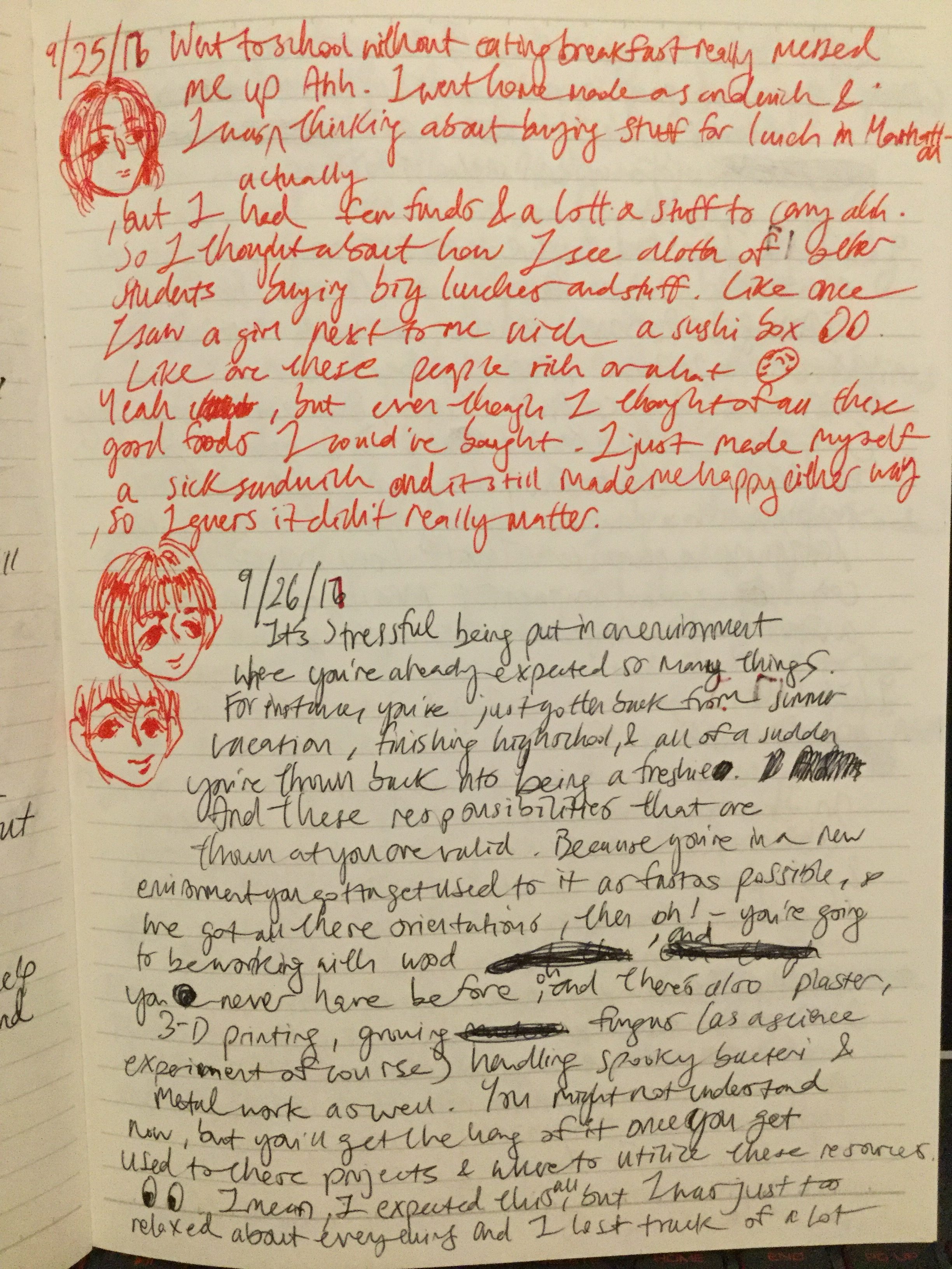
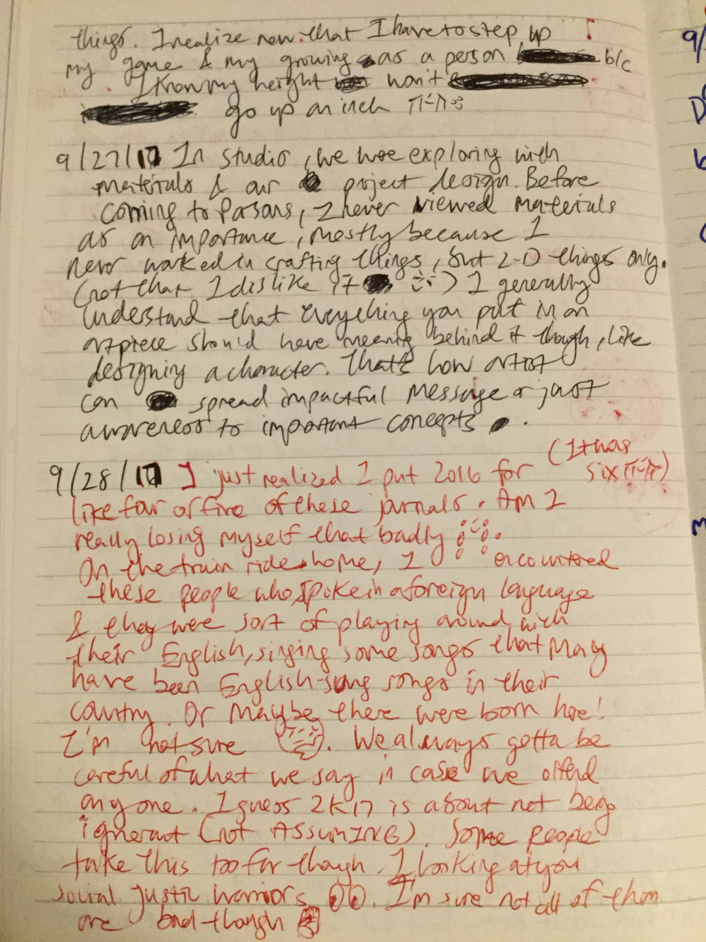
Bridge 2: Body Extension Exhibition

Progress photos

So when I first made the base of the eyewear, I realized an extra slip of foam sheet against the face would be useful, so I remade the box and added a layer of vinyl. This process involved a lot, and I mean A LOT, of slicing.

Attaching the velcro straps with tape and a supportive layer of vinyl sheet.

Preparing the side pieces in order to attach the magnifying sheet.

Calen’s, my partner for this Bridge, in progress body extension. It’s almost like an elephant trunk. You have to look at the mirror on bottom end while holding this straight up in order to see the mirror on the top, showing you the view outside of the tunnel.

This is our exhibition setup

On Calen’s final piece, she added cardboard supports so the trunk wouldn’t be so wobbly.

Eleven Integrative Journal Entries (Wow!!) I tried to spice it up a bit, but writing when you’re super tired really gets you into weird headspaces//

My project has come a long way after originally writing what I would use for constructing the body extension. I had planned to use chipboard-

, but I ended up using foam sheet and vinyl sheet (actually I ended up using lots of sheet related things, which shows how I preferred flexibility and malleability of materials).

My earlier prototype design is pretty similar, only tweaking how the straps were fastened on rather than making a little hole and tying a knot so the strap wouldn’t be able to fall out (similar to goggles). But as I explored with materials, the way I built the body extension began to change because I wanted a cleaner minimalistic design, I bought white sheets instead of my original idea which called for black material in order to create contrast. I wanted my piece to look more futuristic because of Virtual Reality technology, which is what I began to replicate in some way. In the first place, I imagined the design to look almost like a pair of binoculars.

Image result for virtual reality paper


Related image

From the readings of this class and of my Space/Materiality class, I’ve learned that western society has a huge emphasis on visuals and what we see and how we describe things in the concept of time because, in some civilizations, time doesn’t exist in their culture. But times are changing again and there’s a shift to include other senses. Something like augmented reality may seem like it’d only rely on sight, but with the advent of new media technologies, that is also bound to change. My partner and I used this and connected this to the fact that there are people who see things or read news while scrolling down their feed and that’s all there is to it. They may only take in news from one source (which is most likely unreliable) and use that to dictate their knowledge. Basically what they see is what they know.

“However, communication is a multisensory experience, including not only the ears and eyes but all sensory apparati (Porcello, et al., 2010, p. 60). What helped my understanding of what the role of non-visual communication could be was the addition of technology, or at least it piqued my interest especially the virtual reality section. When I first experienced VR, the movement controls were really wonky. Some games would have the player teleport from one spot to another with a cursor on a screen connected to one of their hand controllers. Now more technologically advanced VR games allow the player to move by just motioning their hands the same way they’d walk in real life. You’d think that playing VR games would require only visual attention like normal video games (besides the use body motions when using a keyboard or mouse), but because of the connotation of “virtual” many of your senses, smell excluded (perhaps in the future this may be implemented somehow, but currently there is haptic research relating to binding touch and kinesthetics into encounters with images (p. 58)) , will be used. Media theorists also recognize the potential that new media technologies carry to destabilize presumptions of ocularcentrism, as modes of interaction with media increasingly rely on body, voice, hand, or other body-and-sense interfaces (Hansen 2006). I don’t believe there are solely non-visual mediums, but the future of VR shows how the other senses can be conjoined with visual presentation.”

– Week 4 Reading Response

Postcard copy-17869qi

(Curatorial Statement and Artist Labels)

Calen and I tried spicing up our curatorial statement (fun assignment for Integrative Seminar in order to liven things up!)

Working together with something to create a whole exhibition was an enjoyable experience. If this was my only art class, I would have definitely planned out with my partner more to a create a more exhilarating experience for the audience, but I wouldn’t say this experience was useless It’s always fun building new stuff (especially things I’ve never done before, even though it’s extremely stressful juggling other classes) and seeing how far I can push myself and what can I make besides doodling on sketchbooks. But for the most part, I think I was just excited doing something almost game design related instead of all these foundation courses (cries, but not really because all experiences are valuable). For the next project, we’ll be working in groups of four, so I wonder how that’s going to go (laughs nervously). I hope our communication will be on point.


Figure/Ground Assignments

My collage for the assignment that I didn’t use because the shapes were very geometric (and I didn’t have a well-made collage at the time). It’s not that geometric shapes aren’t good, but there’s more diversity with the picture I used:

Lived traced and took some individual shapes to trace with the pen tool.

Shapes being used before transformed. The two-line shapes is what I elongated and the other single thin stick is what I shortened. The rest was resized. Black on White

I was focused on building a ground and then building on the top of the ground. I want to say that black on white is easy, but it’s really not especially when you have limited shapes and rules to follow (using the same shapes throughout the Figure/Ground series). Becaucse of the stick on the top holding up an arc, I imagined this to be some sort of ship.
 White on Black

White on Black was relatively easy to understand, but you know what they say about putting theory on paper. My idea here was to wrap or surround the negative space to create a white figure and using the sticks it came out to look like the woods, but I should have left more room for the negative space to shine, instead I made a silhouette of a rabbit.

Ambiguous

So ambiguous is suppose to be unclear, and so I interpreted it for this Figure/Ground file to have two grounds and have the figures (little moomen) floating off. One of my shapes already has a gound and the big curved pieced (combined with other pieces) also seemed like a good starting point for ground.

Some troubles I encountered was mostly just creating a good composition with the limited shapes I had because I didn’t use the collage photo, instead I grabbed shapes from a drawing I did recently.