Figure Drawing

I had done live nude model drawing before in high school, but I never explored the different techniques in drawing, such as using just lines to shape the figure or not outlining when drawing. That was the most challenging part for me – not drawing outlines that is. I just had to force myself to draw with shadows, which was still very difficult for me, but it was fun. Looking over the drawing in week 2 (for the longer drawings), I actually don’t dislike it! In fact, the many lines forming the figure are really pleasing and accomplishing to look at.  I think I improved a lot at the anatomical structure and using shadows to build the figure. I wish we also focused on individual body parts like feet, hands and the face.

Week 1


Week 2


Week 3


Week 4


Week 5


Week 6


https://drive.google.com/drive/folders/1s8Z4sJibQwYJ_0vazlYe-TZKZmoEkTn0?usp=sharing

Reconstructing Times Square

László Moholy-Nagy, Constructions, Kestner Portfolio 6, 1923 (Portfolio of six lithographs)

There was no background and the center of the drawing was just floating in this empty space, which was something I found pleasing to look at. In addition, the flat colors and multiple perspectives were interesting.

Louise Bourgeois, Topiary, 1997, Watercolor, ink, oil, charcoal and pencil on paper

I tried to replicate the concept of the further an object is the smaller they are drawn. I wanted the viewer to understand that and the perspective in my poster by making the dogs different sizes.

There’s not one picture that doesn’t have people in it, well except the picture of the tall building – that doesn’t count. I included that one just to represent all the tall buildings in Time Square, which pretty much all have advertisements on them. But yeah, what basically symbolizes Time Square is huge crowds of moving people, animated advertisements and tall buildings.


1 point perspective

1 point perspective – most of my pictures were one point perspective because of my vertically challenged phone, which I mean myself, but the third picture shows a bit of another perspective, 2 point perspective, on the first line.

At first, I tried doing a legitimate artchietectural imagined sketch, but I started doodling at the end and kind of all over the page.

So I decided to copy the pictures I took and studied those perspectives while not giving up on my doodle of people.

I ended up not doing an architectural drawing since that would be boring and drew shapes instead. My project in another class had to do with Illuminati and I was so influenced by that and made it my focal point of this project.


At first, I didn’t have any gradient in my line drawing, but I realized the trippy black coloring resembled stars so I went along with that and played with the coloring. My idea was that the triangular figure transformed into something, hence the opening of the eye and magenta-colored tear, and I wanted perspective to represent that. The side pointing inwards was just a single-color yellow because I didn’t want the picture to be too chaotic since I filled in the sides and front with a gradient.

https://drive.google.com/file/d/1iS5Cd8EaY3is2tMjdR-13Ouhtl6T-lfm/view?usp=sharing

After seeing you insert the cut-out of the bear into the drawing, I was inspired to put in my favorite things – puppers, I mean dogs, yes. I also wanted to fit into that vaporwave aesthetic, which is something like this:

I also included Japanese (translated from google, so it’s probably not entirely accurate – actually not at all), which is a huge element in vaporwave that there’s even music based on it:

From top to bottom, the first line says, “I am a happy dog.”, the second line says, “Will I be remembered?” (based off Gabe the dog – a huge internet sensation featured in this song https://www.youtube.com/watch?v=5dbG4wqN0rQ any many others) who passed away) and, lastly, the third line says, “I’m a fast puppy.”

So that concludes it! My project is a replication these elements and my favorite things. I don’t usually work in these things of posters and stuff, so it was really fun. By the way, the single happy body is me in the picture just having a good time :).

Space/Materiality: Project 2

This project is on the relationship between shadow and secrecy. I explored how a secret can be fragile in relation to shadow and how a secret can contain both beauty and ugliness.

I wanted the shadow to portray a cage with roses and thorns surrounding it. The secret would be inside the soft-shadowed cage reflected on the wall which showed how it was locked away, but simultaneously, the secret’s existence was known.

I was actually using two light sources. One you can see hanging in the cage and the other one was behind the camera’s view.


This project was actually a reiteration of a previous shadow project. Although it looks like a lantern, it looks stunning when there’s really bright light source. I went more a lantern appearance because I liked the way it flickered and I wanted the shadows to do the same, to seem fragile.


Bridge 3: Site-Specific Installation

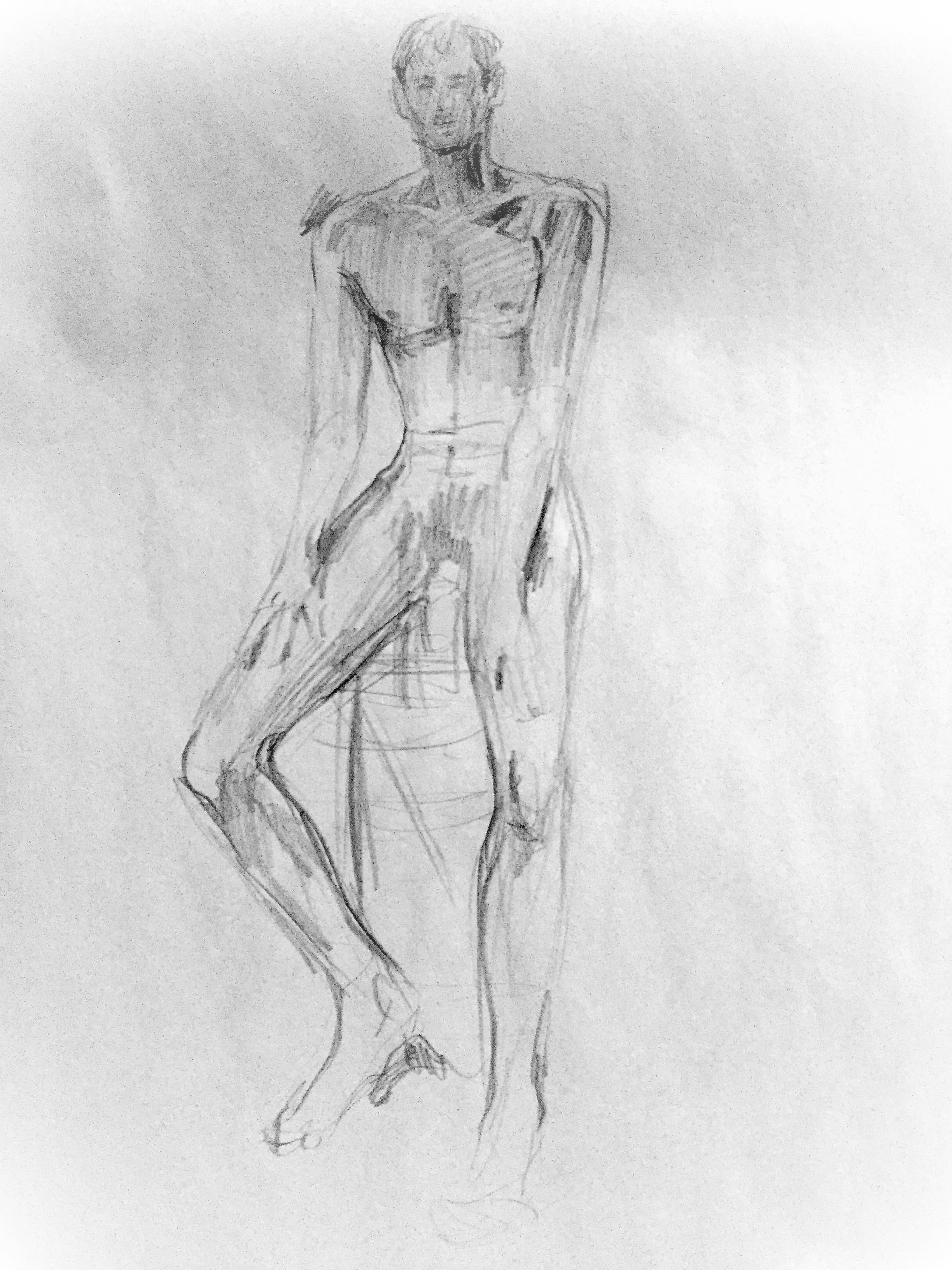
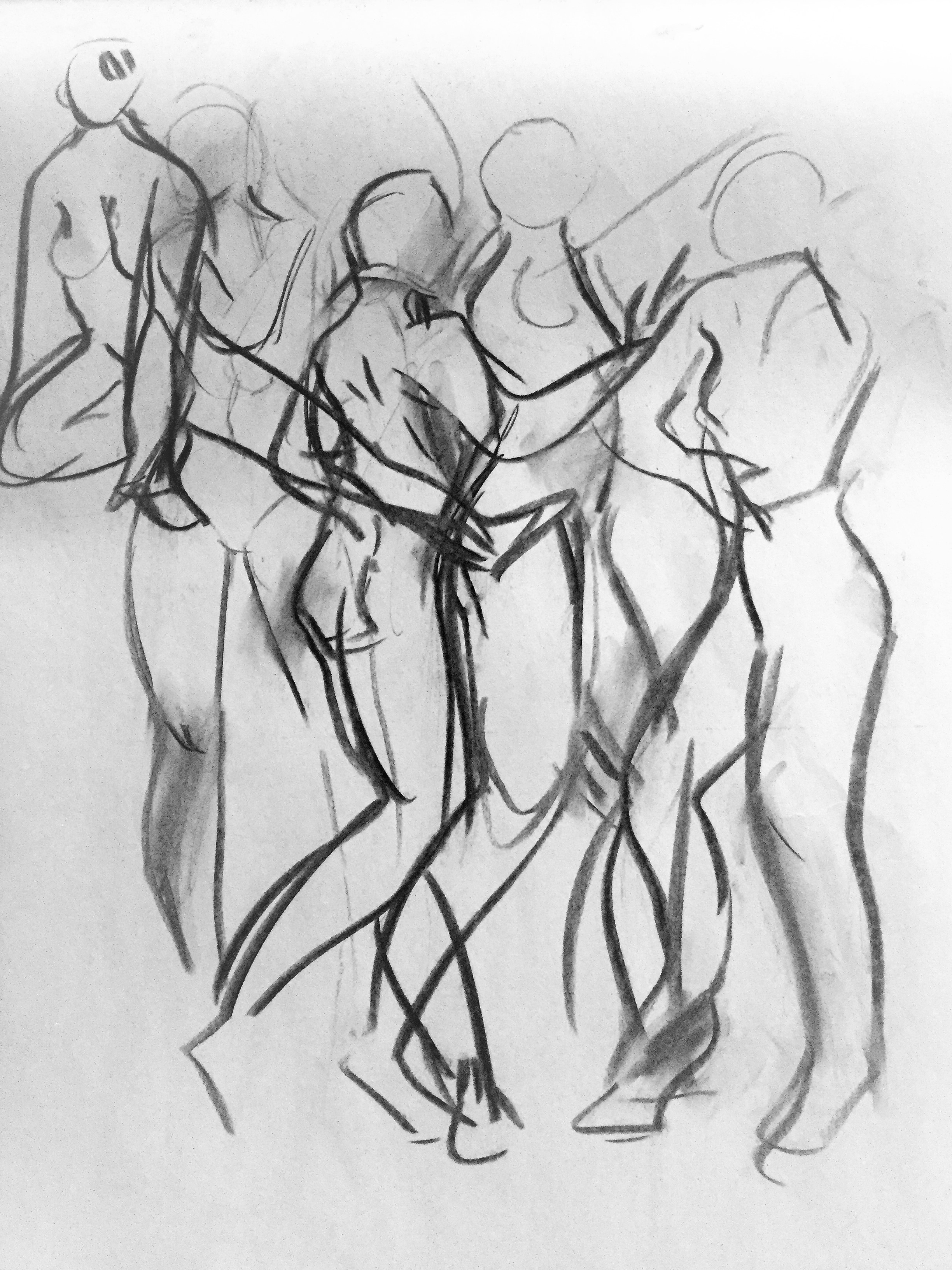
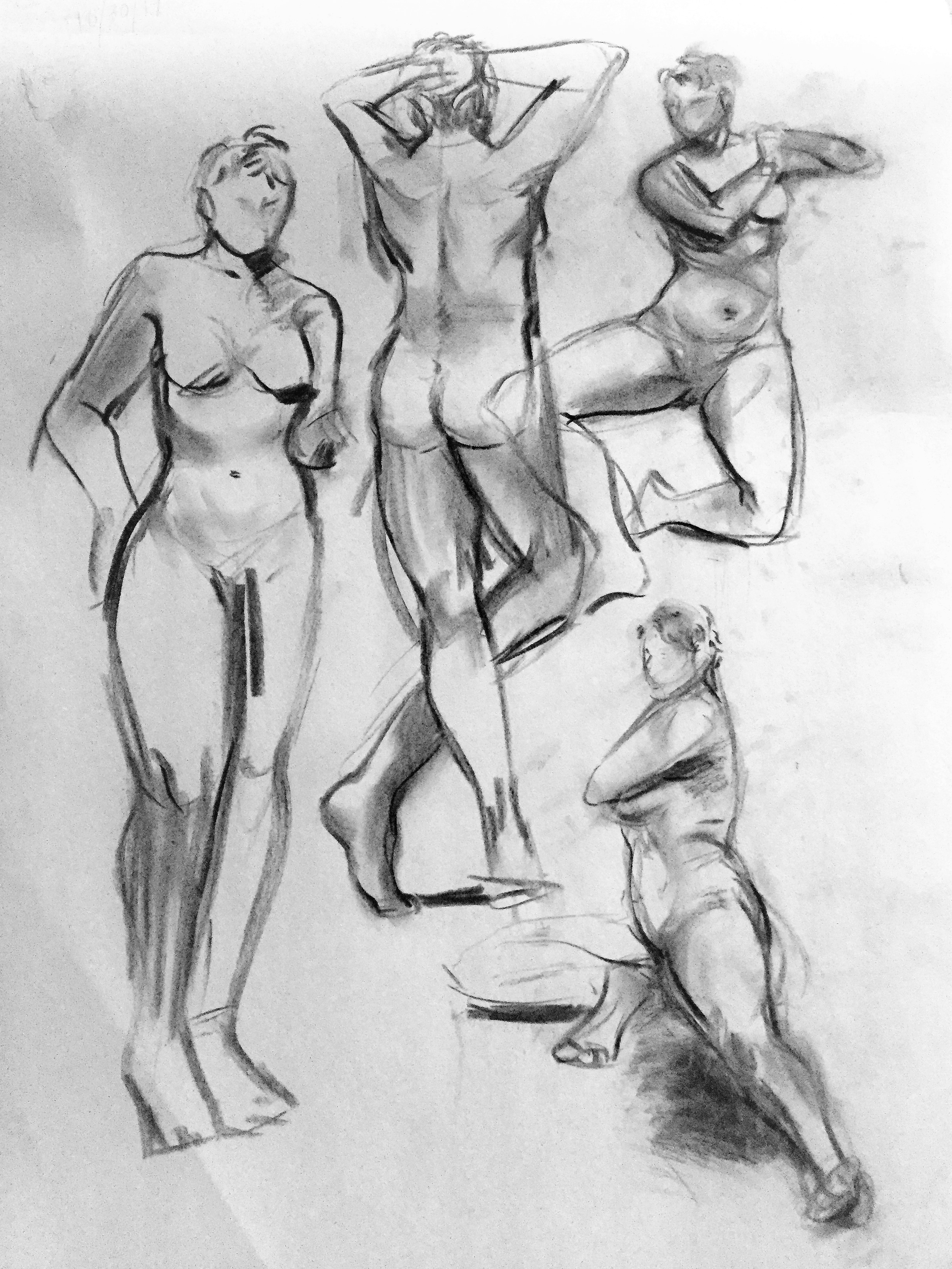
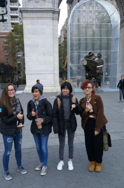
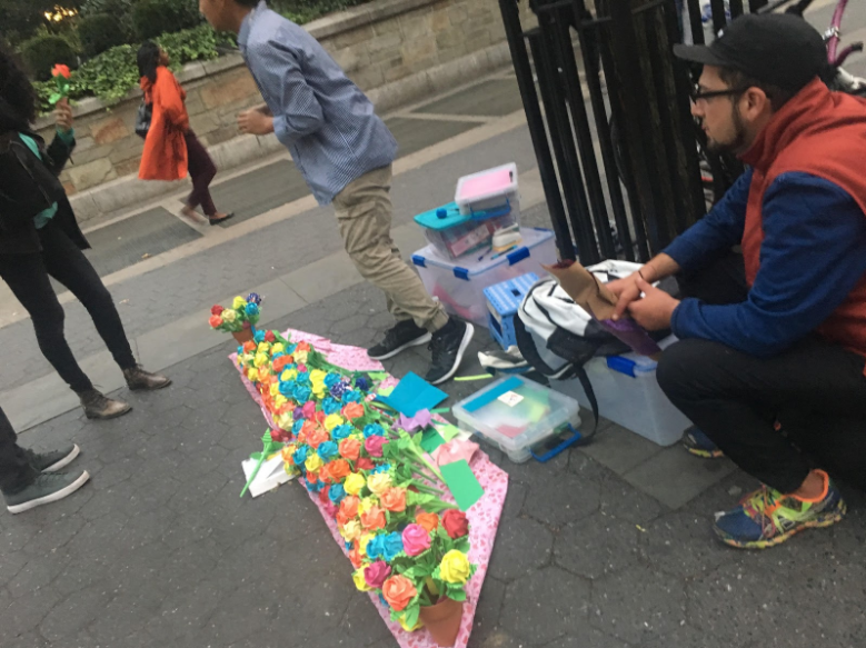
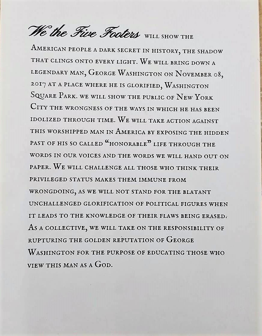
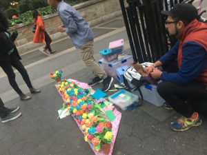
The Five Footers spotted at Washington Square Park

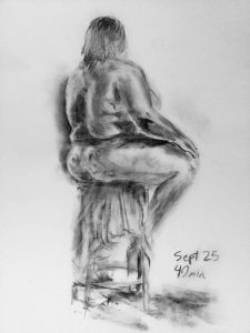
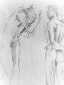
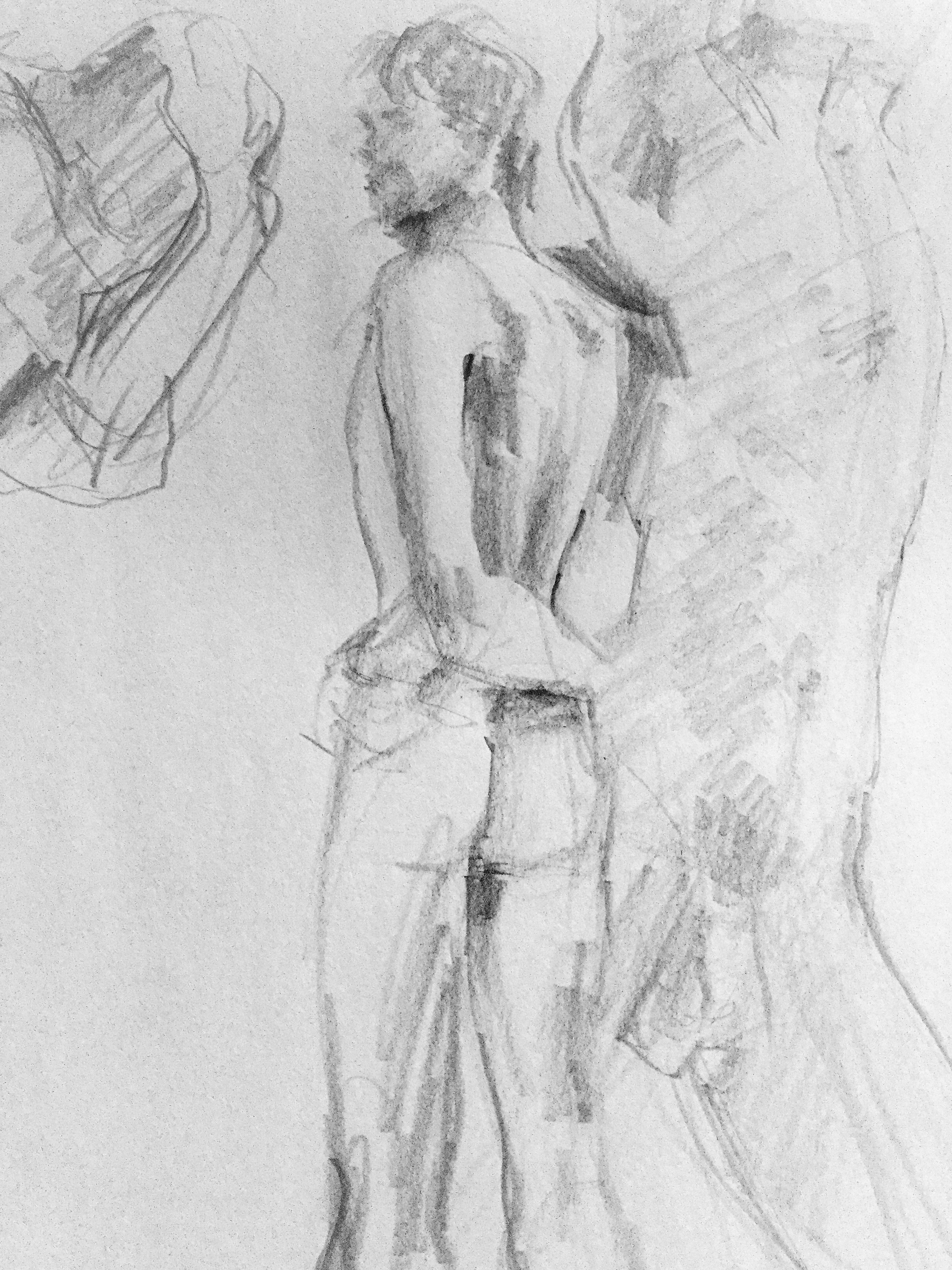
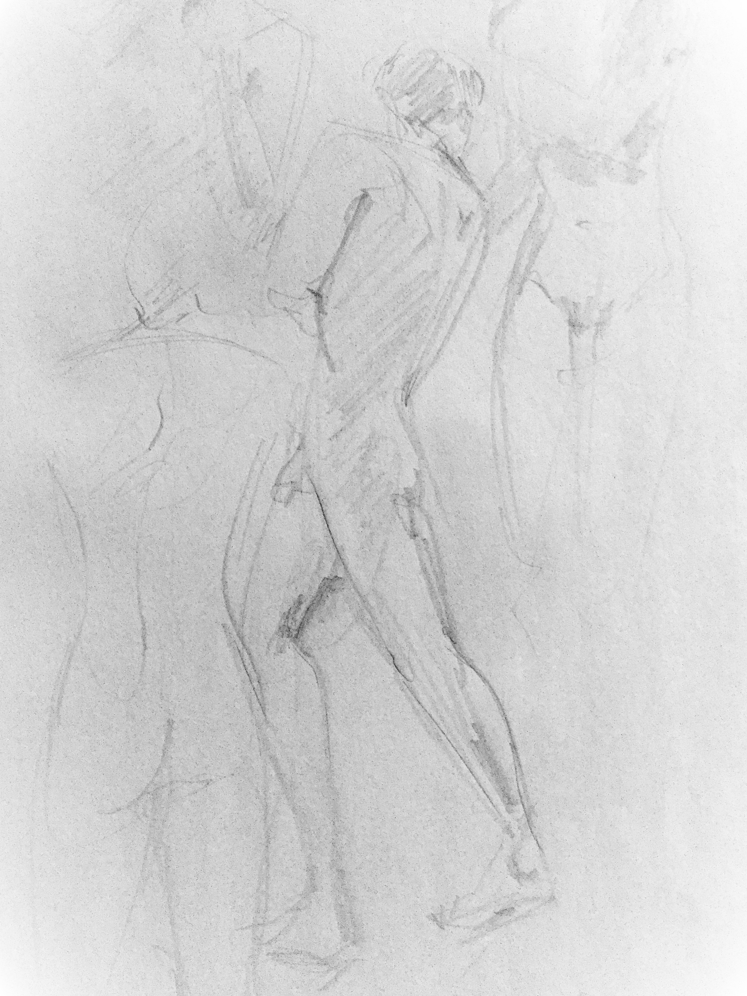
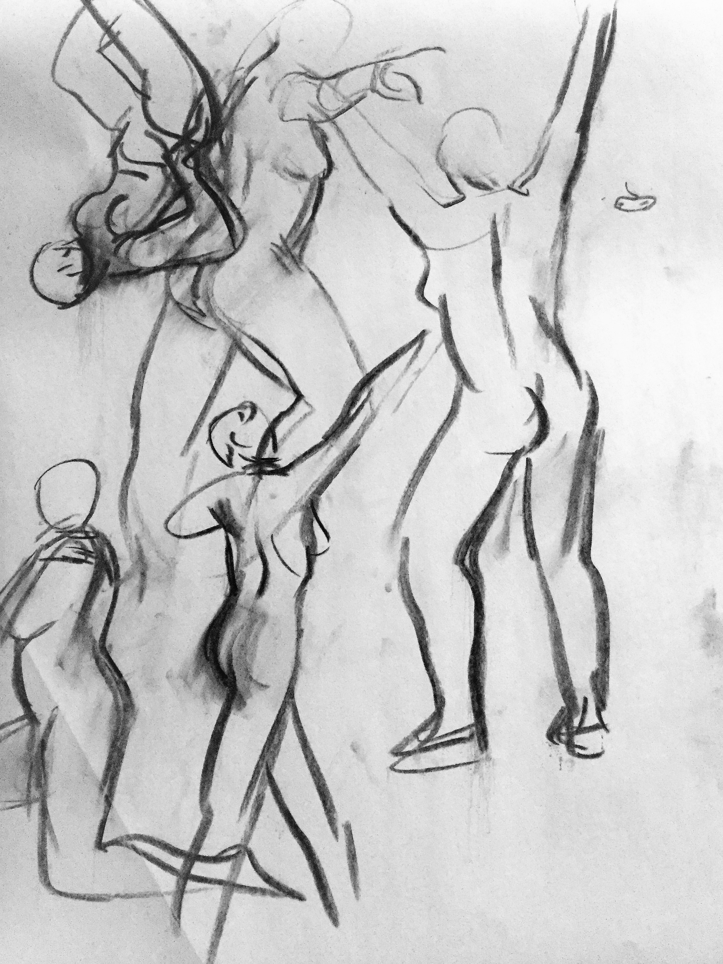
To get us going, we did group assignments for class and for homework. Here are some examples of our work:

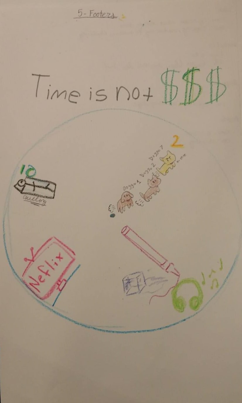
Our paradise group clock

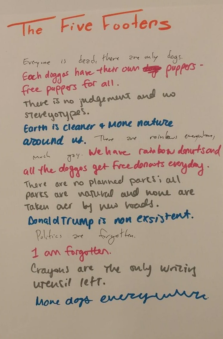
Our imaginary Utopia world

Our world drawn out

~

Seminar Week 9 Collective Reading Response

Both French rapper and mother, Ana Tijoux, holds the same beliefs with music as she talks about how warped the industry has become in making their money through objectifying female artists instead of through the beauty of the actual music. In her article, La Cultura de la Basura, or garbage culture when translated, she says, “Every female singer must compete in an infinite game of provocation… who can show more and more… who is the most desirable, and who has the highest ability to annul the most beautiful femininity…” (Tijoux 2014, 6) Tijoux deprecates the music industry and music videos that only serve to make girls and women into objects of greed, and stresses the importance in discussing the impact it has on the younger generation. For them, opportunities have become severely unequal; the possibilities of work have dwindled as our society not only supports this but now expects this. In turn, Tijoux believes that it is the responsibility of the artist to step away from this cycle and take the initiative change things. She says, “Singers have the imperative task of bringing about a shift through our songs and lyrics. We have to bring the issue to the fore, awaken critical thought, remember with beautiful responsibility the reason for our voices.” (8)

Weil states that, “Work makes us experience in the most exhausting manner the phenomenon of finality rebounding like a ball… ” (Weil 2002, 179)

~

Photo of Influence, spreading happiness by beautifully made paper flowers

~

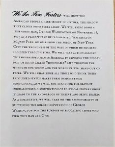
After team-building excersies, we got into the flesh of the project – deciding on what we, as a group, wanted to do and forming a manifesto for that. Because the project was a site-specific installation, we researched about the square and found an abundance of dark history that we would have never known if we had not purposely searched up about this place. We related this to the importance of knowing all sides of something, not only focusing on the good, but also the bad. When exploring the square, we saw a man selling anti-trump buttons and we were inspired to do something similar. From then on, our theme would be exposing George Washington, a legendary figure in history, and thus, showing the public the bigger picture – not that it’s important to know the secrets of powerful figures, but that in a political sense, there is not perfect glorious figure, that they are humans just like us.

~

Manifesto Investigation

Chosen Manifesto: An Incomplete Manifesto for Growth by Bruce Mau

Chosen Primary Resource: “Bruce Mau Commencement Speech”


Bruce Mau not only wrote a manifesto on human growth, he is also a graphic designer, architect and entrepreneur. As art students we depend heavily on design, especially since our corresponding studio project is based around graphic design.  When we saw that Bruce Mau was such a famous designer we knew that he would be a great source of inspiration reading his manifesto only made us more sure. Unlike many of the manifestos, Mau has a more universally applicable message. He talks to the individual but in a way that many individuals can relate to. We felt that the best way to better understand where Mau was coming from would be to find a primary source directly from him. We found a commencement speech and knew it would be the perfect way to connect Mau to his manifesto and then for us to be able to connect ourselves to our manifesto.

Manifesto Draft

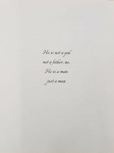
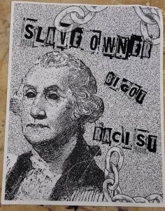
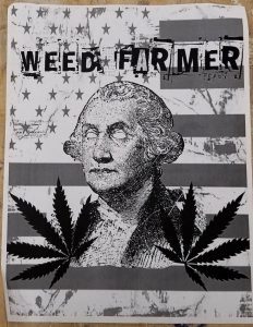
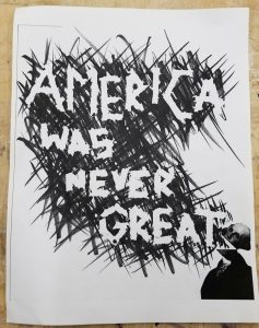
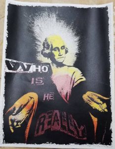
  • We are here to expose the hidden life of George Washington
  • Exposing these truths will shed a new light on how we perceive and think about history and the people we assume are good
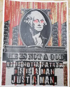
  • George Washington was not the man we thought we knew, we must inform people the man he really is
  • The first president should be someone we know 100% it’s only fair and we have the right probably
  • George Washington, like many other presidents, have their ups and downs because he’s human
  • Society erased these truths, we must go against that
  • We have to be open-minded about his past life
  • History textbooks in school erased his life and only focused on the good concepts, it is our duty to be the better textbook to the public
  • Create a new perspective on history

Our Collective Manifesto 

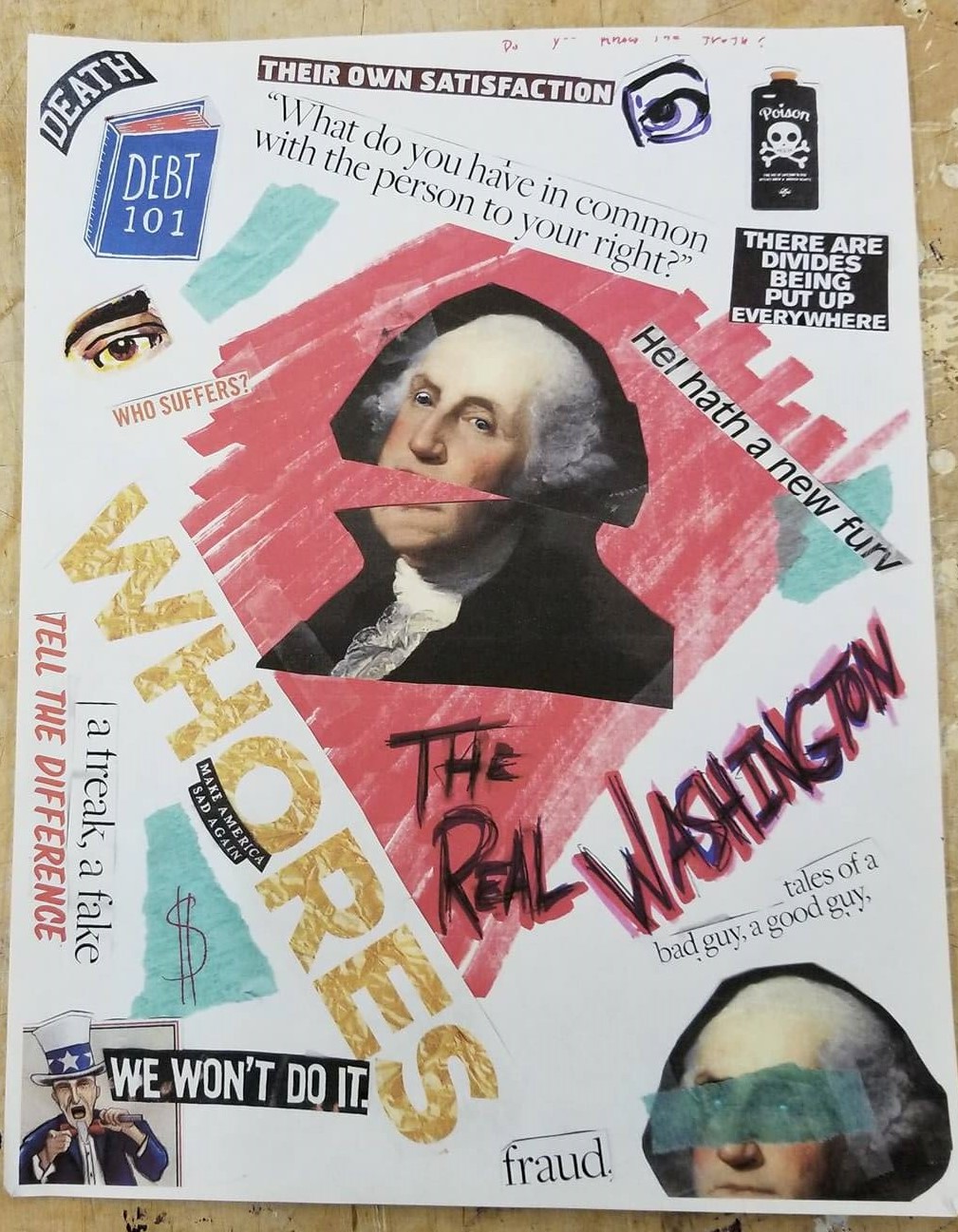
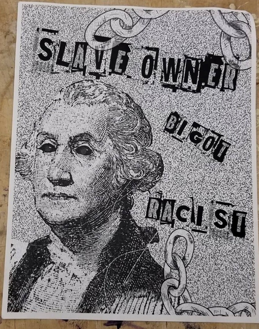
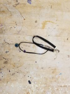
On the day we were performing our project, we all dressed up in black to look punk in order to match our poster themes. We chose this theme because punk has a history of being rebellious against authority. Nicole brought chokers for me and Leach. Alyssa went through an edgy phase so she was prepared.

Our soup poster – this was when we couldn’t decide on a theme and just stacked everything in this one poster.

~

Final products

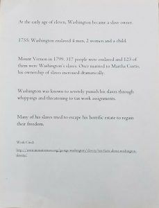
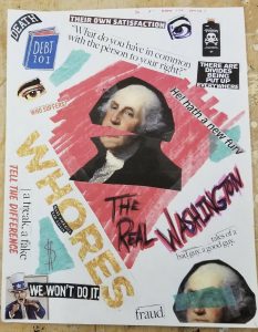
one of the posters contained an informative back side.

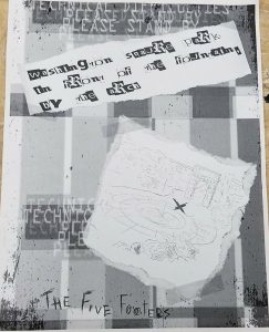
our map for locating our installation

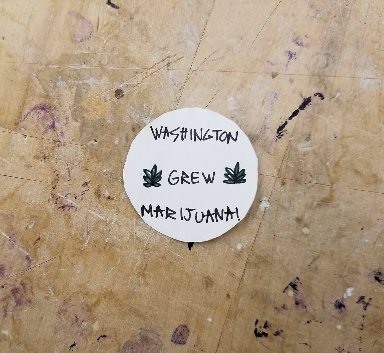
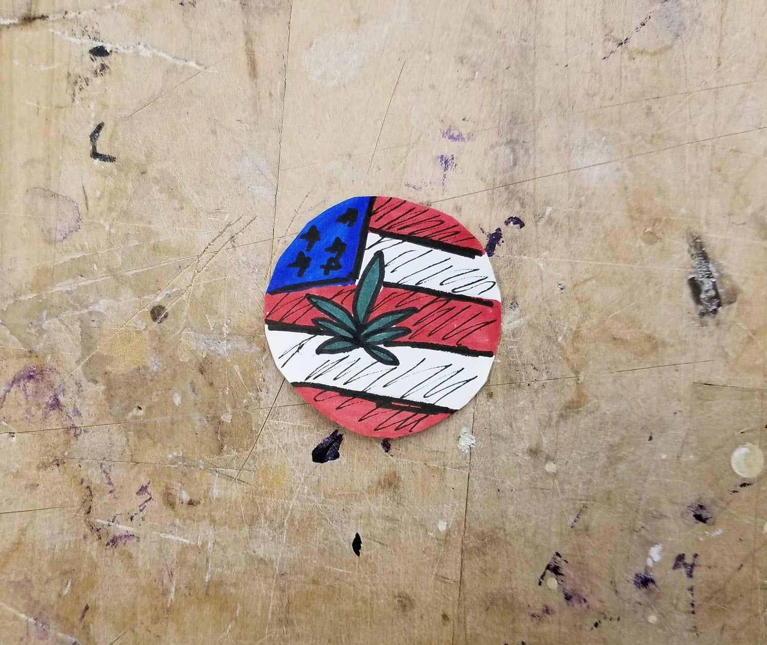
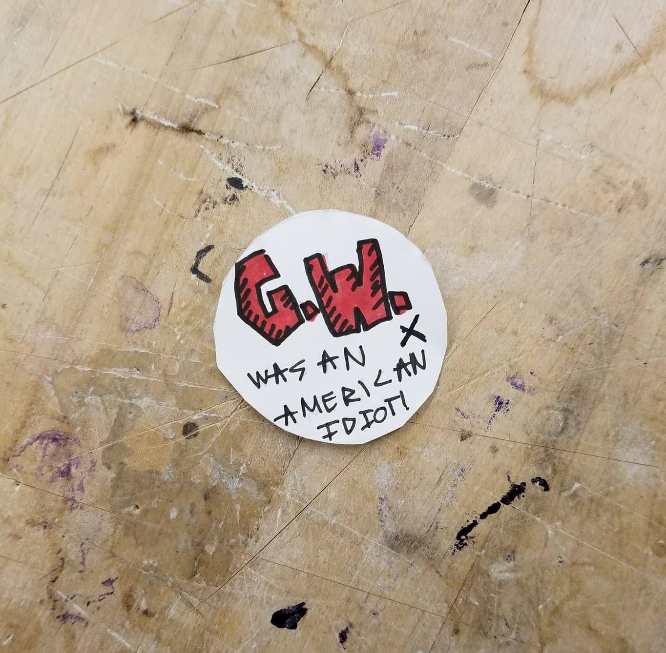
we made a lot of stickers, however not all are showcased because we handed them out

people liked it a lot because it was almost like a collectable (like some trading-card game)


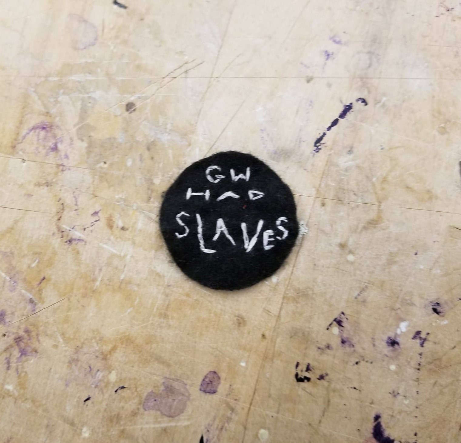
an example of one of our smaller patches (made out of felt and embroided on)

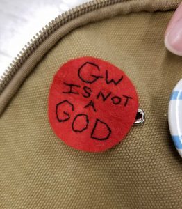
I stuck one of my bag with one of Alyssa’s saftey pins

~

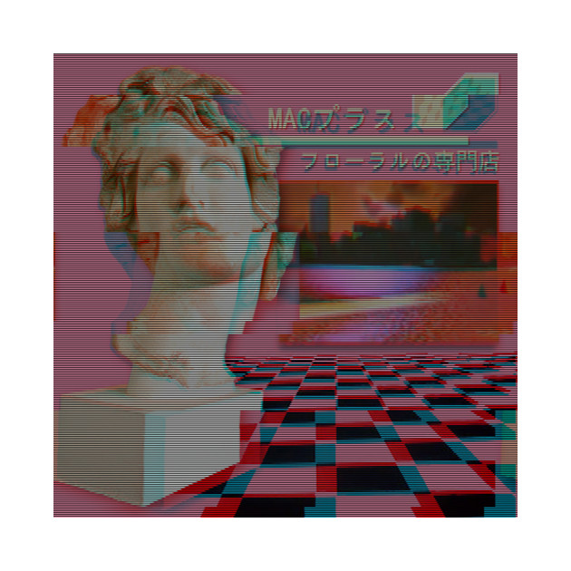
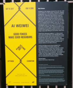
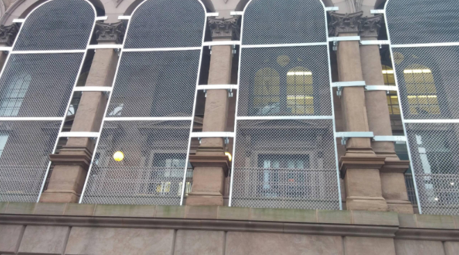
I’ve done plenty of graphic design projects in high school, but I wasn’t the greatest at it. I would design on illustrator, but for this project, I worked on both illustrator for getting transparent pictures and editing in photoshop. It was really fun experimenting with the filters and I learned a lot of how to transform objects into looking punk like. The only thing I regret is making more posters because after getting the hang of everything, many other ideas popped up. Working in a group to install something we each made as a collective was a really fun experience because I believe our final product was amazing. In the first place, putting something together as a group has an accomplishing feeling to it. Especially because our location was by Aweiwei’s installation, Good Fences Make Good Neighbors, since we were both being critical of a person in power.


Bridge 3: Collective Boundary Exploration & Public Reading

Arch in Washington, Good Fences Make Good Neighbors

  • It’s 3D, so it looks more like a cage (which I related to a birdcage)
  • The middle portion is a solid opening unlike the whole fence (it makes an organic shape) and makes it interactive in this way
    • It’s situated right under the arch and sort of becomes the arch
    • There are some lights on the sides so it must look really shiny at night
    • Some sick folk music playing and it’s pretty lit


The Fences on the building in Cooper Union

  • There’s (what I assume to be fences) blocking the windows
  • The fences certainly make it harder to look out the window, but I think it represents blocking out hope because when I think of looking out the window, I think of looking far away and wishing for something


As a collective, we observed that Good Fences Make Good Neighbors at Washington Square Park, looked more like a cage rather than a fence. The organic shape in the center of the piece also ruins the illusion of a fence. In fact, one of us noted that these fences wouldn’t make particularly good fences (if they were to be setup as it). The hole in center makes the piece more interactive, allowing people to freely pass through, although a bit restrained. Perhaps this represents immigrants still managing to sneak over. That even though we put up laws against refugees and immigrants, there will still be people against it and that’s something to be hopeful for. The on-site-construction in Cooper Union had the fences merge smoothly with the architecture. It wasn’t full on locking up the place, just covering the holes, but people probably wouldn’t be able to pass through (unless they squeezed through the gap). However, the piece is placed up on building, blocking out, what one of us noted, hope. The piece in Washington appeared more hopeful than the one at Cooper Union because the fences at Cooper Union were full on lockdown, whereas the single one at Washington Square had a hole in the center. The visual themes the two constructions shared was both being fences and situated under arches, already existing before the fences. Both were also unified in this minimalistic aesthetic using metal as a way to make viewers understand the overall concept of being trapped or imprisoned.