László Moholy-Nagy, Constructions, Kestner Portfolio 6, 1923 (Portfolio of six lithographs)
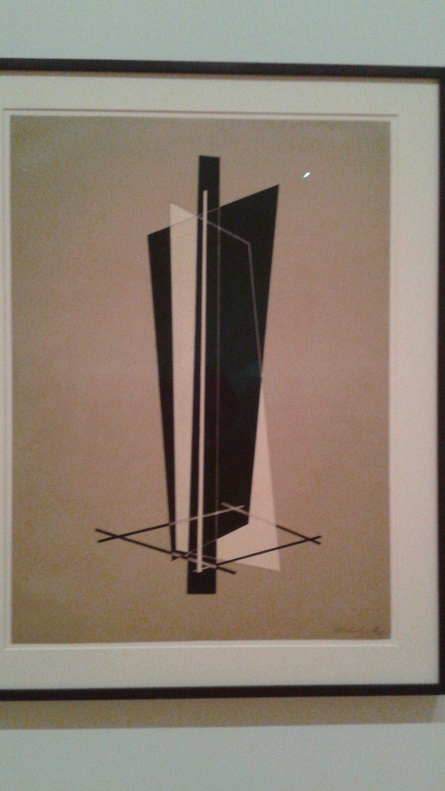
There was no background and the center of the drawing was just floating in this empty space, which was something I found pleasing to look at. In addition, the flat colors and multiple perspectives were interesting.
Louise Bourgeois, Topiary, 1997, Watercolor, ink, oil, charcoal and pencil on paper

I tried to replicate the concept of the further an object is the smaller they are drawn. I wanted the viewer to understand that and the perspective in my poster by making the dogs different sizes.
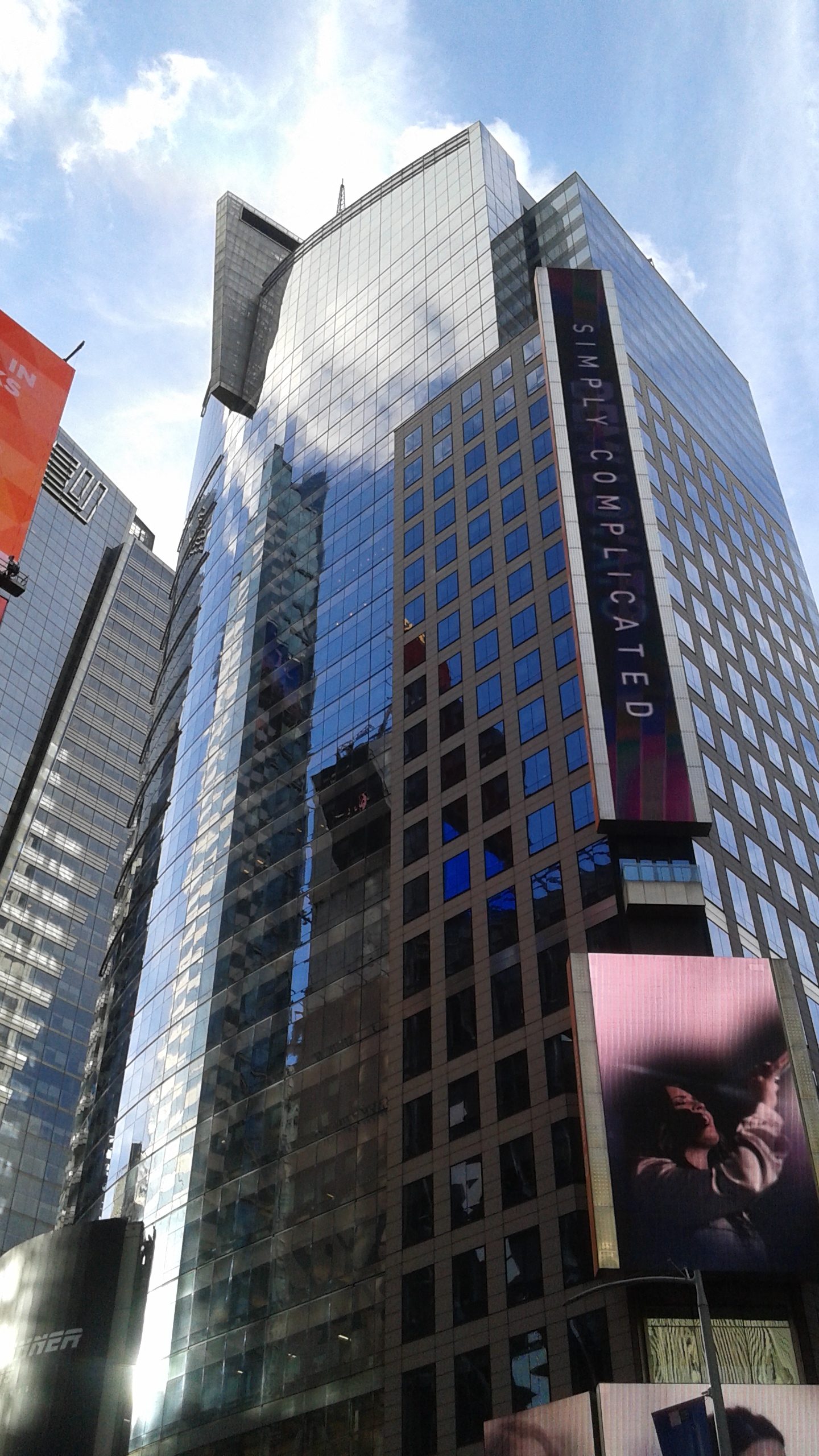
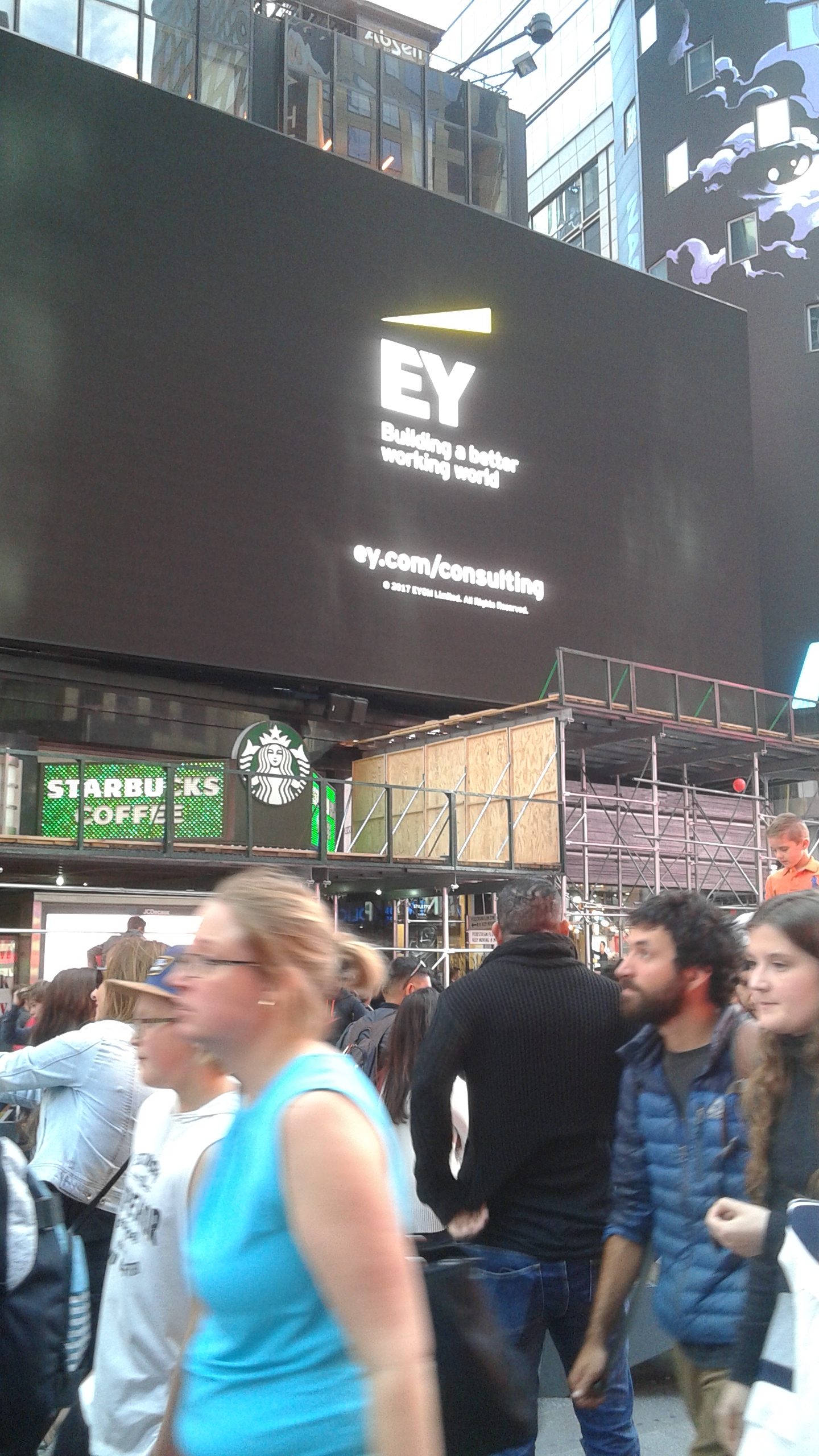
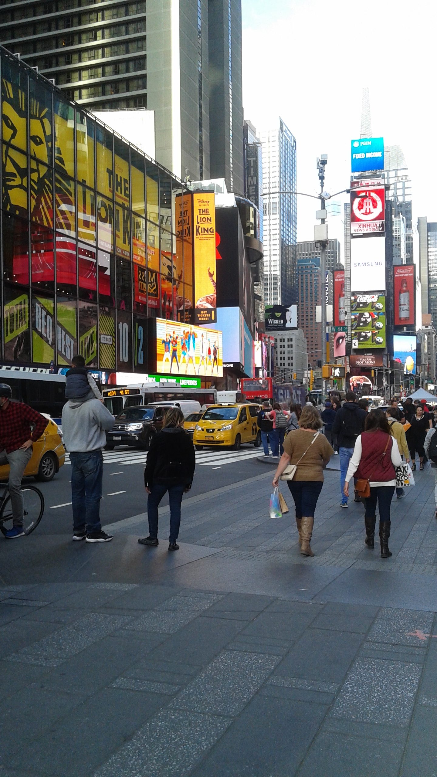
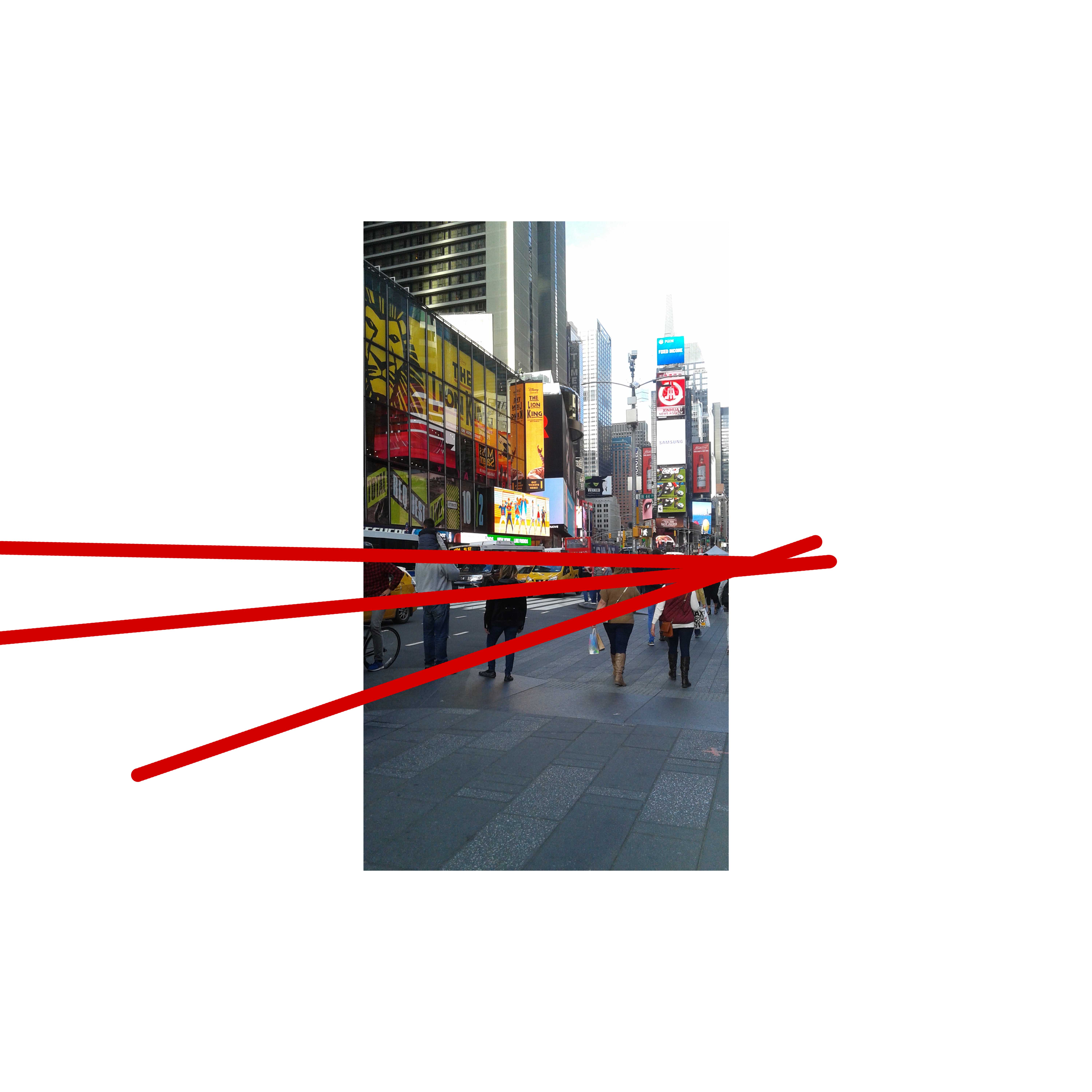
There’s not one picture that doesn’t have people in it, well except the picture of the tall building – that doesn’t count. I included that one just to represent all the tall buildings in Time Square, which pretty much all have advertisements on them. But yeah, what basically symbolizes Time Square is huge crowds of moving people, animated advertisements and tall buildings.

1 point perspective
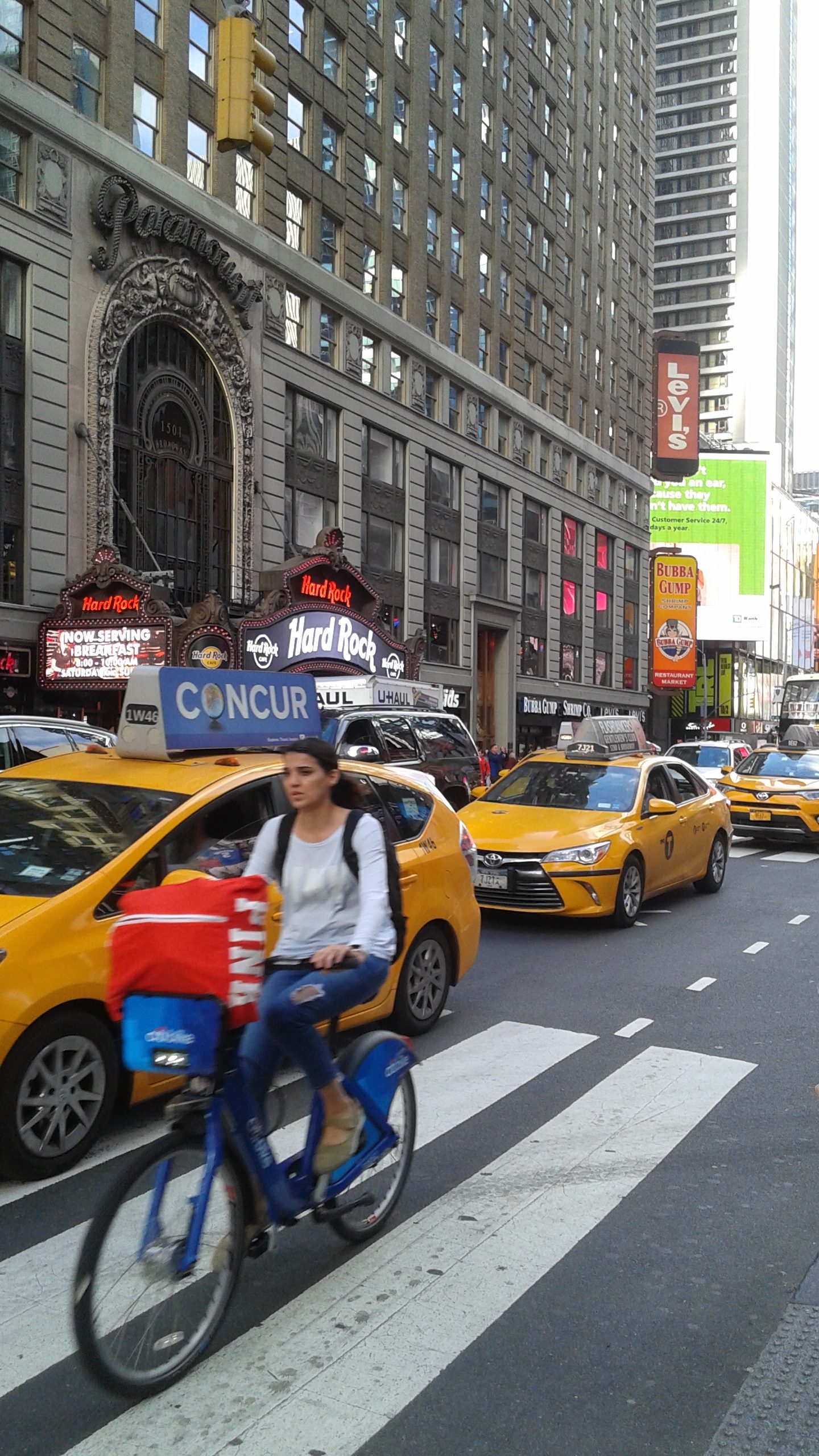
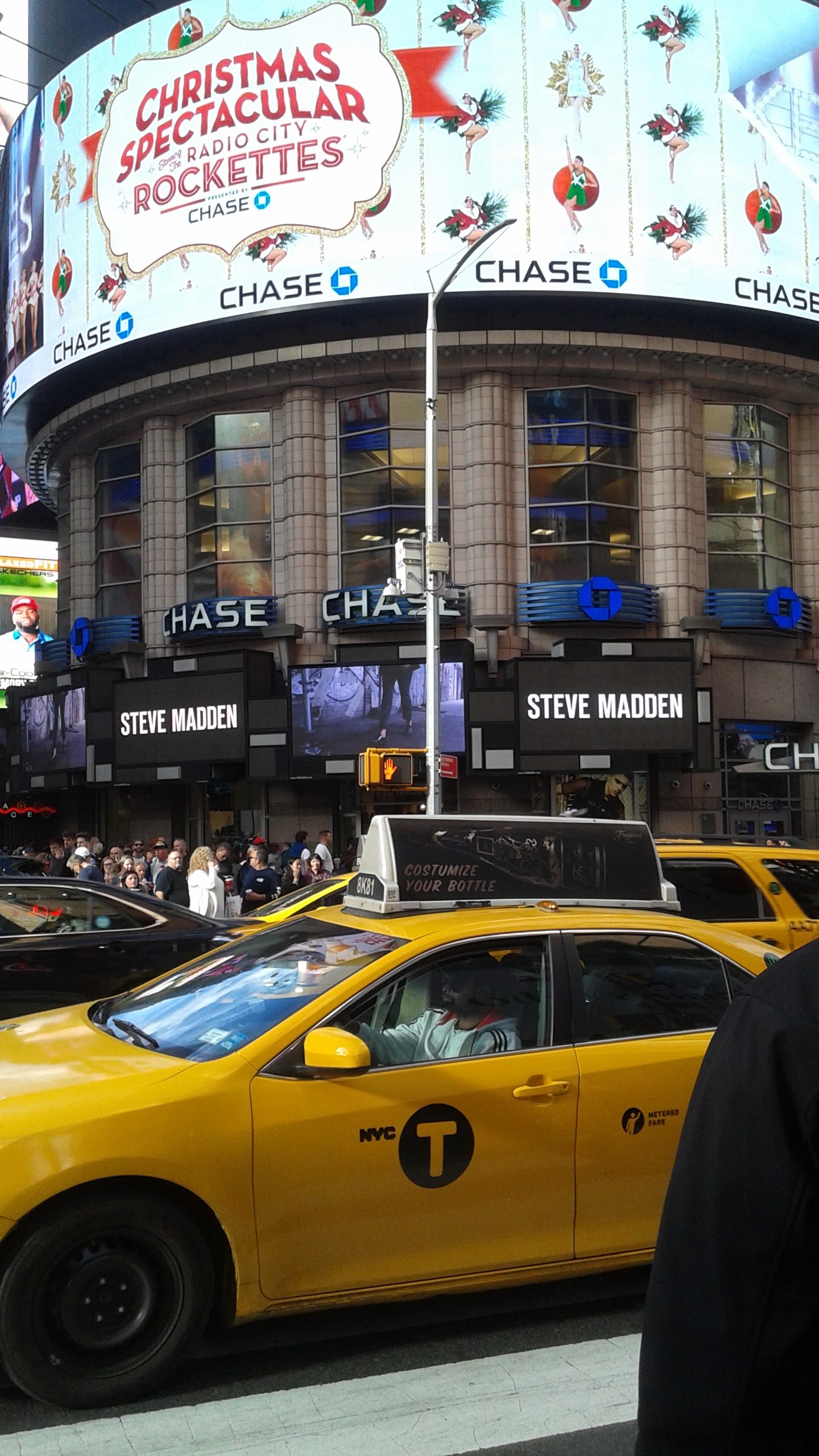
1 point perspective – most of my pictures were one point perspective because of my vertically challenged phone, which I mean myself, but the third picture shows a bit of another perspective, 2 point perspective, on the first line.
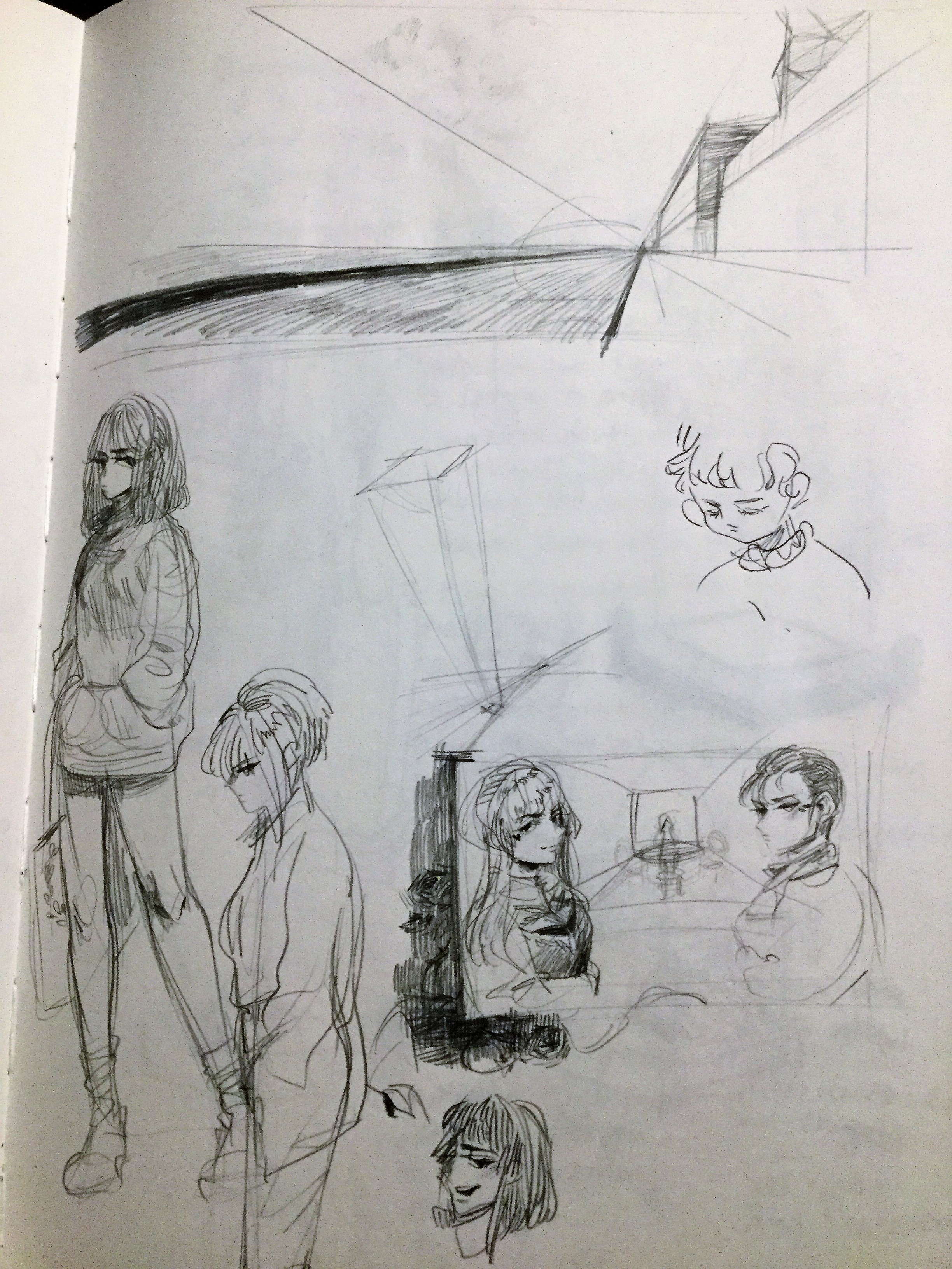
At first, I tried doing a legitimate artchietectural imagined sketch, but I started doodling at the end and kind of all over the page.
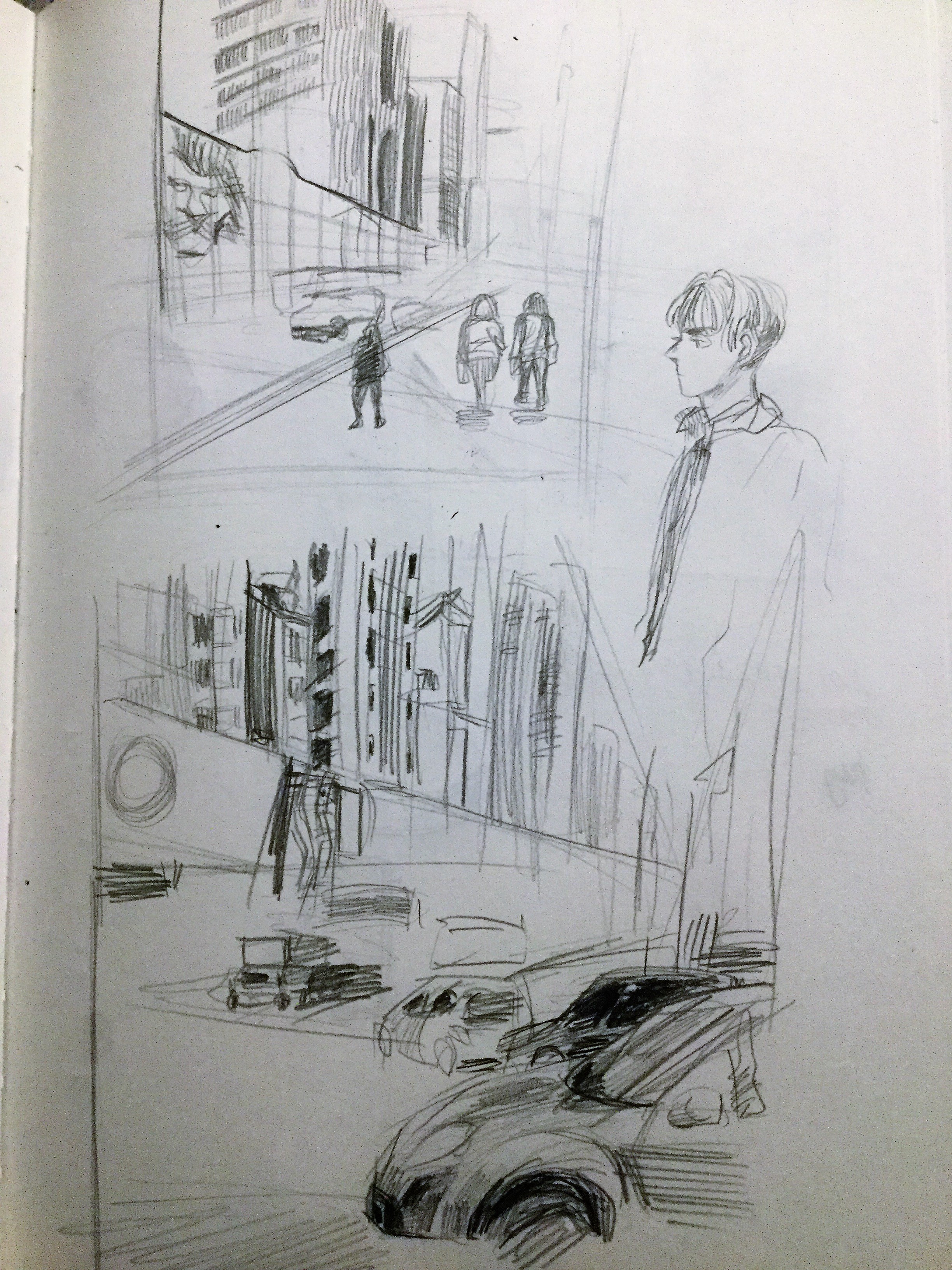
So I decided to copy the pictures I took and studied those perspectives while not giving up on my doodle of people.
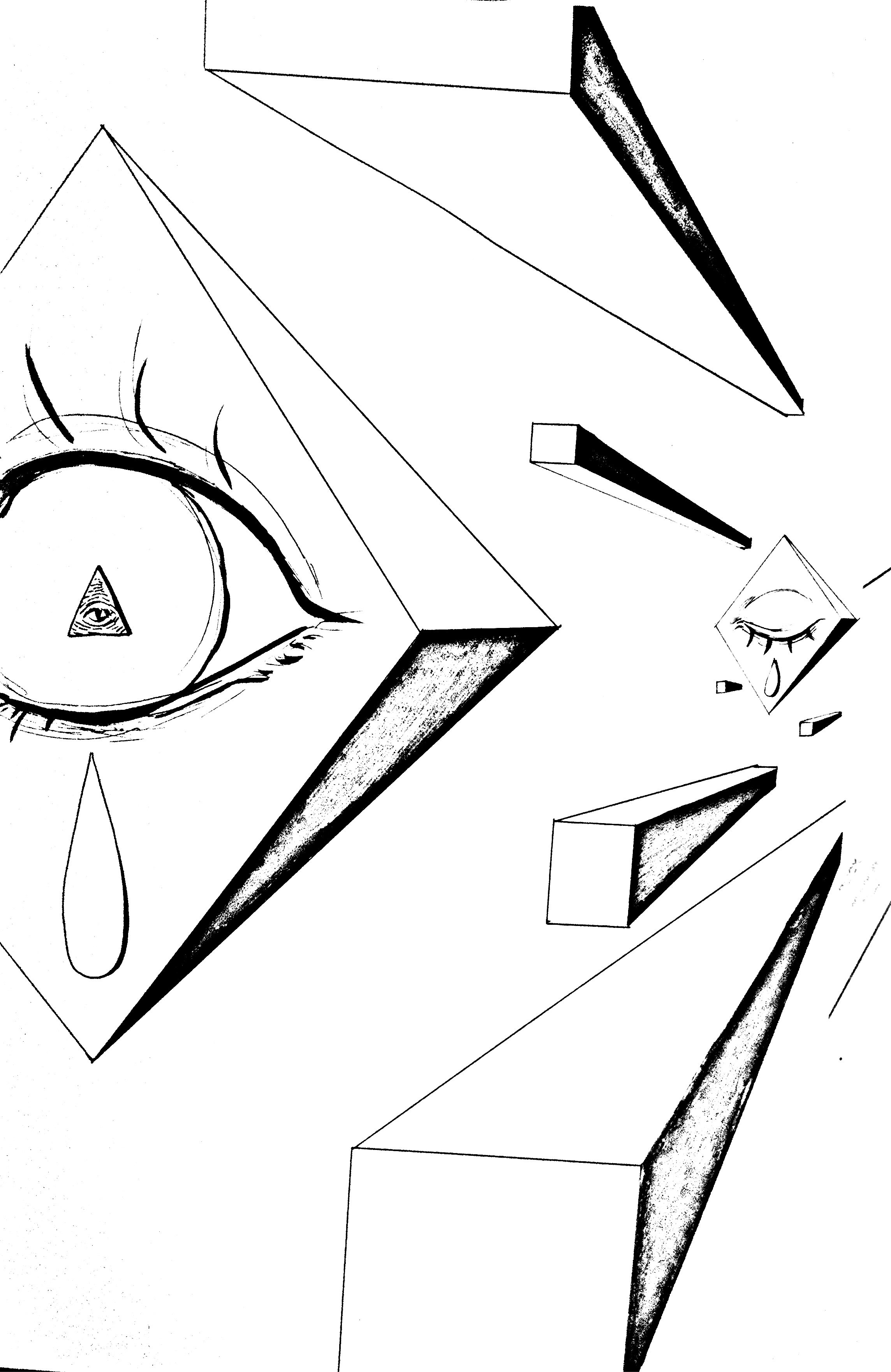
I ended up not doing an architectural drawing since that would be boring and drew shapes instead. My project in another class had to do with Illuminati and I was so influenced by that and made it my focal point of this project.
![]()
At first, I didn’t have any gradient in my line drawing, but I realized the trippy black coloring resembled stars so I went along with that and played with the coloring. My idea was that the triangular figure transformed into something, hence the opening of the eye and magenta-colored tear, and I wanted perspective to represent that. The side pointing inwards was just a single-color yellow because I didn’t want the picture to be too chaotic since I filled in the sides and front with a gradient.
![]()
https://drive.google.com/file/d/1iS5Cd8EaY3is2tMjdR-13Ouhtl6T-lfm/view?usp=sharing
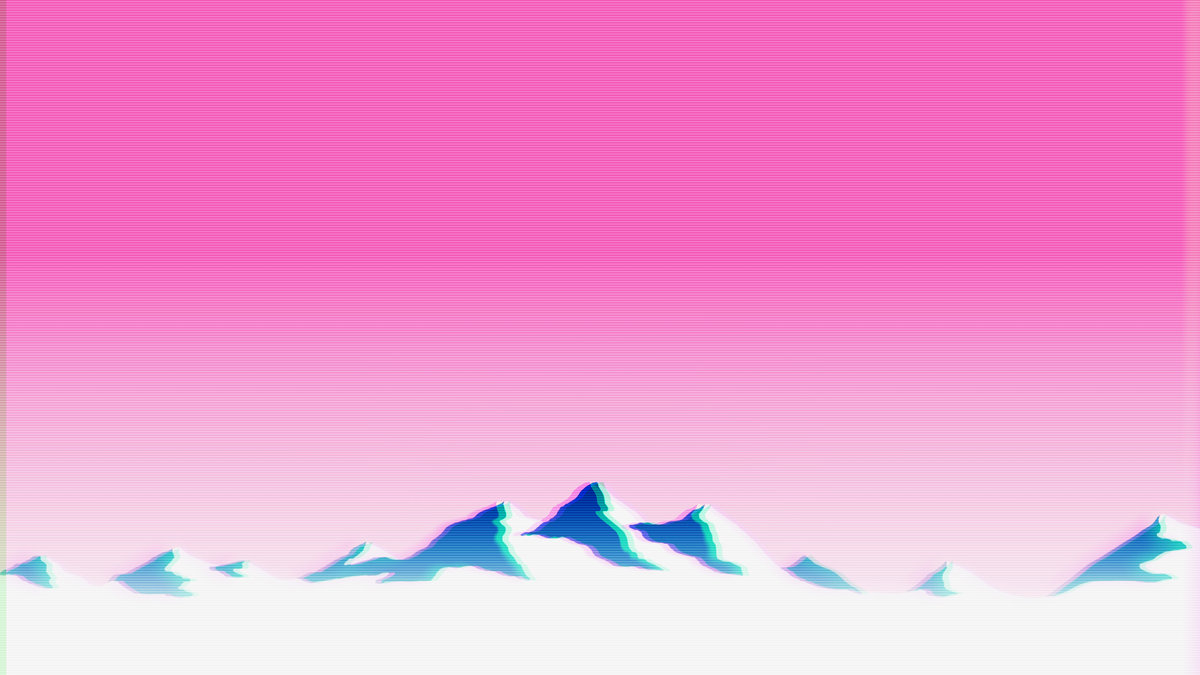
After seeing you insert the cut-out of the bear into the drawing, I was inspired to put in my favorite things – puppers, I mean dogs, yes. I also wanted to fit into that vaporwave aesthetic, which is something like this:
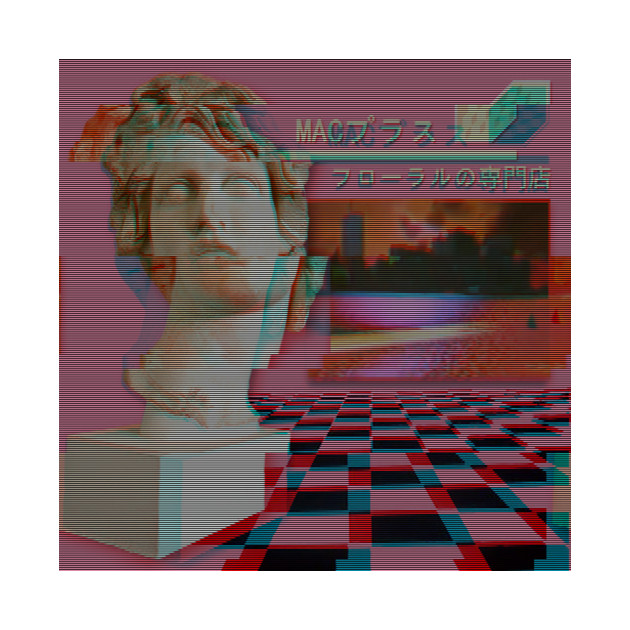
I also included Japanese (translated from google, so it’s probably not entirely accurate – actually not at all), which is a huge element in vaporwave that there’s even music based on it:
From top to bottom, the first line says, “I am a happy dog.”, the second line says, “Will I be remembered?” (based off Gabe the dog – a huge internet sensation featured in this song https://www.youtube.com/watch?v=5dbG4wqN0rQ any many others) who passed away) and, lastly, the third line says, “I’m a fast puppy.”
So that concludes it! My project is a replication these elements and my favorite things. I don’t usually work in these things of posters and stuff, so it was really fun. By the way, the single happy body is me in the picture just having a good time :).