To begin the assignment, we were required to read chapters from John Berger’s Ways of Seeing. After gaining inspiration on how what we perceive greatly impacts our appreciation of certain images, we set off to explore two different locations in New York.
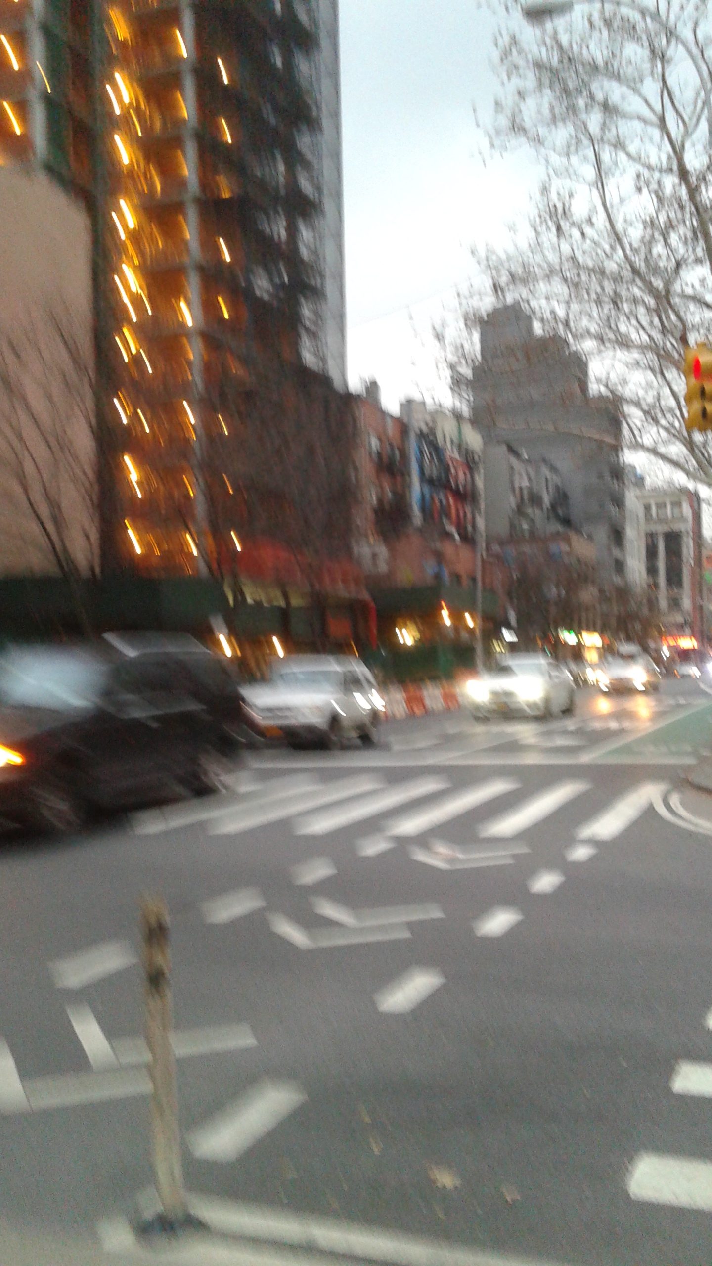
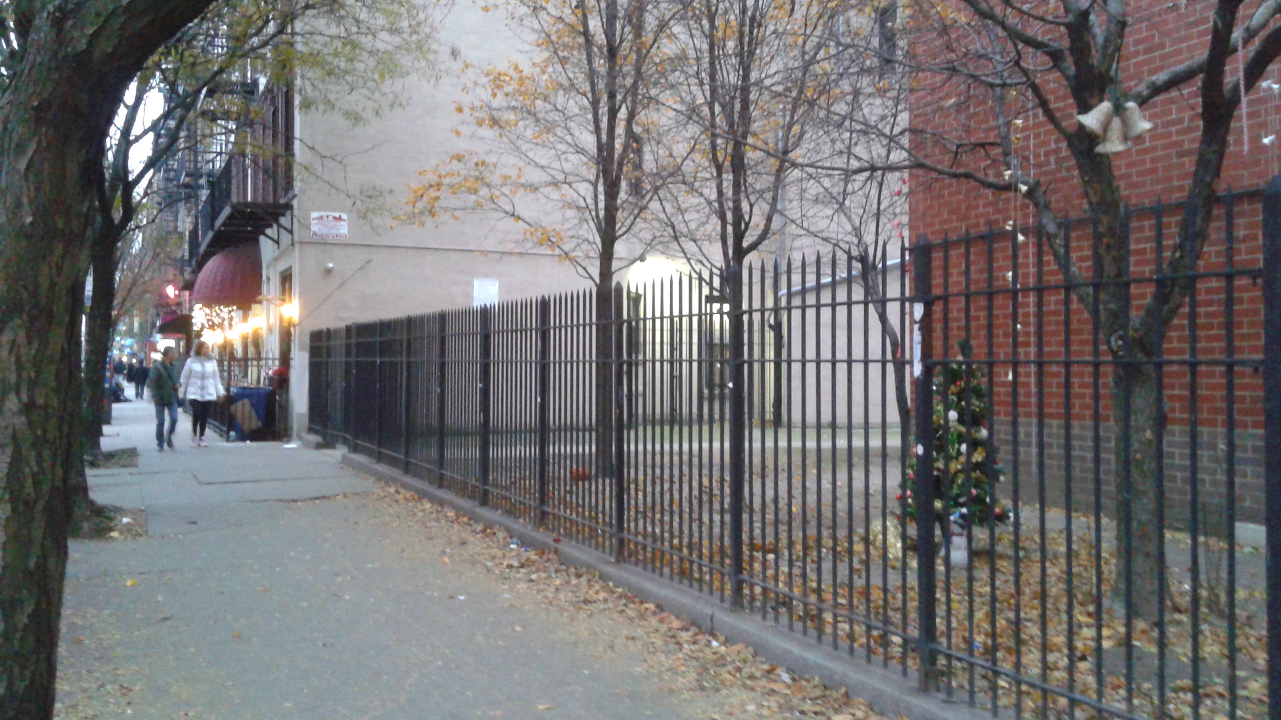
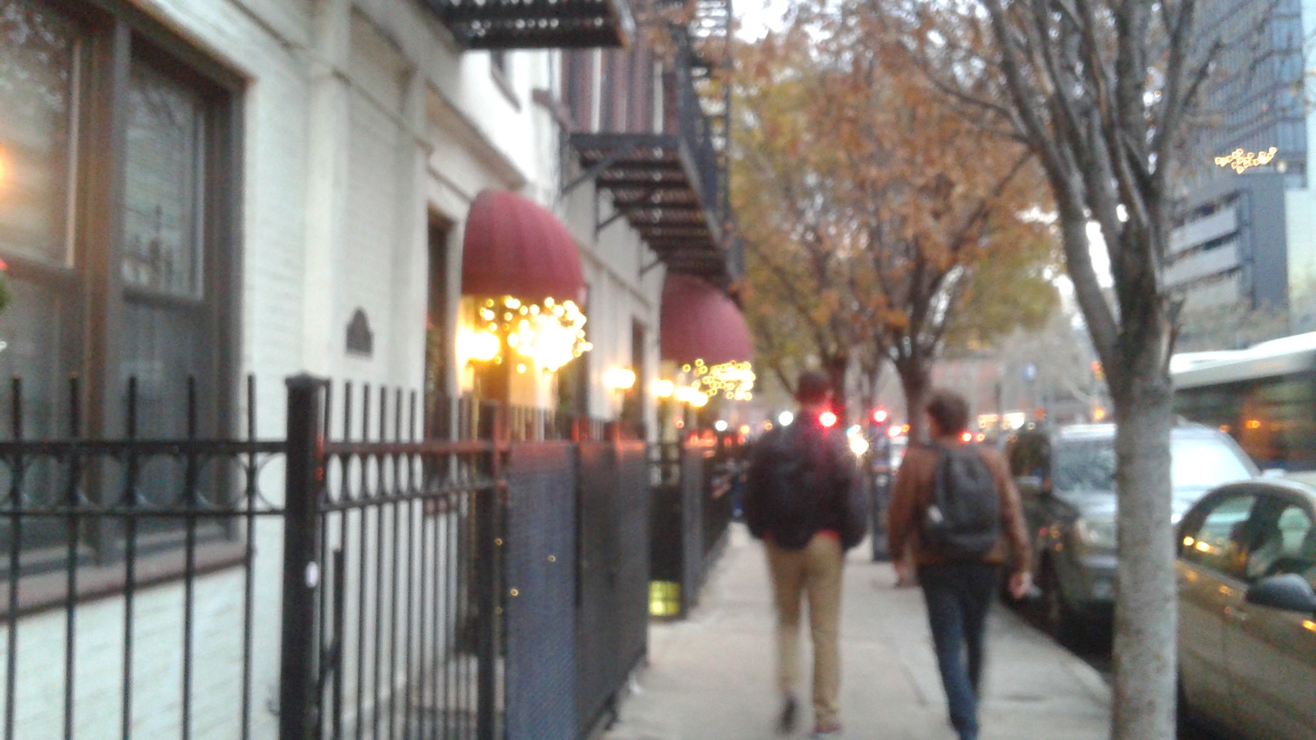
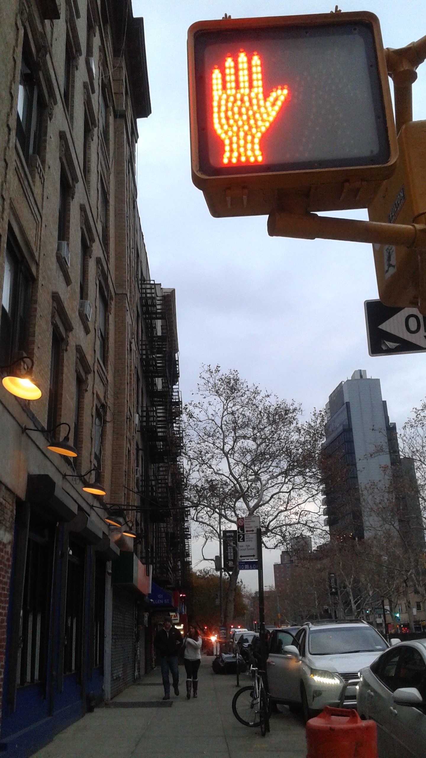
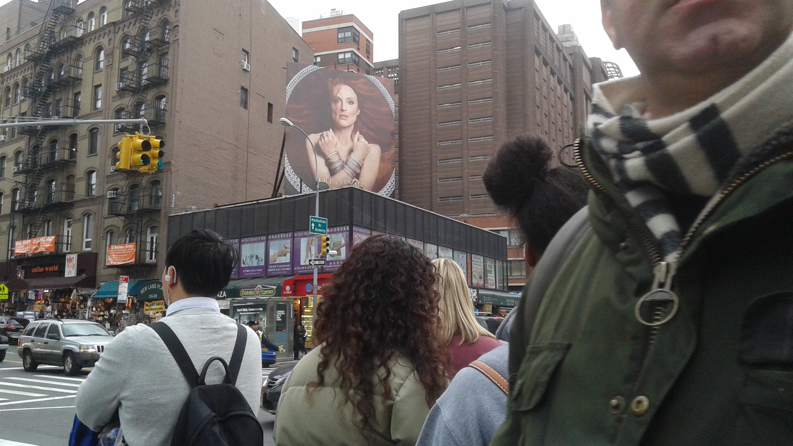
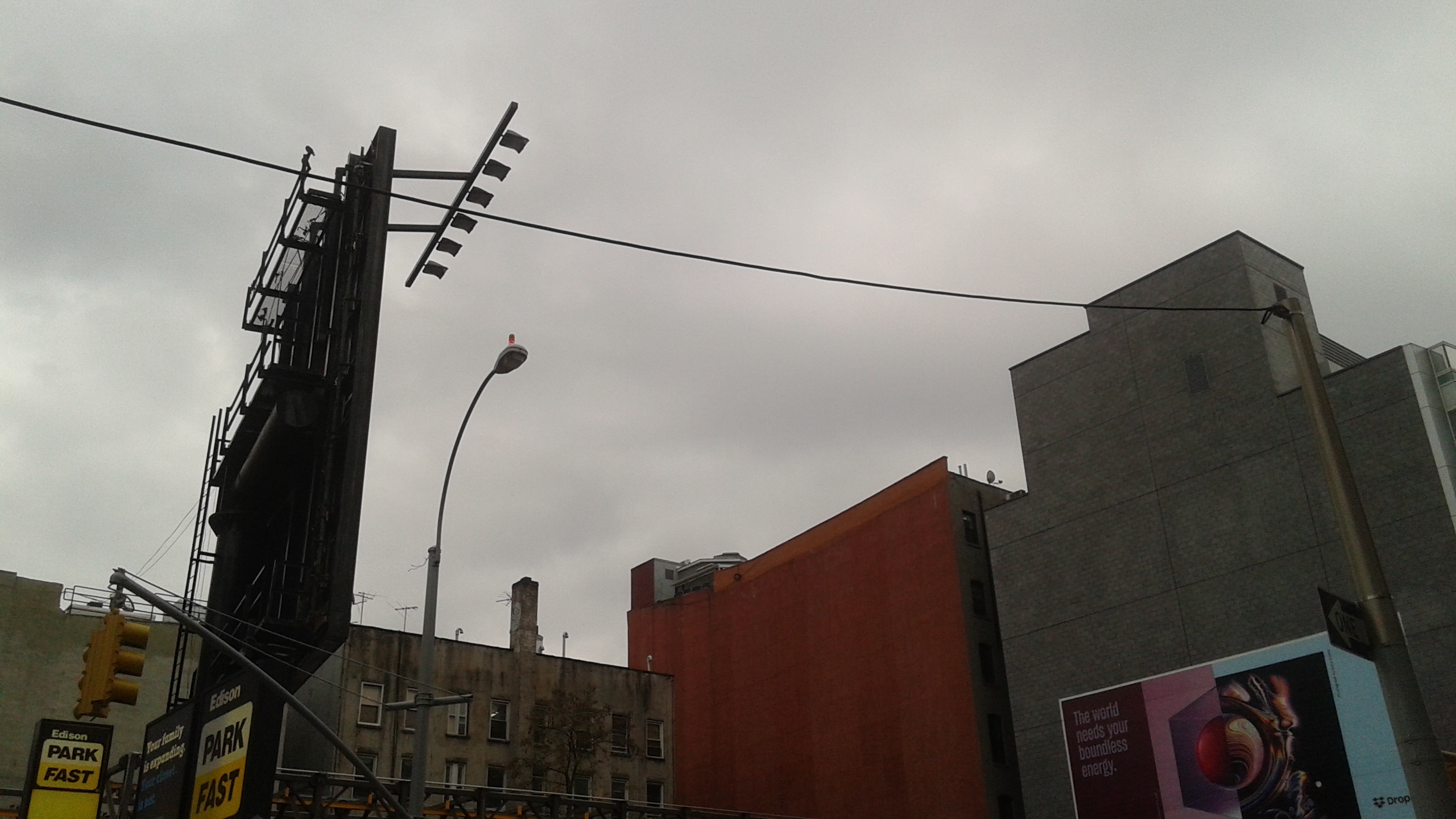
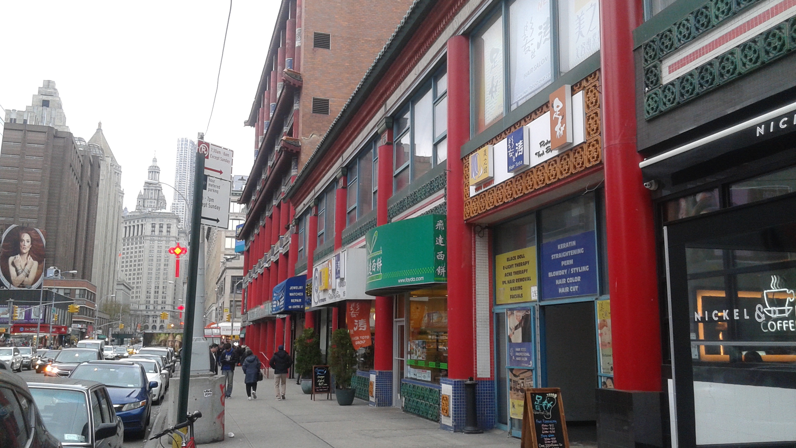
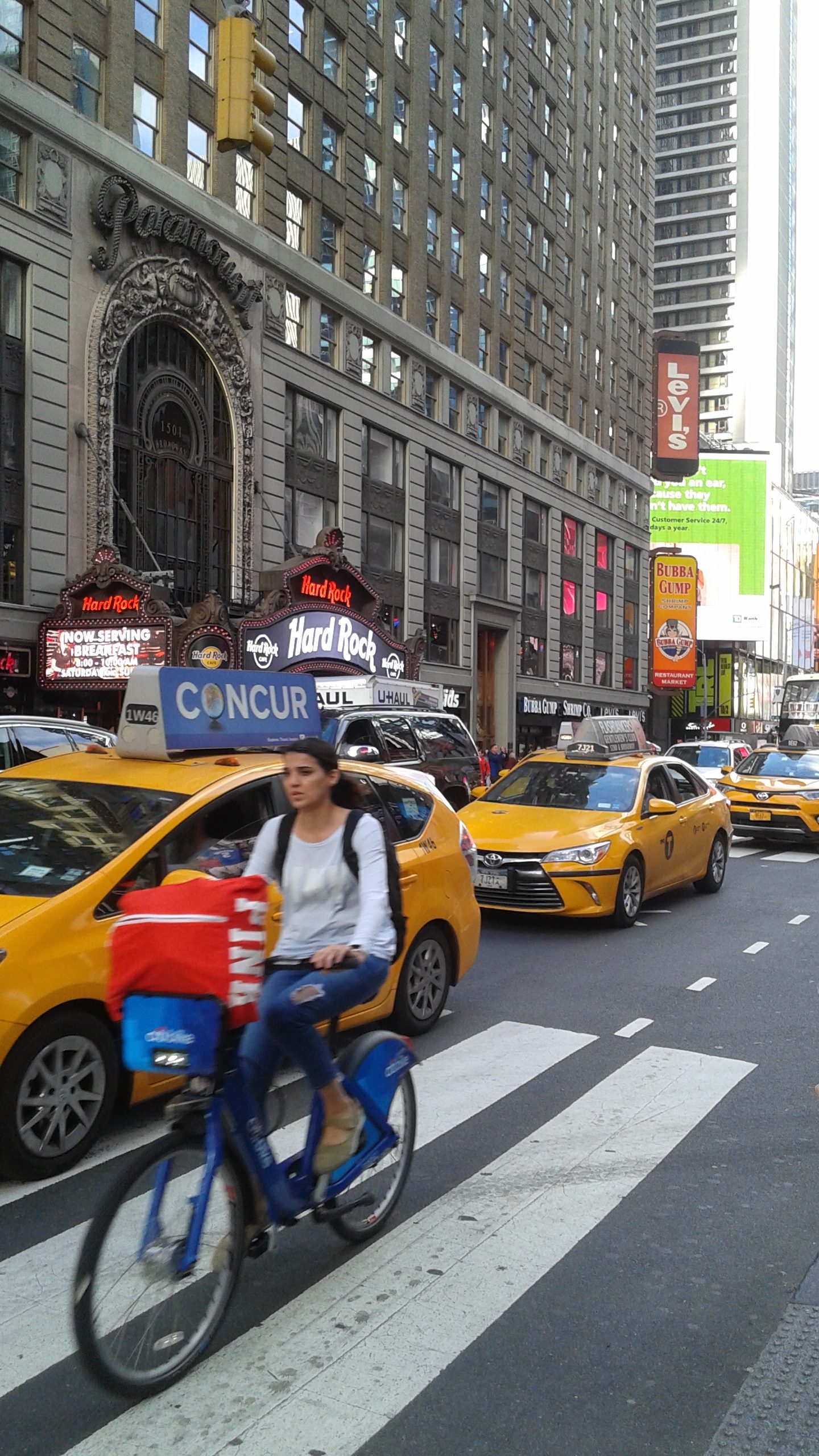
I chose the locations around Allen Street and Centre Street – both familiar places since I’ve lived in New York all my life.
Some featured pictures:
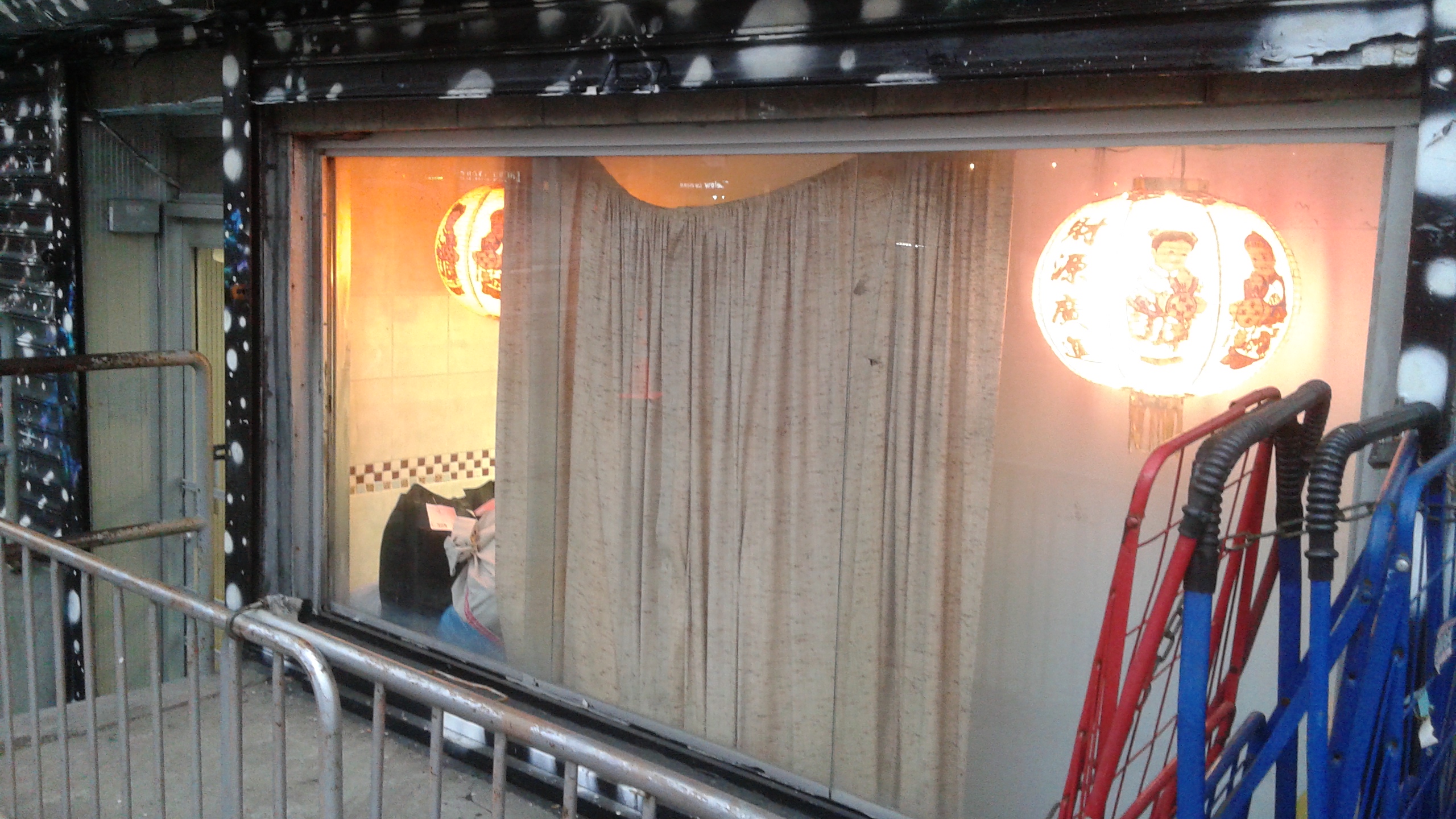
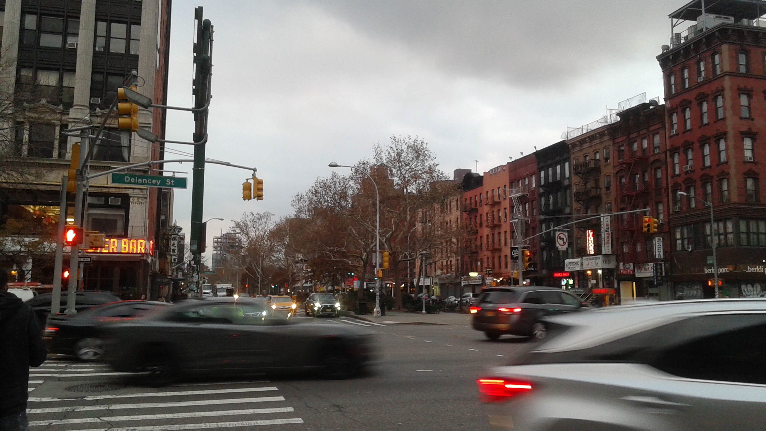
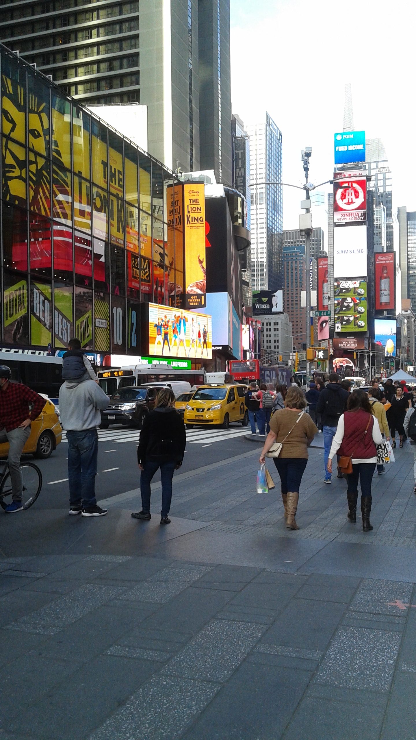
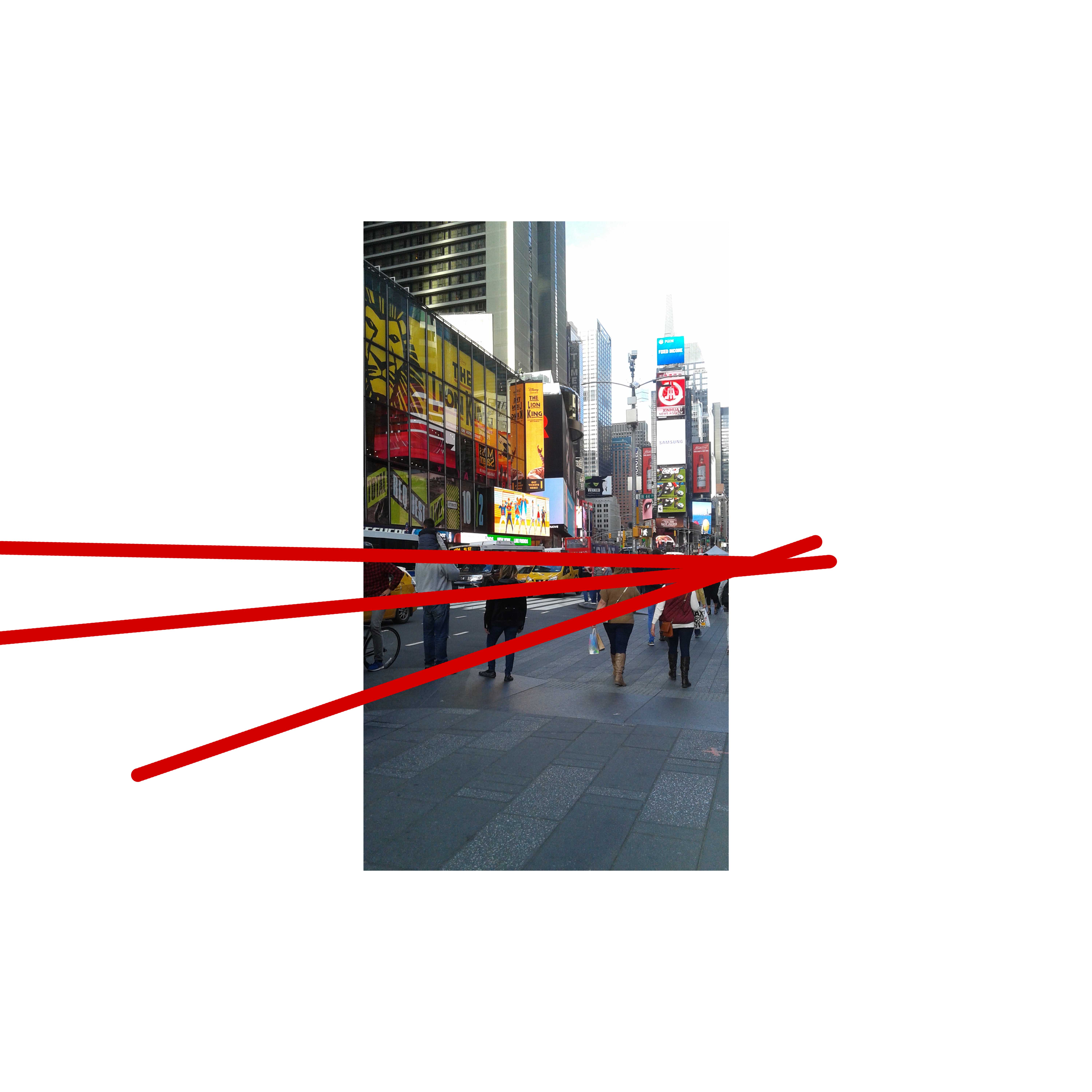
Around Allen Street
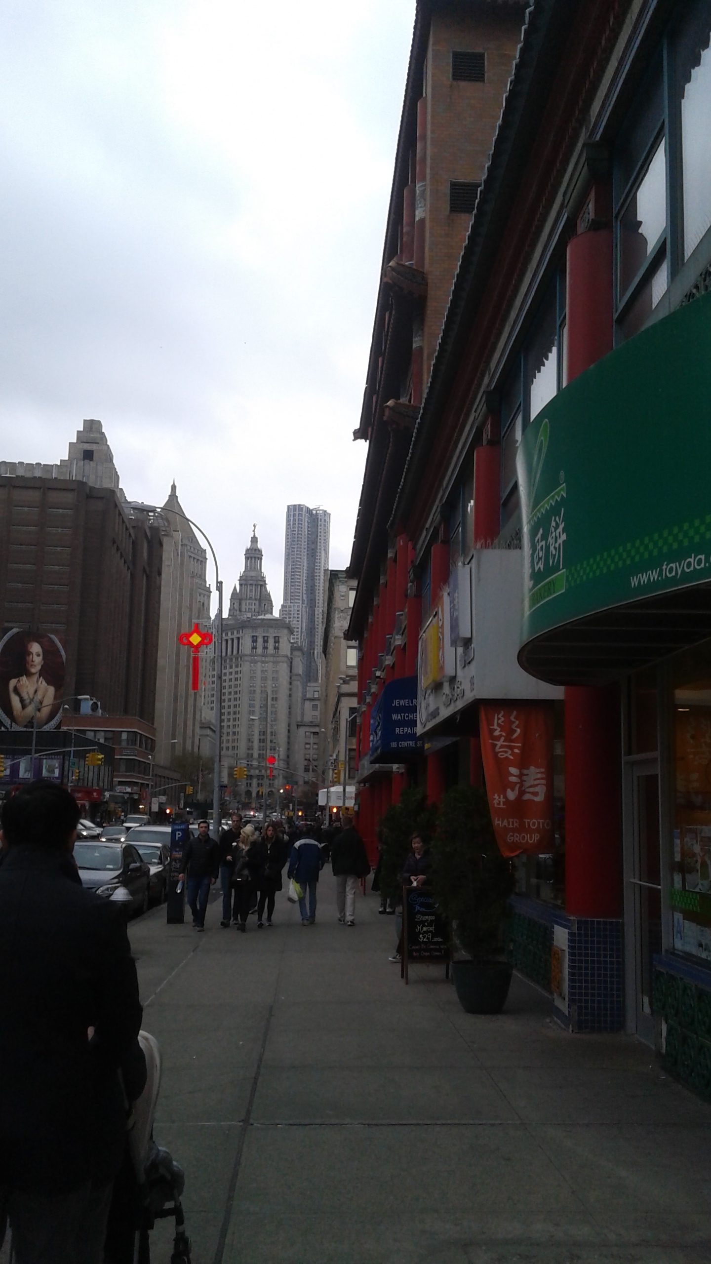
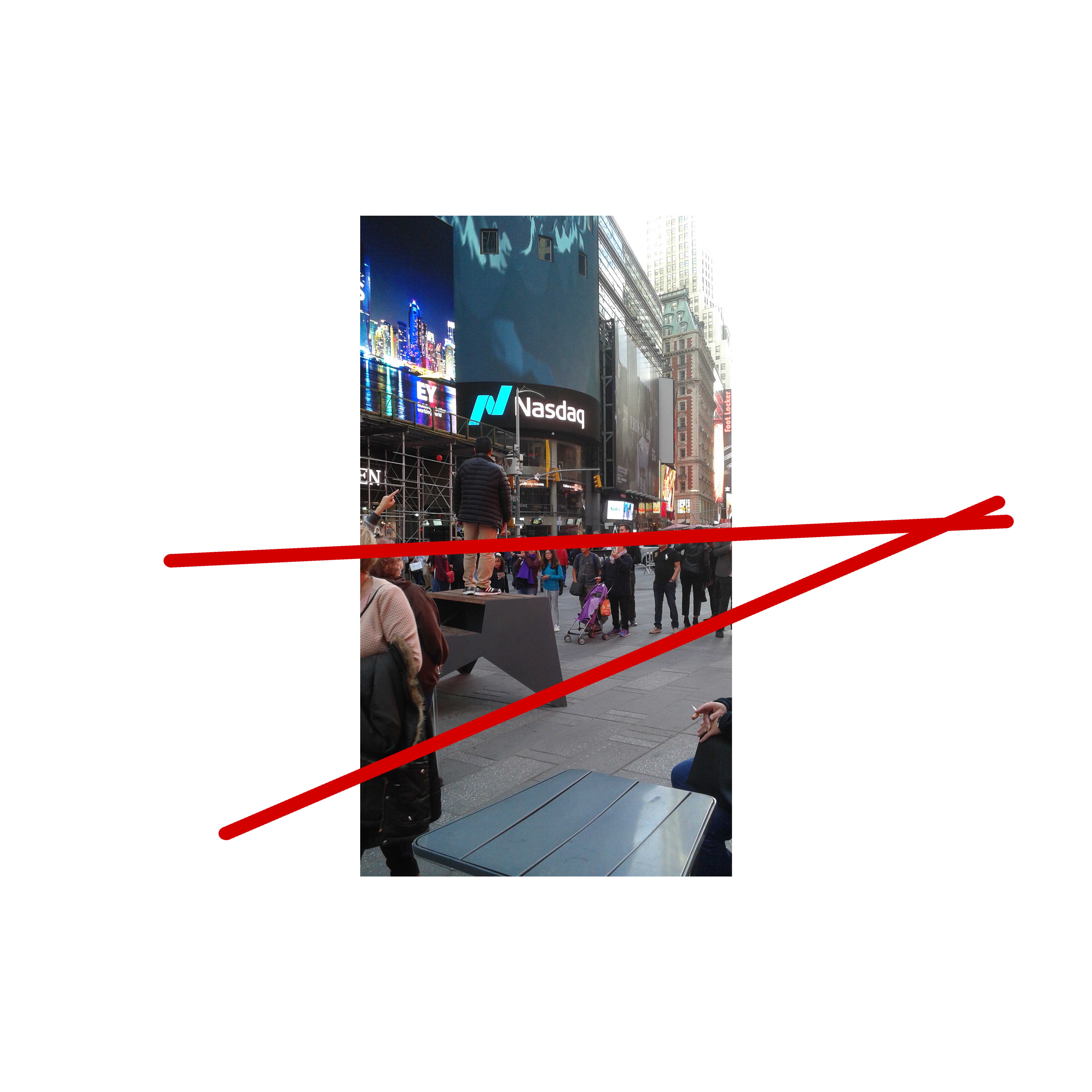
Around Centre Street

At first, I planned on narrating a story with the pictures I had with two characters looking for each other. This was influenced by a conversation in Centre street where I overheard two people trying to find each other on the phone.
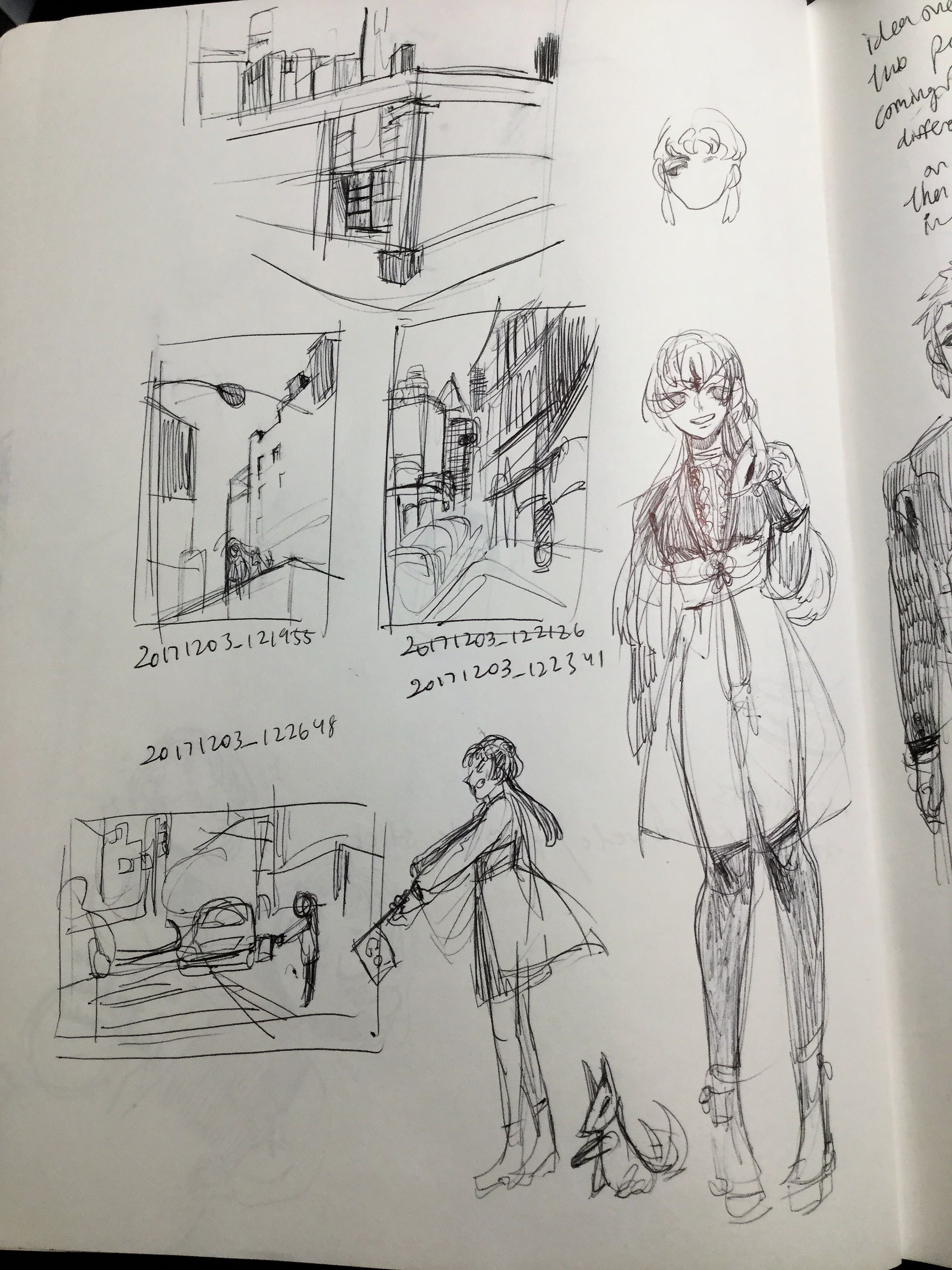
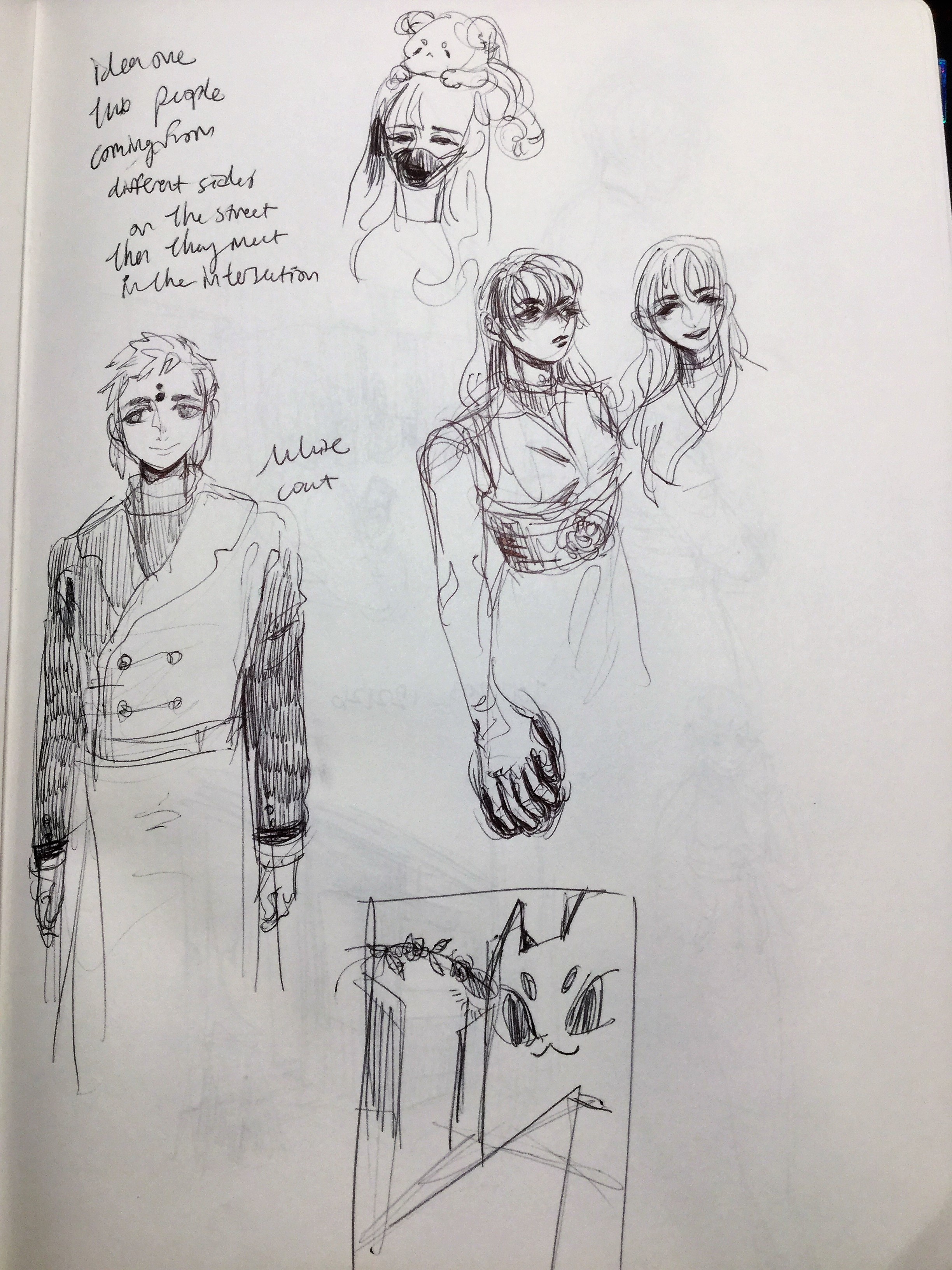
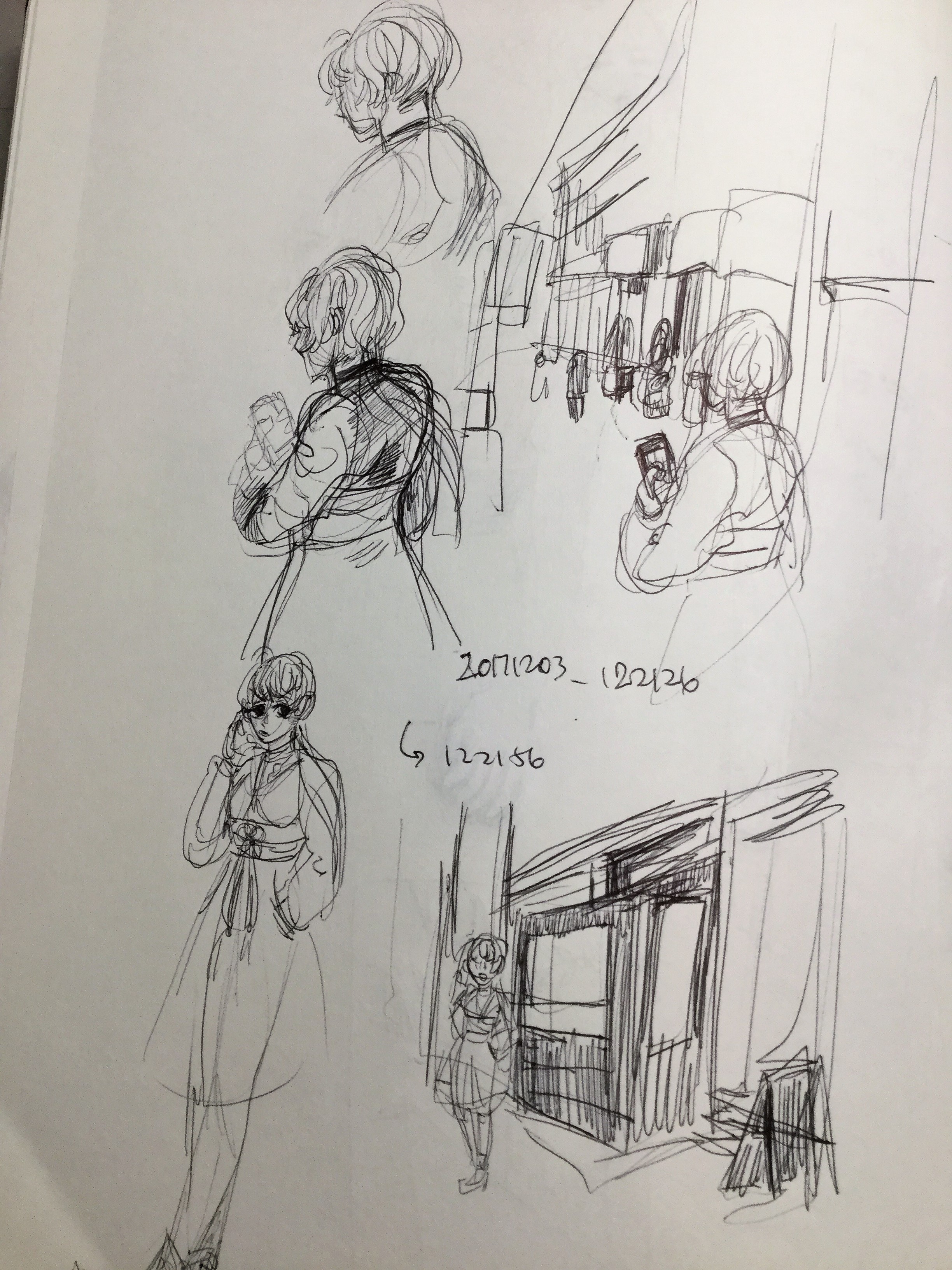
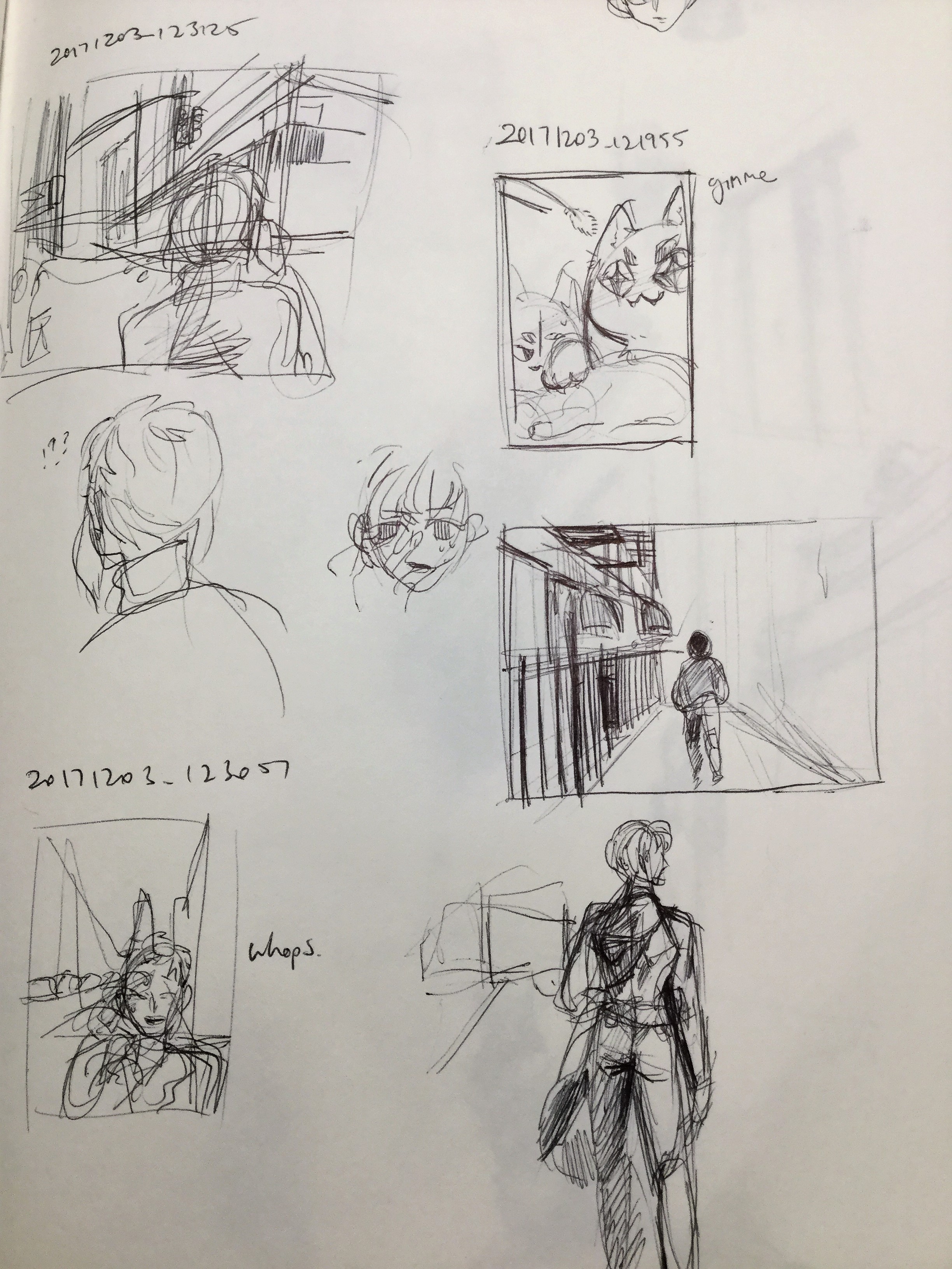
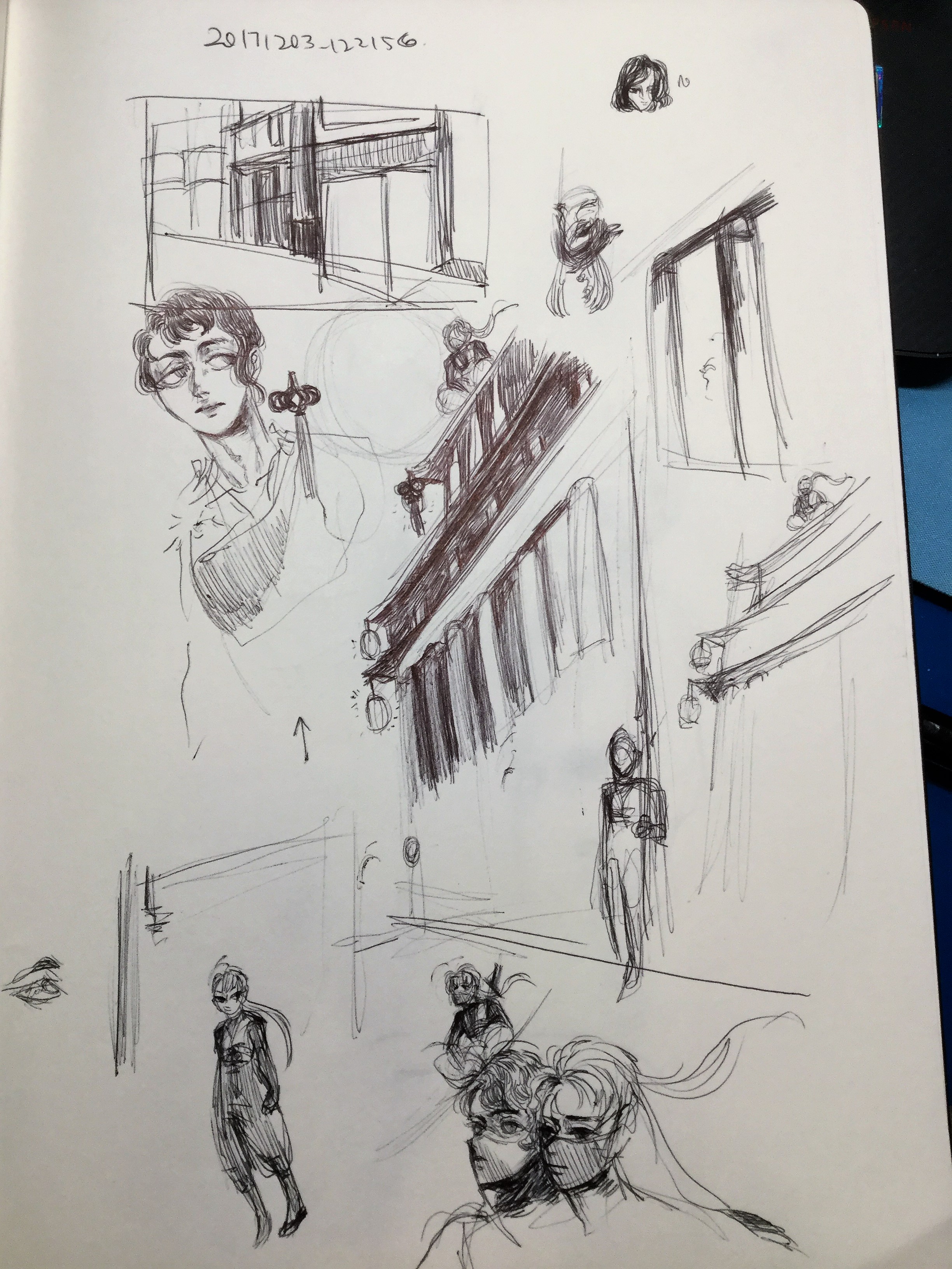
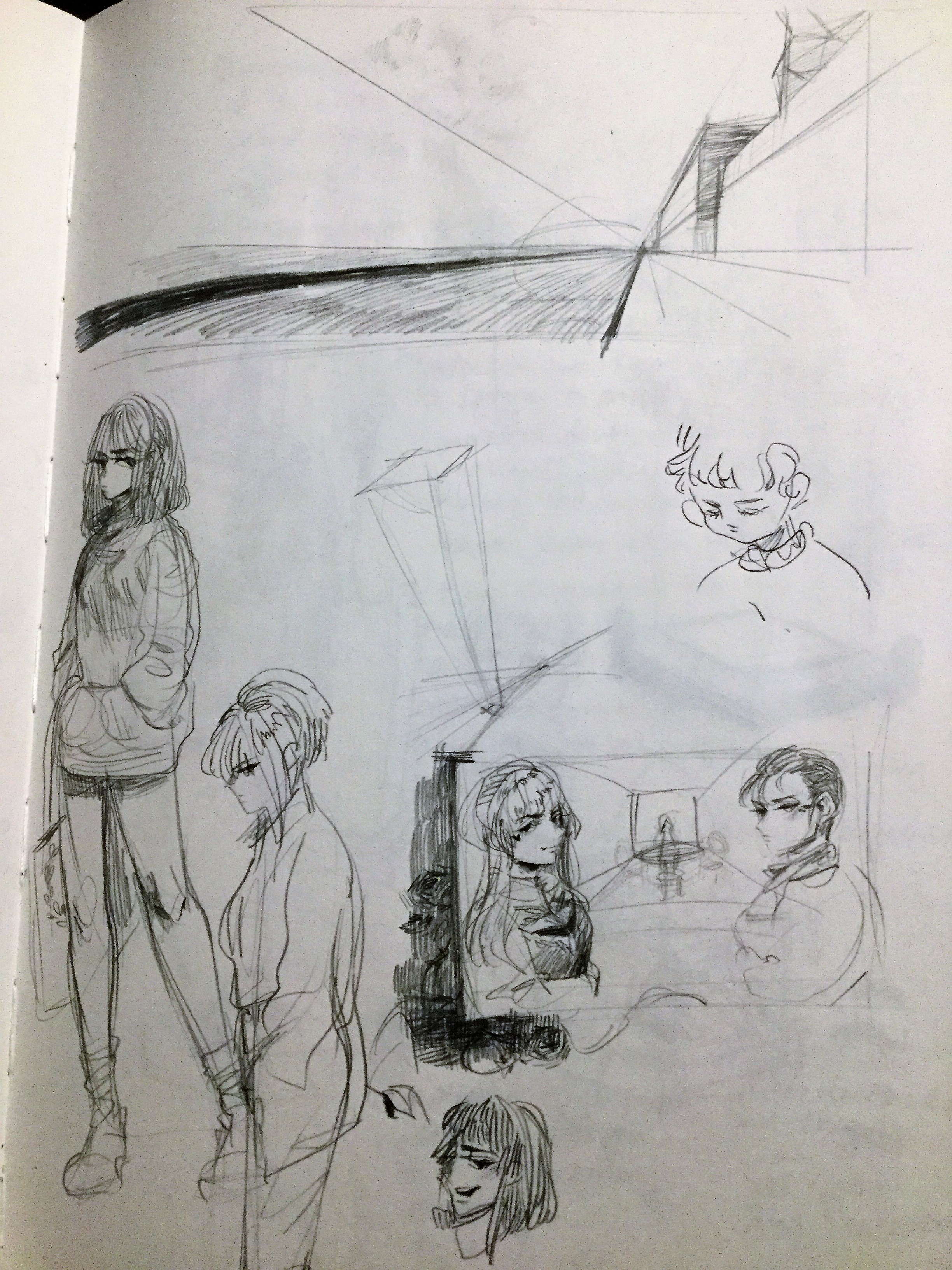
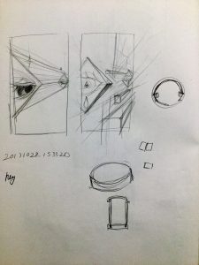
I scratched that idea and decided to focus on the oriental looking building in Centre Street, but then moved onto other ideas when I made mockups.
This was the oriental building idea I had. The building was also a bank so I was going to draw a ninja on top of the building.
This was a wonky merge of pictures I took in Allen Street. There’s a lot of hipster places in that area and, in contrast, some old apartments, an old laundromat, and an immigrant taxing place. Despite that contrast, I wanted to mix this hotpot of disparency because that made up Allen Street.
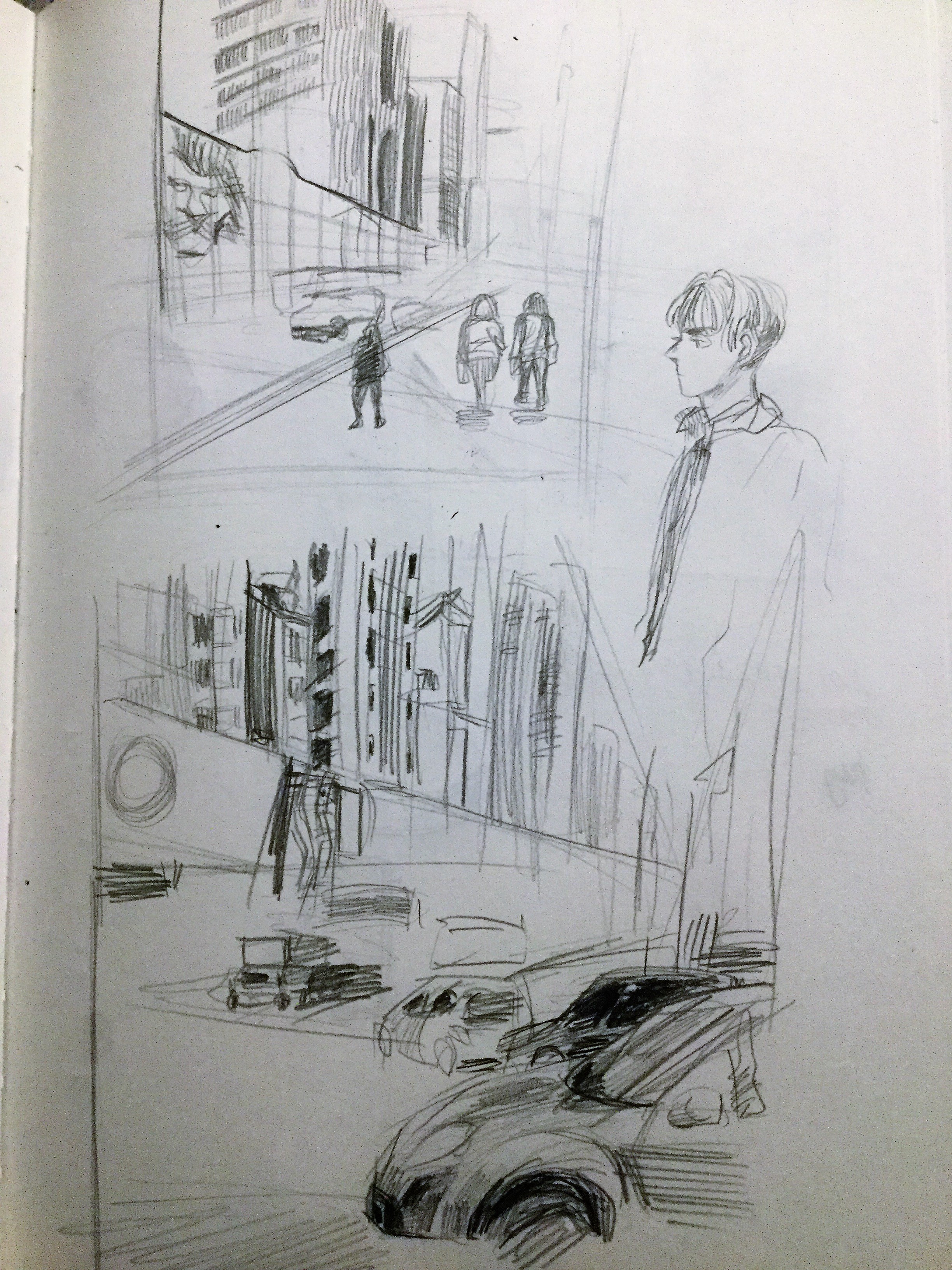
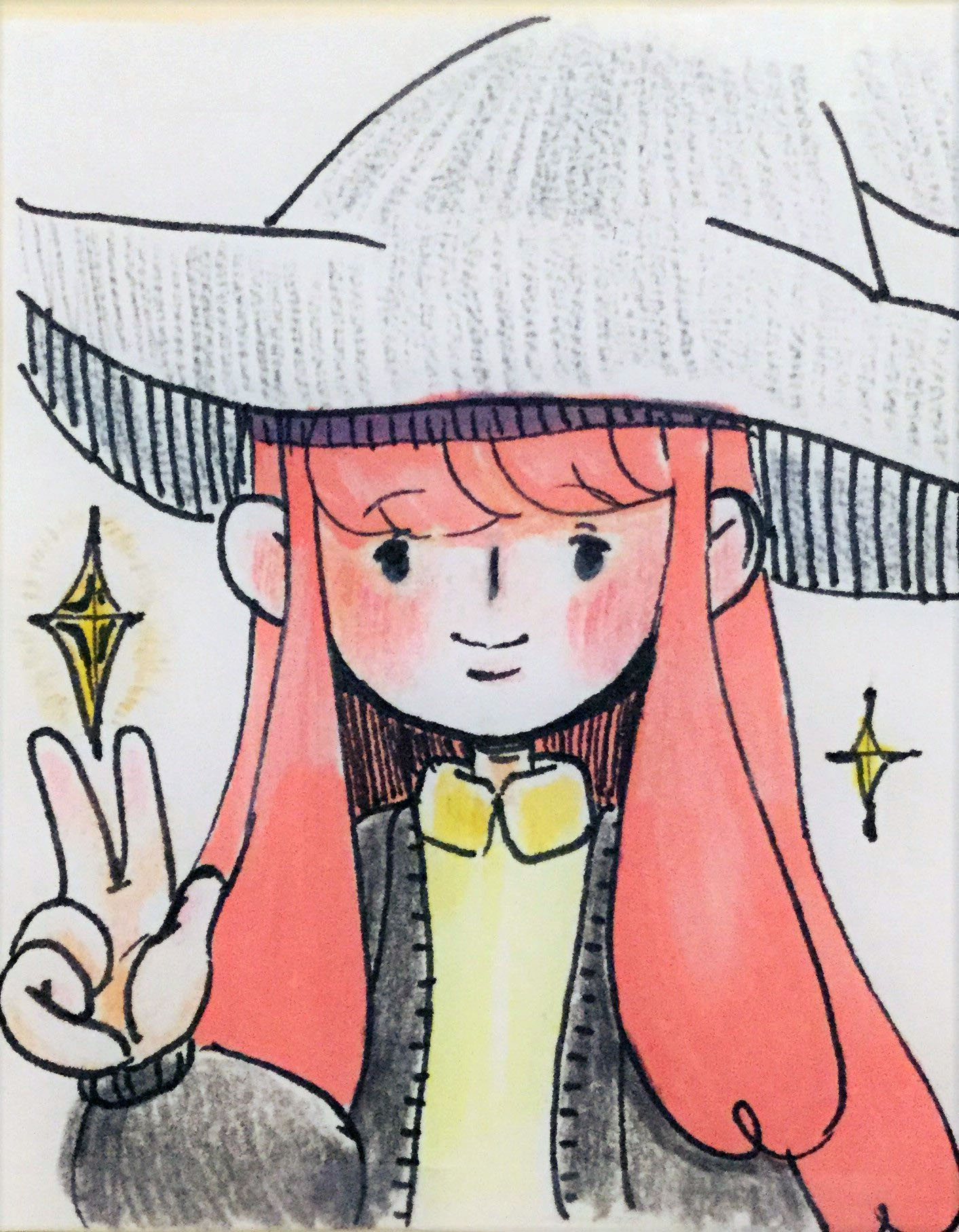
The idea I went with was based on one of the featured pictures I posted for Centre Street.
“We are our own protagonists of our stories. However, these stories overlap, creating bonds that’ll last for an eternity.”
In New York, many of us are in our little bubble and even I’m guilty of that. We’re all so unique and different and despite our differences, friendships are still possible.
In this picture, I drew fantasy characters in order to represent that idea of uniqueness. I wanted their color palettes to still share similarities because they aren’t opposing enemies, but a squad. I believe that unification can battle anything. Hurray for the power of friendship!


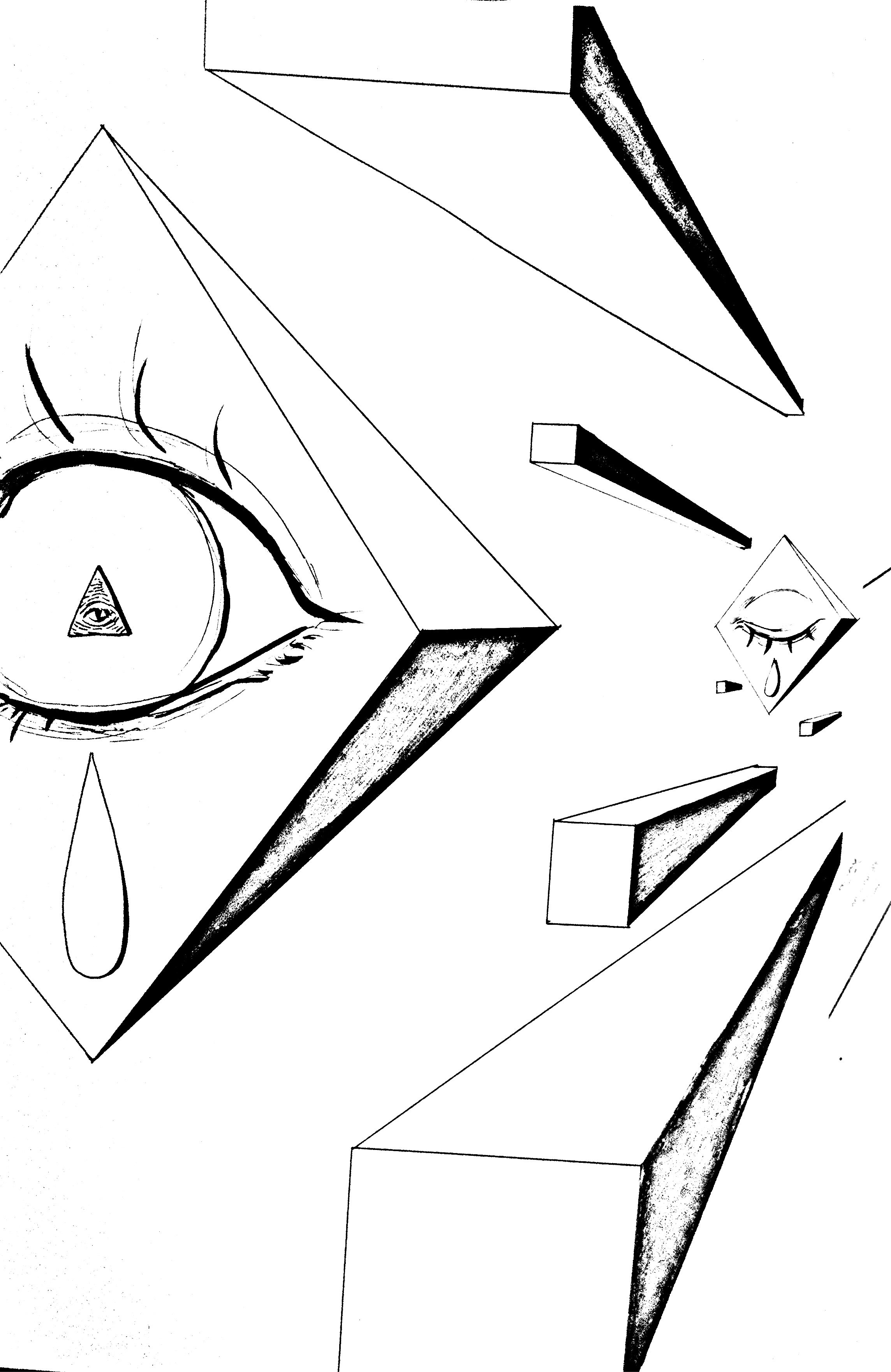


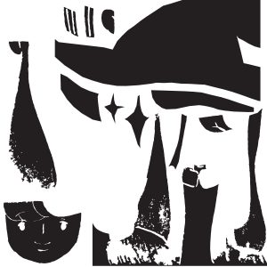
 White on Black
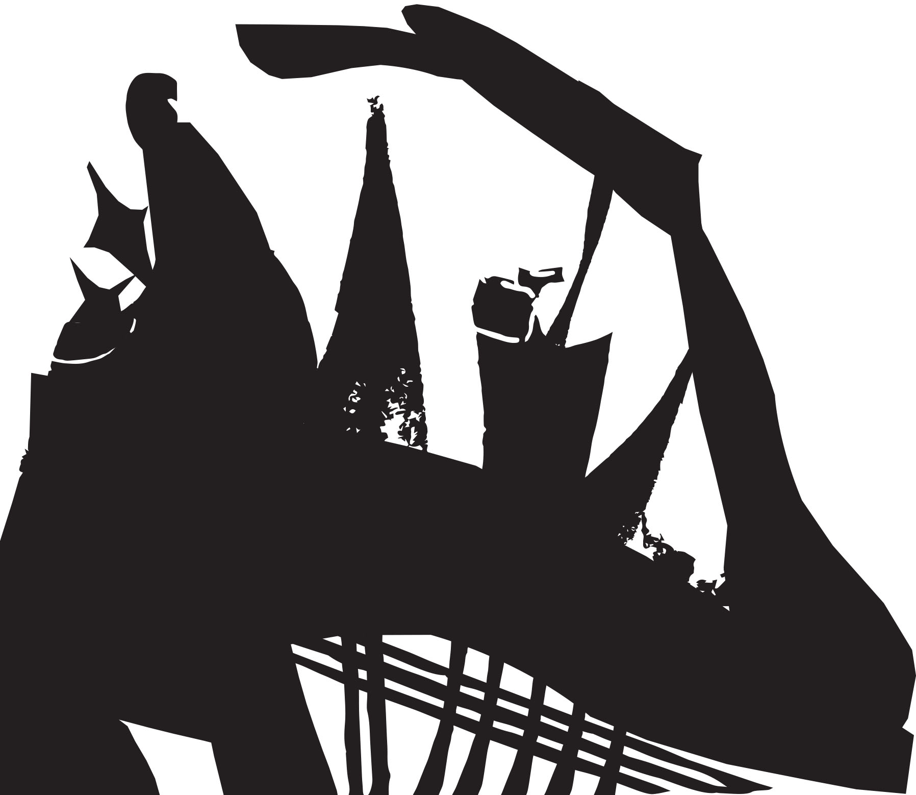
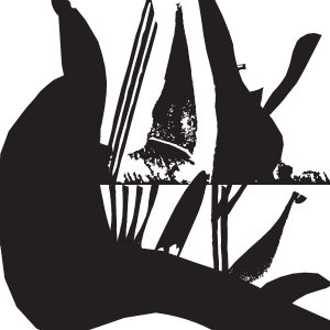 Ambiguous
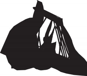