What makes something a certain something within that category?
Personally I feel that the term bench has been put into a category that when thinking of ideas that fit what a bench is, what does that really mean? The idea of design that can be used to help others is to rethink and continue to refine. So when thinking of designing a bench, I tried to wipe out the idea of what makes a bench a bench and instead was trying to solve a problem I noticed in public spaces.
In everywhere we go we are passing so many stories in motion. Some of these stories we hear and others we don’t. With this in mind everyone is different, especially with the way they interact with the way they see the world, and feel comfortable in certain situations. Within all the designs I had in mind was this idea of making a place for most people’s comfort levels, and the piece being sustainable (in material and helping the environment as it was in place).
The three ideas I had was:
- creating a foldable hexagon on two sides so that it could fit as many people as possible, but there could be a rest for the back if there were less people who wanted to sit for that moment.
- a canopy on the rails: something that would integrate the water while transporting the viewer
- customizable sitting space that can fold both ways
The design I decided to pick was #3. This idea came almost immediately to me. A bench that can come together but the user can decide for themselves where they want to face, how much they want length to add to thier bench, and it not taking to much space. Therefore the person can fold it, this can change form thus a new look of sculpture each time, and and it is easy to pick up the trash and keep the environment clean. The idea of making something shared your own, but doing it as a community at the same time.
I wanted to put this design to the test beyond school, so when Nick mentioned that there was a seat seats completion in Portland I thought that was a good opportunity to see if this could help people and the environment in a public setting. Getting feedback of not making it to any round would tell me to keep refining and thinking of ways to better the design is helpful to me.
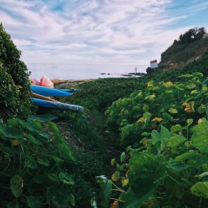
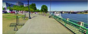
The streat seats competition is to create a sustainable bench for the area around the World Trade Center in Portland, Oregon.
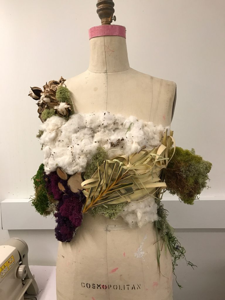
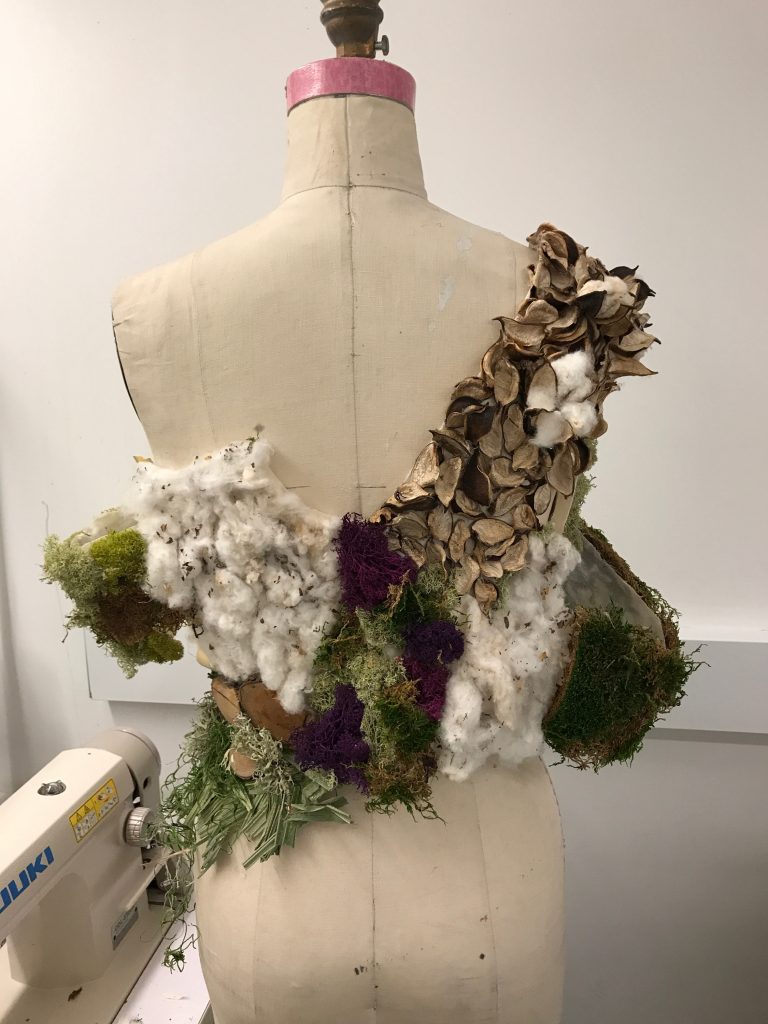
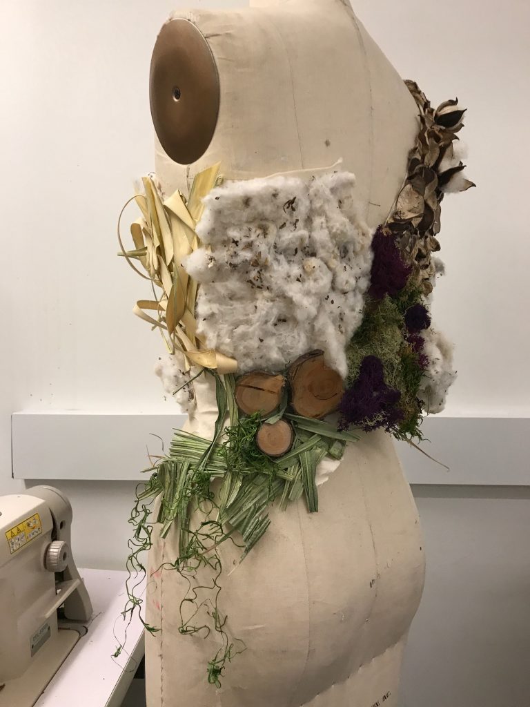
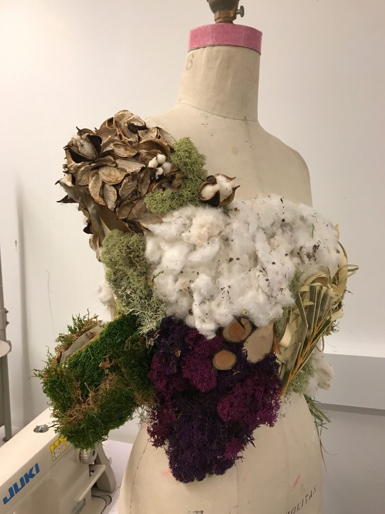
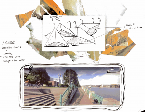
I am from the West Coast, and also know a couple of people in the area of Portland. The lifestyle is super laid back and merging with so many new kinds of ideas. As well as the environment being a major factor of thoughts. When I saw the park and water this gave me the idea to want to use biodegradable wood as a material with a plant glaze to protect the wood, release toxins away and bring more oxygen. The glaze could go on every year with the plants that are getting tossed out when there were done with decoration in the World Trade Center. I also wanted to incorporate air plants into the planter attached to the bench that way there would be less watering to be done. Especially since it rains a lot in Portland, therefore saving energy, resources, and money. Water conservation is something we take really seriously on the West Coast.
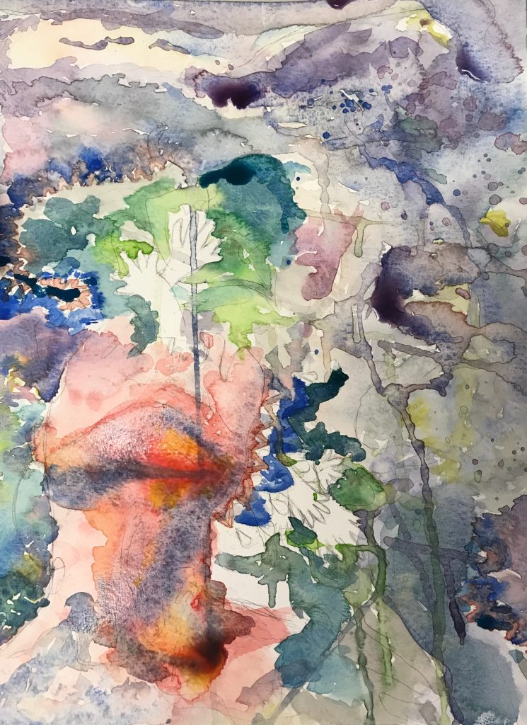
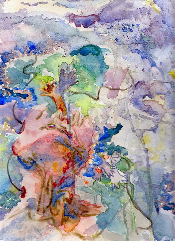
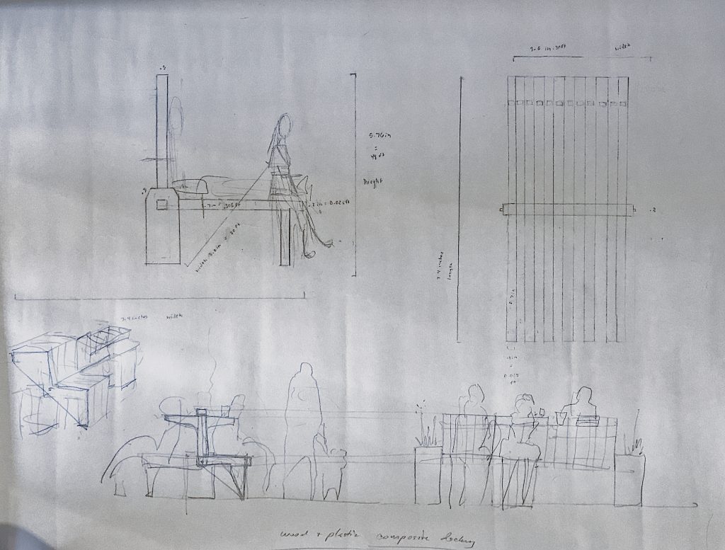
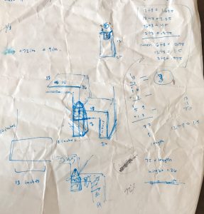
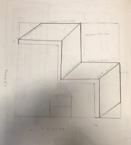
In terms of drafting and making models.I first found pictures of the site and put a piece of plastic and drew my idea over the plastic. That way the viewer can flip back and forth for what the site will look like with and without the bench. Also there are drawings to show the attachments, and colors that evoke and designate with an earthy and West Coast feel.
-
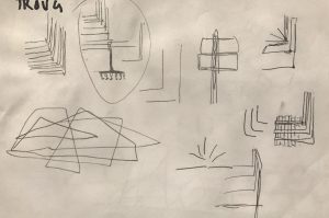
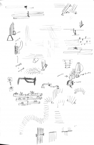
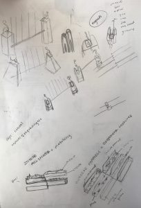
- brainstorming ideas: a flexible structure that has pockets on the sides so that people can place their stuff there. This would hang on the rails. Including the rails right on the water.
-
- brainstorming ideas: an octagon that can fold up and down. Each side provides seating, thus being able to provide space for many.

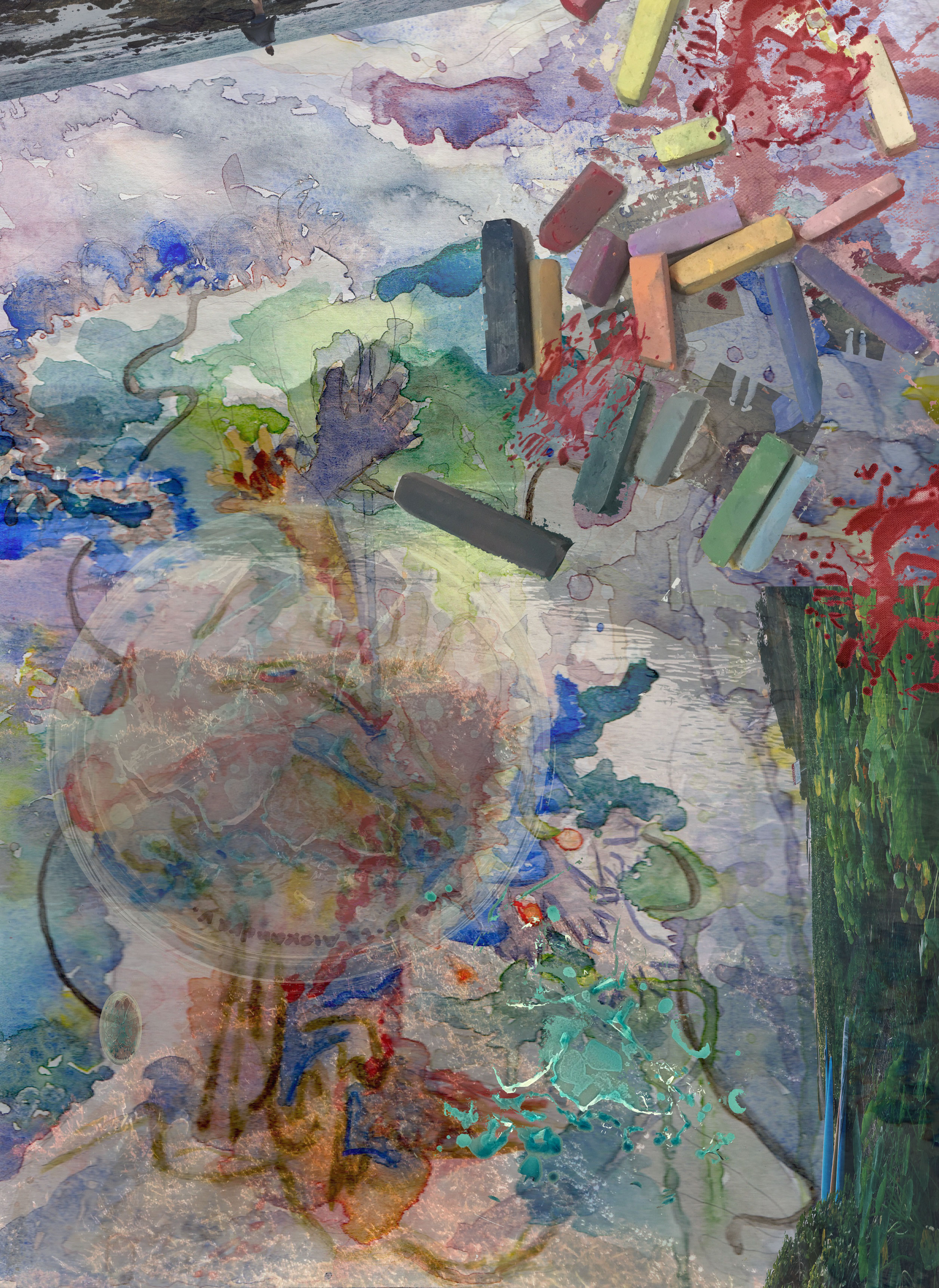
it is hard to see since this was scanned but, the bench is in the middle of the circle of flowers
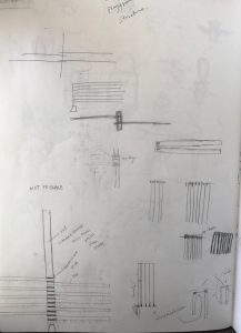
Model 1)
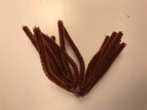
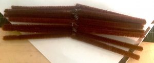
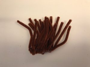
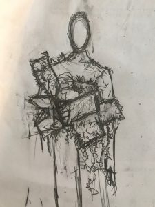
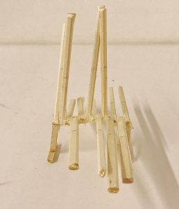
I first started to construct a model with pipe cleaners. That was not smart. I thought since they could bend this material would work to show the way the user could manipulate the bench. This did not work at all and it doesn’t even look like a bench. It looks more like a shaven puppet mustache. I chose the color brown to show that the material is wood, and the pipe cleaners where glued together.
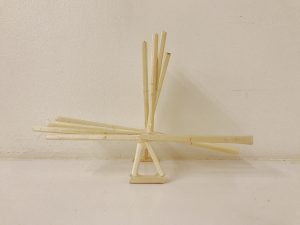
Model 2 + 3)
-
- brainstorming ways that elements to the bench could change shape and more seats could be added onto the original design
-
- thinking of ways to connect the wood without a bar or any element becoming visible
-
- drawings of planters and the wood to think of how to incorporate plants and personal marks from the people of Portland
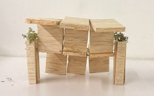
Model 2 is connected by glue to start drafting how upright the bench would stay and start to rotate. The triangle that stays the same in both models would hold books and work as part of what keeps the bench upright. Actually the idea that the planter would help keep the bench upright stayed the same throughout the whole process, just the way it looked changed. Model three was connected by magnets. The magnets that I had used where not strong enough, but I know it would work if I had bought stronger ones. Also, just a note, but nanos might work as an alternative binding system. This way I can achieve my goal of having no pin, or rod showing and going between, to really make the entire bench look vertical. As well as people adding to the bench more easily. Nanos are small pieces of iron that are in the fluid form called ferrofluid. Model 3 also has my idea of adding carvings and texture/patterns from local artists while being able to hold airplants where model 2 does not.
-
- side
-
- top view
-
- front
-
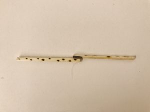
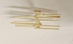
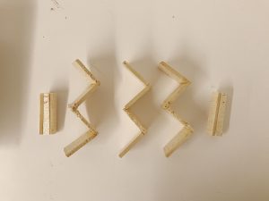
- This was a repeated sequence that would replicate the model above. All the pieces were tossed before documenting. The base also was the same to the other model. The only difference in this model is that I burned the sides and used magnets.
-
- I also experienced with forks to learn how the bench could pivot and potentially work as a puzzle piece. I cut the fork ends: some pieces were quite long, and others shorter from the rest. I found that they held different forms as well.
add other drawings here
-
- side
-

- front
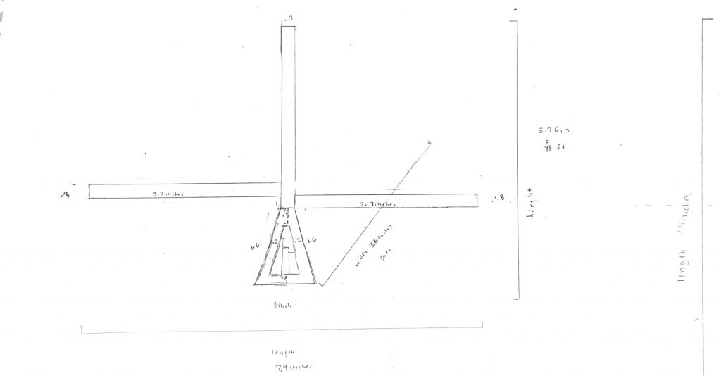
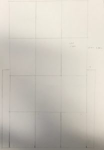
Models 2 and 3 use the same scale and format. 1 inch = 1 foot

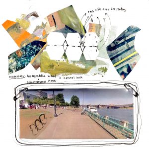
These are the collages with the drawings of the bench and Tom McCall Waterfront park.
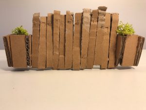
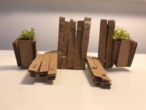
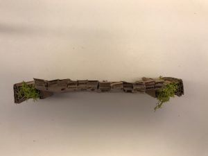
Model 4)
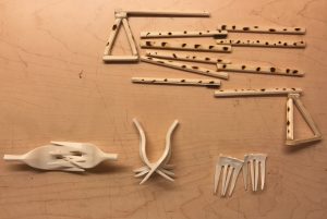
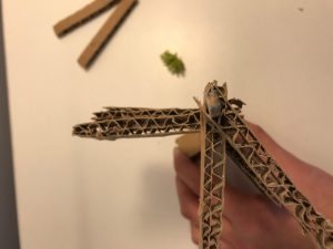
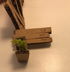
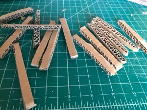
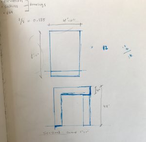
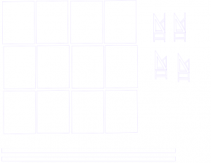
I decided to make a sketch model to get ready to use the wood with the cardboard. I created 12 strips of cardboard and connected them with a wood stick within the space the cardboard had. I did not need to use any glue for this piece. I thought that the holes could do the same thing the magnet bench could do which was the ability to add more seats, and the seating to be moveable to different locations. The holes could also act as a space for storing small art plants to incorporate into the piece. Also there is a flap on both sides of the strips that fold down as a shelf for the user to have if they want to set something down. The design of the planters were to generic for me, but this shape worked as a base.
-
- top drawings are mine and the bottom drawing are Nick’s (professor). Nick helped give input and shared his inspirations to help the design be able to interact with the user.
Model 5)
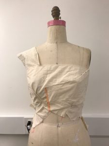
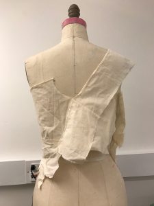
For my next design I was going to use the laser cutter but it was all booked. I instead choose to use balsa wood, but was not crazy about having to use it as a material because of how soft the wood was. The reason why I chose it was because I had not had a wood shop orientation so I thought I would have to exacto and ulfa knife the model. Also, I thought it would be easer to stick wire and pins through. I did half of it in ulfa and exacto knife till I realized that maybe they would let me use the hand tools. They did! I also learned about the direction and grain of the wood. I am glad that I spent over 6 hours gluing and cutting this time because I learned new techniques and about patience in a new way.
I used gorella glue, pins, and wood to construct this one.

-
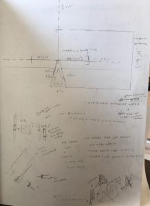
- contemplating measurements: I was inspired by the everyday chairs we sit in.
-
- hard to see because it is in the format made to be ready to cut
-
- hard to see because it is in the format made to be ready to cut
I did so many Illustrator variations of how to get this piece cut out in one slice. This took me full days and hours, but I finally figured it out. Those drawings are not here because they kept being altered.
-
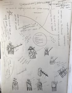
- rethinking the material of wood and how to rethink the way a planter can work
-
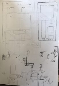
- poster layout ideas and ways for the bench to stay up right and supported
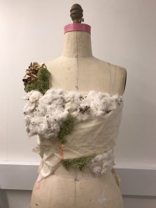
As mentioned I started to rethink the idea of using wood into creating a whole new material. But because of time for the project deadline and research I did not have time to do so, but for the future I think this would an interesting concept: the use of algae in a mixture with wood pulp, reused plants, and maybe even food waste.
Algae can be used to make bulletproof glass and is used in would dressings. This is a really strong natural material which contains nanocellose. Nanocellose is also found in food waste, most plants, and wood pulp. Wood pulp is wood fiber that has been reduced chemically or non chemically into pulp (used in paper manufacturing). Using the non chemical method would be beneficial to our health and also to the environment: when producing the bench, as well as when it is in it’s place. The reason why I want to stray away from plastic, even recycled is because of it’s toxicity and if someone touches it and puts their hands into their mouth, thus digesting it, that is dangerous. Also because it is sitting on the skin, or even when its being produced the pollution seaping, it is not safe. Making a glaze and healthy material is where we can start to combat this, and through plants they decrease toxins and release lots of oxygen. What if making production and something being in use can double up and start to help make positive impact in multiple ways?
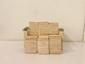
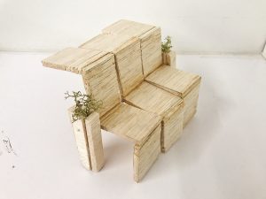
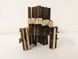
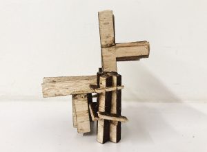
Model 6)
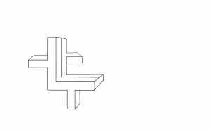
I went to laser cut with my file and drawings to cut the wood in the desired shape that I wanted. I had a more elaborate idea for the planter but it had too many details and caught on fire… There fore I altered the look of my planter and added shelves to the sides since I was limited on making it longer and wider due to competition restrictions.
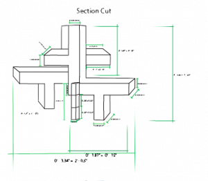
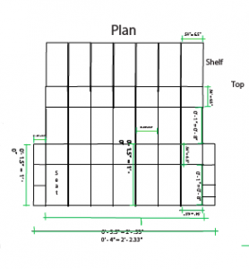
These are my final plans, elevations, an drawings:
-
- all reclaimed wood with no Yakisugi method
-
- with the Yakisugi method applied to the front parts of the wood, the sides of the wood do not have the method applied
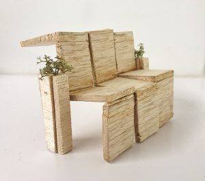
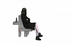
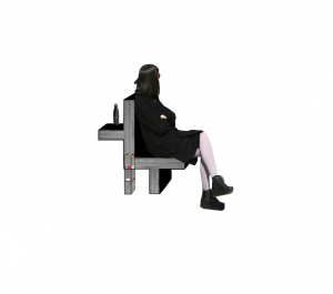
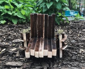
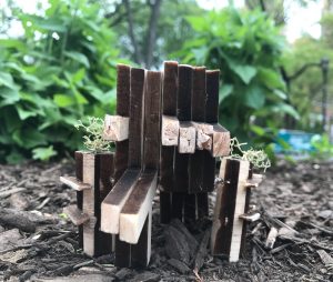
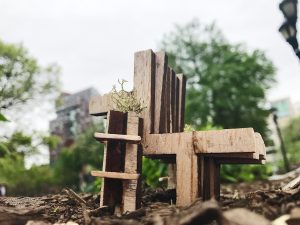
The Final Model:

The Poster:
My video:
Final right up t0 describe the bench for the competition:
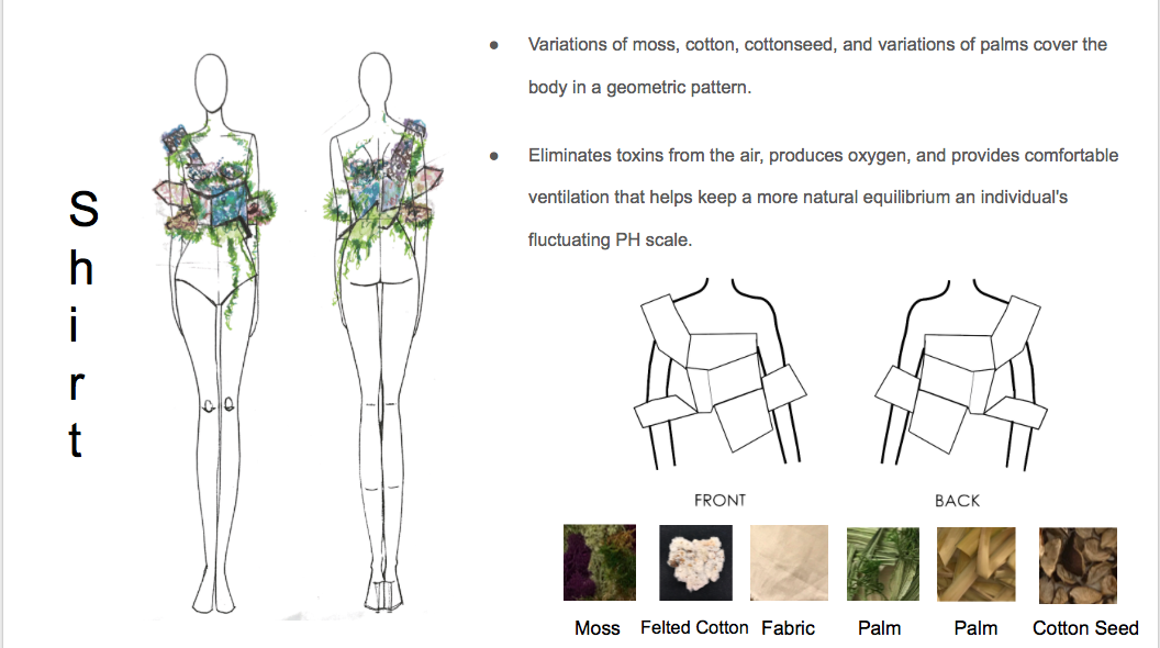
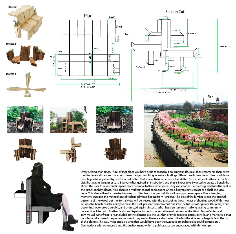
Every setting changings. Think of that place you have been to so many times in your life. In all those moments there were multitudinous situations that could have changed resulting in various findings different each time. Now think of all those people you have passed by or interacted within that space. Their experience has shifted too: whether it is their first or last visit that was in the rain or sun. Everyone has gained an inspiration, and that is inerasable. I wanted to create a bench that allows the user to make public space more personal to their experience. They can choose their setting, and turn the seat in the direction they please. Also, there is a multifunctional component where all seven seats can act as a shelf and visa versa. This also will make it easier to sweep up litter from the ground, thus allowing a cleaner space. Ever-changing moments inspired the material use of reclaimed wood hailing from Portland. The side of the lumber keeps the original outcome of the wood, but the frontal view will be treated with the Yakisugi method: the act of charring wood. With those actions the bench has the ability to mesh the past, present, and can continue into the future lasting over 100 years, while becoming: waterproof, durable, and protected against insects. What has been created is a long lasting community connection, filled with Portland’s stories dispersed around the versatile environment of the World Trade Center and Tom McCall Waterfront Park. Included on the planters are shelves that provide recycled paper, pencils, and markers so that people can document the present moment they are in. There are also holes drilled on the side and a large hole at the top of the planter. This way moss and air plants that would have been thrown out somewhere else could be used still. Connections with others, self, and the environment within a public space are encouraged with this design.
Describing the design process for the competition:
It is crucial to incorporate and research multiple subject lines from many resources when trying to solve a problem, instead of just fully relying on ourselves as an individual. For little over a month, two days a week I would ask classmates from various disciplines and professor who is an architect to give me feedback on my design. I also read many books to learn what factors can make materials and catalysts within chemical reactions dangerous. Through this I started to see how we can implement sustainable methods that can help better the environment as well benefit design. Woodshop technicians, people educated in sustainability, a wide range of the public, chemists, fellow students, florists, and various professors I spoke to. I learned some materials that are sustainable, how design can help people, and how to feel connected to an experience within an ecosystem I have learned a lot about patience too. The first idea you have may not be the best answer to solving the problem. It can help become a starting point inspiration, but there are many factors when formulating that idea. Lots of trial and error occurred. So many models and drawing for measurements, ascetics, and sustainability was being thought out. Also, for plants I was thinking of what can decrease toxins from the air, good at insulating, release a large amount of oxygen, do not need soil, and can thrive in a moist and hot climate. I found that thick air plants and moss fit those criteria. I also tested different materials: chopsticks, cardboard, and balsawood planks. Figuring out a way to get the bench to rotate, and work as a shelf and seat took some time. In the beginning, my designs had no shelves included, but the idea of bench being manipulated in two directions stayed the same. Towards the end, I realized that I could cut out the seating/shelf panels and planter panels into one piece each so that each individual section can be bound by pins to connect the bench. In total there are three shapes: shelving on the planter, pieces that make up the bench, and the planter. This realization came when I figured out my final drawing and laser cut it out. I feel that this can make it easier to waste less material when using reclaimed wood. More of those panels of the bench can be added or eliminated from the existing design to create more or less space for an area. As well different shapes in layout the bench can take start to create different shapes then just being in a straight line, depending on the area and need for the design. The way the pieces are designed do not even need written directions because the image is speaks for itself so that it can be universally understandable to figure out how to construct the bench. That also relates to the idea of how public space raises senses to see intertextus within an ecosystem.
Reflection:
This entire project was a challenge for me. When it comes to technical 3D making it is not my most brushed up skill. This process taught me to be more patient, to learn how to measure more, and disciplined me in another way to make a 3D form. Installations is something that I love, but I wanted to challenge myself in learning how to make a bench. Not just making a bench but something that can serve an simple everyday function in a public space (functional in public space). Function and usage can spread messages and is another way of reaching out to others (whether they know it or not). I think it is easy to overlook fonts, that is one for example, or in this case stereotypical seats in a park. The idea of not creating a stereotypical bench, can also teach me how key into another realm of design that is functional. Because if there is ever something I want to showcase that might be best done that way it is important to be educated in it. I also figured, since our professor Nick is in architecture I thought the bench would be a good way of learning more different techniques from him and to see design as a whole in a new way. The competition was a plus because it gives the chance for the design to help others within a physical reality standpoint. The process of talking to the class and showing our designs was a new experience and cool to see how everyone formulated their ideas and kept building throughout the weeks. Awareness about how people interact in public space in terms of design feel like I cannot go back to looking at public space/design the way I did before. Its been cool to build ideas from other subjects and mesh them into this one to create a design that helps the ecosystem and environment. Overall a good experience.