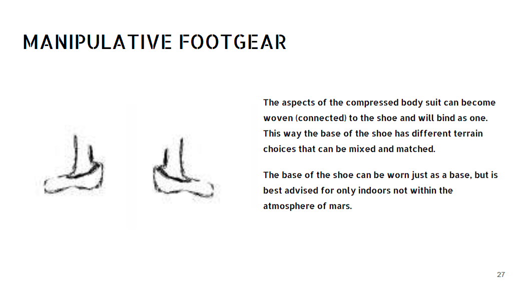
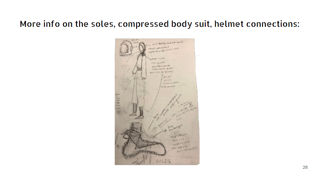
photography


FUTUR:I.S.M:ARS ~ 2nd year

Internum Quoddam ~ 2nd Year
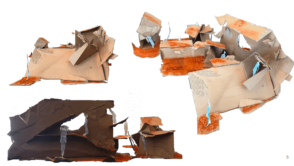
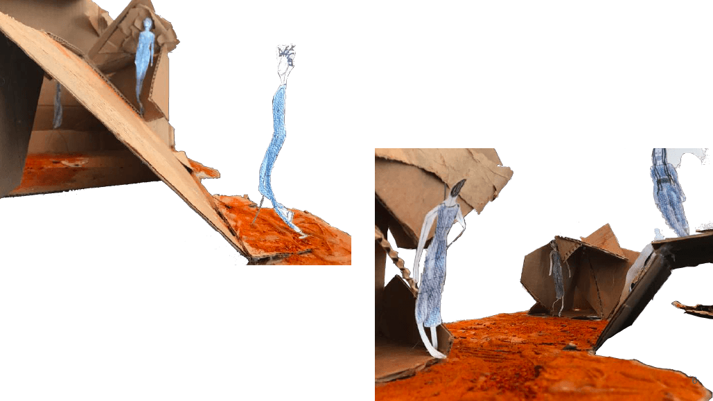
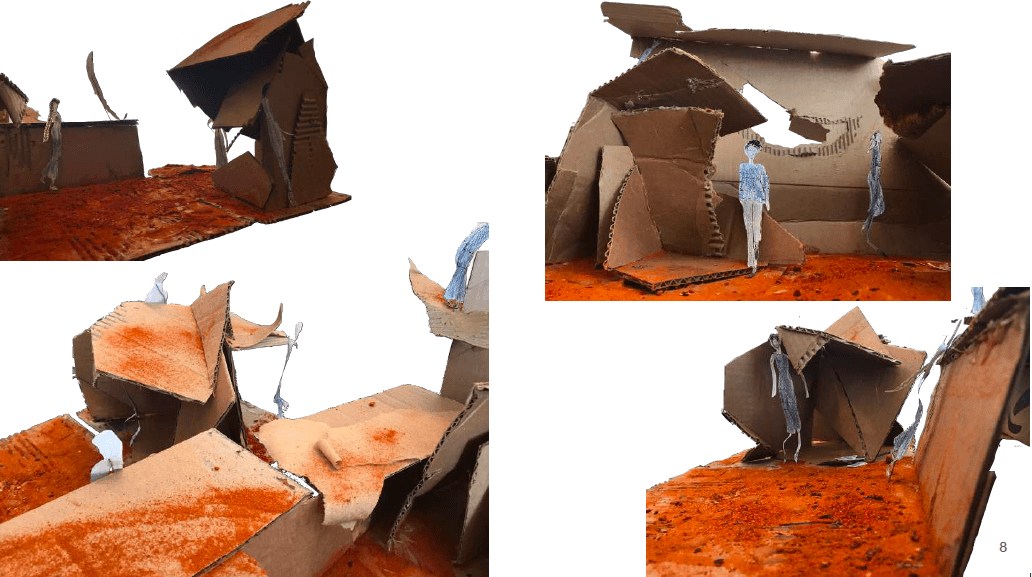
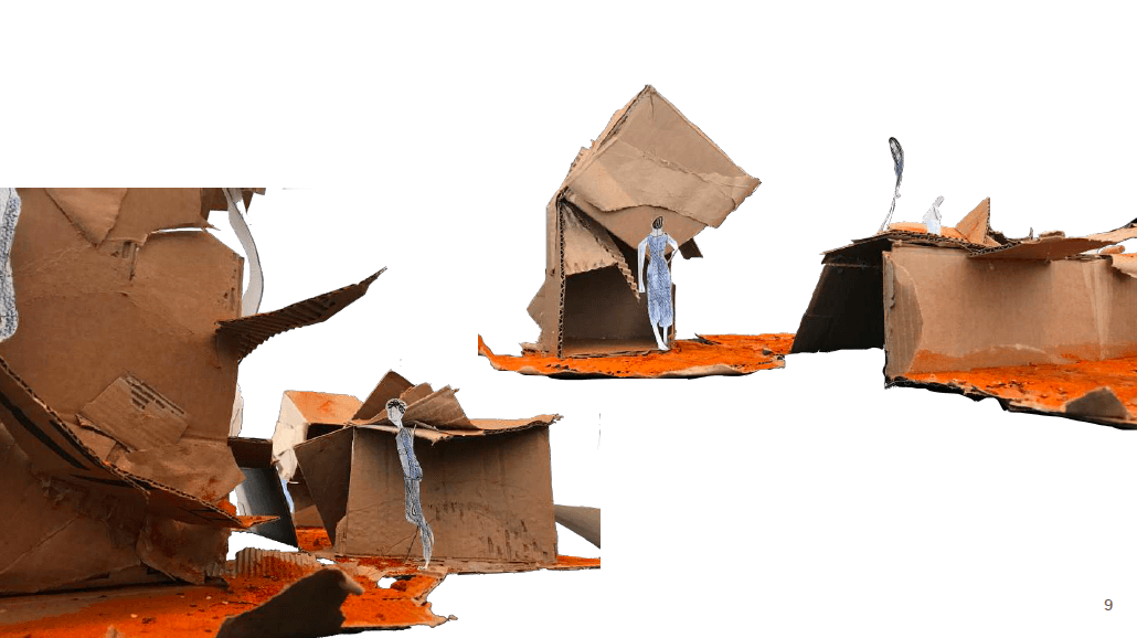
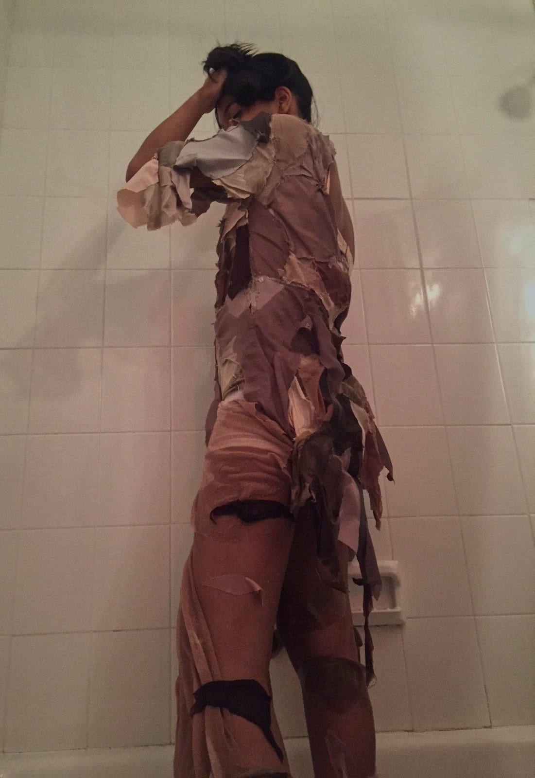
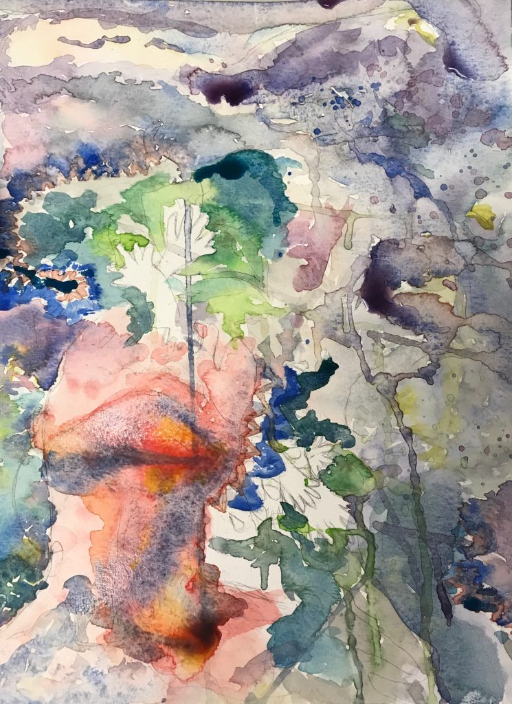
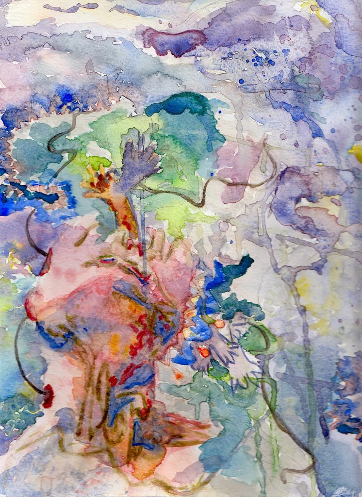
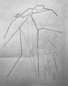
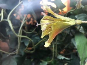
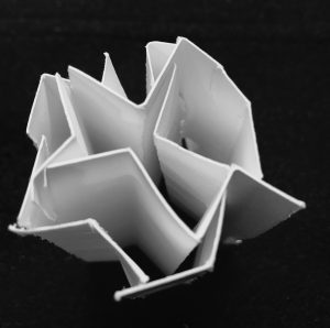
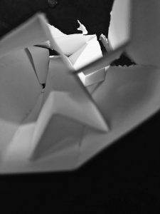
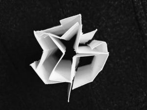
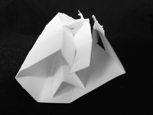
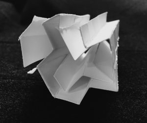
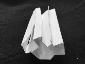
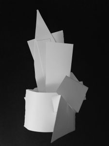
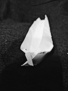
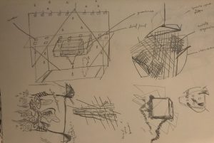
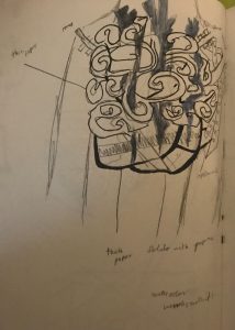
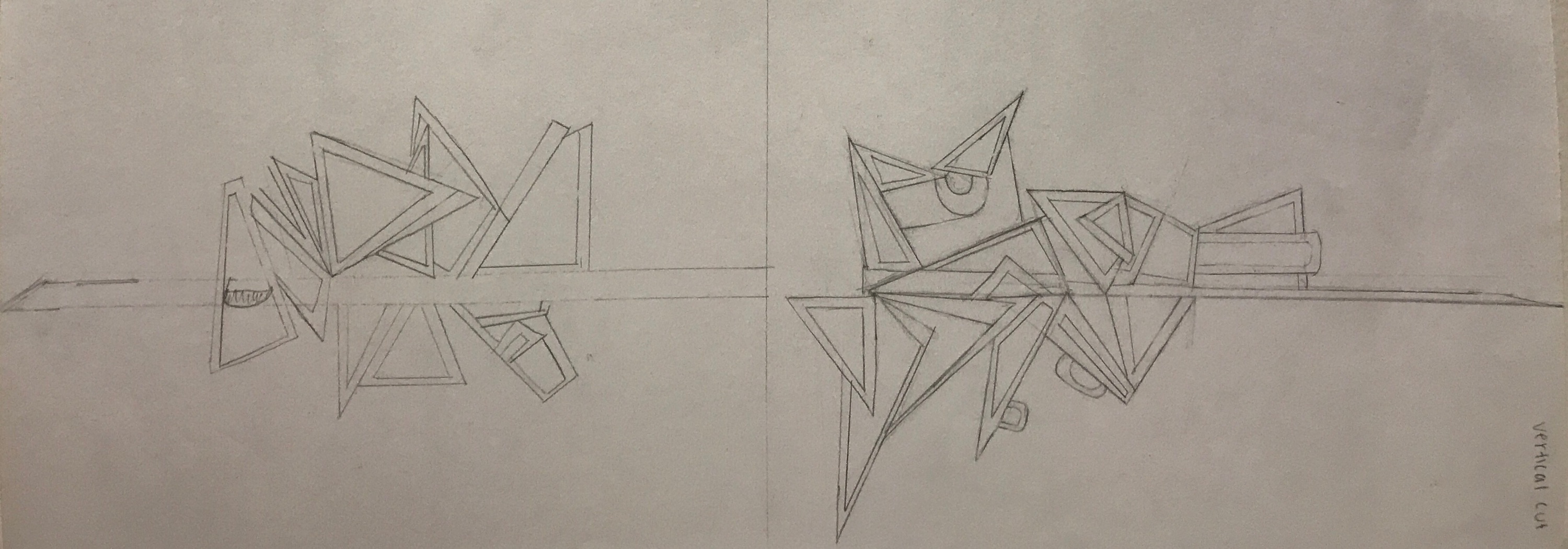
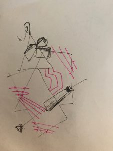
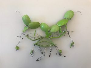
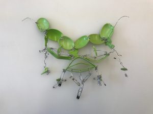
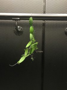
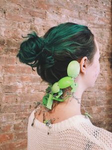
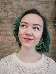
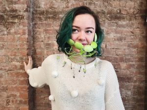
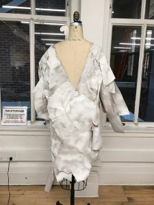
Internum quoddam* conveys society’s focus on our EXTERNAL selfs. We look and discover within sometimes to learn more about and how to convey our EXTERNAL selfs. We look to the EXTERNAL view point of actions to reveal what could be felt
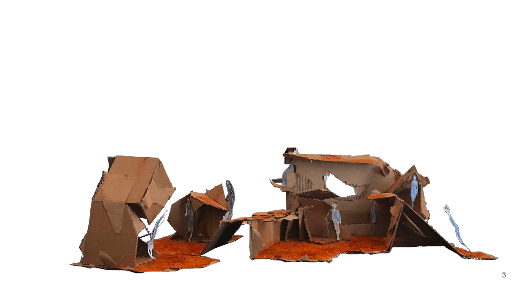
within. The alterations of biogenetics, the application of makeup, mirrors, autopsy are different forms that can be a role in someone’s story today. Health wise we are in our bodies but don’t always see all the movements occurring. In this piece I want to take the idea of what if we altered our insides for not the reasons we usually are thinking of, what could that look like in an
abstract way**. Specifically the organs and sensory nerves that affect the way we feel, and how this could affect us externally. As focused as we are on the EXTERNAL view point we do come to realize it taps into our conscious mind, but it could be altering our bodies too. This is a juxtaposition at another viewpoint of what if society did this. This piece is meant to be disturbing and controversial because it can be taken the wrong way in terms of ethical and technical opinions.
*internum quoddam means three parts in latin. the three parts are relating to: soul, mind, and body of both the external and internal parts of ourselves, collectively as individuals, and coming together as one.
**What if we could reshape, recolor, and live without some organs and senses? Fantasy like look to the
garment.
. . .
Inspiration
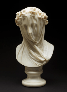
- The Veiled Lady: by Raphael Monti (Italy c. 1860)
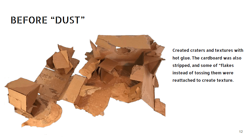
https://artstories.artsmia.org/#/o/12092
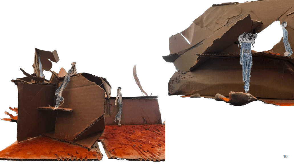
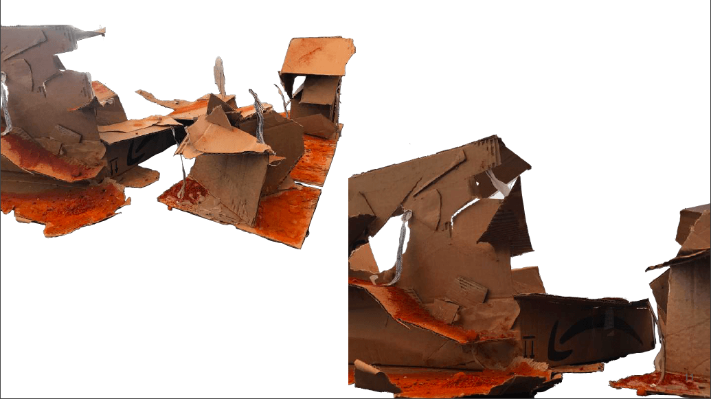
- Polished sculpture
- Relies on less light reflection (search more about light reflection for piece)
- Loose and tight veil
- allusion
- Marbel (search more about this sculpting technique)
- “Veiled ladies were vehicles for flaunting virtuosity, not portraits (aka showing skill). In many European cultures, wreaths were worn by unmarried women and veils were symbols of new life—something about to be unveiled.”
- “One theory about the identity of veiled ladies is that they’re actually everyone, or at least every Italian. Created by Italian sculptors at a time when Italy was unifying, the veil and plain white color obscured regional differences (features and colors).”
This piece inspires my garment because the transparency of the external figure and a material draped over externally onto a material to unite yet still shows emotion.
2. Golgotha: André Martins De Barros (Paris, France 1989)
https://www.artmajeur.com/en/amartinsdebarros/artworks/99596/golgotha
- Uses bodies and pieces them together to create a portrait as well as showcasing a scene. Brings together many bodies with different emotions as a unison for one all at the same time.
- Other paintings to reference do the same thing: some with plants, fruit, and bodies.
3. Victorian style really focused on the body and creating garments to change the external state:
Crinolines: weaving technique on garment, different kind of symmetry reminds me of a creating a new kind of ribcage
-
http://www.vam.ac.uk/content/articles/c/corsets-and-crinolines-in-victorian-fashion/
-
https://www.metmuseum.org/art/collection/search/104430
-
Dangerous
-
Almost as if another piece of the body was added (would be put on top of carriages while lady was riding so she could sit)
-
16th Century: “the corset was not meant to draw in the waist and create an hourglass figure; rather, it was designed to mold the torso into a cylindrical shape, and to flatten and raise the bust line.”
-
“Some men wore corsets in the 18th and 19th centuries. Especially in the late 1700s and early 1800s, high fashion for men called for form-fitting trousers and jackets. Some men wore corsets to create the required smooth silhouette. By the mid-1800s, however, the few men who wore fashion corsets were more commonly subjects of ridicule.”
-
“The S-curve form imposed on women’s bodies in 1900 was the result of a straight-fronted corset that started lower on the bustline than the corsets had a few years previously. The shape of the corset allowed the bosom to hang low and unarticulated in front while the hips were pushed backwards.”
-
1930s transitioned into a girdle
4. Bioengineering:
https://www.britannica.com/technology/bioengineering
– Medical instrumentation, biological modeling, blood-flow dynamics, prosthetics,
biomechanics, heat transfer, biomaterials.
– They can replace organs
Replacing organs:
https://www.medscape.org/viewarticle/450133_2
– “The best approach to organ replacement depends on the organ system involved and
may change over time.”
– Stem cells: https://stemcells.nih.gov/info/basics/1.htm
– cellular therapy
– Organogenesis: “the growing of an organ from primitive cells or stem cells.” This can
take a very long time.
– tissue engineering
5. Electromyography: recording electrical activity of muscle tissue of the skeleton as a visual
display or audibility
https://www.mayoclinic.org/tests-procedures/emg/about/pac-20393913
– “Motor neurons transmit electrical signals that cause muscles to contract. An EMG uses
tiny devices called electrodes to translate these signals into graphs, sounds or numerical
values that are then interpreted by a specialist.”
My question: Can the brain alter the way the body works with the not original organs?
– Can this alter, power, let us forget more memories?
– New actions in the body: mimicking versus new motions
– “the brain recognizes foreign and altered chemical structures that may occur in the host
organism and how it mobilizes the proper mechanisms in the cause of host defense.”
“The nervous, endocrine, and immune systems form a neuroimmune supersystem,
which is characterized by continuous interaction and mutual reliance on each other and
which coordinates and regulates all physiological and pathological events in their entire
lifetime.”
https://www.sciencedirect.com/science/article/pii/B9780123846914000079
The brain is connected to the sensory nerves
– Spinal cord
Veins connect to the valves of the heart and surround the entire body
Function of blood in the brain:
– Blood Brain Barrier: “prevents materials from the blood from entering the brain”
– allows some substances to pass through, but not all
“Low lipid (fat) soluble molecules do not penetrate into the brain. However, lipid soluble
molecules can.”
– Exposures to other sources of factors could make it more easier for substance that
should not pass to pass
– Alinement of cells
– Can relate to the garment in terms of order and manipulation effects
– On of the circumventricular organs
– https://faculty.washington.edu/chudler/bbb.html
– http://www.innerbody.com/image/musfov.html
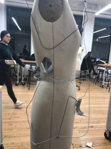
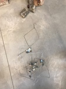
Using material in between as the muscular system that keeps the body held together and some elements of a spinal system that connect senses to the brain and keep the body intact for the
garment.
. . .
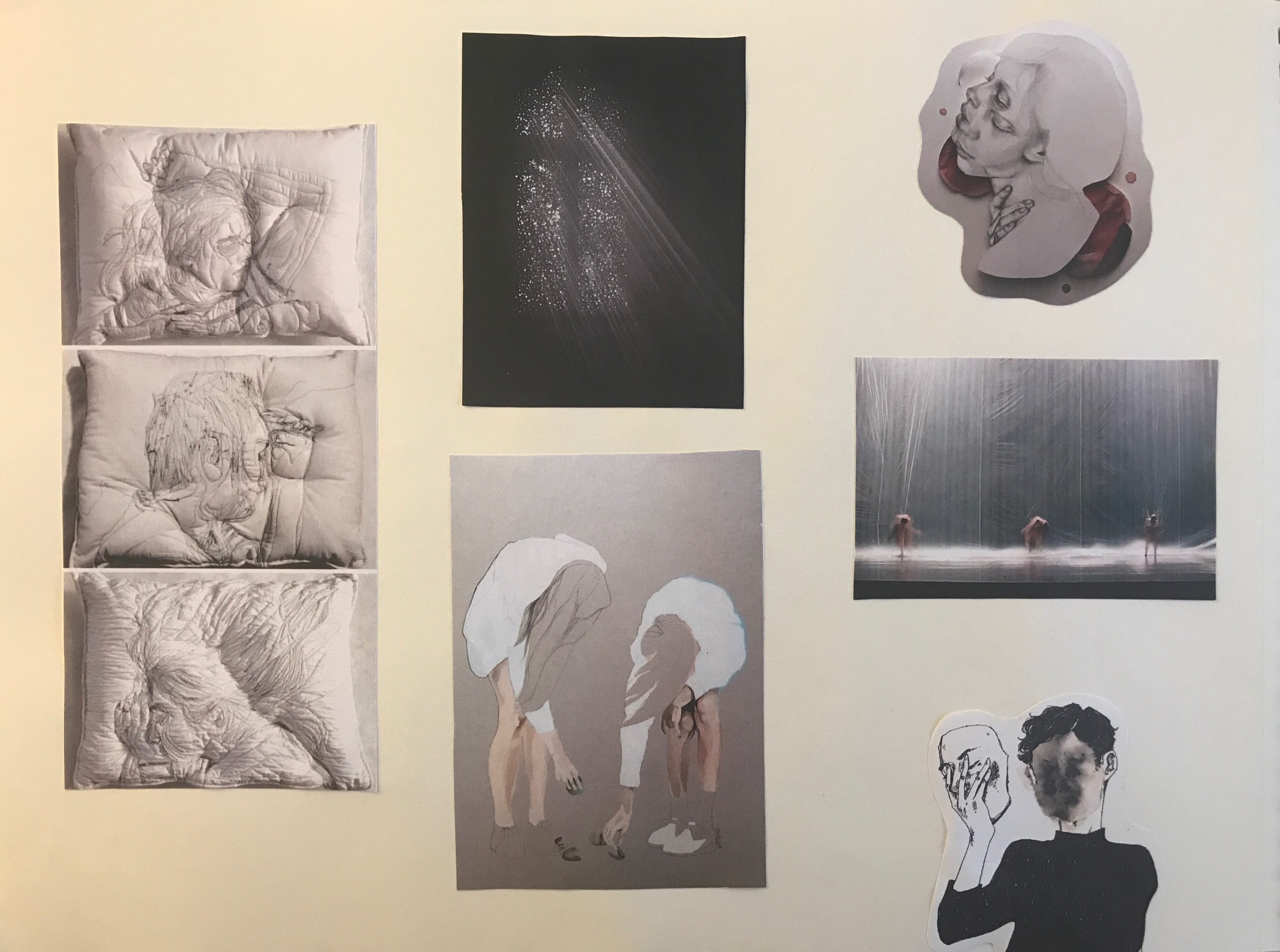
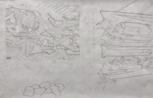
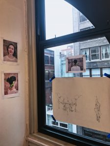
Visual Inspiration


. . .
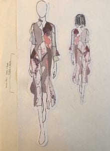
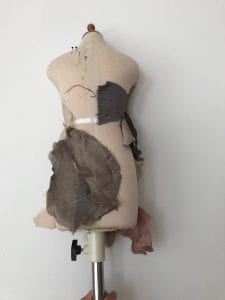
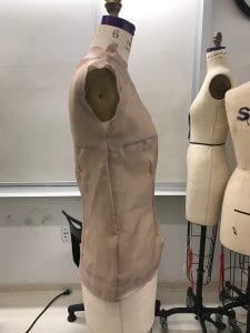
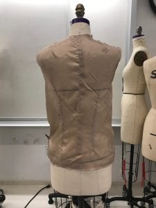
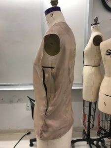
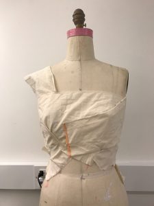
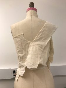
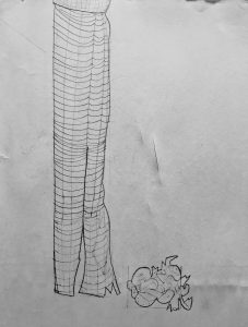
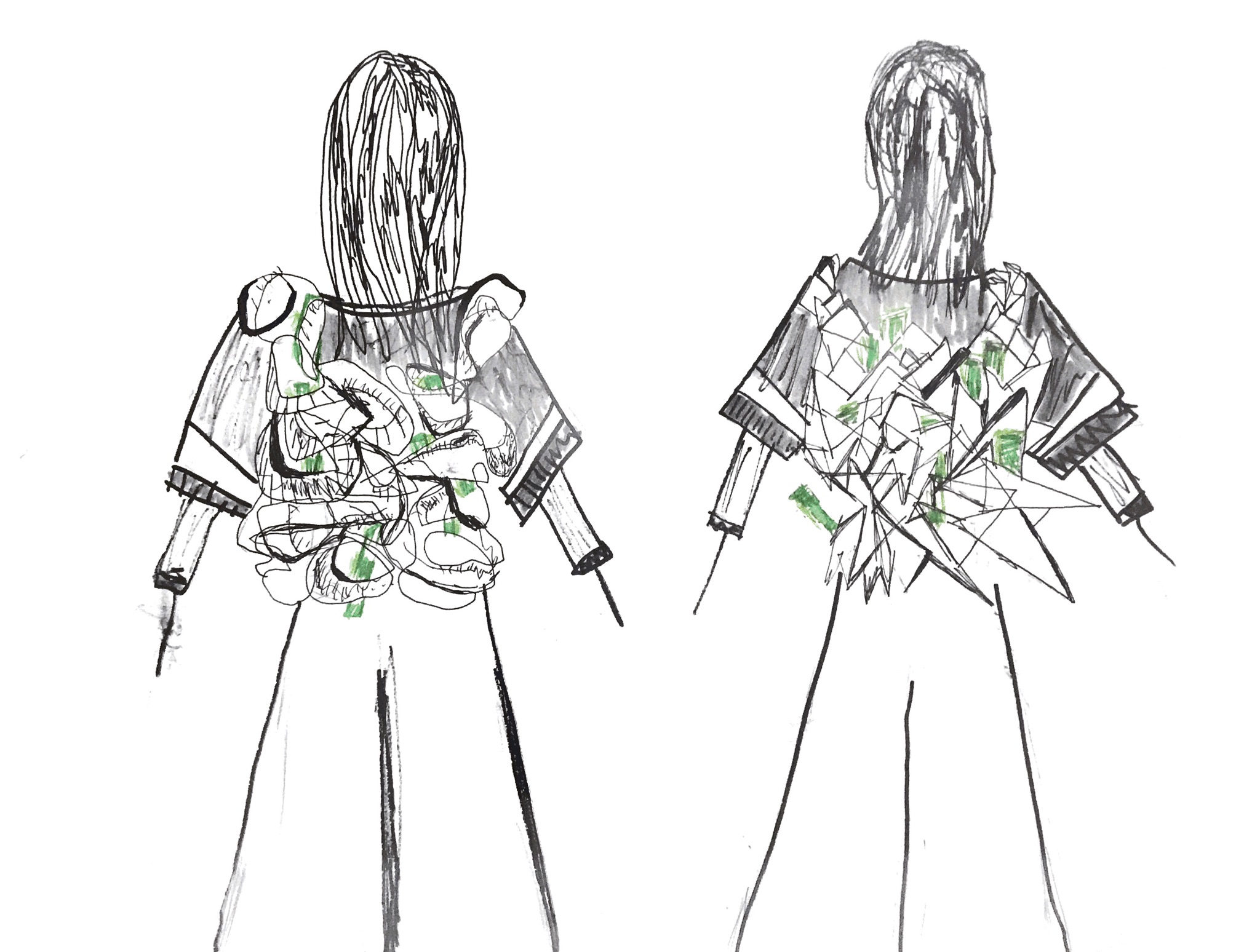
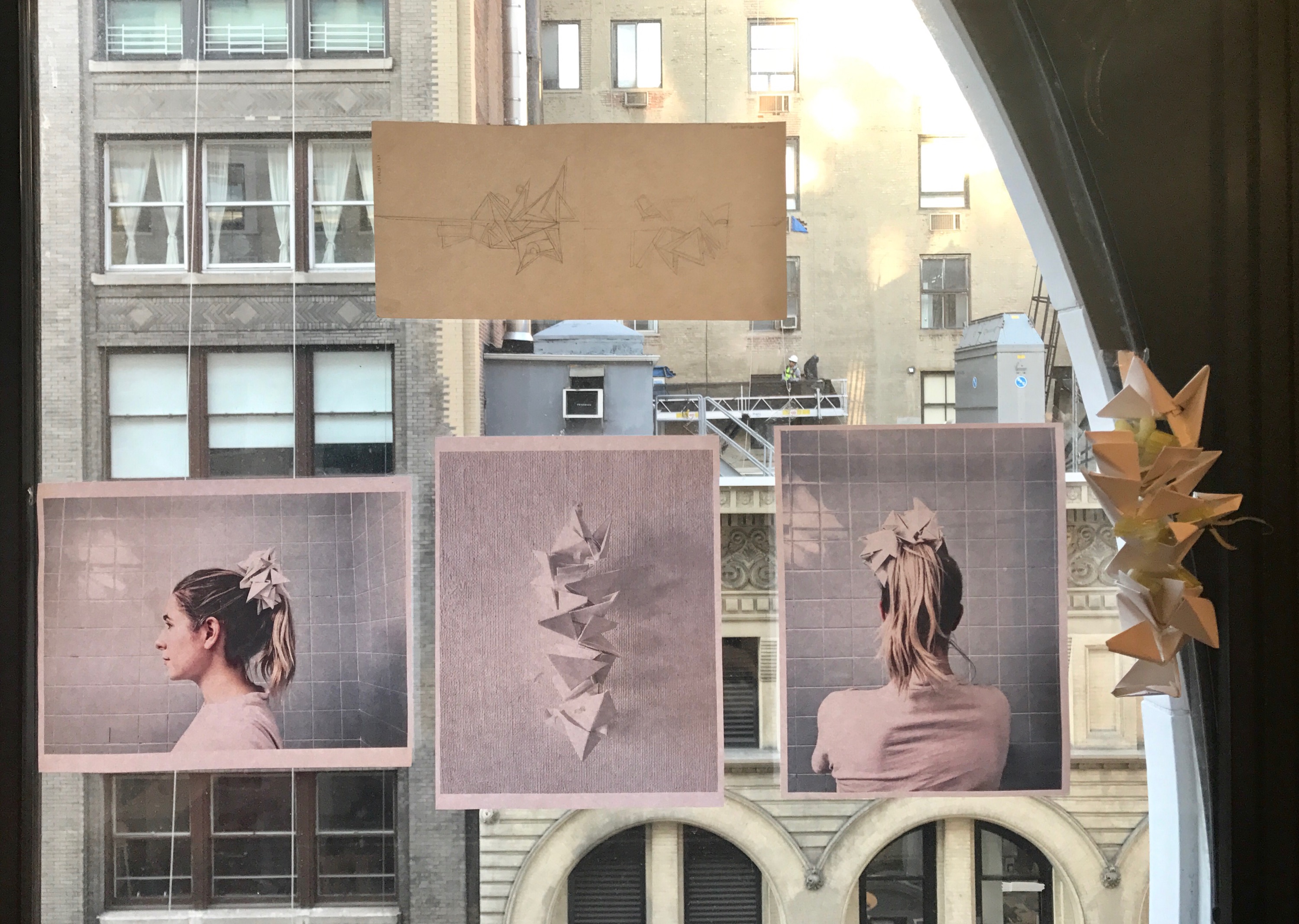
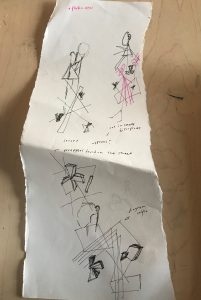
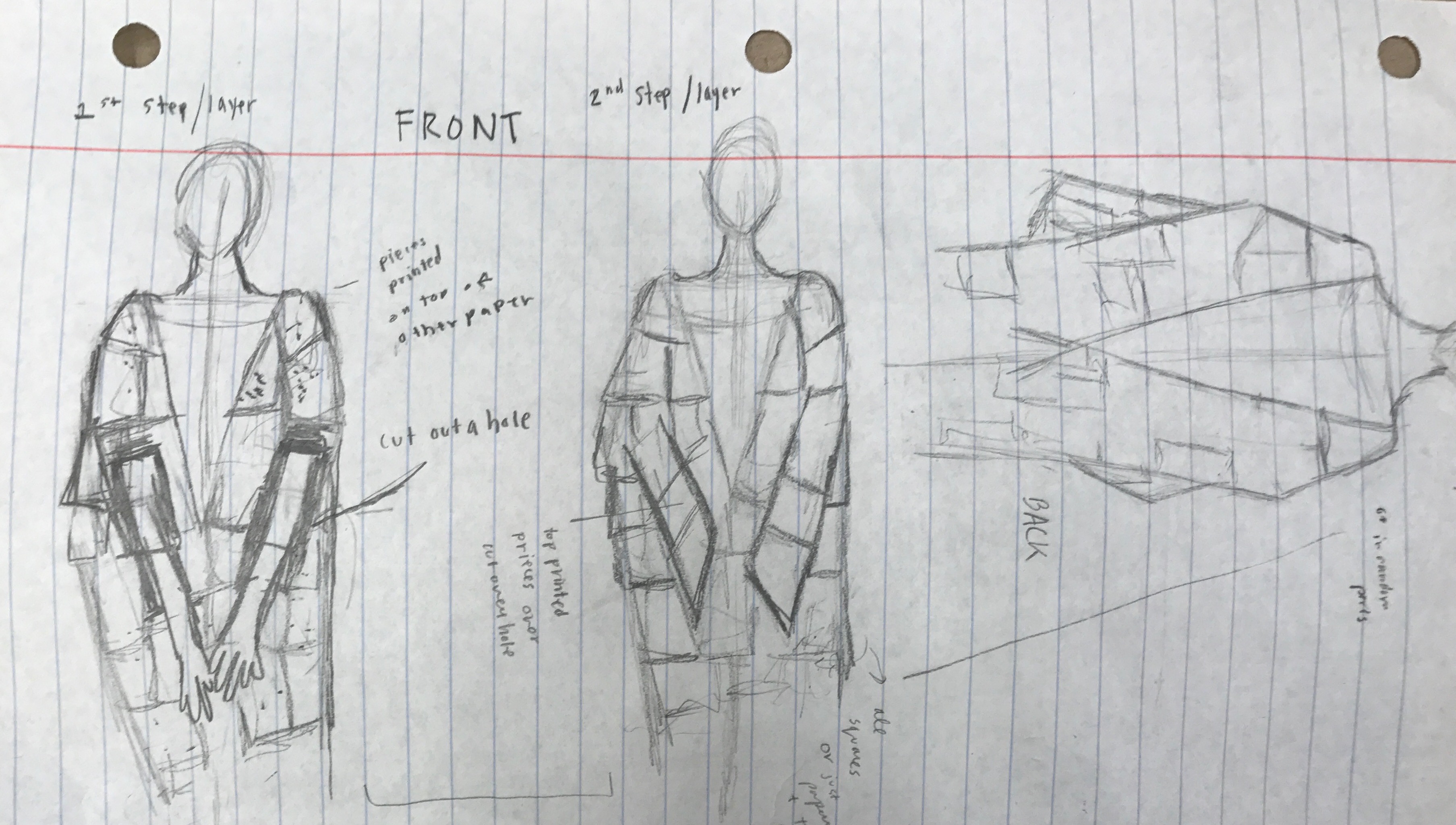
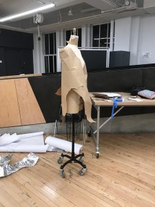
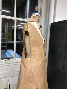
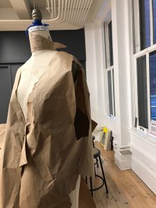
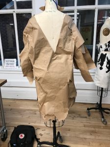
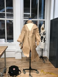
Garment + Treatment Ideas
REQUIREMENTS: “DRESS with a collar, facing and sleeve.”
– Some other ideas and thoughts are in the research areas
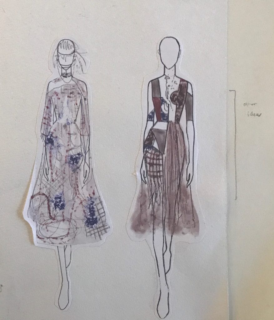 Underpart of the skirt stays closer to the legs: under layer and strategy to signify veins and
passageways that connect the body.
Top part of the skirt: sheer so you can see the underlayer.
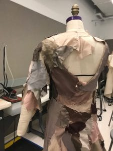
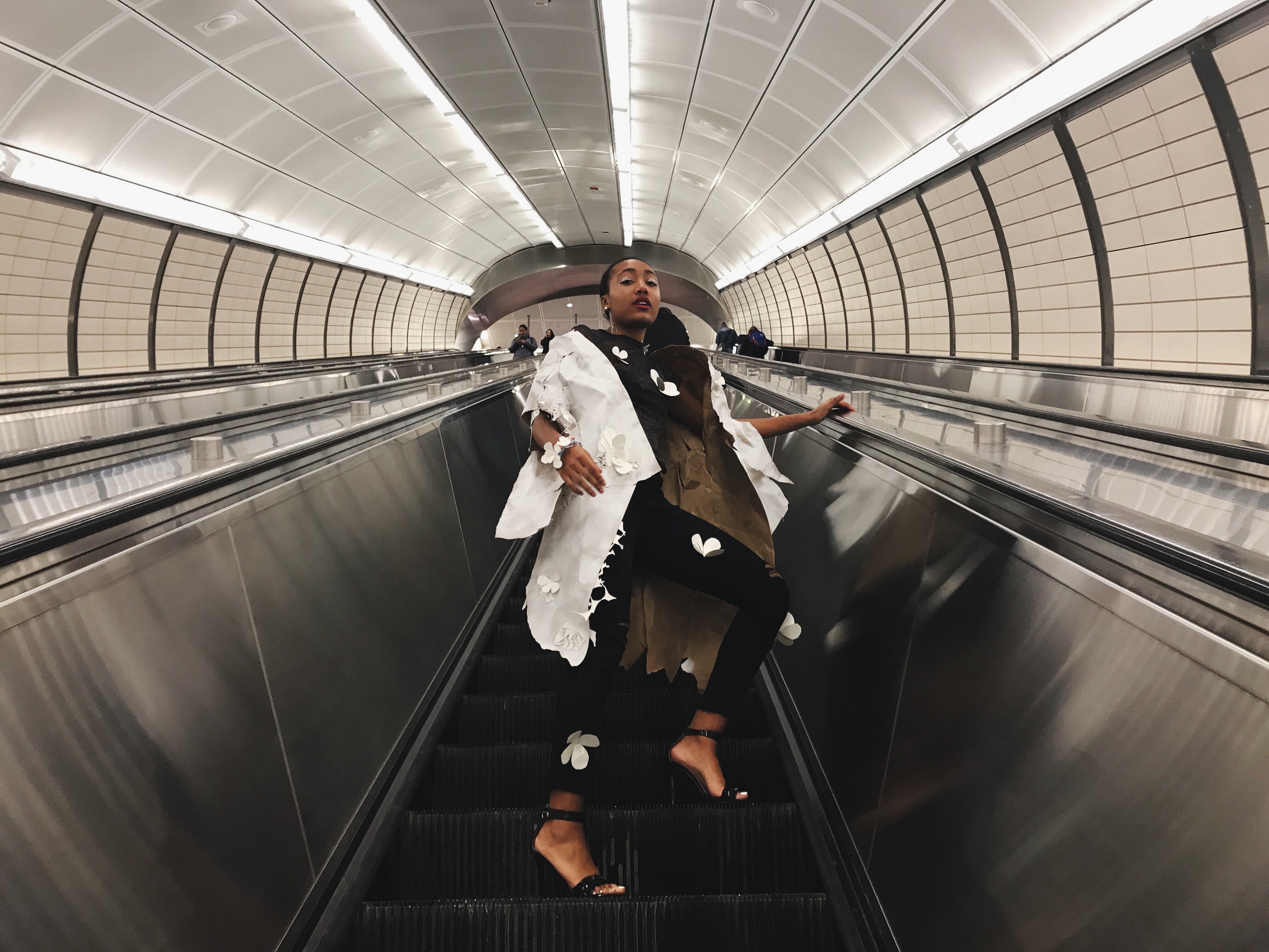
Some spaces show the body of the person wearing the garment. Showing the contrast of the body and the fantasized juxtaposition .
- embracing your true self
The collar I was trying to figure out how to add that requirement.
Weaving on the side of the leg that connects to the underpart of the skirt.
Blue represents the blue valve in the science books.
Red represented coloration of blood and different tones represent all the material in our body over time that changes coloration that we may not be able to see
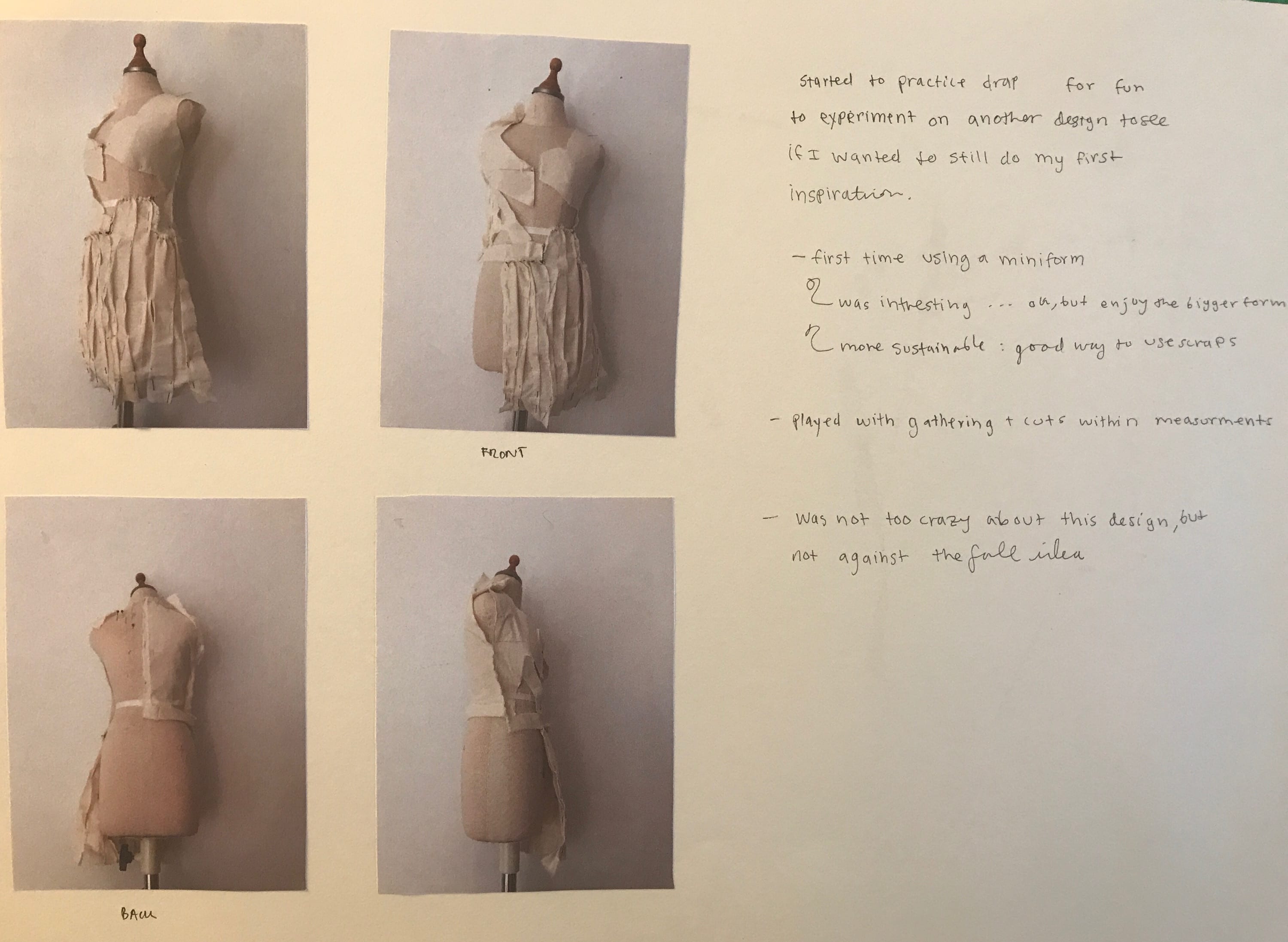
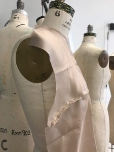
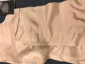
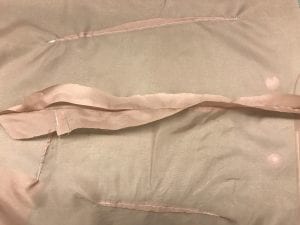
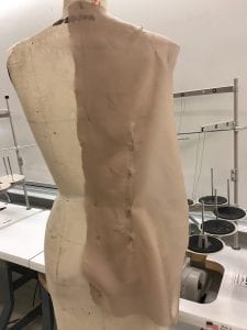
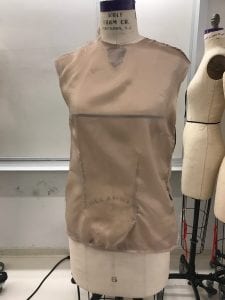
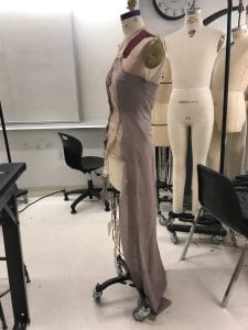
I found that through doing this drape that in draping wise this drawing would make more sense to drape with a layer underneath. I wanted a uneven pleat, and found that this look on the muslin looks odd. With the he silk and thin fabric it could work possibly. Slits were cut were the pleats met at the end of the dress.
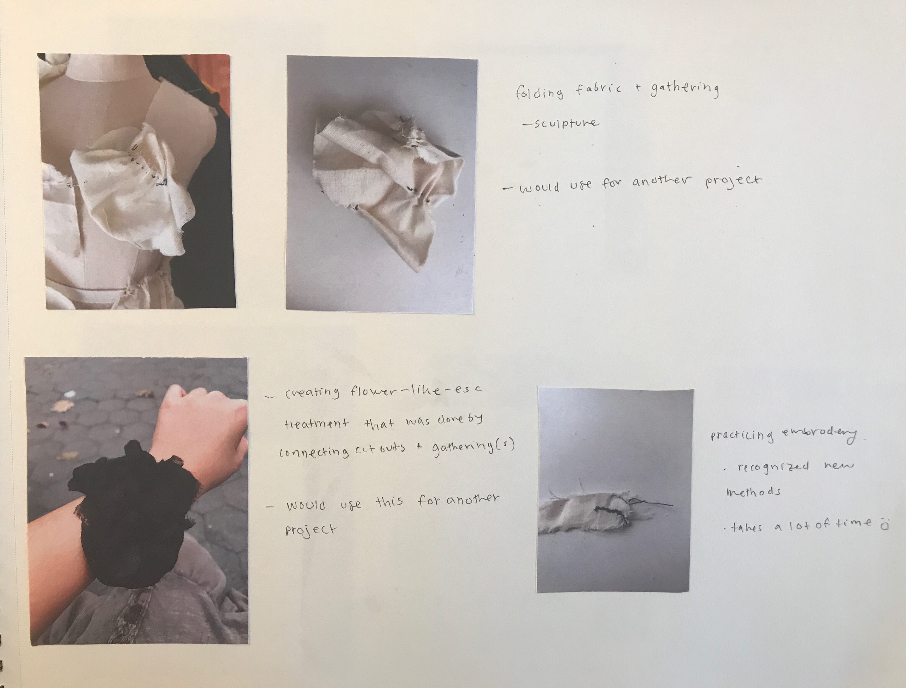
I have tried some treatments out of silk and discovered that I really like one look I tried, since the other ones look very similar to each other.
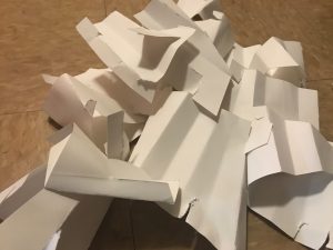
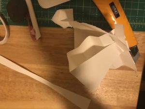
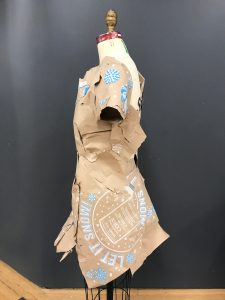
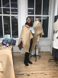
Tried to use wrappers that were thrown away to make a three dimensional shape then transitioning to stitch them together. The problem was that the material was so thin that the needle kept breaking the shape.
Also tried to use sequins, but found that I was not crazy about it, but still it is in consideration.
Embroidery is nice, but I just to note to myself the process is time consuming, but faster than making dots that were on my drawings since I had to keep retying the needle
Doing a running stitch, then folding the fabric added a cool texture that when pieced together makes a good texture on the form and body for the dress.
Felting probably will not do, but might consider it to piece together certain fabrics together or will test it out when I get my final fabric to see how it turns out.
. . .
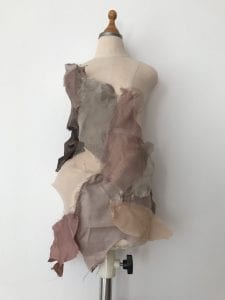
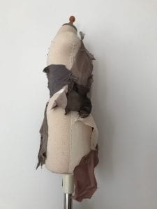
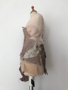
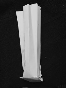
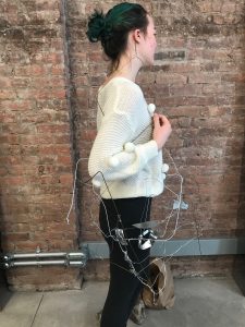
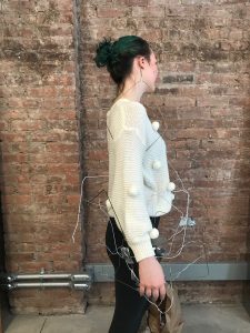
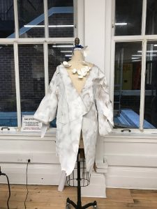
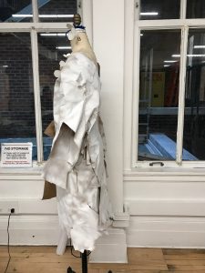
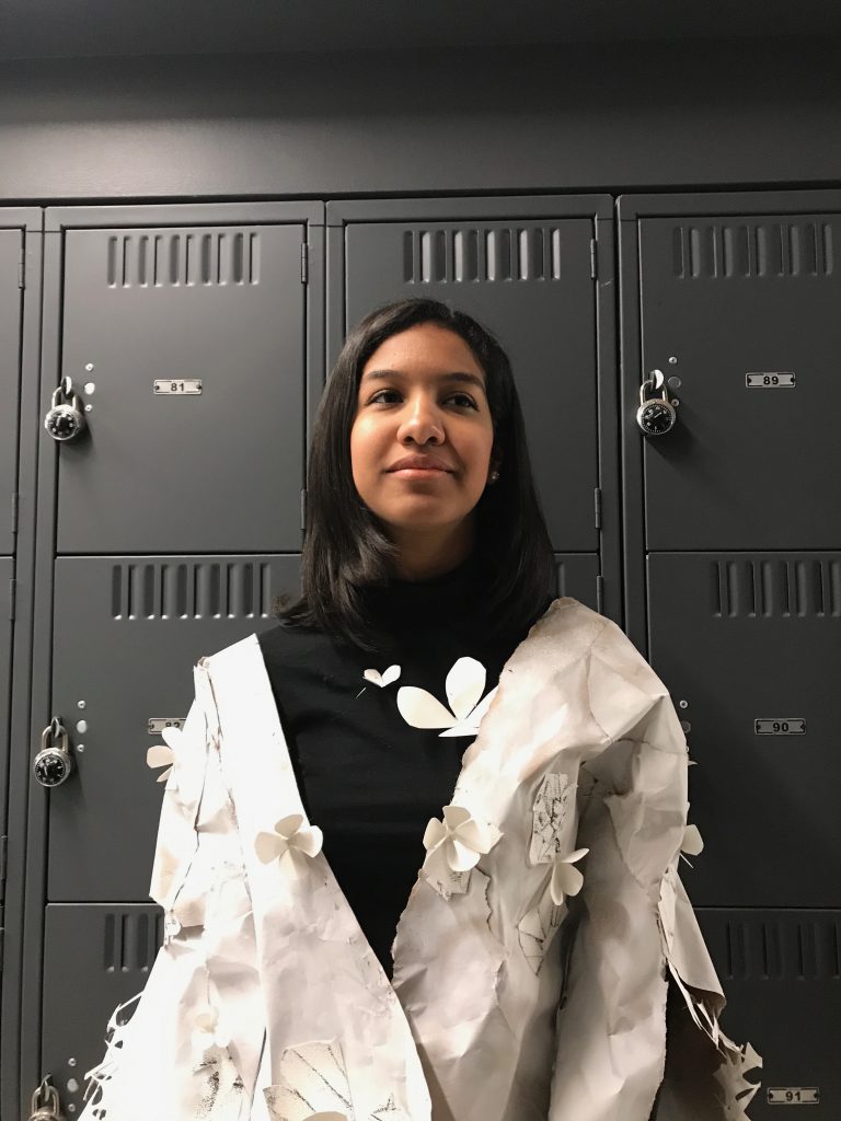
Final Design

- Openings and closings conveyed by layering pieces together of sheer material.
- Some spaces show the body of the person wearing the garment. Showing the contrast of the
body and the fantasized juxtaposition. - Embracing your true self
- Shapes are inspired by reconfiguring organs.
- Blue represents the blue valve in the science books
- Red represents coloration of blood and different tones represent all the material in our body.
over time that changes coloration that we may not be able to see. - Completely made out of swatches, and treatments are all hand sewn.
- Colors inspired by the skin tones of many people, and colorations of organs (that change tone overtime).
- Skin openings to show the natural beauty of the person wearing the garment and the contrast of external and internal.
. . .
Construction
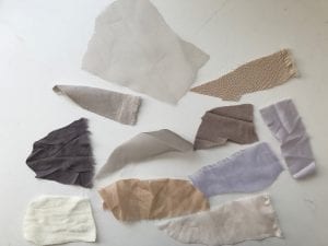
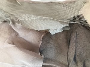
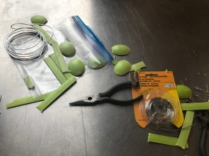
FABRIC:
Lining: Bemberg Acrylic from Chadick and Rosen Fabrics : bought 1 yard incase, only need 1/2″yrd
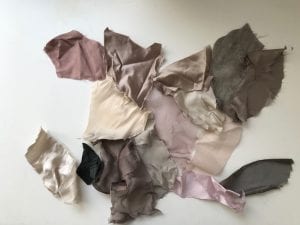
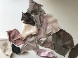
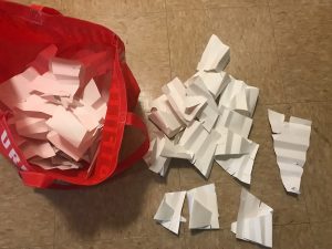
Most swatches came from Mood NYC, and I had to keep going on weeks on end to get enough. All of the pieces are silk. Some swatches were found. I wish I had done all the pieces being found to create more of a sustainable element. I wanted to think of zero waste design in a new way. Also the act of people cutting the swatches I had zero control of the shape and in a way it feels as if the originality component of what makes others was infused into this garment.
There was a much larger selection at Mood. I think that I really gravitated towards the silk. Some of the fabric has a nonmetallic and metallic side. I think that I do not want any metallics in my garment and only matte colorations so that the color can blend more into the skin, or even just seem more realistic like than something shiny. If I was making a collection I might add some elements in other designs that are shiny with the juxtaposition of the matte coloration.
Playing around with the swatches:
I decided to layer and piece the swatches together to see which ones I would want, and I released that maybe I don’t need to buy just huge roles of one kind of fabric. I could use already used materials and piece them together. This way it is more sustainable. Also, this is not me draping a design, it is just seeing how the fabric would work on the body.
I think I am going to keep these colors, I really like them together. I like using silk. It feels free and nice on the body and skin. It is semi transparent and has great movement, thus you will be able to see the person’s skin embodying the body literally.
-
- A&A
-
- Mood NYC front
-
- back
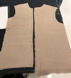
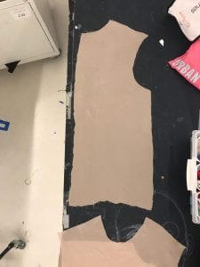
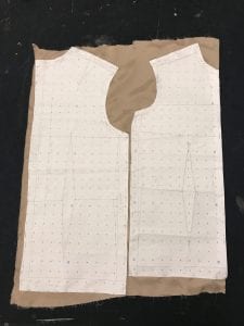
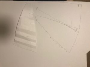
Pattern Making:
-

- Front
-
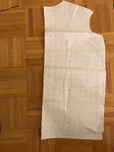
- Back
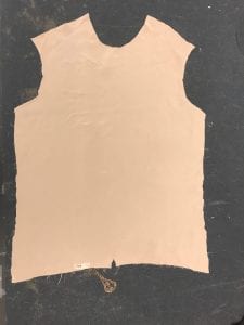
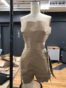
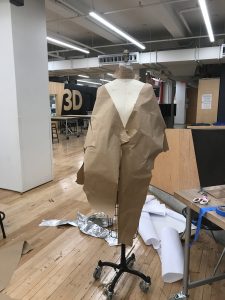
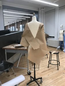
I decided to use the straight top pattern so that I could sew my treatments onto of the garment. This was my first time ever using the sewing machine and drawing a pattern for my original designs. Usually I just construct everything as I create the piece, which I did with the element of hand sewing, but to say the least this was a new experience.
First Attempt:
The arm holes were off in the pattern in the first try, therefore I had to remake the entire pattern.
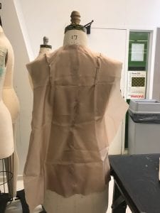
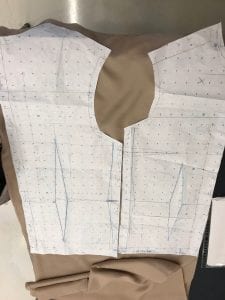
Second Attempt:
Machine Stitching:
- darts
- side seams
- seam allowance on the bottom of the top
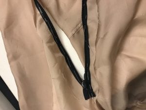
- added an invisible zipper: didn’t care if the zipper matched the color of the garment to juxtapose trying to make a garment always look perfect. The professor did not like the color and told to paint it. I tried but it looked messy, and wouldn’t fully paint over the fabric.
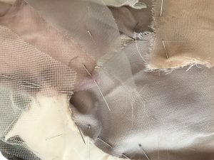
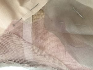
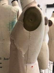
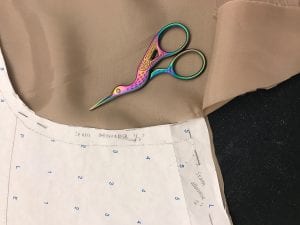
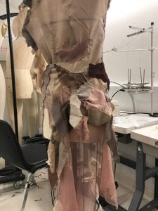
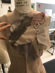
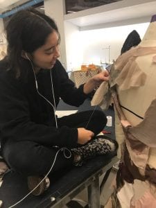
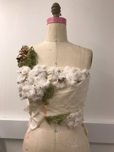
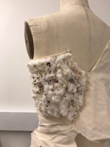
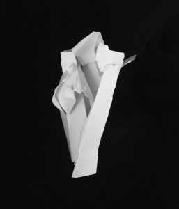
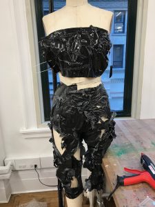
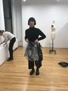
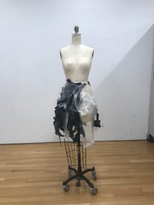
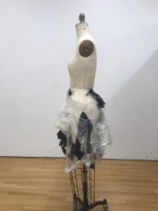
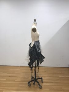
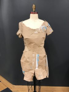
Treatments:
Over the weeks I had sewn swatches together*, and it was time to fit them together onto the dress form. I also had bought three types of china silk and a piece of mesh Oscar De La Renta fabric for the bigger pieces of the sketch. There were many swatches left that I had used to fill in the holes.
The reason why I hand sewed the swatches was because I love working with my hands. Also, I did not want all the seams to show, only some. A rugged look was wanted and to show the non perfection versus how many people want their garments to look clean cut. This is to show venerability. The act of working with my hands and touching/bending the shapes mesh with the concept of the dress.
*many of the pieces were sewn on the train which helped me stay on a good pace. Also, instead of going on a phone this taught me how much you can take time to learn a skill if you do not always have an excuse it is possible.
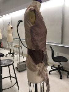
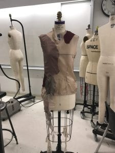
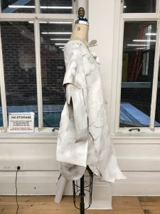
Working on the sleeve I had to make some cuts on the left side, and did not enclose it. That way the top flaps could naturally drape over the body. Then the right side sleeve was longer and was made to enclose/wrap around the entire surface area of the arm. The attachment arm to the mannequin was quite helpful versus when I did not use it.
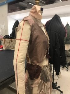
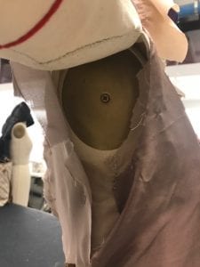
When cutting out the sections that would show the skin, the fabric became loose. To make sure the dress was still fitting (not too tight, not too loose) I gathered some of the swatches.
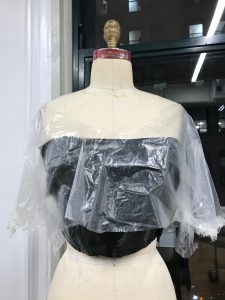
To make the collar, I layered swatches on top of one another. At first it was common sense to layer it, and the more swatches added, I had to reverse the way I attached the fabric together.
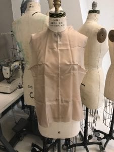
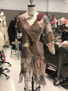
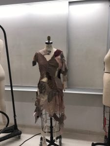
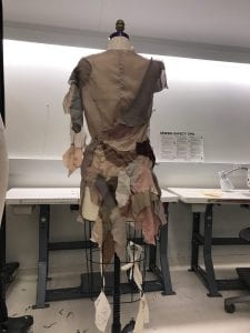
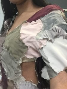
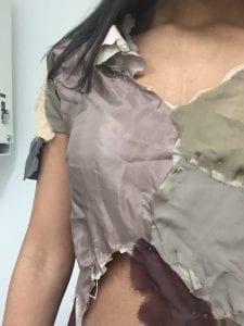
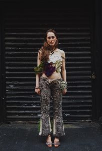
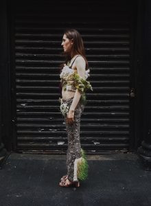
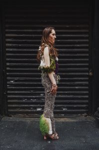
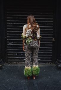
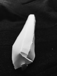
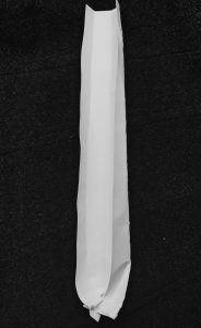
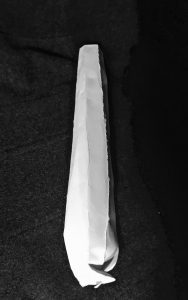
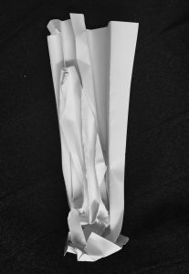
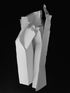
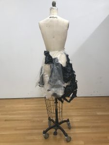
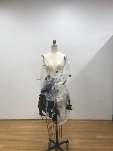
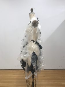
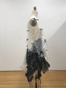
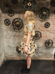
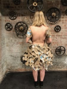
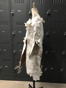
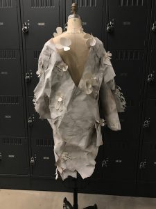
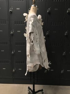
Completed Garment
-
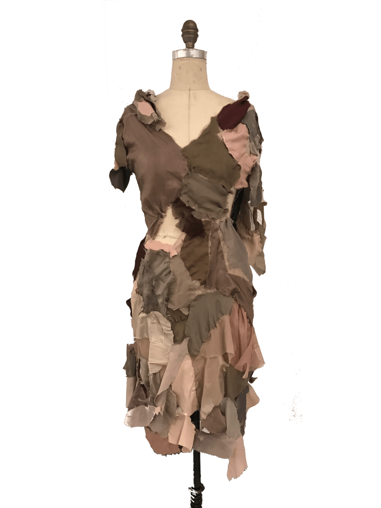
- front
-
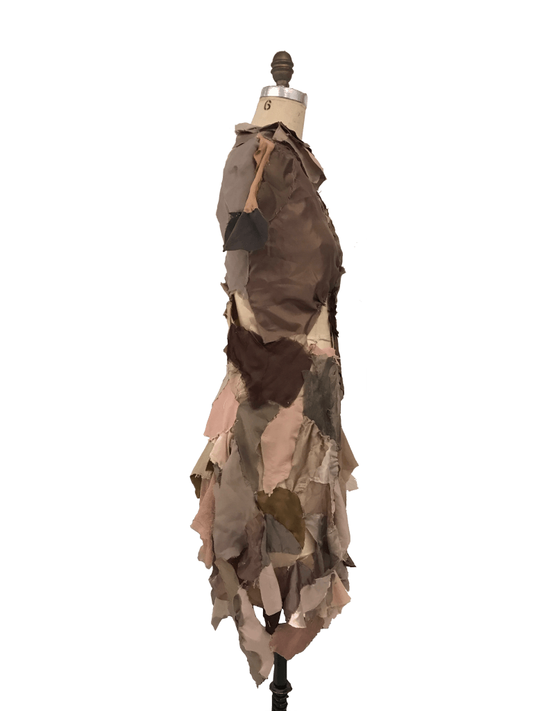
- left side
-
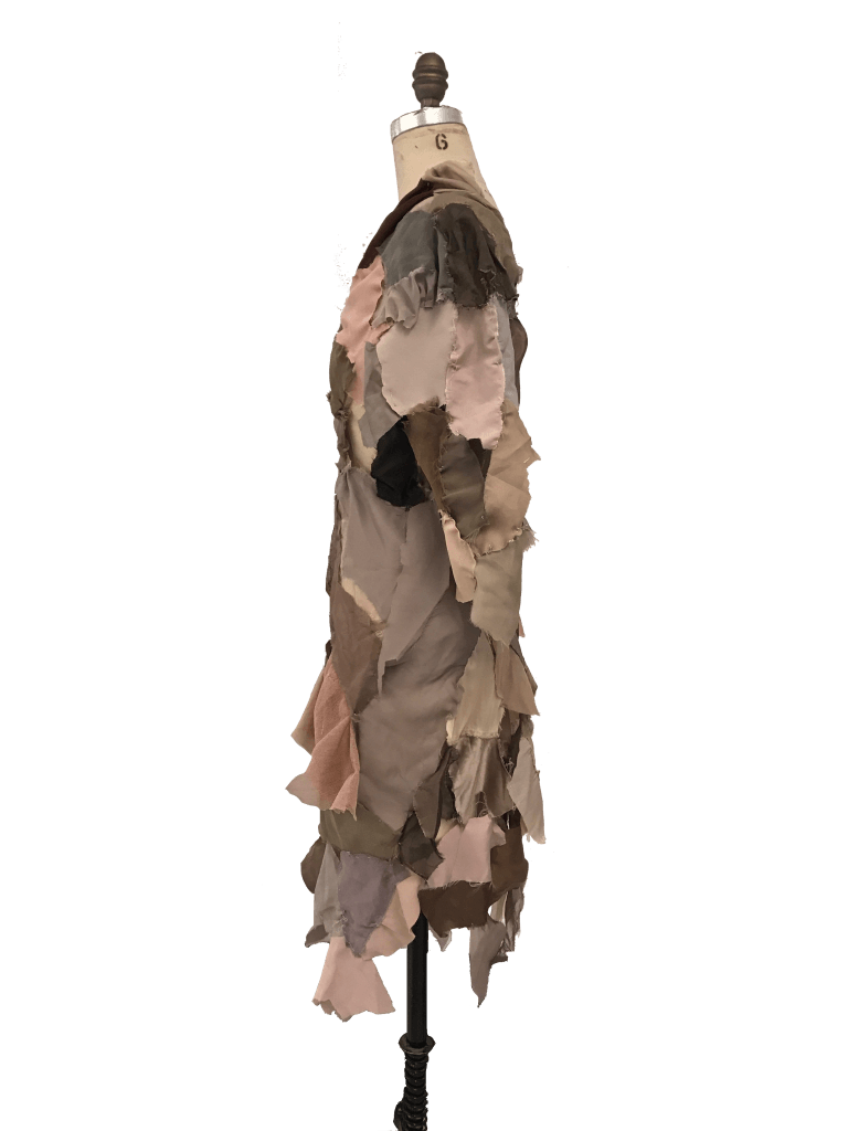
- right side
-
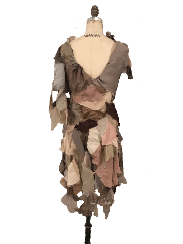
- back
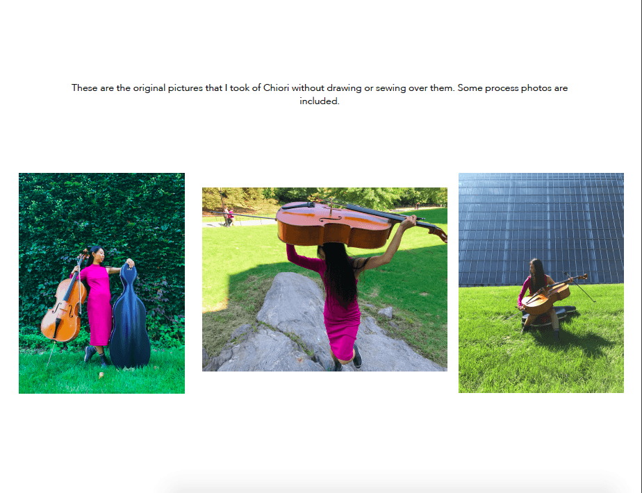
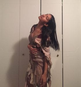
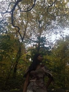
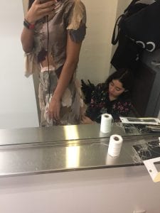
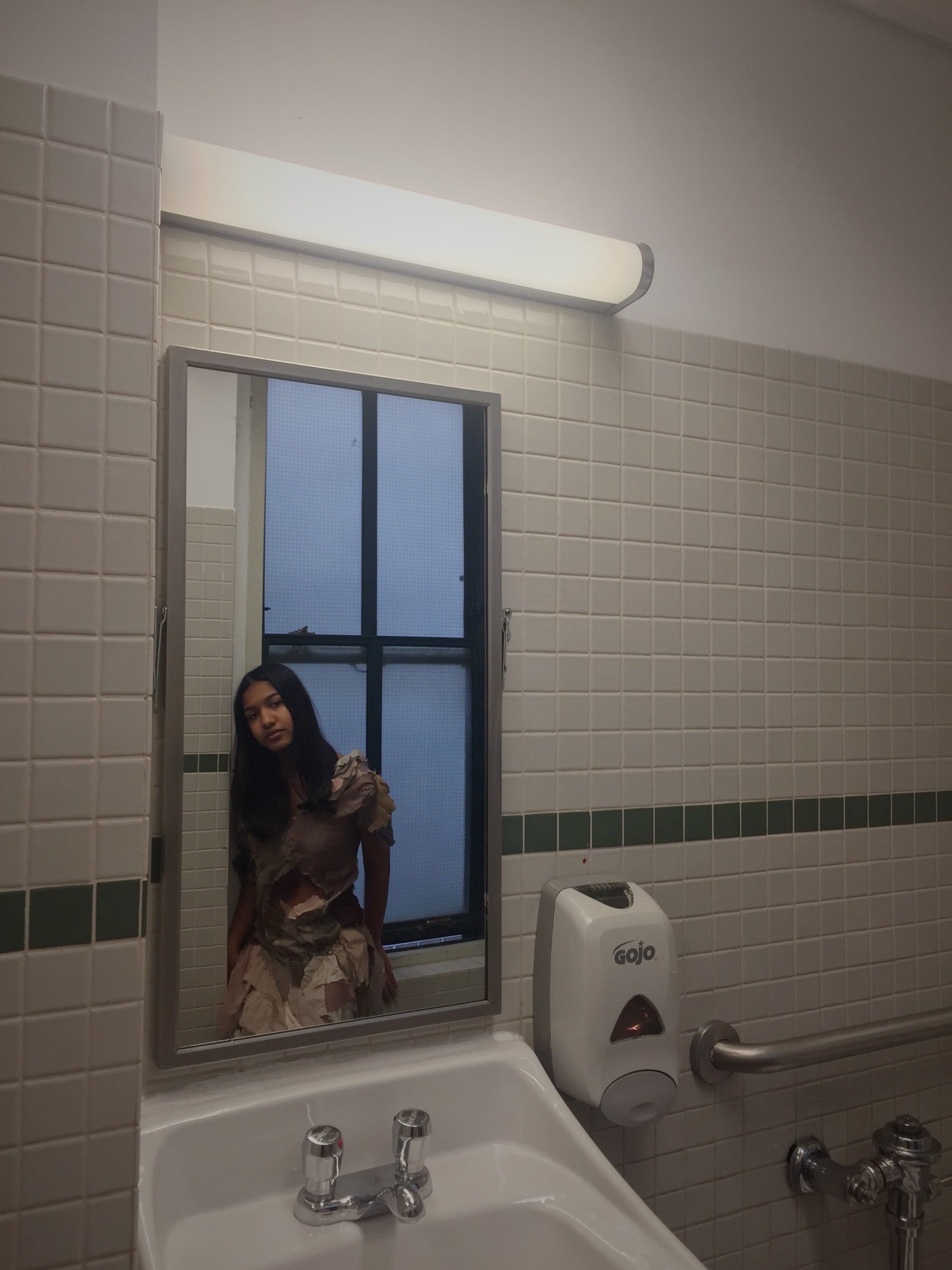
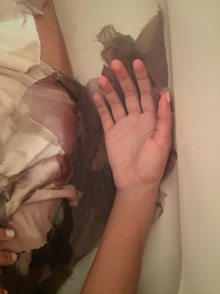
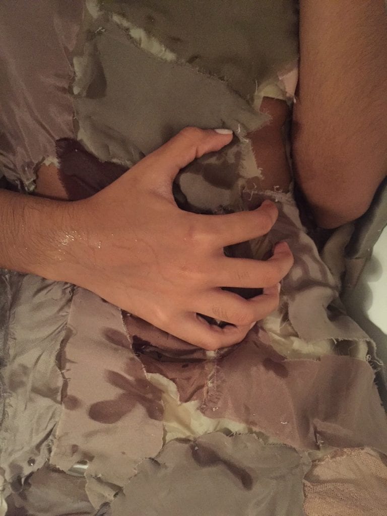
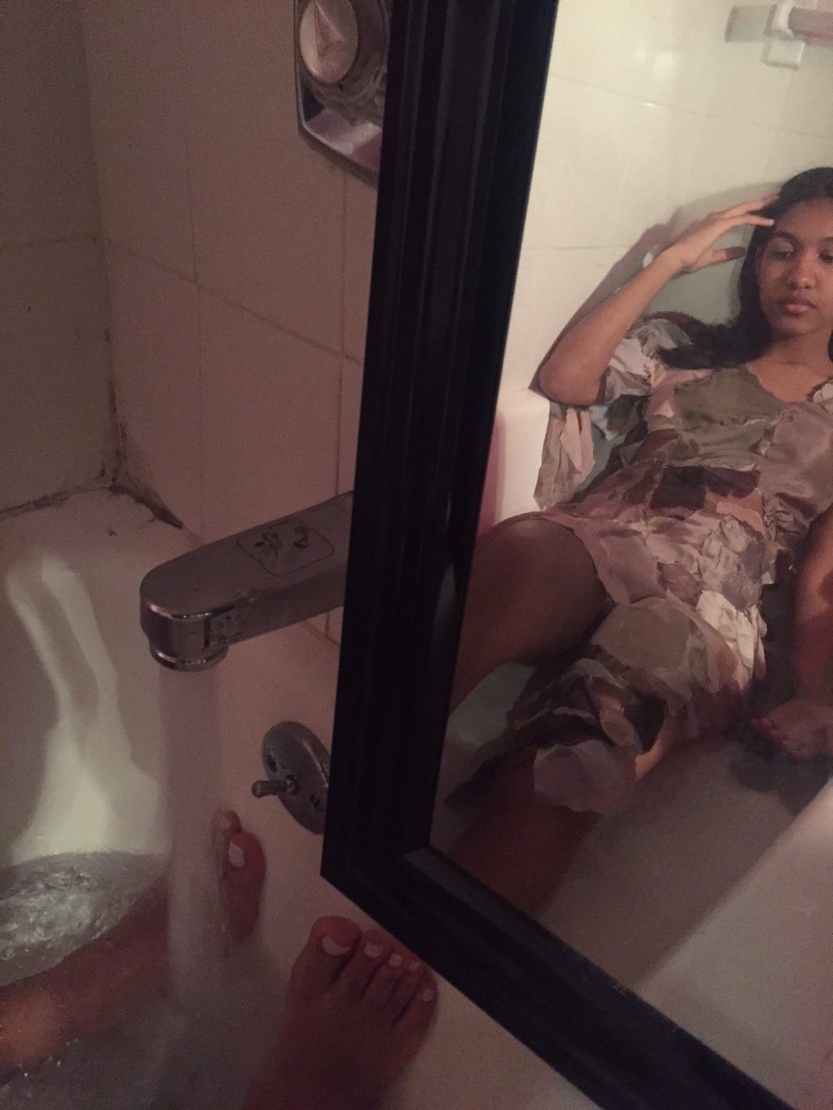
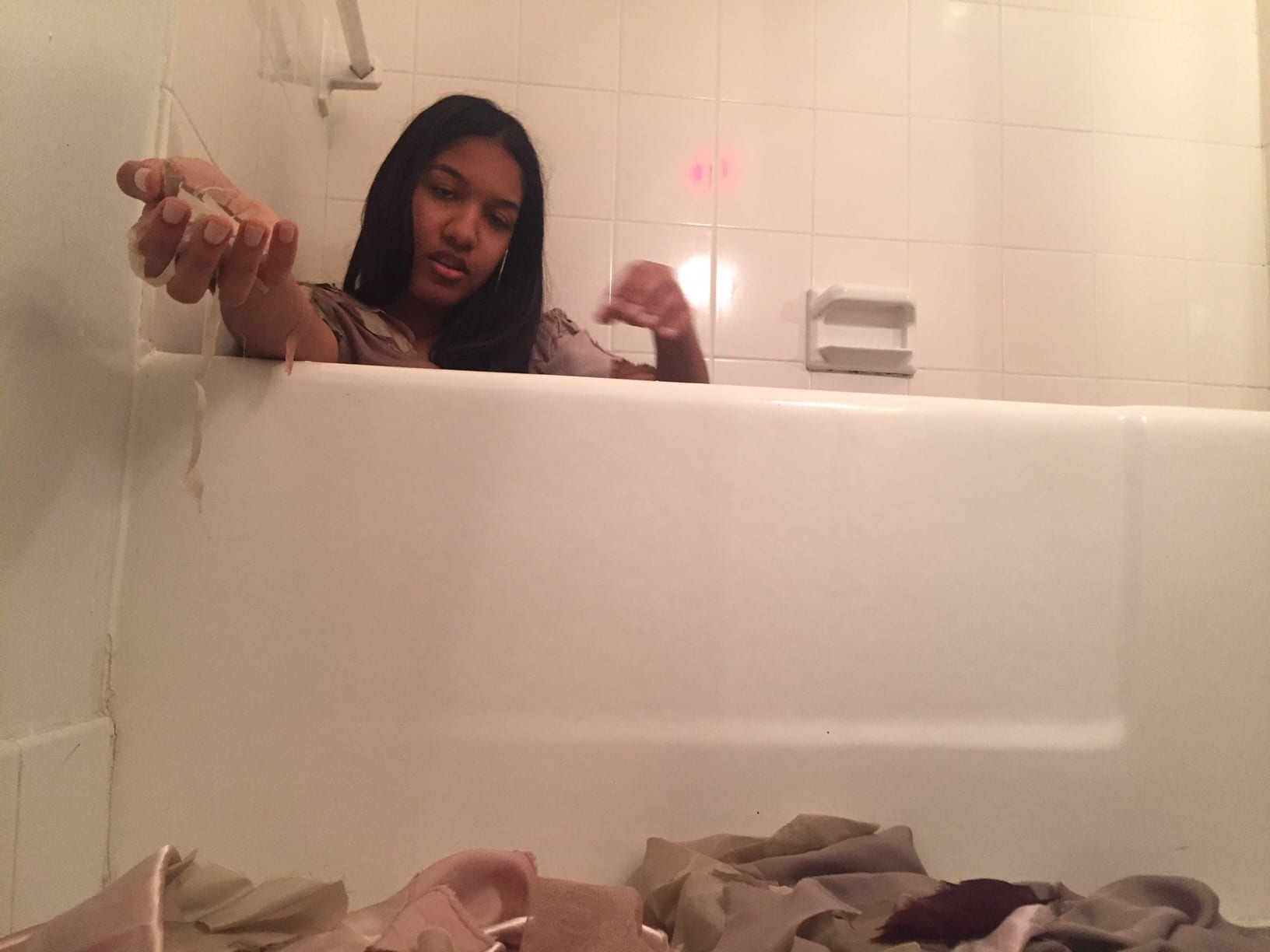
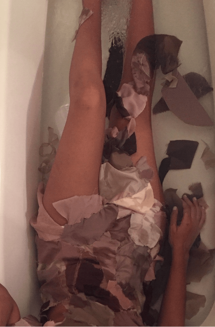
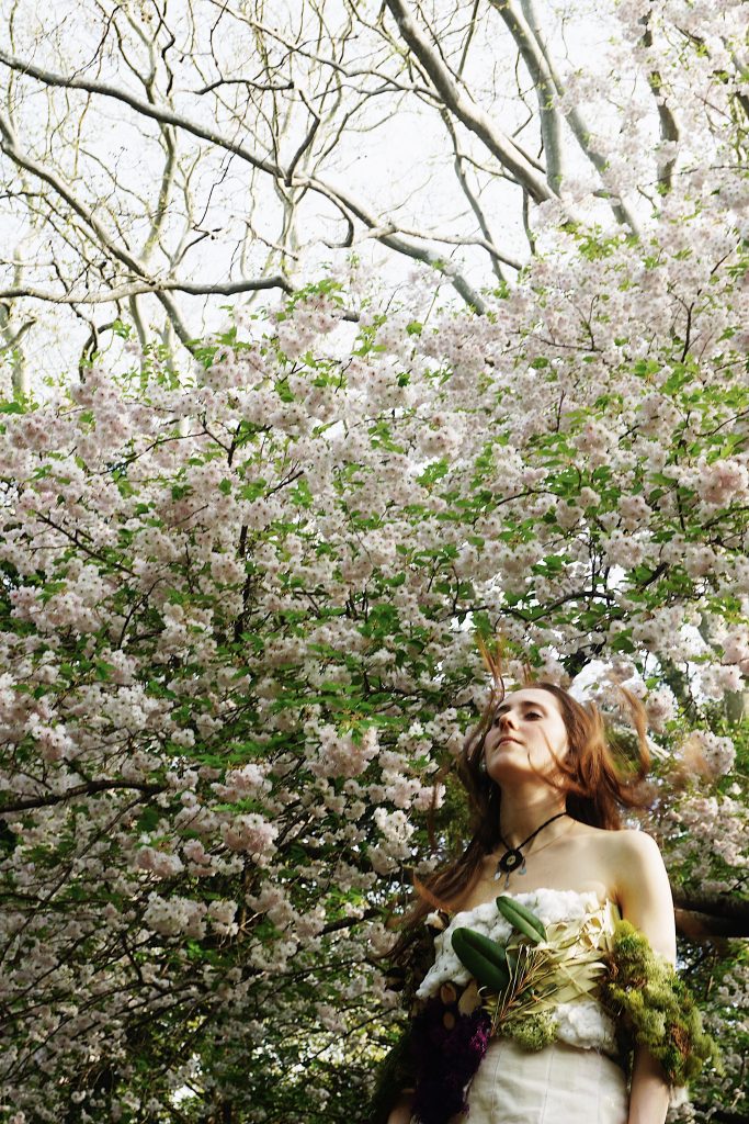
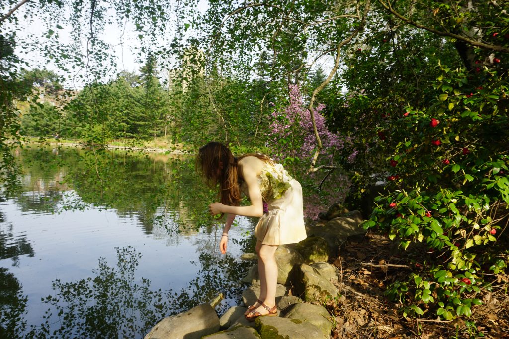
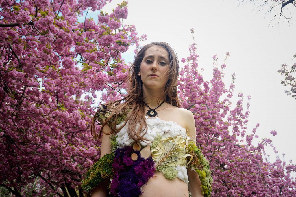
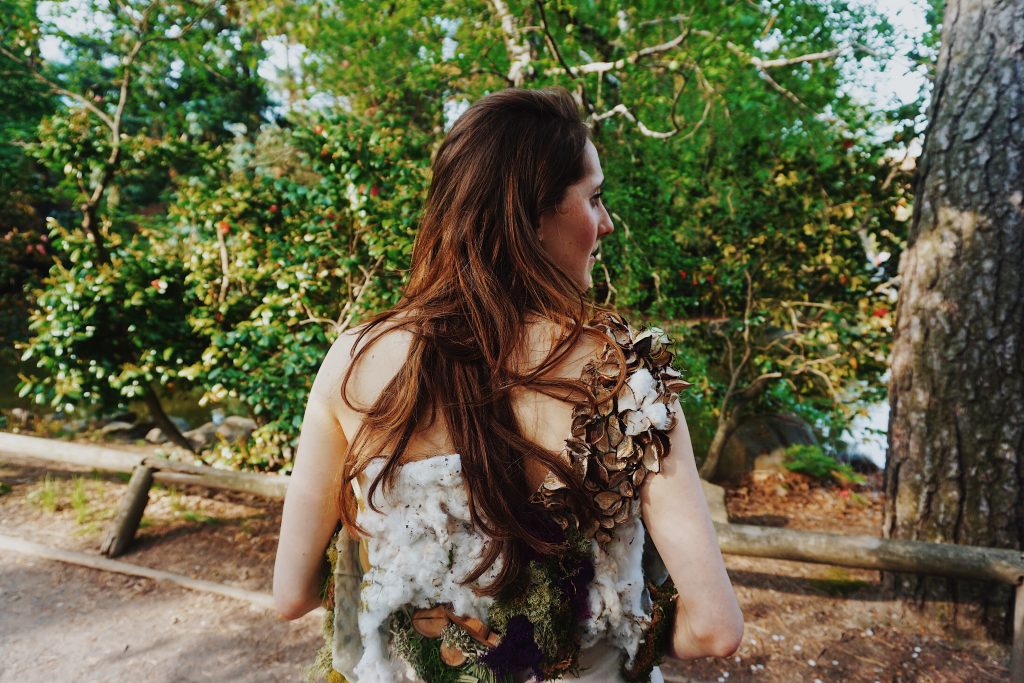
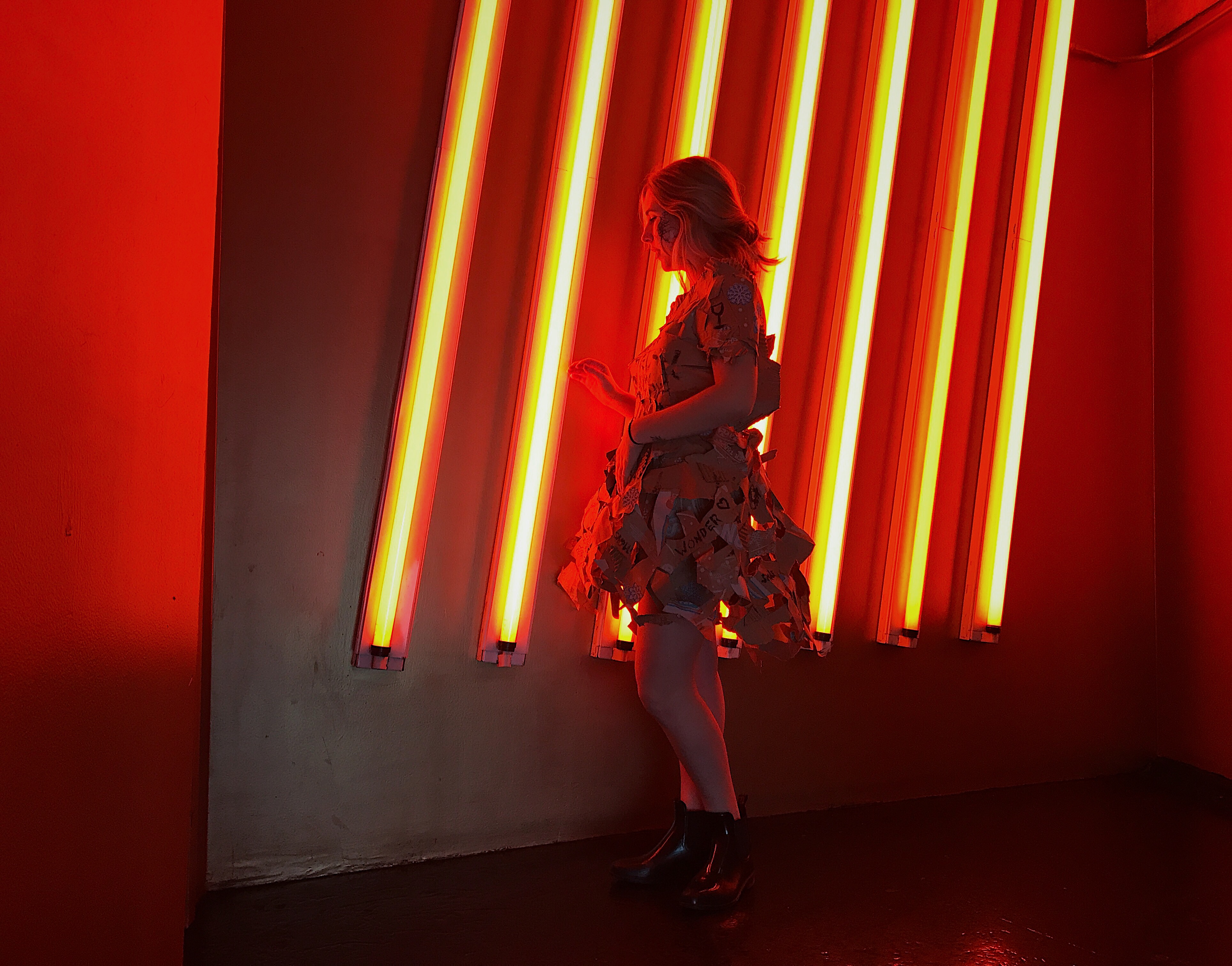
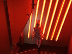
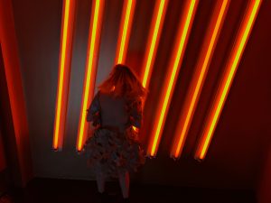
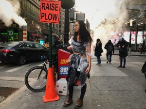
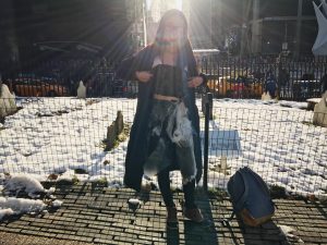
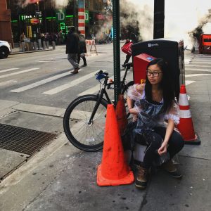
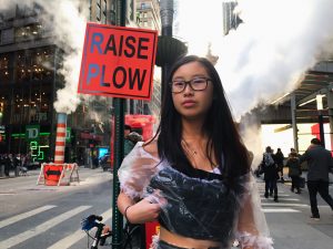
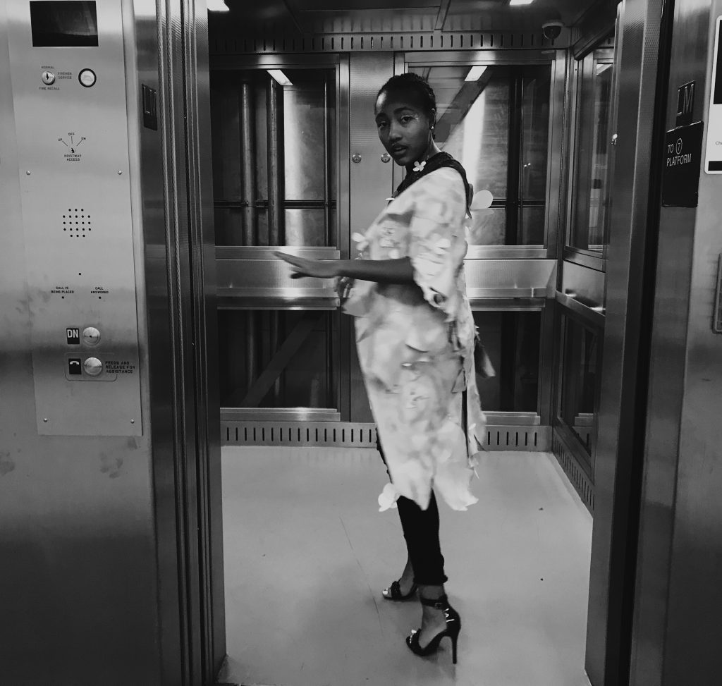
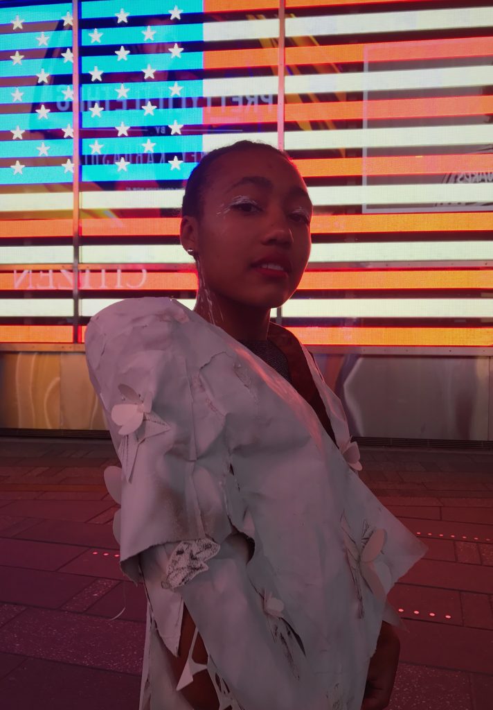
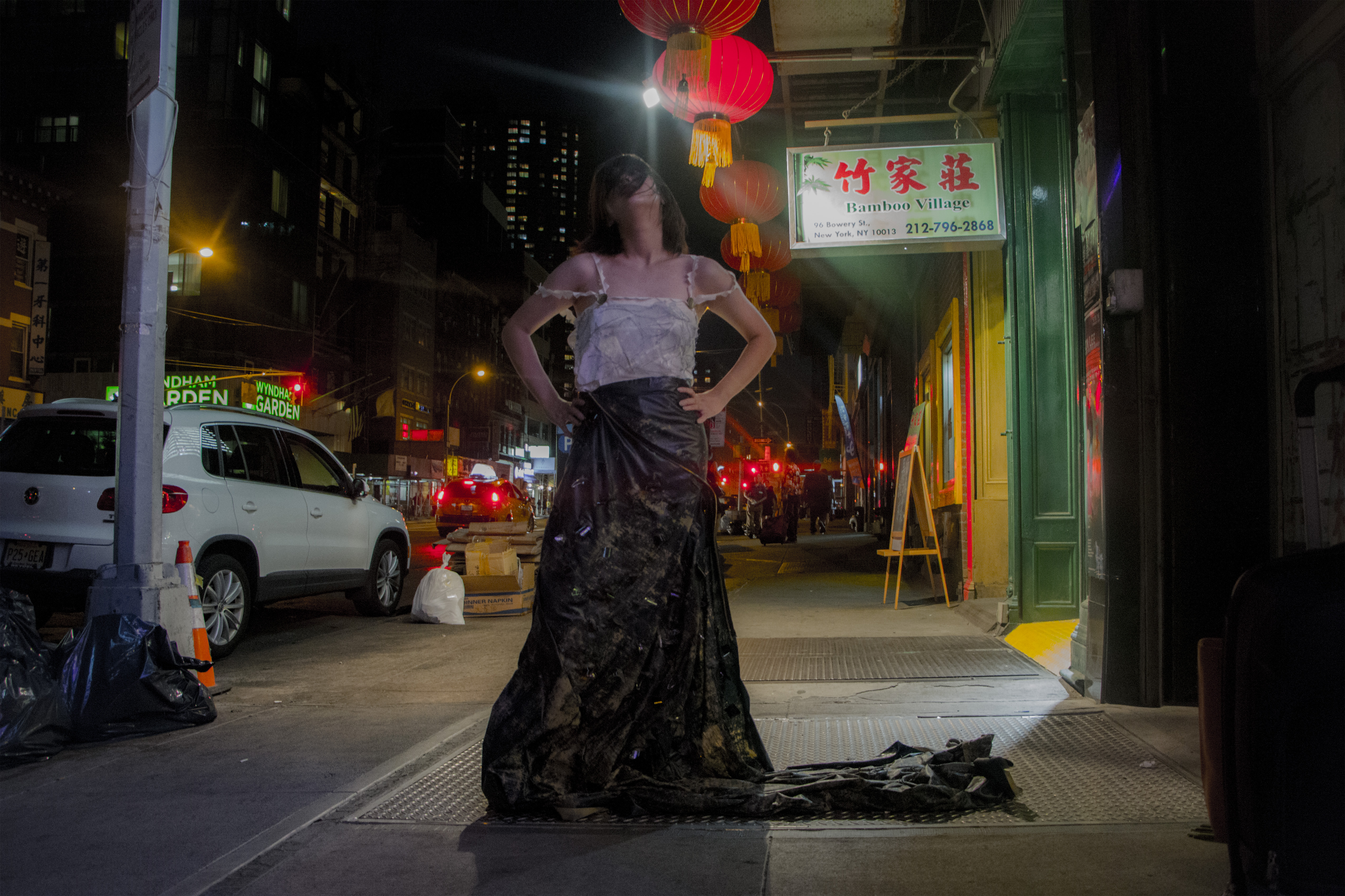
Photoshoot
. . .
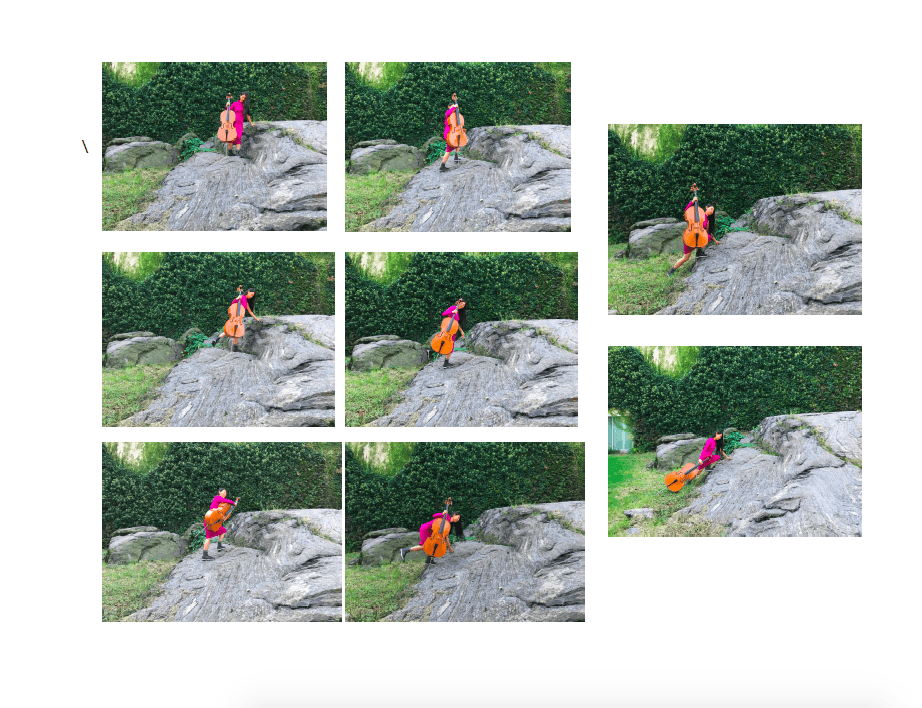
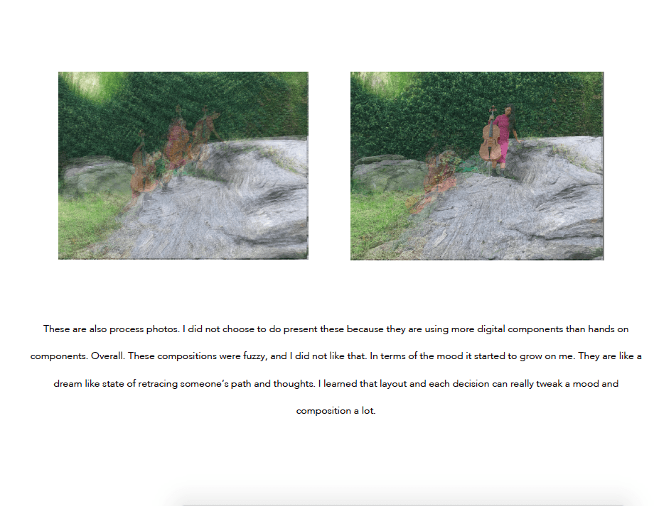
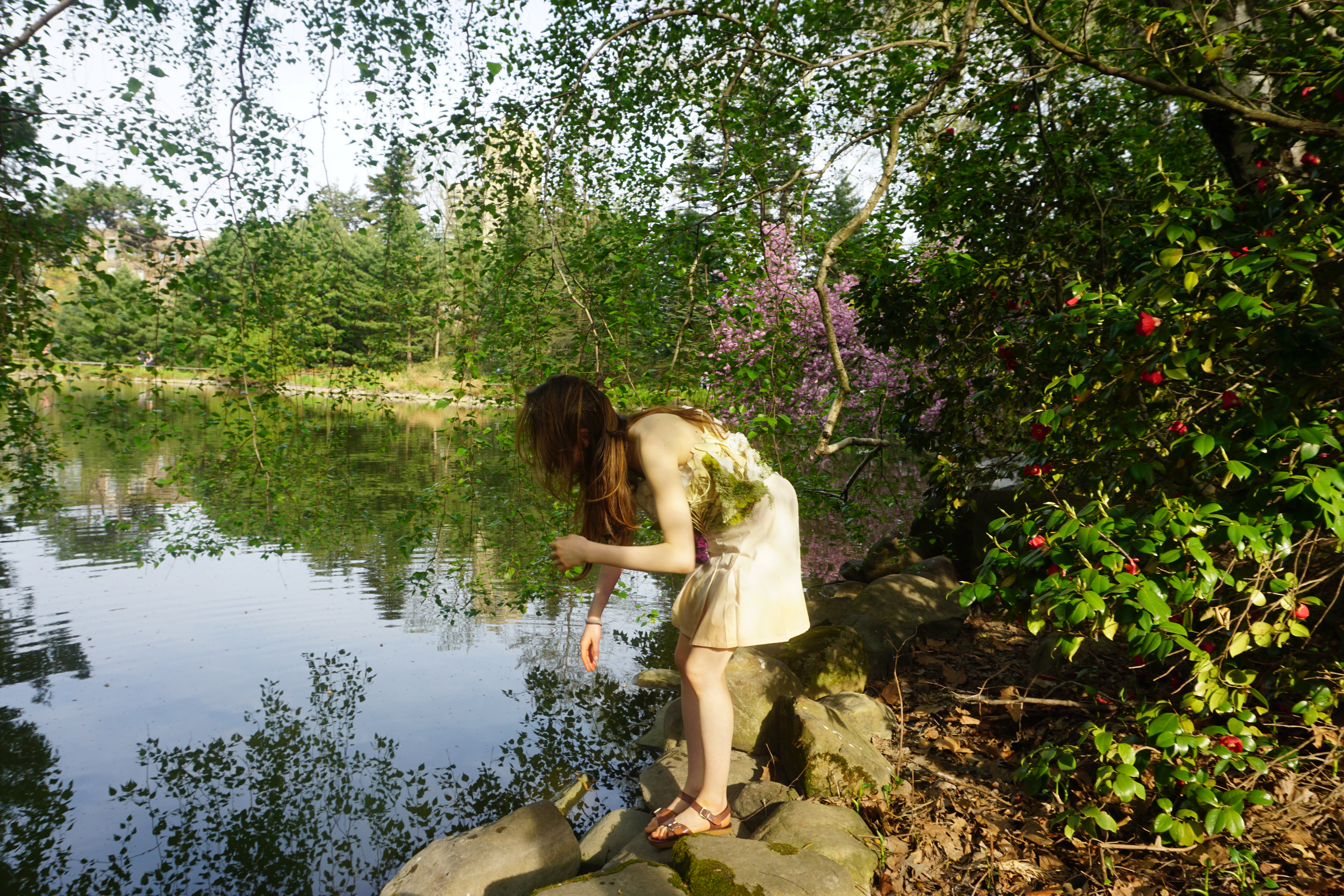
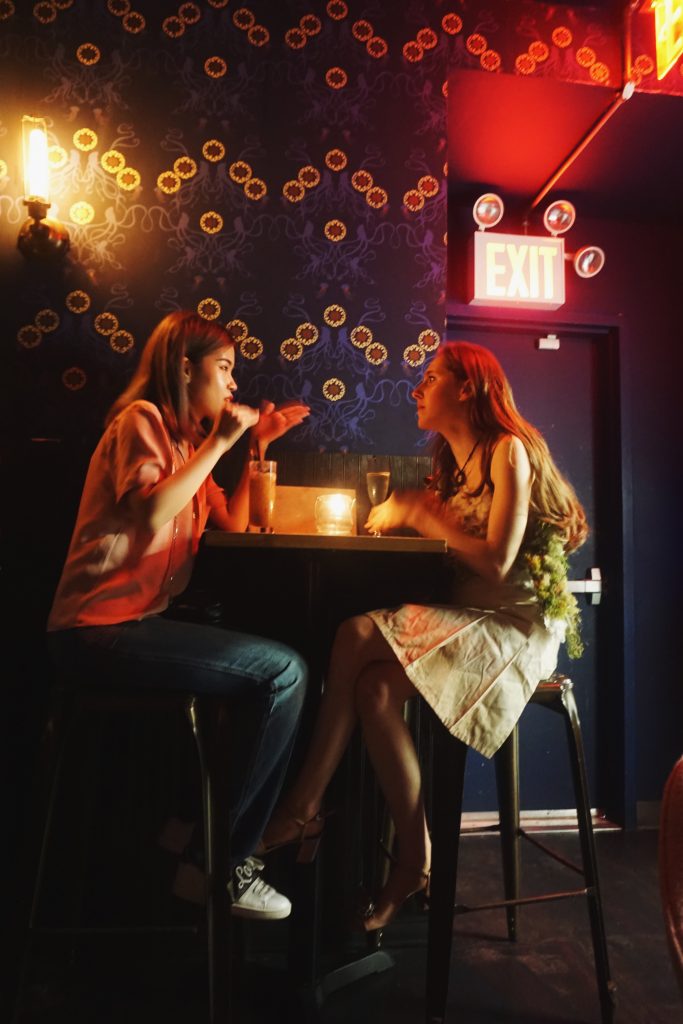
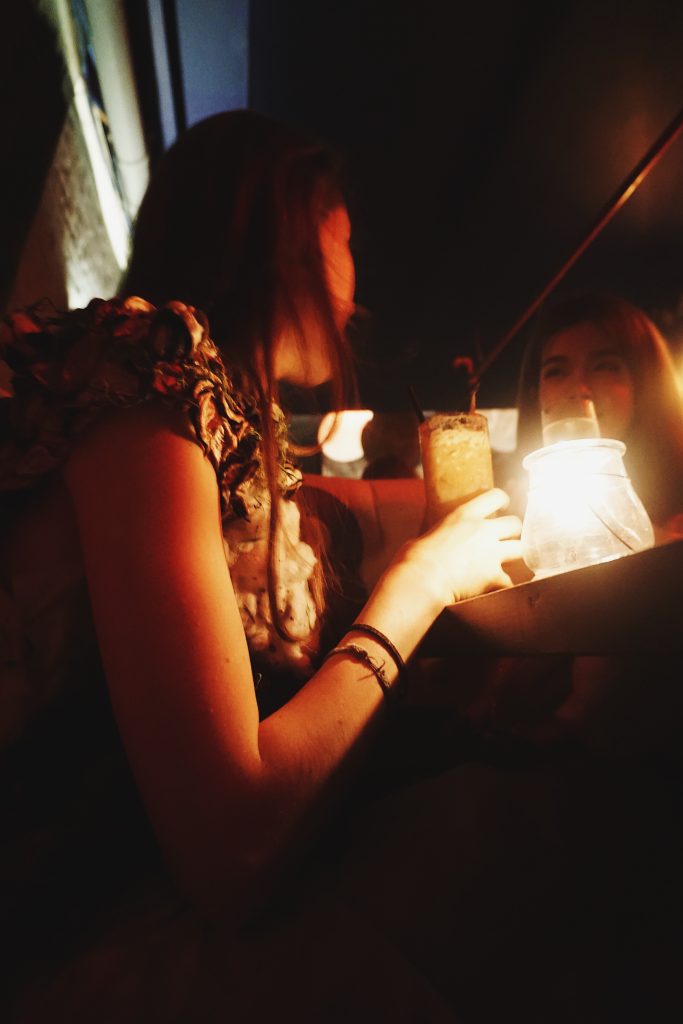
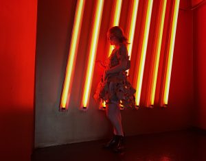
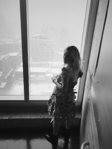
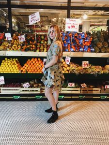
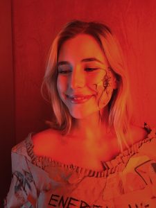
The idea of looking into the mirror and staring at yourself so long that you know and don’t know who you are so that you are staring into your soul tied to the manipulation of organs was the inspiration. We tried to play with the red light. In the beginning, we started at Central Park. It was beautiful there, but it did not fit the mood.

Final Story

. . .
This garment taught me new techniques that I could blend into my own ways that I enjoy creating. This project in creative tech proved to me that I can learn the technique and twist around the traditional ways of creating while using fabric that can be worn. Most of my previous garments had been made out of materials or had been abstract structures that are not applicable to everyday wear. This really has given me new ideas on how to approach technical wear while meshing only one of a kind motions.
Intertextus ~ 1st Year
What makes something a certain something within that category?
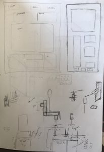
Personally I feel that the term bench has been put into a category that when thinking of ideas that fit what a bench is, what does that really mean? The idea of design that can be used to help others is to rethink and continue to refine. So when thinking of designing a bench, I tried to wipe out the idea of what makes a bench a bench and instead was trying to solve a problem I noticed in public spaces.
In everywhere we go we are passing so many stories in motion. Some of these stories we hear and others we don’t. With this in mind everyone is different, especially with the way they interact with the way they see the world, and feel comfortable in certain situations. Within all the designs I had in mind was this idea of making a place for most people’s comfort levels, and the piece being sustainable (in material and helping the environment as it was in place).
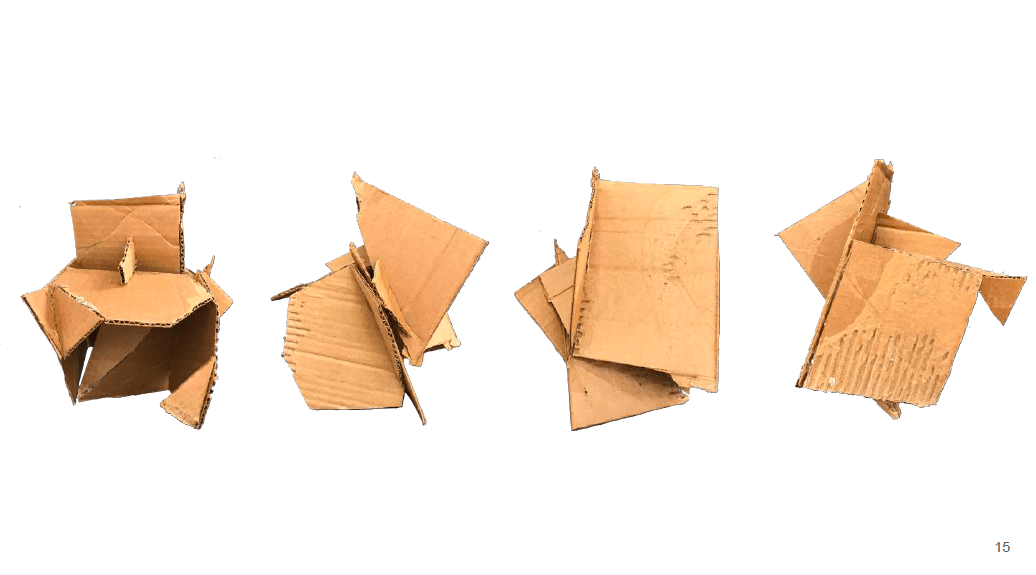
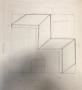
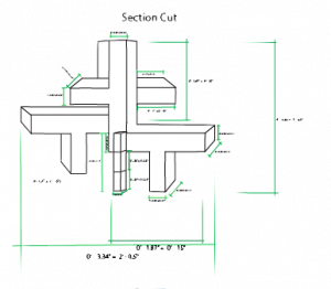
The three ideas I had was:
- creating a foldable hexagon on two sides so that it could fit as many people as possible, but there could be a rest for the back if there were less people who wanted to sit for that moment.
- a canopy on the rails: something that would integrate the water while transporting the viewer
- customizable sitting space that can fold both ways
The design I decided to pick was #3. This idea came almost immediately to me. A bench that can come together but the user can decide for themselves where they want to face, how much they want length to add to thier bench, and it not taking to much space. Therefore the person can fold it, this can change form thus a new look of sculpture each time, and and it is easy to pick up the trash and keep the environment clean. The idea of making something shared your own, but doing it as a community at the same time.
I wanted to put this design to the test beyond school, so when Nick mentioned that there was a seat seats completion in Portland I thought that was a good opportunity to see if this could help people and the environment in a public setting. Getting feedback of not making it to any round would tell me to keep refining and thinking of ways to better the design is helpful to me.
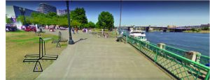
The streat seats competition is to create a sustainable bench for the area around the World Trade Center in Portland, Oregon.
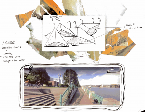
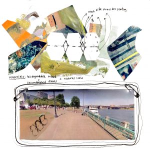
I am from the West Coast, and also know a couple of people in the area of Portland. The lifestyle is super laid back and merging with so many new kinds of ideas. As well as the environment being a major factor of thoughts. When I saw the park and water this gave me the idea to want to use biodegradable wood as a material with a plant glaze to protect the wood, release toxins away and bring more oxygen. The glaze could go on every year with the plants that are getting tossed out when there were done with decoration in the World Trade Center. I also wanted to incorporate air plants into the planter attached to the bench that way there would be less watering to be done. Especially since it rains a lot in Portland, therefore saving energy, resources, and money. Water conservation is something we take really seriously on the West Coast.
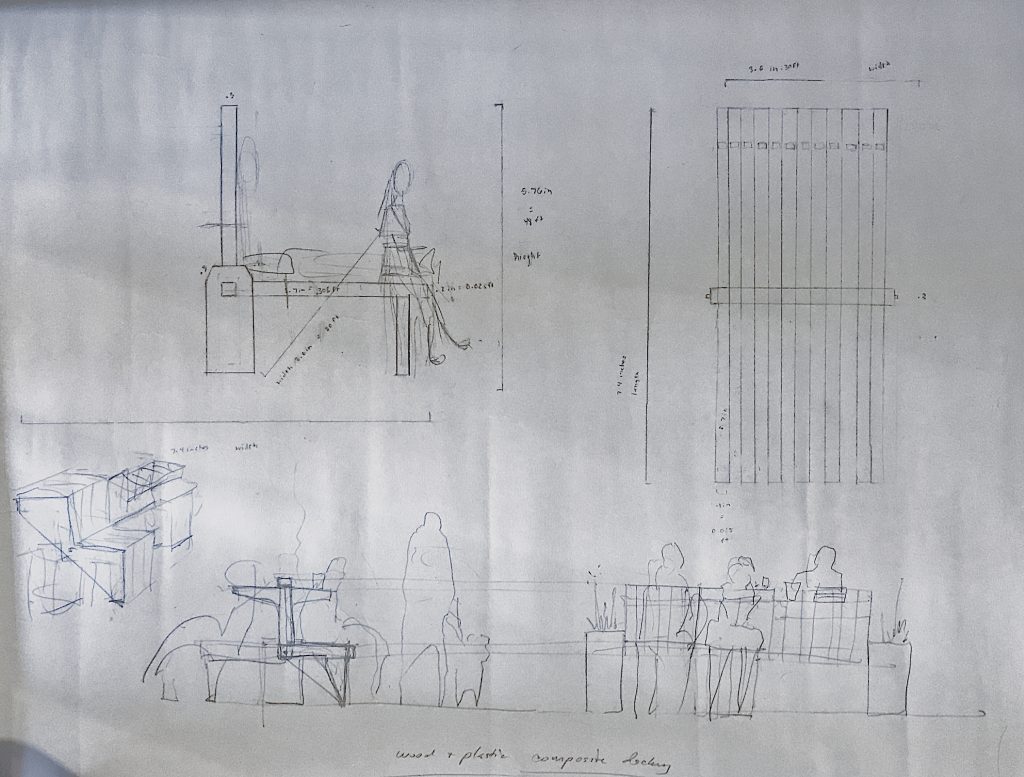
In terms of drafting and making models.I first found pictures of the site and put a piece of plastic and drew my idea over the plastic. That way the viewer can flip back and forth for what the site will look like with and without the bench. Also there are drawings to show the attachments, and colors that evoke and designate with an earthy and West Coast feel.
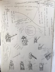
-
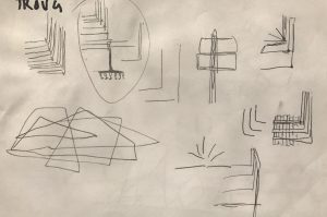
- brainstorming ideas: a flexible structure that has pockets on the sides so that people can place their stuff there. This would hang on the rails. Including the rails right on the water.
-
- brainstorming ideas: an octagon that can fold up and down. Each side provides seating, thus being able to provide space for many.

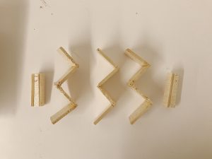
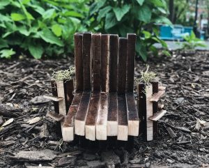
it is hard to see since this was scanned but, the bench is in the middle of the circle of flowers
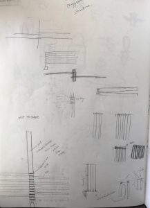
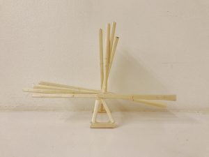
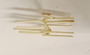
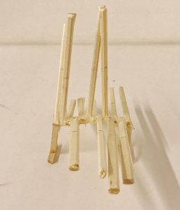
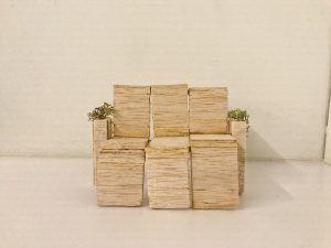
Model 1)
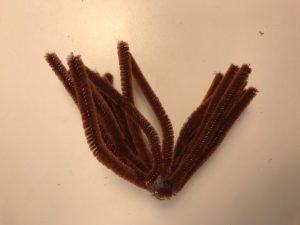
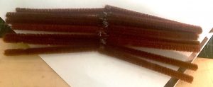
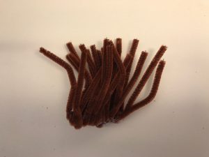
I first started to construct a model with pipe cleaners. That was not smart. I thought since they could bend this material would work to show the way the user could manipulate the bench. This did not work at all and it doesn’t even look like a bench. It looks more like a shaven puppet mustache. I chose the color brown to show that the material is wood, and the pipe cleaners where glued together.
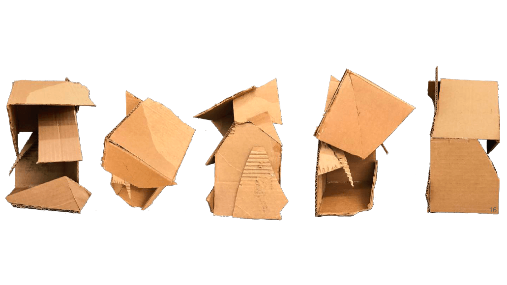
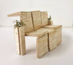
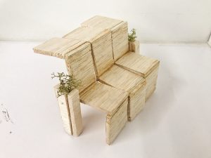
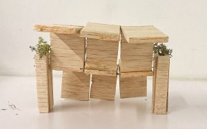
Model 2 + 3)
-
- brainstorming ways that elements to the bench could change shape and more seats could be added onto the original design
-
- thinking of ways to connect the wood without a bar or any element becoming visible
-
- drawings of planters and the wood to think of how to incorporate plants and personal marks from the people of Portland
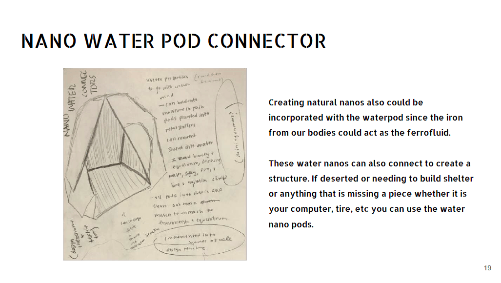
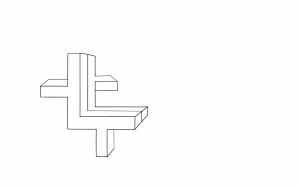
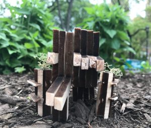
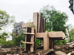
Model 2 is connected by glue to start drafting how upright the bench would stay and start to rotate. The triangle that stays the same in both models would hold books and work as part of what keeps the bench upright. Actually the idea that the planter would help keep the bench upright stayed the same throughout the whole process, just the way it looked changed. Model three was connected by magnets. The magnets that I had used where not strong enough, but I know it would work if I had bought stronger ones. Also, just a note, but nanos might work as an alternative binding system. This way I can achieve my goal of having no pin, or rod showing and going between, to really make the entire bench look vertical. As well as people adding to the bench more easily. Nanos are small pieces of iron that are in the fluid form called ferrofluid. Model 3 also has my idea of adding carvings and texture/patterns from local artists while being able to hold airplants where model 2 does not.
-
- side
-
- top view
-
- front
-
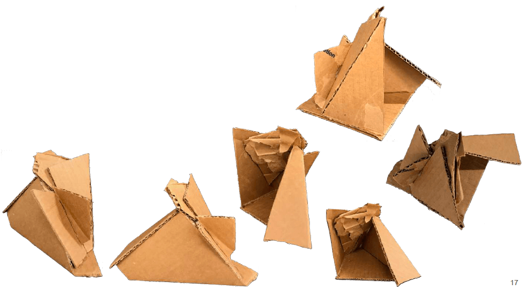
- This was a repeated sequence that would replicate the model above. All the pieces were tossed before documenting. The base also was the same to the other model. The only difference in this model is that I burned the sides and used magnets.
-
- I also experienced with forks to learn how the bench could pivot and potentially work as a puzzle piece. I cut the fork ends: some pieces were quite long, and others shorter from the rest. I found that they held different forms as well.
add other drawings here
-
- side
-

- front
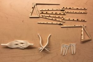
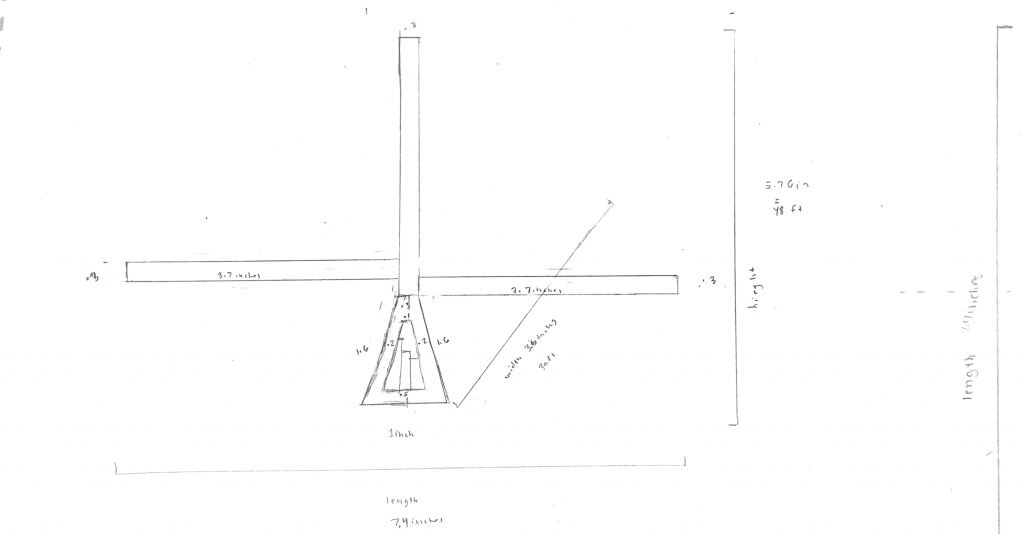
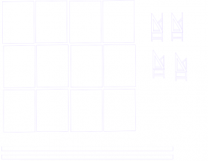
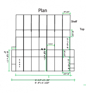
Models 2 and 3 use the same scale and format. 1 inch = 1 foot

These are the collages with the drawings of the bench and Tom McCall Waterfront park.
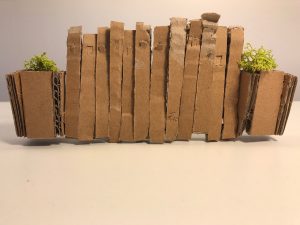
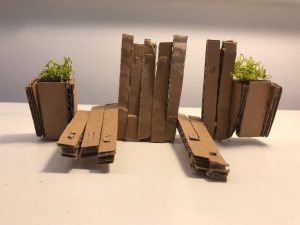
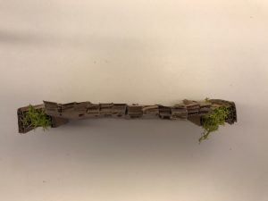
Model 4)
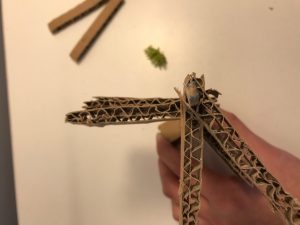
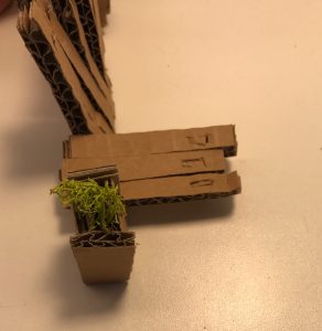
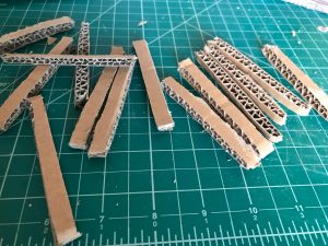
I decided to make a sketch model to get ready to use the wood with the cardboard. I created 12 strips of cardboard and connected them with a wood stick within the space the cardboard had. I did not need to use any glue for this piece. I thought that the holes could do the same thing the magnet bench could do which was the ability to add more seats, and the seating to be moveable to different locations. The holes could also act as a space for storing small art plants to incorporate into the piece. Also there is a flap on both sides of the strips that fold down as a shelf for the user to have if they want to set something down. The design of the planters were to generic for me, but this shape worked as a base.
-
- top drawings are mine and the bottom drawing are Nick’s (professor). Nick helped give input and shared his inspirations to help the design be able to interact with the user.
Model 5)
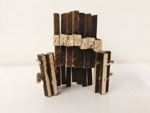
For my next design I was going to use the laser cutter but it was all booked. I instead choose to use balsa wood, but was not crazy about having to use it as a material because of how soft the wood was. The reason why I chose it was because I had not had a wood shop orientation so I thought I would have to exacto and ulfa knife the model. Also, I thought it would be easer to stick wire and pins through. I did half of it in ulfa and exacto knife till I realized that maybe they would let me use the hand tools. They did! I also learned about the direction and grain of the wood. I am glad that I spent over 6 hours gluing and cutting this time because I learned new techniques and about patience in a new way.
I used gorella glue, pins, and wood to construct this one.

-
- contemplating measurements: I was inspired by the everyday chairs we sit in.
-
- hard to see because it is in the format made to be ready to cut
-
- hard to see because it is in the format made to be ready to cut
I did so many Illustrator variations of how to get this piece cut out in one slice. This took me full days and hours, but I finally figured it out. Those drawings are not here because they kept being altered.
-
- rethinking the material of wood and how to rethink the way a planter can work
-
- poster layout ideas and ways for the bench to stay up right and supported
As mentioned I started to rethink the idea of using wood into creating a whole new material. But because of time for the project deadline and research I did not have time to do so, but for the future I think this would an interesting concept: the use of algae in a mixture with wood pulp, reused plants, and maybe even food waste.
Algae can be used to make bulletproof glass and is used in would dressings. This is a really strong natural material which contains nanocellose. Nanocellose is also found in food waste, most plants, and wood pulp. Wood pulp is wood fiber that has been reduced chemically or non chemically into pulp (used in paper manufacturing). Using the non chemical method would be beneficial to our health and also to the environment: when producing the bench, as well as when it is in it’s place. The reason why I want to stray away from plastic, even recycled is because of it’s toxicity and if someone touches it and puts their hands into their mouth, thus digesting it, that is dangerous. Also because it is sitting on the skin, or even when its being produced the pollution seaping, it is not safe. Making a glaze and healthy material is where we can start to combat this, and through plants they decrease toxins and release lots of oxygen. What if making production and something being in use can double up and start to help make positive impact in multiple ways?
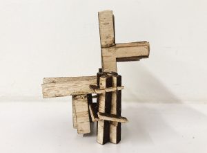
Model 6)
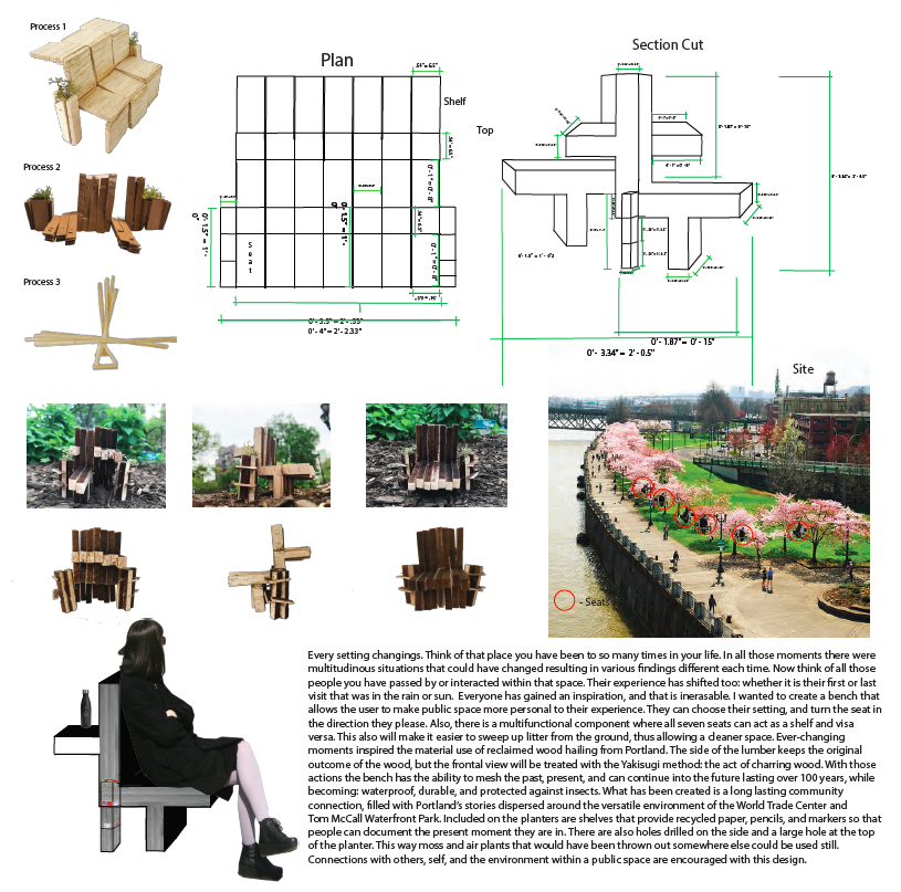
I went to laser cut with my file and drawings to cut the wood in the desired shape that I wanted. I had a more elaborate idea for the planter but it had too many details and caught on fire… There fore I altered the look of my planter and added shelves to the sides since I was limited on making it longer and wider due to competition restrictions.
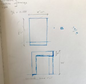
These are my final plans, elevations, an drawings:
-
- all reclaimed wood with no Yakisugi method
-
- with the Yakisugi method applied to the front parts of the wood, the sides of the wood do not have the method applied
The Final Model:

The Poster:
My video:
Final right up t0 describe the bench for the competition:
Every setting changings. Think of that place you have been to so many times in your life. In all those moments there were multitudinous situations that could have changed resulting in various findings different each time. Now think of all those people you have passed by or interacted within that space. Their experience has shifted too: whether it is their first or last visit that was in the rain or sun. Everyone has gained an inspiration, and that is inerasable. I wanted to create a bench that allows the user to make public space more personal to their experience. They can choose their setting, and turn the seat in the direction they please. Also, there is a multifunctional component where all seven seats can act as a shelf and visa versa. This also will make it easier to sweep up litter from the ground, thus allowing a cleaner space. Ever-changing moments inspired the material use of reclaimed wood hailing from Portland. The side of the lumber keeps the original outcome of the wood, but the frontal view will be treated with the Yakisugi method: the act of charring wood. With those actions the bench has the ability to mesh the past, present, and can continue into the future lasting over 100 years, while becoming: waterproof, durable, and protected against insects. What has been created is a long lasting community connection, filled with Portland’s stories dispersed around the versatile environment of the World Trade Center and Tom McCall Waterfront Park. Included on the planters are shelves that provide recycled paper, pencils, and markers so that people can document the present moment they are in. There are also holes drilled on the side and a large hole at the top of the planter. This way moss and air plants that would have been thrown out somewhere else could be used still. Connections with others, self, and the environment within a public space are encouraged with this design.
Describing the design process for the competition:
It is crucial to incorporate and research multiple subject lines from many resources when trying to solve a problem, instead of just fully relying on ourselves as an individual. For little over a month, two days a week I would ask classmates from various disciplines and professor who is an architect to give me feedback on my design. I also read many books to learn what factors can make materials and catalysts within chemical reactions dangerous. Through this I started to see how we can implement sustainable methods that can help better the environment as well benefit design. Woodshop technicians, people educated in sustainability, a wide range of the public, chemists, fellow students, florists, and various professors I spoke to. I learned some materials that are sustainable, how design can help people, and how to feel connected to an experience within an ecosystem I have learned a lot about patience too. The first idea you have may not be the best answer to solving the problem. It can help become a starting point inspiration, but there are many factors when formulating that idea. Lots of trial and error occurred. So many models and drawing for measurements, ascetics, and sustainability was being thought out. Also, for plants I was thinking of what can decrease toxins from the air, good at insulating, release a large amount of oxygen, do not need soil, and can thrive in a moist and hot climate. I found that thick air plants and moss fit those criteria. I also tested different materials: chopsticks, cardboard, and balsawood planks. Figuring out a way to get the bench to rotate, and work as a shelf and seat took some time. In the beginning, my designs had no shelves included, but the idea of bench being manipulated in two directions stayed the same. Towards the end, I realized that I could cut out the seating/shelf panels and planter panels into one piece each so that each individual section can be bound by pins to connect the bench. In total there are three shapes: shelving on the planter, pieces that make up the bench, and the planter. This realization came when I figured out my final drawing and laser cut it out. I feel that this can make it easier to waste less material when using reclaimed wood. More of those panels of the bench can be added or eliminated from the existing design to create more or less space for an area. As well different shapes in layout the bench can take start to create different shapes then just being in a straight line, depending on the area and need for the design. The way the pieces are designed do not even need written directions because the image is speaks for itself so that it can be universally understandable to figure out how to construct the bench. That also relates to the idea of how public space raises senses to see intertextus within an ecosystem.
Reflection:
This entire project was a challenge for me. When it comes to technical 3D making it is not my most brushed up skill. This process taught me to be more patient, to learn how to measure more, and disciplined me in another way to make a 3D form. Installations is something that I love, but I wanted to challenge myself in learning how to make a bench. Not just making a bench but something that can serve an simple everyday function in a public space (functional in public space). Function and usage can spread messages and is another way of reaching out to others (whether they know it or not). I think it is easy to overlook fonts, that is one for example, or in this case stereotypical seats in a park. The idea of not creating a stereotypical bench, can also teach me how key into another realm of design that is functional. Because if there is ever something I want to showcase that might be best done that way it is important to be educated in it. I also figured, since our professor Nick is in architecture I thought the bench would be a good way of learning more different techniques from him and to see design as a whole in a new way. The competition was a plus because it gives the chance for the design to help others within a physical reality standpoint. The process of talking to the class and showing our designs was a new experience and cool to see how everyone formulated their ideas and kept building throughout the weeks. Awareness about how people interact in public space in terms of design feel like I cannot go back to looking at public space/design the way I did before. Its been cool to build ideas from other subjects and mesh them into this one to create a design that helps the ecosystem and environment. Overall a good experience.
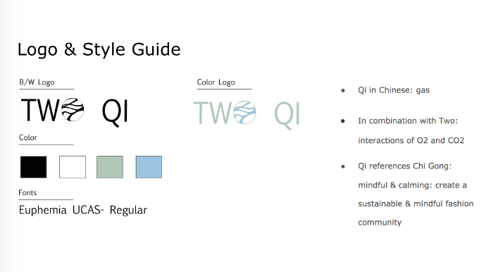
sym·bi·o·sis ~ 1st Year
The first day Harvest handed us a list of questions were the class would go around the room and see who matched. I remember it had to do with writing and fashion. Most of the class was a fashion major, and I remember how easy this simple getting to know you assignment was. I honestly could only relate to the writing themed ones…. And I was probably the only one who marked those boxes. At that moment I was excited to learn more from my professors and classmates. That for sure happened this semester. I have not experienced such a class full of students who all go above and beyond. Just cause they have to, but because their passion drives them. On top of that they are all so incredibly talented, and I feel so lucky to have been able to work with them.
Our last project I felt that our team clicked ideawise in a vision. It was so much fun to collaborate with them! Not only that but our seminar papers happened to be similar to each other, so we also grew more in studio as well as in seminar. Our research and garments grew more because of how tightly connected our discussions and process every step of the way was. Our vision didn’t always match 100%, but that is natural. This helped push us to grow as artists and make our design more versatile for everyone. We wanted to help better the environment around us, and raise awareness. Sustainability was quite key to us.
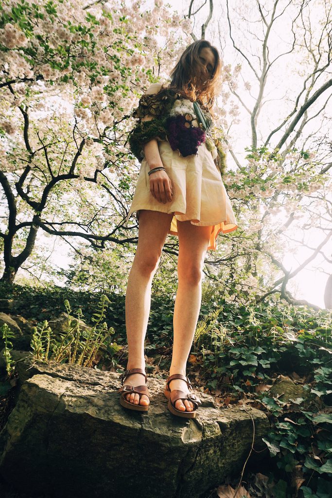
This video with the skirt, shirt, and pants was filmed by me, the caplet was filmed by Bella, and the film was edited by Zihan.
A segment of our mission statement:
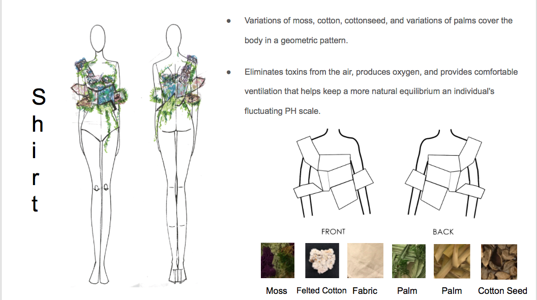
Confronting with one of the world’s most crucial topic sustainability, our fashion brand Two Qi wants to alleviate the negative impacts to human bodies and the environment induced by:
– non-renewable materials such as cancerogenic synthetic fabrics
– chemical and wasteful proceeding of materials such as dying
– unsustainable business strategies
– inappropriate consuming habits
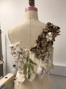
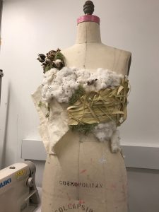
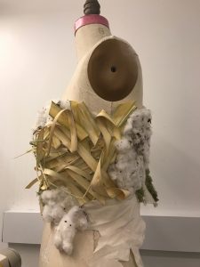
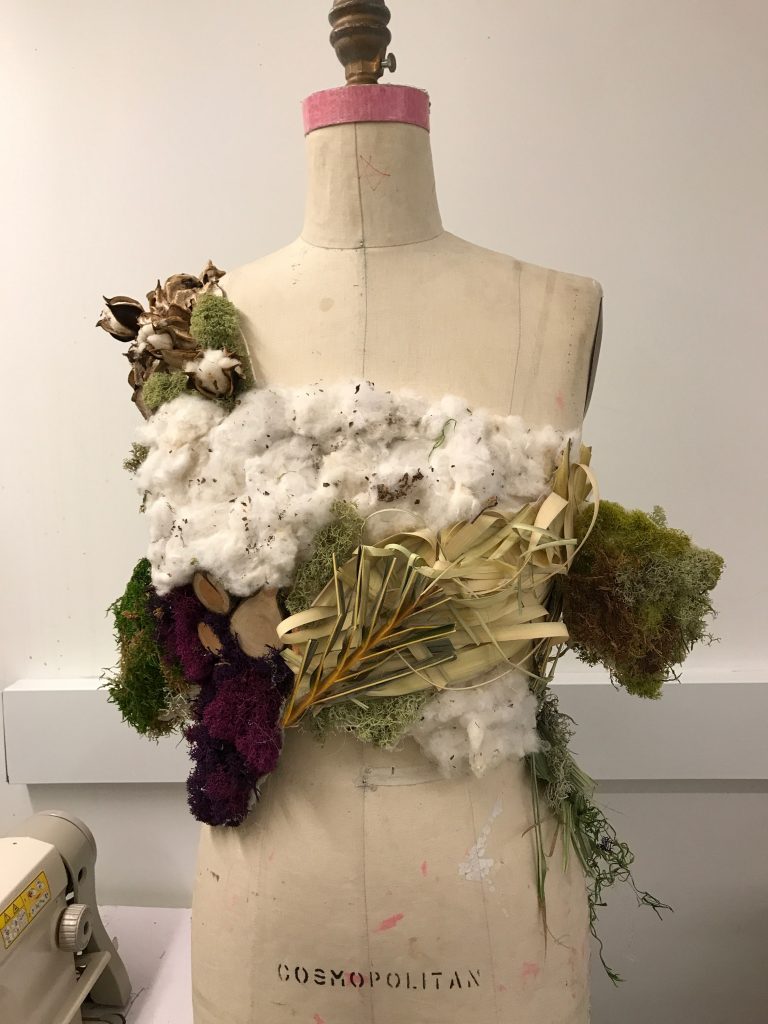
The materials and fabrication of our garments are 100% natural and use the least
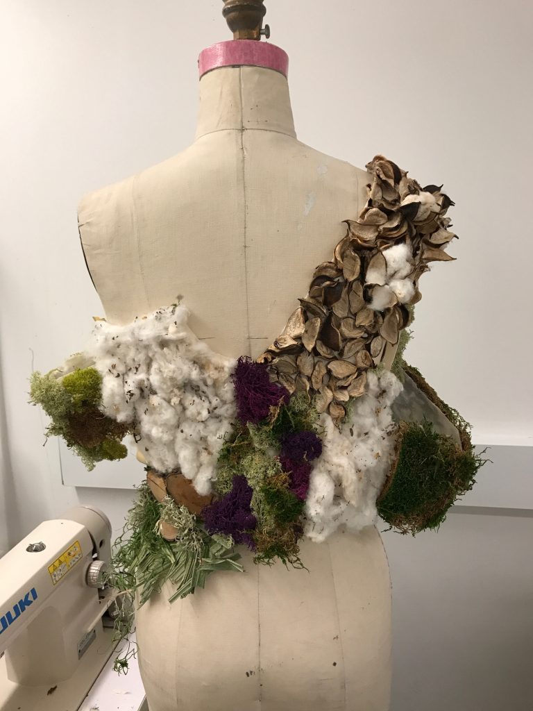
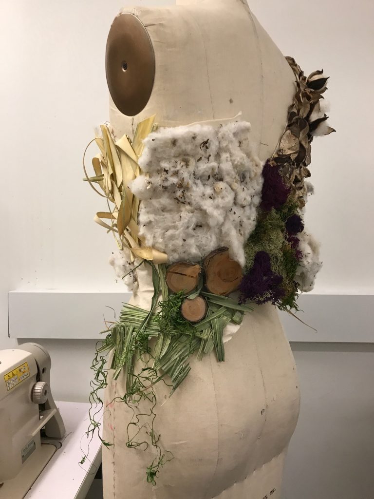
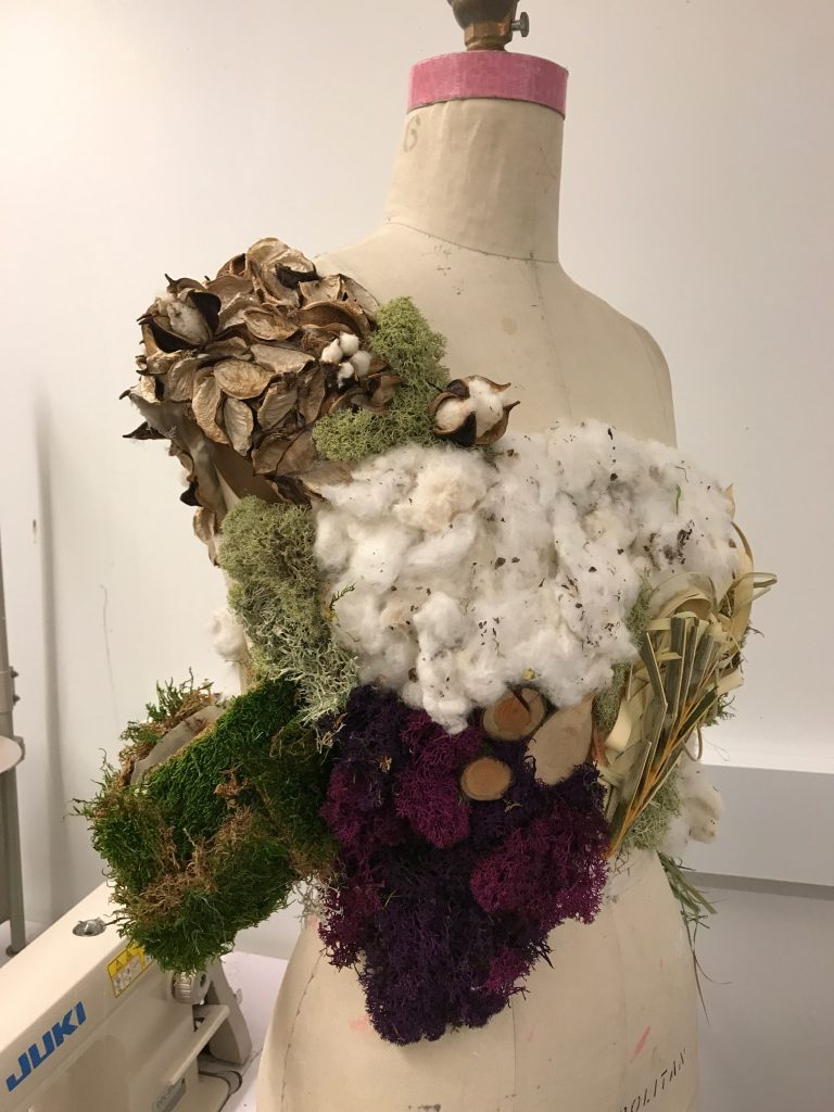
amount of energy possible. The textiles are based on palm leaves, raw wool, moos,
organic cotton, pressed leaves, air plants and wheatgrass. Compared to synthetic
fabrics, which cause cancer, mental diseases, asthma, allergies and autoimmune
diseases these materials all have healthy benefits. By using onion as a way of
natural dying, moos, pressed leaves and O2 producing plants we actively save
energy and decrease the CO2 household on our planet. To close the production
circle the garment has a second purpose when the customer doesn’t want to wear it
anymore. This means it becomes a decoration for the apartment, food or cosmetica
( Aloe Vera as a body lotion) . As a last step, people bring the reusable parts back
to our company and compost the rest. Longliveity in symbiosis with nature.
Our contemporary society is occupied with the fast pace of living such as
productivity, development, and efficiency. This penetrates also into the fashion
world: people pursue profit-oriented fashion marketing and day-to-day changing
outfit with attributes like new, updated, and fresh. Consequently, our company
would like to establish and redefine the sense of steadiness, persistence, and
carefulness through fabrication and design. Our brand will follow the habits of
observing and making decisions in a long-term perspective to inspire others. Our
brand is all about enjoying life embracing taking the time when living a busy
lifestyle. We strive to make a connection with each individual interacting with the
garment. Not profit oriented.
Our logo:
In summary:
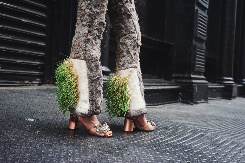
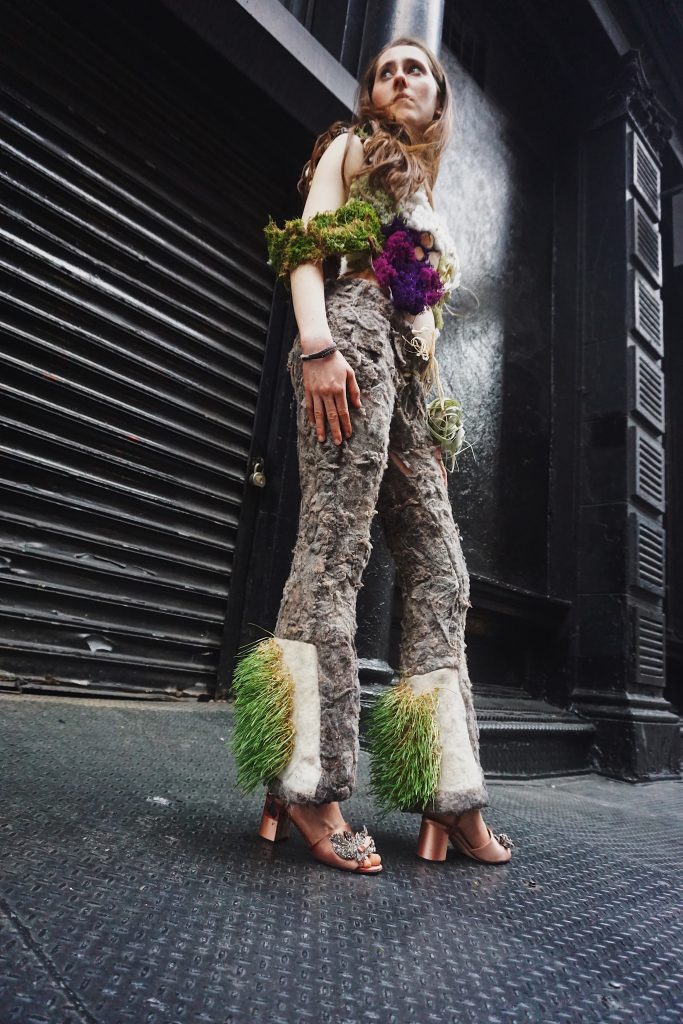
- Meret handfelted wool and grew wheat grass on her textile.
- Zihan dyed her fabric with veggies
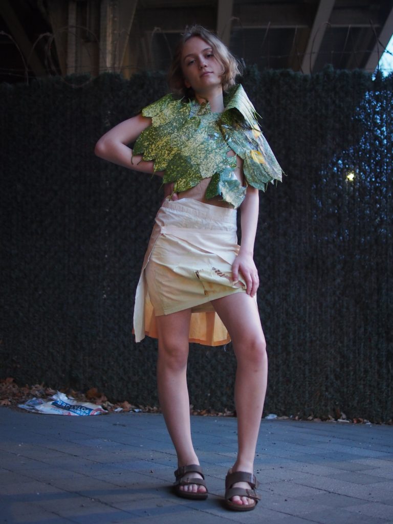
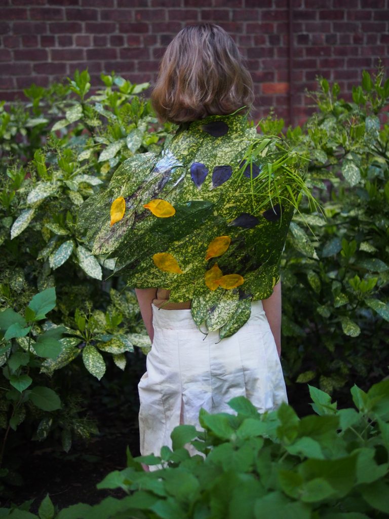
- Bella made a caplet with leaves
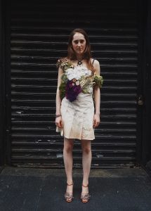
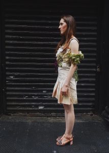

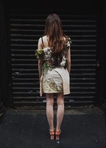
I made a top out of plants and reused fabric lining. I thought that this tied in with my research paper because plants are natural and they are safe on our skin. Chemicals that are harmful to us such as synthetic fibers that we are wearing today are not. Rethinking that idea is important for our health as well as for our environment. Enzymes are the catalysts between a chain reaction and when thinking of the fabrics we clothe ourselves in and the changes in the environment constantly happening our PH balance is shifting consciously. The choices we make include our environment, and affect not only the climate but our ecosystems. As well as social aspects and the bodies of all creatures including humans. Chemical balances from nature have an effect on reactions within our body and outside of it. The two work together whether they want to or not. We can learn from previous situations to apply new innovations and problem solving into today’s world. That is what we started to do as a group and as indviuals.
Our presentation: https://docs.google.com/presentation/d/1aiSeCsQZMH3MBXO3E-52wkHsLFYh9k3hXIadXqFQkao/edit?usp=sharing
Our website:https://2twoqi.wixsite.com/twoqi
Making the garment:
-
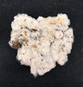
- hand felting the cotton
-
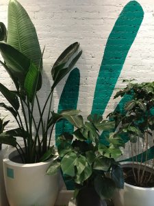
- researching plants around the city
-
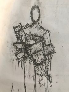
- starting to sketch a lot in order to figure out how to build the design
Final outcome:
The photoshoot: I took all the photos of the shirt, skirt, and pants. The caplet photos were taken by Bella.
I am going to continue to further my research as well as implement the idea of nontoxic chemicals and finding other resources to use when making and for others whether it is in clothing or anything else to help the ecosystem as a whole. This experience taught me that when combining ideas and thoughts positive progress for the future it can bring unity as well as more positive impacts. We just have to be willing to be open minded.
Links of Correlations ~ 1st Year
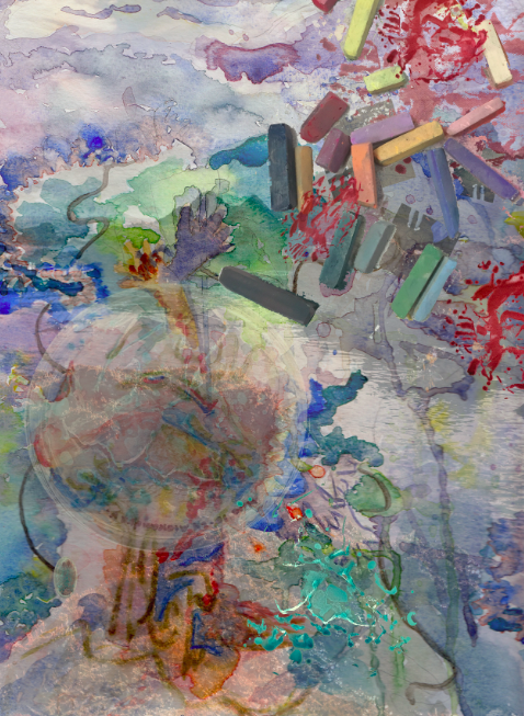
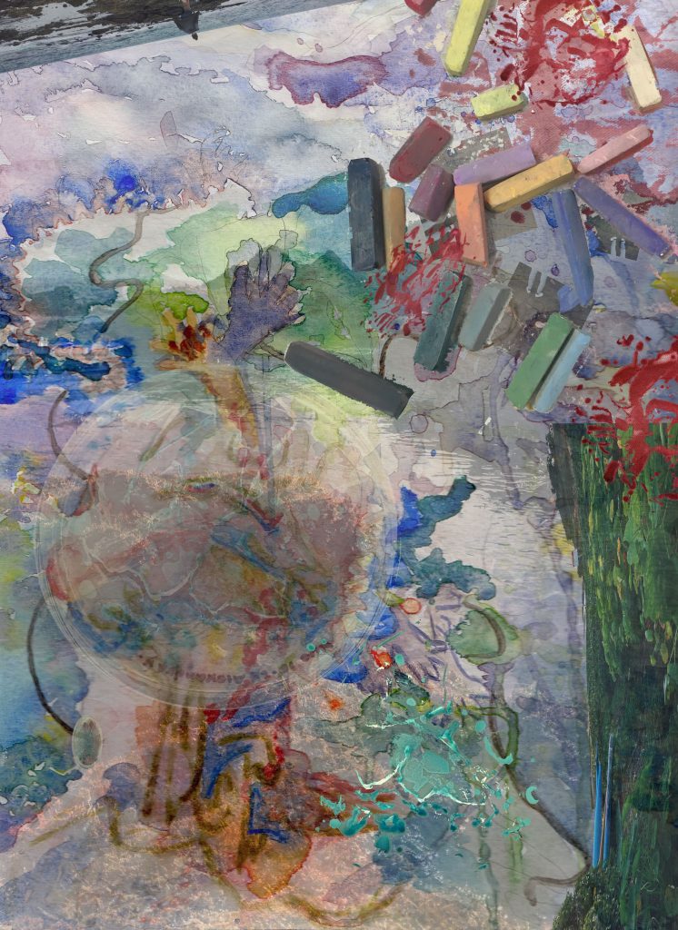
I was so excited to be able to paint what I heard. Usually I just listen to a song and paint the everything I hear in terms of colors I feel and see, and frequencies. But this time I went for more of a realistic picture I saw in my head. The song I listened to was “La Baie” covered by Clara Luciani. I saw a scene at night in France where it was dark with glimmers of random lights of purple and yellow where a girl had her head into titled up at an odd angle. My watercolor ended up becoming more abstract, but I will talk more about that later.
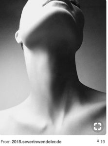
When drawing the composition: I used this neck as a reference to draw the girl looking up. I did not draw the entire face and started to fracksome of it off as if she was dissolving into the errie and mysterious lights floating around her. I had hands that were like flower petals and leaves come out of her, as if there was something in her that was releasing into the air but also connecting her which is why there are holes with stuff coming out of her
![]()
When doing the watercolor I tried to depict the colors and let them flow a lot by using the wet on wet technique. I used greens and blues to contrast the yellow and purple too. The yellow in the purple represents the lights, the green is like more of an organic plant feel, and the red and gold is like intoxication and danger in a way.
I was going to go over some parts with a micron pen to make more of the features realistic, but then I thought that would take a way from the free flowing affect. It would of created another affect too, and I would of liked it, but now when have adding the photos I am glad I choose to experiment without relying on the micron lines to paint more of the picture. My roommates said they say various things, and not a face.We were joking that the piece was like a mishmash of inkblot tests. They saw different things from each other, and its cool cause we all feel different connections. We all interpret uniquely, and that is special!
-
- final watercolor
. . .
Contact sheet: all these photos I took and I thought that these colors and application of textures would mesh well with the watercolor’s aesthetic.
All these photos I took, and I wanted to keep it that way to create a personal making element instead of using other people’s pictures from the internet.
-
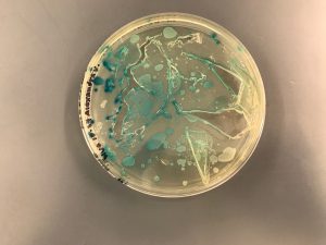
- bacteria I painted
-
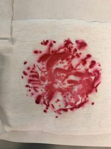
- bacteria on fabric after I painted it
-
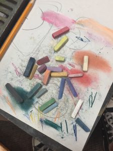
- pastels from when I was using them
-
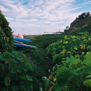
- the greenery of plants at the ocean
-
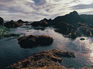
- tide pools full from a high tide several hours before
The feet on the street:
- I used the fill and opaque settings to manipulate how much the color would show through.
- This fit the theme of a night in urban France that I imagined and I wanted it to be hidden swirling in the back of her mind. That is why it looks hidden.
The ocean/tidepool pictures:
- For this layer I cut out the background and sky for two of the pictures.
- I used the fill and opaque settings to manipulate how much the color would show through.
- The water and rock formation texture can add an interesting effect of the idea of dried watercolor but wet water combining. Also, the one of my friend creates a paradoxical world element and the grass creates a juxtaposition. I did not realize till when trying to find an example of the song, that it was a cover song. The original song was done by Metronomy titled: “The Bay”. In this video it has a lot of the ocean, and I already knew the song had to do with the bay but it was just a coincidence because I did not add the ocean pictures for that reason. Also when seeing the video it reminded me of some of the beaches where I live. The pictures I took of the beach add an element of home to me, but these beaches don’t fully remind me of the beach in the video.
Pastels:
- For this layer I cut out the background.
-
How I was going to complete the piece, but then did not because Alaiyo challenged me add more.
I wanted to created a cool texture and effect as if they were laid on top of the picture and someone was creating and working on the composition. Showing how the mind continuously works, and the frequencies of sound is everywhere whether we can or cannot hear it or feel it.
Bacteria:
- For this layer I cut out the background and some elements.
- I used the fill and opaque settings to manipulate how much the color would show through.
- These pictures are from bacteria I painted last semester. It reminded me of the effect of the splatters I did when water coloring. I thought it would be cool to add into the piece since it was like something was overtaking the girl and the girl was contributing to that. Bacteria does that same thing. We contribute, but it also gets a grasp on to us, and can spread. The red bacteria was transferred onto a cloth, and I thought that texture was cool to add. I overlaid it on the holes I made on the girl, with the blue petri dish on top. I also put it in the corner of the composition and on top of the pastels to create the spreading effect. Pastels hold into the skin and spread as well. Therefore I thought it was fitting. The blue bacteria was while Iwas in the process of painting it. I thought it would be cool to show the idea of containment, breaking, spreading, and moving. I overlaid the dish on top of the girl’s face, and positioned it so that some of the things coming out of her looked like it was coming out of some of the cracks in the goo within the dish. I also eliminated the dish and just had the blue bacteria to show it fully out onto the collarbone of the skin and not in the dish anymore.
The final piece:
I enjoyed this project a lot it was really fun and a good way how to use layers and the tools on Photoshop. I wish Photoshop had more of a command Z usage like Illustrator does, but it is personally good to learn to not get used to the luxury of command Z to become more patient with technological applications. I tried and desired between using or not to use to the fill and brush tools, but I realized that because I wanted the composition to blend together instead of look like a more obvious collage that it needed to be minimalist. I am glad I got to blend an imaginary vision that somehow altered to fit some of my personal connections to the ocean.
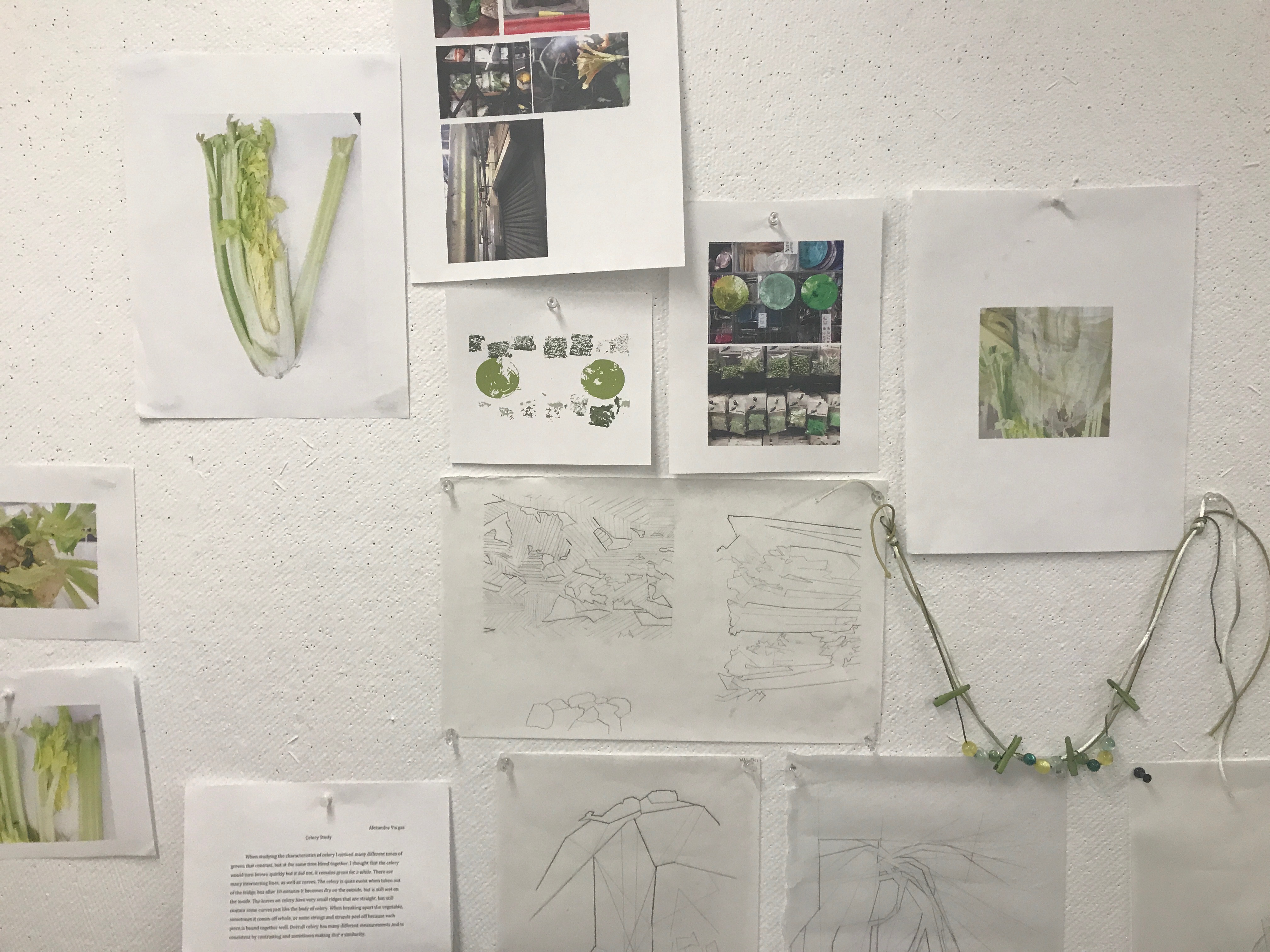
Comprehending Celery Through Different Art Forms ~ 1st Year
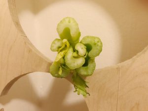
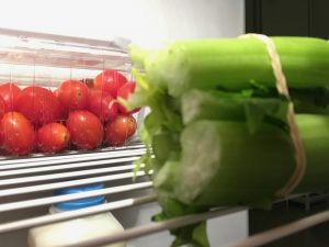
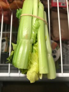
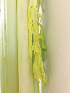
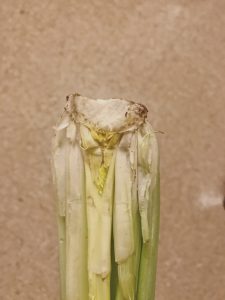
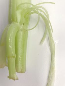
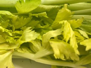
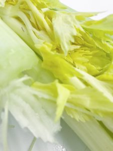
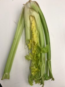
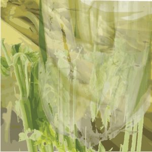
Over the course of the past few weeks I have been studying celery. I think this ties in a lot with the idea of patience. When taking the time to look , more than the average minute or even few hours you can discover a lot of context you would have realized was never there. Some characteristics of celery I noticed: many different tones of greens that contrast, but at the same time blend together. I thought that the celery would turn brown quickly but it did not, it remains green for a while. There are many intersecting lines, as well as curves. The celery is quite moist when taken out of the fridge, but after 10 minutes it becomes dry on the outside, but is still wet on the inside. The leaves on celery have very small ridges that are straight, but still contain some curves just like the body of celery. When breaking apart the vegetable, sometimes it comes off whole, or some strings and strands peel off because each piece is bound together well. Overall celery has many different measurements and inconsistent by contrasting and sometimes making that a similarity.
I have not so far in my life been a big fan of eating celery, but now starting to really appreciate its form out of many other vegetables. It does not rot fast, it holds water, and acts like a vessel, the way it is constructed can lead to other findings of how to construct stuff. I think it would be useful for space thiea of boiling water in a structure and even the models of how it combines.
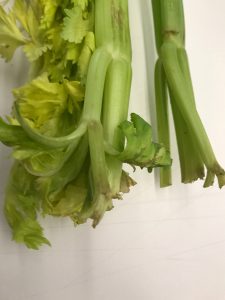
First set of pictures:
These are my first set of photos, I wanted to document the celery in a creative way showcasing the body and certain sections of it in the way of still knowing that it was celery. The lighting was quite poor where I took these and it effected some of the coloration of how the vegetable looks. I learned what drastic difference lighting can make on this vegetable.
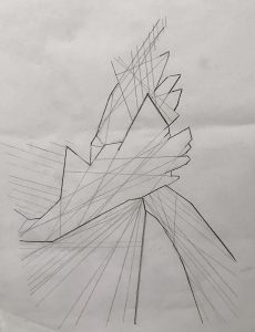
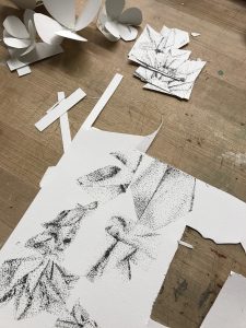
Measurements and drawing:
For the measurements, I measured each section of the celery. I did a planar cut, transverse cut, and did a planar drawing on the vegetable. After that I measured out all the angles and lines of the celery stock. Its hard to see but there are more lines, they just came out light in the image below:
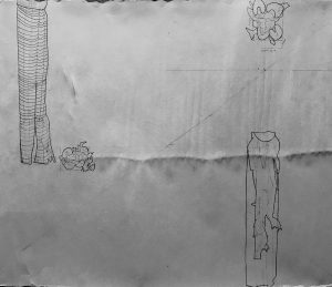
Planar: I noticed how much negative and positive space celery holds. The leaves fill in gaps, or other parts of the celery stock shade in the holes. There are small little circles in the planar view of the celery and a gap. The size of the celery which is kind f shaped like a bean, stays similar in size but all individual pieces are not the same.
Transverse: The leaves almost have shorter measurements and ridges, and the celery has small ridges in the stock. (two drawings were done for this cut)

Plane: This was difficult at first because I felt that the celery would have more curvature, it ended up being quite slight instead of drastic change. More of the curves and twists were at the bottom root area to the stock. Then where there divergence occurs it changes a tiny bit, but stays still at a constant distance pattern.
-
- The right drawing is the plane drawing, and the left drawing is one of the transverse cuts.
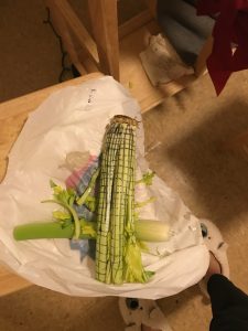
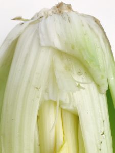
These are my second set of photos, I gathered the comments given in class, and decided to retake them.
Better lighting was important, so I choose a location with white walls, tables, and floors, so that the lighting could bounce off and make it more of a natural lighting effect.I zoomed in more and broke the celery. In doing so, I learned that the celery when broken can get stringy, and is easy and hard to break it depends. This inspired to diagram the drawings with more of that kind of effect.

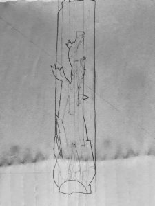
Turning Celery into a Diagram:
When drawing the diagram of celery, I found that this vegetable actually holds lots of straight edges. Those slight curves at a glance make such a difference making the shape seem so much more rounded. It is a lot of straight slight lines that occasional curve that make that illusion. Of course the top part looking at the planar cut is very rounded which is the interesting part. It was fun to learn in this way, and to be able to tie in abstract and realism in a creative form.
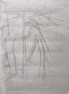
-
- 3 diagrams are in this picture
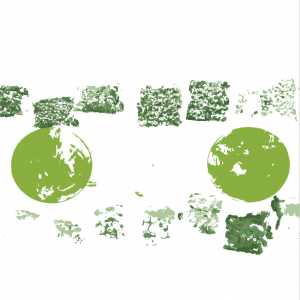
Color Wheel:
For the color wheel, being inspired by how celery holds many colors and textures I was curious to see how on the street if I could find those colors. It was extremely rare to find those colors, here is what I found in two hours of searching:

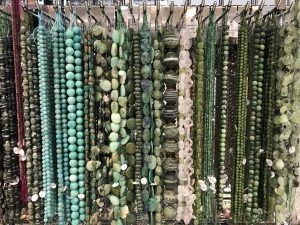
Then those stings inspired me to make a necklace, so at the bead store I looked for colors that matched.
Final color wheel:
-
- overlaid three pictures I took of the celery to see the different tones of color they hold
-
- overlaid beads from the pictures above that match the color scheme of celery
-
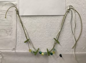
- necklace
Folding Celery Out of Paper:
Folding these structures was a challenge because it was hard to get the paper to stay still. It was fun to turn some of the diagrams into a three dimensional object.
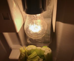
For photographing these I wanted to how the light and the way that it hits the paper and the folds. That is why it is in black and white.I used my coat which has some texture and laid it on top and had one warm lightbulb slightly casted onto the paper.
1st diagram: entire stock of celery
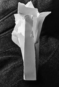
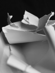
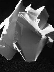
2nd diagram: small round of celery that you see at the planar cut
3rd diagram: inspired by abstracted diagram drawing

4th diagram:one piece of the stock
-
- front
-
- back
-
- front
-
- back
5th diagram: stock of celery
-
- front
-
- back
6th diagram: stock of celery inspired by the diagram
-
- front
-
- back
7th diagram: small round of celery that you see at the planar cut
(all structures were held together only by paper, not by glue)
Folding a holder for the celery:
Brainstorming ideas of what to make:
I decided wanted to create a backpack. The final backpack after learning from this prototype would not be made out of paper ideally but out of a material that would be biodegradable. There is a lot of attention on reusing bags at the store, but not that many people talk about the vegetable bags. Also farmers and people on the go can use this product by quickly placing their item on the bag instead of it bumping together in the bag.
The first attempt I made right triangles and accordion folded them then unfolded them and cut on 3 parts of the triangle to connect that triangle that would connect to the duplicates made in an attempt to make a backpack. It worked, but then when placed down and then picked up, some parts would fall apart. I almost made the entire bag, I just had the straps left. But was this design ideal, not it was not. It was a study leading to another style of folding.
-
- binding some of the pieces together
-
- the bag holds more parts of the module
-
- measurements to cut
The second attempt I cut small rectangles and folded them into small triangles. I started to connect the triangles into a backpack. It was working, but once again parts of it would fall apart.
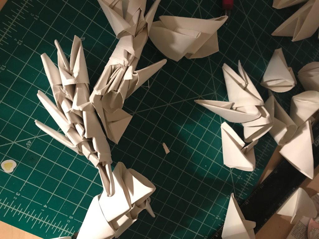
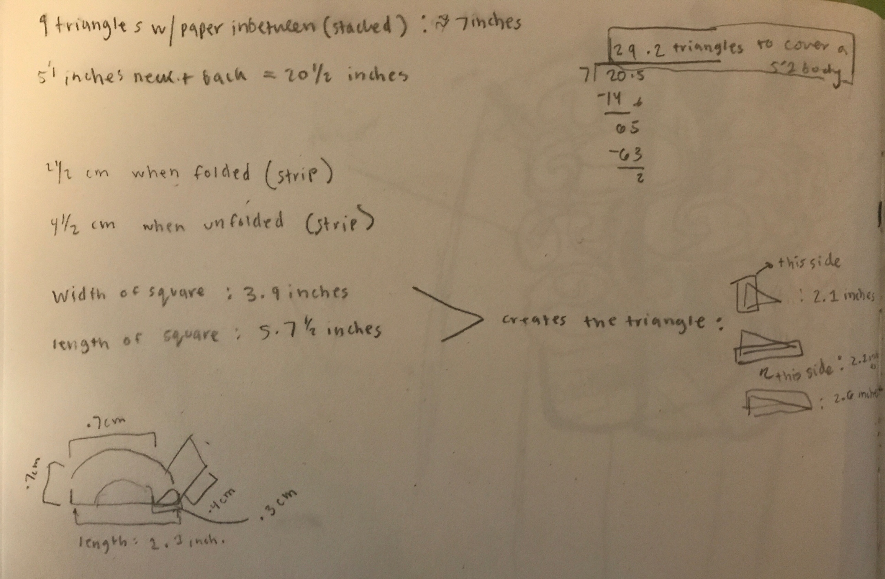
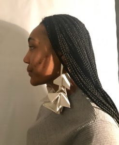
The third attempt I used that same triangle design but connected them differently. This time adding a strip of paper in-between as a chain link. I made them into earrings, and a srunchie that doubled as a holder. This structure I found when adding a strip can be manipulated into many different designs. Almost like the idea of how Legos can be build into many structures. Bur this is versatile in holding stuff as well as sculptural and taking on many helpful forms.
I also took more precise measurements to make sure that they would fit together and how many I would need to make:
-
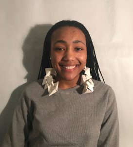
- earrings can hold celery as well
-
- You can make the earrings as long and short as you want to by adding or subtracting triangles. Also, they can become wider by placing the triangles into each other without the stripe width-wise.
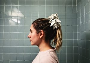
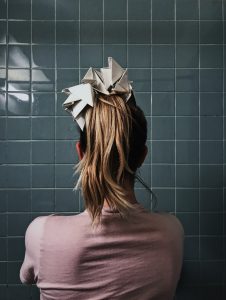
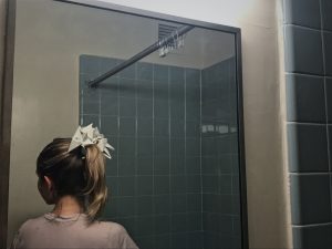
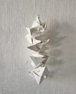
diagram folding of the celery holder:
left side: horizontal cut
right side vertical cut
diagram of the earrings
the holder/scrunchie is holding celery inside in this picture
(all attempts were held together only by paper, not by glue.
Armor + Wearable:
(all attempts were bound together by wire or held by its own pressure)
brainstorming:
-
- last two on the right I decided to create
First attempt:
I started to collect metal scraps and had clothes hangers that I had found a while ago to create a wearable that connected at the ears. This design was going to be based off of the lines and slight curves celery holds, and inspired by some of the diagrams I had made.
I got half of the wearable’s frame done and even made a second set of sketches to improve the base, but decided to scratch that idea for using used spoons.
-
- second set of sketches
-
- second set of sketches pink signifies the new parts
-
- Alex moved her arm upwards so the detail can be shown, this was longer but it folds too this is being shown as the short choice.
-
- the earpiece supports the piece on the body
-
- long full length version, this image cut off the full piece
-
- folded version: short choice
Second attempt:
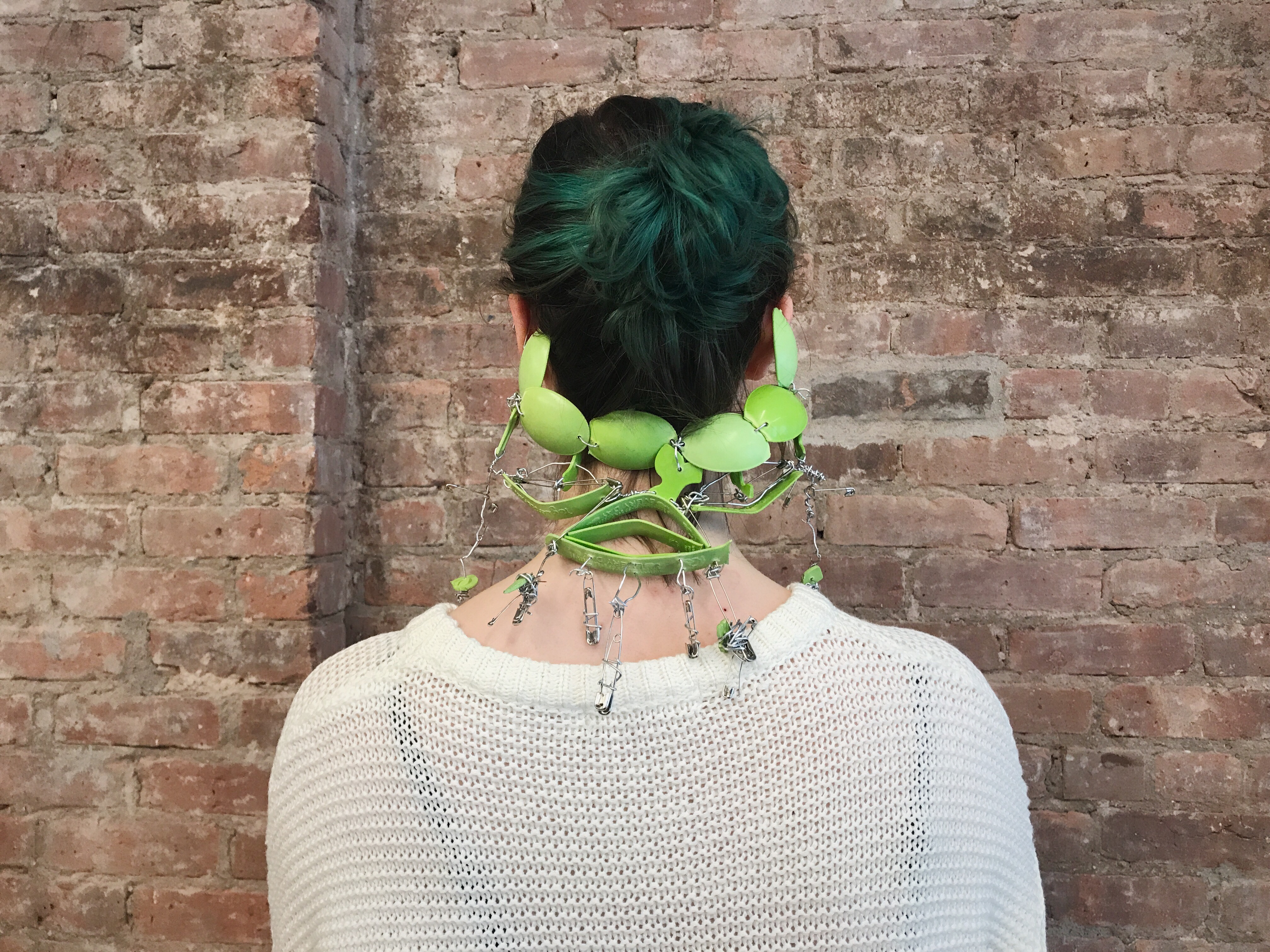
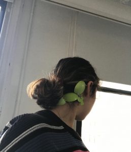
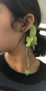
Over the years I have been collecting spoons and reusing them, instead of throwing them away because that adds to waste. I was planning on using these spoons as a small part of my garment. It thought it would be interesting to only use the limited amount I had which was around 20 or less to make a piece. I ended up using way less than half of that amount. My goal was to make something that would connect to the ear so I kept that idea. I broke the spoons, put a hole in them with a alm and mallet, and then connected them with wire and close pins to create an earring accessory that can protect the back of the neck. This would be ideal for bicycle rider riders and their helmets since the back of the neck isn’t protected. Also this would be good for neck support when further developed. This is a prototype and I think there is a better placement than wire that could be used for this.
Making and Testing:
-
- less spoons where used than what is shown here.
-
- an attempt to take a picture so I could see how what sections to keep building on
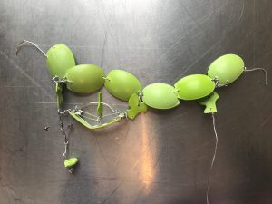
Measurements and diagram of the armor:
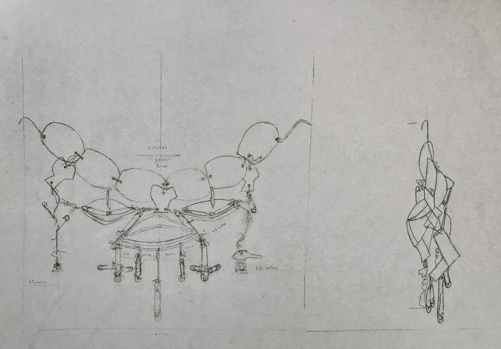
The drawing depicts the front and side view of the armor. The front’s measurements are similar the back side.
The piece:
-
- front
-
- back
-
- testing to see if it holds its own weight

-
- A subtle accessory and good if someone does want it to be noticed. Also it can be like earrings in the front.
-
- we also realized this could become a mask, this even has a potential to be a necklace (there is not picture of it like a necklace)
Class Presentation + “Fashion Show”:
-
- Jasmine models the accessory for the class
Reusable and Subjective Waste ~ 1st Year
Final for Biology, Art, And Social Justice Lang Class
Reusable and Subjective Waste
By: Alexandra Vargas
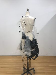
I walk almost everywhere I go in the city, and through the different settings there is one link that keeps catching my attention: Trash and used objects. We pass by and lay out these objects on the street, which then they are seen as unuseful. Almost as if a lifecycle has ended it’s means. That kind of thinking prompted my first project at Parsons to be made with used materials that were available to be taken. That action then transferred to going onto the street collecting and picking up items to use them for majority of what I was making. I started to challenge myself and raise awareness in class to everyone that instead of resorting to buying new materials, we could find them. When carrying my art projects to class people would look at me oddly. Which gave me an idea to video tape Krystyanna picking up trash, myself spray painting what was collected, and then having my friend Caroline lay down on the street while Krystyanna dumped the trash on her. We got different reactions from the public, which than led me to the idea of how fashion is everywhere and how ironic it would be to make garments out of different used materials. I tested it out in one project, but then made it look like a normal garment. When on the street, people had no idea that it was used material and they treated it differently. So with this project I wanted to make it actually look like trash and make a garment with that kind of angle. Sustainable clothes are starting to be considered, but clothing ends up in a landfill still, so I wanted to intertwine/explore those contrasting ideas together[1]. The production of clothes wastes energy so I wanted to make this as a sculpture style. Also, seeing all the matter every day made me wonder what happens to the trash and objects in landfills[2].
“In 1937 first landfill brought inspiration to pass laws saying each state should participate in that action because before landfills people were dumping their trash into a pit. They thought that landfills would significantly help the United States, but actually it has tripled since the 60s because of the usage of biodegradable packaging versus nonbiodegradable[3] packaging[4]. This causes a problem because methane is released into the air, which harms the surrounding environment, and also plays a role in climate change. I decided to go online and research to see if the idea of trash leading to climate change and landfills were on others’ minds. I proceeded to an article from Time Magazine in 2012 that stated: “The higher numbers are especially significant because trash in landfills releases methane gas, a greenhouse gas that contributes to climate change. The Environmental Protection Agency (EPA) estimates that landfills are the third-leading cause of methane emissions in the U.S. Nearly a fifth of methane emissions come from landfills. Landfills utilize methane gas collection technology, but researchers say that methods should be improved at open landfill sites. Methane is the second most prevalent gas emitted by human activity following carbon dioxide. And, while Americans emit significantly less methane than carbon dioxide, methane emissions are 25 times more damaging to the environment, pound for pound, than carbon dioxide over a 100-year period.[5] ” I had heard of the term methane, but I wanted to know exactly what it was: “(CH4), is a gas produced by a group of colonic anaerobes, absorbed from the colon and excreted in expired air.[6]”
These statements then reminded me of Alexis Rockman’s art pieces and how he explores genetics, the future, and impact of the environment[7]. Alexis bluntly conveys his ideas to raise awareness, which is kind of linked to my idea of my garment. To put what is contributing harm in front of people, because it holds the idea where something adds up, until one realizes: we can see traces, but there are still invisible traces too.
I created two fashion pieces. I picked two materials that were about to become trash or were suddenly turned to look that way. The first garment was made out of trash bags that I took from the trash. I threw the trash that these bags were holding into other bags so there would be no extra littering involved. With this look I wanted to make four pieces that could be pieced together, or they could have the option to be styled with other articles of clothing. My original idea was to make a crop top, a strapless top, pants, and a skirt. Instead I made a crop top, a strapless top, I combined the pants with the skirt, and a shawl that could also be turned into a top or could be added to the skirt. I gravitated towards both the transparent and black garbage bags because I thought it brought contrast and also to the idea that it is creating waste to help reduce or get rid of unwanted items. I did not use a pattern, but instead ripped the pieces or cut them to fit them together into the item I desired. They were mended together by hot glue. For plastic when it was used like fringe it was cool to have the hot glue make the plastic curl and manipulate it. For the shawl I cut holes and tied knots with the black trash bag. Overall the process went well, my pants looked odd so that is why I took them apart and added them to the skirt.
For the second look, I used Trader Joe’s bags, because I realized how many bags we waste when we go shopping. For example: Trader Joe’s doubles the bags for items that could use one bag. Thus, I had four bags in total enough to make the dress and romper. Also the irony of needing that bag to carry things that keep you alive such as food and then to throw them out and then they are deemed as unuseful and as trash. That is why I chose to create a garment out of those bags used from when my roommates go shopping there. I decided to make a dress and romper in one. I started to form a body suit out of the paper bags once again without a pattern, then my friend told me she wanted to model it so I measured her body to make sure that I could fit it on her. From there I made the skirt by cutting out strips of the paper bag and gluing them together, and everything was hot glued once again. Then I got a cardboard box and striped it and cut pieces of that certain texture and put it on the back of the romper/dress, sleeves, and the skirt. Both garments are structured more as a sculpture to showcase the more art side of how trash can be reused and seen as. The reason why I choose fashion is because fashion is a way of expression and I thought it would be ironic to have people wearing a fashion pieces as trash that they pass by every day without thinking subconsciously. I also thought if someone would to wear literal trash then it can raise awareness. I also chose to covey the process through fashion photography so even in an editorial story this could be used for that purpose.
Process:
Final Piece:
As for my schedule, I paced myself by to create these two garments. I allocated a few days towards one and a few days towards the other which totaled to two weeks. Then I took photos and video, wrote my reflection, and the artist statement when listening to other classmates present on the third week. For the photoshoot, I choose to shoot at Chelsea Market because it has a modern yet old, new, industrial, and local vibe. We asked people to write a word that described New York City to them on the dress with acrylic paint. As for the dress made out of trash bags, another photoshoot was done around Wall Street. I wanted to see how my friend would self express her style with the trash bag. My friend paired her style that has a lot to do with nature in such an industrial setting. She wore leggings and hiking boots with the dress, skirt, sleeveless top, and crop top.
Chelsea Market and The Standard Hotel:
-
- makeup inspired by methane
Wall Street:
Reflection:
For the photo shoot, it did not occur to me that there would be mostly tourists there, and so people would either approach us or give weird looks while walking by. It made me realize different levels of comfort and openness that we all have. A lot of young kids got more into it and they just went for it on the dress, where as adults felt weird or if they went for it they thought hard thought about each mark they were making. It was funny because they didn’t want to mess up the work I made, but in retrospect they are throwing away the work when they buy the stuff that was put inside of it. Some people recognized it as a trash bag, and a ton of pictures were taken. I realized that maybe the idea of having people pass and give weird looks was completing the notion I wanted. Overall the experience of seeing how the garments interacted with the settings and public was interesting. I was not too crazy about my designs, so the act of choosing the design became more like a study of how the materials can be folded and formed into different pieces of clothing. I asked Trader Joe’s why they double bag, and if it was a requirement too. They said that it was not but the reason why they do is because the handles are not strong enough. That response was odd to me because I carried my garment as a heavy snowfall was happening and it barely ripped. Their bags are quite sturdy, which puzzles me towards their response, or even the design of the bag.
The class presentations were really fun. I liked hearing and seeing my classmate’s interests and ideas. All the ideas that the presentations held unique expressions that were different from each other. Kind of like another angle of how Madison was saying that everyone is unique in her art critique. At the same time the material presented had some common links that could be made. Maria, Destiny, and Juliet all linked their ideas to togetherness and not presupposing. That there is unity. Also the process of the projects was interesting, I witnessed seeing Krystyanna and Makaleh in the process of making their projects and it taught me new approaches of ways to brainstorm and articulate while making a piece. I loved the experimentation that our class had as well. Miranda played around with water. This was cool because Miranda was using a material that was her subject line as well, which reminded me of how Jenifer Wightman studied bacteria but made it into an art piece.[8] Also, Daryn had the people who read her character’s voice encountering the story for the first time to see what their reaction would hold. Phoebe’s talk about organ sharing was fascinating to be educated about, and her piece also tied to one of the subjects Daryn held, which was accessibility. When thinking about how teaching each other through presenting art, Alyssa and Ani brought the materials they used for their project so the class would get a kinetic understanding. They both also used textiles to convey the subject that they were passionate about while lessening certain stigmas. I thought how Candida took a lab and furthered it into her project was cool, and how Ethyn took his passion of plants and tied into the work of Kahlo, which in his act of doing that presentation and research almost alluded about how to go about looking to an artists’ work when we focused on Kahlo this year. Overall I learned a lot from everyone, and gained many new outlooks. This project really helped me try to spread the message about the effect littering and waste is bringing towards climate change and the surrounding environment. Also allowing me to raise awareness of how we can make change and think of futuristic ideas to raise awareness and lessen stigmas as well as waste.
As for my own work I think I should have stated more facts and gone more in depth. I truly enjoyed working on the pieces and I learned more about certain kinds of reactions in public spaces and was educated more about landfills. I think through hearing feedback and seeing how my peers went about their research made me want to further the idea of waste and fashion coming together. I would like to make cloth-like material from decomposed trash to help eat up the waste that is being produced in the landfills and what is being tossed into the ocean. Once that cloth is made I can express myself in a new way, not just sculpturally. I feel that is what a lot of the class did. They took their passion and experimented with it to share a message.
Footnotes:
[1] Rob Walker, “Fashion in new bid to be truly sustainable,” The Observer, April 08, 2017, https://www.theguardian.com/fashion/2017/apr/08/fashion-sustainable-clothes-wwf-finland.
[2] “Landfill: not to composed trash so it breaks down quickly or bio degrades but to burry it, dirty it and lock it from the surrounding world. They isolate the trash from the environment.” Josh Clark, “How Landfills Work,” How Stuff Works (audio blog), June 23, 2015, https://science.howstuffworks.com/environmental/green-science/landfill.htm.
[3] Non-biodegradable packaging consists of plastic aluminum and Styrofoam.
[4] Clark, How Stuff Works.
[5] Justin Wordland, “Trash Climate Change Methane Gas:,” Time, September 22, 2015, http://time.com/4042559/trash-climate-change-landfill/.
[6] “Methane,” National Center for Biotechnology Information. PubChem Compound Database, https://pubchem.ncbi.nlm.nih.gov/compound/methane#section=Top.
[7] Rachel Corbett, “Painter Alexis Rockman on His Dire Eco-Dystopian Visions,” Artspace, September 10, 2013, accessed December 11, 2017, https://www.artspace.com/magazine/interviews_features/studio_visit/studio_visit_alexis_rockman-51528.
[8] Jenifer Wightman, Winogradsky Rothko: Bacterial Ecosystem as Pastoral Landscape. Journal of Visual Culture. 7(3): 309-334, 2012.
Bibliography:
Clark, Josh. “How Landfills Work.” How Stuff Works (audio blog), June 23, 2015. https://science.howstuffworks.com/environmental/green-science/landfill.htm.
Corbett, Rachel. “Painter Alexis Rockman on His Dire Eco-Dystopian Visions.” Artspace. September 10, 2013. https://www.artspace.com/magazine/interviews_features/studio_visit/studio_visit_alexis_rockman-51528.
“Methane.” National Center for Biotechnology Information. PubChem Compound Database. https://pubchem.ncbi.nlm.nih.gov/compound/methane#section=Top.
Walker, Rob. “Fashion in new bid to be truly sustainable.” The Observer. April 08, 2017. https://www.theguardian.com/fashion/2017/apr/08/fashion-sustainable-clothes-wwf-finland.
Wightman, Jenifer. 2012. Winogradsky Rothko: Bacterial Ecosystem as Pastoral Landscape. Journal of Visual Culture. 7(3): 309-334.
Wordland, Justin. “Trash Climate Change Methane Gas:.” Time. September 22, 2015. http://time.com/4042559/trash-climate-change-landfill
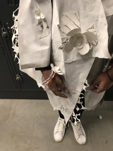
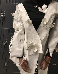
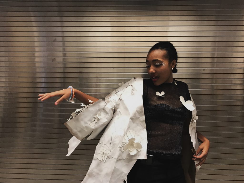
Foldings ~ 1st Year
When my best friend moved back to her home country, she gave me an origami flower she had made. During moments of wondering if we will every meet again reminds me of the flower growing or withering. Experiencing new milestones was hard, and knowing that we both were going to change and witnessing that as a mystery was going to be mind-bending. There is this in-between point of wondering. Each entrance and exit my friend makes into my life rests in my head, as if a new seed has been planted.
When keeping in contact with my friend the idea of time zones was on our minds. We would be talking to each other in the most random moments at the most random times. Thus, I wanted to create a dress /coat that combined the idea of how style is an expression that has changed overtime, yet still is a subject that we see all over the place. With the flower my friend gave me as an inspiration, I created a flower that represented the shape of her country’s flower and my state’s flower. I also took another project I did based on a study of twelve different angles of the flower she gave me to use as part of the textile to incorporate the inspired flower seen in different points of view.
The first step to conveying the story was planning out a design:
I sketched a lot, looked for reusable materials*, took measurements of a couple people to get a idea of how to make a unisex size, and then started to do a demo piece on the mannequin (since I do not usually approach making garments by first creating a pattern) to get an idea of how to construct the final piece.
*A goal of mine is to use sustainable materials and to use already used materials (to recycle/reuse/less waste is occurring). Materials I found: close hangers, brown paper, white paper, borrowed a hot glue gun, borrowed pliers, borrowed makeup, and borrowed a mannequin. Materials I bought: watercolor paper, glue stick, and white spray paint. Materials I already had: watercolors, brushes, pins, scissors, and a hot glue.
The second step was making the final design:
I made the garment out of the paper I found and than spray painted it white. I was going for a minimalist look so that anyone could style their look in the way they wanted to express themselves.
Front Side Back Side
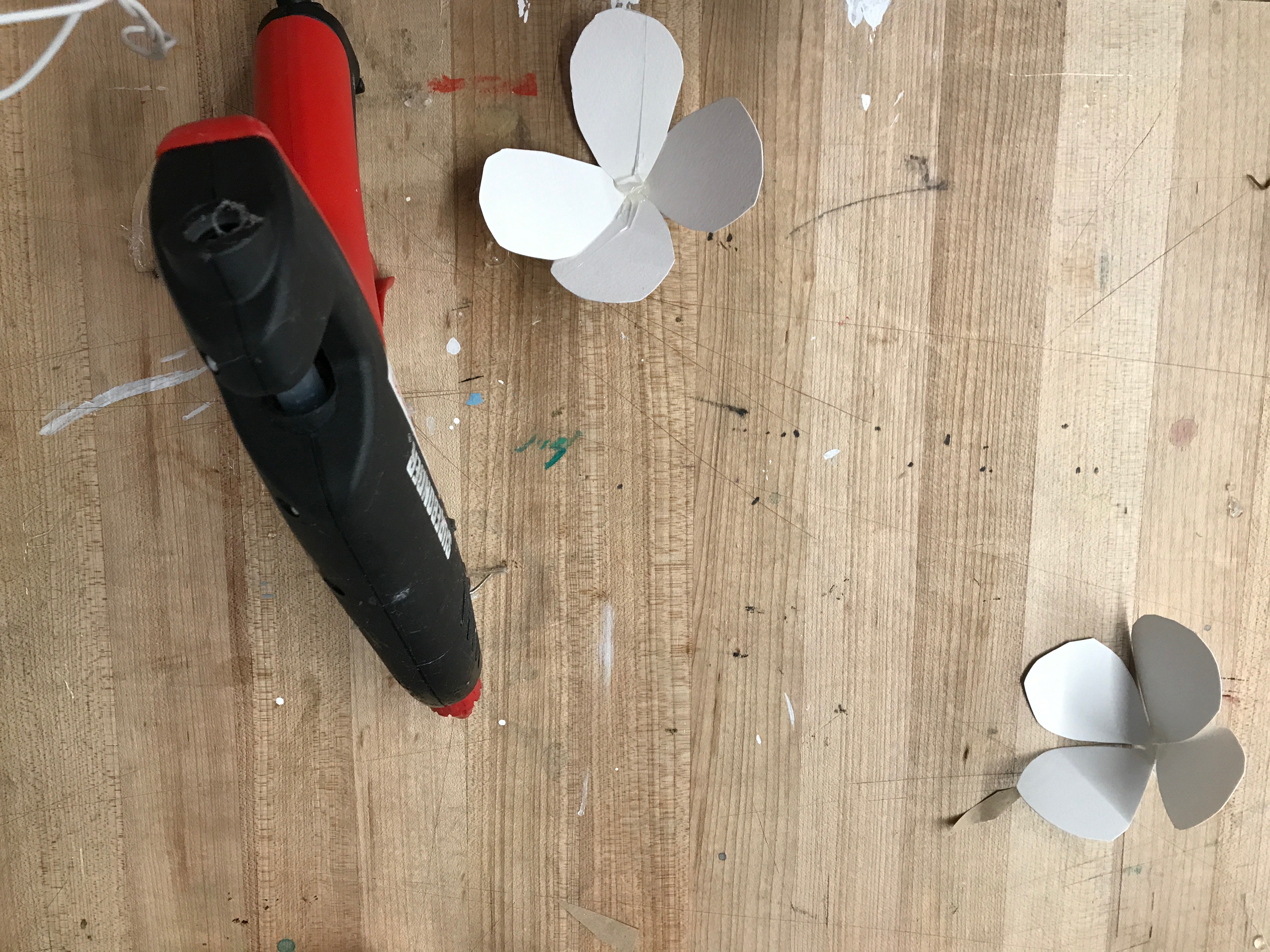
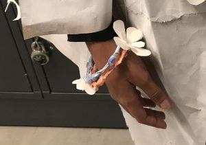
I cut out flower petals and hot glued them together. Some where turned into pins, others were glued onto the dress/coat, and two were used for the bracelets I made.
The bracelets were made out of paper and some wire clothes hangers that I found. I shaped the wire and wrapped paper that was watercolored and sealed it with a sporadic pattern made by the hot glue.
Then I printed out my old project onto a sheet of watercolor paper and cut each angle and pasted it onto the garment. I also took some reused paper and cut it into strips. I then glued them together so that it kind of looked web pattern and then glued that design on certain areas of the sleeves and end of the coat line.
Test trial to see if the flowers will fall off in motion:
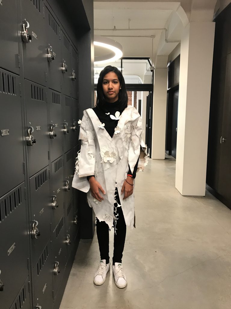
Garment is complete!

Front Side Back Side
Details Up Close:
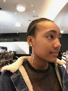
The third step was the photo-shoot:
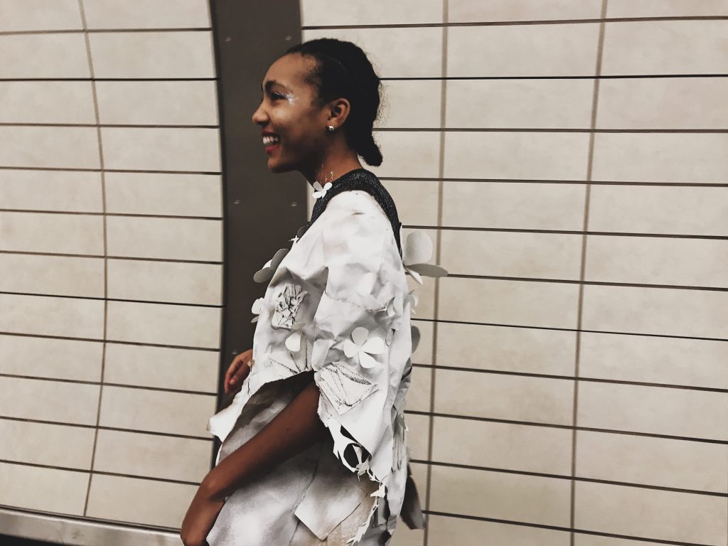
I put on some white makeup in a brush like affect with some magenta lip stick to match a dreamlike state.
Jasmine (the model) and I headed to the end of the 7 line, because most of the time when my friend and I talk it is when we are at a train station. We also stopped by Times Square ( the connection line to the 7 ) to test out the sturdiness of the garment in an industrial place to see if it would hold up against a crowd of people pumping against the dress/coat.
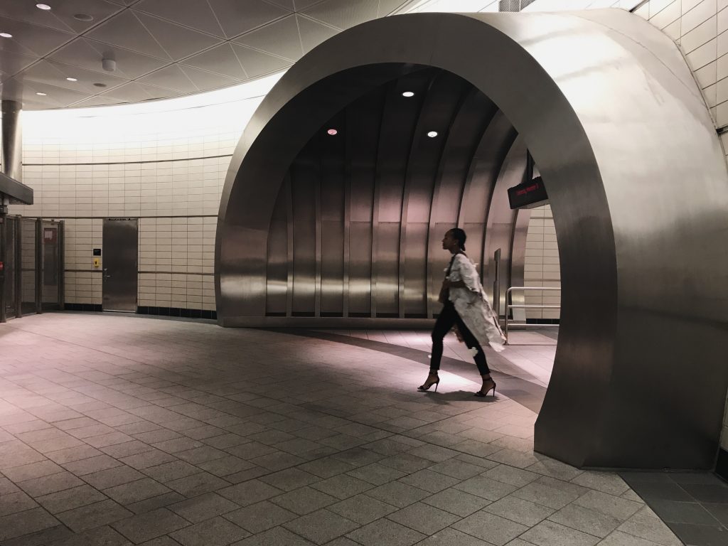
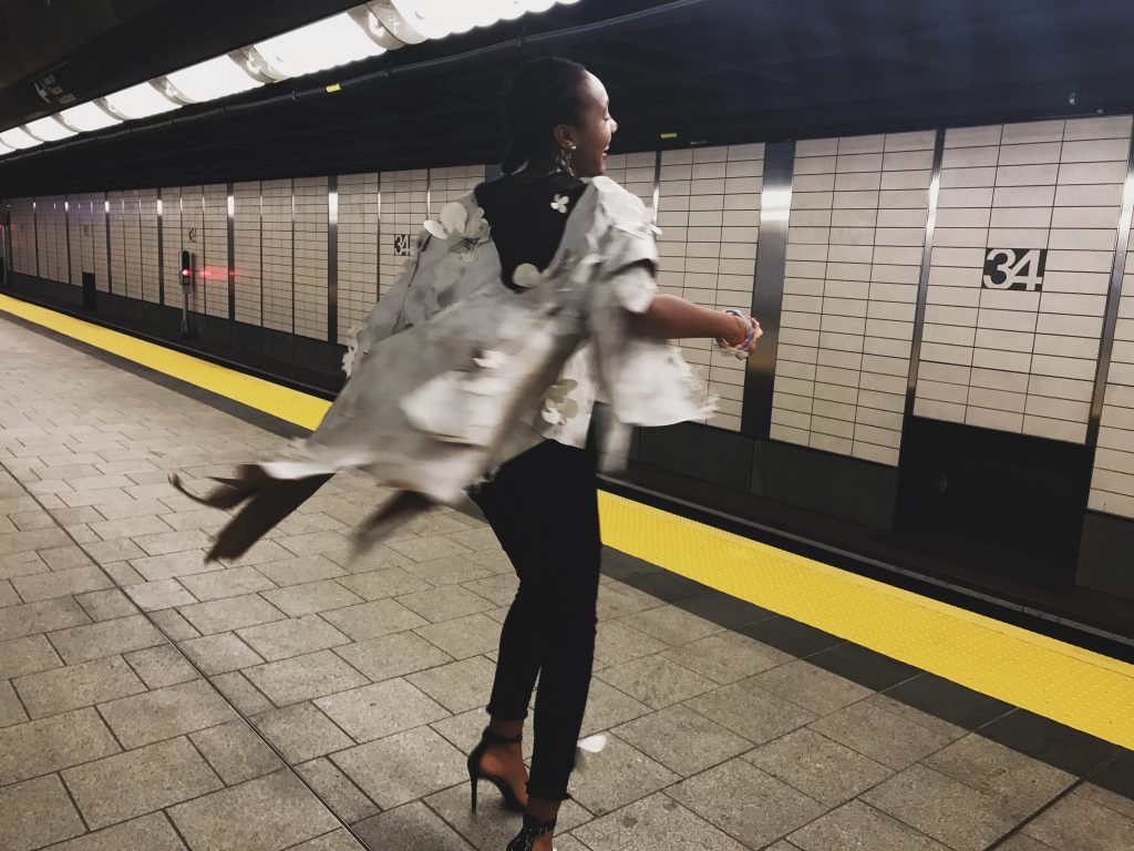

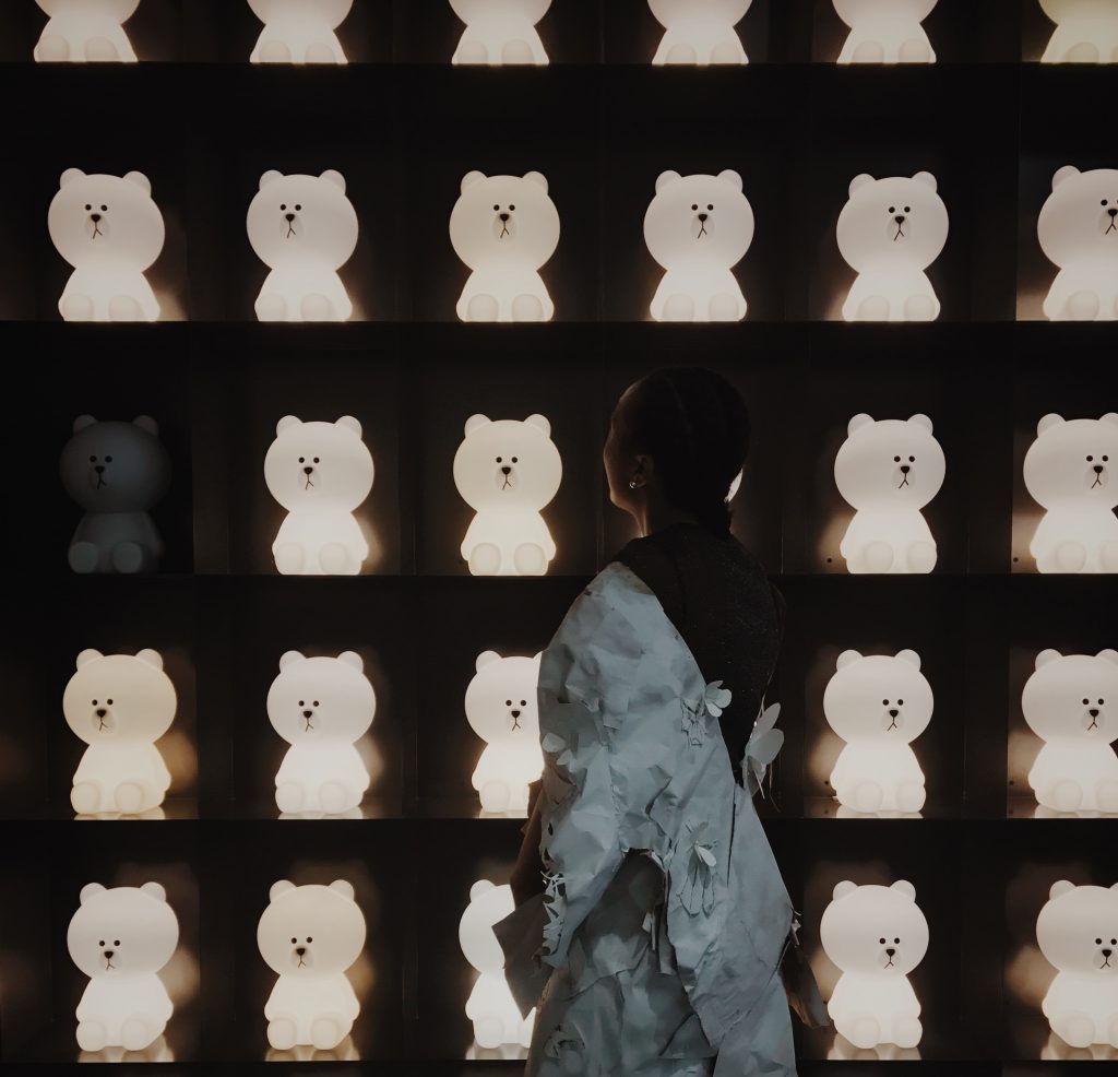
Test on how durable the garment would be in a crowd of people:
Up close details during the photoshoot:
Throughout this process I learned to see origami, flowers, and our friendship in another way.
Floriography was invented in the Victorian age as an act of discrete message of communication through flowers.“The language of flowers involved more than the simple meaning given to a flower. It also referred to the combining, presenting, and even the receiving of flowers (1).” This brings forth the idea that communication does not always have to be in a sentence or have a traditional formatted context. It also reminds me how in origami certain symbols were adopted to interpret connotation (2). Before written and symbolic instructions the Japan shared their designs verbally until 1797 (3). Both floriography and origami have changed communication contexts throughout the years, as well as holding onto their traditions and adopting a meaning to an object.
This sort of alludes to my friend and I, how our communication has been shifting along our friendship throughout the years have known each other: how we intertwine our languages, communicated by drawings for a while, just spoke in English, translating for each other, text message, video chat, and in person. As for the origami flower my friend made, I feel each time I do a study of it, the meaning it holds starts to accumulate new findings through all kinds of outlooks that are coming more into focus.
(1): https://www.proflowers.com/blog/floriography-language-flowers-victorian-era
(2) https://www.origami-resource-center.com/origami-symbols.html
(3) http://www.origami.as/Info/history.php
Overall, this experience was really enjoyable, and also doubled as a fun way to tie an experience and express it with some recycled materials* to raise awareness about the importance of sustainability.
*Majority of the stuff that could be recycled was recycled at the end of the project.
Perspective + Perception
My perspective and perception of fashion has been changed these last three weeks.
Coming into the intensive program I knew nothing really about the fashion world.
I used to think of all fashion more along the lines of what I now see as industrial fashion, without meaning too. I would look at “crazy” designs and think, “Who would wear that ?” I thought fashion should be made to be creative, but in a wearable/casual way on the streets.
Manus x Machina opened my mind what fashion really means. I realized that fashion doesn’t have to be worn by the masses. It can be an art piece. Analyzing,viewing, and reading the descriptions of the designers tactics and inspiration was amazing.
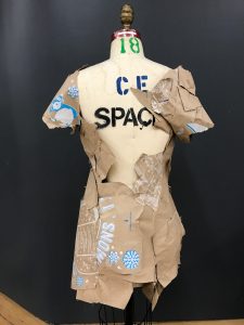
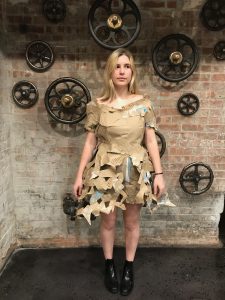
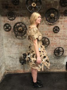
As a class we then went to Chinatown for some inspiration for an upcoming project. My inspiration was the word “brokenness” and how it has so many contradicting points in Chinatown.
Chinatown really embodies the New York theme of individuality. Everyone has a story that you might come across and hear. Also, I observed a lot of ambition. These elements provided inspiration for my garment.
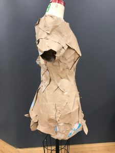
THE ASSIGNMENT:
In class, when Stacy and Aaron said that we would have to make a garment, my first reaction was to be freaked out. I barely knew how to sew and had never made a garment before.
I first considered making a purse, but then realized that it was against the rules. So, I decided to make a dress.
My strategy was unknown at the beginning. I was thinking, “Where do I begin?” “What materials are the easiest to make something with?”. Then I realized in the past (especially on art projects), I had used critical thinking to solve a problem. I remembered that setting boundaries can make some things more difficult, but those same boundaries can cause you to problem-solve and unleash creativity.
PROBLEM SOLVING:
The first step I took to approaching the assignment was to sketch out some ideas:
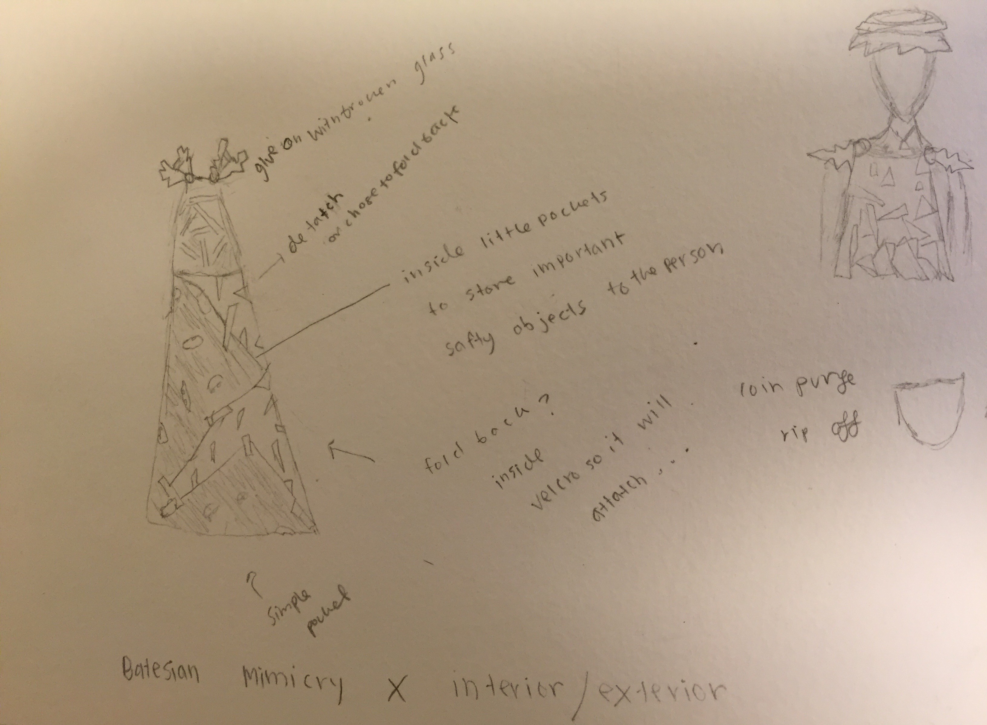
When we had to propose our ideas, I was afraid of doing what was in my brain because I didn’t actually think it could be executed. I was thinking of molding a hard dress out of plaster because I thought the plaster would be easy to form, and turn into a the dress I saw in my mind.
The second step was to find materials:
I honestly had no idea where to start. So I thought of colors that I would like to use that would depict my inspiration from Chinatown.
Some people kept talking about a small material store. So some of my friends and I went to check it out. There I found a unique material that I would use for my skirt part of the dress for only $3 in total (it was on sale! I found some white cloth material for the top there.
Afterwards, I headed towards Blick Art Supplies. I was on a mission for my most important material: Plaster! I was so stoked that they had it there. But…….
The next day I was still not sure how to attach the material to the plaster. I decided to put my design on the mannequin and plan out the dress before jumping into the process of making the final project. To my great surprise, I no longer needed plaster. The unique material that I bought created a beautiful train skirt for the garment.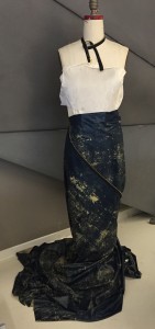
Reevaluating the design:
I started to recreate my design, but with the same concept in mind. I really wanted to achieve Batesian Mimicry by using broken glass vs. broken buttons. I quickly realized that I should only use broken glass on one side of the skirt and let it flow into the train of the skirt. I wanted to create an disorderly effect to achieve the word “brokenness” with the glass. With one side of the dress clean and the other side scattered, the random colors and sizes of glass it would show contrast. To separate the glass side from no-glass side, I thought of having a flap on the front side with a broken zipper making a boundary. That front side would allow the person to get inside the dress. On the top of the dress, I realized I could glue small-holed mesh wire and then thread thin wire into it to create more of a design
Ready for hands-on work! :
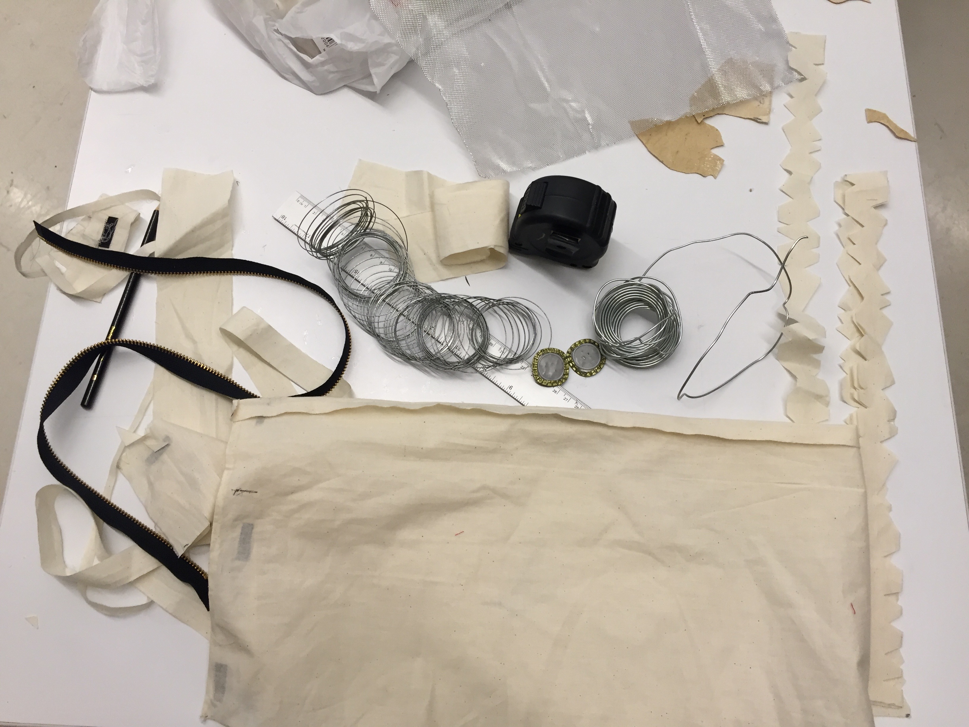
These are the ways I made the parts of the dress:
GLASS – I placed glass bottles in a huge trash bag and threw it on the ground. Then I grabbed a hammer and started to smash the glass. I hot-glued the glass to small pieces of cardboard. Then I cut slits into the one side of the dress and slid the glass/cardboard inside. With the glass poking outside I then glued the cardboard to the underside of the material.
TOP OF DRESS – I cut the small wire mesh into varying sizes of fixed triangle pieces. I threaded thin wire into the triangles and connected them together with the wire. Then I glued it to the fabric with metal wire. None of the wire was threaded directly into the material, so the top is actually the safest part of the dress. The side of the dress is fastened with velcro to allow the person to get into the dress which connects to the skirt.
STRAPS OF DRESS – I cut material into a zigzag line and attached the straps with velcro to the back of the top. I did this because it would be easier for the person wearing it. The buttons are made from smashed bottle caps that I distressed. They are hot-glued to the straps.
NECKLACE: necklace is optional but you can separate a zipper and make it into a chocker.
SKIRT: I attached the skirt to the top of the dress with hot-glue. The skirt starts to open up in the front. This allows the person wearing the dress to get into the dress safely. The dress has velcro on the inside to attach, so that the skirt stays on.
After proving to myself that I could piece together a garment, I started to measure the model.
Measurement:
It was frustrating at times because sometimes the measurements were off. But in the long run, I am glad that I measured the model so that there was no second guessing if the garment would fit.
I decided to make a cape out of the same fabric that was used for the top of the dress. I had some concerns that the cape might overpower the rest of the garment, taking away from the edgy vibe. So… I put triangle cut-outs in the back of the cape so you could still see the dress. Some of the triangles had mesh and wire with string attached, some were left open.
With the garment completed, it was time for the photoshoot.
READY FOR THE CAMERA:
Photoshoot Prep:
The makeup I picked for my model was inspired by Vivian Westwood’s runway makeup x punk x messy. I used the first colors that caught my eye as matching the color scheme and feel of my project (dark brown, navy blue, etc.). I blended into the face with some white eyeshadow. Mascara was used to pop the eyes and a dark purple/magenta lipgloss was applied. I intentionally applied the make-up quickly (3 minutes to achieve the look), because it I wanted the process to convey the reality of the situation I was trying to depict with my garment. I wanted it to look a bit distressed and not planned out.
Photoshoot:
Finally it was time to take pictures!!!!
I am so passionate about photography, so this was exciting.
We shot at night.
The dark sky with illuminating colors conveyed the feminine and fatal look of the garment.
The sidewalk was not crowded. This made the shoot run more smooth. The streets had some cars which provided more light to the photos. These circumstances were very helpful and meant that Photoshop was only needed for enlarging and lightening the photos for the exhibition.
I wanted the photoshoot to depict a person who experienced a full range of emotions, with confidence.
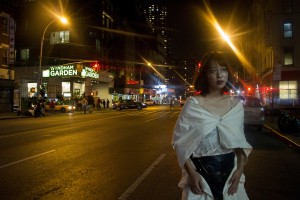
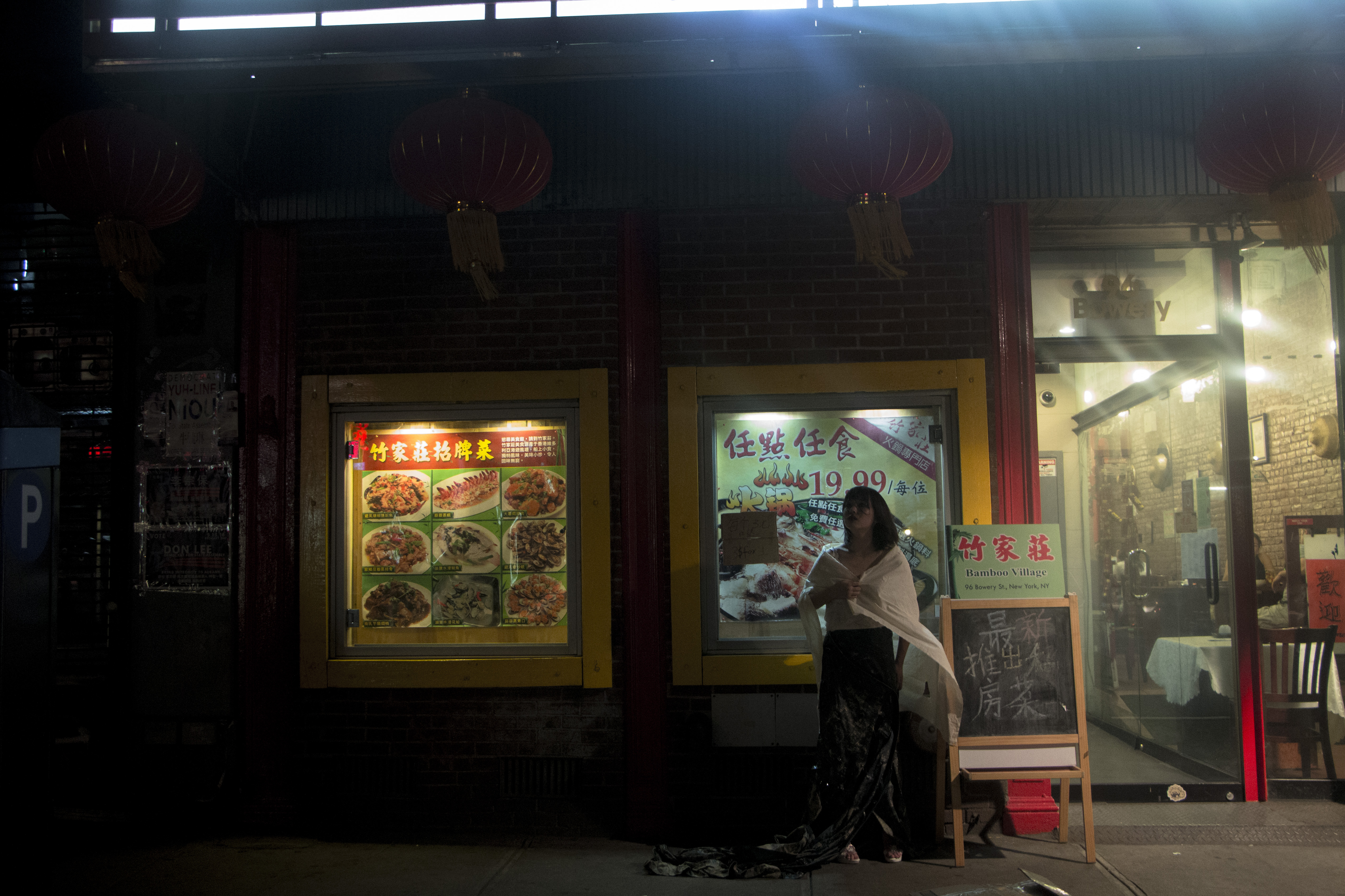
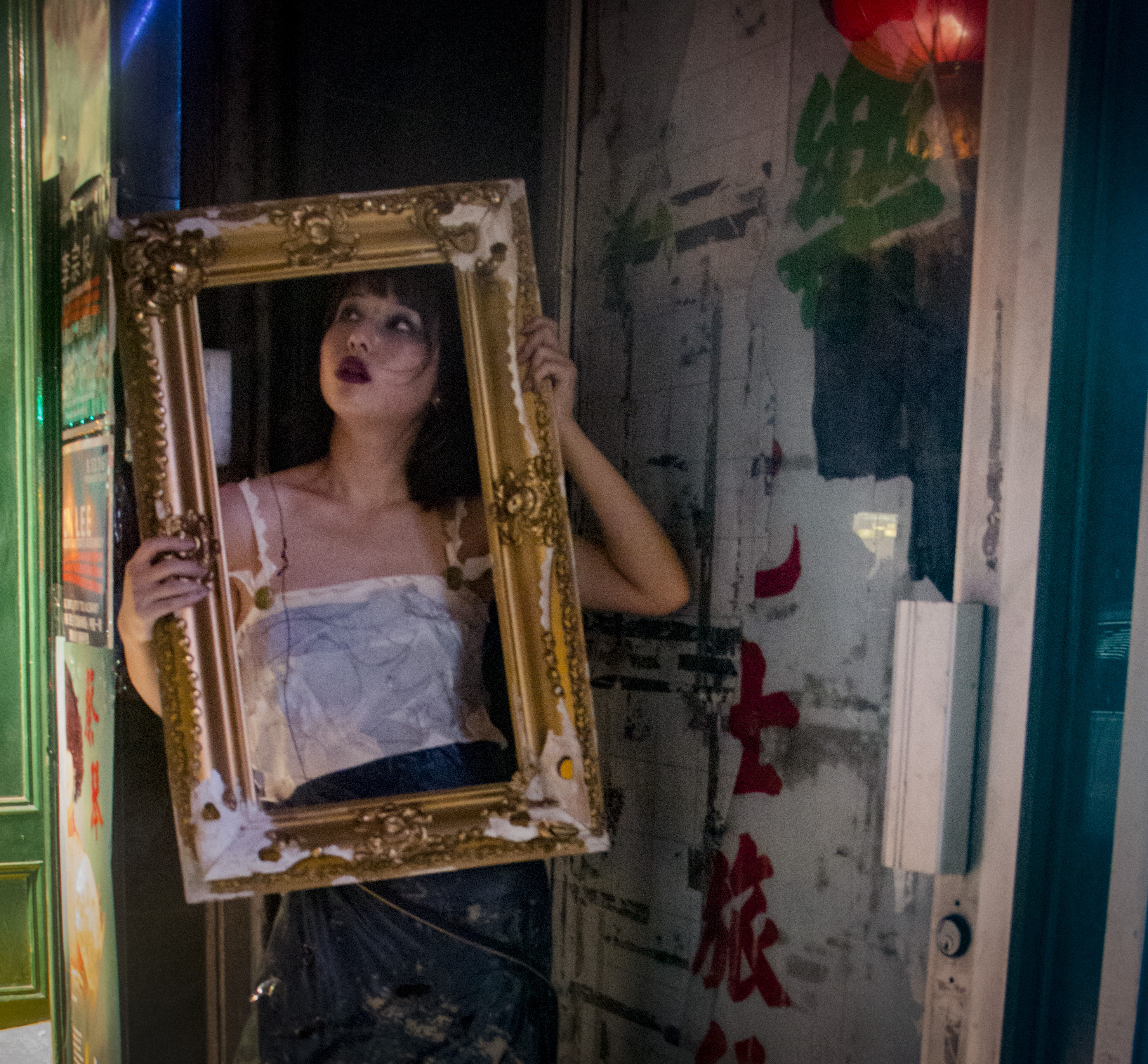
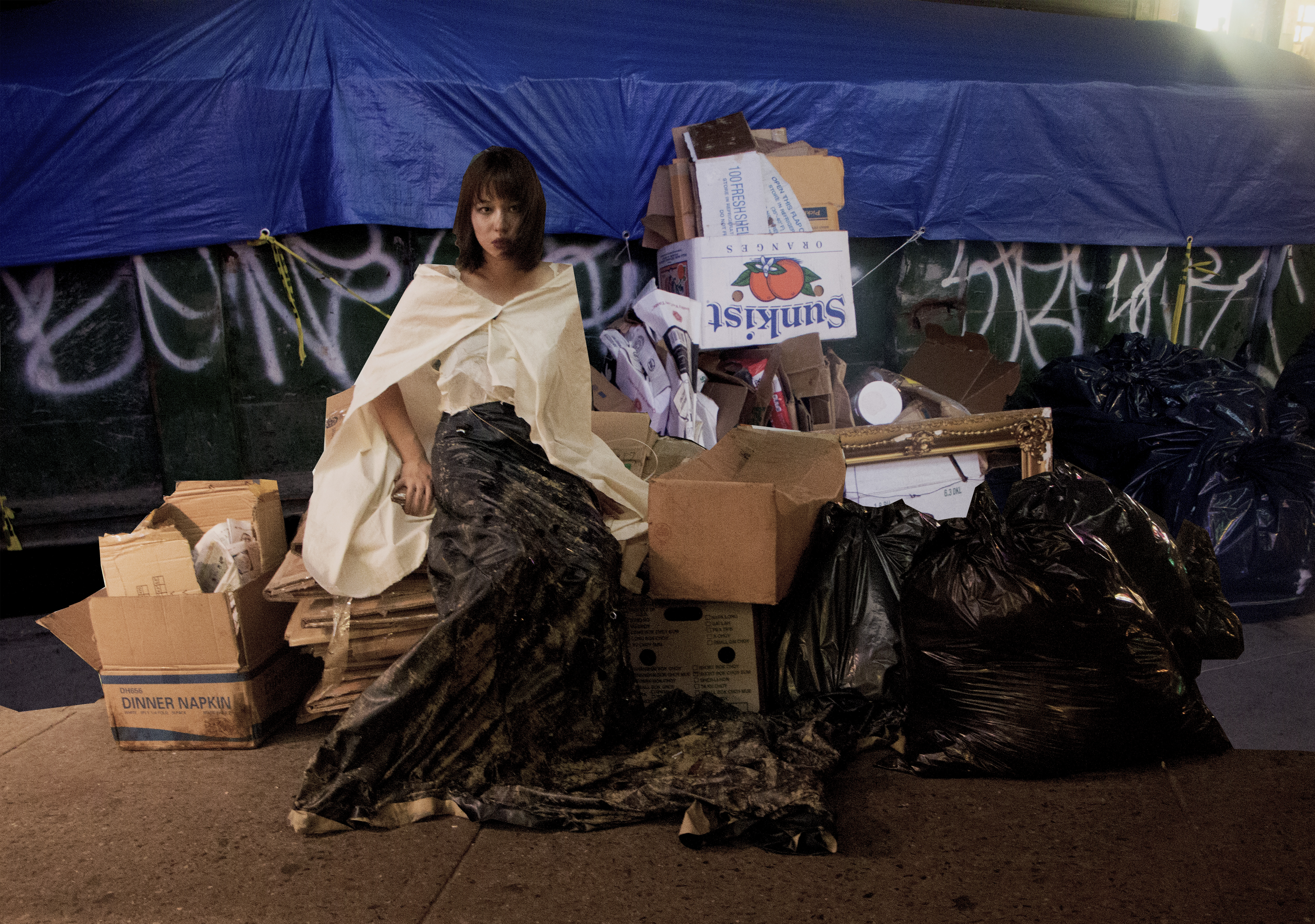

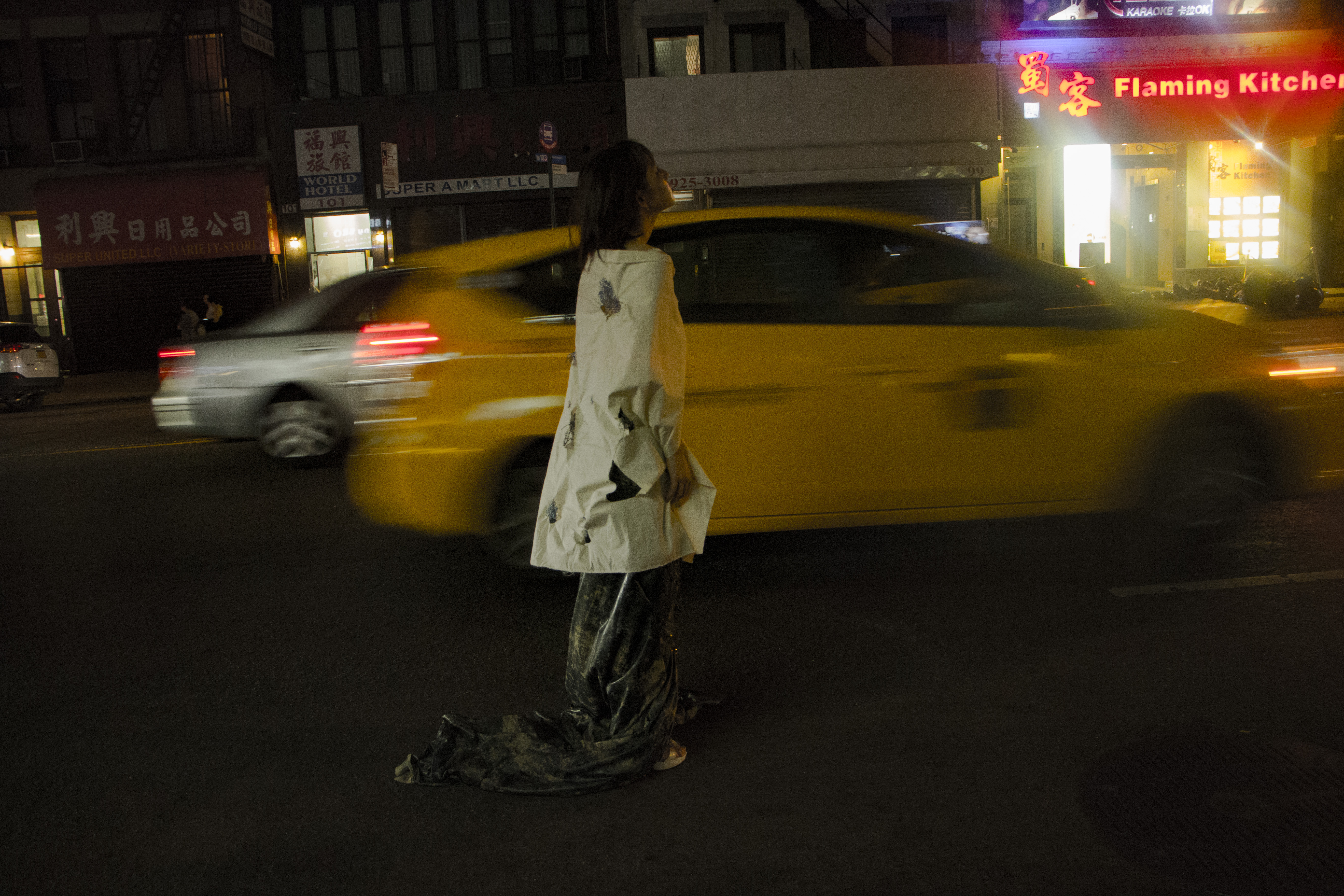
Inspired to convey the different types of brokenness. I gravitated towards the word “oblique” which can be interpreted as askew/not perfect.
Chinatown is full of character and contradictions. Chinatown is not perfect; it has a fluctuating style that makes it special.
With this in mind, I named the collection Oblique Counterflect.
THEME(s) BEHIND FEMTAL:
The blend of edge and a classy look achieves the effect of batesian mimicry.
The personality of the dress is very strong, just like the strong background of stories that take place in Chinatown.
The edge of style is more punk like, and the classy look shows the attitudes and attributes that the people hold.
Both blended together show the immigration of the type of people that live there.
Feminine + Fatal = Femtal
Femtal is the main focus of the collection.
The dress and the cape are titled Femtal in the collection of Oblique Counterflect.
Femtal depicts the contrast of what the collection Oblique Counterflect’s inspiration is.
Overall I learned fashion is art, expressive, and can convey a story. Fashion explores.
This prompted a question to arise in my mind:
What if everyone stopped following the “normal” ways of industrial fashion?
What if fashion was used to convey the real, raw stories of people you come across?
We are currently wearing the past with designs that are being picked out for us ahead of time.
Stores are copying each other.
What has happened?
It is a business.
But when seeing Manus X Machina, and seeing true passion and dedication I now appreciate what fashion can be.
When doing this assignment it was energizing and enjoyable. It was incredible to see how all my classmates got something different out of the same Chinatown.
We hear, see, smell, and feel.
So let’s now start to depict our different perceptions through everyday fashion wear: to inspire, appreciate, and understand more.