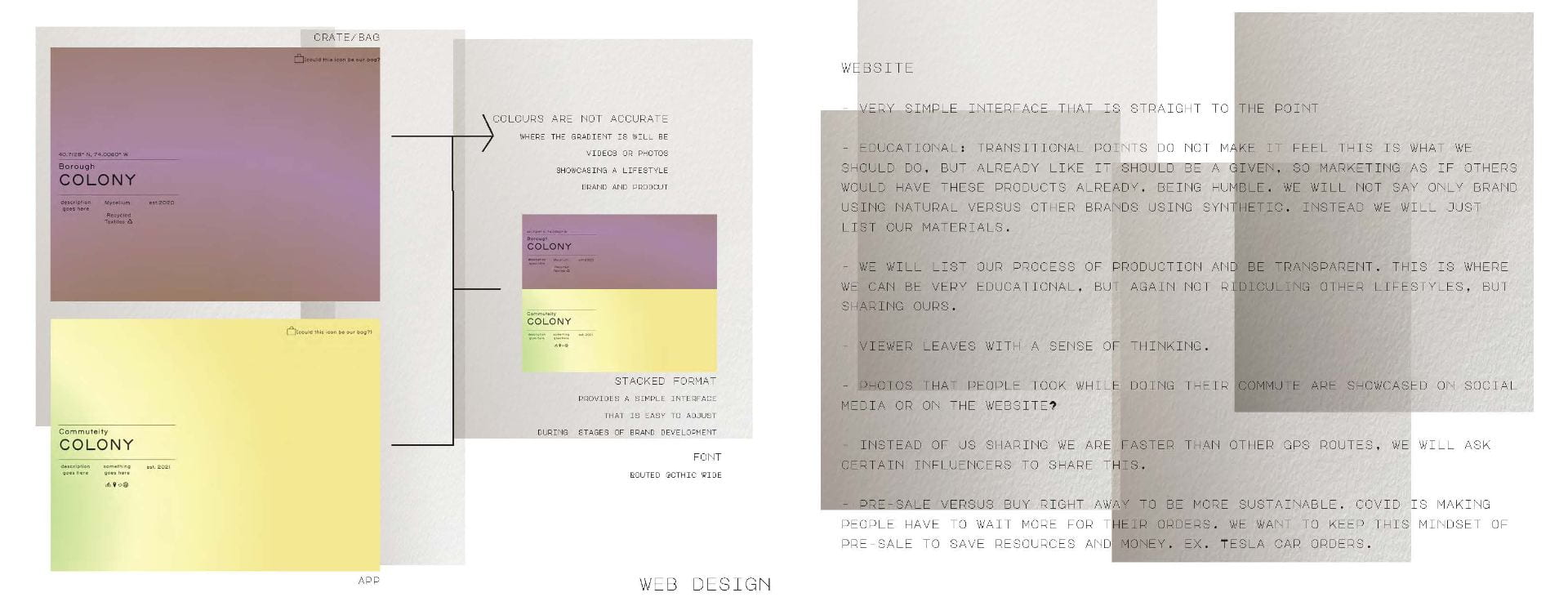
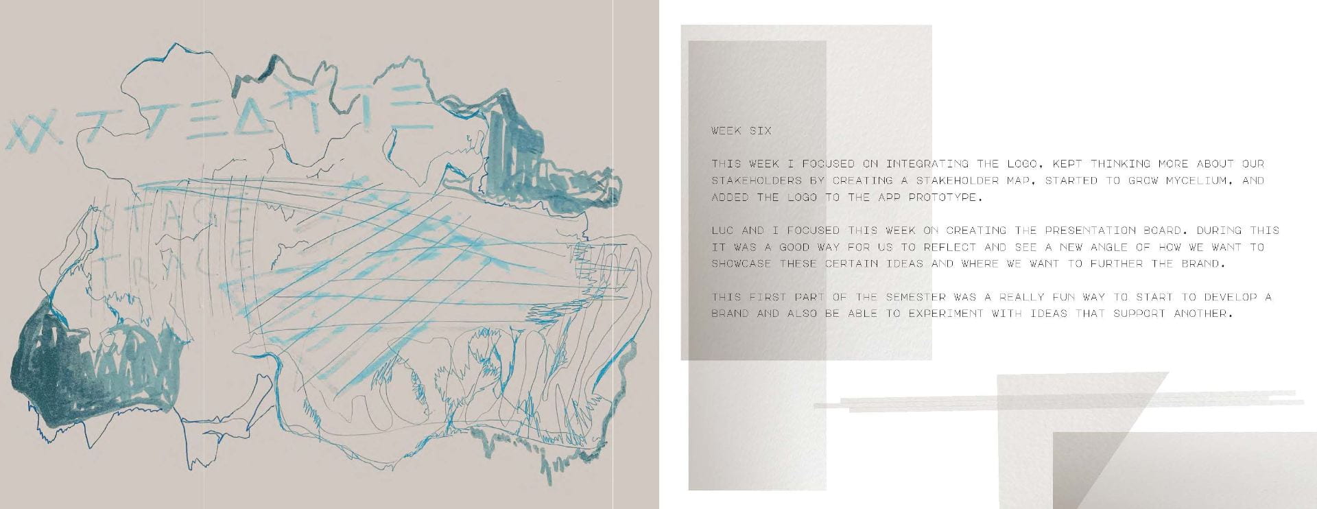
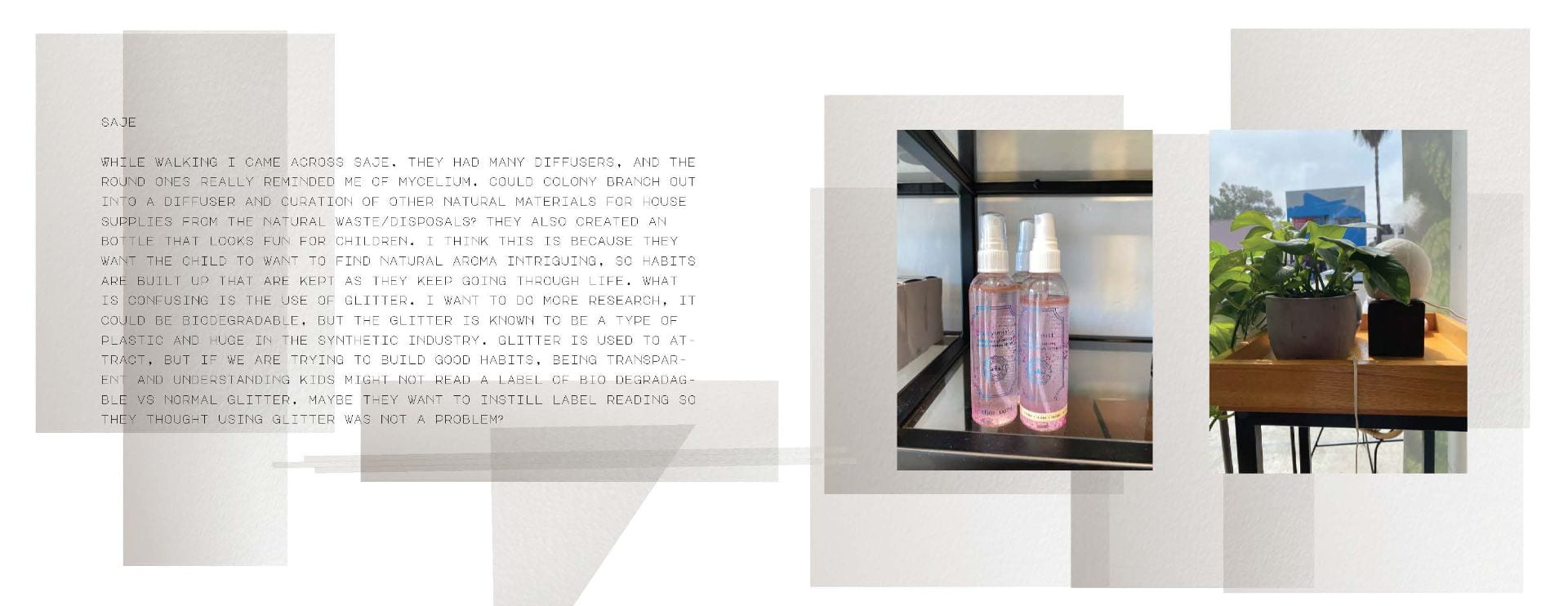
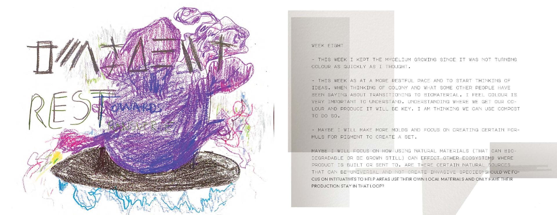
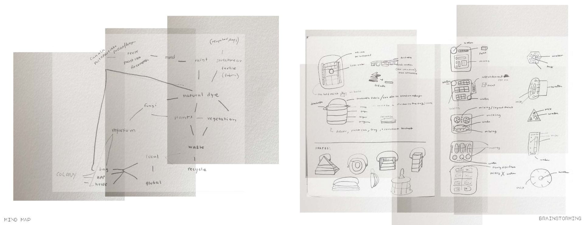
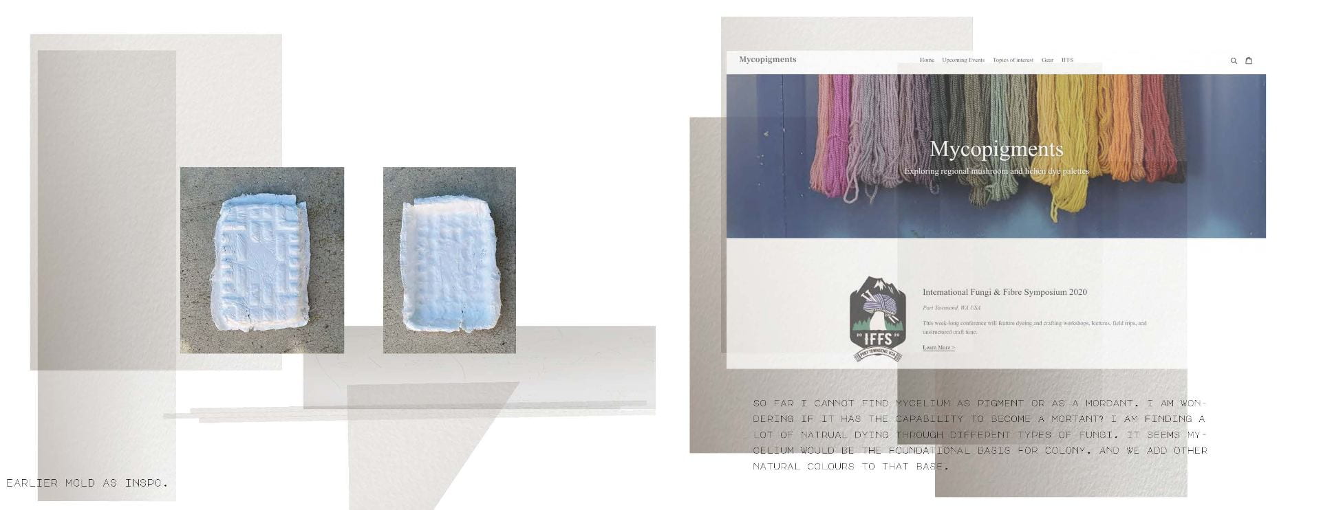
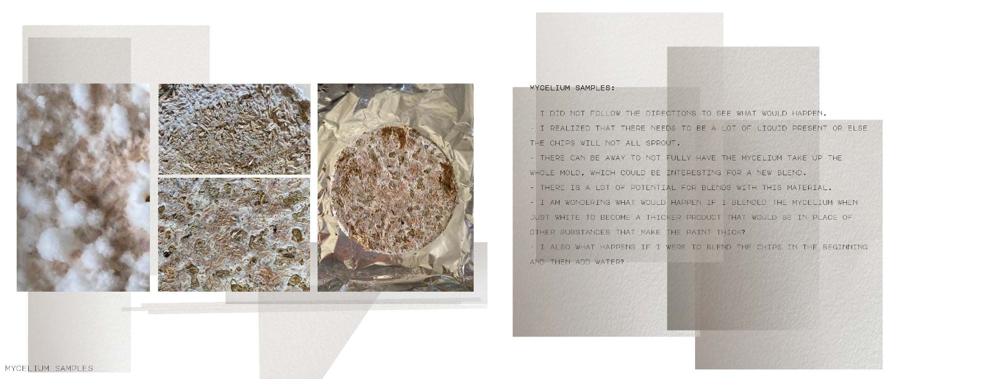
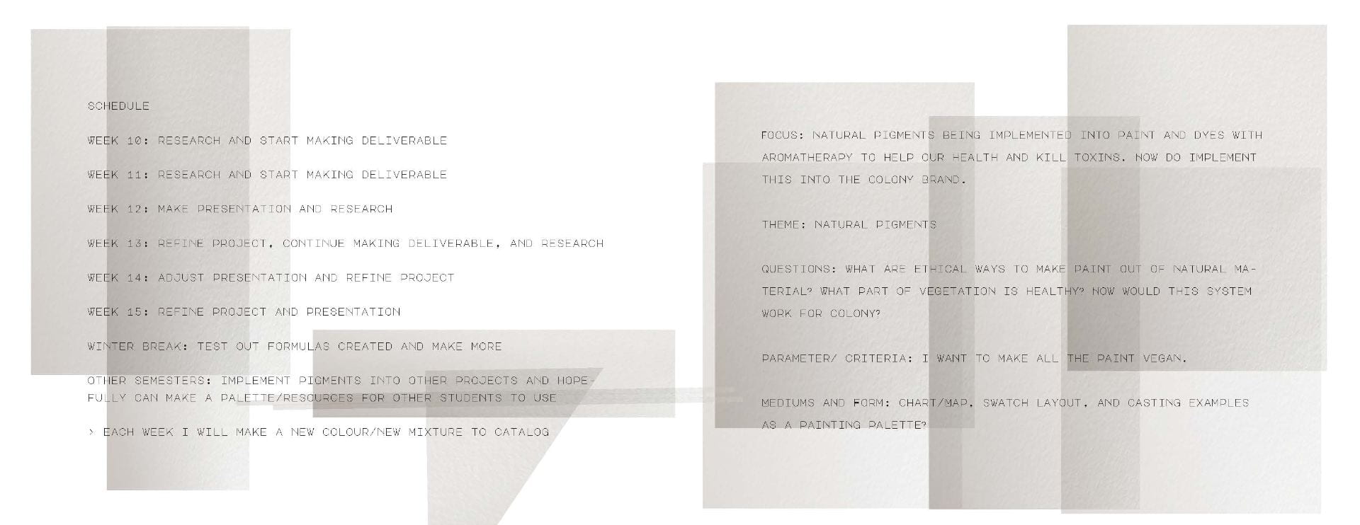
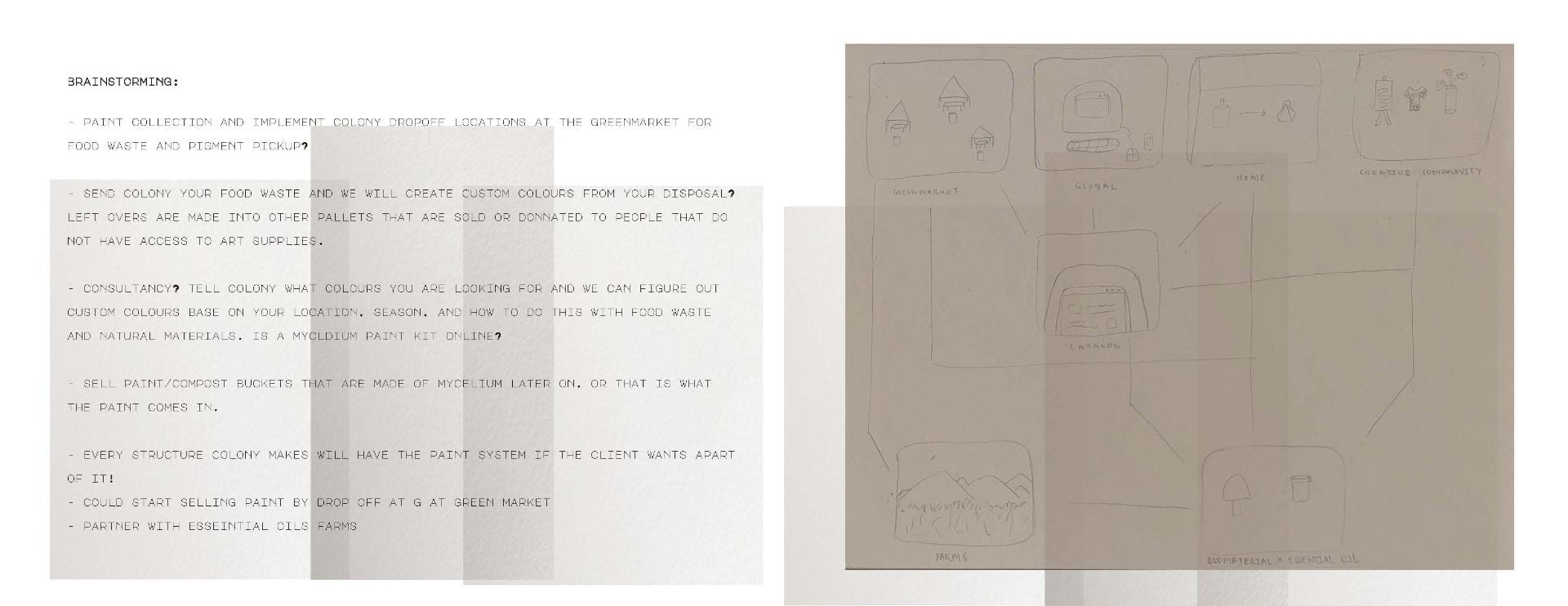
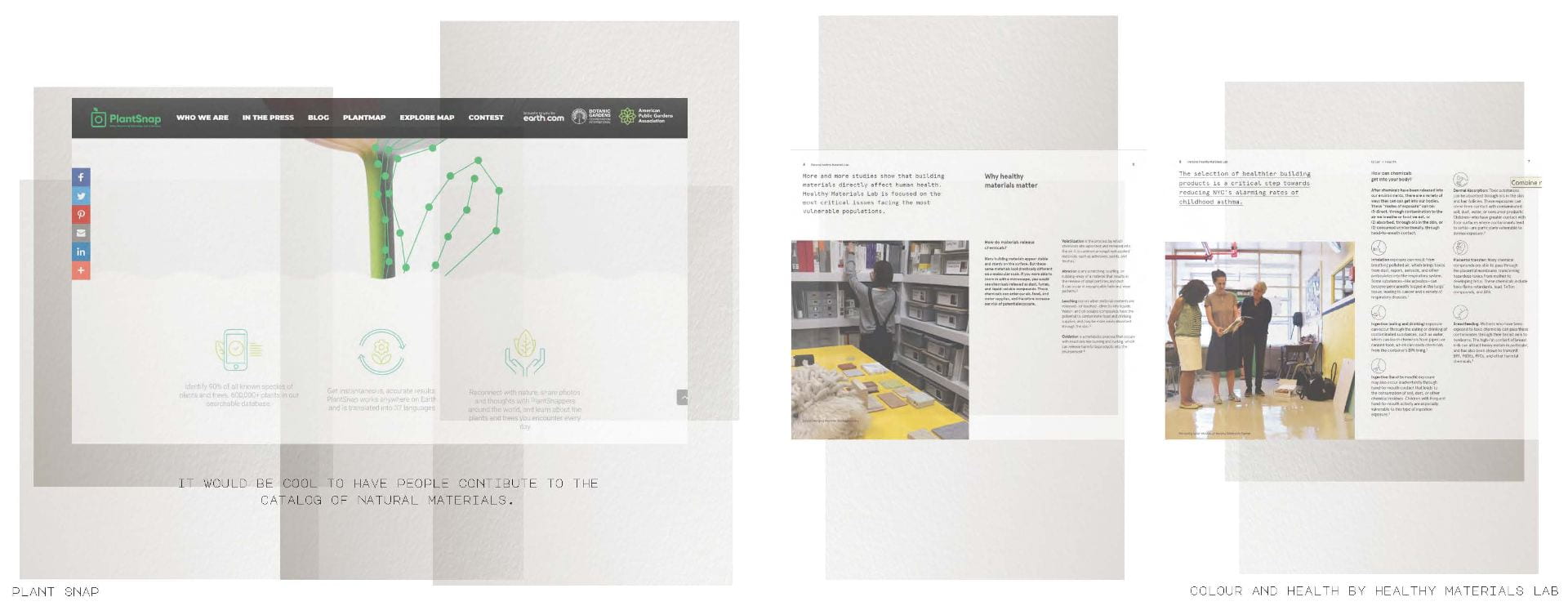
Uncategorized


COLONY : Presentation ~ Y:4/3: STUDIO 3
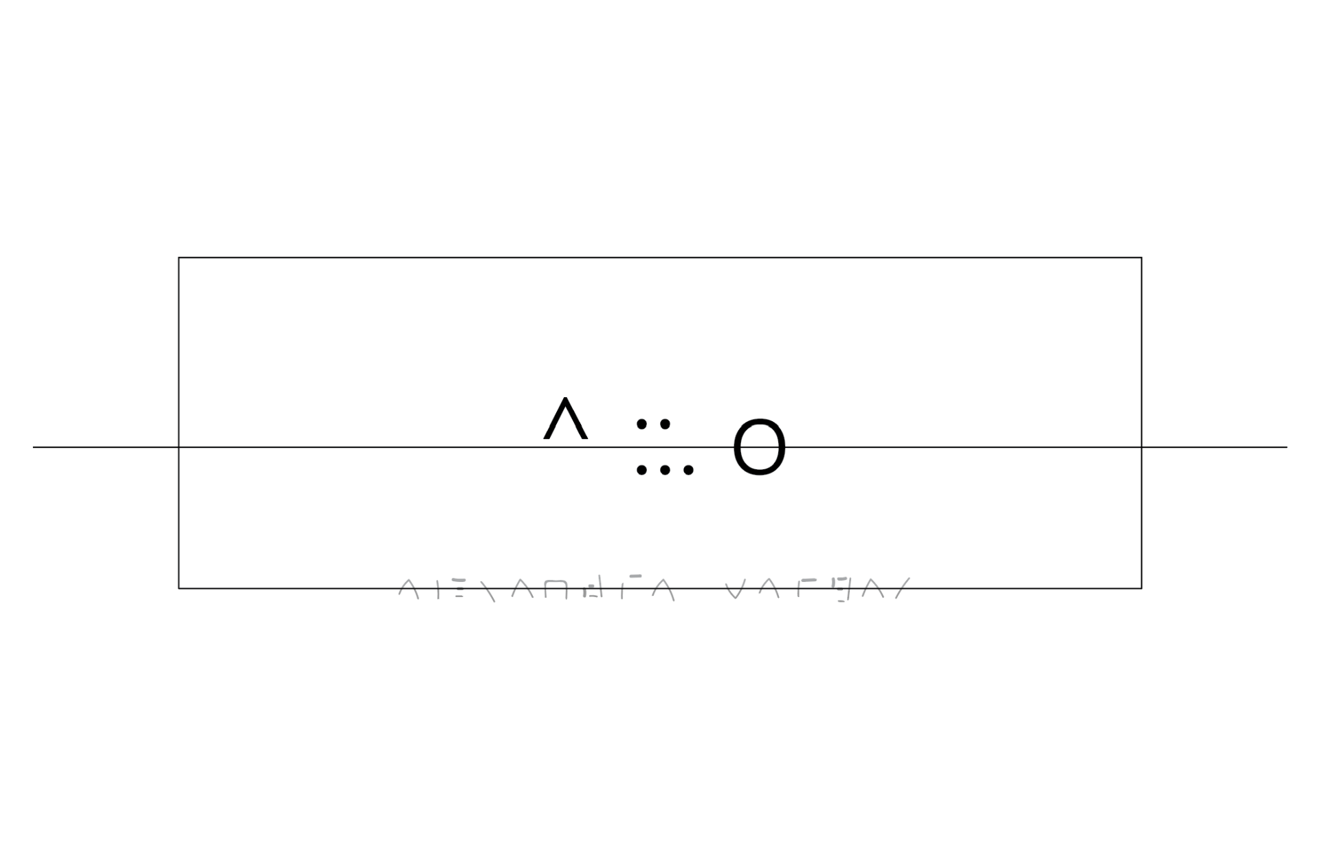
^::.o [ idea for final project] y3/2 studio 1
A focus on this project is on the mental +physical connections we hold with the Earth and where we hope to settle, or have mentally ruled out as an option.
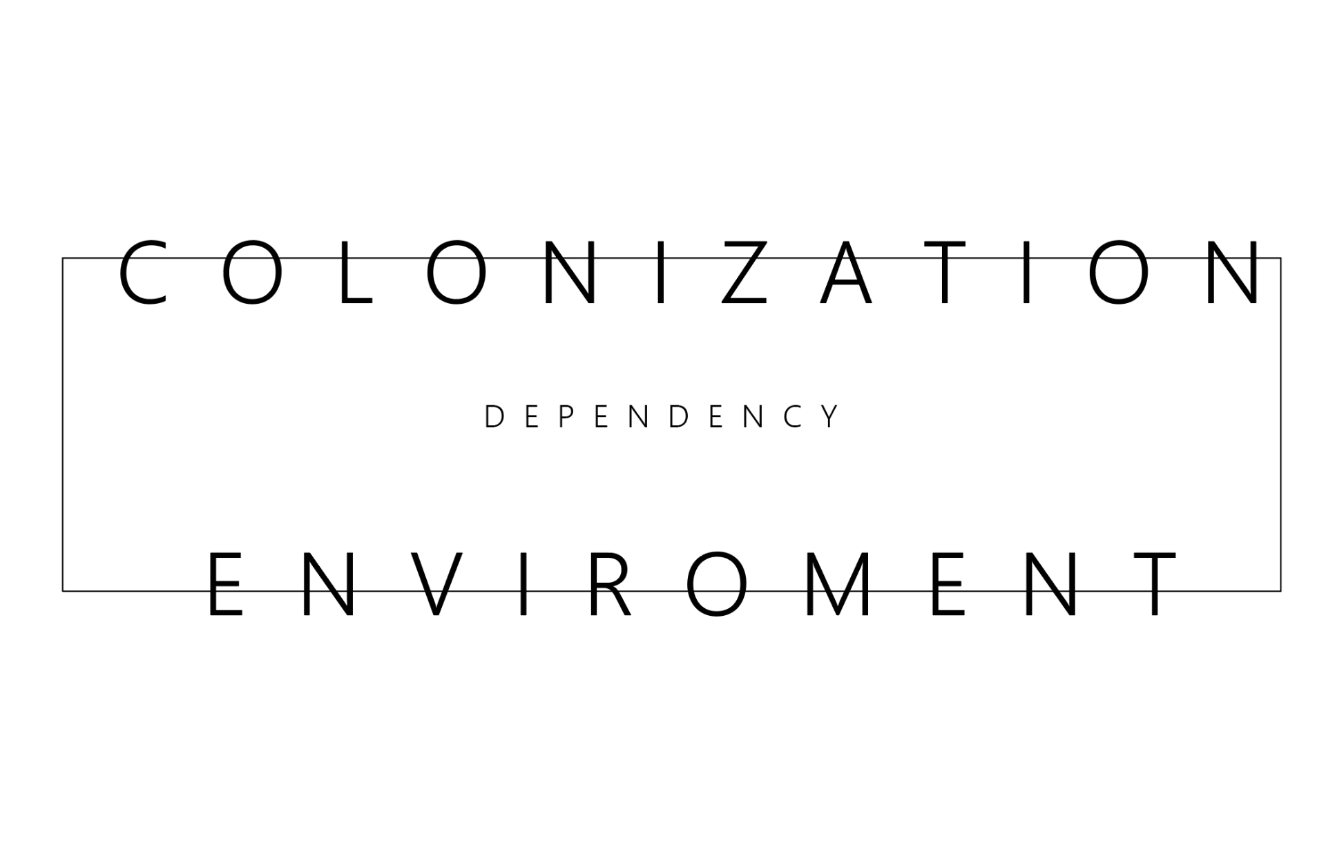
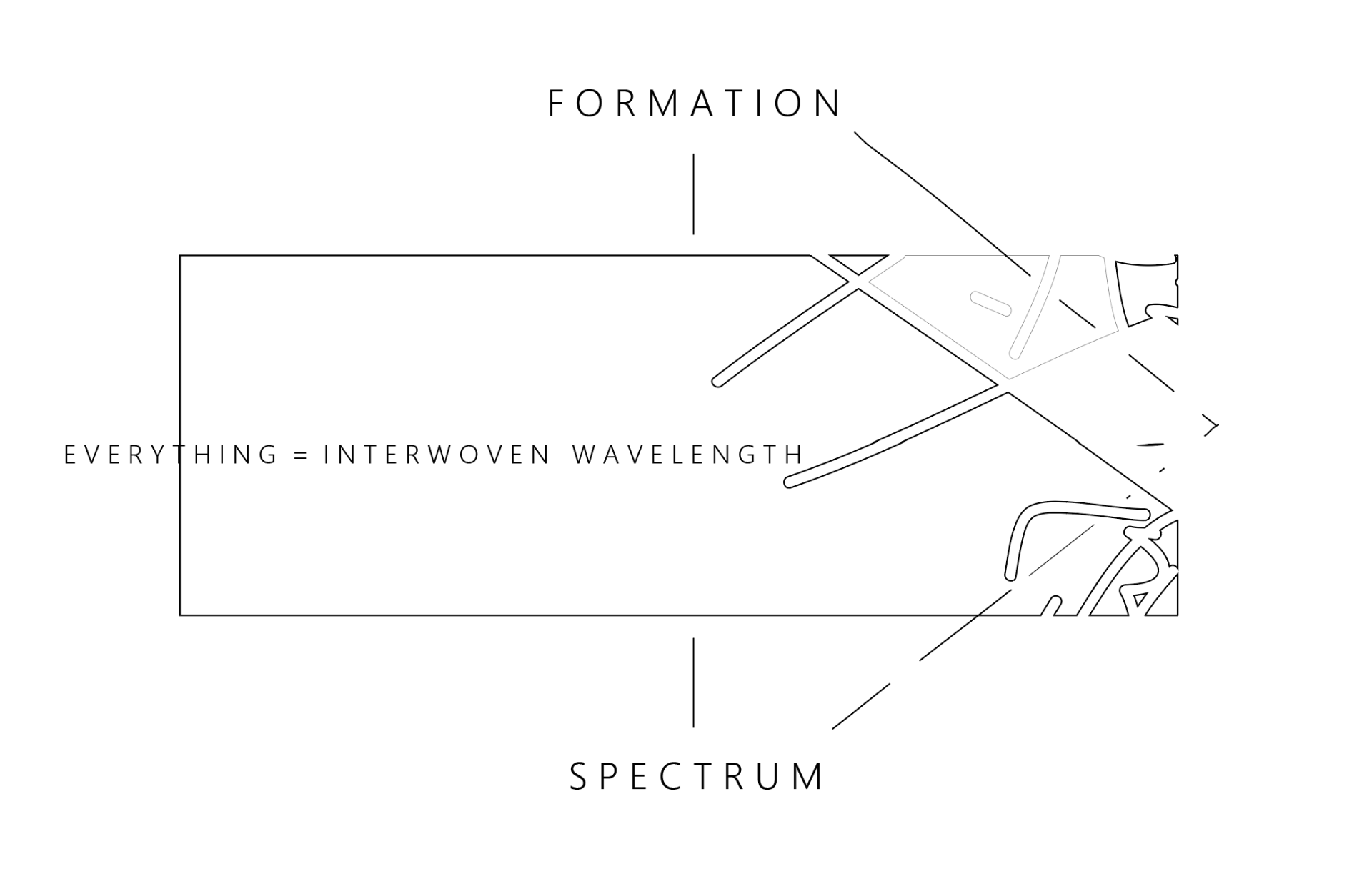
Colonization coincides with its surrounding environment.
This impacts the mental +physical interactions. This also creates more ecosystems within exisiting ecosystems.
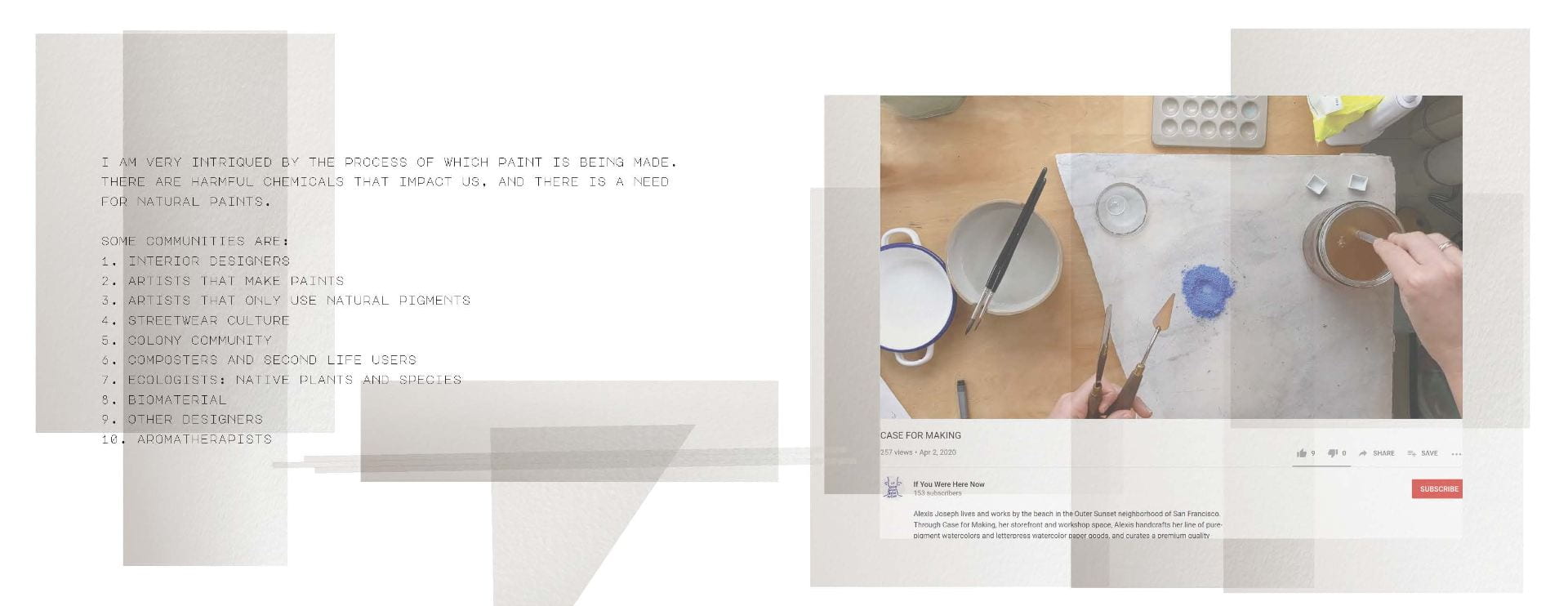
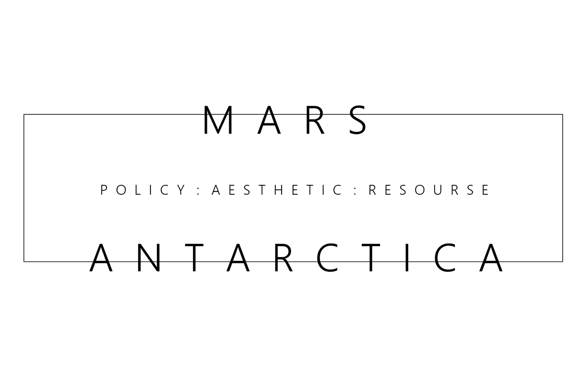
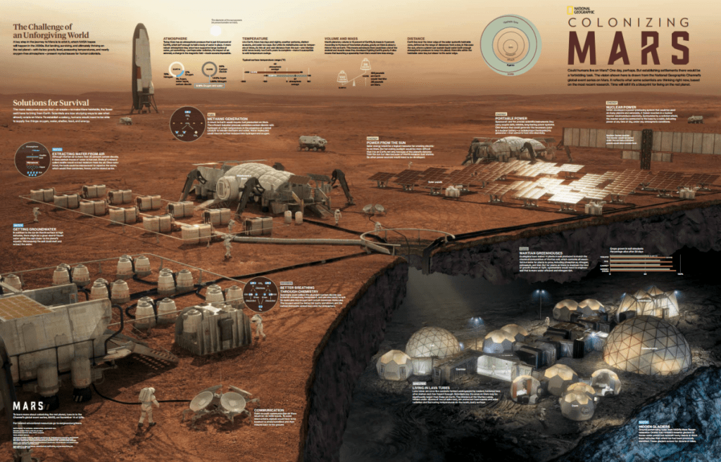
I want to focus on studying Mars + Antarctica because both regions are inhabitable, policies influence another, and it’s terrain brings forth wonder.
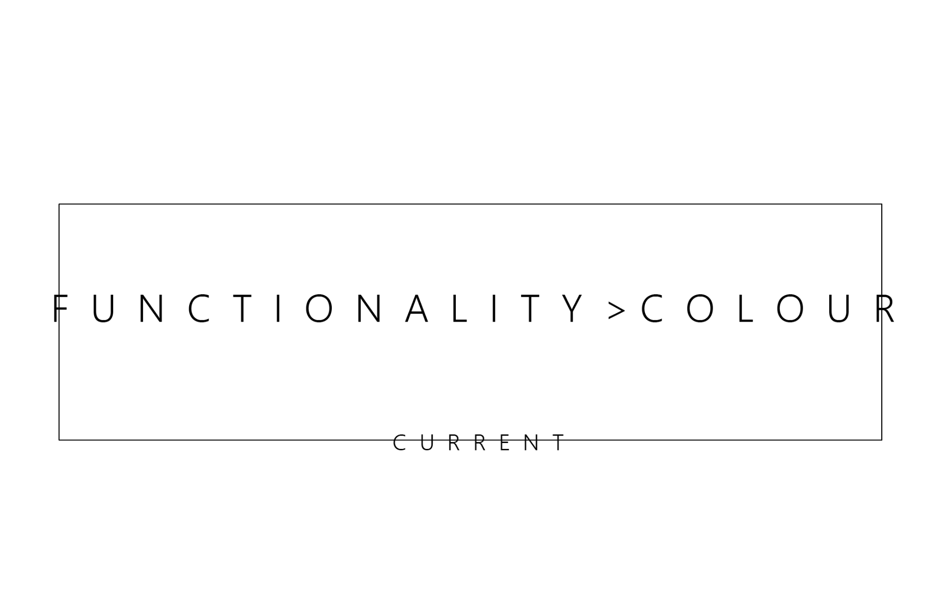
A lot of research is conducted in these areas, and a lot of the equipment being used as well as shelter colour’s do not seem as thought out as in other areas of inhability. It seems that functionality and non permanence is what overrides this. We are looking towards a future of settlement it would be nice to implement colour into these designs that can generate more peace for inhabitants.
Right now colour design for example a building will play with the material. If it looks purple chances are it will just stay purple. It would be cool, especially for long voyages and being encapsulated in a space for a large amount of time for the colour and material to change automatically based on the environmental conditions and feelings for a more peaceful world.
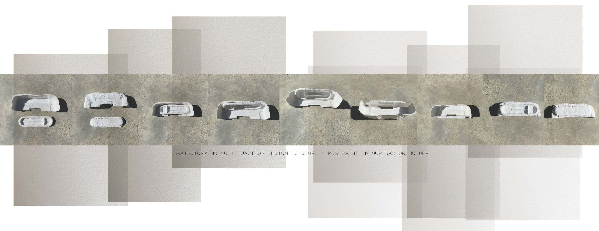
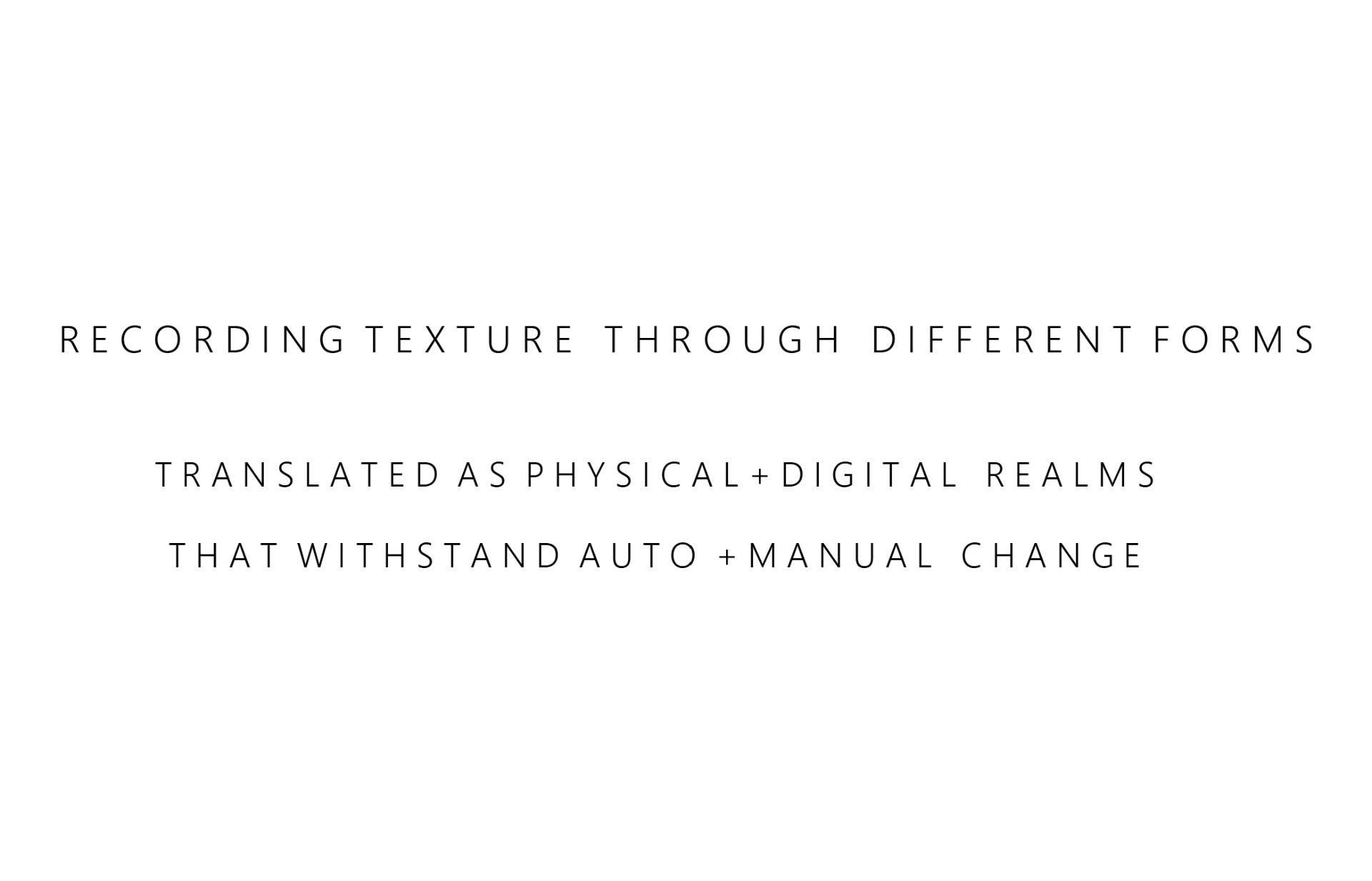
I aim for my project to be multi-versatile. It lessens waste.
This will be inclusive to all with an aim to lessen the idea that there are norms in this world. Nothing is normal. We are all unique. And everyone should be able to enjoy the same thing, in their unique way. I will be continuing to study urban ecology and different types of ecosystems.
I have been exploring VR. Right now I am at crossroads between VR and AR. They are dangerous tools. I would chose VR to immerse the viewer into the structure that changes to their emotion. I would chose AR to immerse the viewer with the real world. I would create a structure and have projections that would trigger the AR device. I am curious to learn these tools to be prepared for what is to come.
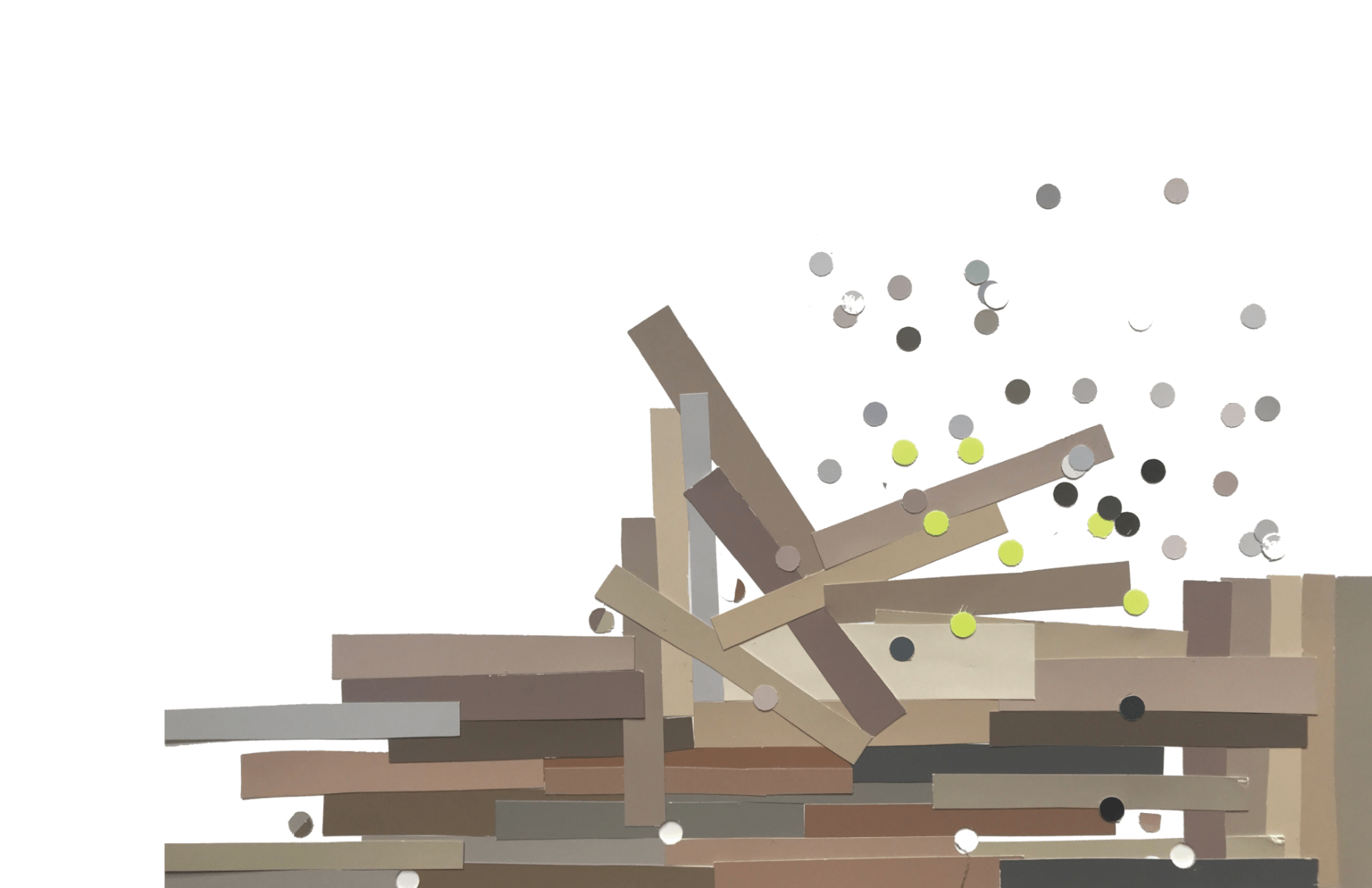
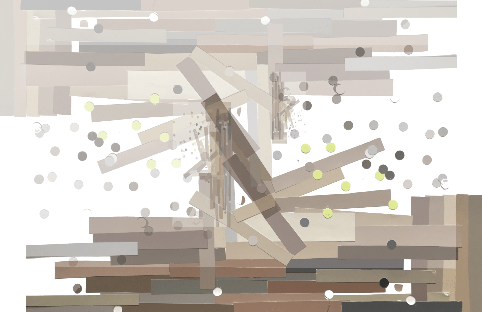
I also am going to be using Paint by google in VR to draw ideas by sketching and recording those formations of structures using the colours I find within terrain of Antarctica and Mars of colours that will naturally reflect well vs man made colour reflection. These colours will link to the mind of how certain colours make us feel and with body temperature.
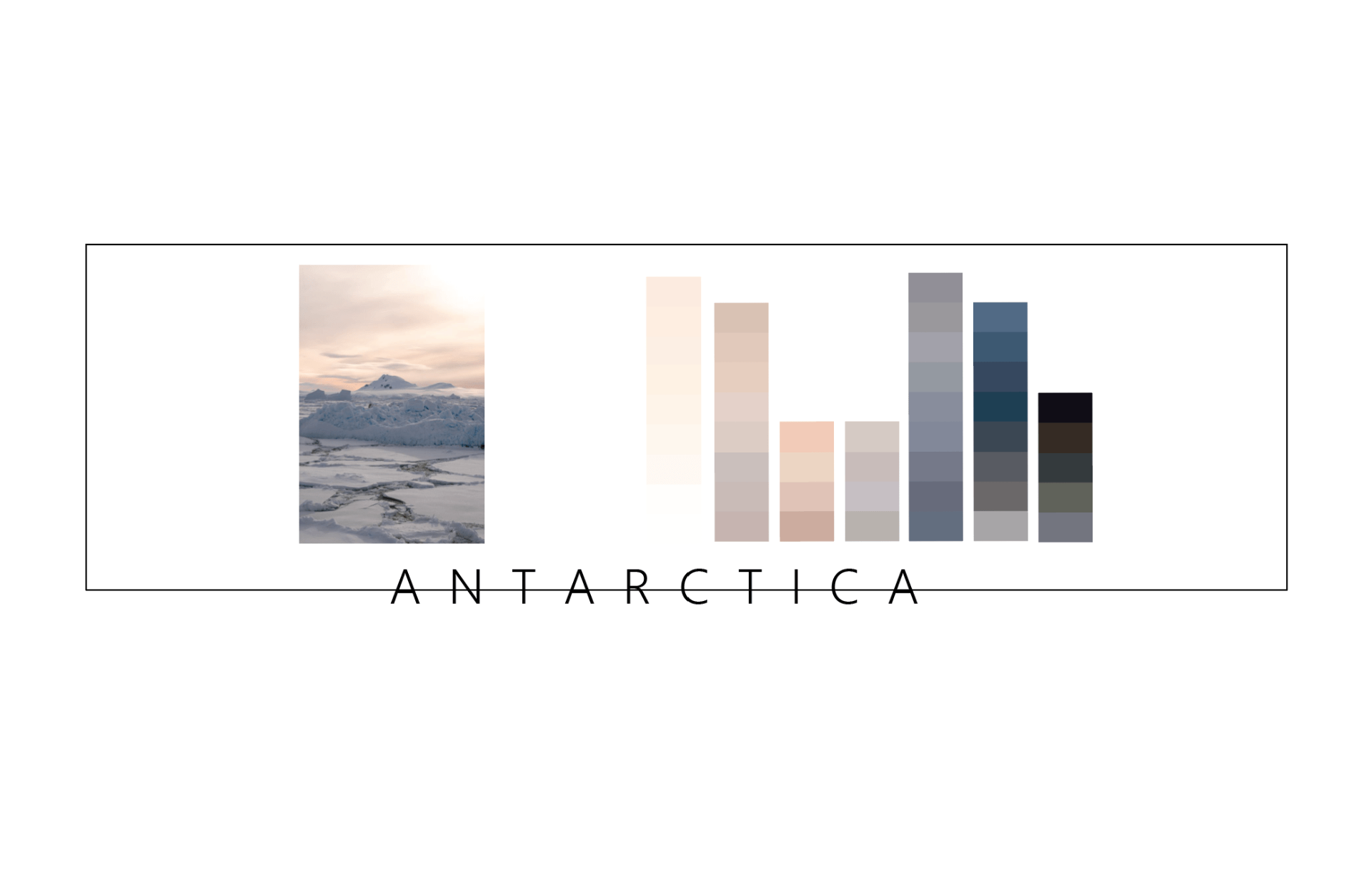
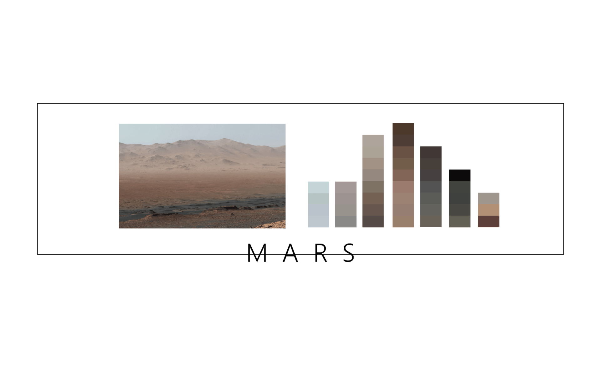
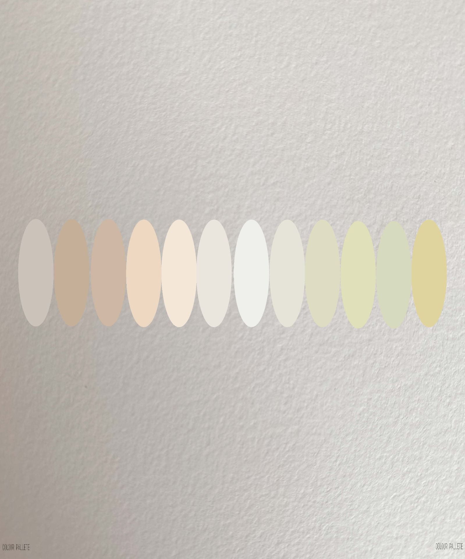
These are a few of many hues I collected from my visual vocabulary. I get a lot of inspiration from reality photography.
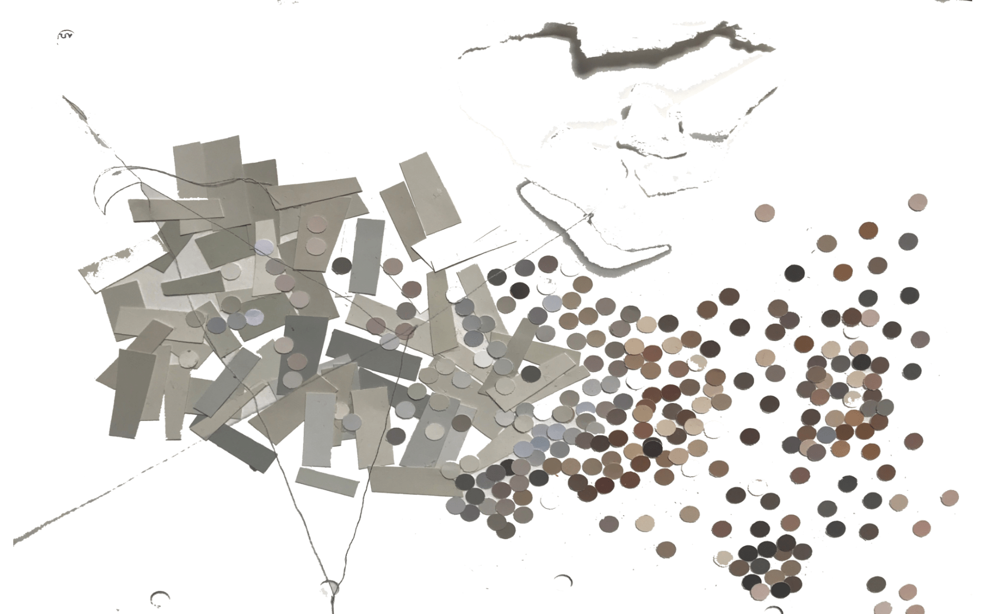
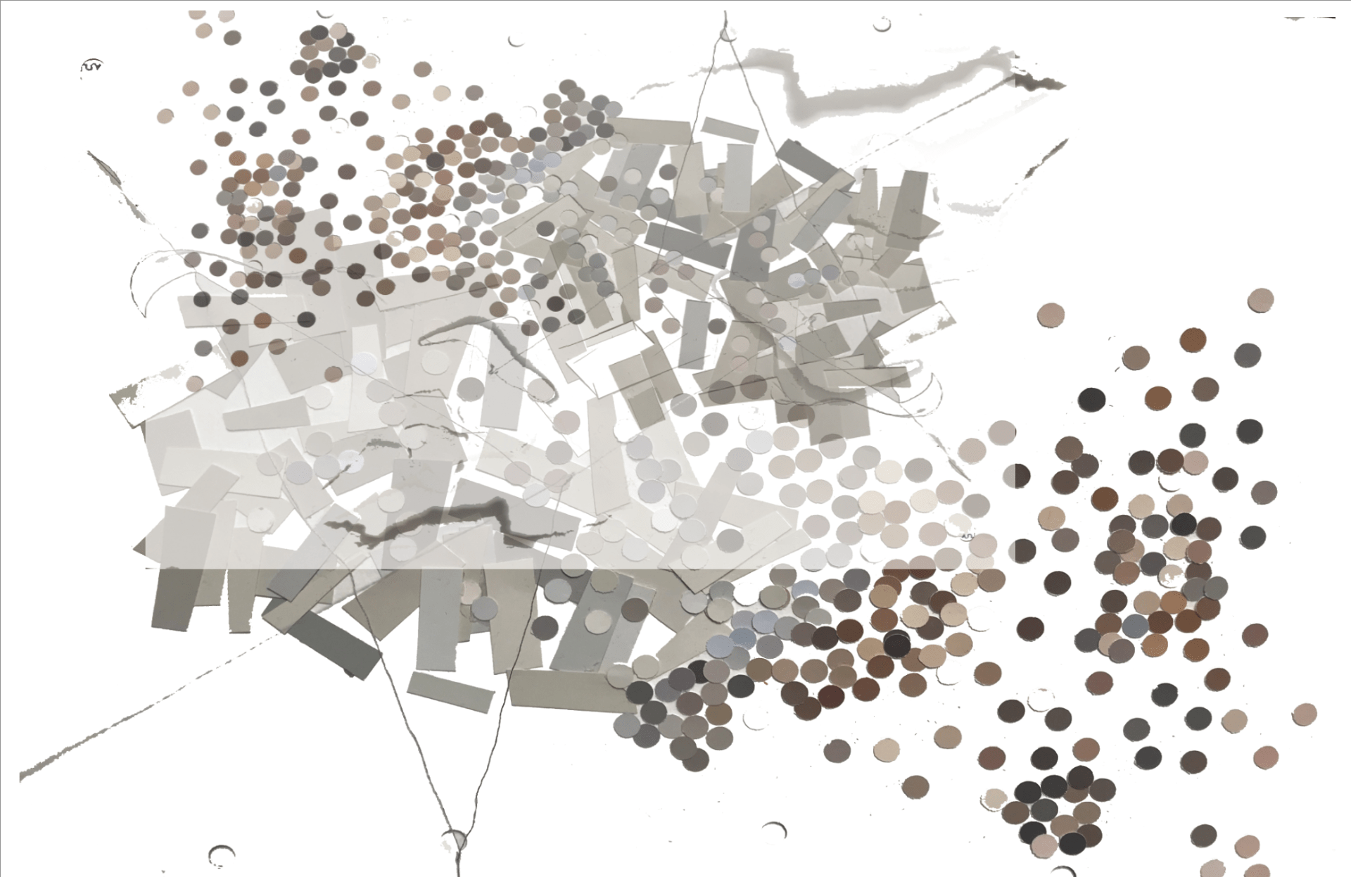
Here are the combined colours from these two pictures, and I am drawing with them. There are overlays that are playing with opacity as well to see when light hits these colours in different ways their reaction points.
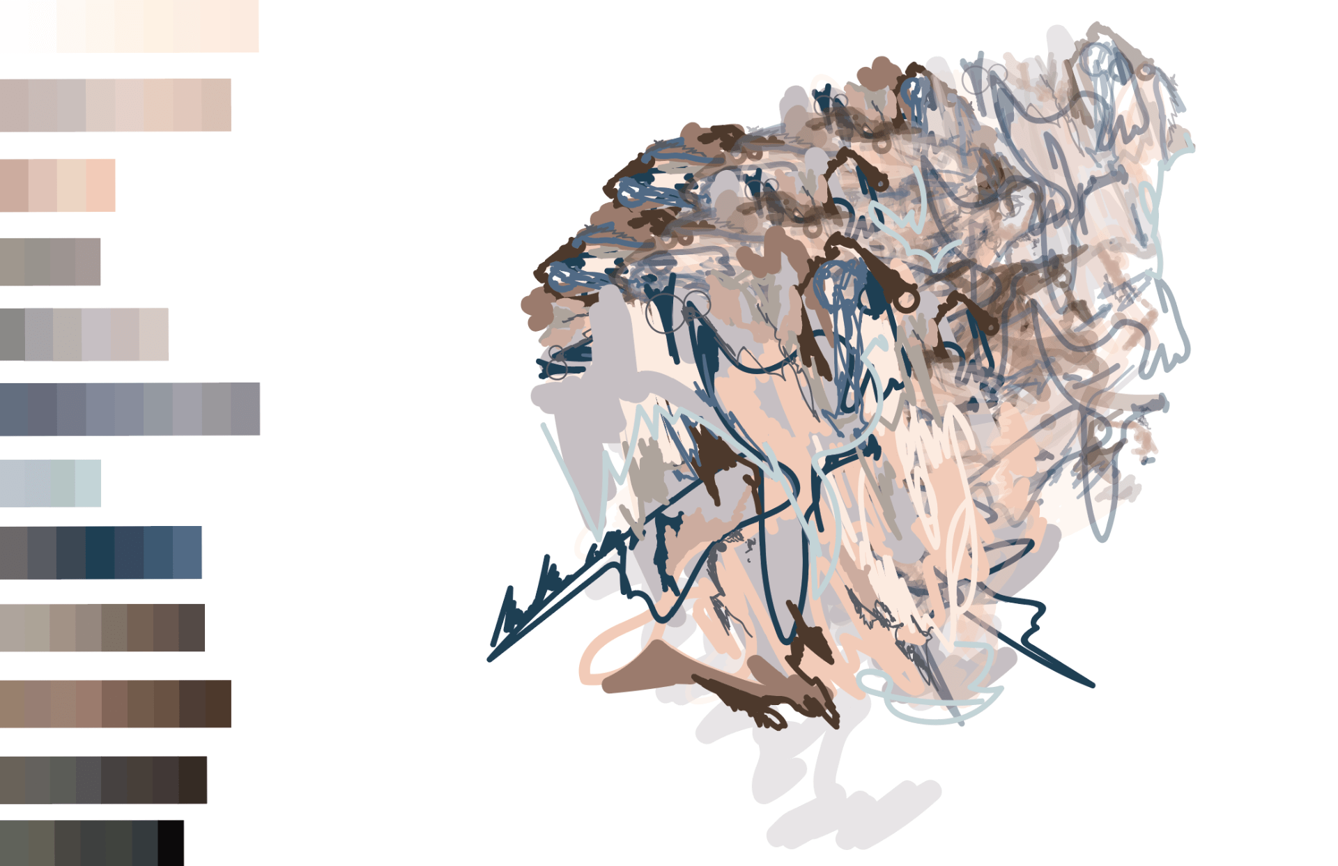
I am continuing to do this process in which I will make into a book (possiably with augmented reality?) just for people’s curiosity of the different colours that are in a setting we might not always be aware of. This perception of colour can allow people to get even more creative to play with colours within their designs.
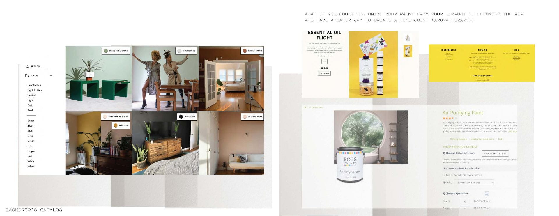
Here are some ideas of me playing with hue from paint swatches from Home Dept. A place that people nationally get their colours for their structures from. I wanted to see how this related to the colours I pulled out from the terrain, and what we are not accessing within our own society today.
OBJECTIVE:
Steps-Process:
I believe that research is also experimentation. There are so many different questions and kidns of ways to discover.
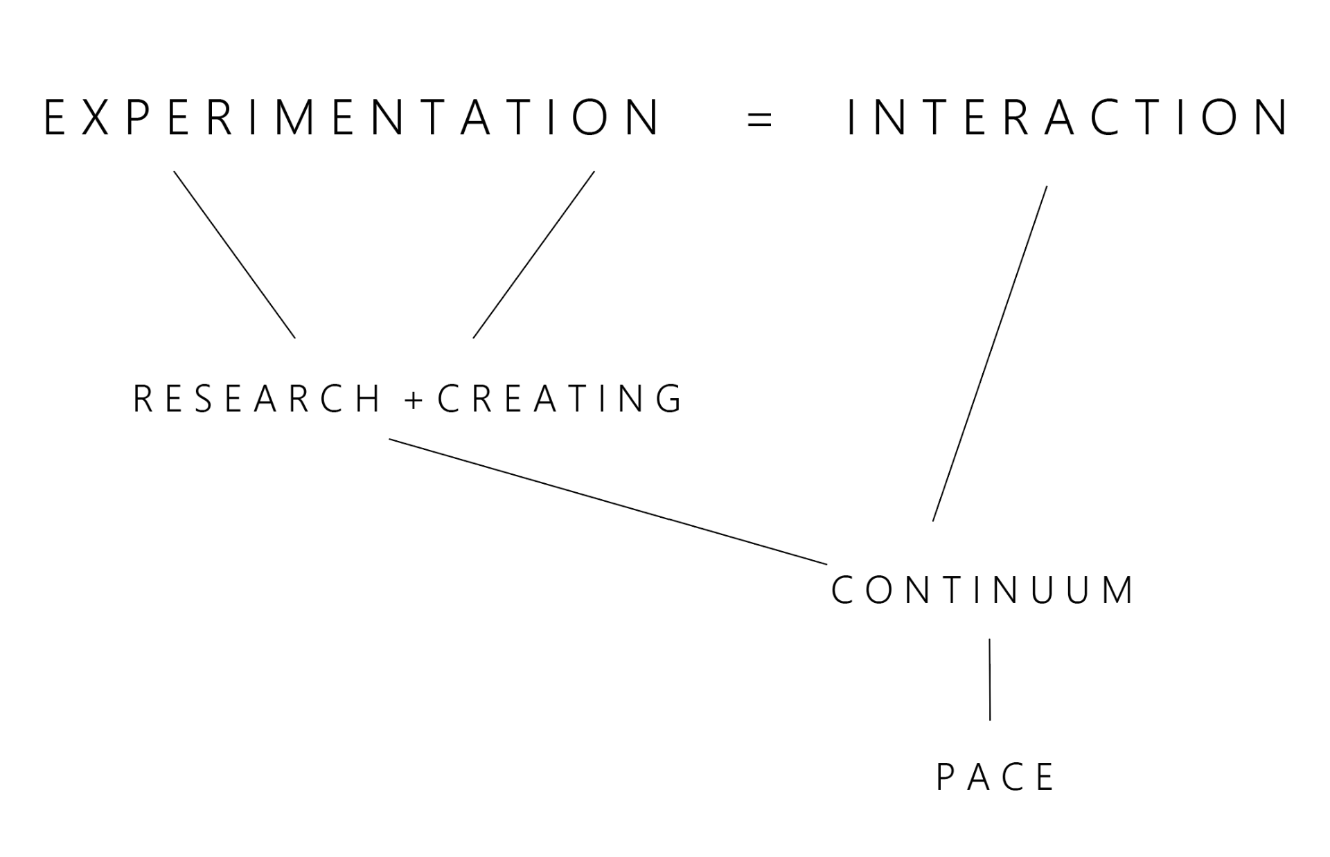
I seperated three parts towards “steps”, but I still will continually use all these aspects during the whole process:
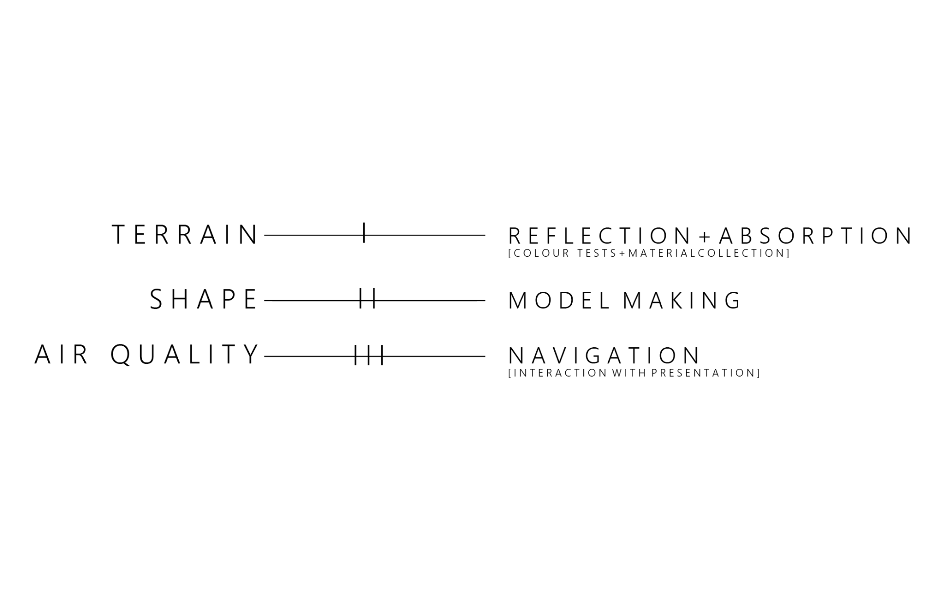
- Focusing on the terrain of both Antarctica and Mars. A lot of colours we chose impacts the effects and flow occurring in the surrounding habitat. Also again with colour swatching that is a countious project. Going to material labs andpainting places to see swatches of materials they are using to learn how light reflections and our current perception of light.
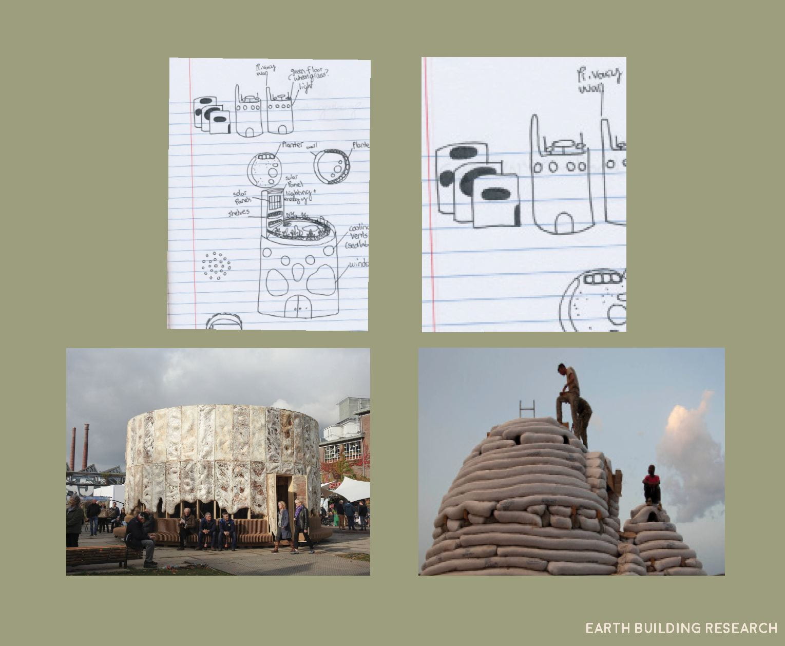
- Making more 3-D models to inspire me and see how colour plays within angles and structure.
One of some 3-D models so far were done with nature elements found on the ground within NYC:
Also, 3D sculptures in class were quite helpful for this element of process.
3. Researching air quality within Antarctica. This impacts the way people will move around the terrain. This impacts the way the design looks like and pathways are formed. In both places certain garments at the moment in time are required to keep us warm.. this might not be the case though in the future! The way we move in the space also links to our mental and physical being.
This semester so far I participated in many different orientations to find out methods that might inspire me to work with:
- Motion Capture
- X Reality Lab
- Web + Casting Lab
- Screen-printing
- Metal Shop
- Vacuum Sealing (on waiting list)
- 3D printing
- Risograph ( most sustainable way to print)
Some books out of many I have been researching out of:
- Planetary Echoes by Spector Books
- Urban Ecosystems by Frederick Alder + Colby Tanner
- Interior Design by Mini Love +Chris Grimley
A a brief sample of a ton research + resources so far:
- The Great Hack (2019)
- Jon Rafman’s video (I forgot what it is called…. when I find the link I will insert it here). It shows the formation of people following each other in society through digital video art.
- The reason why we haven’t settled so fast on Mars or the Moon is because of the access we have to drinking water:
https://en.wikipedia.org/wiki/Martian_chaos_terrain :
“Some parts of this chaotic area have not collapsed completely—they are still formed into large mesas, so they may still contain water ice. Chaos regions formed long ago.
- Most of the chaotic terrain exists in the highlands of Mars
- Theory formed from many floods and that there were even massive floods
Many explanations involve the sudden melting of giant reservoirs of ground ice. Some researchers have suggested that a frozen layer, called a cryosphere, developed over a long time period and then something triggered it to rupture and melt suddenly. The rupturing event may have been impacts, magma movements, seismic activity, volcanic tectonic strains,increased pore pressure, or the dissociation of clathrates. A clathrate composed of carbon dioxide and methane could have explosively dissociated, thereby liquefying water-saturated sediments. A variation of this idea of a cryosphere is that an aquifer was created along with the cryosphere. As more and more ice was added resulting in a thicker cryosphere, the water in the aquifer became pressurized. When something like an impact or movement of magma broke or melted the cryosphere, floods of water under great pressure were released. However, further calculations showed that the great channels could not have been produced with just a single discharge.”
4. Maps:

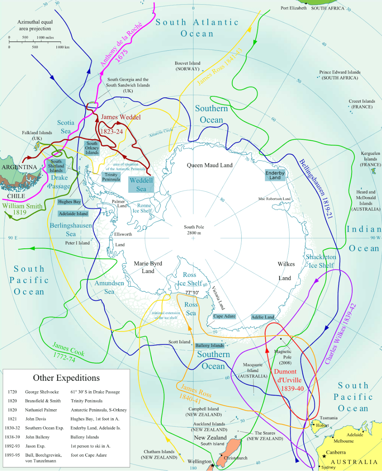
5. Antarctic Discovery:
Early 1400s had the idea of Terra Australis Incognita exists.
https://en.wikipedia.org/wiki/History_of_Antarctica
“1473
Portuguese navigator Lopes Gonçalves proved that the equator could be crossed, and cartographers and sailors began to assume the existence of another, temperate continent to the south of the known world.
The doubling of the Cape of Good Hope in 1487 by Bartolomeu Dias first brought explorers within touch of the Antarctic cold, and proved that there was an ocean separating Africa from any Antarctic land that might exist[2]
In 1599, according to the account of Jacob le Maire, the Dutch Dirck Gerritsz Pomp observed mountainous land at latitude (64°). If so, these were the South Shetland Islands, and possibly the first European sighting of Antarctica (or offshore-lying islands belonging to it).
1771: James Cook attempts but gets stopped by an ice burg was extremely close.
1819: a few of the 644 crew of the wrecked Spanish ship of the line San Telmo might have been the first men to set foot on Antarctica before probably dying of hypothermia – but there is no proof that they did.
1820: technology helps make expeditions more possible
- a Russian expedition led by Fabian Gottlieb von Bellingshausen and Mikhail Lazarev discovered an ice shelf at Princess Martha Coast became the first explorers to see and officially discover the land of the continent of Antarctica.
- a British expedition captained by Edward Bransfield sighted Trinity Peninsula,
- American sealer Nathaniel Palmer sighted Antarctica
1881:
- The first landing was probably just over a year later when American Captain John Davis, a sealer, set foot on the ice.
1820, Nathaniel Palmer, an American sealer looking for seal breeding grounds, using maps made by the Loper whaling family, sighted what is now known as the Antarctic Peninsula, located between 55 and 80 degrees west.”
6. Treaties:
- Antarctic treaty system….. https://www.ats.aq/e/ats.htm
- Outer space treaty http://www.unoosa.org/oosa/en/ourwork/spacelaw/treaties/introouterspacetreaty.html
7. Spoke with Laura Hutchinson about new ways and her experience of using VR x Audio including how to be inclusive with all mediums.
8. Listened to Gal Nissim….. give a talk about using audio and walking experience with animals in the park. Immersing the public into the parks and to be aware during all light forms.
9. Abstract episode about Ian Splatter. When he worked at Instagram and his design process.
Some keywords for this project:
I see this project as one part or introductory/developing research towards a larger goal and a collective resource.
Links of Correlations ~ 1st Year
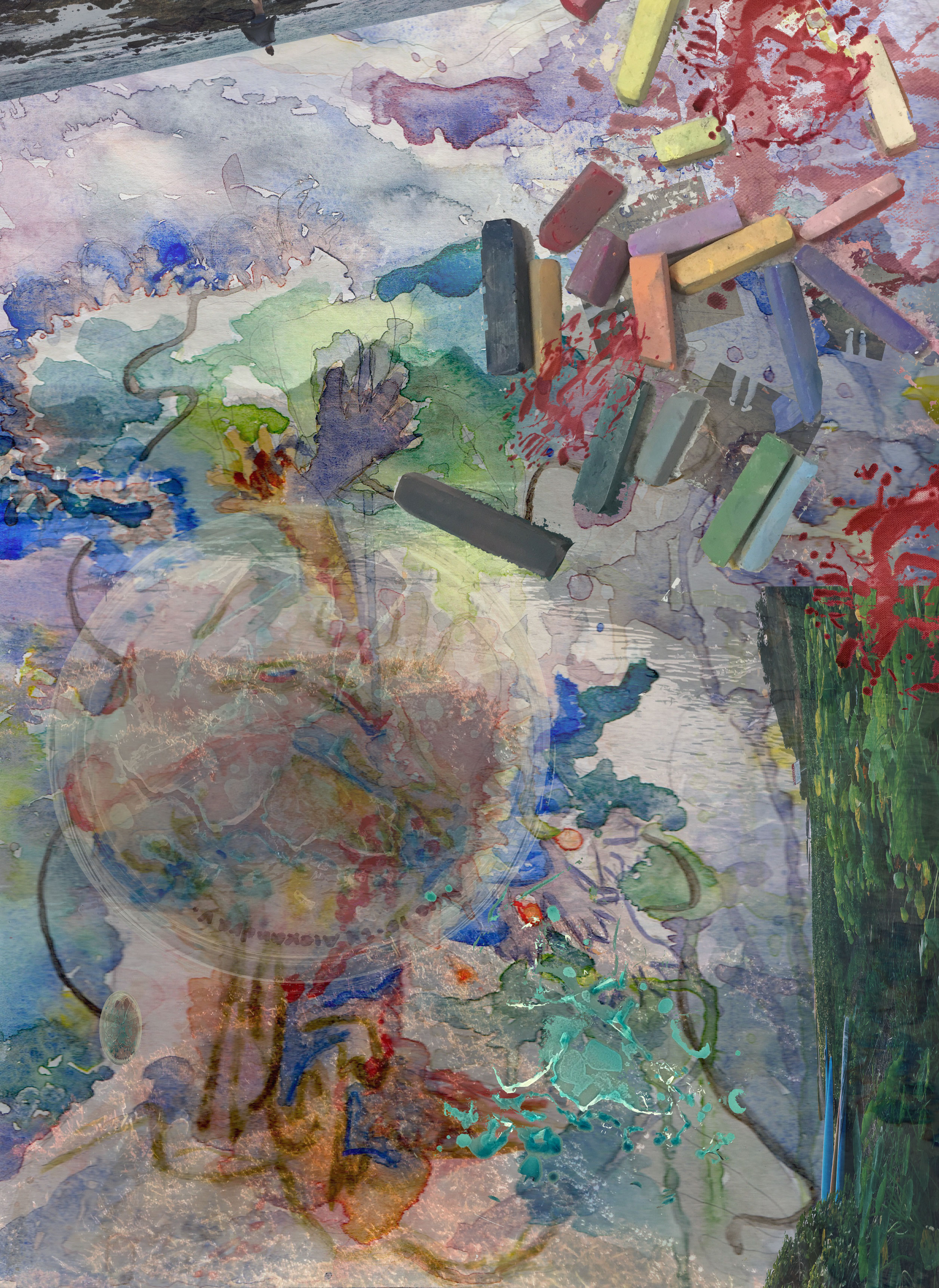
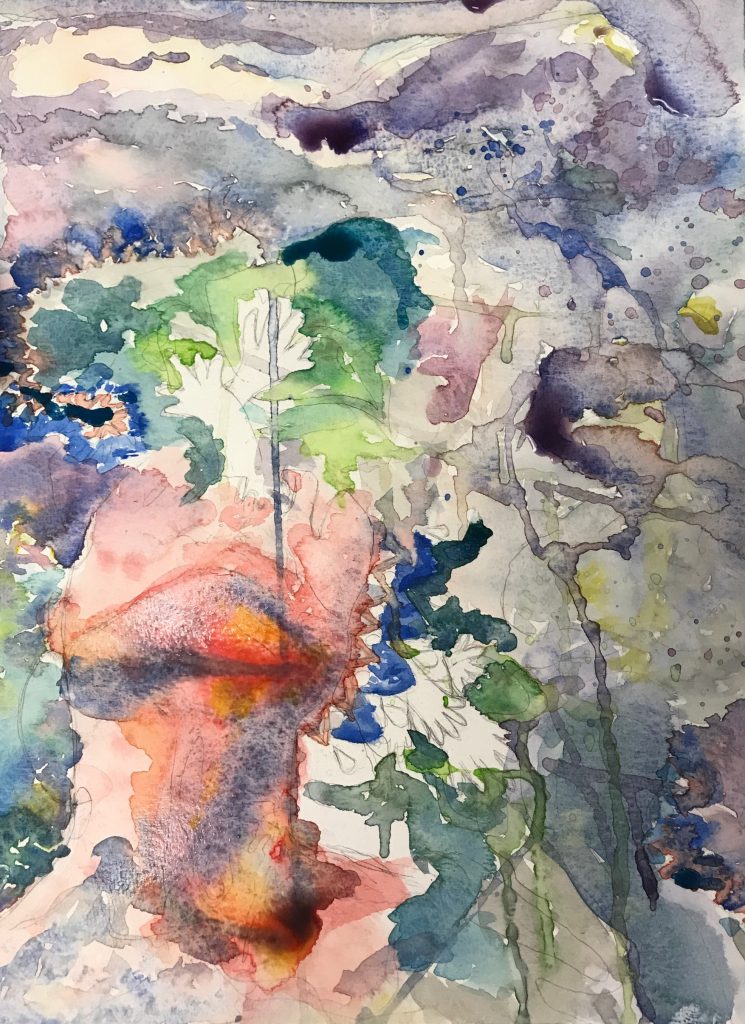
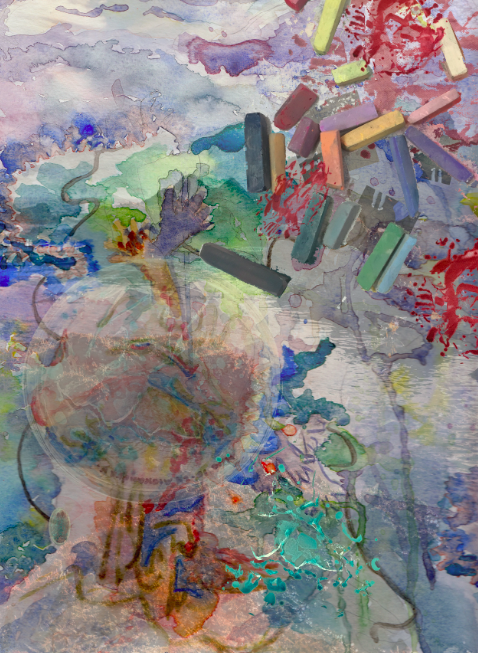
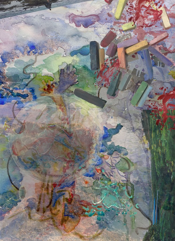
I was so excited to be able to paint what I heard. Usually I just listen to a song and paint the everything I hear in terms of colors I feel and see, and frequencies. But this time I went for more of a realistic picture I saw in my head. The song I listened to was “La Baie” covered by Clara Luciani. I saw a scene at night in France where it was dark with glimmers of random lights of purple and yellow where a girl had her head into titled up at an odd angle. My watercolor ended up becoming more abstract, but I will talk more about that later.
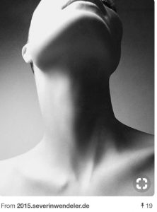
When drawing the composition: I used this neck as a reference to draw the girl looking up. I did not draw the entire face and started to fracksome of it off as if she was dissolving into the errie and mysterious lights floating around her. I had hands that were like flower petals and leaves come out of her, as if there was something in her that was releasing into the air but also connecting her which is why there are holes with stuff coming out of her
![]()
When doing the watercolor I tried to depict the colors and let them flow a lot by using the wet on wet technique. I used greens and blues to contrast the yellow and purple too. The yellow in the purple represents the lights, the green is like more of an organic plant feel, and the red and gold is like intoxication and danger in a way.
I was going to go over some parts with a micron pen to make more of the features realistic, but then I thought that would take a way from the free flowing affect. It would of created another affect too, and I would of liked it, but now when have adding the photos I am glad I choose to experiment without relying on the micron lines to paint more of the picture. My roommates said they say various things, and not a face.We were joking that the piece was like a mishmash of inkblot tests. They saw different things from each other, and its cool cause we all feel different connections. We all interpret uniquely, and that is special!
-
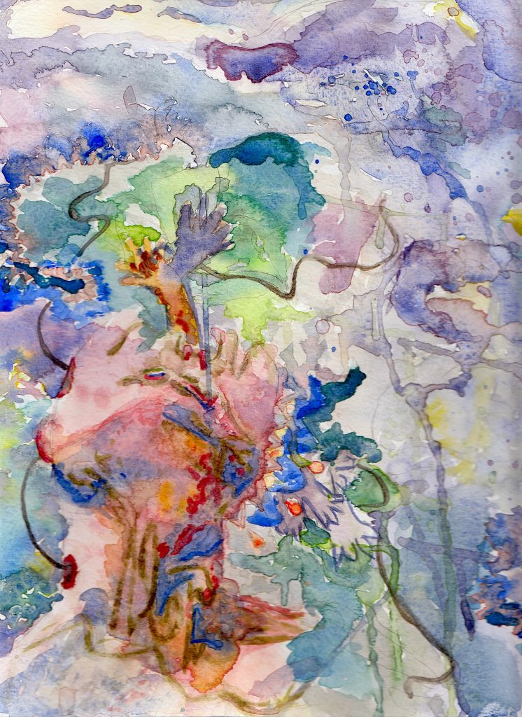
- final watercolor
. . .
Contact sheet: all these photos I took and I thought that these colors and application of textures would mesh well with the watercolor’s aesthetic.
All these photos I took, and I wanted to keep it that way to create a personal making element instead of using other people’s pictures from the internet.
-
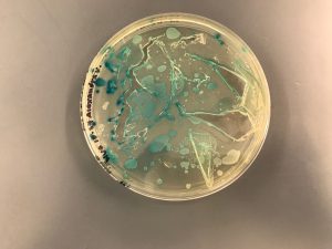
- bacteria I painted
-
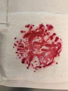
- bacteria on fabric after I painted it
-
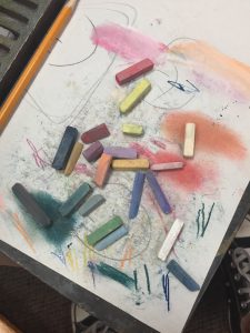
- pastels from when I was using them
-
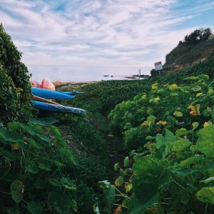
- the greenery of plants at the ocean
-
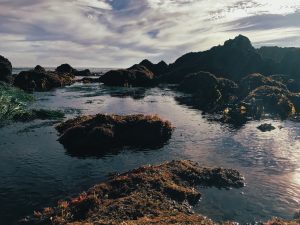
- tide pools full from a high tide several hours before
The feet on the street:
- I used the fill and opaque settings to manipulate how much the color would show through.
- This fit the theme of a night in urban France that I imagined and I wanted it to be hidden swirling in the back of her mind. That is why it looks hidden.
The ocean/tidepool pictures:
- For this layer I cut out the background and sky for two of the pictures.
- I used the fill and opaque settings to manipulate how much the color would show through.
- The water and rock formation texture can add an interesting effect of the idea of dried watercolor but wet water combining. Also, the one of my friend creates a paradoxical world element and the grass creates a juxtaposition. I did not realize till when trying to find an example of the song, that it was a cover song. The original song was done by Metronomy titled: “The Bay”. In this video it has a lot of the ocean, and I already knew the song had to do with the bay but it was just a coincidence because I did not add the ocean pictures for that reason. Also when seeing the video it reminded me of some of the beaches where I live. The pictures I took of the beach add an element of home to me, but these beaches don’t fully remind me of the beach in the video.
Pastels:
- For this layer I cut out the background.
-
How I was going to complete the piece, but then did not because Alaiyo challenged me add more.
I wanted to created a cool texture and effect as if they were laid on top of the picture and someone was creating and working on the composition. Showing how the mind continuously works, and the frequencies of sound is everywhere whether we can or cannot hear it or feel it.
Bacteria:
- For this layer I cut out the background and some elements.
- I used the fill and opaque settings to manipulate how much the color would show through.
- These pictures are from bacteria I painted last semester. It reminded me of the effect of the splatters I did when water coloring. I thought it would be cool to add into the piece since it was like something was overtaking the girl and the girl was contributing to that. Bacteria does that same thing. We contribute, but it also gets a grasp on to us, and can spread. The red bacteria was transferred onto a cloth, and I thought that texture was cool to add. I overlaid it on the holes I made on the girl, with the blue petri dish on top. I also put it in the corner of the composition and on top of the pastels to create the spreading effect. Pastels hold into the skin and spread as well. Therefore I thought it was fitting. The blue bacteria was while Iwas in the process of painting it. I thought it would be cool to show the idea of containment, breaking, spreading, and moving. I overlaid the dish on top of the girl’s face, and positioned it so that some of the things coming out of her looked like it was coming out of some of the cracks in the goo within the dish. I also eliminated the dish and just had the blue bacteria to show it fully out onto the collarbone of the skin and not in the dish anymore.
The final piece:
I enjoyed this project a lot it was really fun and a good way how to use layers and the tools on Photoshop. I wish Photoshop had more of a command Z usage like Illustrator does, but it is personally good to learn to not get used to the luxury of command Z to become more patient with technological applications. I tried and desired between using or not to use to the fill and brush tools, but I realized that because I wanted the composition to blend together instead of look like a more obvious collage that it needed to be minimalist. I am glad I got to blend an imaginary vision that somehow altered to fit some of my personal connections to the ocean.
Font Thoughts ~ Pre College Summer Program
On the first day of class, I had no idea what to expect. The course description for Design Studio covered a lot, and seemed like it could go in any direction.
I was so excited when we immediately dove into creating.
When we were given words to depict in the alphabet I thought it was a fun because it would let us explore how to think of those words, fonts, and the words diffrently.
I always wondered how fonts were made for a typeface. This project really made me appreciate all the thought, effort, and conciseness that goes into a making a letter.
Also, the perspective Aaron and Stacy had right from the get go made it so interesting to get started.
We each received a random word and were told this word plus the font created would be used for another project. This really got me thinking about the goals of this class and how unique it was.
Never would I have gotten to do anything like this back home.
This class was tailored to be in New York.
back to the font…..
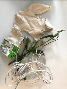
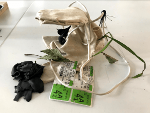
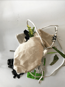
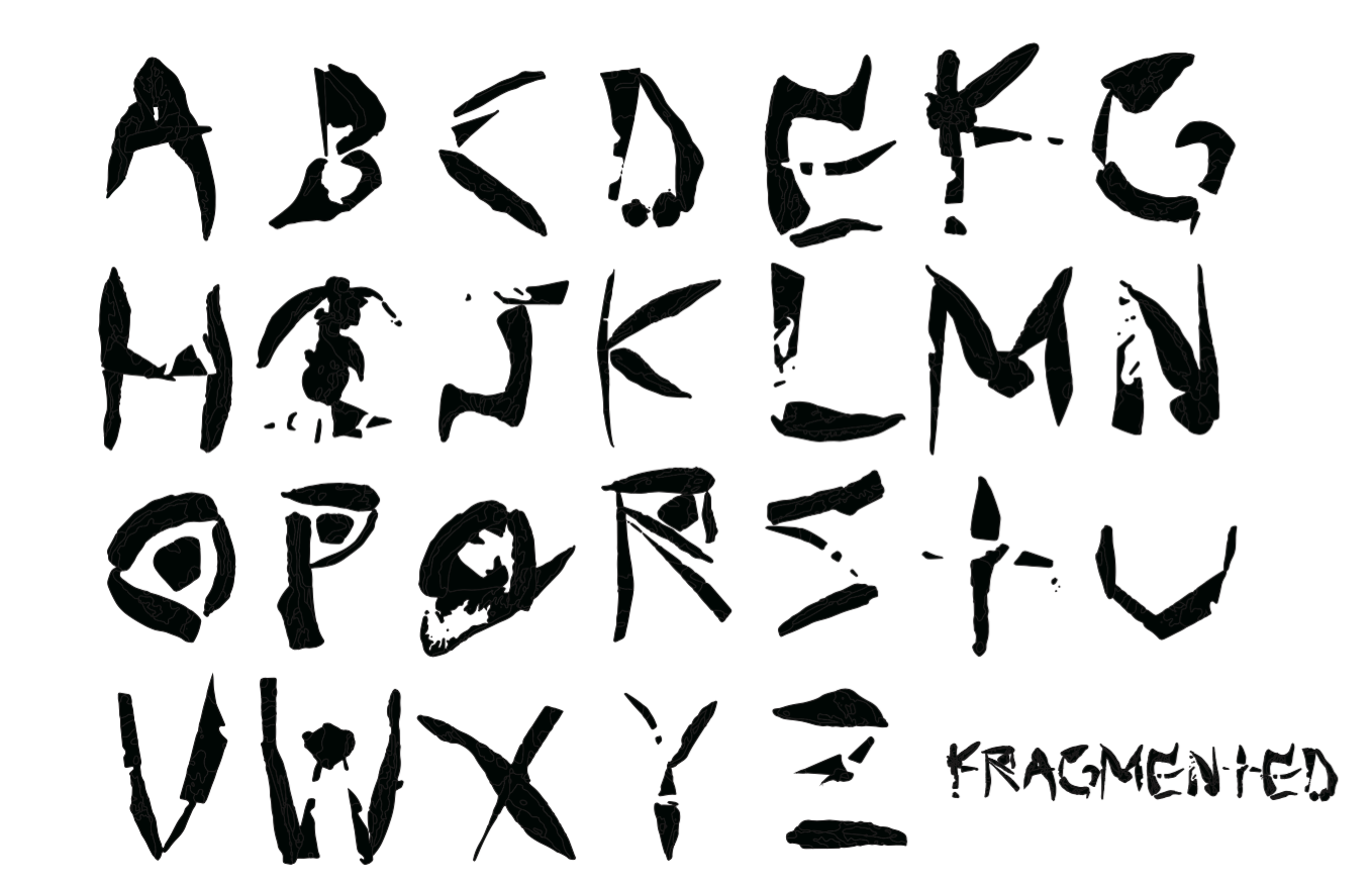
We were supposed to gather material for our font. I ended up walking around Union Square and found someone selling local plants. I got a very soft and thick plant that did not look like a stereotypical plant. Then I went to Paper Source and found an image to add a hard edge to the plant. I wanted to combine the plant with the paper to create a unique texture. My word was “broken” so I wanted to incorporate the contrast of hard and soft edges.
Oh my gosh!!!!!
Ahh!!!
Photoshop was so confusing at first!
I found Photoshop and Illustrator frustrating because I have never used them before. You have to get through the frustrating part(s) before you can actually accomplish what is in your head. It takes patience and practice. Once you get it down, it is such an amazing tool to use.
Then we had to take the letters from Photoshop to Illustrator. It was so astonishing to see the photograph change and morph into a font!!!!!! Whoah!!!!
It is so cool to produce different content… art is everywhere.
I decided to title the font fragmented because some letters are broken and staggered.
This is the final product:
