On the first day of class, I had no idea what to expect. The course description for Design Studio covered a lot, and seemed like it could go in any direction.
I was so excited when we immediately dove into creating.
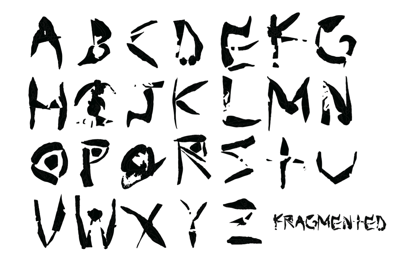
When we were given words to depict in the alphabet I thought it was a fun because it would let us explore how to think of those words, fonts, and the words diffrently.
I always wondered how fonts were made for a typeface. This project really made me appreciate all the thought, effort, and conciseness that goes into a making a letter.
Also, the perspective Aaron and Stacy had right from the get go made it so interesting to get started.
We each received a random word and were told this word plus the font created would be used for another project. This really got me thinking about the goals of this class and how unique it was.
Never would I have gotten to do anything like this back home.
This class was tailored to be in New York.
back to the font…..
We were supposed to gather material for our font. I ended up walking around Union Square and found someone selling local plants. I got a very soft and thick plant that did not look like a stereotypical plant. Then I went to Paper Source and found an image to add a hard edge to the plant. I wanted to combine the plant with the paper to create a unique texture. My word was “broken” so I wanted to incorporate the contrast of hard and soft edges.
Oh my gosh!!!!!
Ahh!!!
Photoshop was so confusing at first!
I found Photoshop and Illustrator frustrating because I have never used them before. You have to get through the frustrating part(s) before you can actually accomplish what is in your head. It takes patience and practice. Once you get it down, it is such an amazing tool to use.
Then we had to take the letters from Photoshop to Illustrator. It was so astonishing to see the photograph change and morph into a font!!!!!! Whoah!!!!
It is so cool to produce different content… art is everywhere.
I decided to title the font fragmented because some letters are broken and staggered.
This is the final product:
