2ND ITERATION

For my second iteration, I added a few more things to my website, after doing my expert review. RTQLT was my critic and he gave me a couple tips, as to how I could make my website better.

GENERAL IMPRESSION OF PROPOSAL

I love the proposal however, there’s a part of it which seems awfully strange to me –

“ At the same time, this project aims to include a generous selection of work by each of the selected artists and address the number one problem these artists face, in order to show the expressive and discursive richness characteristic of graffiti can be definitive. “

EXPERT REVIEWER

1 Isaac Opoku

2 He’s an artist who has explored street art through varying mediums

3 The strengths lie in the fact that the proposed idea would not only help preserve and share this inherently ephemeral art to a wider audience, but also because it would serve as a platform for these artists to expand their audience and propagate their individual styles.

4 Since there are a handful of similar platforms, it could make it a challenge for the proposed idea to make an impact in the street art [online] space

5 Yes the project definitely has legs. The question is, how fully developed are these legs? Does the project need to crawl till it learns to walk or is it already ready for a 100m sprint? I think the proposal as it currently is, may need to learn how to walk which in this case translates to finding its own unique edge that would make it standout among the rest. Because even though the project will be both feasible and helpful to the community as it currently stands, it can be made even better with a special cutting-edge feature.

http://globalstreetart.com/

http://www.complex.com/style/2012/07/the-10-coolest-street-artist-websites/phlegm

http://www.space-invaders.com/home/  <— this is a similar site but with only the work of one artist.


After his general impressions of my work, I went on to interview him. I also added some things to make my website look unique amongst the other sites. I added Music and also Video. This makes the site more fun to browse.

VIDEO

CRUISE VIDEO FROM VIMEO

SOUNDCLOUD WIDGET

SOUNDCLOUD WIDGET FOR MUSIC

COMMUNITY GIFT – ‘THE STREET GALLERY’

The motivating idea in doing this gift, is that graffiti – or the urban art form commonly called graffiti – has been, since its inception, generally (and indeed intentionally) excluded from the institutional world of art. This project, is based on a fundamental conviction that graffiti is not an anthropological phenomenon to be dissected, not a social malady to be cured, but a legitimate aesthetic and cultural movement, born of a revolutionary spirit and a will to resistance.
Graffiti is a powerful assertion of personal identity, invented and nurtured by working-class youth, despite ceaseless efforts by public institutions, corporations, and popular culture to deny the artists’ individuality – to turn them into statistics, consumers, and a mass audience. Thanks to messages handed down principally by the mass media, graffiti writers have been stereotyped as delinquent, marginal, or artistically inadequate – an intentional deception that justifies the preconceived idea that this movement is ‘antisocial’ and ‘criminal’, and without stylistic discriminations or standards of achievement.
At the same time, the tendency to marginalize graffiti has allowed enthusiastic authors to bestow on it a heroic and romantic dimension, as being youthful and cathartic, which supposedly removes it from, or places it in opposition to, the practices of conventional, codified art forms. This equally misleading kind of generalization, which continues to define the popular image of graffiti, has obscured and diminished our understanding and blinded our vision. It prevents us from seeing the revolutionary aspect of graffiti’s expression, its culture of resistance to manipulation and censorship; and it keeps us from seeing graffiti as art. Instead we are exposed to a kind of fraud that simplifies and exploits this authentic form of expression of street art. This is, perhaps, because it questions the exclusive ‘ghetto’ of contemporary artistic creation; and because allowing it to function as the work of individual artists dispels the exclusively criminal image that remains associated with graffiti.
Yet the fact that the expression of graffiti is not meditated by an institutional system of schools, galleries, and museums does not mean that it is without a structure. Within New York, there is a recognized history, dating back decades now, with specific individuals, recognized for their innovations and contributions. There are distinct styles with recognized starting points. And there are individuals who have become facilitators and enablers, critics, chroniclers, and publicists – defenders of graffiti as an art form. This disconnect often brings up the number one problem most graffiti artists face, the problem of ‘death’ to their work, in the sense that, their works have a very short life span and really are usually cleaned off in just a matter of days after its conception.
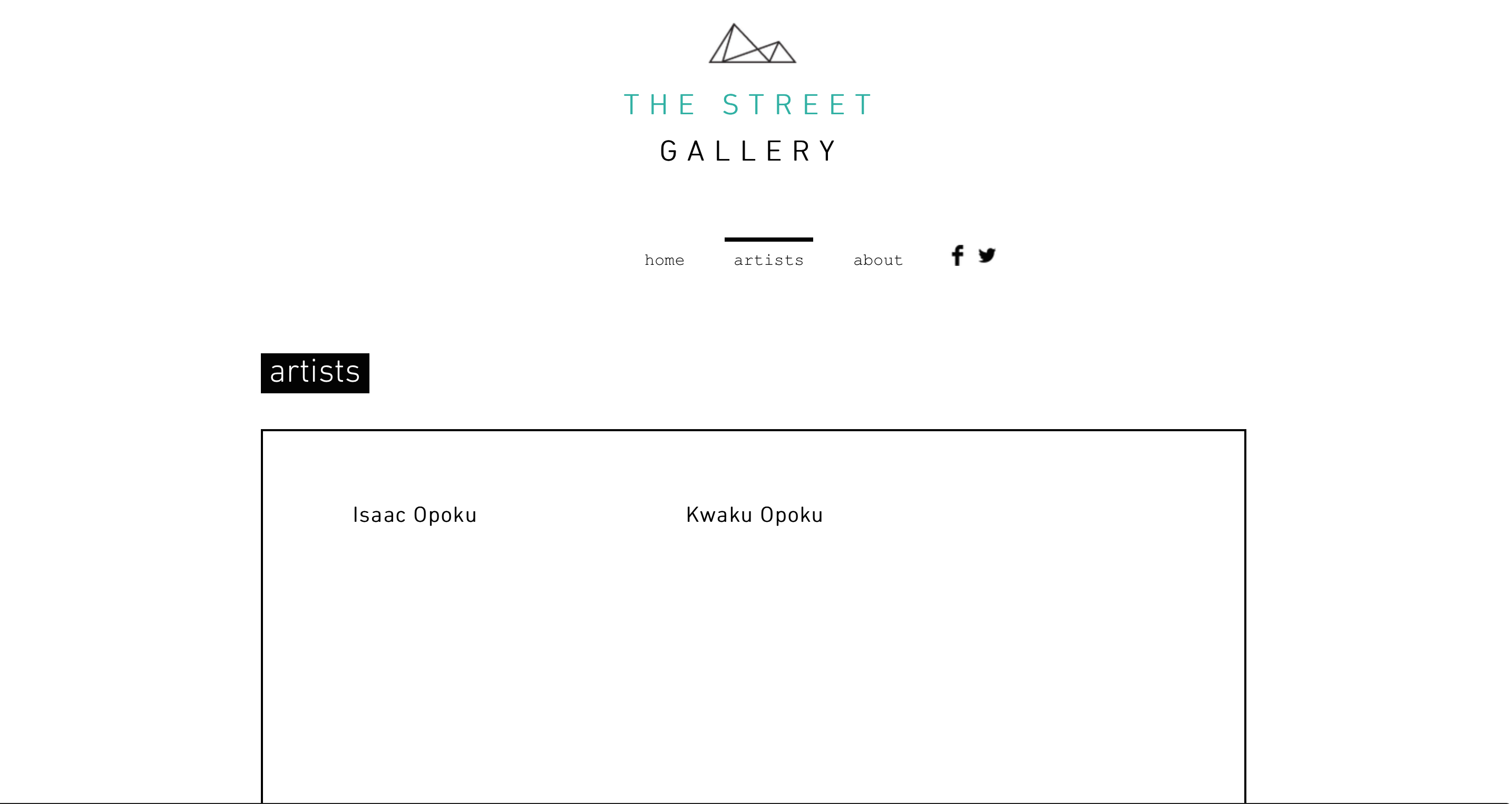
Graffiti touches on a variety of styles and approaches of styles and approaches that characterize the selected artists, putting in evidence of their expressive and discursive depth and at the same time refuting the tendency to generalize them. In this sense, the choice of these artists not only highlights the groundbreaking role of the most recognized artists of this form of street expression in New York City, but also the visible influence that they have had on other ‘writers’ of their generation and succeeding ones, working simultaneously snd subsequently in other corners of the city, equally abandoned.
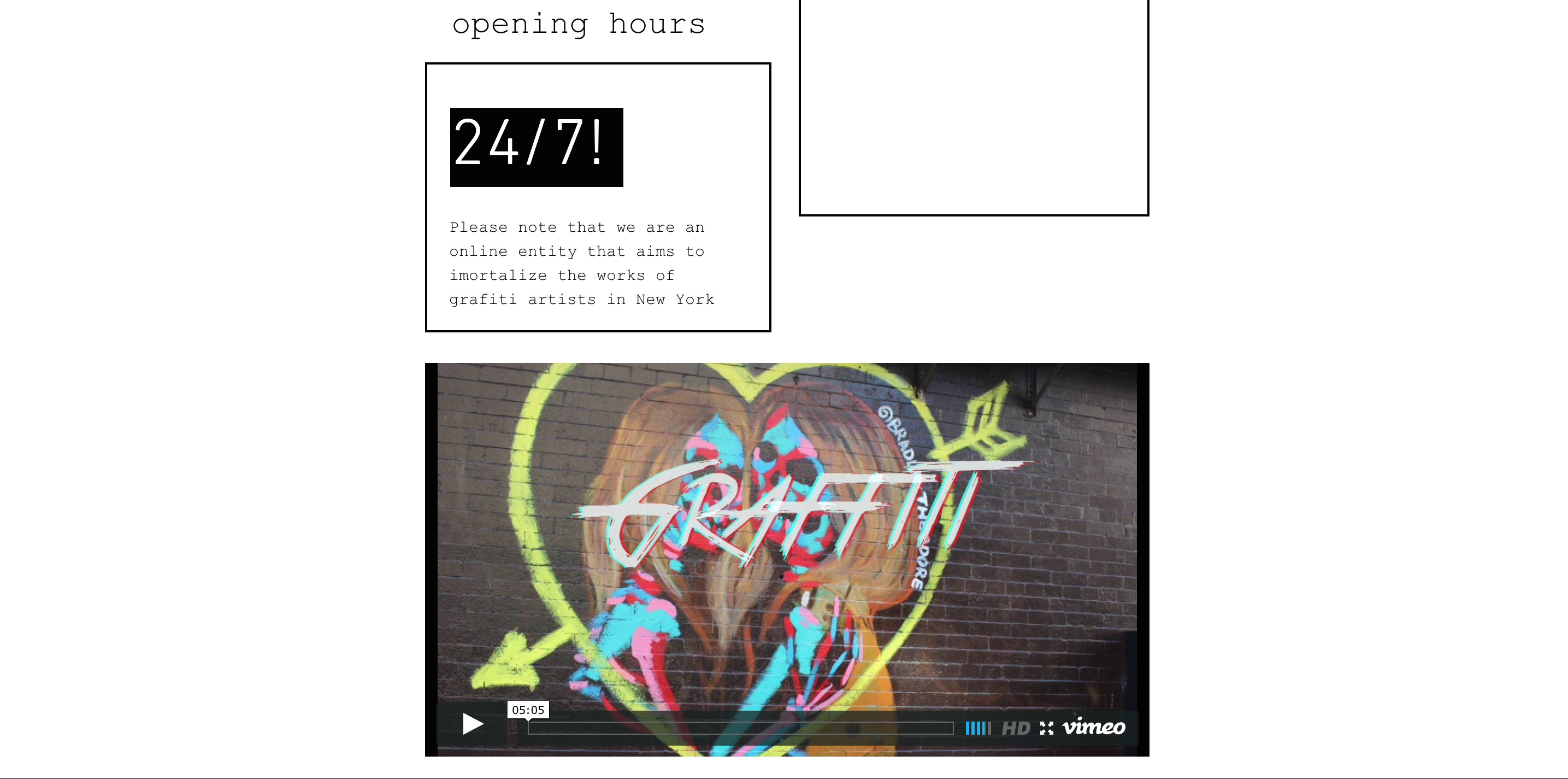
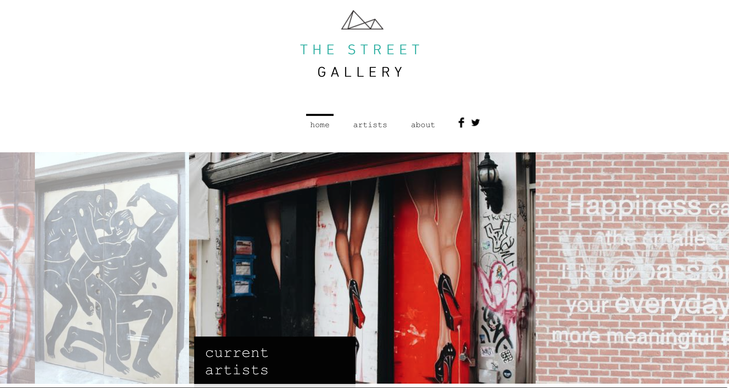
This project, which is making an online street gallery for this community, reveals the vitality, urgency, character and artistic merit of this spontaneous, antiauthoritarian movement, one that spread across the world. It’s a growth that continues despite the ongoing repression that the form has endured since its emergence. At the same time, this project aims to include a generous selection of work by each of the selected artists and address the number one problem these artists face, in order to show the expressive and discursive richness characteristic of graffiti can be definitive. This constantly changing,  ephemeral art form can only be experienced in the vast ‘gallery’ of NYC’s streets, walls, rooftops, tunnels, trucks, and mass transit system. But as with any art form, understanding it, recognizing its artist personalities and the styles of individual writers, can make the viewer’s experience more rewarding.
Screen Shot 2015-04-08 at 10.52.03 AM Screen Shot 2015-04-08 at 10.52.09 AM Screen Shot 2015-04-08 at 10.52.19 AM

Cookbook/Memoir/Type Specimen

I shared a story with Steven about my mother and a specific dish that I have a personal heartfelt attachment to. With this story I’mm creating a cookbook about the food my mother made for me when I was younger with the exact recipe! It’s somewhat crazy to try and make this cookbook without getting hungry, well thats just me. I also think it’s very sad if you’ve got no story to share. (Where’s your childhood!)


First off i know the book is going to be the focus for the next ten weeks. The first  grid was be simple. However, I know as the assignment progresses the grid will become far more complex (Like the one we are currently doing!): currently I have started designing & composing the Cookbook | Type Specimen | Memoir. The final will be a 16-page, saddle-stitched book with self-wrappers.

TRACE, DRAW, CARVE & PRINT 

TRACE

Using the typeface Sabon, I printed an upper and lower case alphabet on 11 x 17 tabloid laser paper so the lowercase x (the x-height) is nine picas high (1.5 inches), the height of the caps will follow. 26 Uppercase letters A–Z + ampersand and 26 lower case letters a–z. I Adjusted my leading to fit U&lc on two sheets of 11 x 17 tabloid. Repeated the process for eight core fonts: Baskerville, Bodoni, Clarendon, Gill Sans, Helvetica, Futura, and Rockwell. Traced these alphabets onto tracing paper— perfectly!

DRAW

Chose a typeface from our list—based on a specific æsthetic aspect of its design that appeals to me.

In my sketchbook, I drew a minimum of ten 4 x 6 inch boxes, drawing the character freehand to fit the boxes. I practiced until I could draw it perfectly. You have to pay special attention to the letterform proportions.

CARVE

After tracing the best image onto tracing paper with a soft pencil, I now have to reverse the tracing paper onto the carving block and burnish the back of the paper until my image is transferred onto the block. The carved letterform could either be a positive or negative image. Using the finest #1 blade in the carving tool I outlined the image. I carefully removed the material.  No need to cut deep. Blocks are somewhat fragile so handling with care is key.

PRINT

After inking the image with the brayer I rolled out an even layer of ink onto the block. Trying not to over-ink. I then placed the block ink-side down onto the print paper and apply light but even pressure all-over the block. Pulled the block off the print slowly and ENJOYEEEEED what I call the eureka moment—the second a student views the print they just pulled!

WORKSHOP!!!

My main contribution to this workshop was bringing the idea up for making collages, in my mind I thought my group members wouldn’t really welcome the idea, but I was wrong. The embraced it (maybe because we didn’t have to buy anything) however, it was a totally great experience, especially when we had to do the mock-ups in class before the real thing.

Initially my feeling towards the workshop was total boredom. I felt it was just going to be my group and I pulling our skills together to just create and complete a workshop and probably never talk about it again. However this was far beyond what I even imagined and I’m even sure what Jen imagined. We all worked together, not just in our individual groups, but as a big community. Taking and sharing pictures amongst ourselves, helping other groups with their ideas and also generally having a great time. Getting people to do the workshop was definitely not an easy task, but we all tried our best to get each other’s participants to try other group’s workshops, which I felt was awesome.

I ultimately enjoyed myself, I played music (which was absolutely my favorite part, because we all had fun listening to some old jams!), took pictures, got people to come try our awesome collages and make postcards, danced around a bit and made new friends. I look forward to having more awesome activities like this, because it not only helps us as artists by learning new skills but goes further to help create bigger and better communities.
 IMG_6786 IMG_7143 IMG_6795

Robert Irwing

Quote

“Gardening always has been an art, essentially.”

Introduction
 
Robert Irwin was born in 1928 in Long Beach, California. He did his time in the united states army for a year – 1946 to 1947. Soon after this, he attended several art institutes : Otis Art Institute, Jepson Art Institute and Chouinard Art Institute. Robert Irwin really explored perception as the fundamental issue of art. He began as a painter in the 1950s and became the pioneer of the L.A.-based “Light and Space” movement in the 1960s, has, through a continual breaking down of the frame, come to regard the role of art as “conditional,” or something that works in and responds to the specific surrounding world of experience. Irwin has conceived fifty-five site-conditional projects since 1975, ranging from the architectural and grounds design of Dia: Beacon Center for the Arts (completed in 2003) to the lush Central Gardens for the Getty Center in Los Angeles, California (completed in 2005). Robert Irwin became the first artist to receive the John D. and Catherine T. MacArthur “Genius” Award in 1984.  Robert Irwin has been with the Gallery since 1966.
 
Central Gardens for the Getty Center

The Central Garden, created by artist Robert Irwin, lies at the heart of the Getty Center. The 134,000-square-foot design features a natural ravine and tree-lined walkway that leads the visitor through an extraordinary experience of sights, sounds, and scents.

The walkway traverses a stream that winds through a variety of plants and gradually descends to a plaza where bougainvillea arbors provide scale and a sense of intimacy. Continuing through the plaza, the stream cascades over a stone waterfall or “chadar,” into a pool with a floating maze of azaleas. Specialty gardens encircle the pool. All of the foliage and materials of the garden have been selected to accentuate the interplay of light, color, and reflection.

Irwin began planning the Central Garden in 1992, as a key part of the Getty Center project. Since the Center opened in 1997, the Central Garden has evolved as its plants have grown and been trimmed. New plants are constantly being added to the palette. Irwin’s statement “Always changing, never twice the same” is carved into the plaza floor, reminding visitors of the ever-changing nature of this living work of art.

Dia Beacon

Robert Irwin’s work at Dia:Beacon may elude the casual visitor. It consists of a master plan for the museum and its outdoor spaces, as well as design work on numerous aspects of the project, most notably the extensive landscape environment, where Irwin was involved in every aspect of the plantings, paving and fencing, and windows and doors.

Most important, Irwin helped Dia consider the design of the Beacon project in experiential and environmental terms as a totality—from the visitor’s entrance, by car or by foot, down a driveway marked at its top by a gate and a new copper beech tree, through an orchard that serves as a parking lot, into a plaza that signals one’s arrival at the museum, into either a café and bookshop or the newly constructed entrance to the galleries, and from there down any of a number of possible paths through the museum’s interior and into the artists’ spaces, each specifically designed by the artist in question and/or by Dia to accommodate the work on view. Irwin’s work in Beacon lay across the borders of a number of different roles—landscape designer, architect, aesthetic philosopher—in a manner completely consistent with his practice as an artist, in which, among other things, he has questioned exactly where the boundaries lie around the role of the artist today.


Central Garden at Getty Center

References

http://www.diaart.org/exhibitions/introduction/84

http://www.getty.edu/visit/center/gardens.html

http://en.wikipedia.org/wiki/Robert_Irwin_(artist)

http://www.nytimes.com/2007/10/14/arts/design/14fink.html?_r=0


Curiosity Map/Post-It

Most of the things on the map are more of questions and statements than memories, because I’m more interested in the questions, the ‘what ifs’ and the unknown than what I’ve already done. That’s just me. I did enjoy putting down some of the questions though because I feel they’ve been in my head for quite a while. Like the question about swimming at the part of the Hudson. I posed that question mainly because back in my sustainable systems class there was some speculation about people being able to swim in there, and this ended up in a huge argument. I still didn’t get my answer though.

Also putting ‘My School’ is basically literally what it is. I put my school on the map, it honestly wasn’t on there. My question about if there being dead people under union square is another question that has been on my mind ever since my teacher asked the class as well. I know about Washington Square Park, not Union Square.

Studio & Seminar Reflection

My Studio & Seminar classes for my first year here at parsons were very interesting, I loved every bit of it, not only because of the amazing teachers I had but also because of the awesome people I was fortunate to have enjoy this class with. There were tough times, like when we actually had to make stuff in Alex’s class or when we had to do those time consuming Talking notes for every one of Mark’s classes. It was worthwhile anyway and I loved it. Thanks.

TEMA: A MODEL CITY

THIS BOOK TALKS ABOUT TEMA, A SMALL CITY ON THE COAST OF GHANA. IT REALLY FOCUSES ON HOW IT CAN GO BACK TO HOW SUSTAINABLE IT WAS MEANT TO BE. TALKING ABOUT ITS HISTORY AND CERTAIN ISSUES TEMA IS FACING AND HOW THEY CAN BE RESOLVED. BRINGING UP IDEAS THAT AREN’T REALLY NEW, BUT VERY PRACTICAL IN SEEING THE CITY RISE BACK TO ITS RIGHT PLACE. THE BOOK ALSO GIVES US AN INSIGHT AS TO HOW THESE ISSUES CAME ABOUT, HOW THEY COULD HAVE BEEN AVOIDED AND HOW THEY CAN NOW BE RESOLVED .

THE AUTHOR BEING A NATIVE, ALSO HAS SOME PERSONAL RELATIONSHIP WITH TEMA AND IS VERY PASSIONATE ABOUT SEEING IT GO BACK TO WHAT IS WAS MEANT TO BE, A MODEL CITY.

THE BOOK WILL BE UP ON THE iBooks STORE FOR FREE, FOR THOSE INTERESTED IN READING IT. HERE’S A PDF ABOUT THE BOOK. ENJOY 🙂