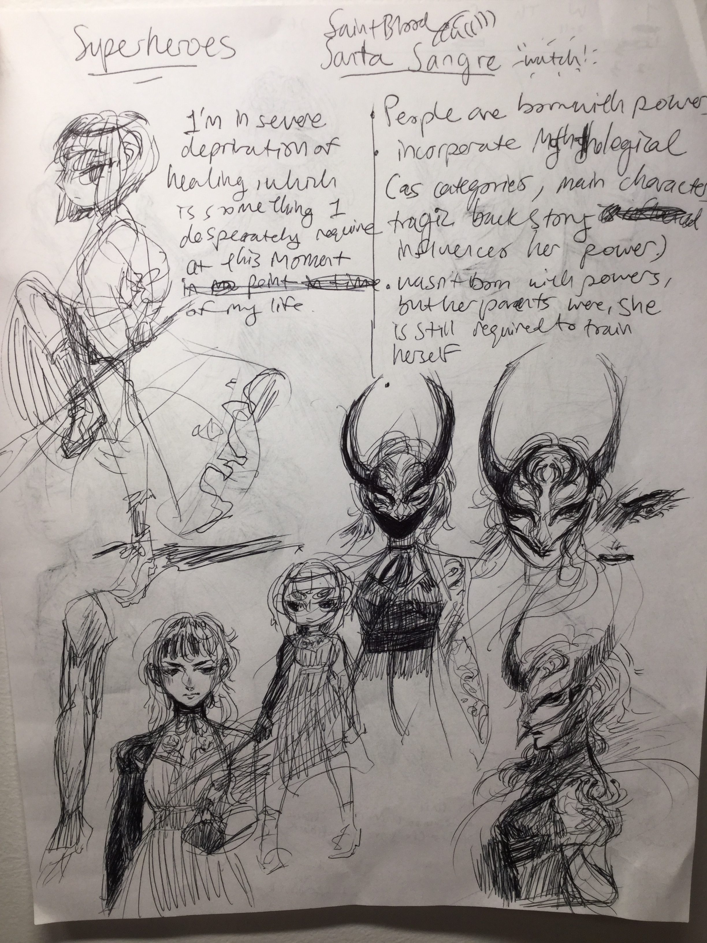
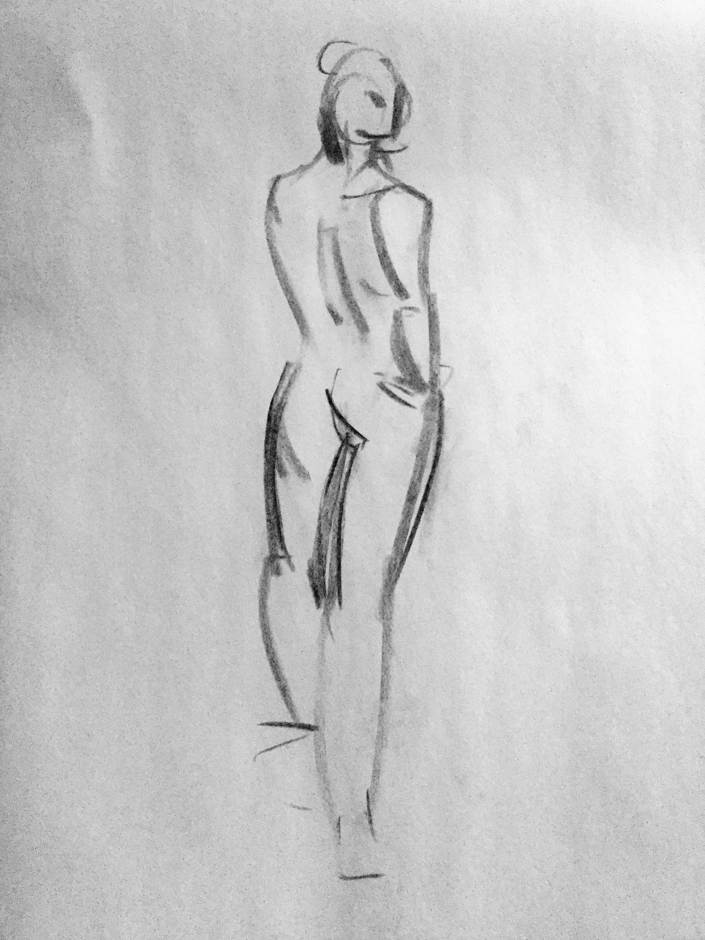
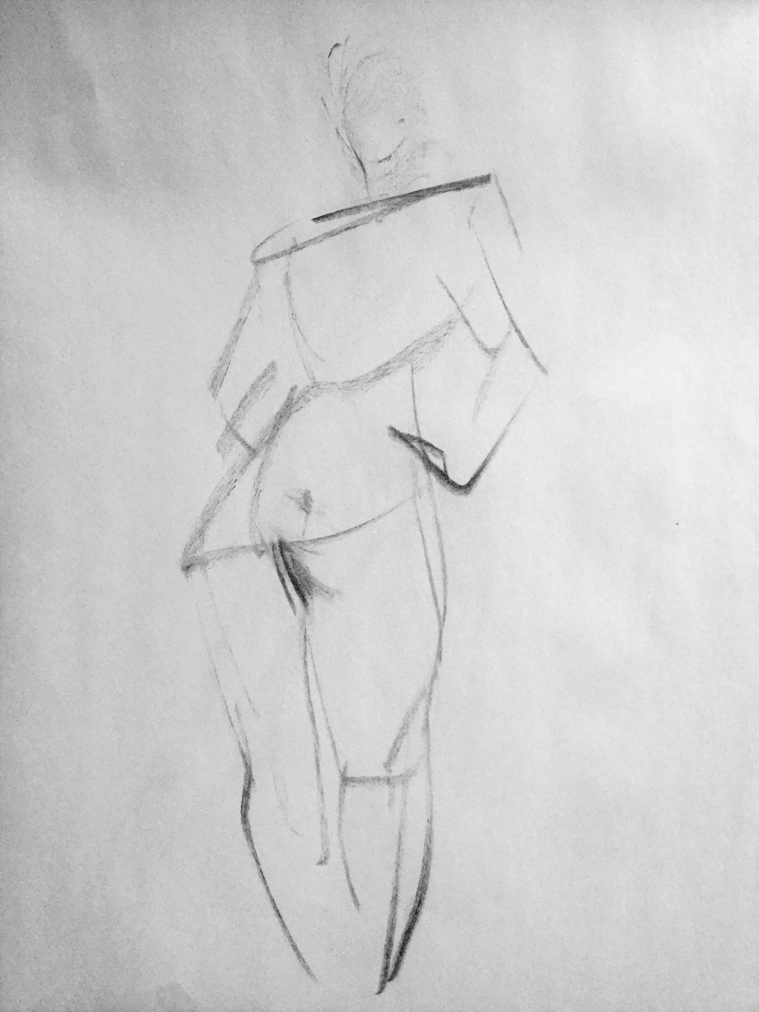
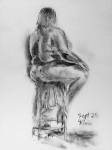
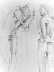
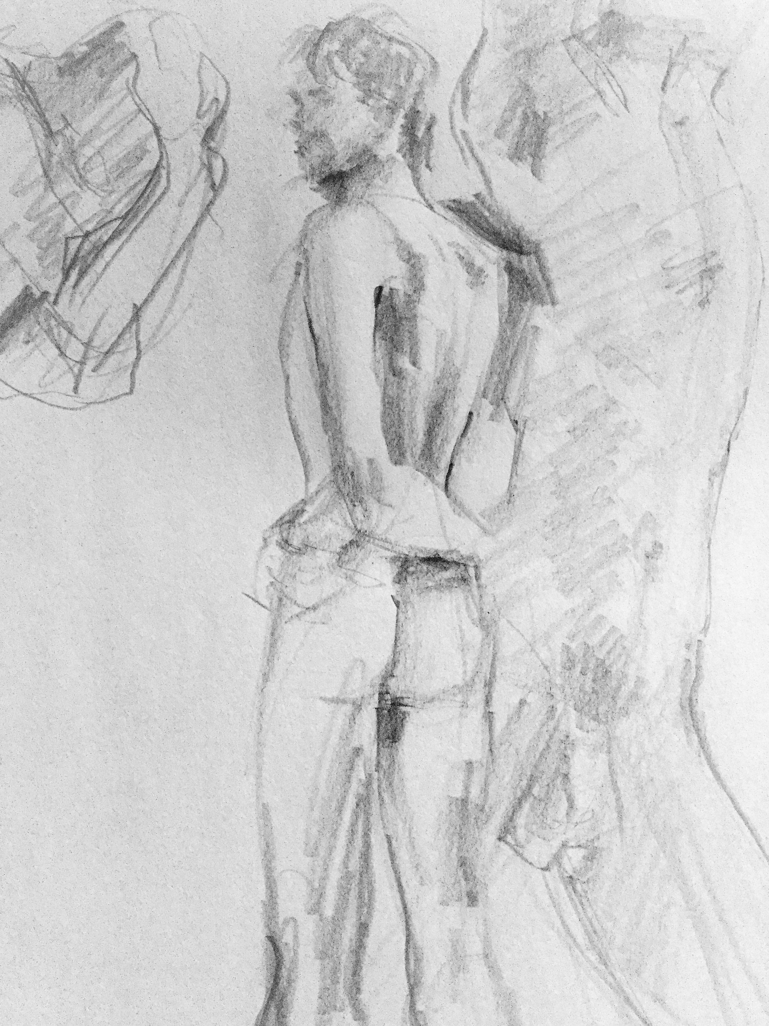
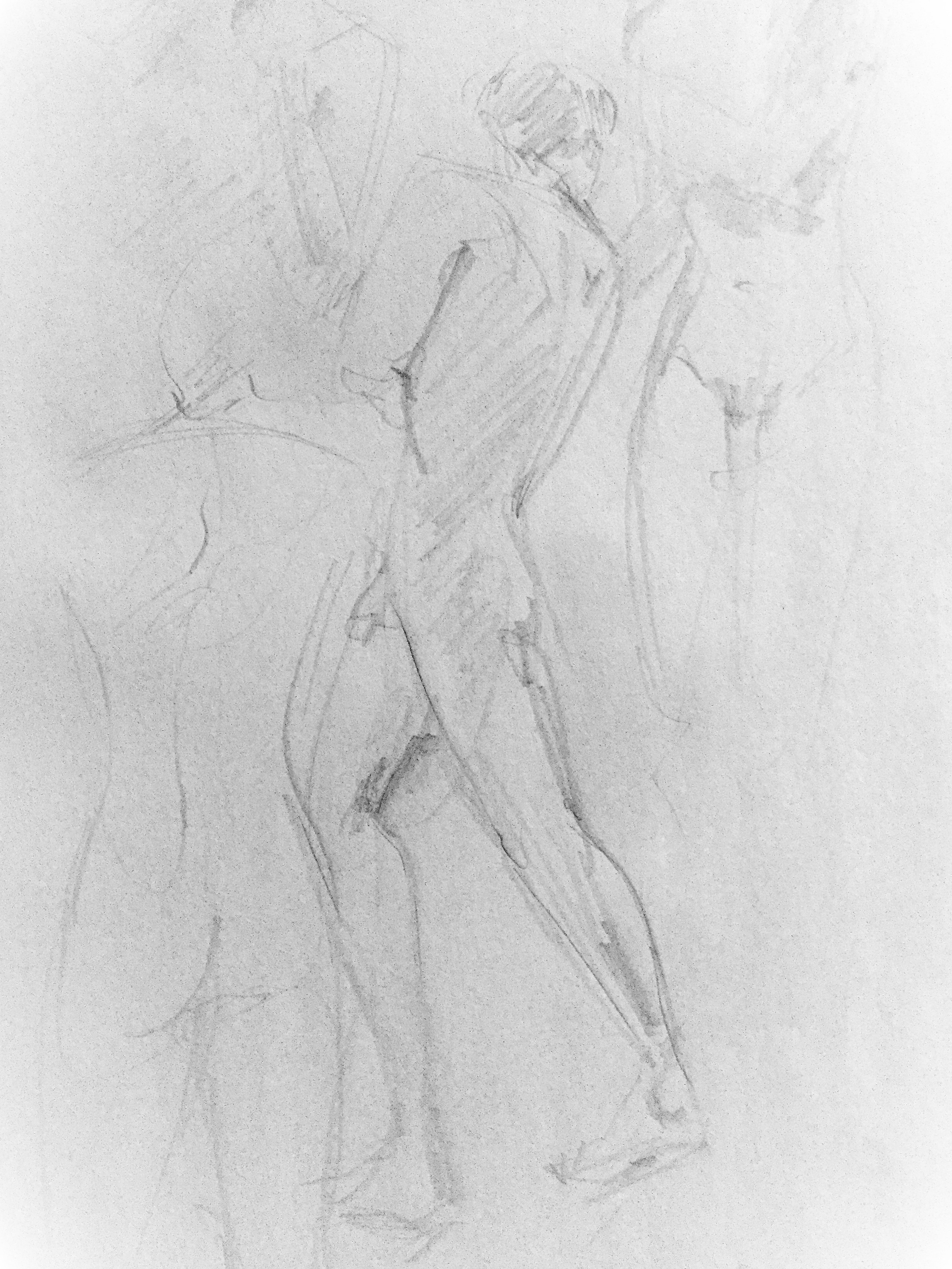
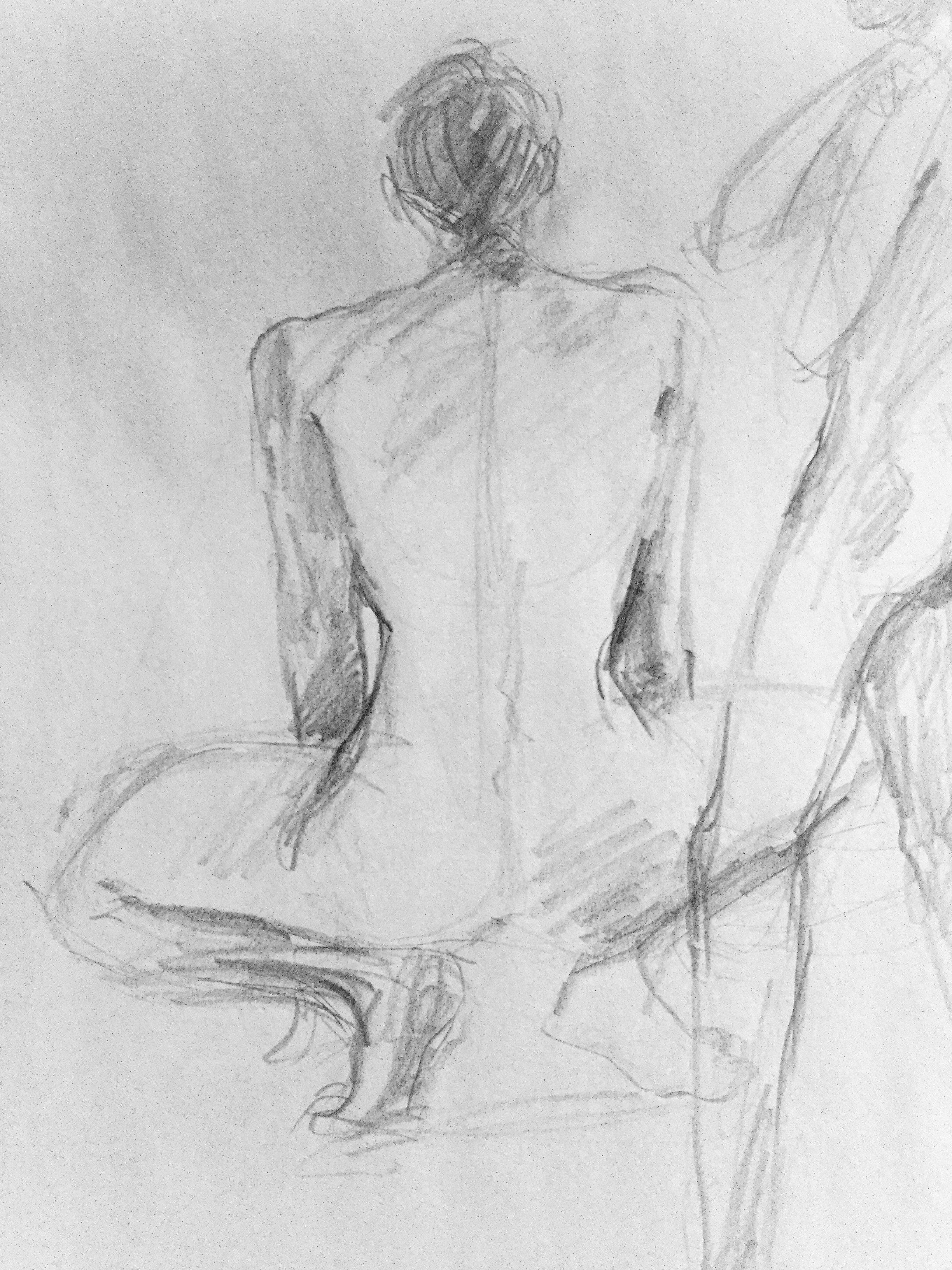
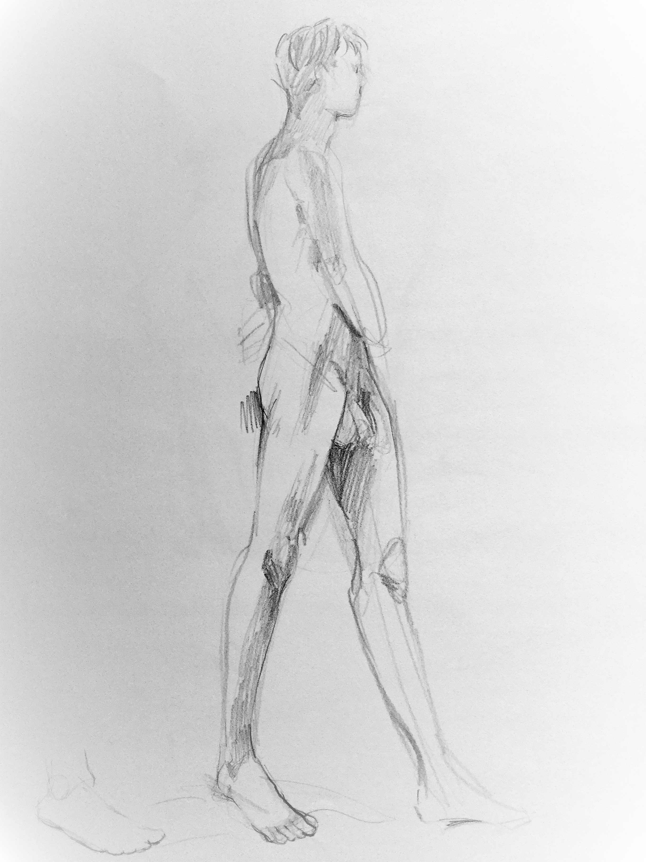
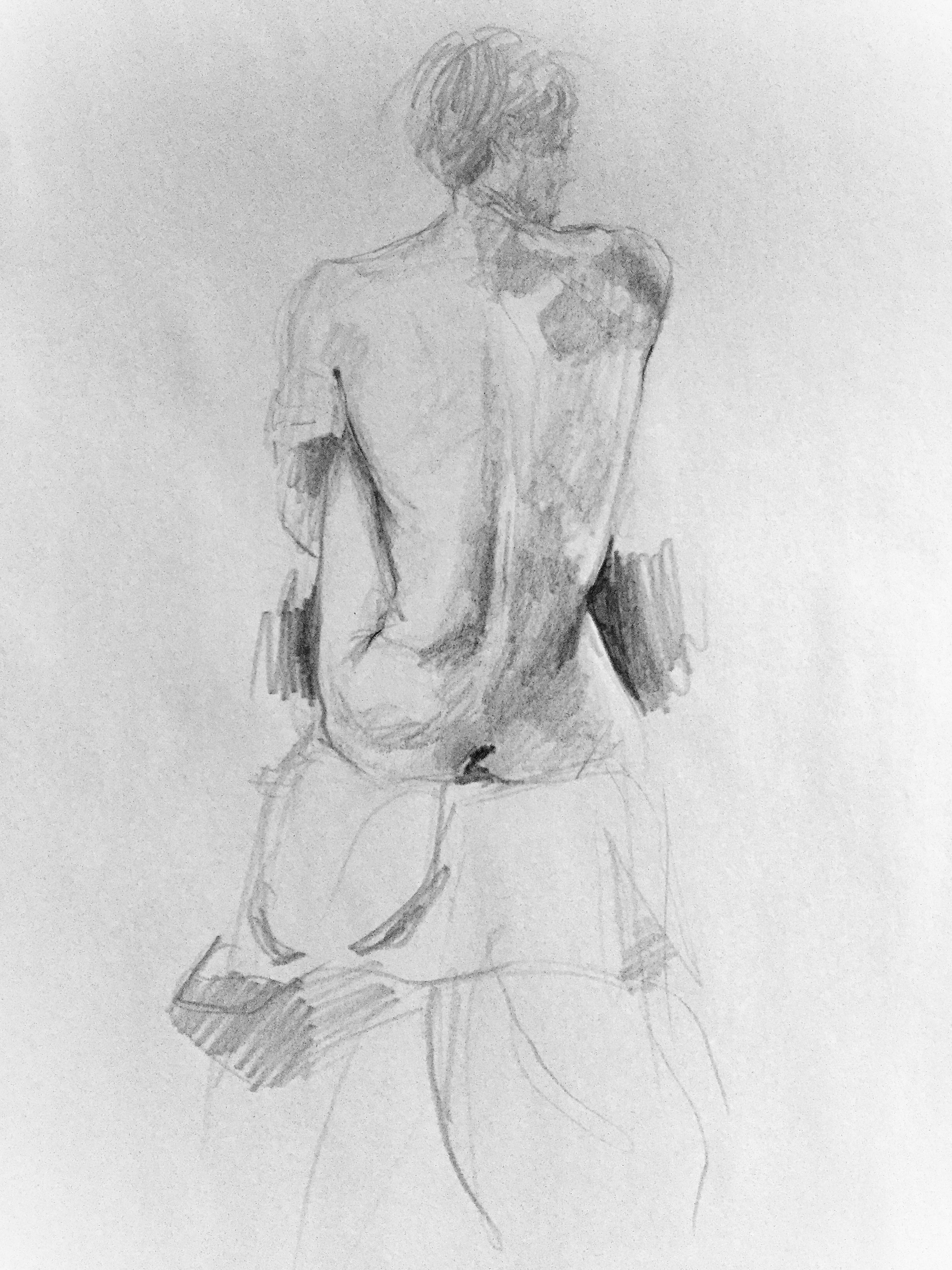
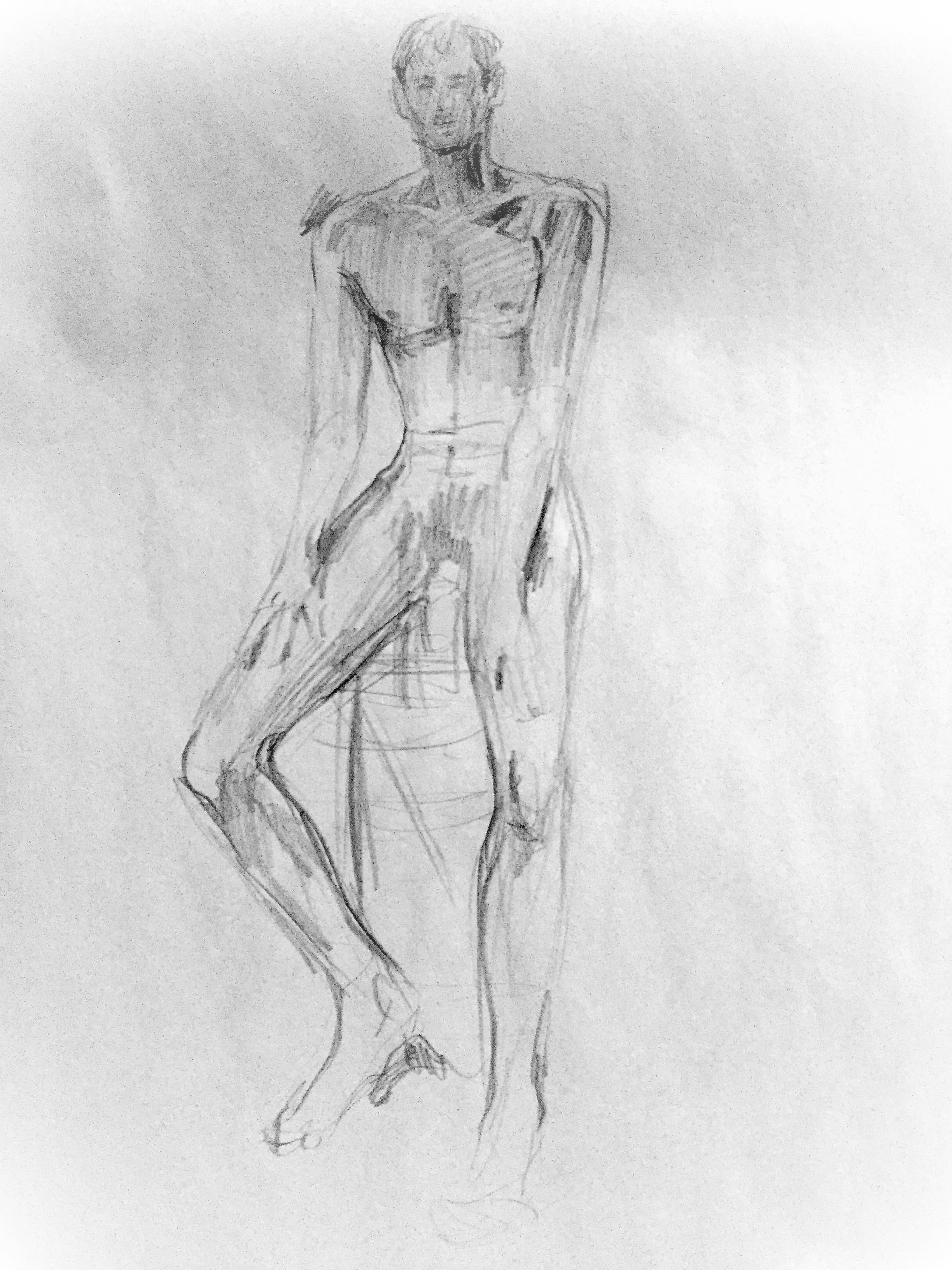
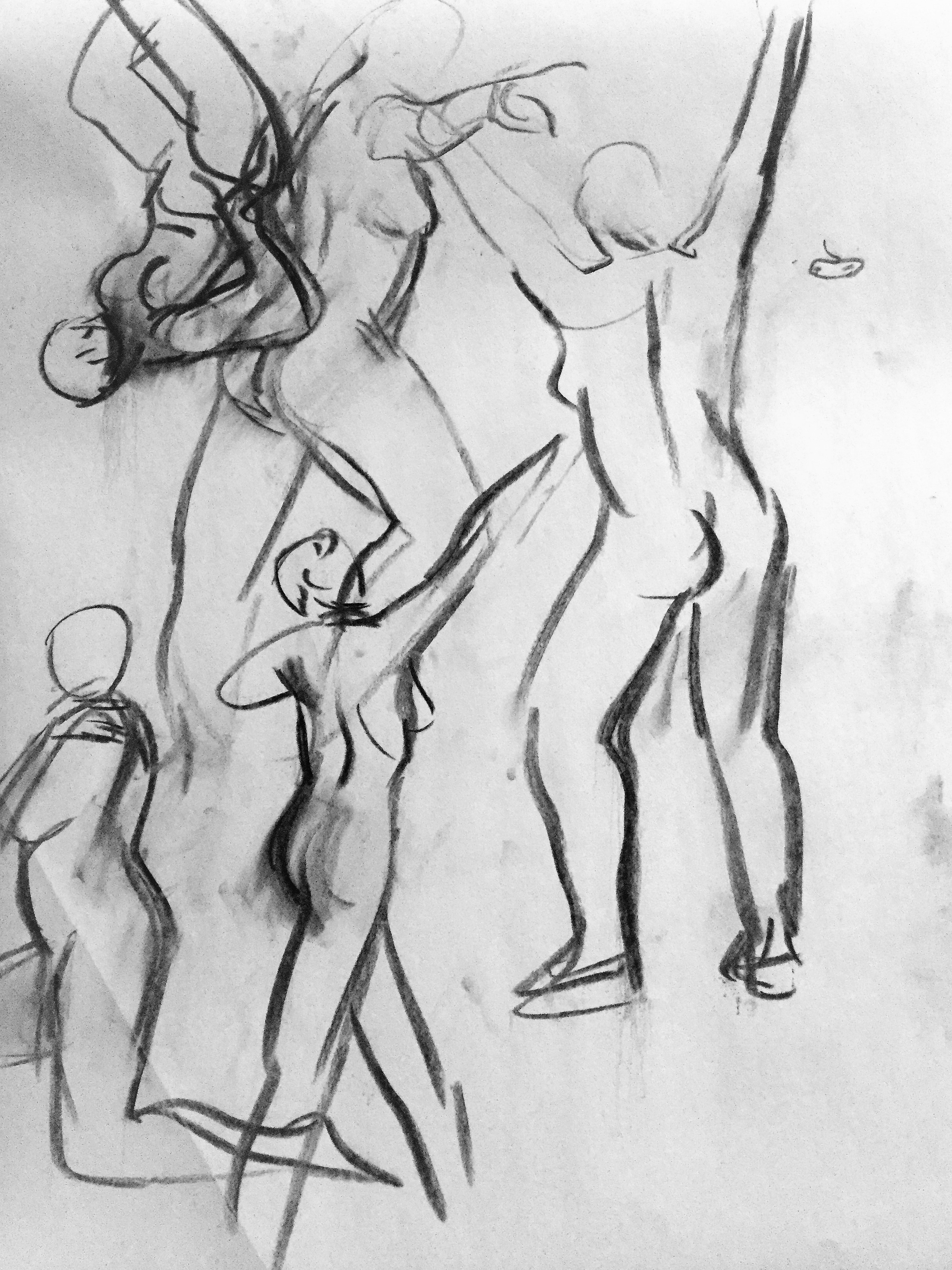
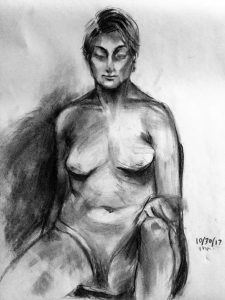
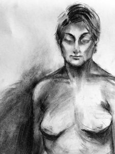
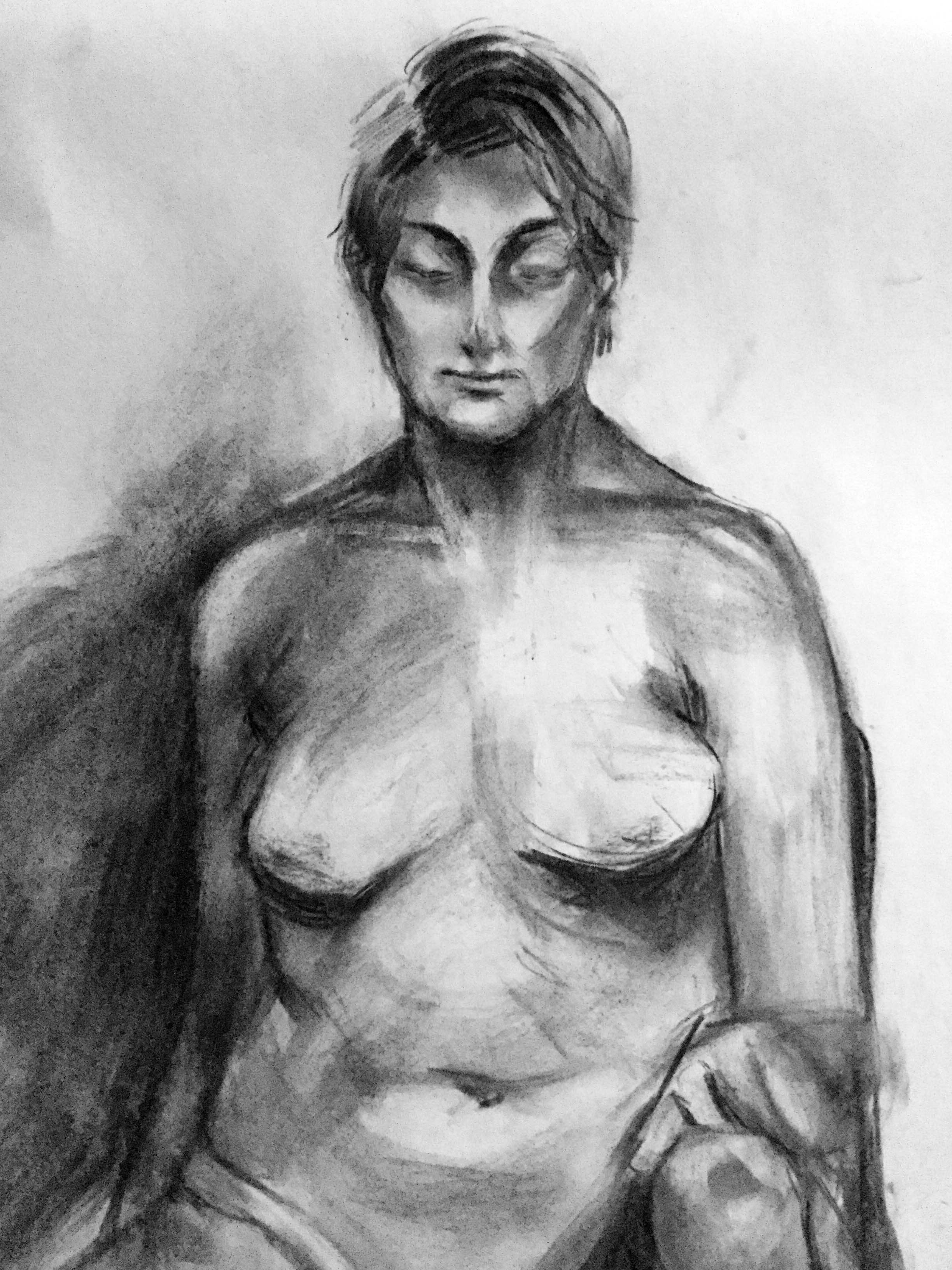
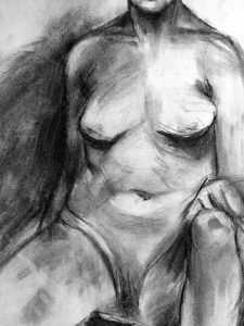
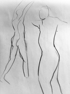
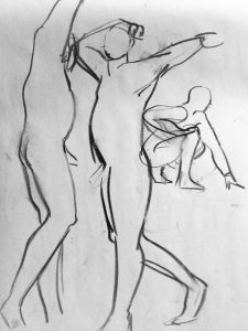
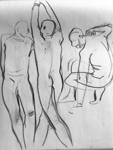
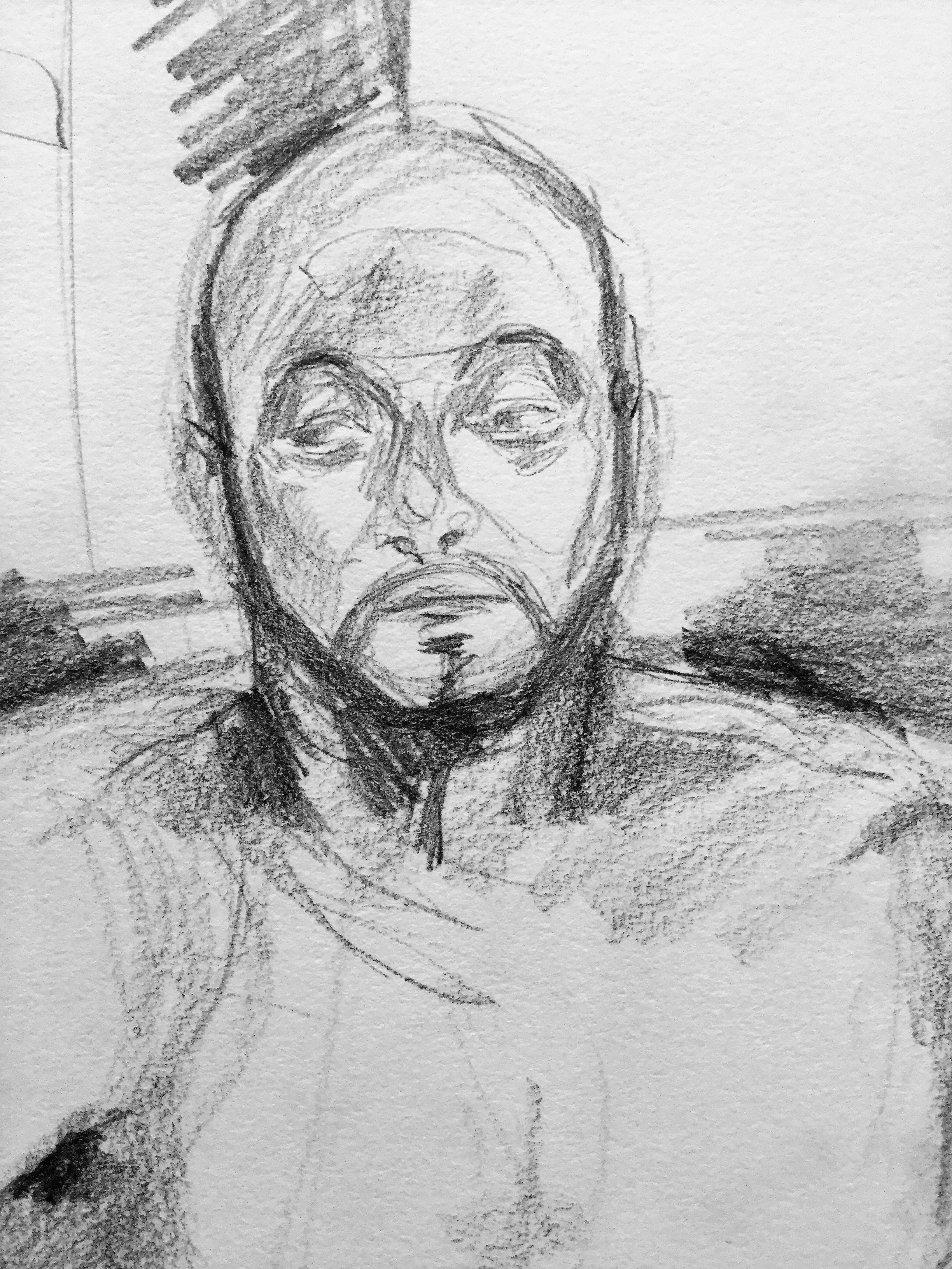
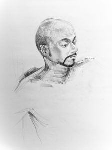
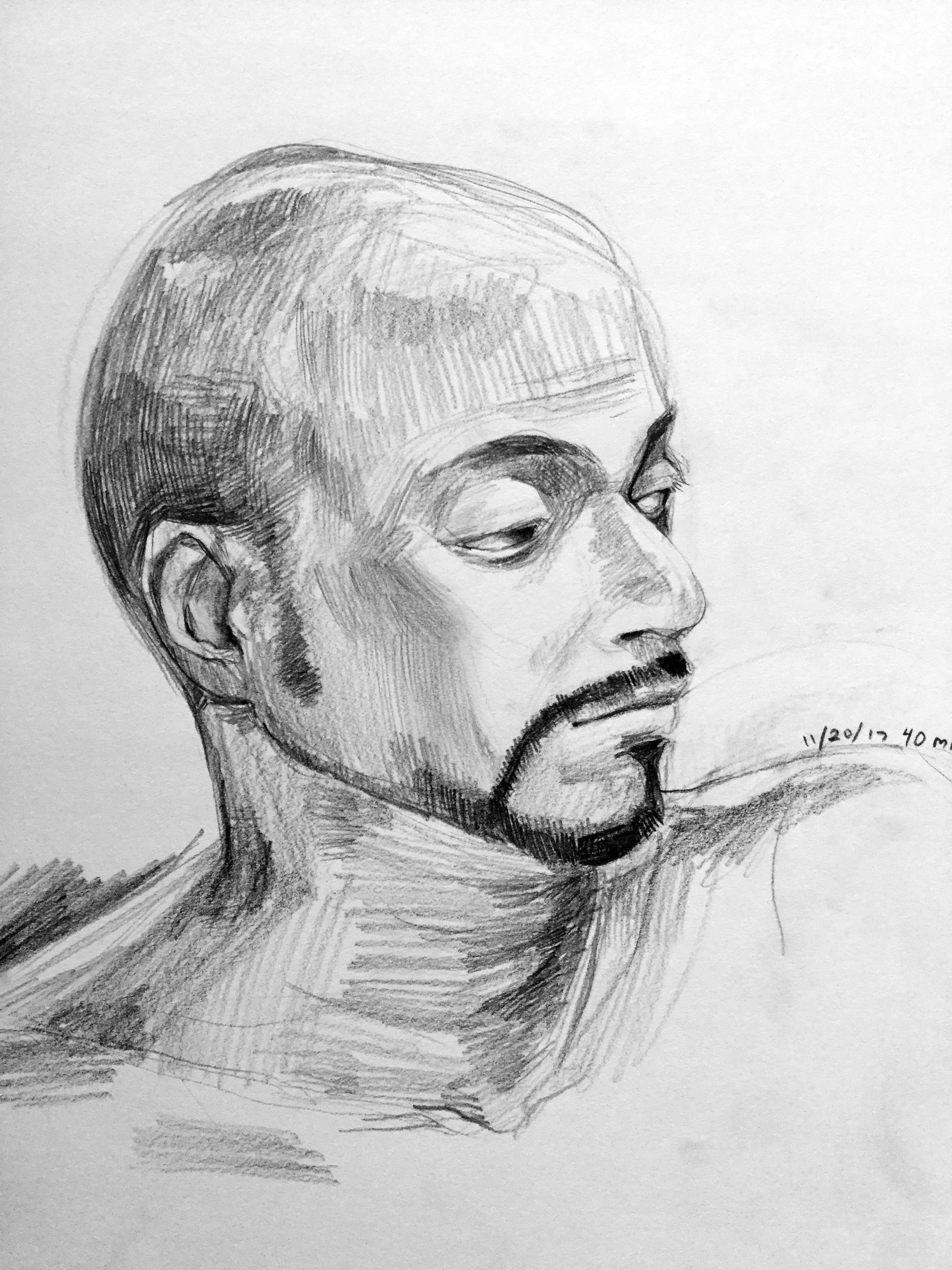
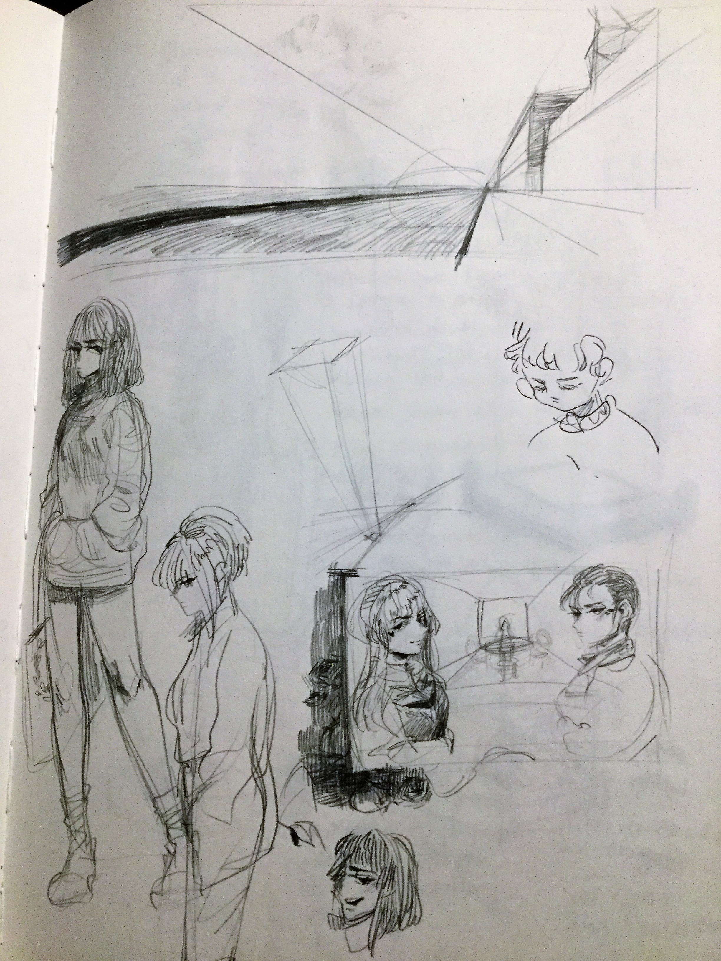
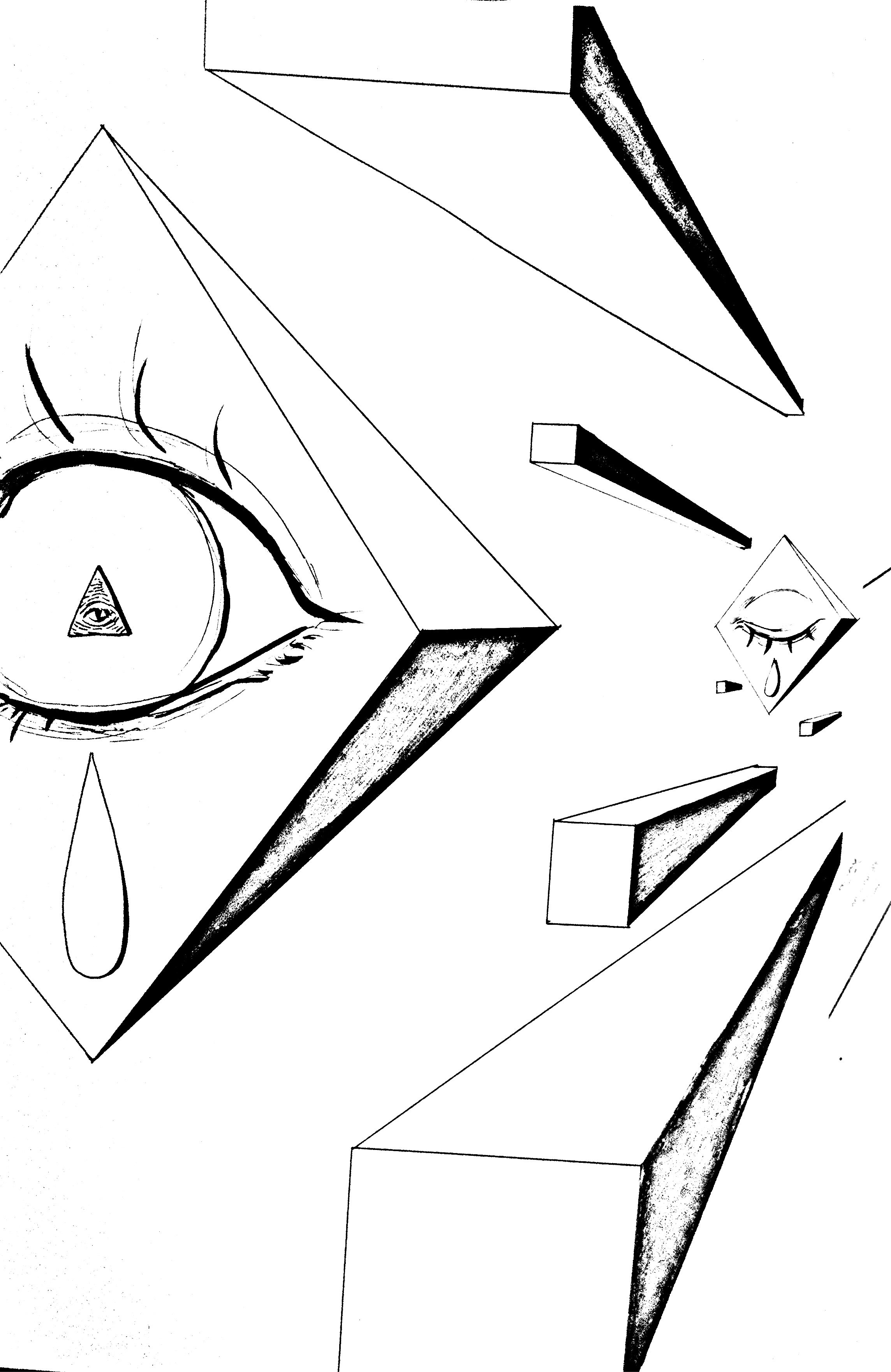
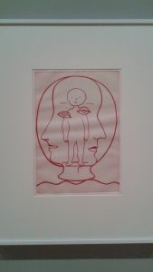
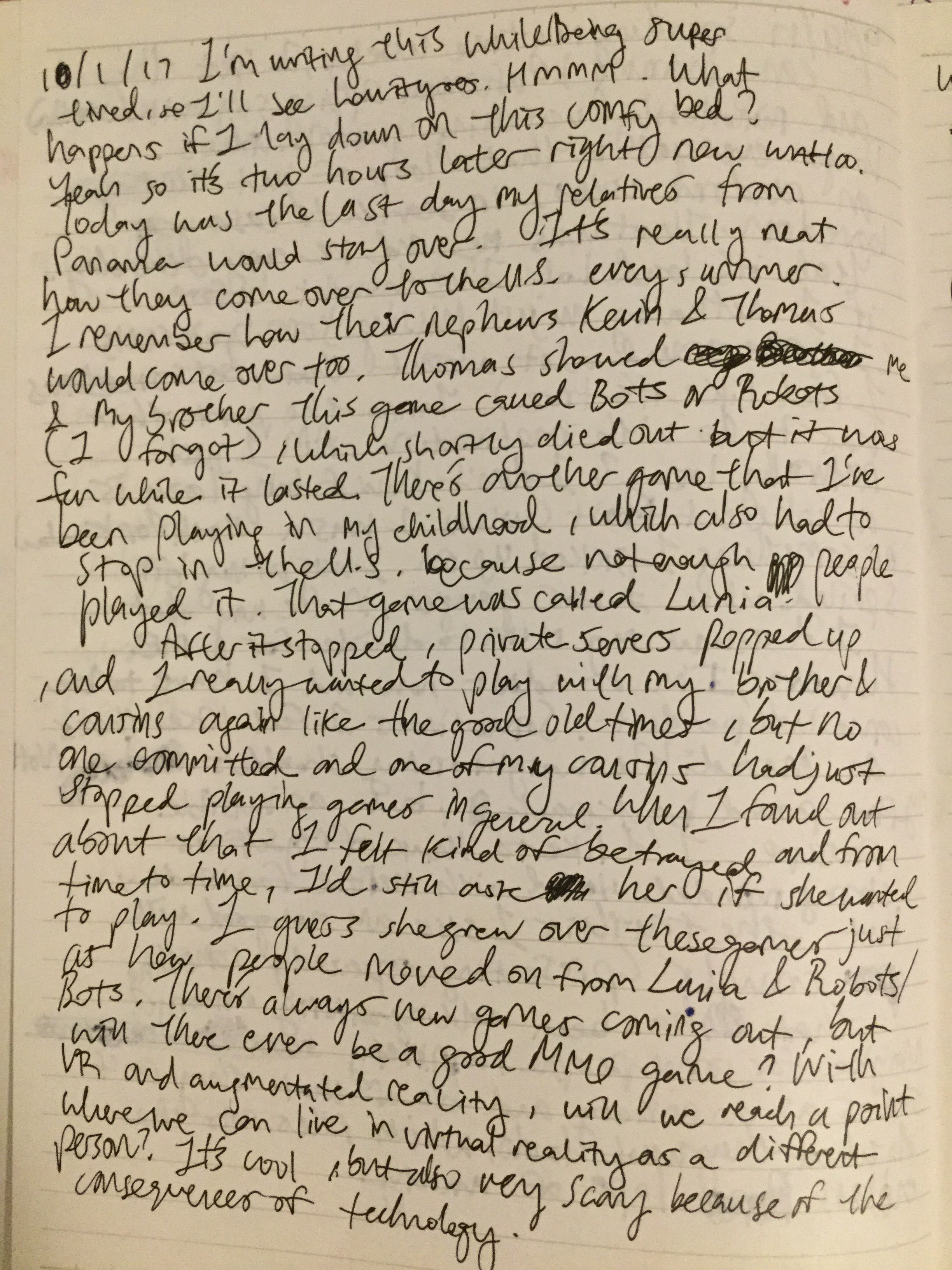
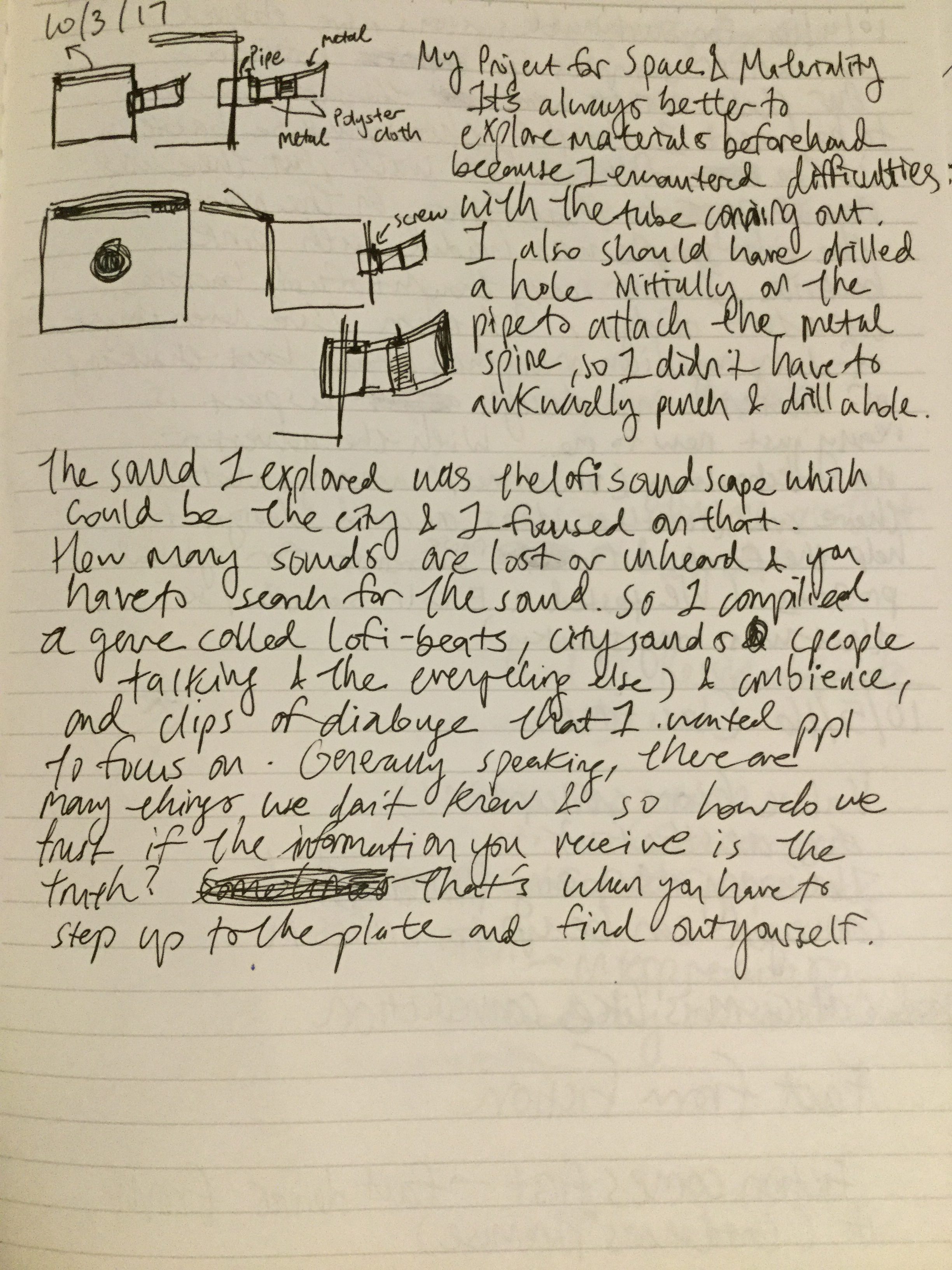
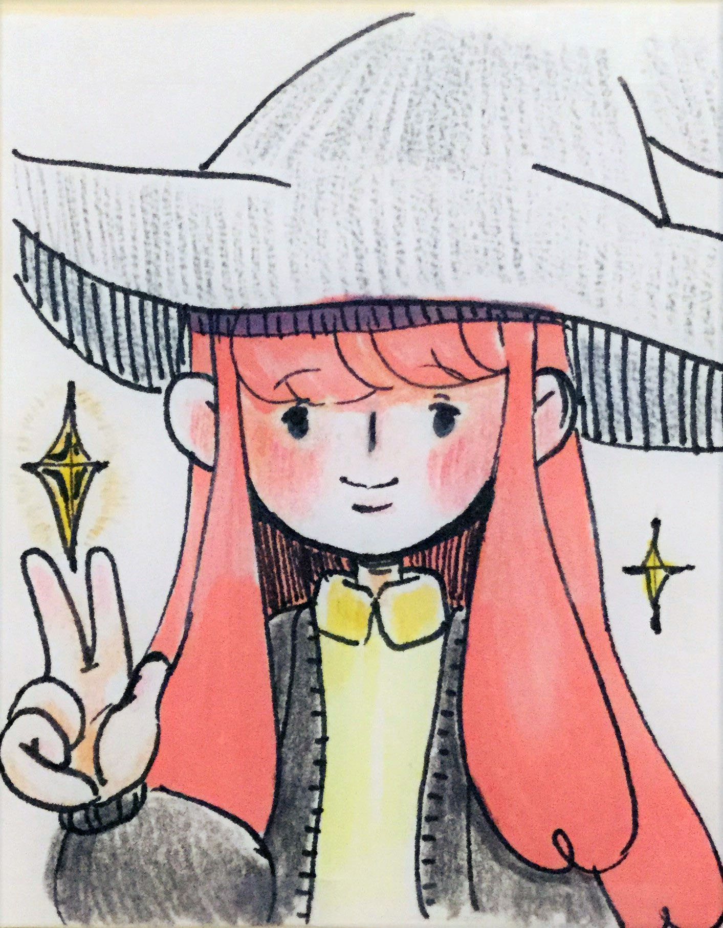
These were my beginning sketches of the character I wanted to portray. Inspired by the web serial, Worm, I created an anti-hero, a vigilante. What I worked on for this project was her backstory. Before explaining how she got her powers, I need to set the scene- the universe really. In this world, there is an Evil God that hovers over the lives of humans. They call him, the God of Fate, the being who controls the golden threads of fate, the question of who dies and who lives is determined by it. For now, I only have one planet, but who knows! With the power of imagination, I could expand on that, which is what I did in creating this world of enhanced human beings (humans with superpowers). On this planet, we don’t call these people “superheroes” because of the fear and mistrust they evoke from citizens. This is also thanks to the cult that follows the God of Fate. They heed his “holy” decrees of creating beings to battle enhanced humans who do not follow his cult. Normal people don’t have any knowledge of this being at all, however, if they did know, one could only say that was also determined by fate itself. The reason being? Who knows? How could us tiny, insignificant ants know what an insurmountable, ubiquitous being was thinking! (Please understand that although I am the creator of this being, I must also hang my head low in order to be safe from its grasps) But I reckon he does this for entertainment, as many would imagine, being at the top is always described as lonely and boring, right? You could also imagine the amount of unrestrained spite this being has gathered (from across different worlds as well) when discovering this fact. That’s why there are two factions, Golden Fate, those who follow this being, and the opposing, Silver of Luck. Founded by the first characters I made for this series.


For more storytelling and worldbuilding (It’s also pretty embarrassing to read, this is always the case when threading the boundary between a nerd and a weeaboo):
Also, they aren’t aligned with some parts of the story now, but this was my early writing.
https://docs.google.com/document/d/10AT_QBQlHqACJqcfbmp64WZpKJhmXymgIkhcyeBoz-o/edit?usp=sharing
https://docs.google.com/document/d/1mAHnrlZ-vb0pQ-X71FQLRFJ3wzq81_ezS3e3vqoSlsc/edit?usp=sharing
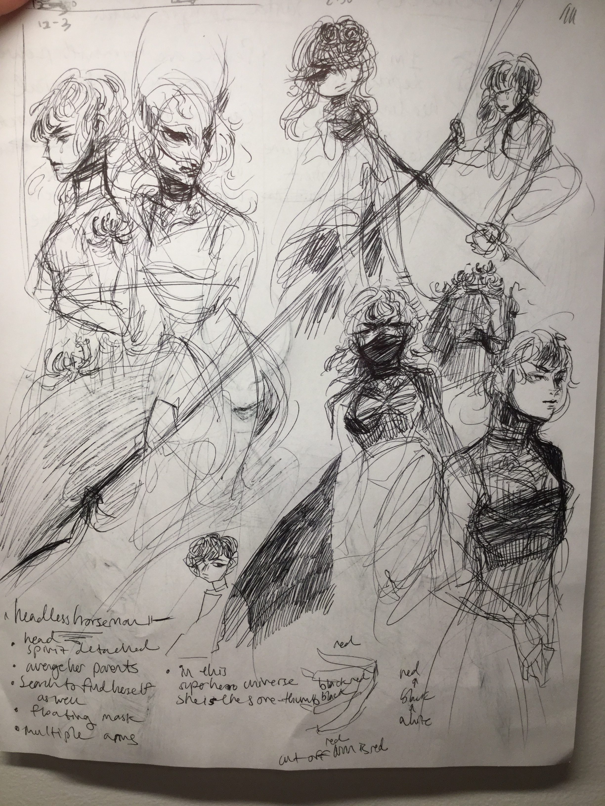
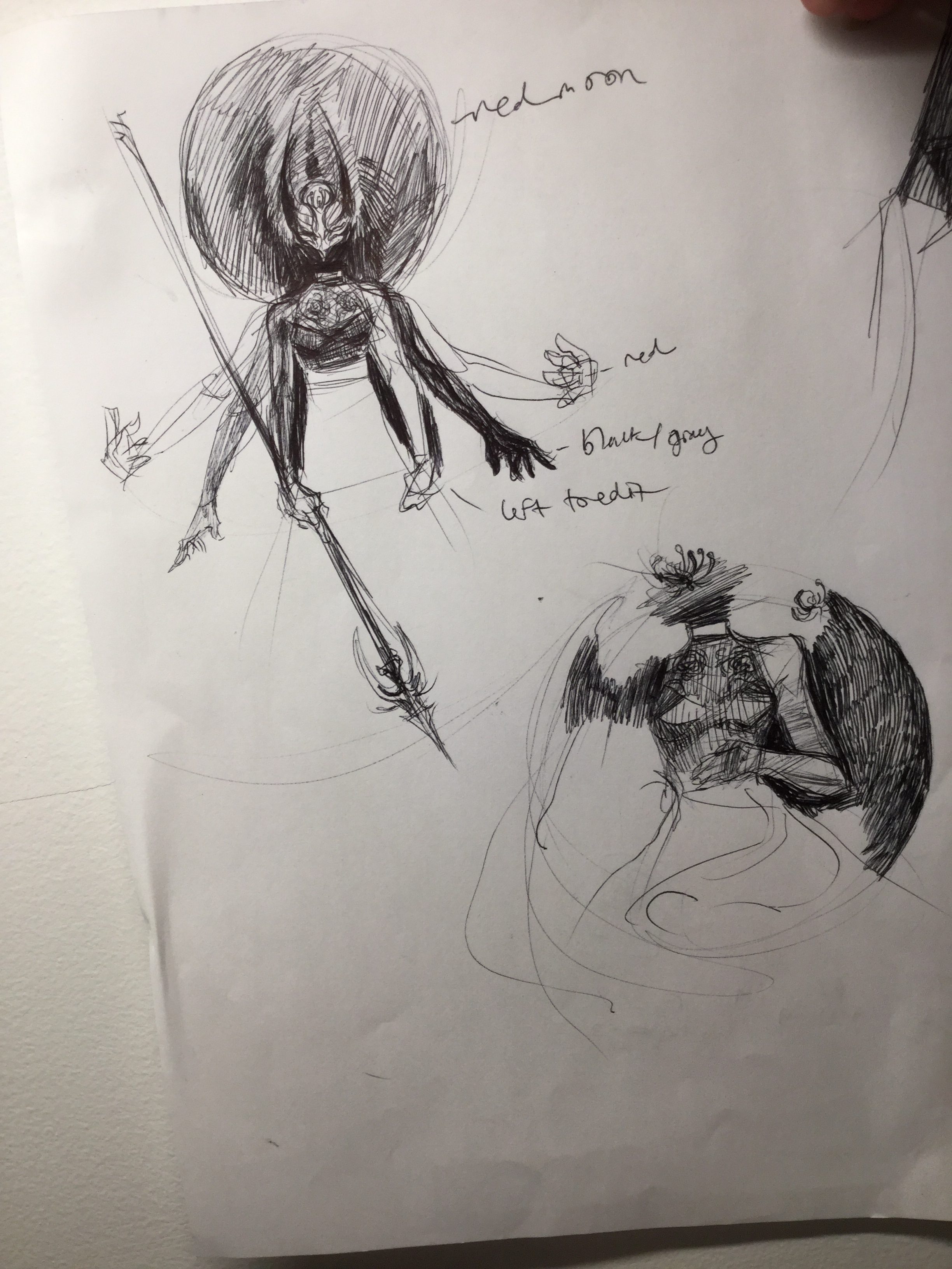
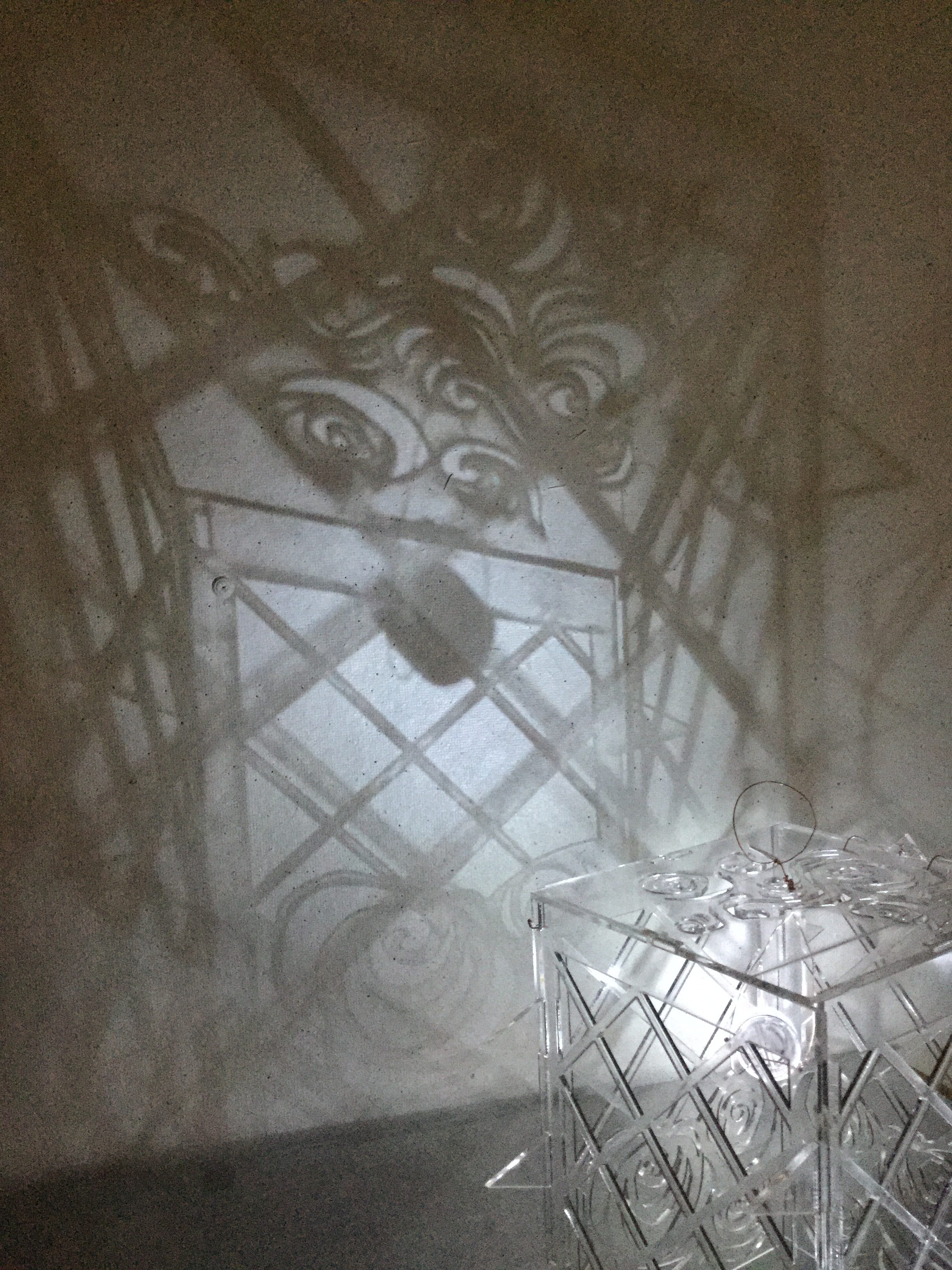
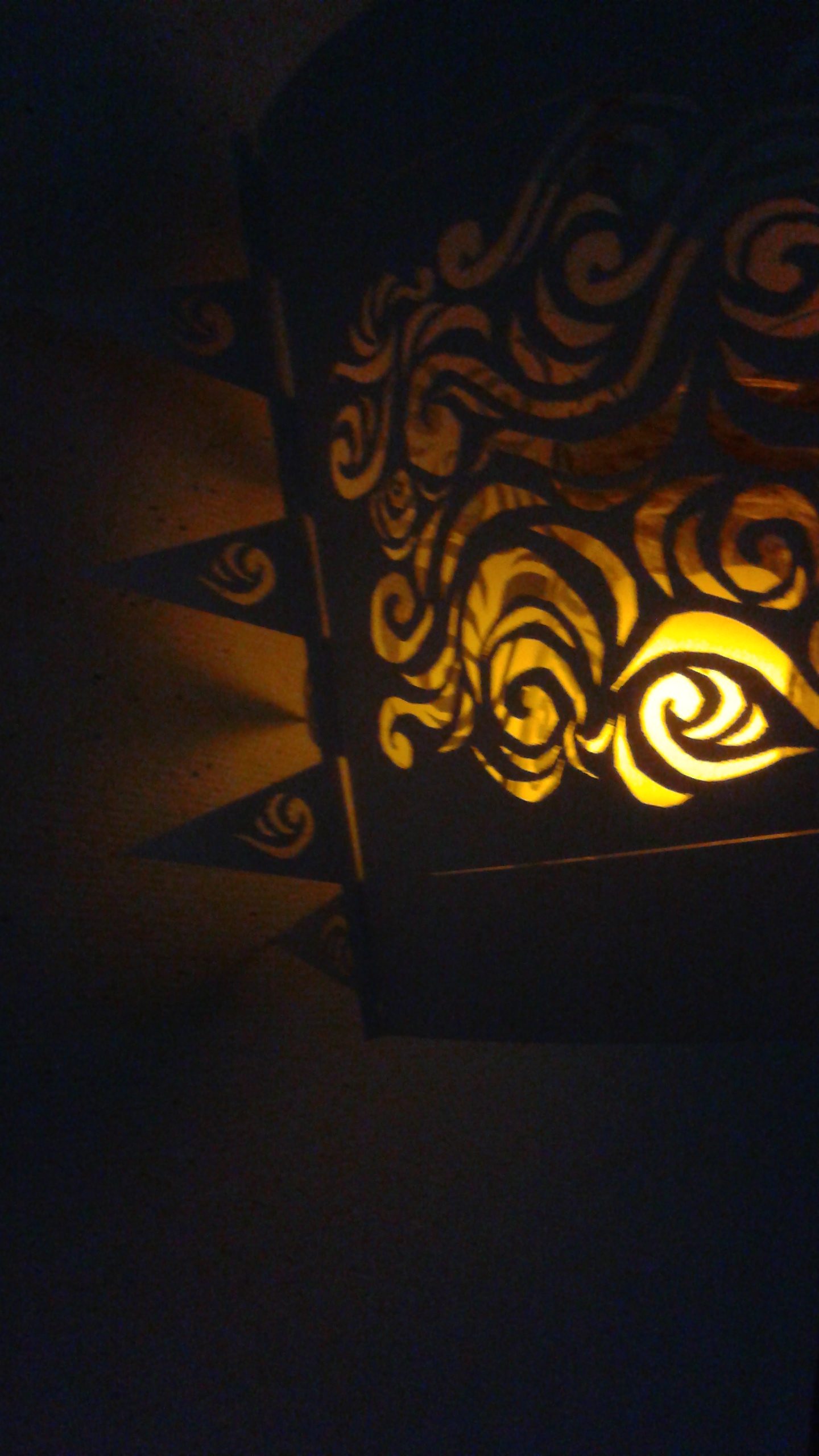
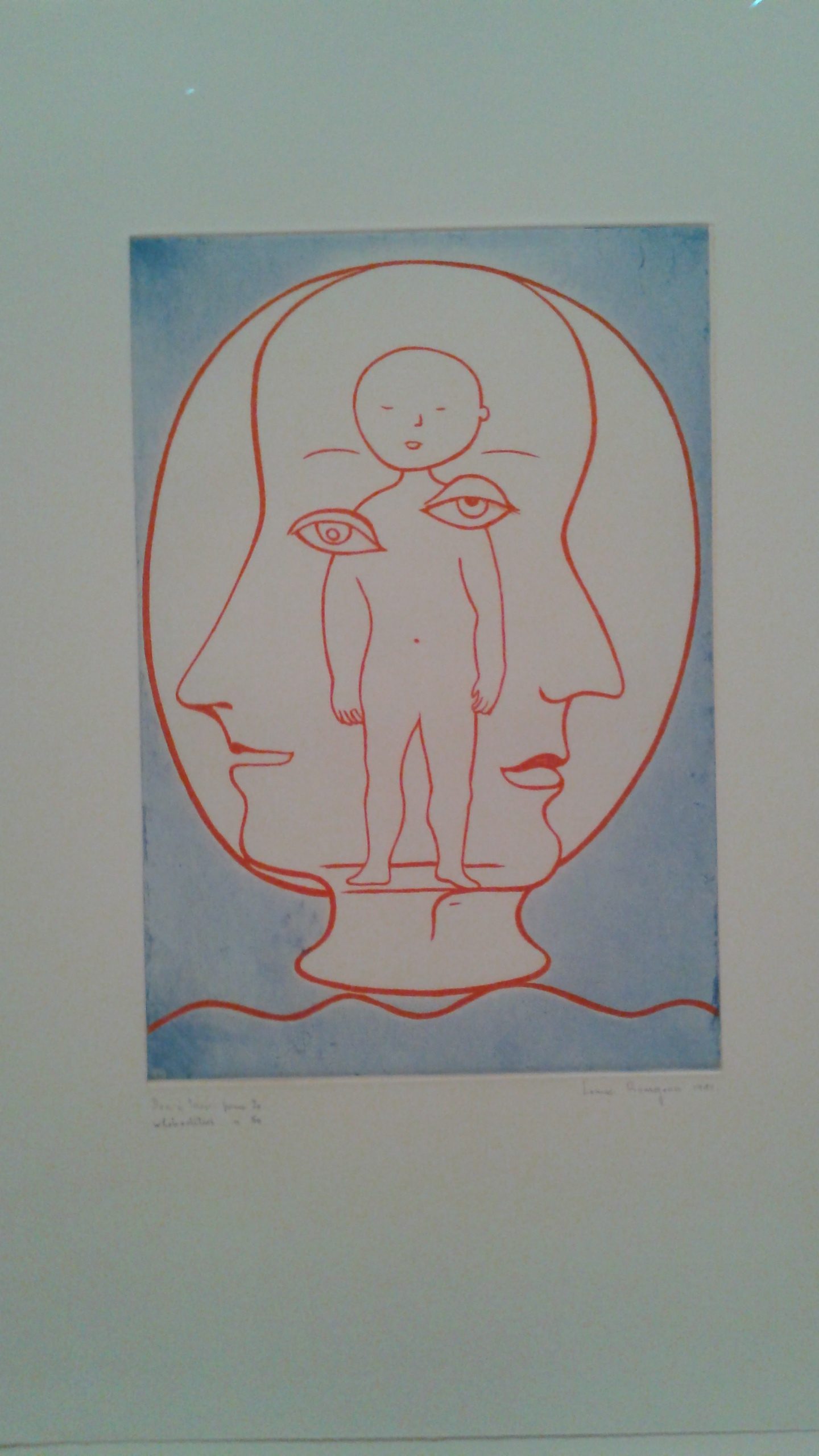
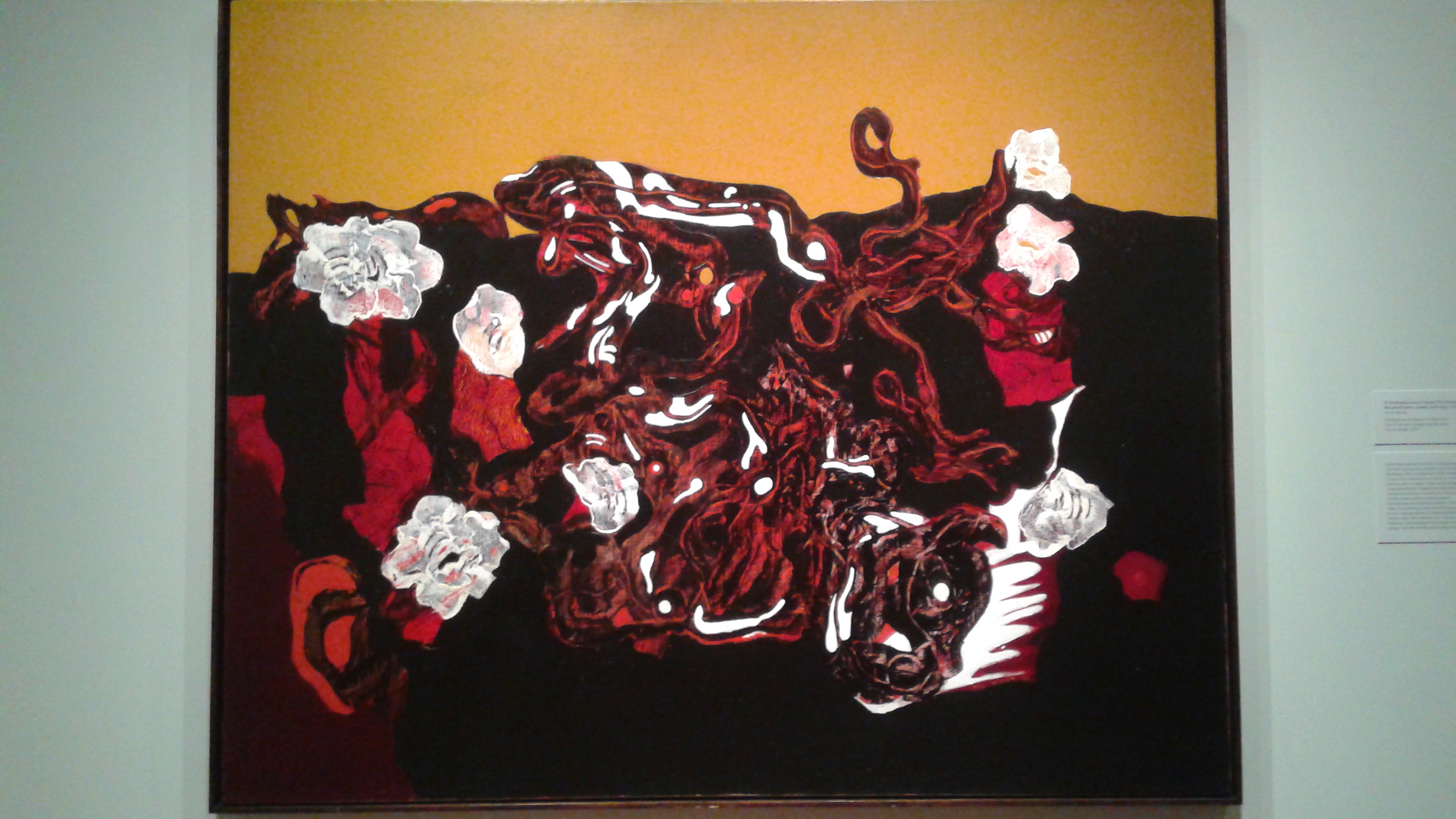
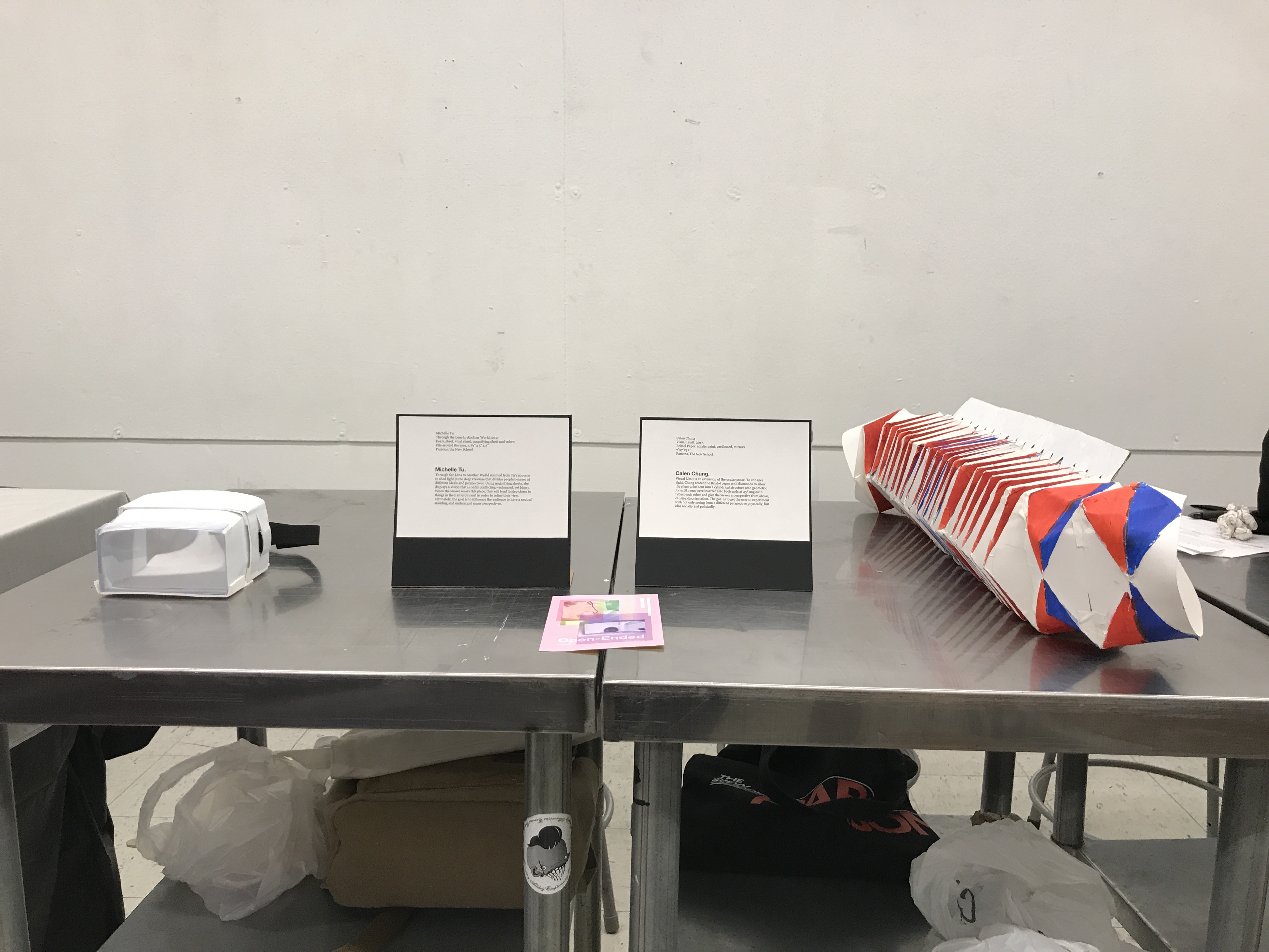
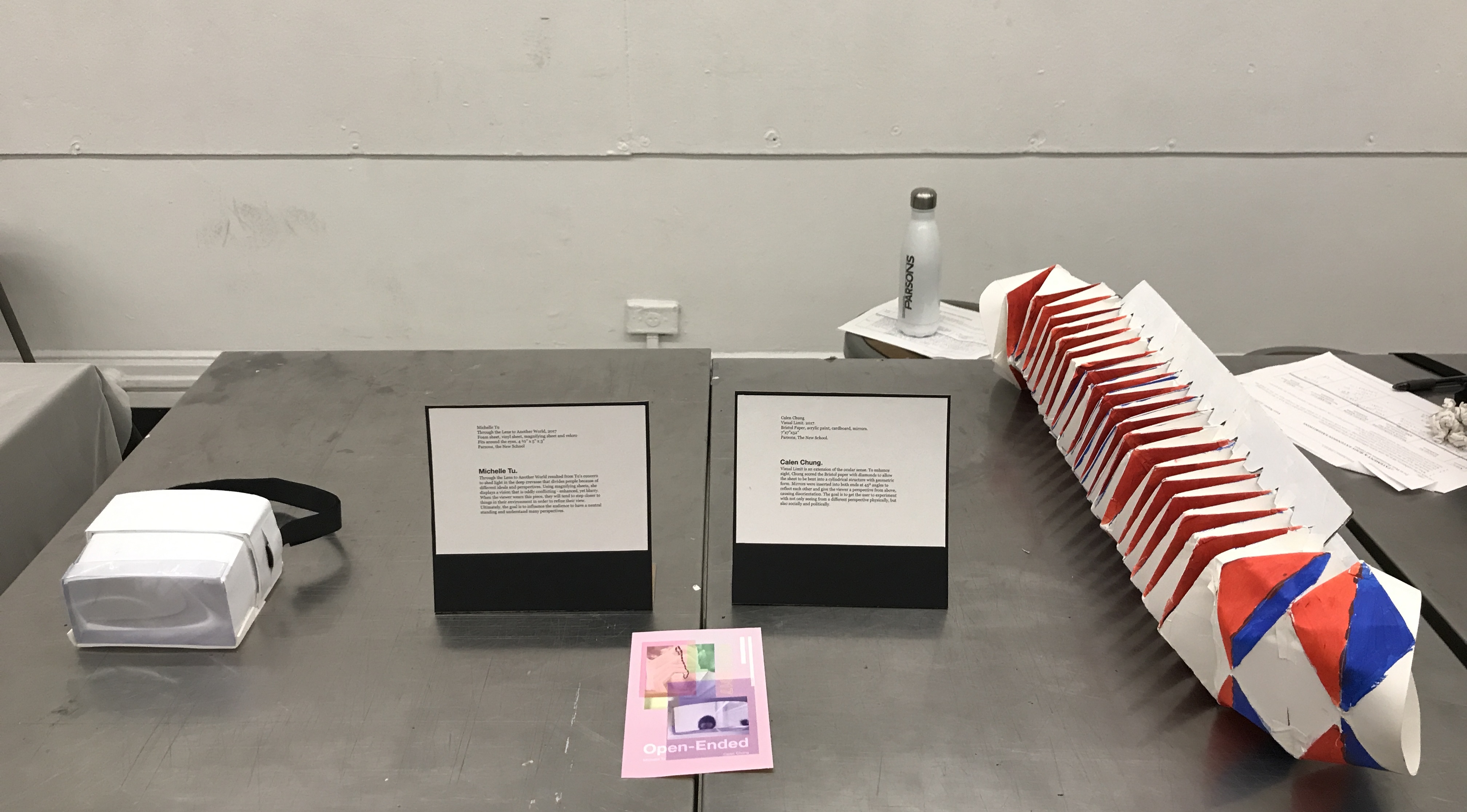
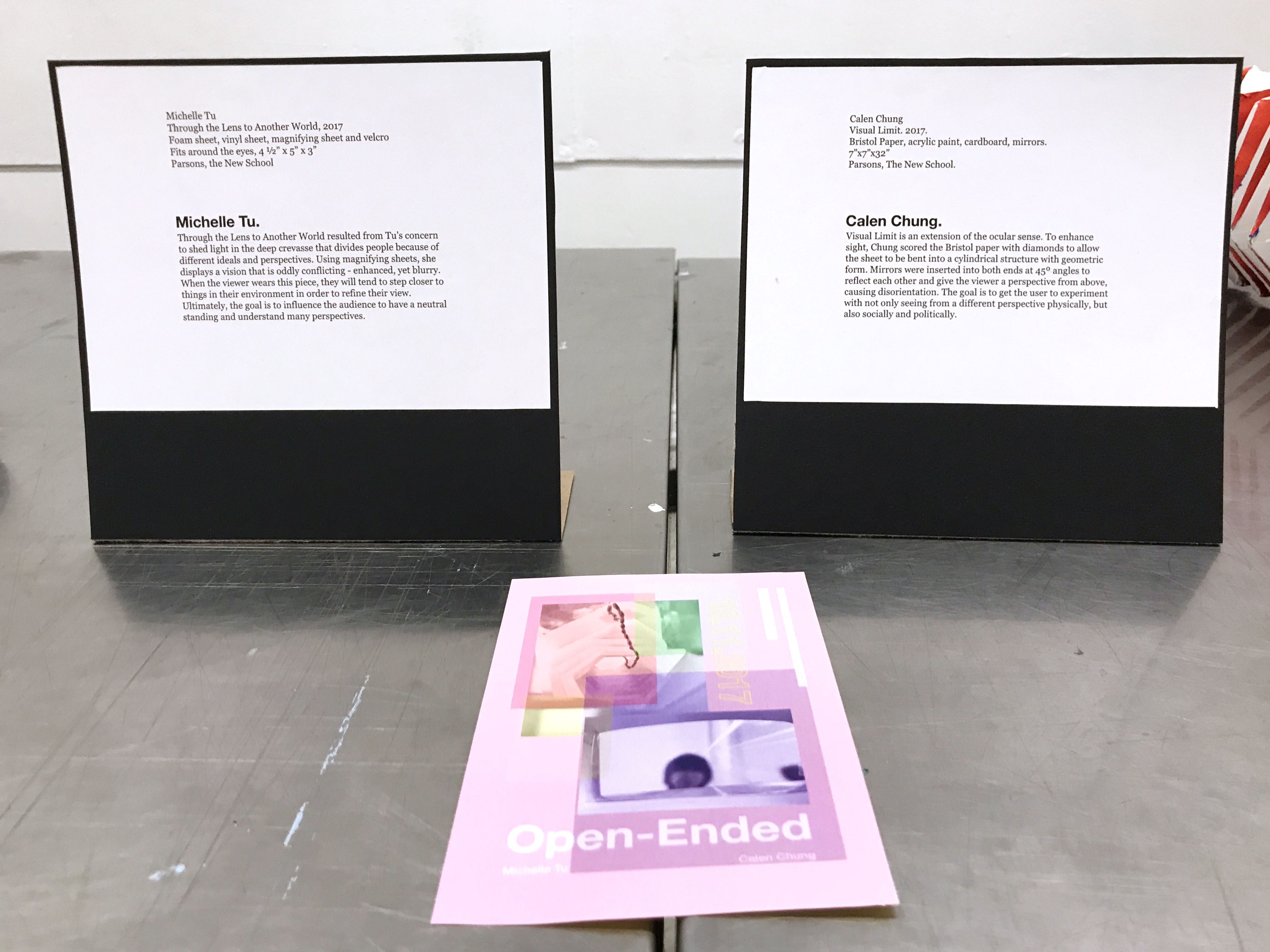
From the work, Growing Suspicion originates my love for drawing masks. How they are used to hide something yet, simultaneously, they represent so much more. At the end of the video, you actually see them appear pulling the golden thread, in search of this newborn power, Lisa, who wields her blood as her power. Never have they’ve ever sensed a power being unlocked in this manner, so they personally searched for this being themselves to guide it.
For the actual video:
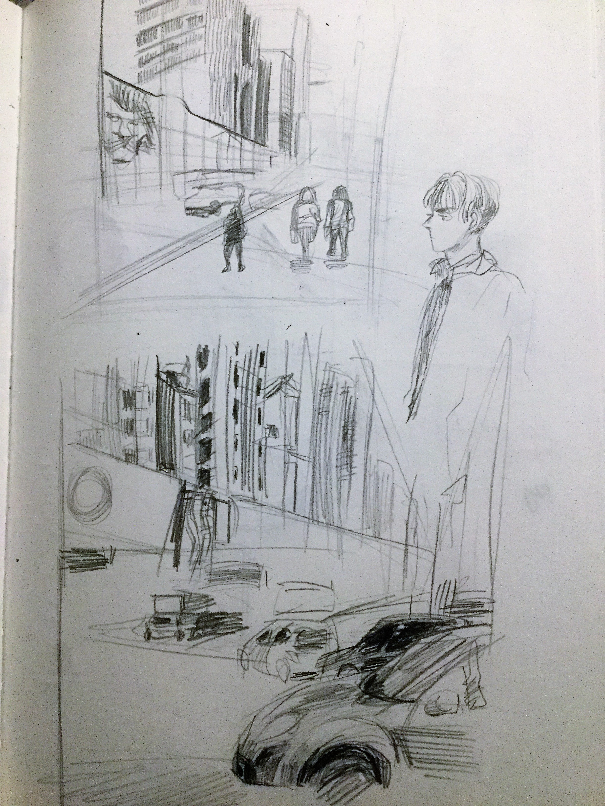
Well… it’s more of an abstract music video. I got tunneled visioned and created a music video instead. I should have thought more about the time I had because I was staying up and rushing this, but it was still fun exploring After Effects’… effects – now that’s just really awkward to say. Because I’m pursuing game design this is still a good learning experience in creating animated shorts if I were ever to do that. What I wanted to portray in the video was, well, at the beginning, the death of her parents who were also enhanced beings. They were sought after Golden Fate and their bodies were taken away for experimentation. Of course, Lisa had no idea about these matters, only thinking the death of her parents was caused by misfortune, only to be later confronted by a beast-enhanced assassin of this organization. Being the cocky-mouthed bastard he was, this assassin spilled pretty much the whole can of beans about what happened to her parents as she was going to die anyway. One of her arms is detached for attempting to confront him and her head is taken away. What happens after is really abstract because to her it is what seems like a dream. In reality, her body and the detached arm sinks into the pool of blood that congregated around her and she later appears surfacing out of this pool later on her new body boiling for vengeance. Following the themes of the headless horsemen, she would seek for herself again – her head and vengeance for the lives of her closest family. There’s going to be a lot of character building before she gets to the stage of being an anti-hero… or is that something I should even pursue for her? This matter can only be decided by herself. Would her efforts be for naught? Or would she discover something else? As for the video, after knowing about the trademarked golden threads of fate, who else could it be besides from this being who granted her this power? Could he be doing this for his entertainment again? But why would he give such a power to this girl? When one realized this, they also acknowledge the monstrosity of power this being really held… to even give such fierce power to that girl, just how much power did he wield then? It shattered all hopes of whoever thought they had a chance against it – The God of Fate.


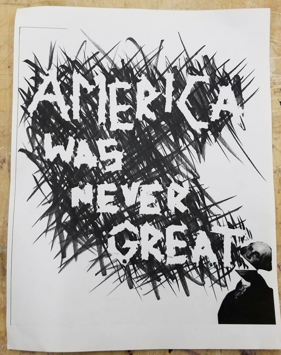


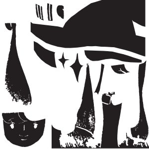
 White on Black
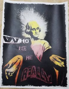
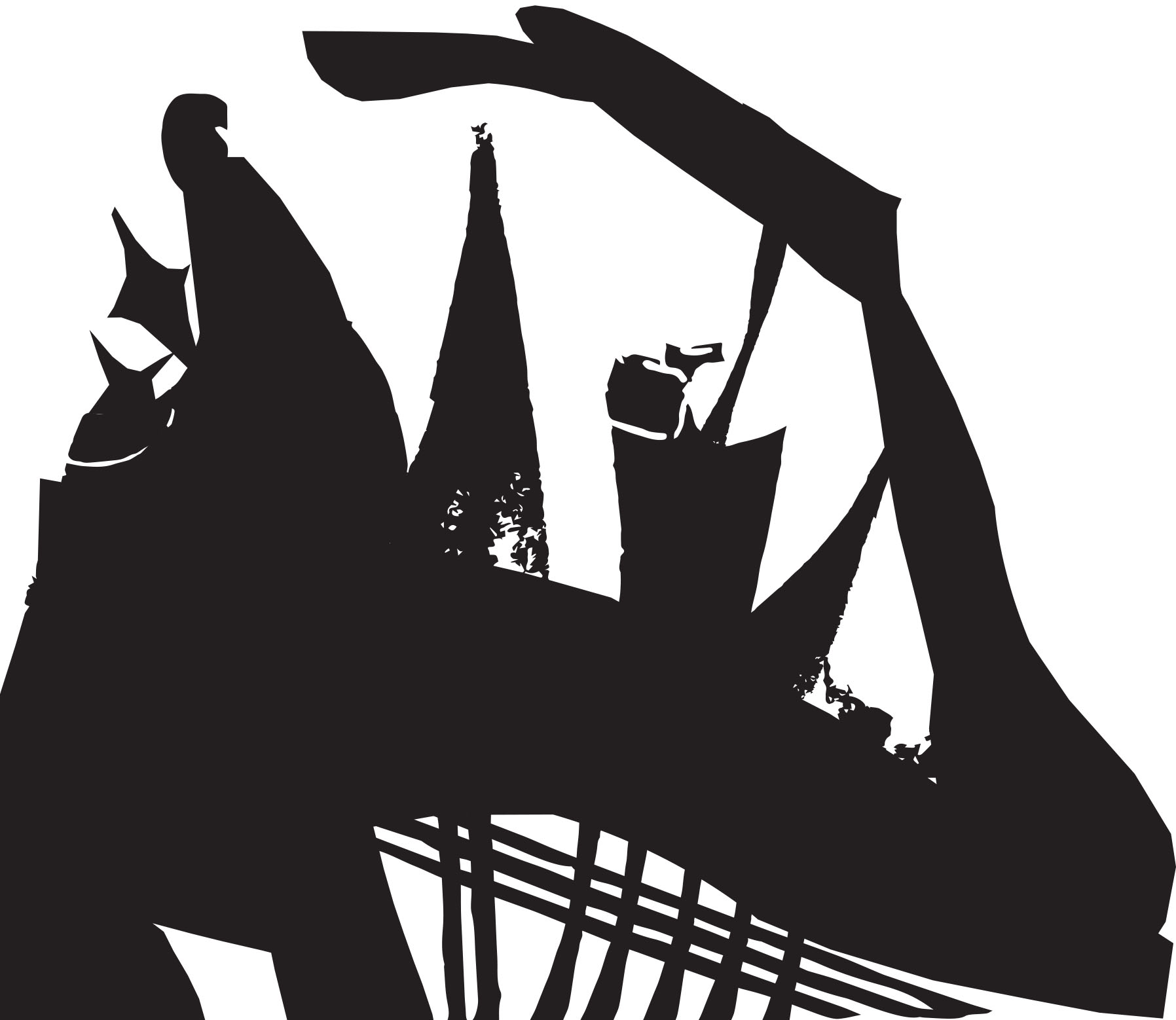
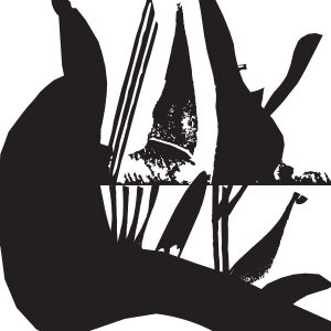 Ambiguous
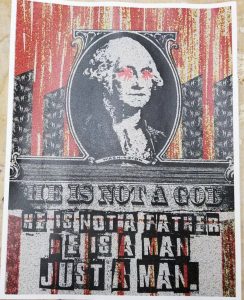
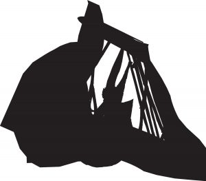