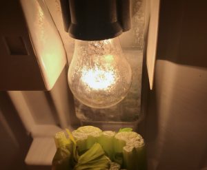
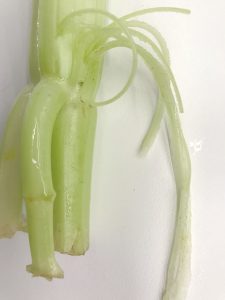
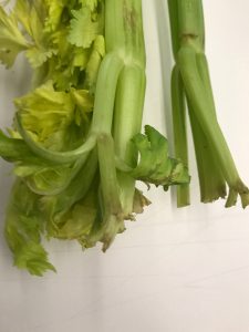
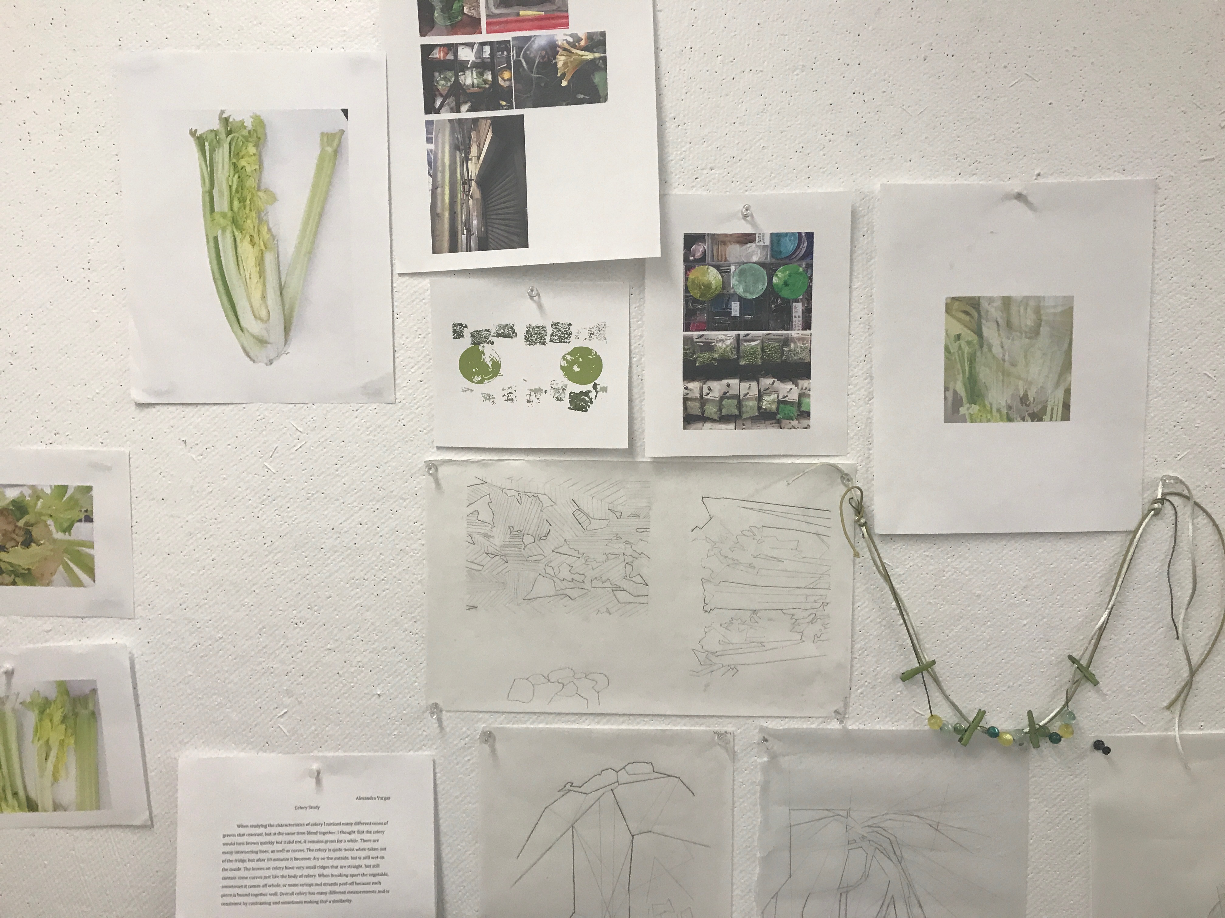
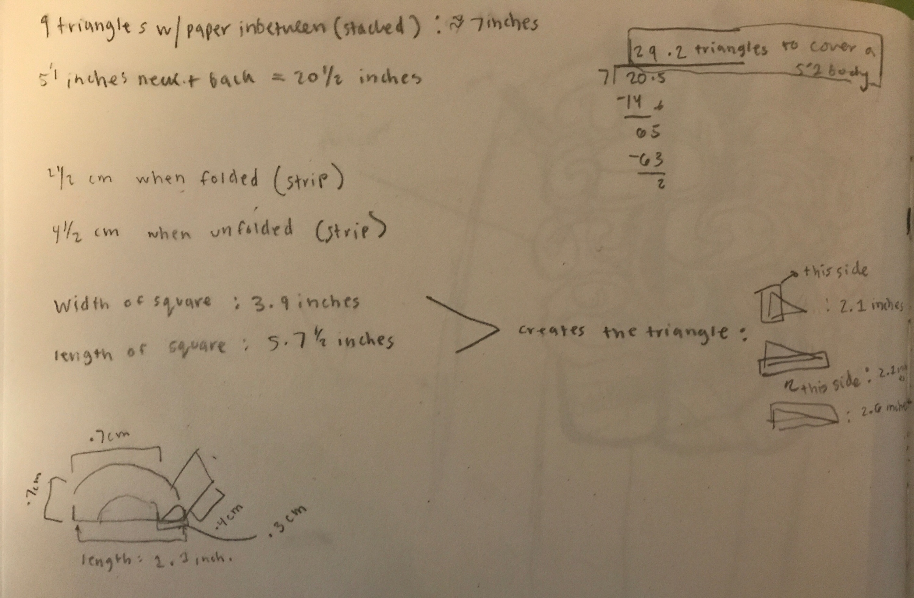
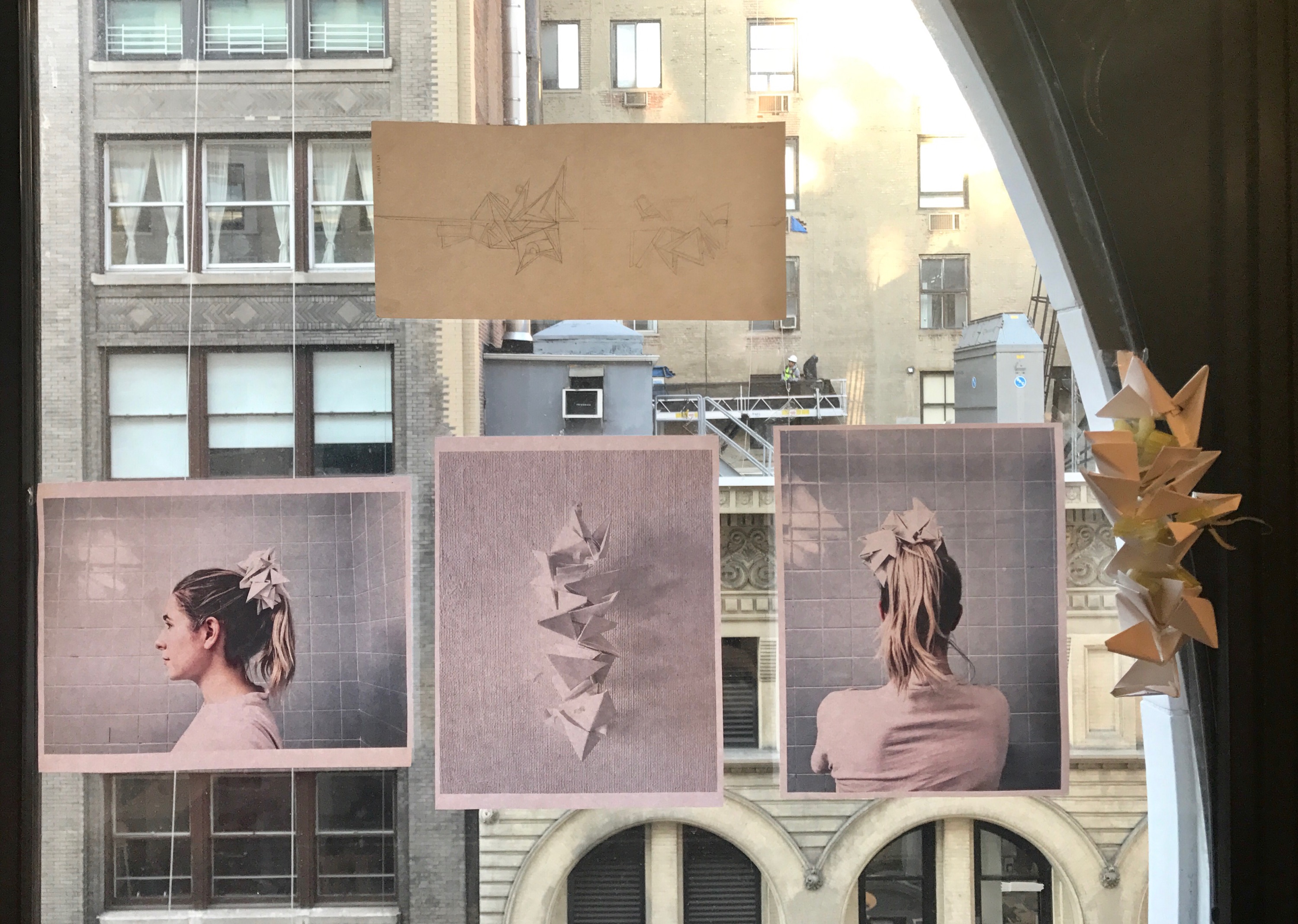
Over the course of the past few weeks I have been studying celery. I think this ties in a lot with the idea of patience. When taking the time to look , more than the average minute or even few hours you can discover a lot of context you would have realized was never there. Some characteristics of celery I noticed: many different tones of greens that contrast, but at the same time blend together. I thought that the celery would turn brown quickly but it did not, it remains green for a while. There are many intersecting lines, as well as curves. The celery is quite moist when taken out of the fridge, but after 10 minutes it becomes dry on the outside, but is still wet on the inside. The leaves on celery have very small ridges that are straight, but still contain some curves just like the body of celery. When breaking apart the vegetable, sometimes it comes off whole, or some strings and strands peel off because each piece is bound together well. Overall celery has many different measurements and inconsistent by contrasting and sometimes making that a similarity.
I have not so far in my life been a big fan of eating celery, but now starting to really appreciate its form out of many other vegetables. It does not rot fast, it holds water, and acts like a vessel, the way it is constructed can lead to other findings of how to construct stuff. I think it would be useful for space thiea of boiling water in a structure and even the models of how it combines.
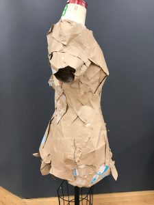
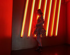
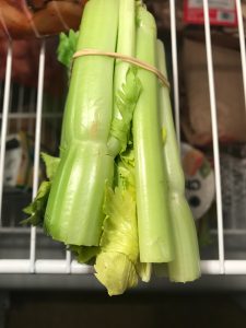
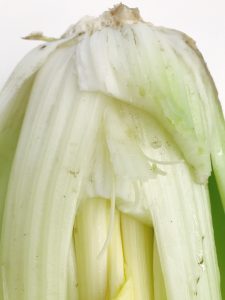
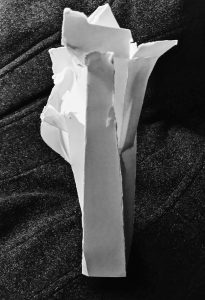
First set of pictures:
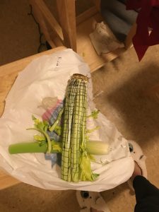
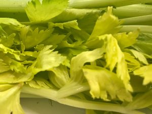
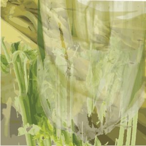
These are my first set of photos, I wanted to document the celery in a creative way showcasing the body and certain sections of it in the way of still knowing that it was celery. The lighting was quite poor where I took these and it effected some of the coloration of how the vegetable looks. I learned what drastic difference lighting can make on this vegetable.
Measurements and drawing:
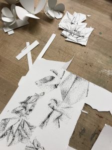
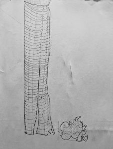
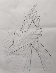
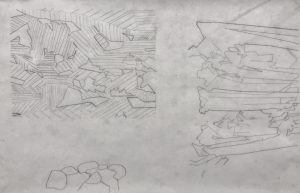
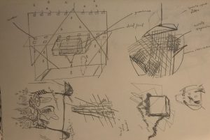
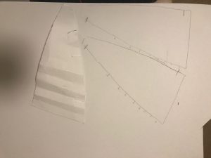
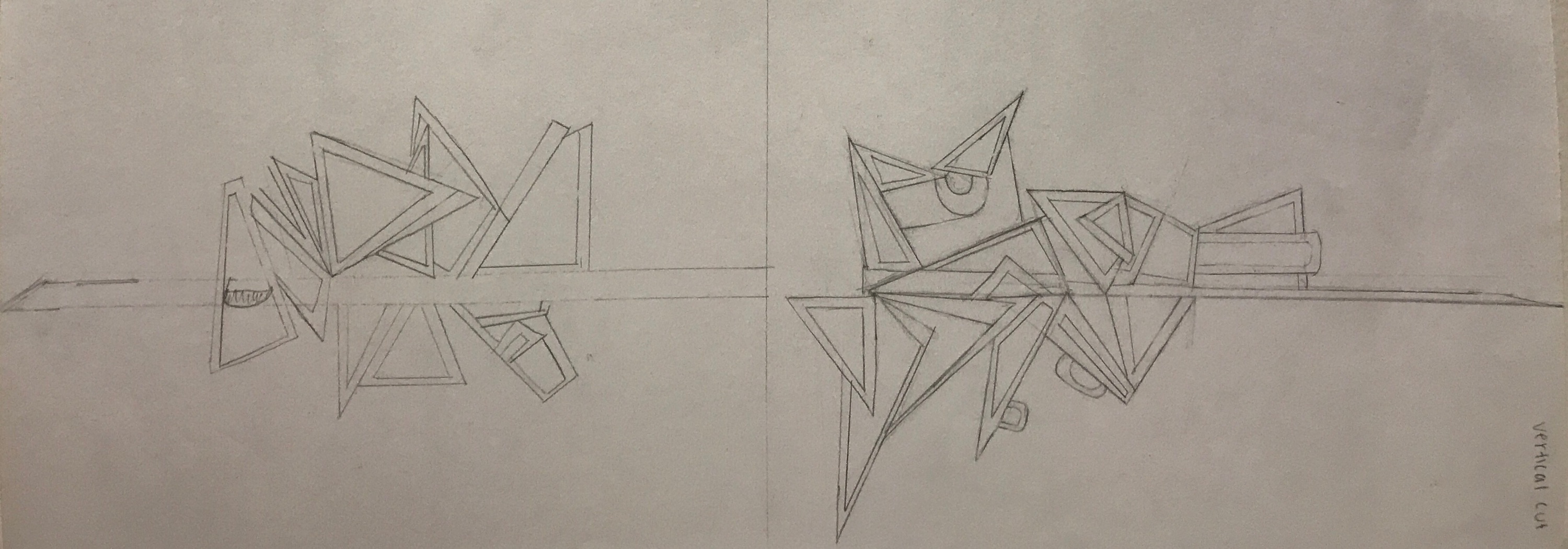
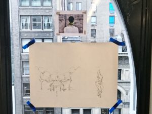
For the measurements, I measured each section of the celery. I did a planar cut, transverse cut, and did a planar drawing on the vegetable. After that I measured out all the angles and lines of the celery stock. Its hard to see but there are more lines, they just came out light in the image below:
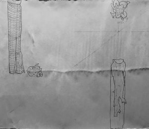
Planar: I noticed how much negative and positive space celery holds. The leaves fill in gaps, or other parts of the celery stock shade in the holes. There are small little circles in the planar view of the celery and a gap. The size of the celery which is kind f shaped like a bean, stays similar in size but all individual pieces are not the same.
Transverse: The leaves almost have shorter measurements and ridges, and the celery has small ridges in the stock. (two drawings were done for this cut)

Plane: This was difficult at first because I felt that the celery would have more curvature, it ended up being quite slight instead of drastic change. More of the curves and twists were at the bottom root area to the stock. Then where there divergence occurs it changes a tiny bit, but stays still at a constant distance pattern.
-
- The right drawing is the plane drawing, and the left drawing is one of the transverse cuts.
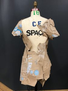
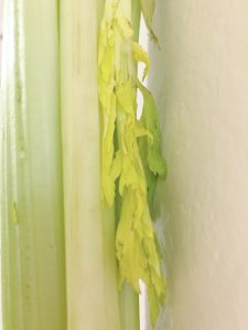
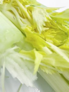
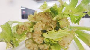
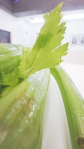
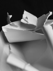
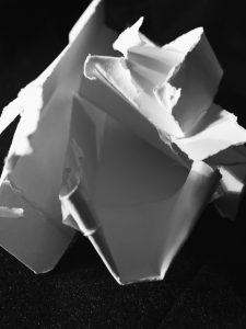
These are my second set of photos, I gathered the comments given in class, and decided to retake them.
Better lighting was important, so I choose a location with white walls, tables, and floors, so that the lighting could bounce off and make it more of a natural lighting effect.I zoomed in more and broke the celery. In doing so, I learned that the celery when broken can get stringy, and is easy and hard to break it depends. This inspired to diagram the drawings with more of that kind of effect.

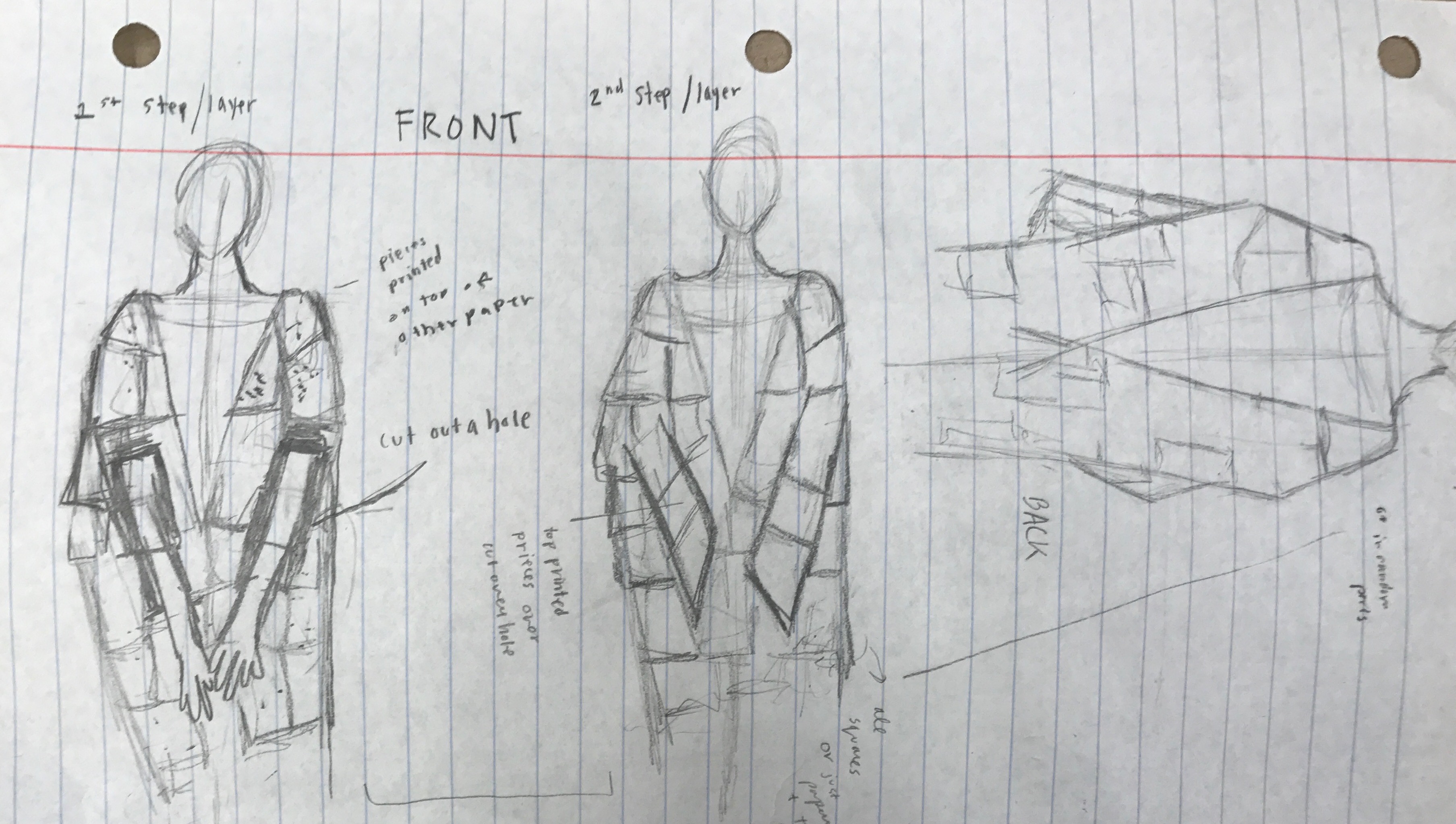
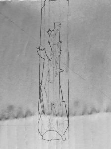
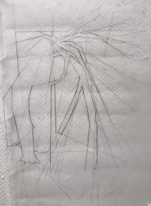
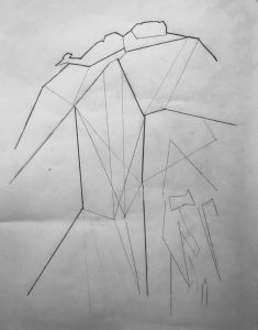
Turning Celery into a Diagram:
When drawing the diagram of celery, I found that this vegetable actually holds lots of straight edges. Those slight curves at a glance make such a difference making the shape seem so much more rounded. It is a lot of straight slight lines that occasional curve that make that illusion. Of course the top part looking at the planar cut is very rounded which is the interesting part. It was fun to learn in this way, and to be able to tie in abstract and realism in a creative form.
-
- 3 diagrams are in this picture
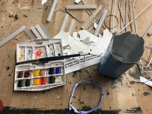
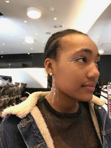
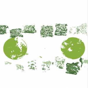
Color Wheel:
For the color wheel, being inspired by how celery holds many colors and textures I was curious to see how on the street if I could find those colors. It was extremely rare to find those colors, here is what I found in two hours of searching:
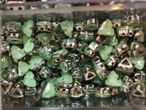

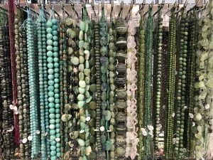
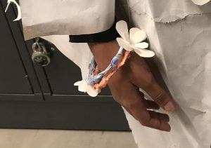
Then those stings inspired me to make a necklace, so at the bead store I looked for colors that matched.
Final color wheel:
-
- overlaid three pictures I took of the celery to see the different tones of color they hold
-
- overlaid beads from the pictures above that match the color scheme of celery
-
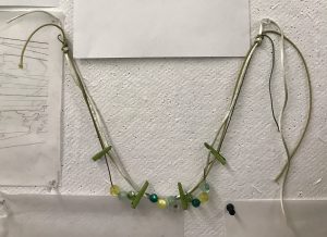
- necklace
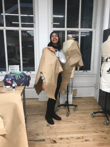
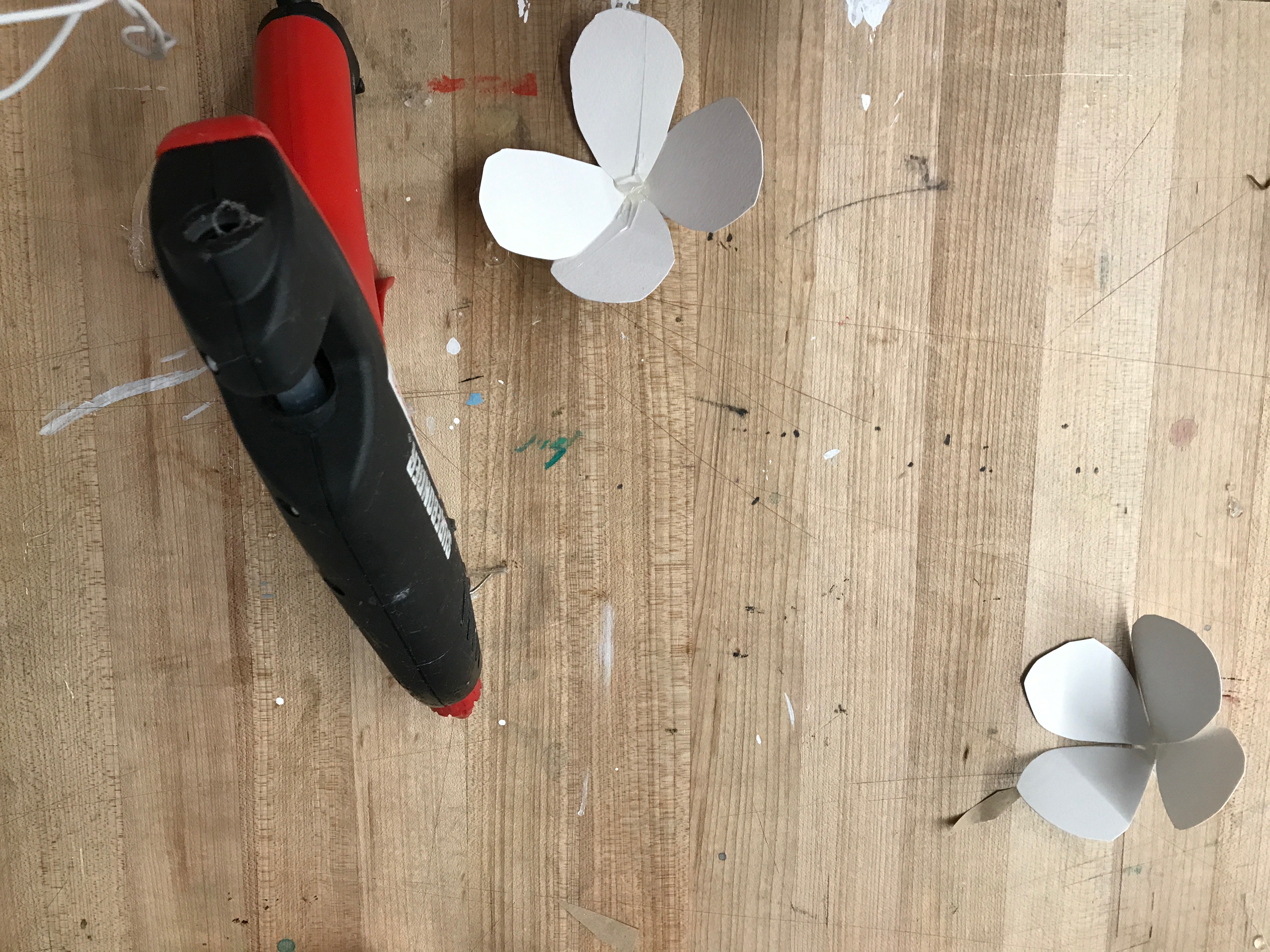
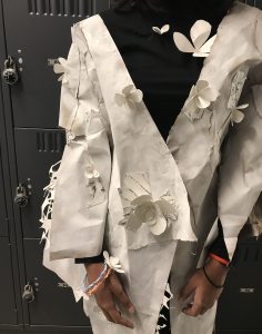
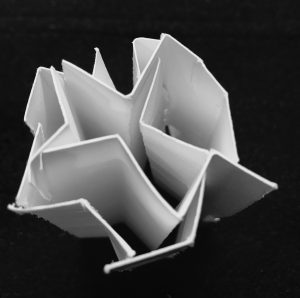
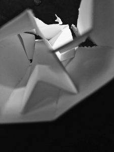
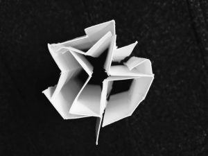
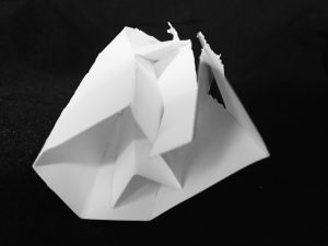
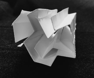
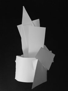
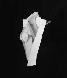
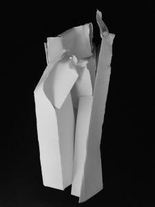
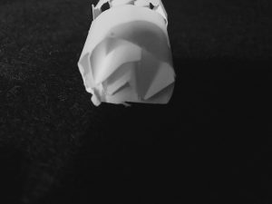
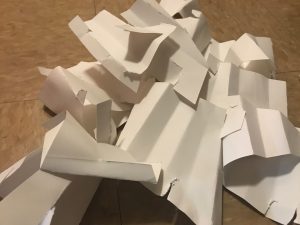
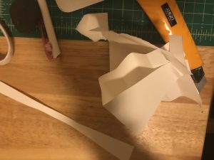
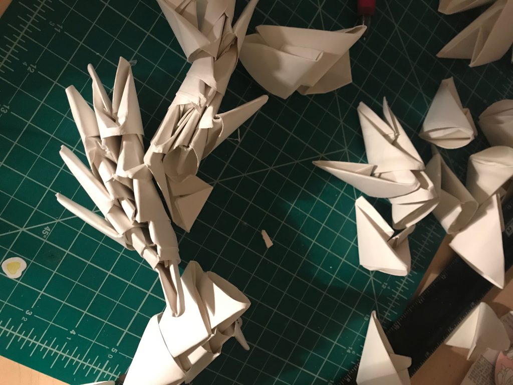
Folding Celery Out of Paper:
Folding these structures was a challenge because it was hard to get the paper to stay still. It was fun to turn some of the diagrams into a three dimensional object.
For photographing these I wanted to how the light and the way that it hits the paper and the folds. That is why it is in black and white.I used my coat which has some texture and laid it on top and had one warm lightbulb slightly casted onto the paper.
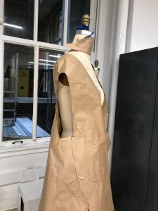
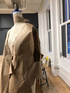
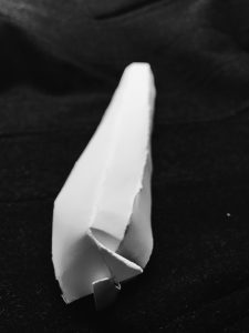
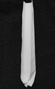
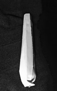
1st diagram: entire stock of celery
2nd diagram: small round of celery that you see at the planar cut
3rd diagram: inspired by abstracted diagram drawing

4th diagram:one piece of the stock
-
- front
-
- back
-
- front
-
- back
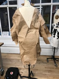
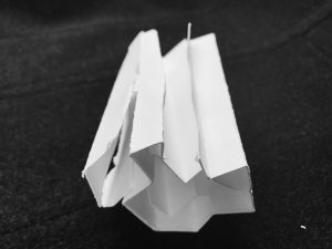
5th diagram: stock of celery
-
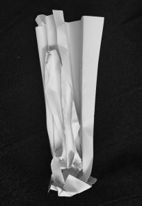
- front
-
- back
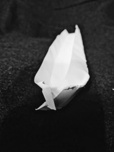
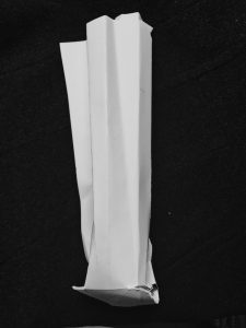
6th diagram: stock of celery inspired by the diagram
-
- front
-
- back
7th diagram: small round of celery that you see at the planar cut
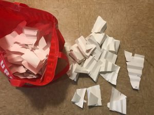
(all structures were held together only by paper, not by glue)
Folding a holder for the celery:
Brainstorming ideas of what to make:
I decided wanted to create a backpack. The final backpack after learning from this prototype would not be made out of paper ideally but out of a material that would be biodegradable. There is a lot of attention on reusing bags at the store, but not that many people talk about the vegetable bags. Also farmers and people on the go can use this product by quickly placing their item on the bag instead of it bumping together in the bag.
The first attempt I made right triangles and accordion folded them then unfolded them and cut on 3 parts of the triangle to connect that triangle that would connect to the duplicates made in an attempt to make a backpack. It worked, but then when placed down and then picked up, some parts would fall apart. I almost made the entire bag, I just had the straps left. But was this design ideal, not it was not. It was a study leading to another style of folding.
-
- binding some of the pieces together
-
- the bag holds more parts of the module
-
- measurements to cut
The second attempt I cut small rectangles and folded them into small triangles. I started to connect the triangles into a backpack. It was working, but once again parts of it would fall apart.
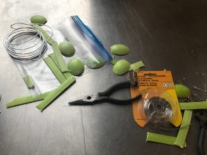
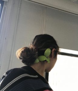
The third attempt I used that same triangle design but connected them differently. This time adding a strip of paper in-between as a chain link. I made them into earrings, and a srunchie that doubled as a holder. This structure I found when adding a strip can be manipulated into many different designs. Almost like the idea of how Legos can be build into many structures. Bur this is versatile in holding stuff as well as sculptural and taking on many helpful forms.
I also took more precise measurements to make sure that they would fit together and how many I would need to make:
-
- earrings can hold celery as well
-
- You can make the earrings as long and short as you want to by adding or subtracting triangles. Also, they can become wider by placing the triangles into each other without the stripe width-wise.
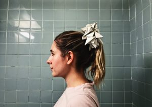
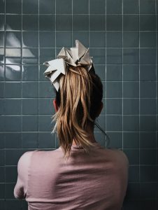
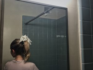
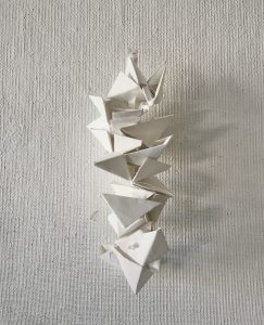
diagram folding of the celery holder:
left side: horizontal cut
right side vertical cut
diagram of the earrings
the holder/scrunchie is holding celery inside in this picture
(all attempts were held together only by paper, not by glue.
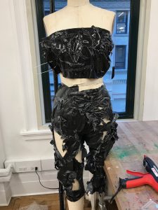
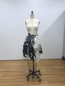
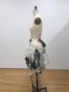
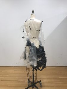
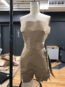
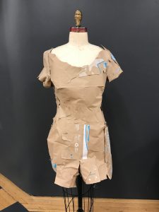
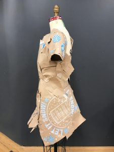
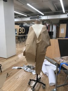
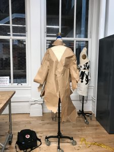
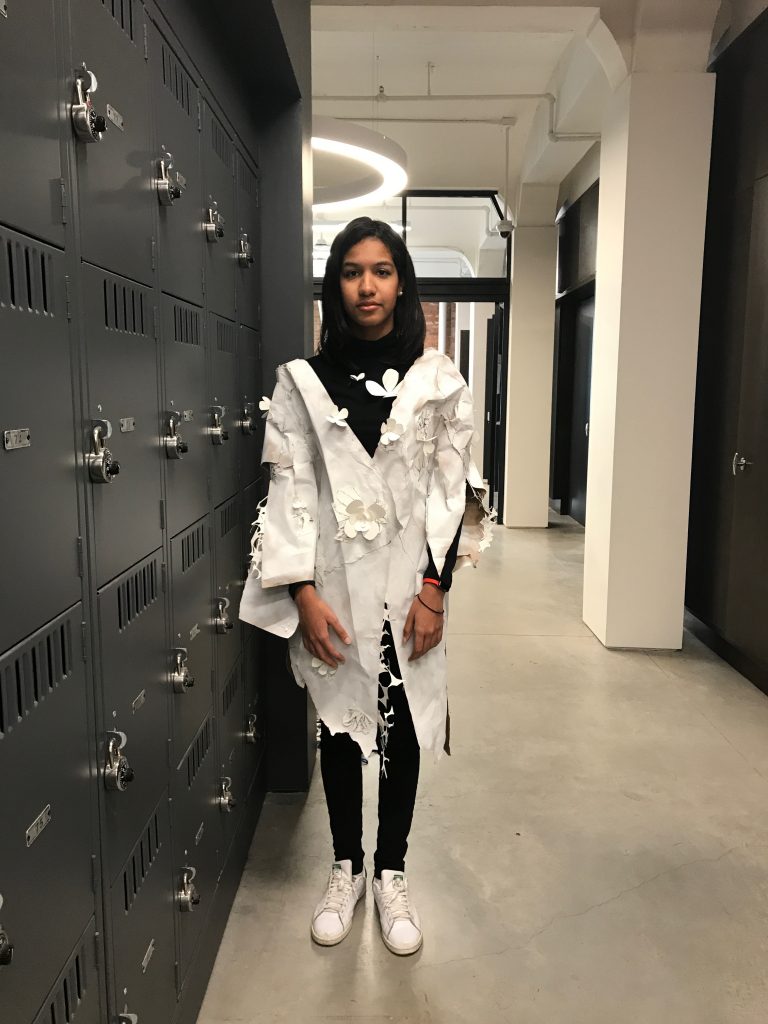
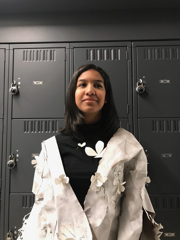
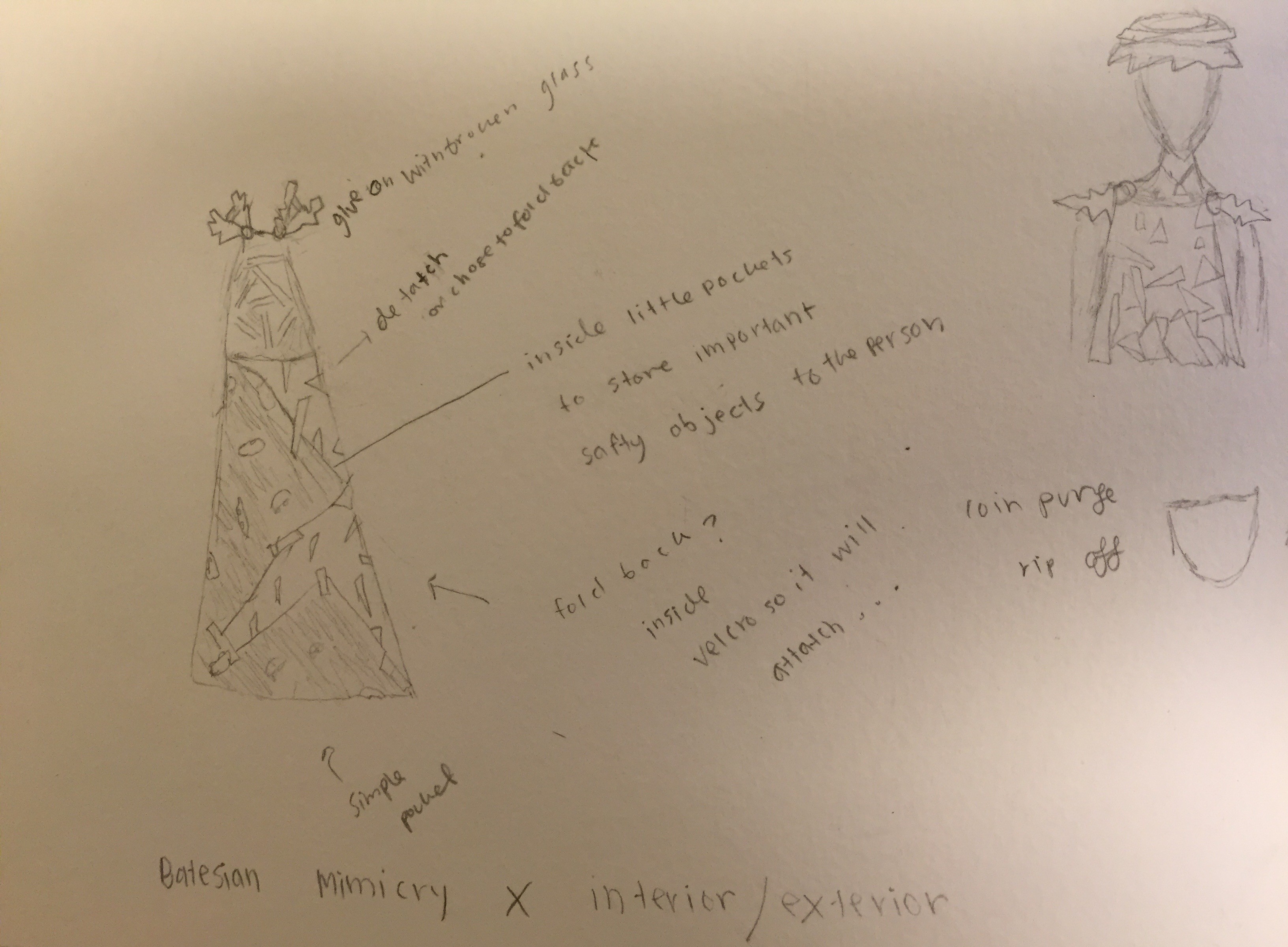
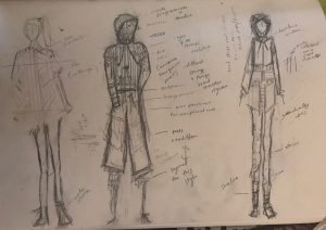
Armor + Wearable:
(all attempts were bound together by wire or held by its own pressure)
brainstorming:
-
- last two on the right I decided to create
First attempt:
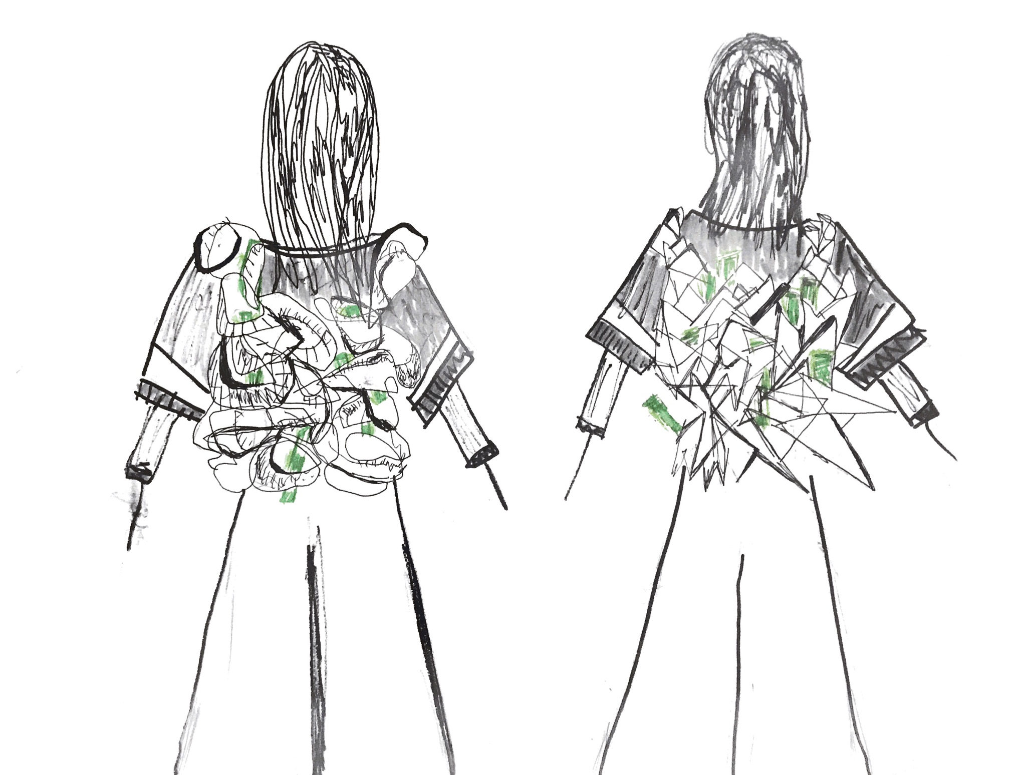
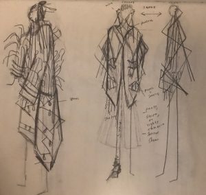
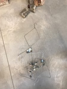
I started to collect metal scraps and had clothes hangers that I had found a while ago to create a wearable that connected at the ears. This design was going to be based off of the lines and slight curves celery holds, and inspired by some of the diagrams I had made.
I got half of the wearable’s frame done and even made a second set of sketches to improve the base, but decided to scratch that idea for using used spoons.
-
- second set of sketches
-
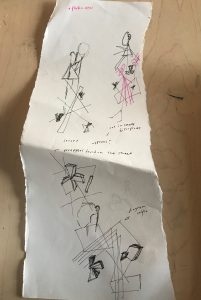
- second set of sketches pink signifies the new parts
-
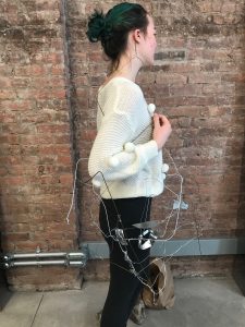
- Alex moved her arm upwards so the detail can be shown, this was longer but it folds too this is being shown as the short choice.
-
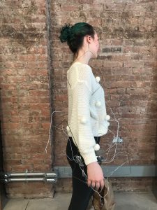
- the earpiece supports the piece on the body
-
- long full length version, this image cut off the full piece
-
- folded version: short choice
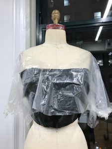
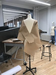
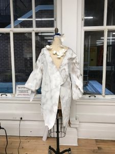
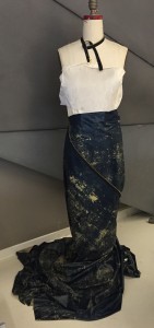
Second attempt:
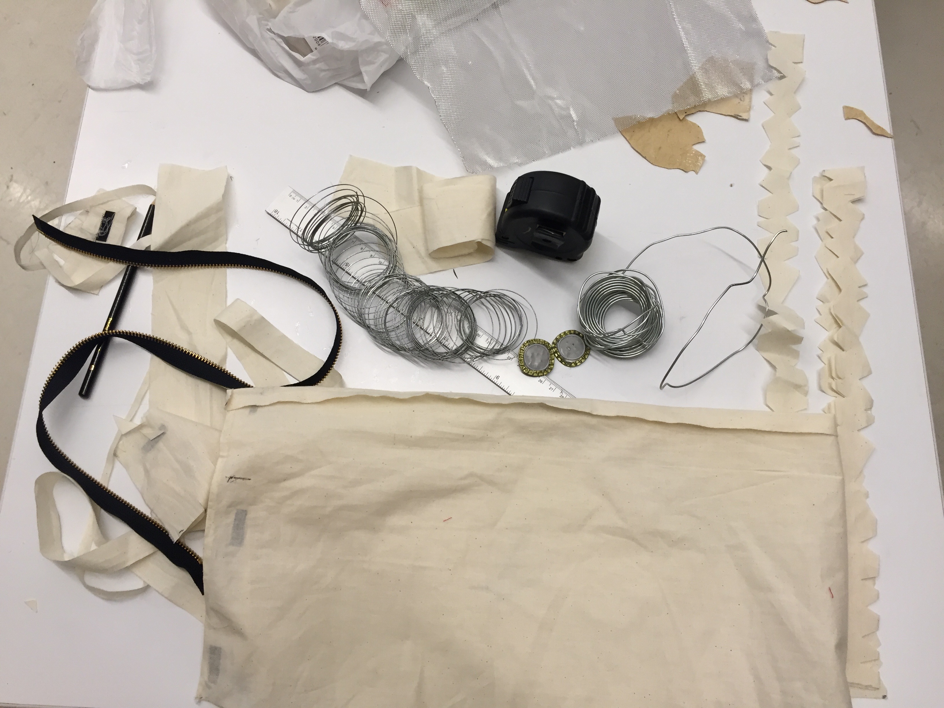
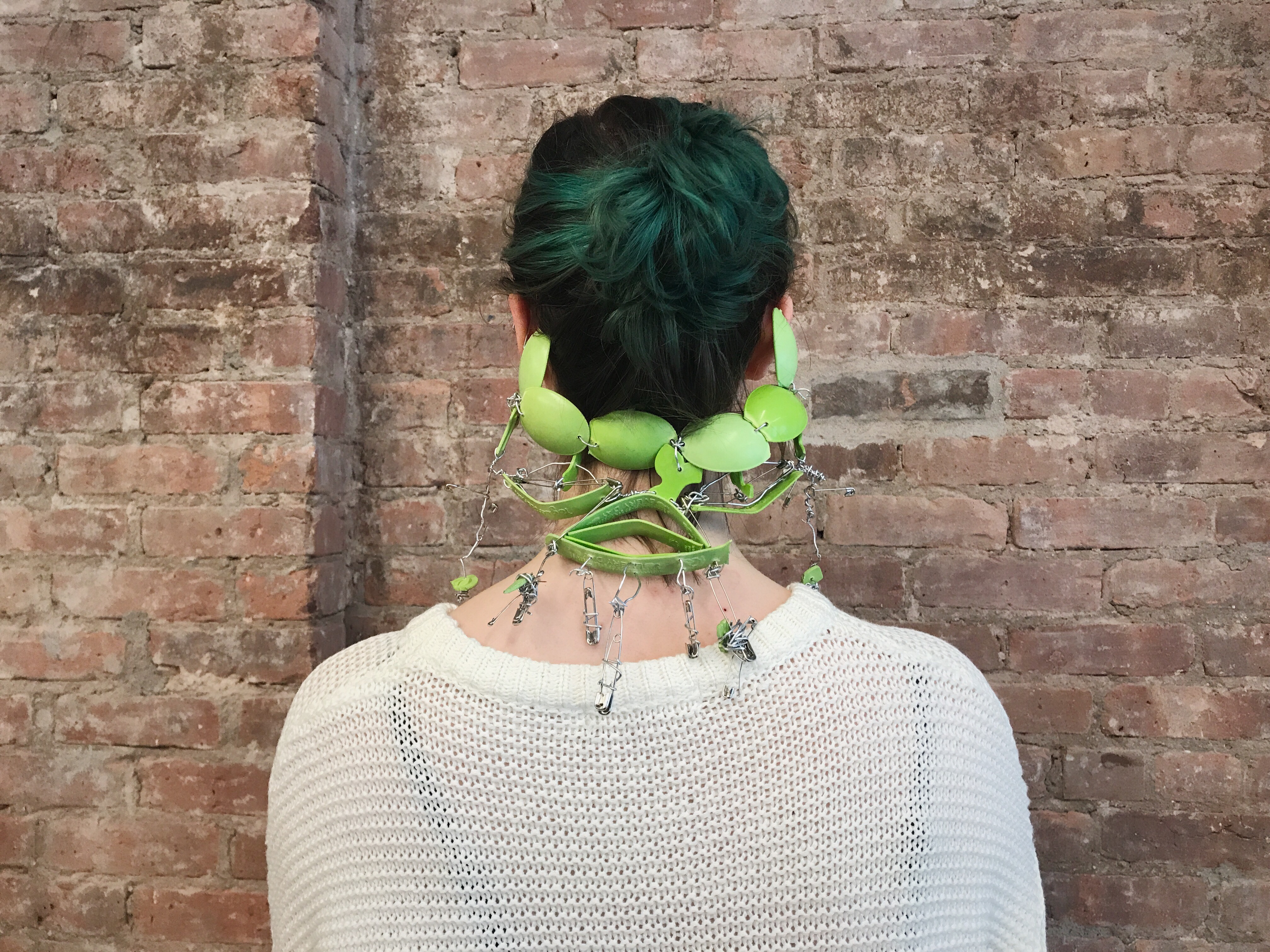
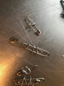
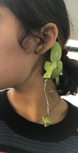
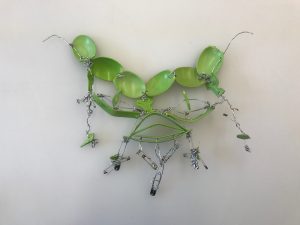
Over the years I have been collecting spoons and reusing them, instead of throwing them away because that adds to waste. I was planning on using these spoons as a small part of my garment. It thought it would be interesting to only use the limited amount I had which was around 20 or less to make a piece. I ended up using way less than half of that amount. My goal was to make something that would connect to the ear so I kept that idea. I broke the spoons, put a hole in them with a alm and mallet, and then connected them with wire and close pins to create an earring accessory that can protect the back of the neck. This would be ideal for bicycle rider riders and their helmets since the back of the neck isn’t protected. Also this would be good for neck support when further developed. This is a prototype and I think there is a better placement than wire that could be used for this.
Making and Testing:
-
- less spoons where used than what is shown here.
-
- an attempt to take a picture so I could see how what sections to keep building on
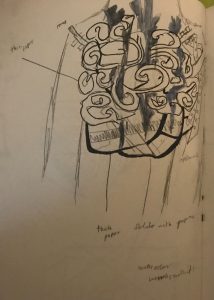
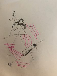
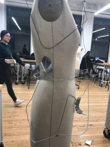
Measurements and diagram of the armor:
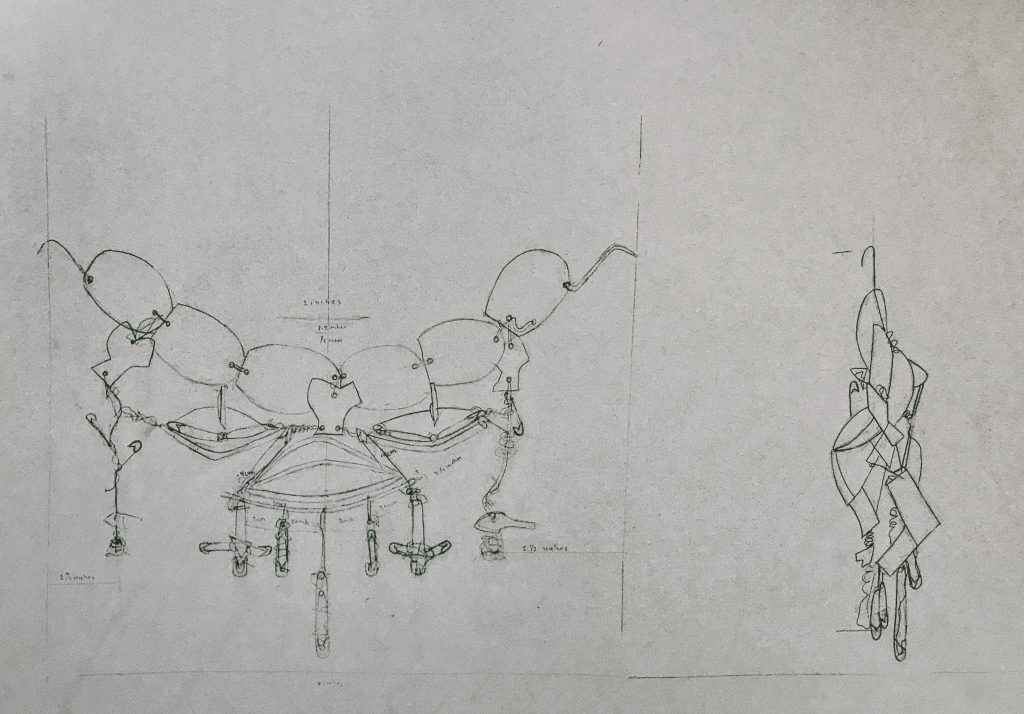
The drawing depicts the front and side view of the armor. The front’s measurements are similar the back side.
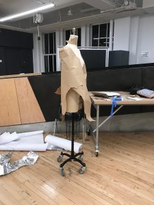
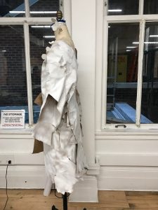
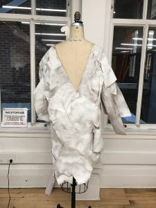
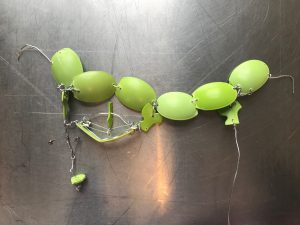
The piece:
-
- front
-
- back
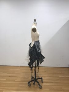
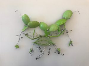
-
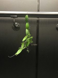
- testing to see if it holds its own weight

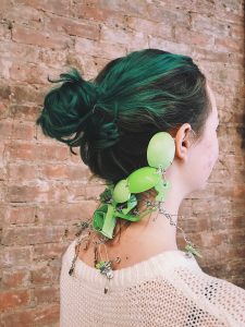
-

- A subtle accessory and good if someone does want it to be noticed. Also it can be like earrings in the front.
-
- we also realized this could become a mask, this even has a potential to be a necklace (there is not picture of it like a necklace)
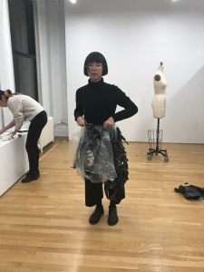
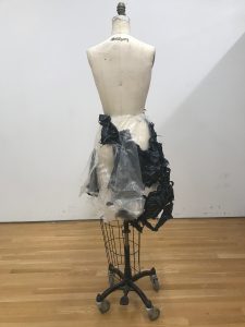
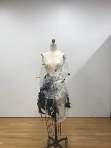
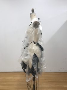
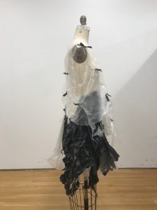
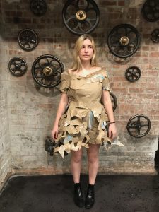
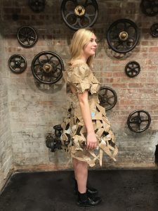
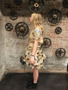
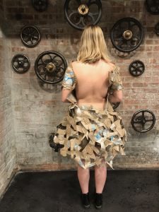
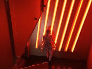
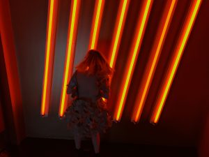
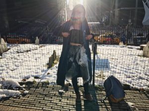
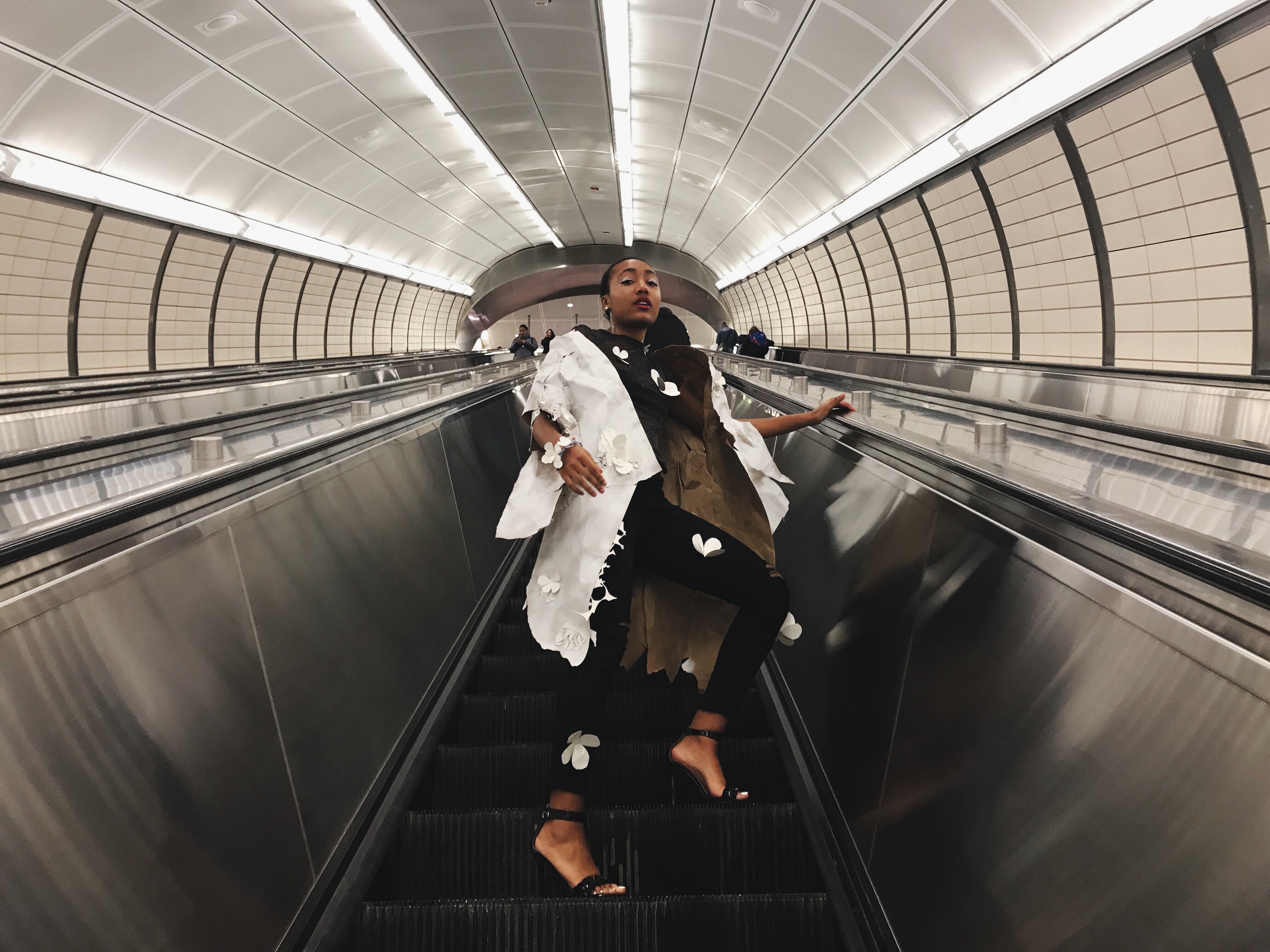
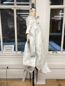
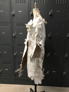
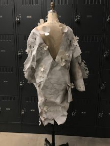
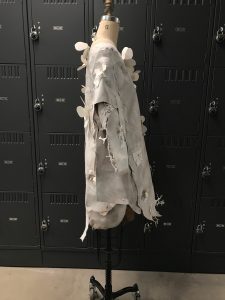
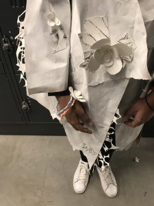
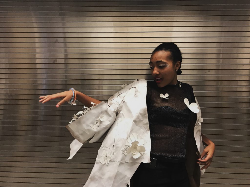
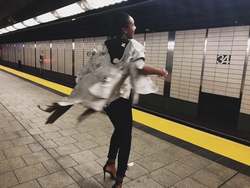
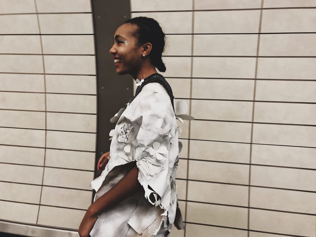
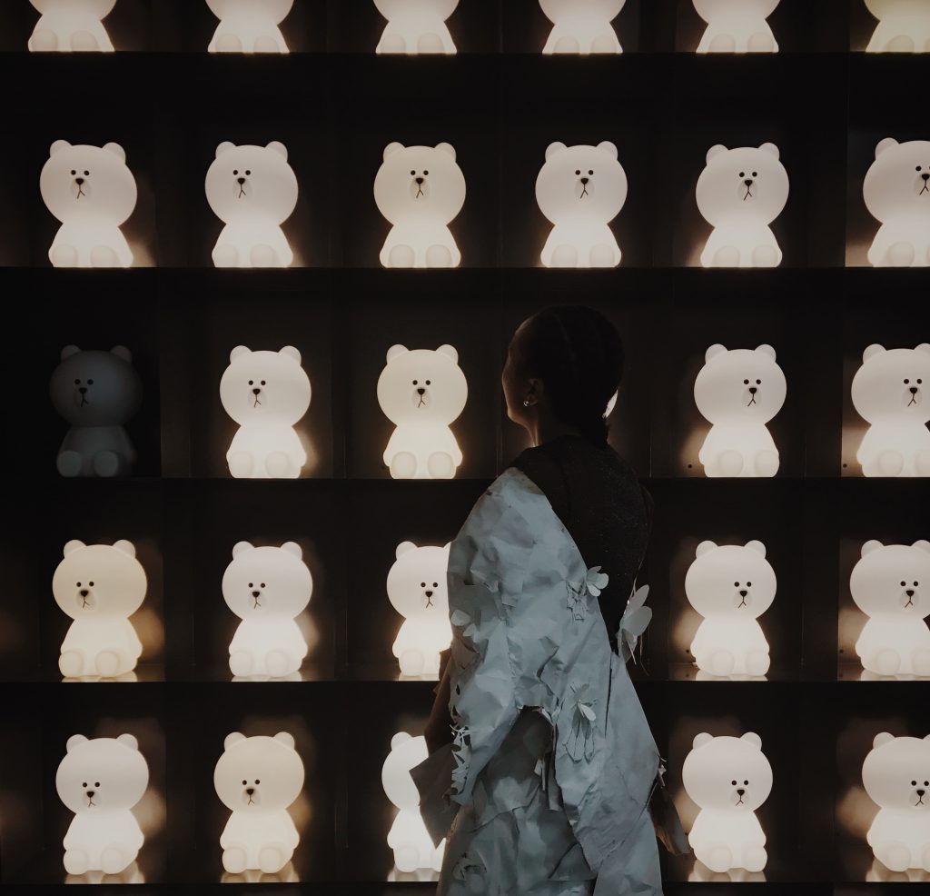
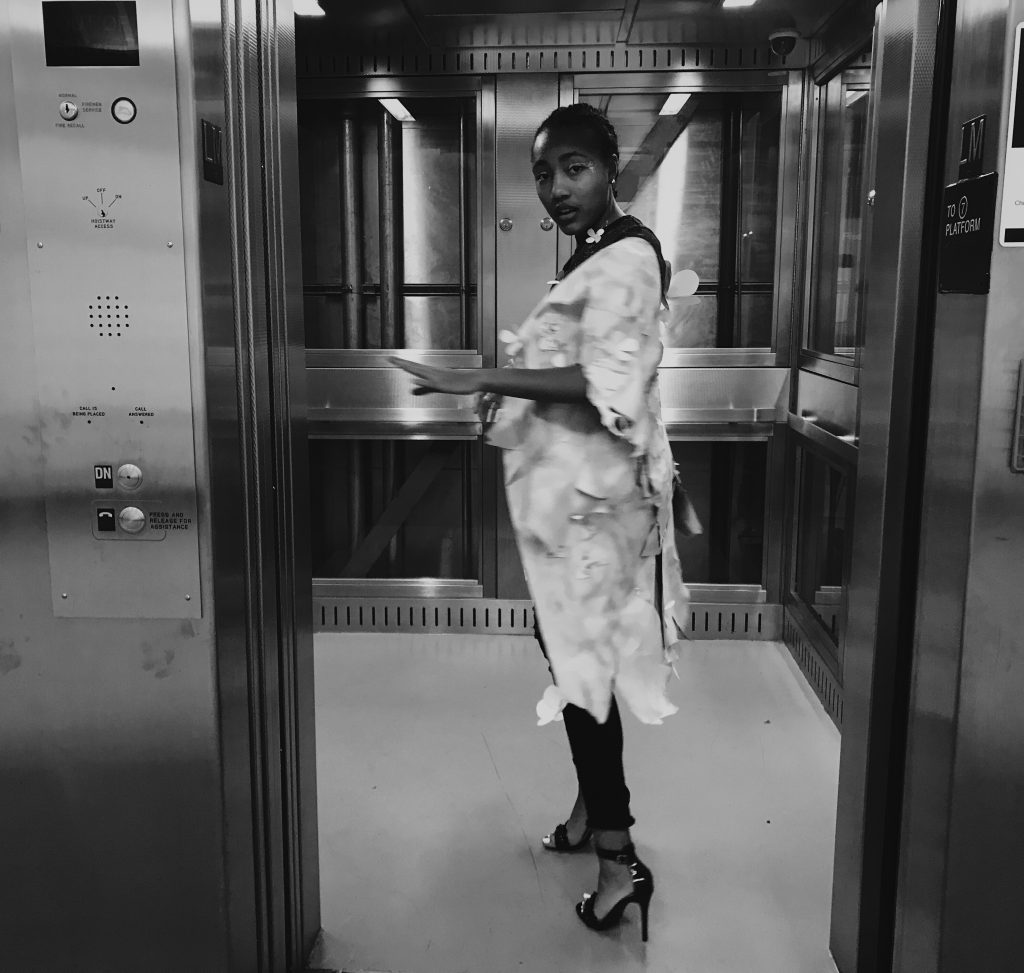
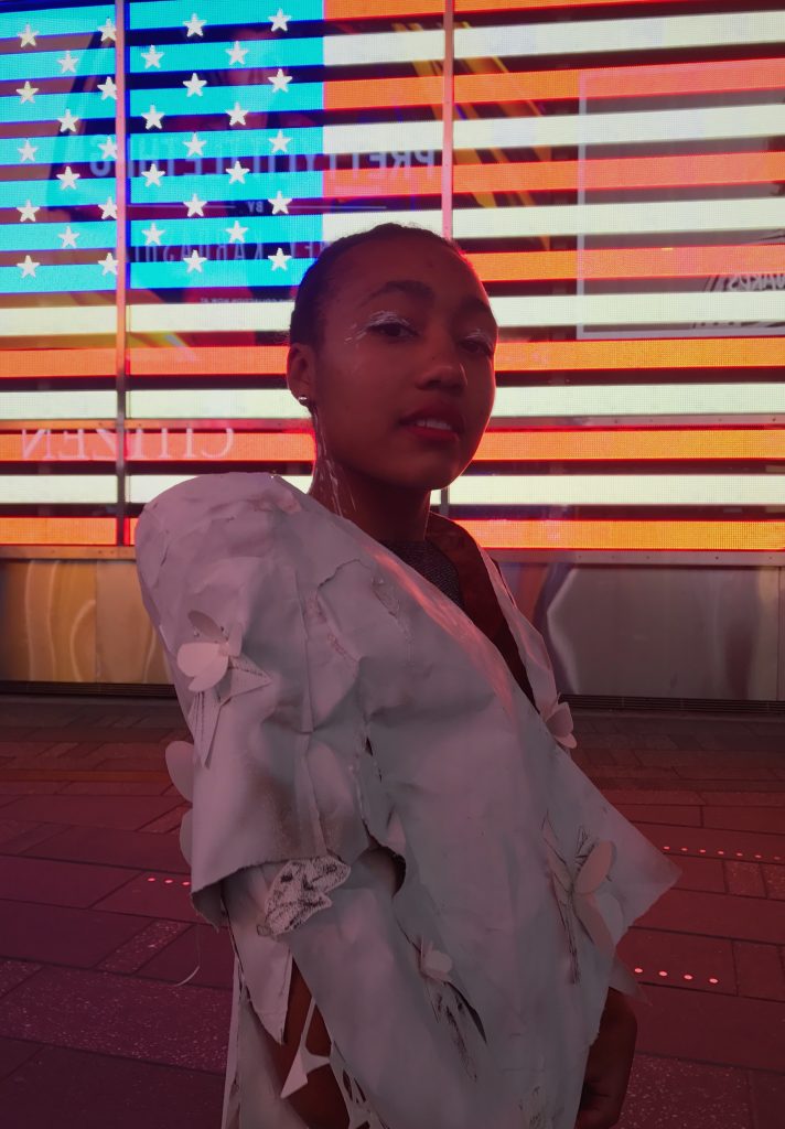
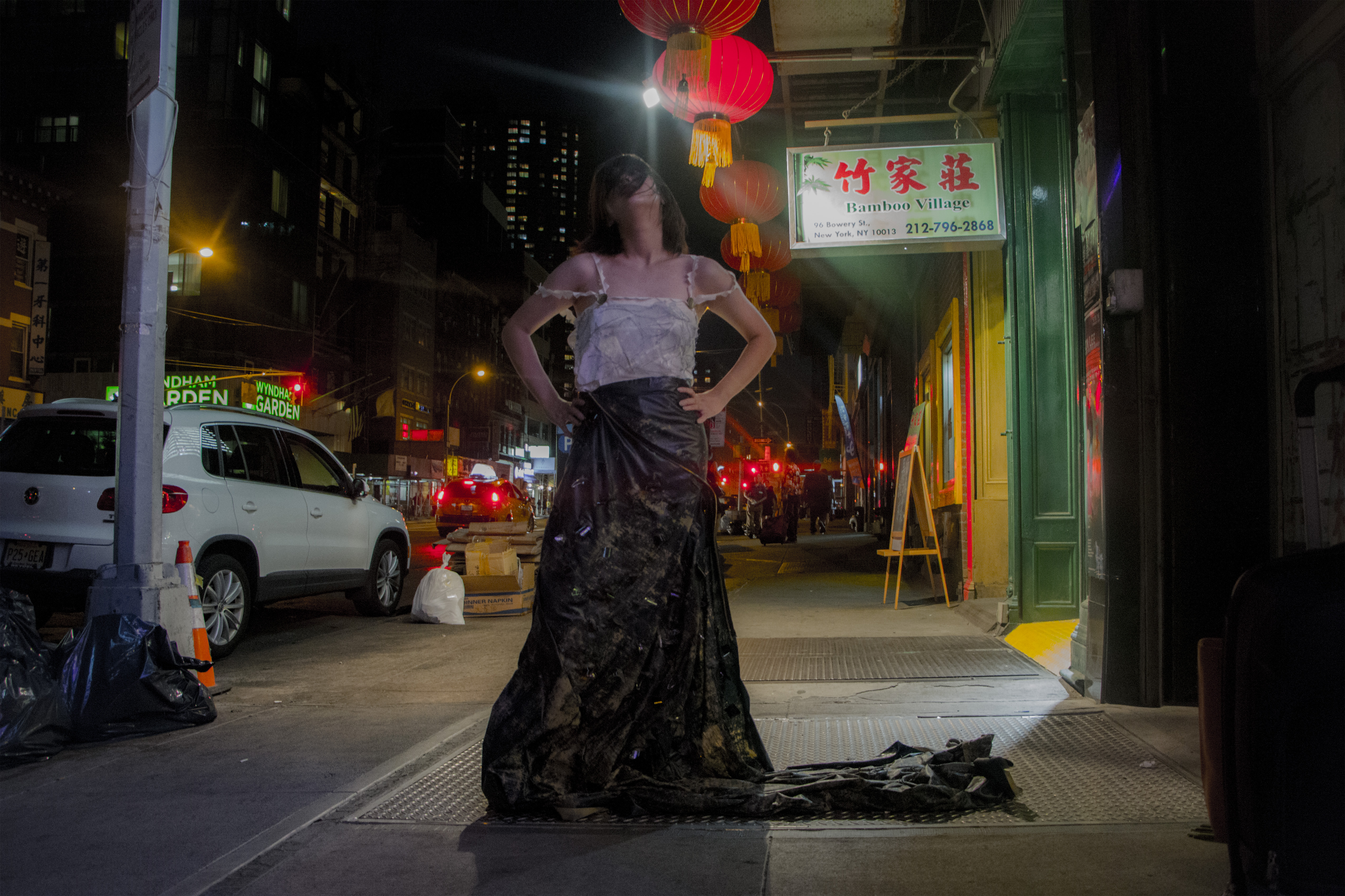
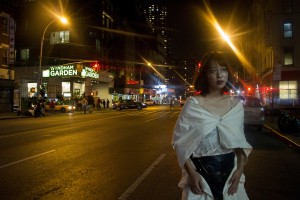
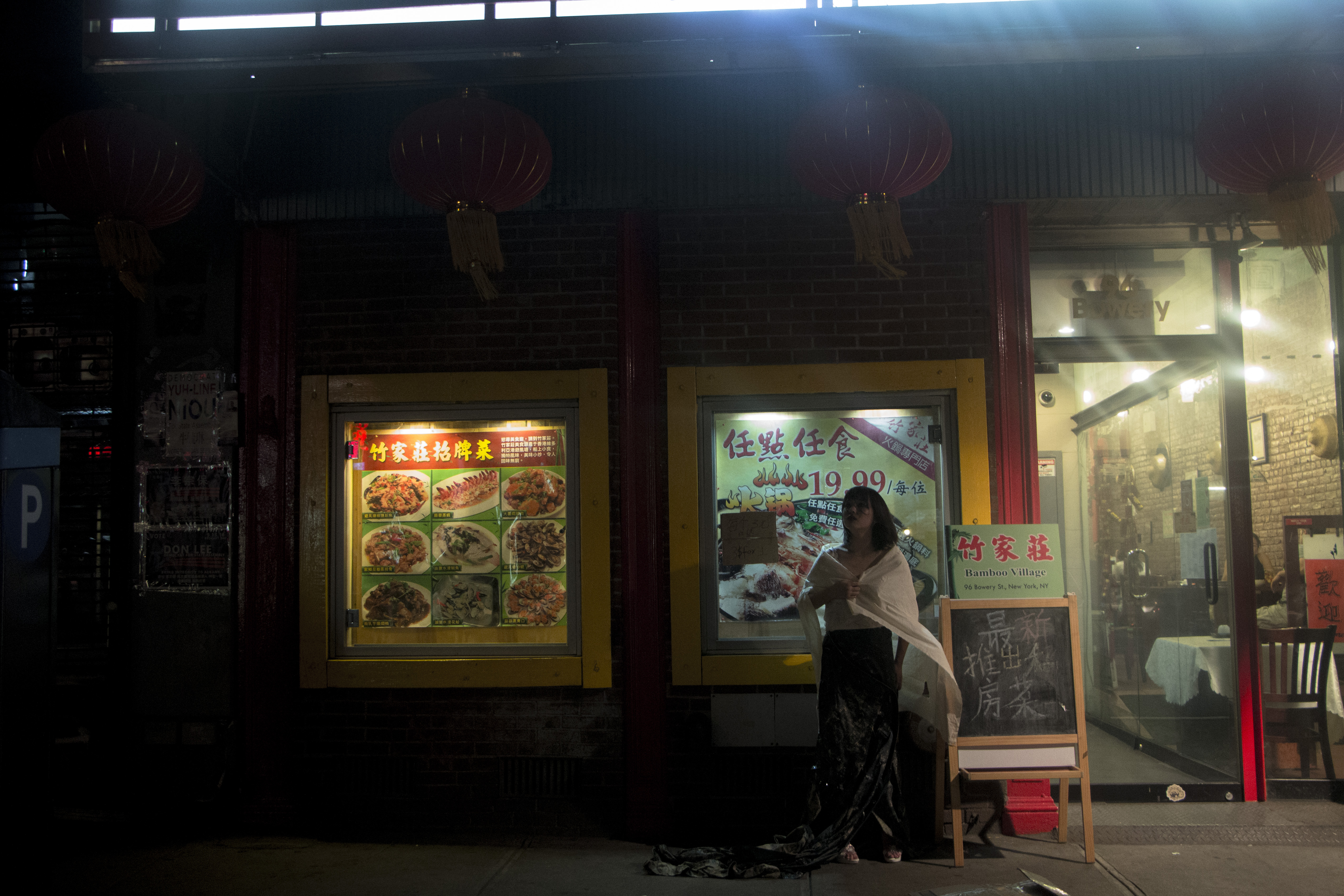
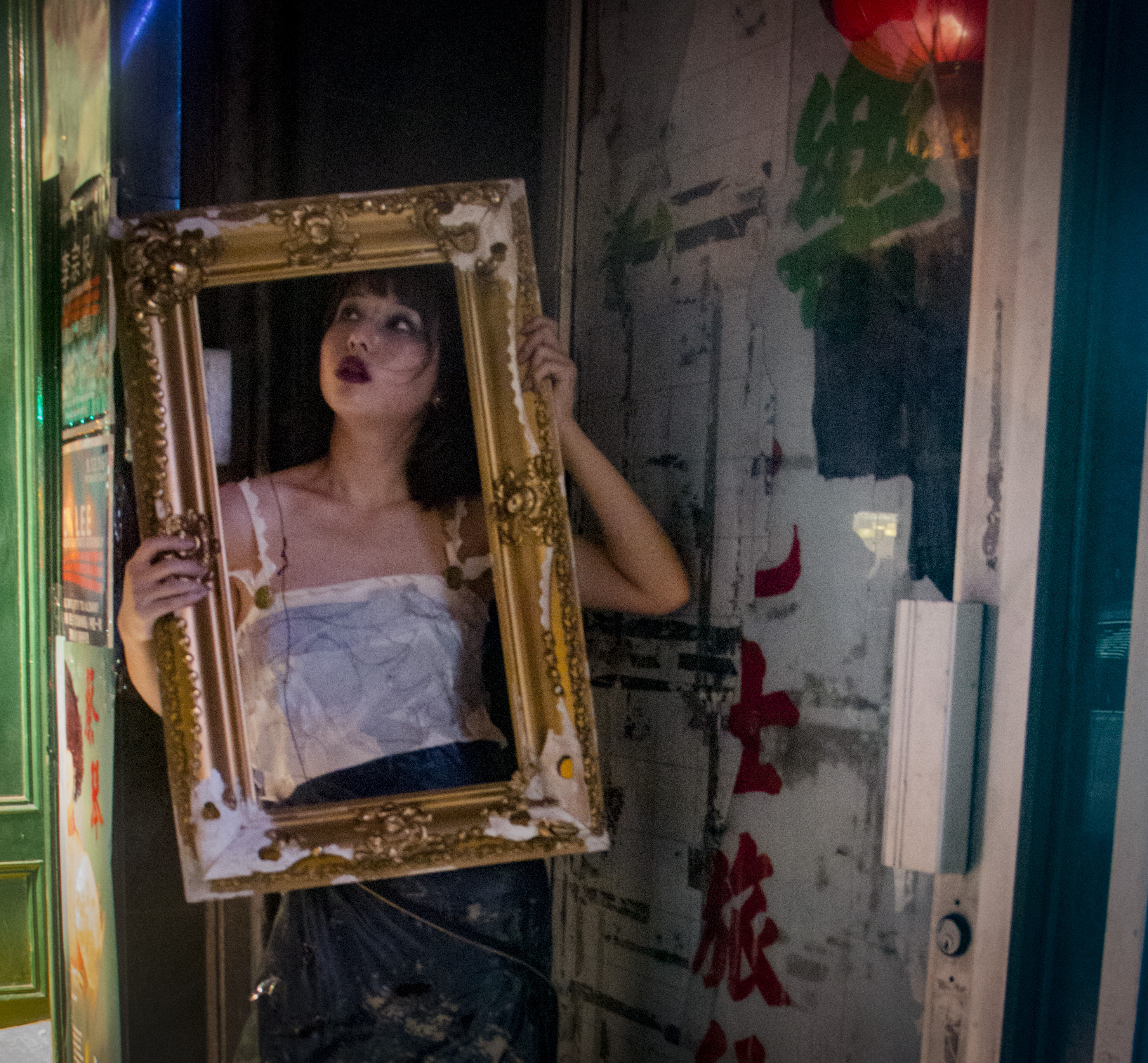
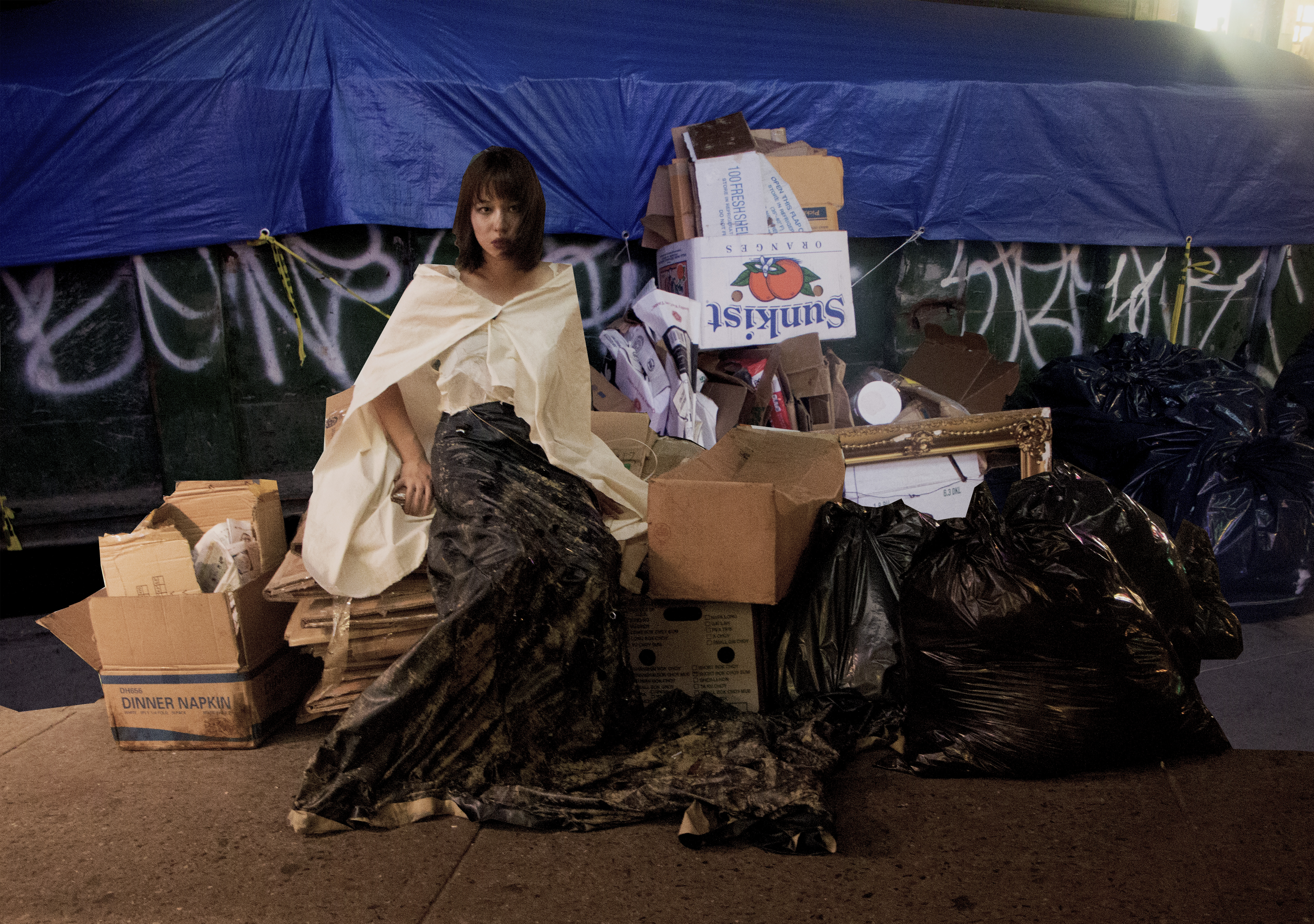
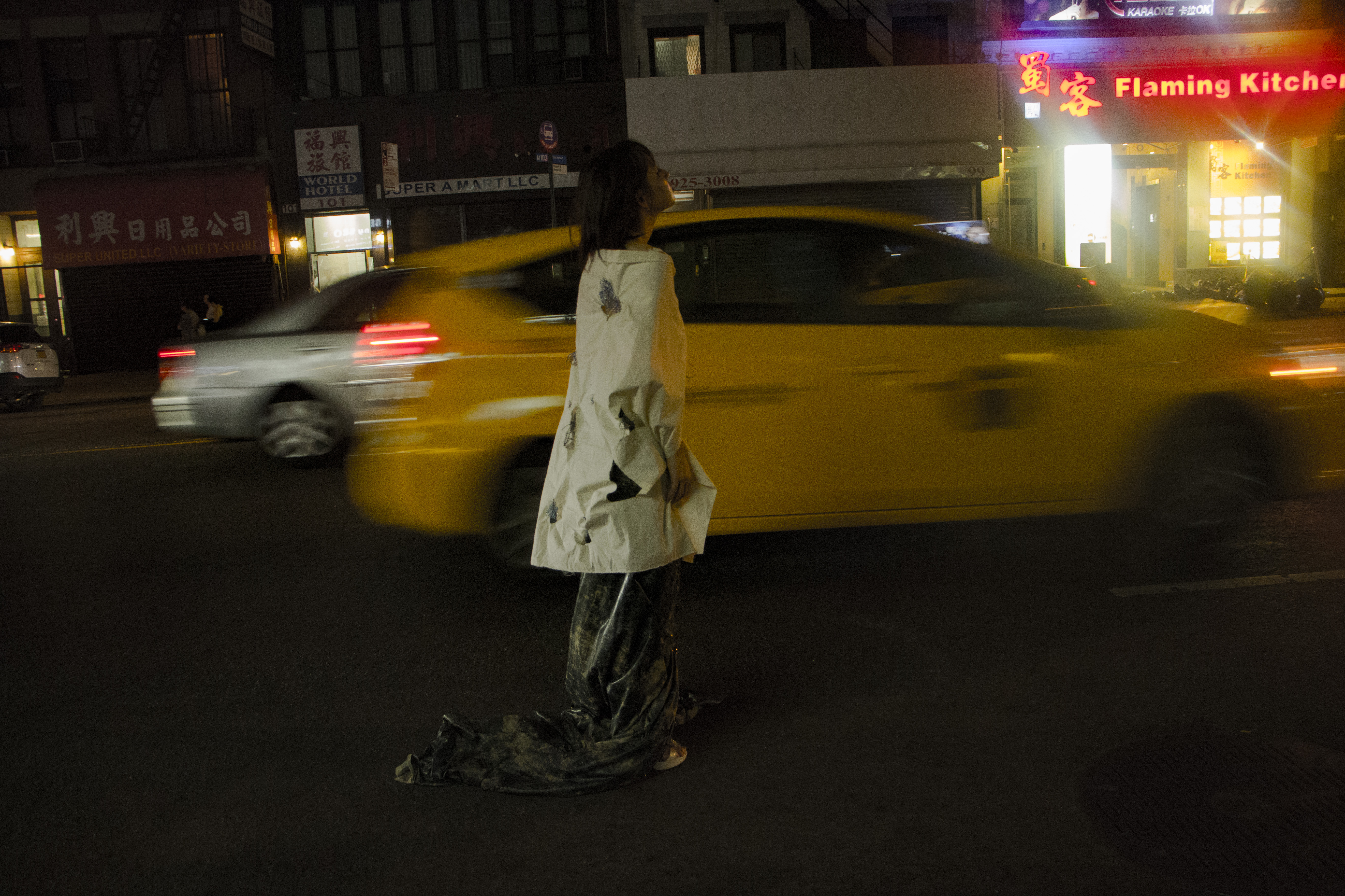
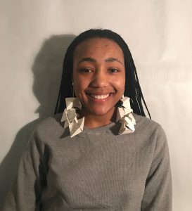
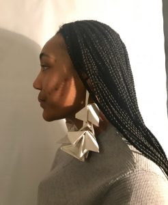
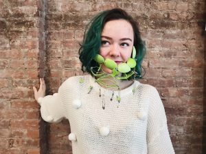
Class Presentation + “Fashion Show”:
-
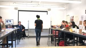
- Jasmine models the accessory for the class