The open book project focused on the concept of “Printed Matter as it corresponds to the digital age and is a reflection of how communication has changed overtime. The project deals with questions like how does printed matter form a particular era encapsulate a moment in History or act as a nostalgic “artifact”?Or if the information presented in the print of your object still relevant or accurate?
Materials:
Wood
Cotton
Glue
Gold chain
Hoops
Craft paper
Concept:
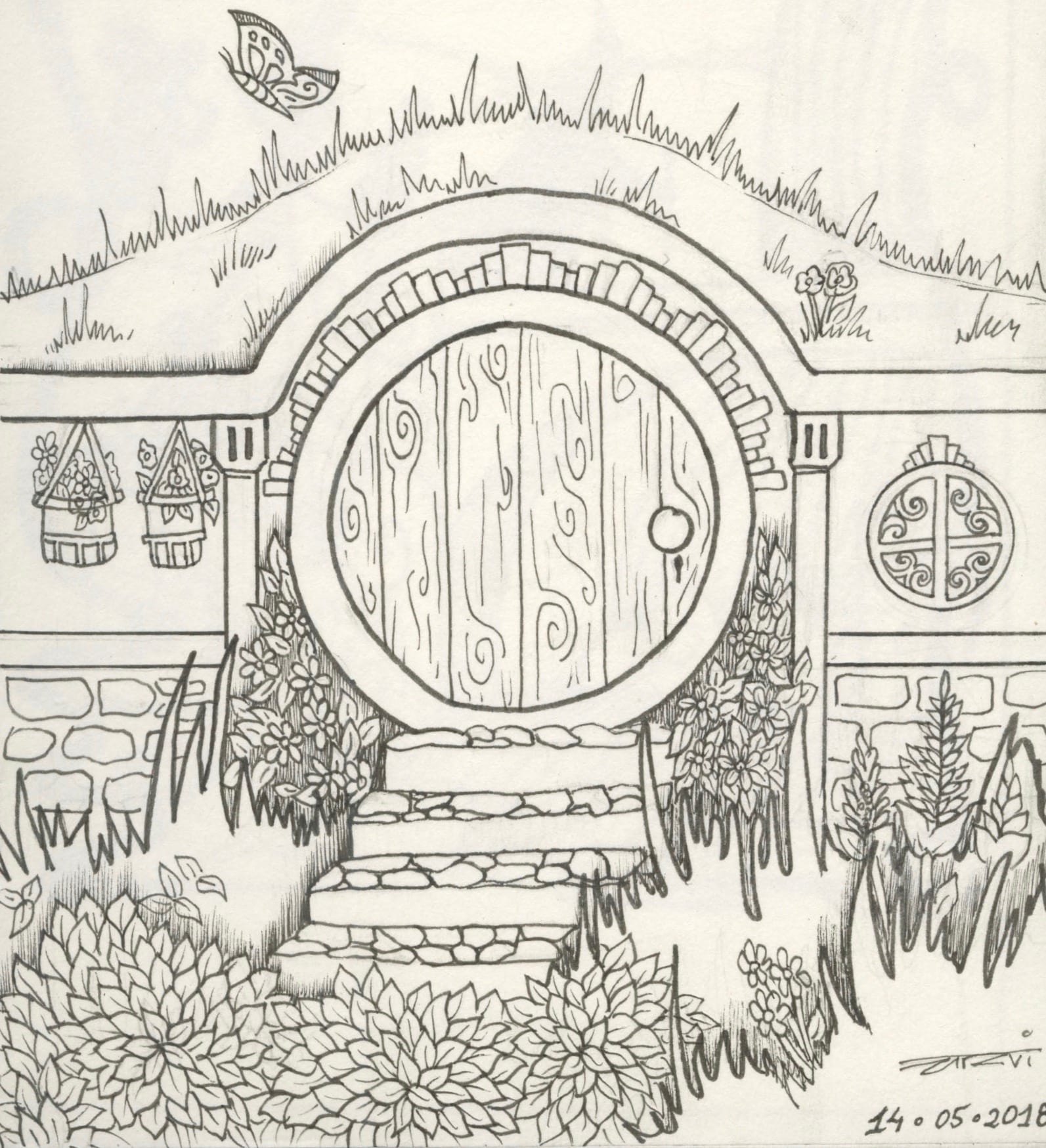
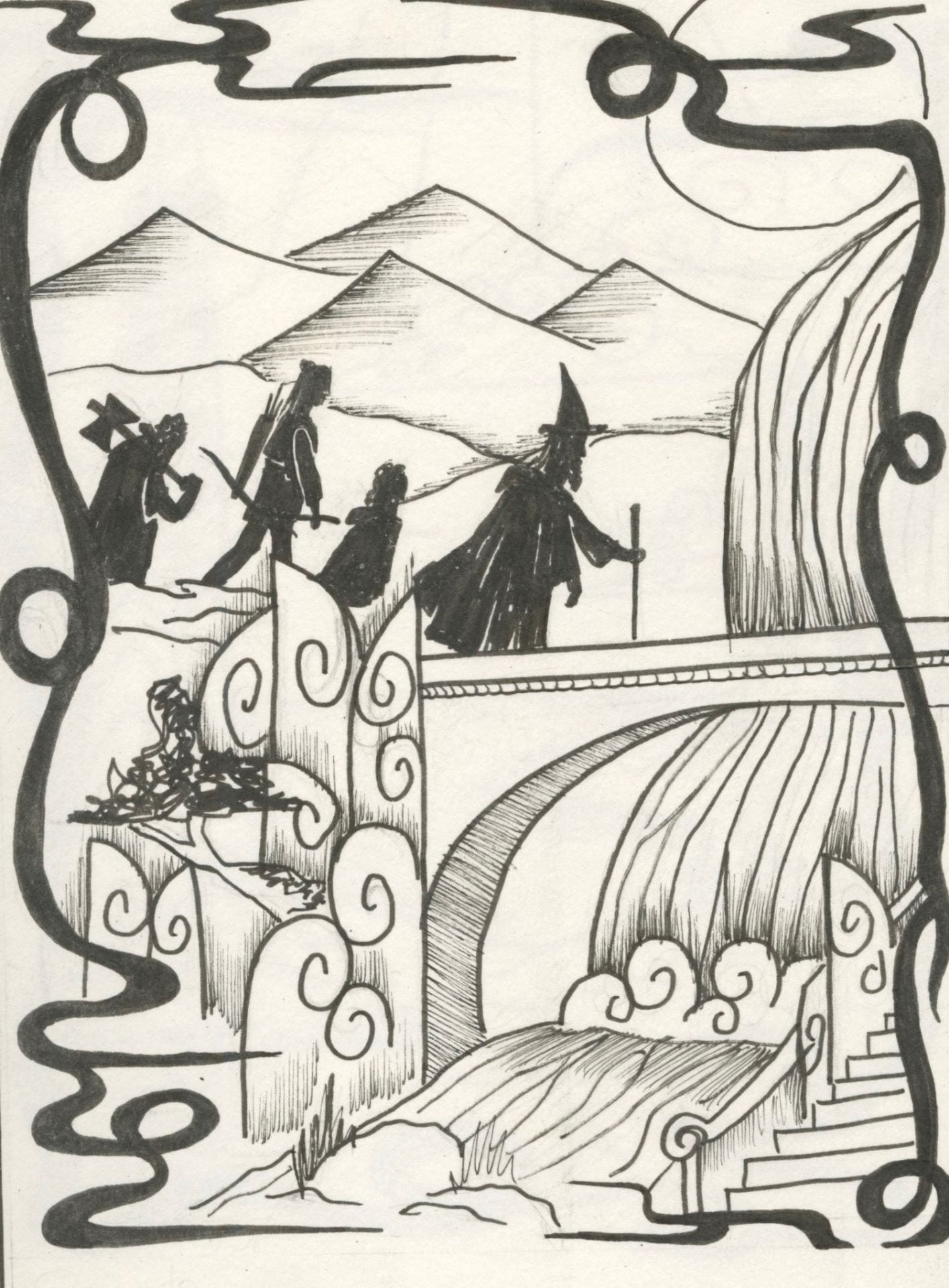
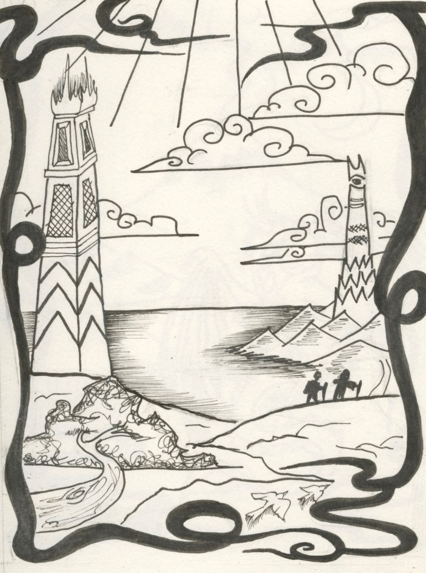
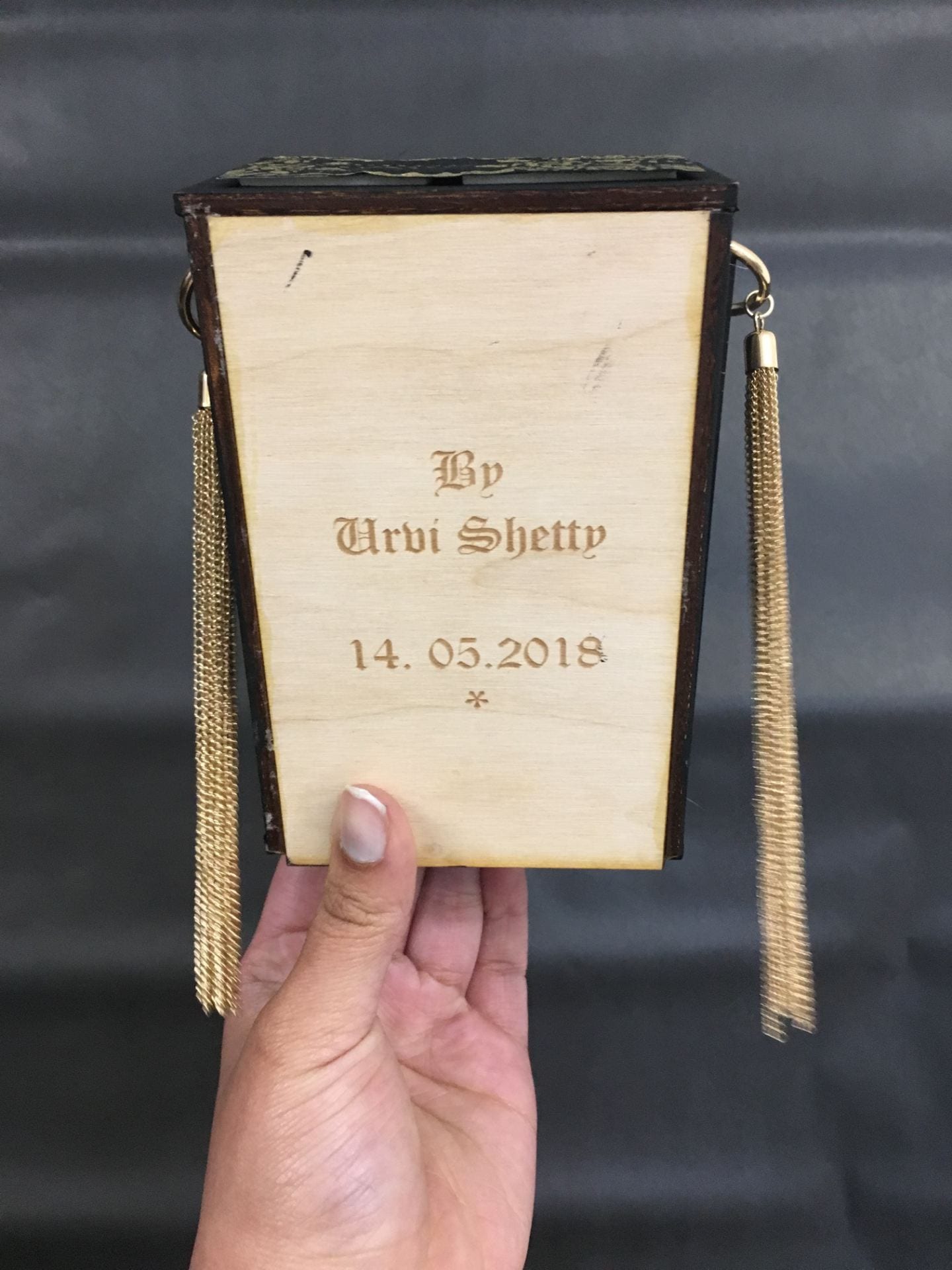
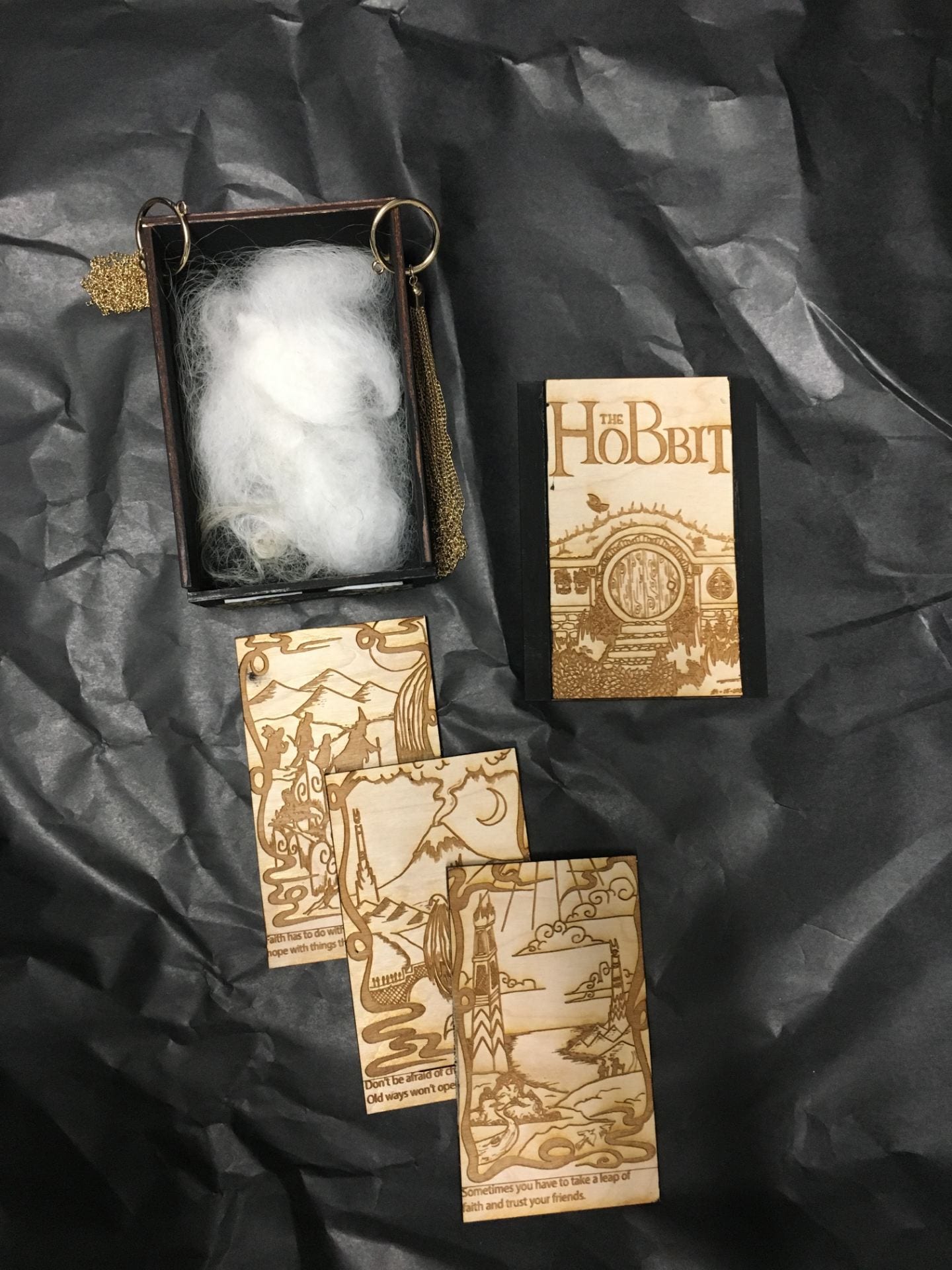
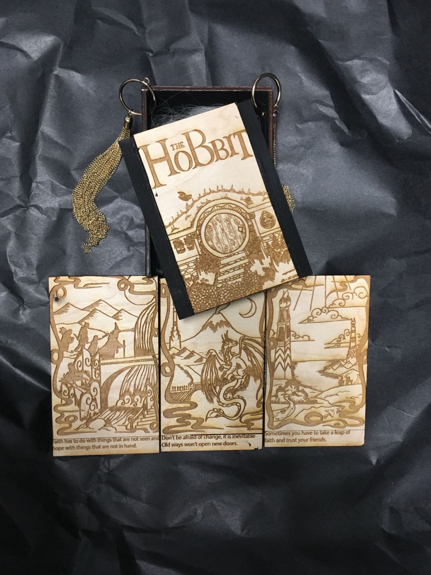
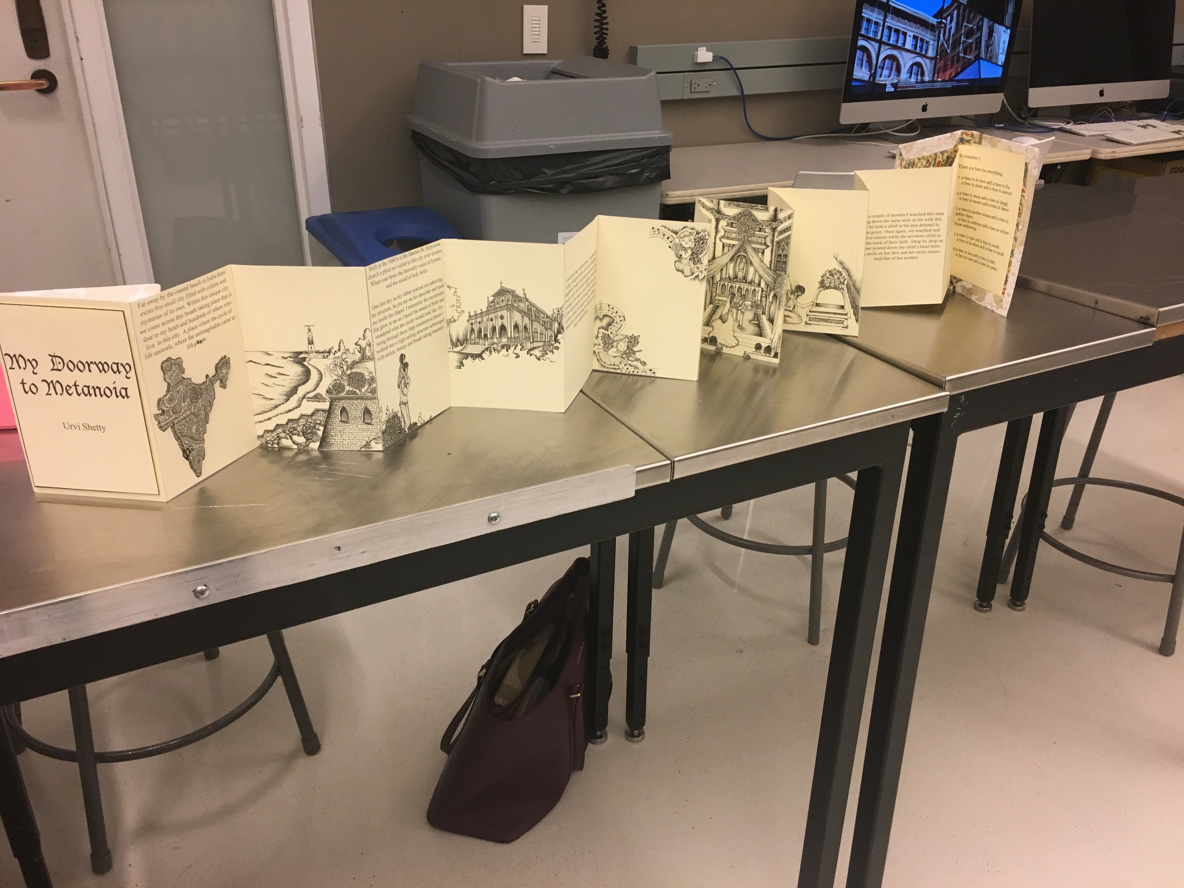
I focused on the only book Ive known and read; The Hobbit. Through my object I wanted illustrate how the series of books through time showcase and exemplify various moral values. Hence I designed a box that unravels the basic moral story of each book, through small blurbl and an illustration based on the story of each series.
In this assignment we examined how personal, physical or an historic concepts of time, are intricately connected to our surrounding environment through creating a book. The book would also exemplify how time connects to a public or private space.
Materials:
Mount board
Paper
Ink
gold tape
wrapping paper
Adobe photoshop
Adhesive spray
Process:
Part.1
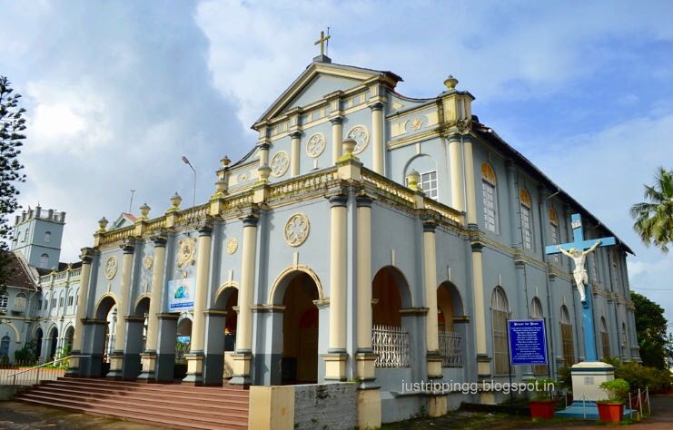
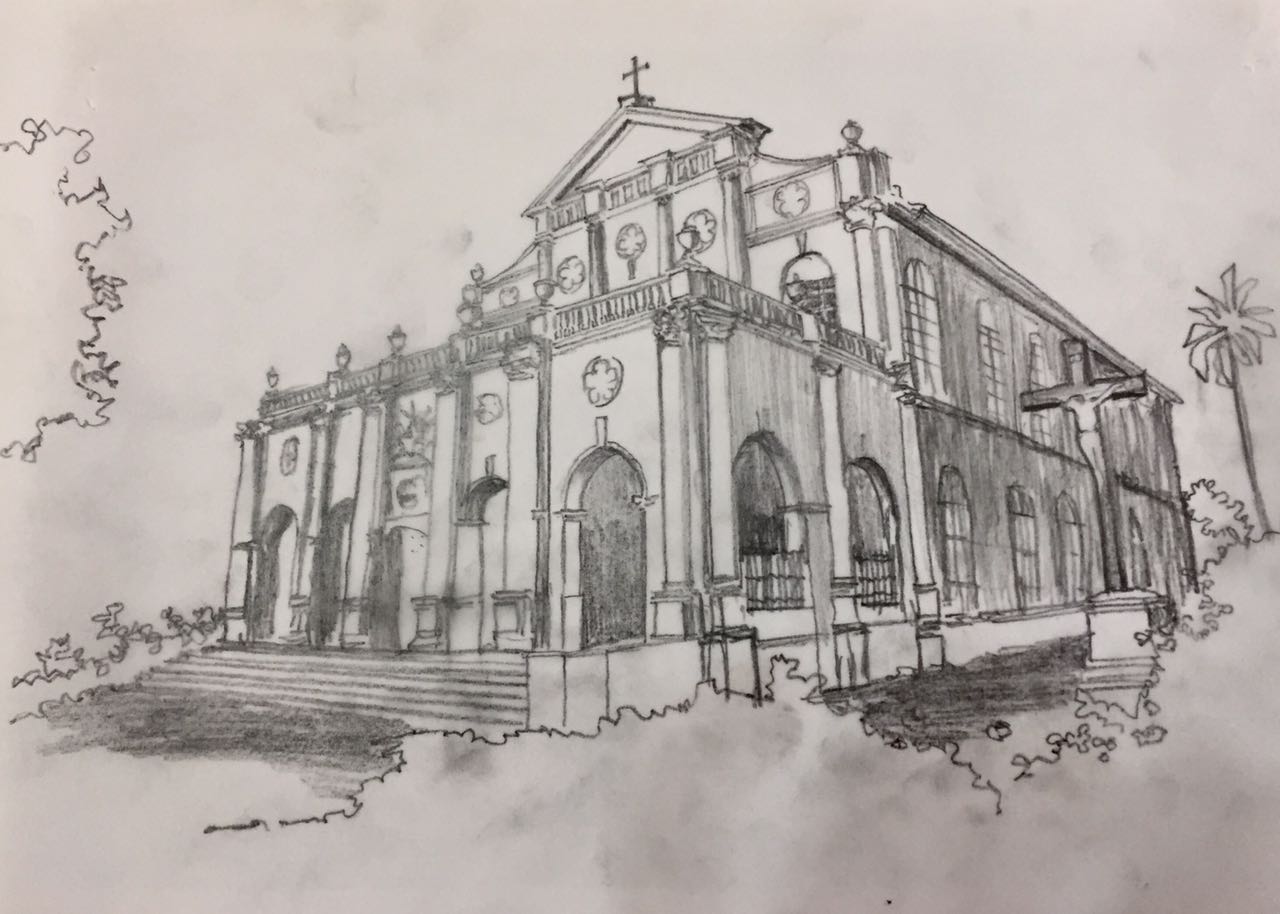
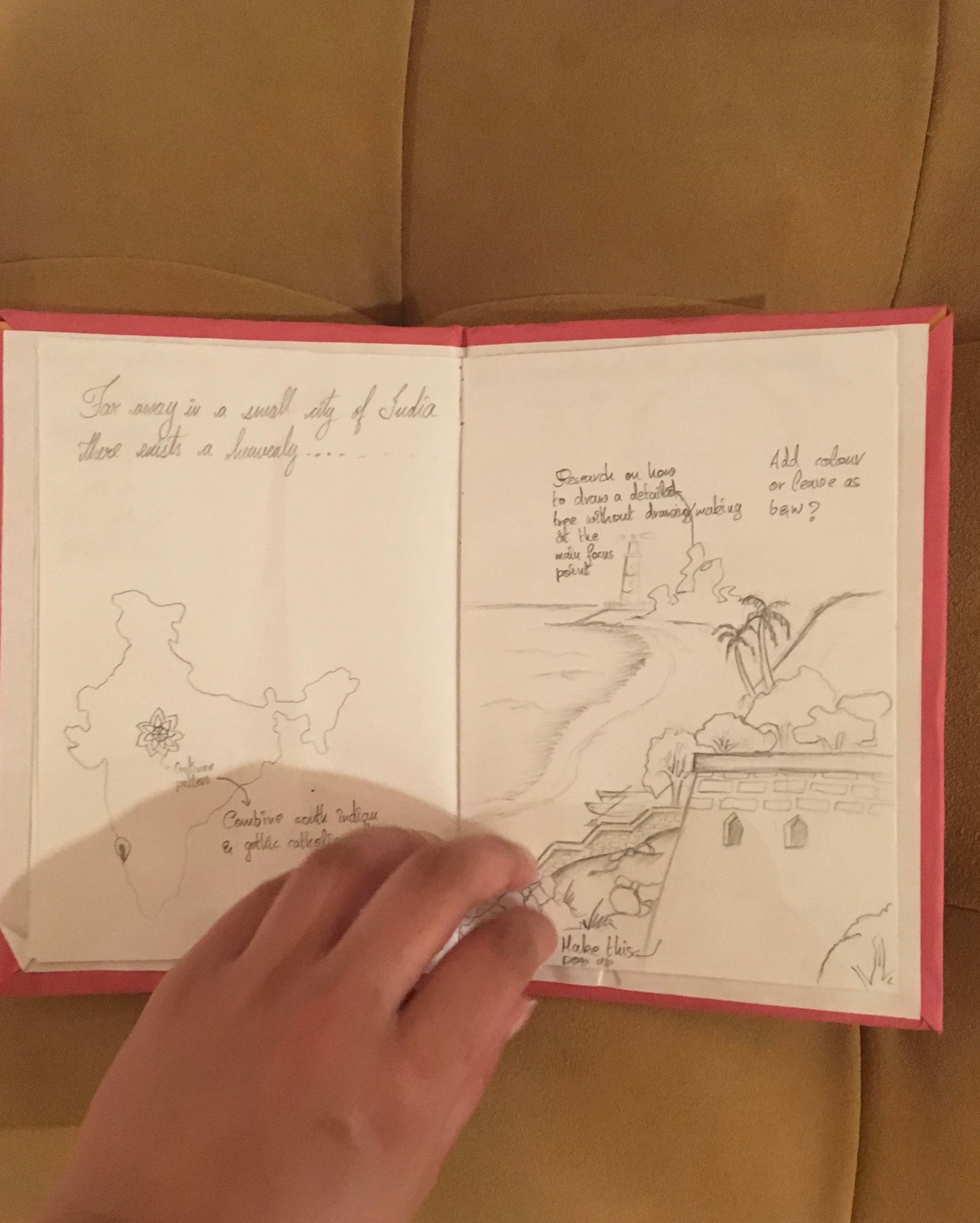
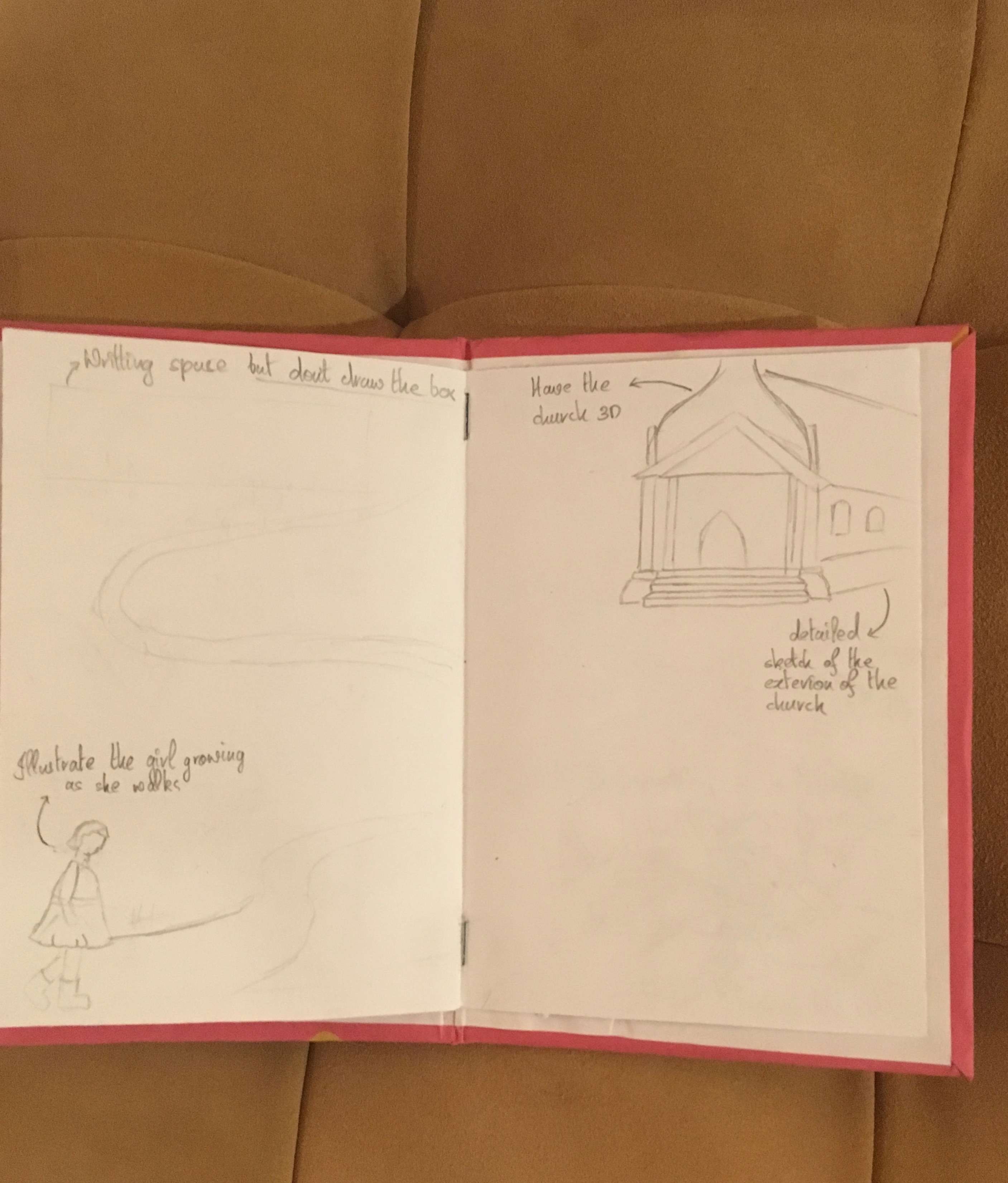
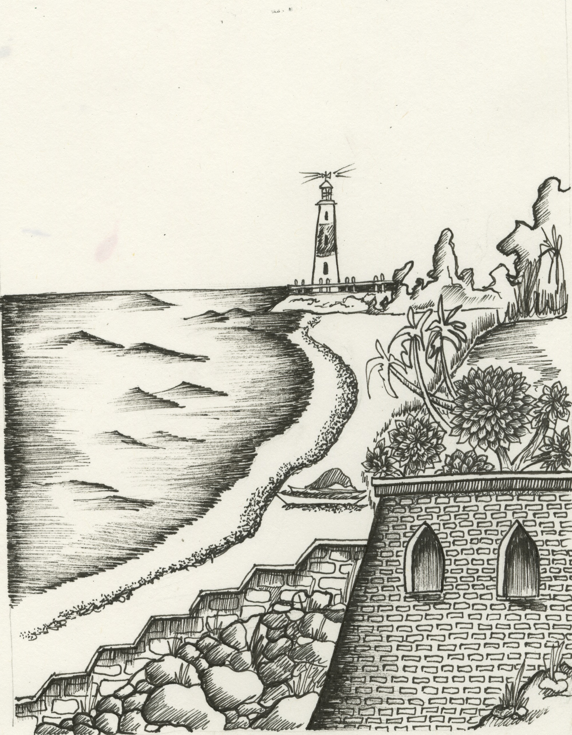
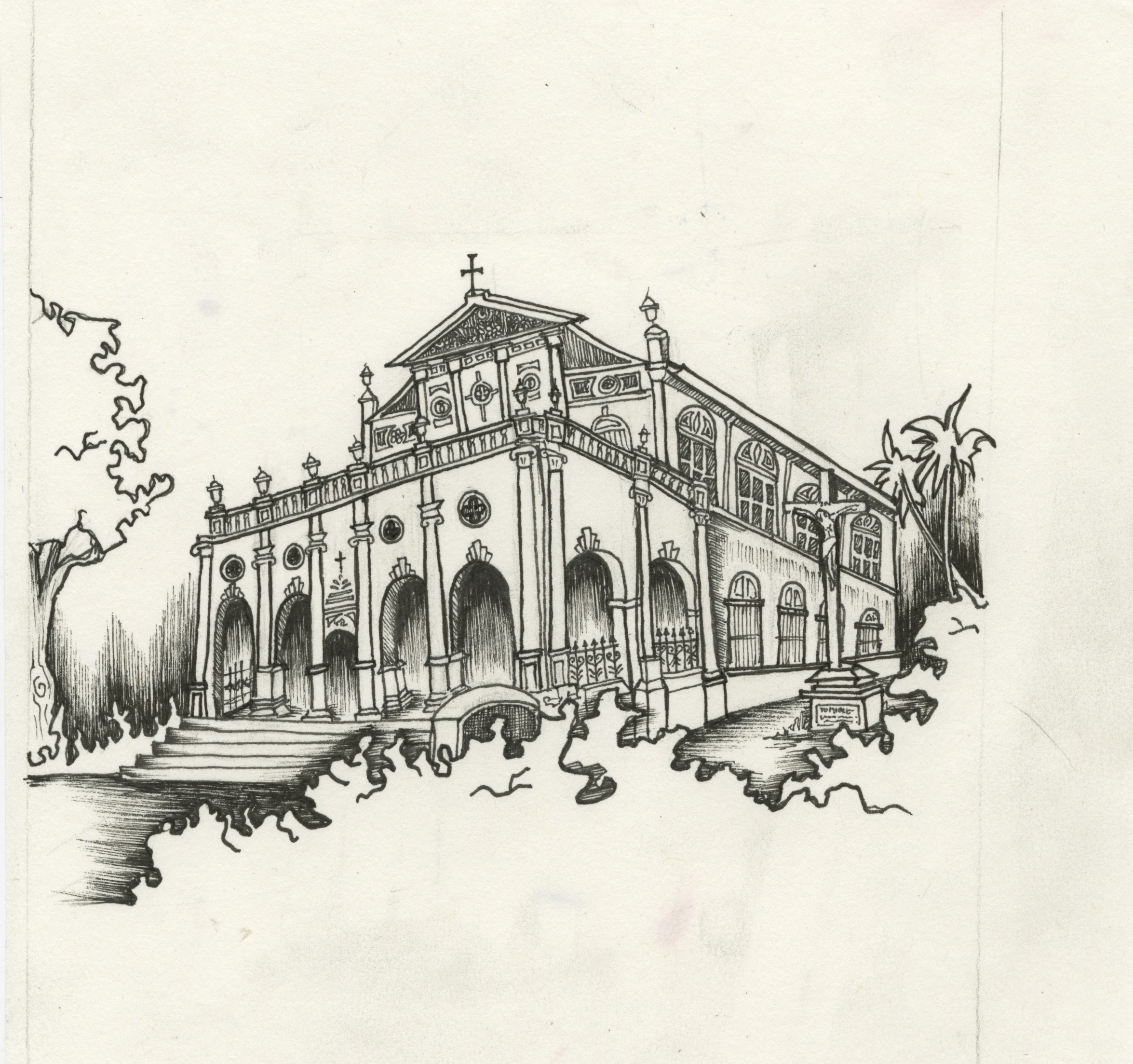
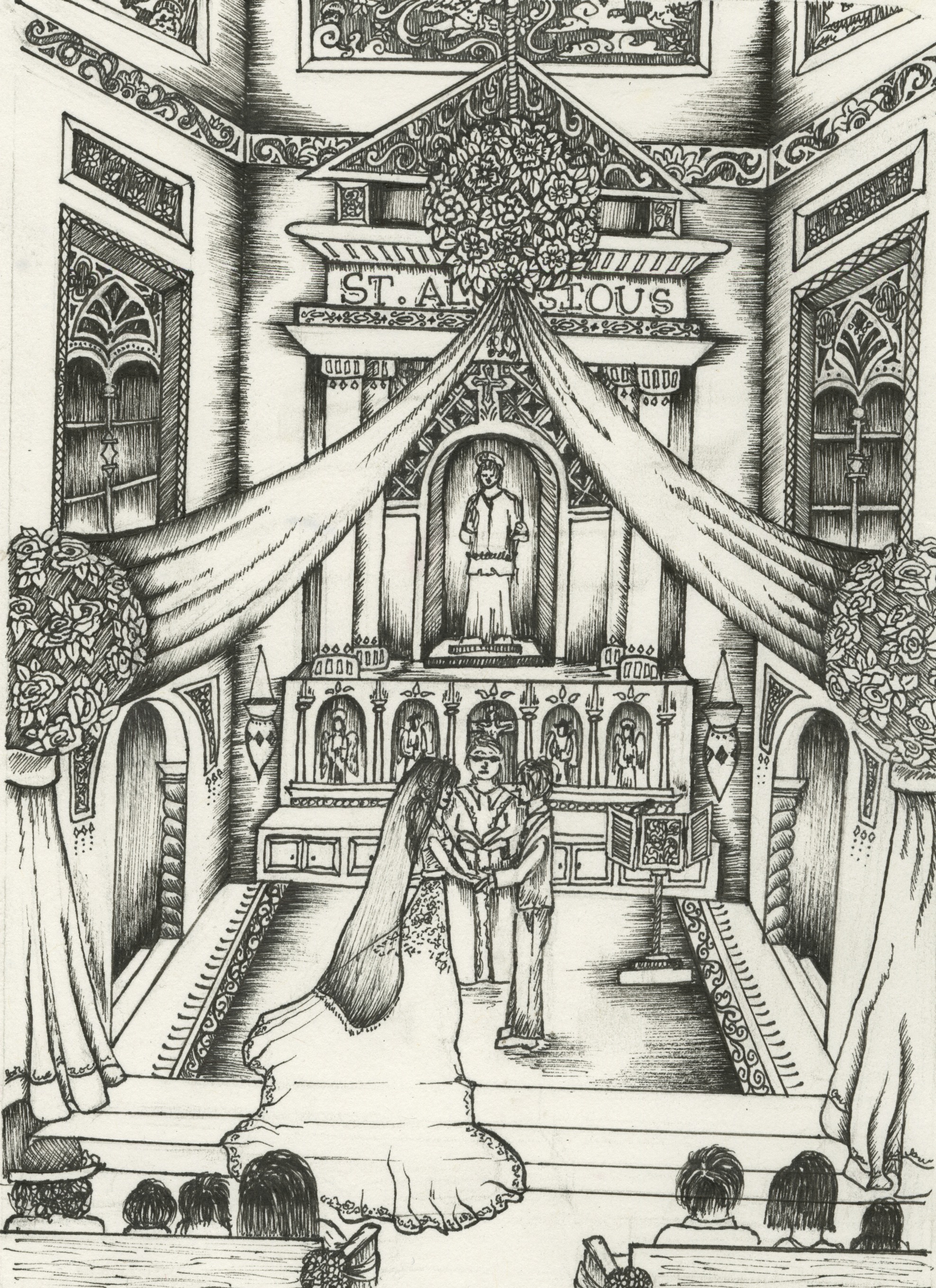
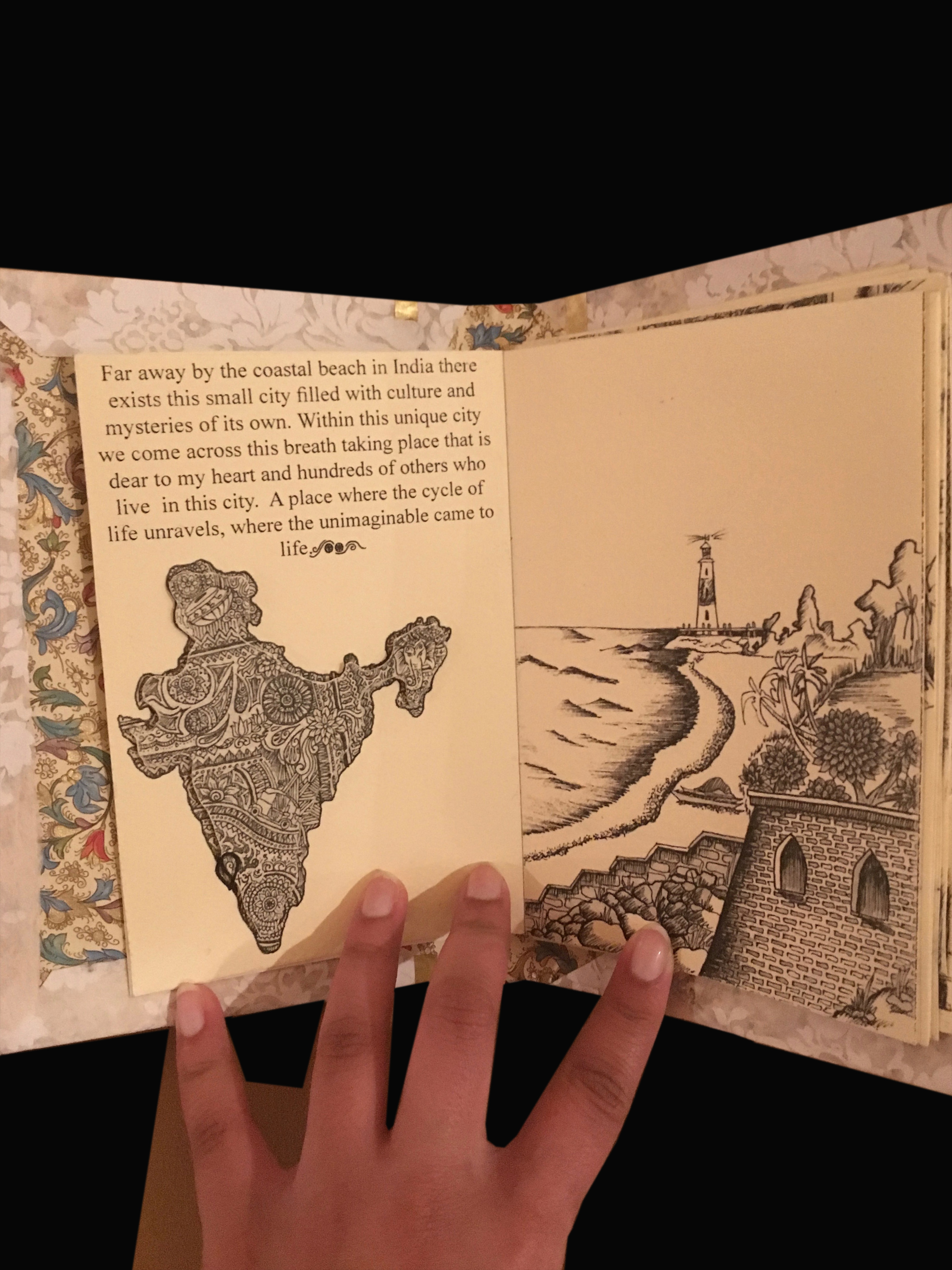
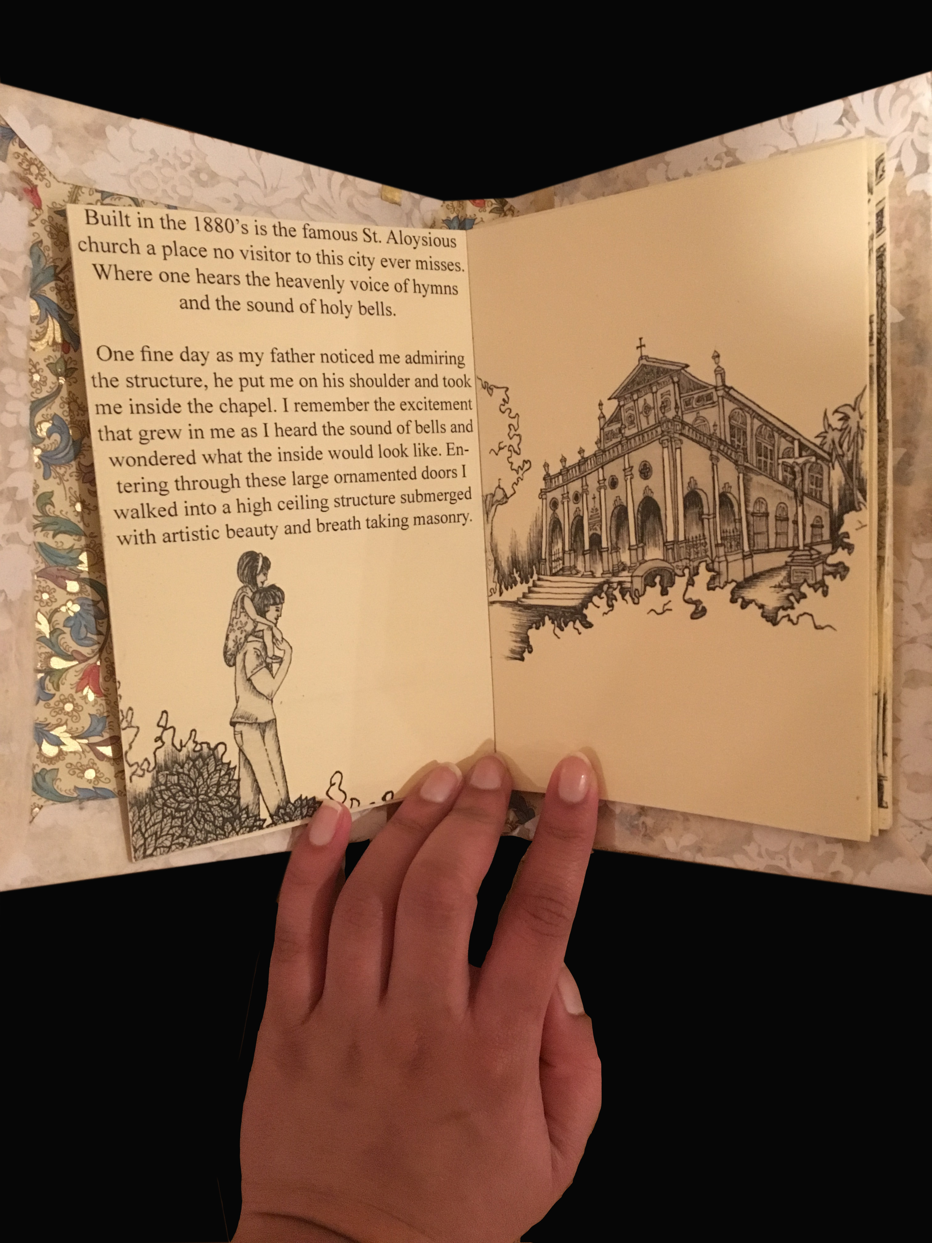
We started by selecting a specific place that exists within a larger architectural environment for which I decided to focus on a church back in my hometown. Built in the 1880’s St. Aloysius Church is a catholic church located in the central part of the city of Mangalore. The structure represents that of the sistine chapel and illustrates beautiful paintings on the wall of the church. The church is a sacred place for all citizens in Mangalore and is no site a tourist to the city misses.
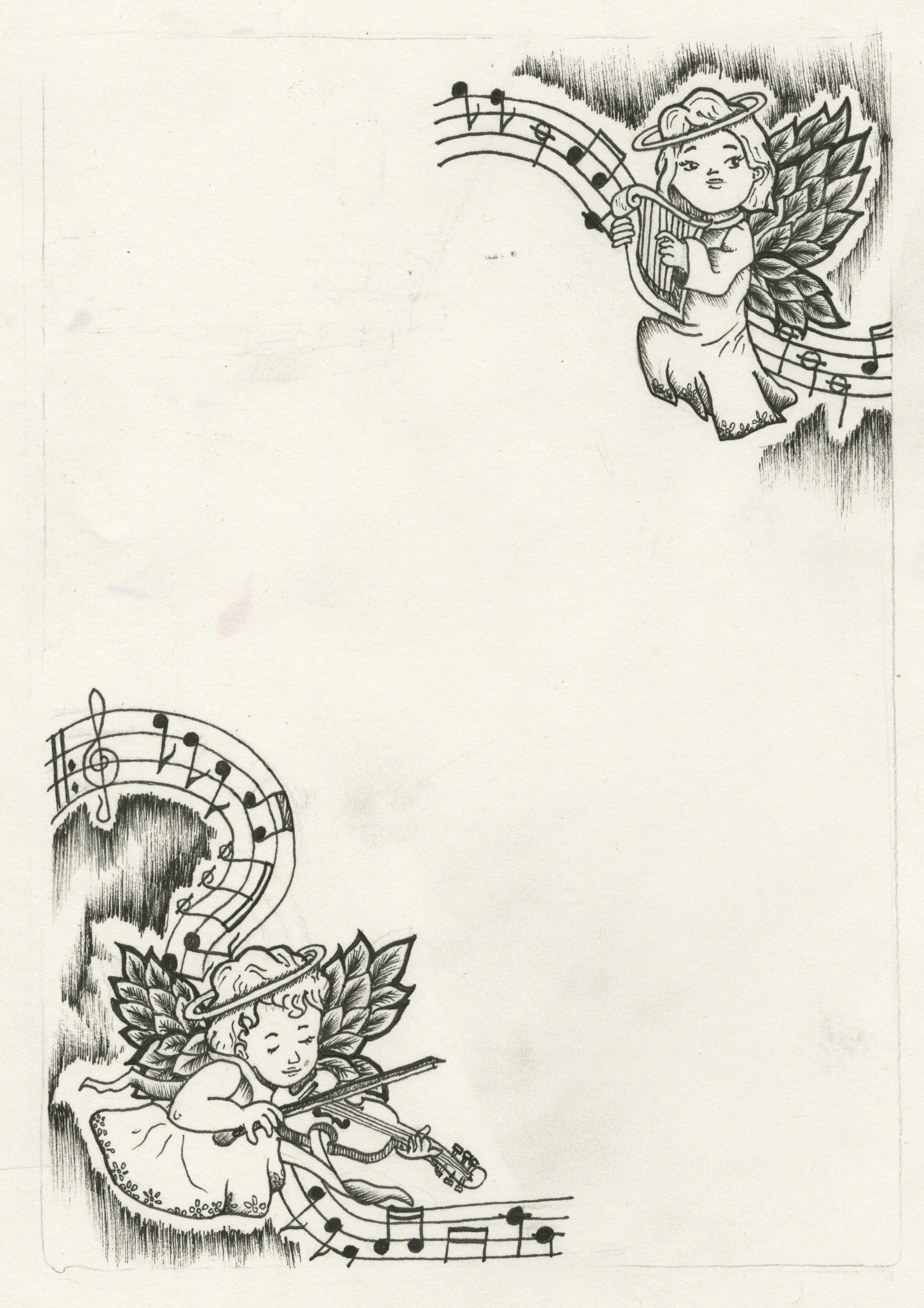
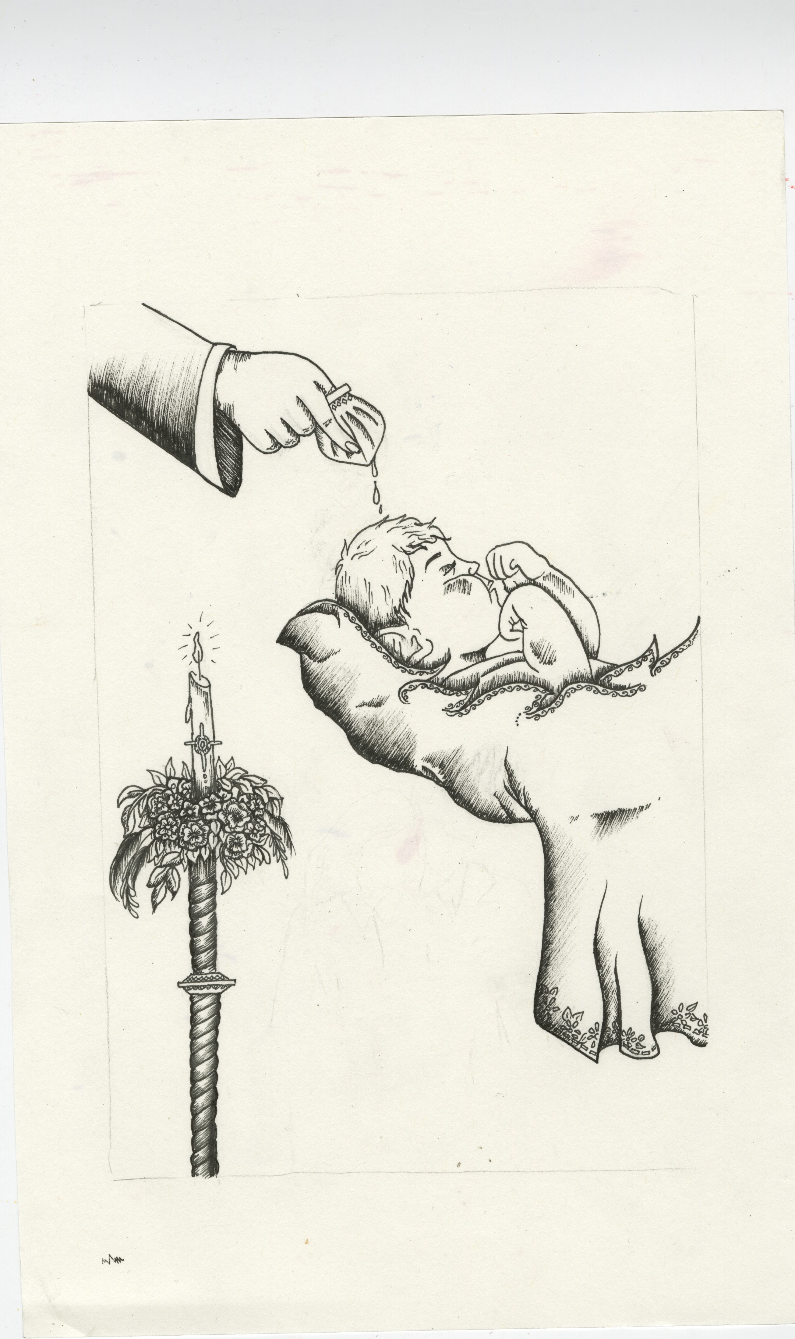
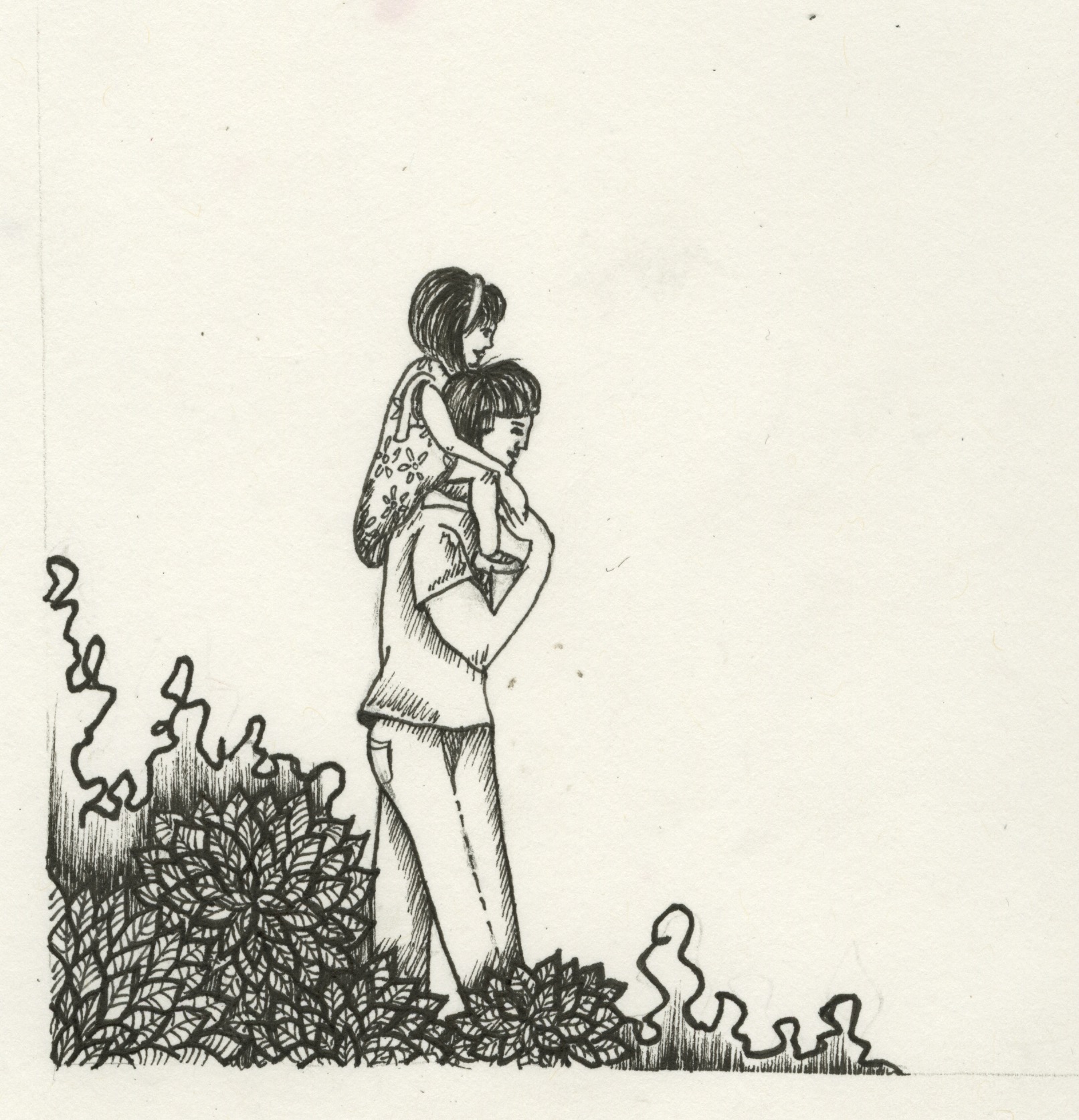
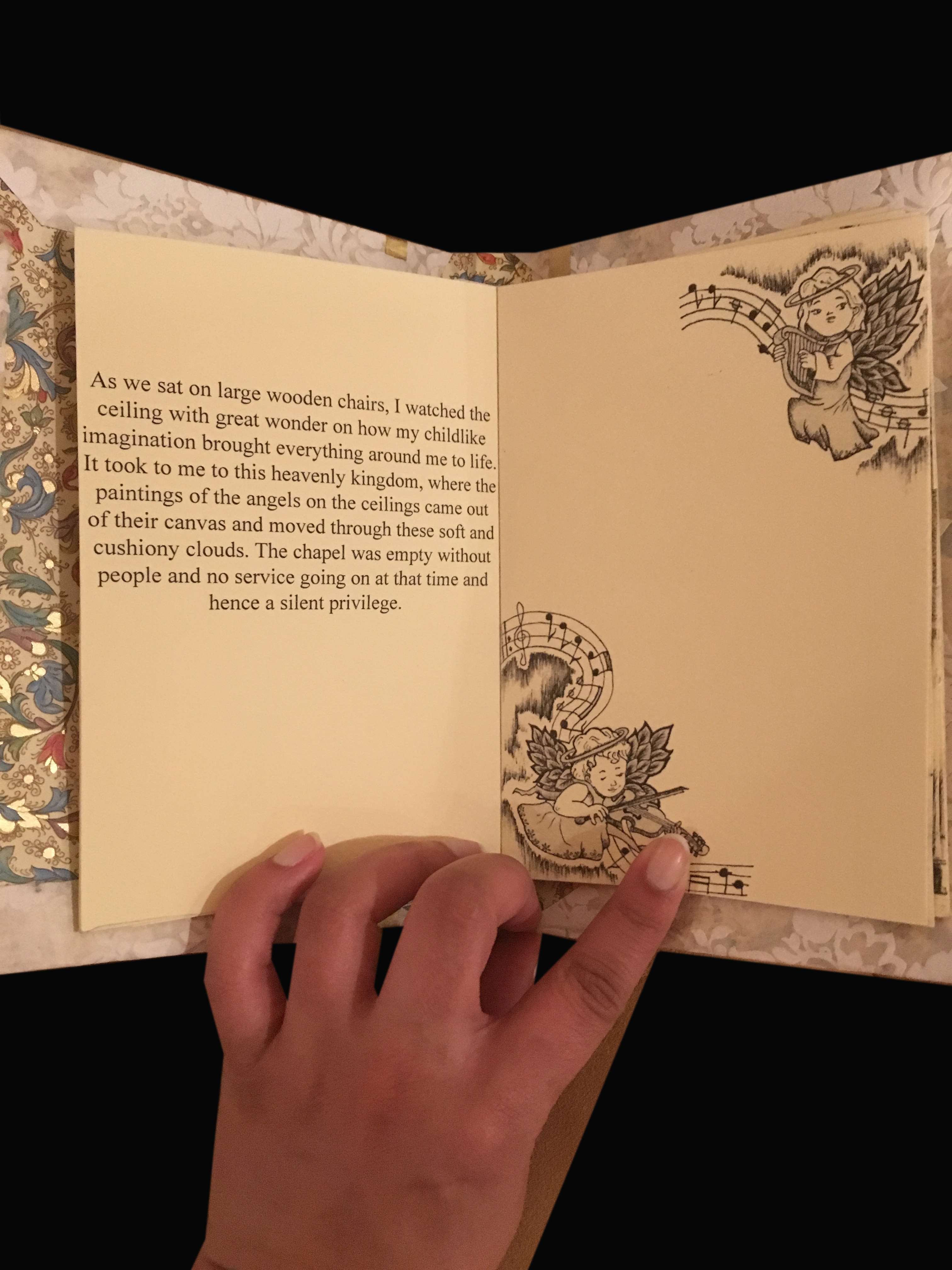
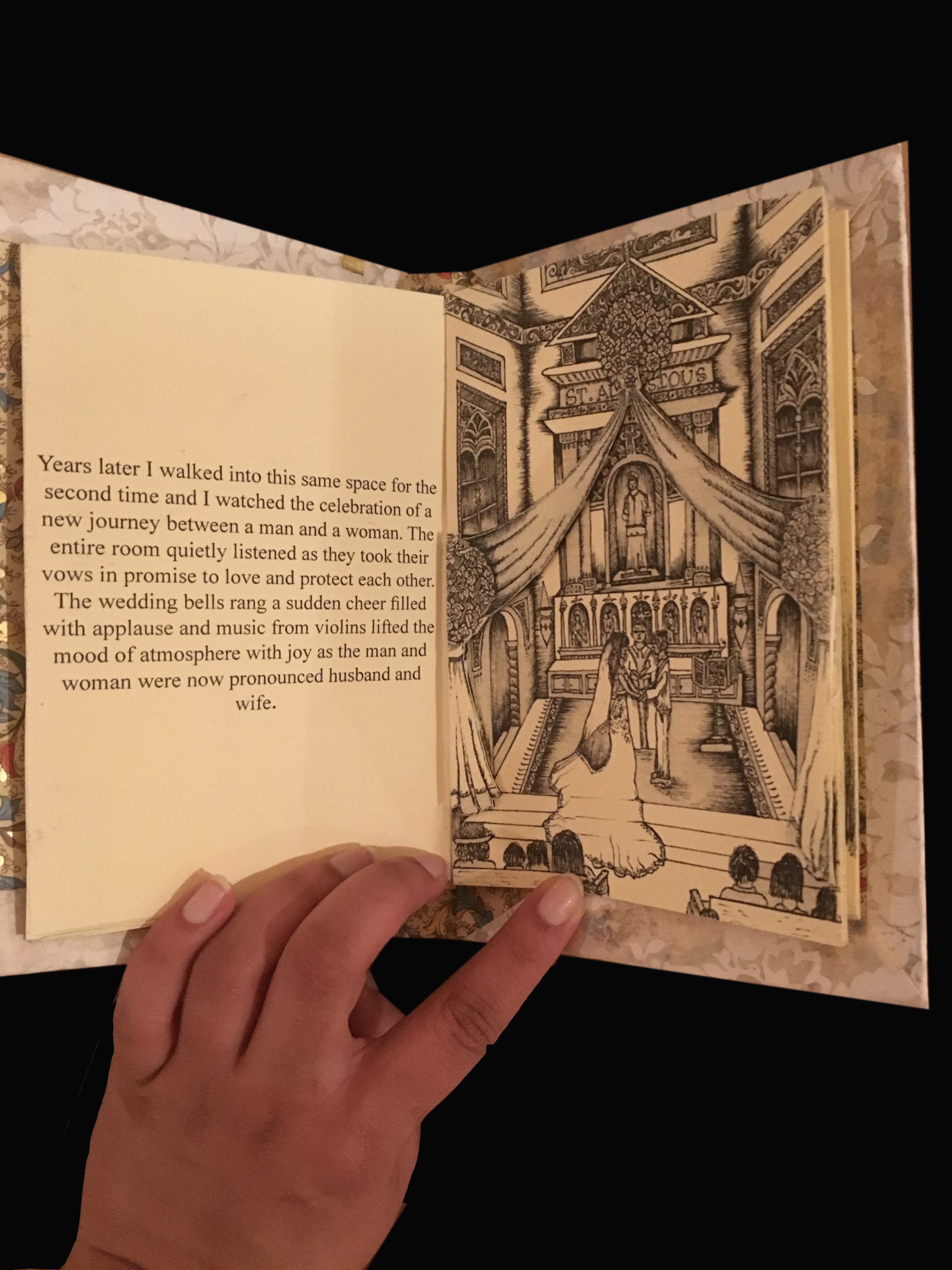
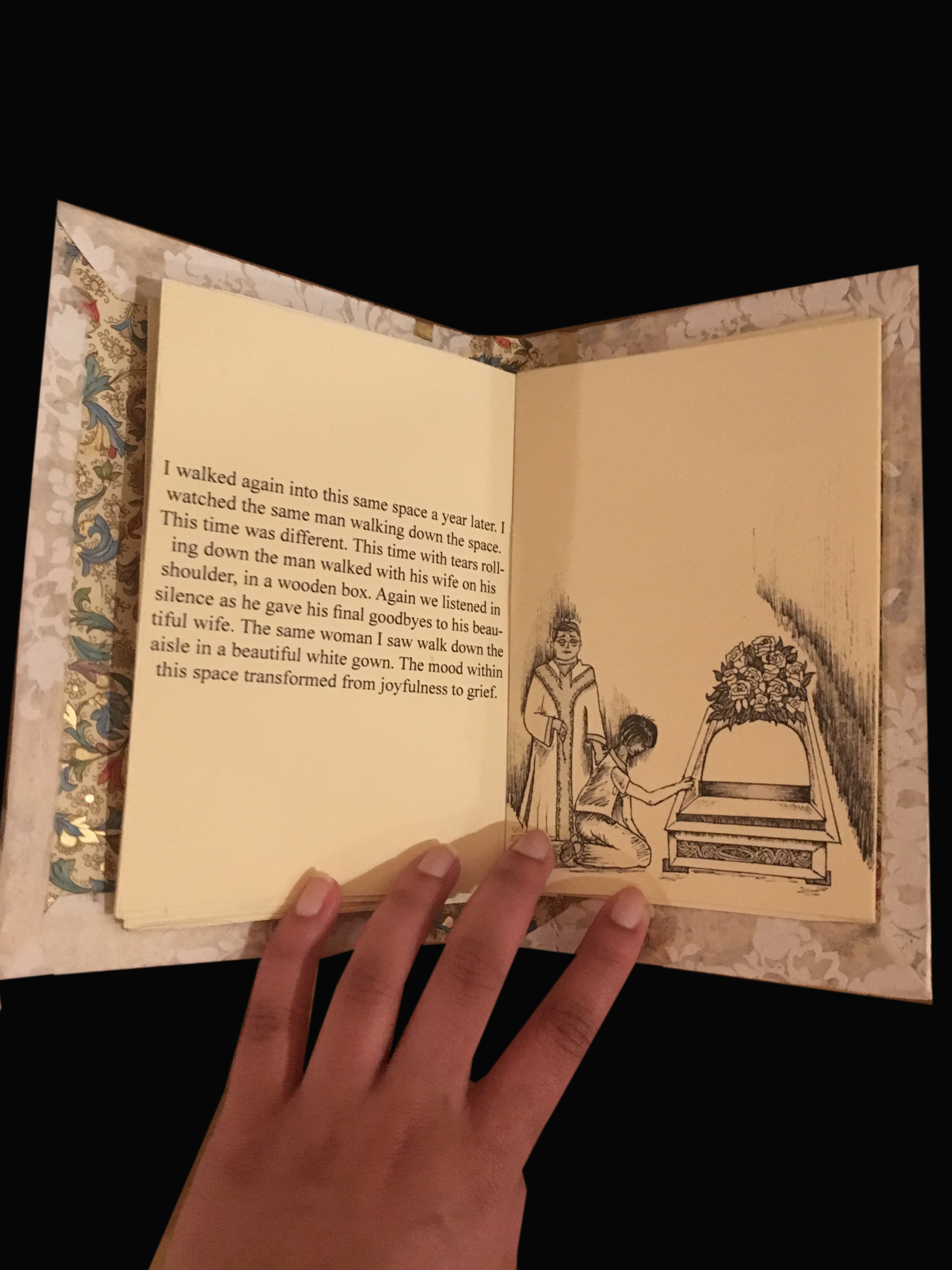
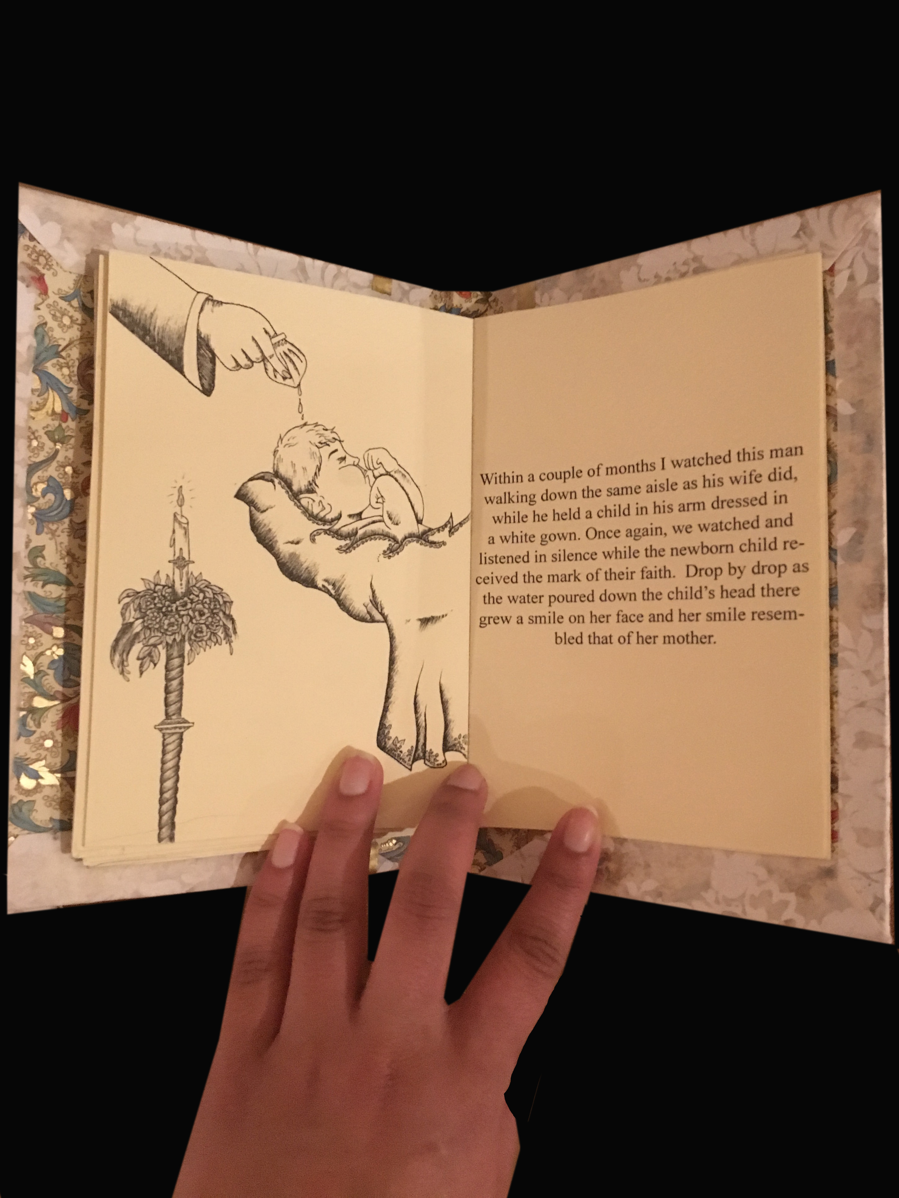
I then began by writing out my story, where I focused on the transition of the mood in the atmosphere that one senses, with time as different events take place in the church. The simple story revolves around one family and a childs experience within the church on the meaning of life over time.
I then began collecting images and drawing out sketches based on the images for example, this is evident as seen in the images below.
Part.2
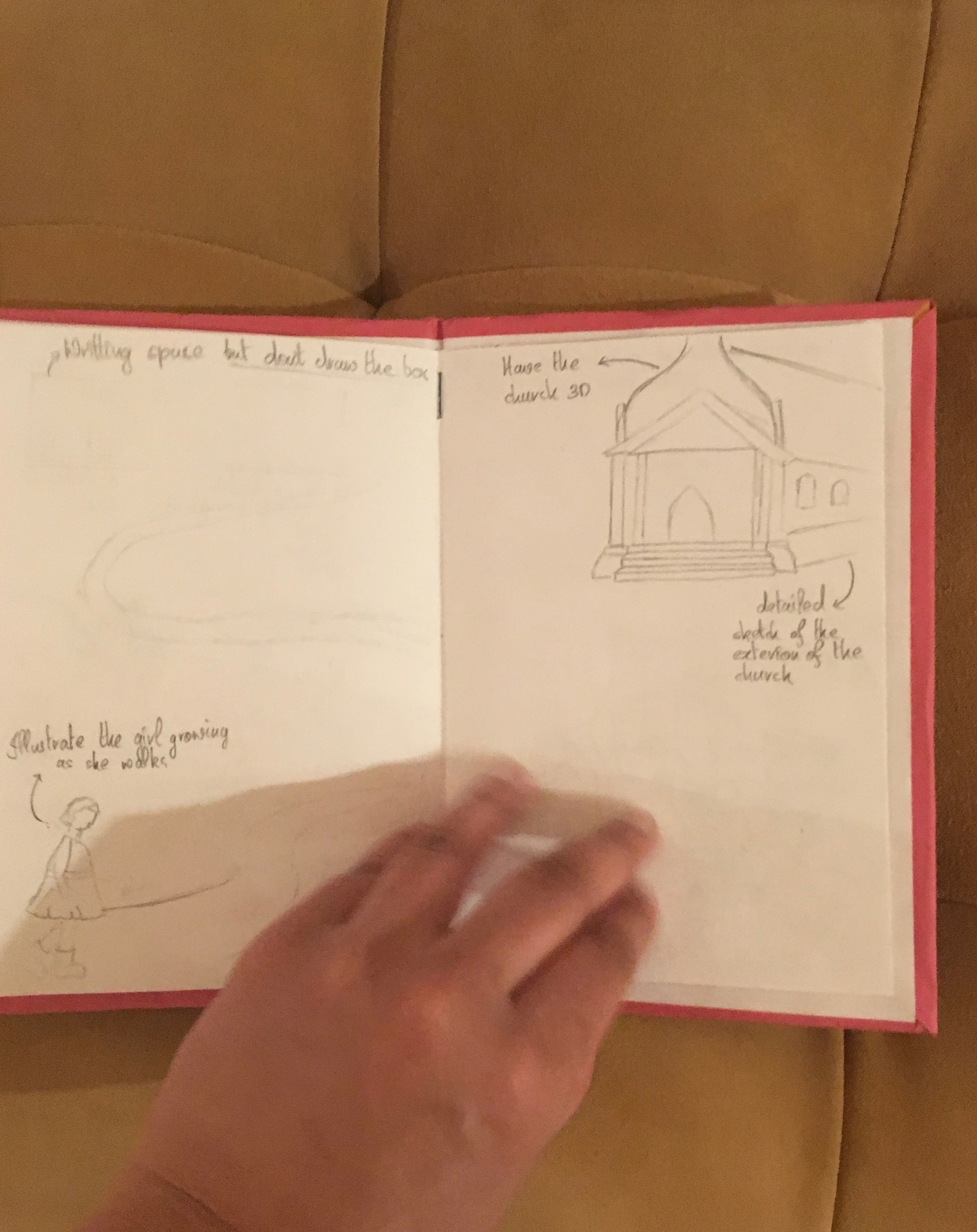
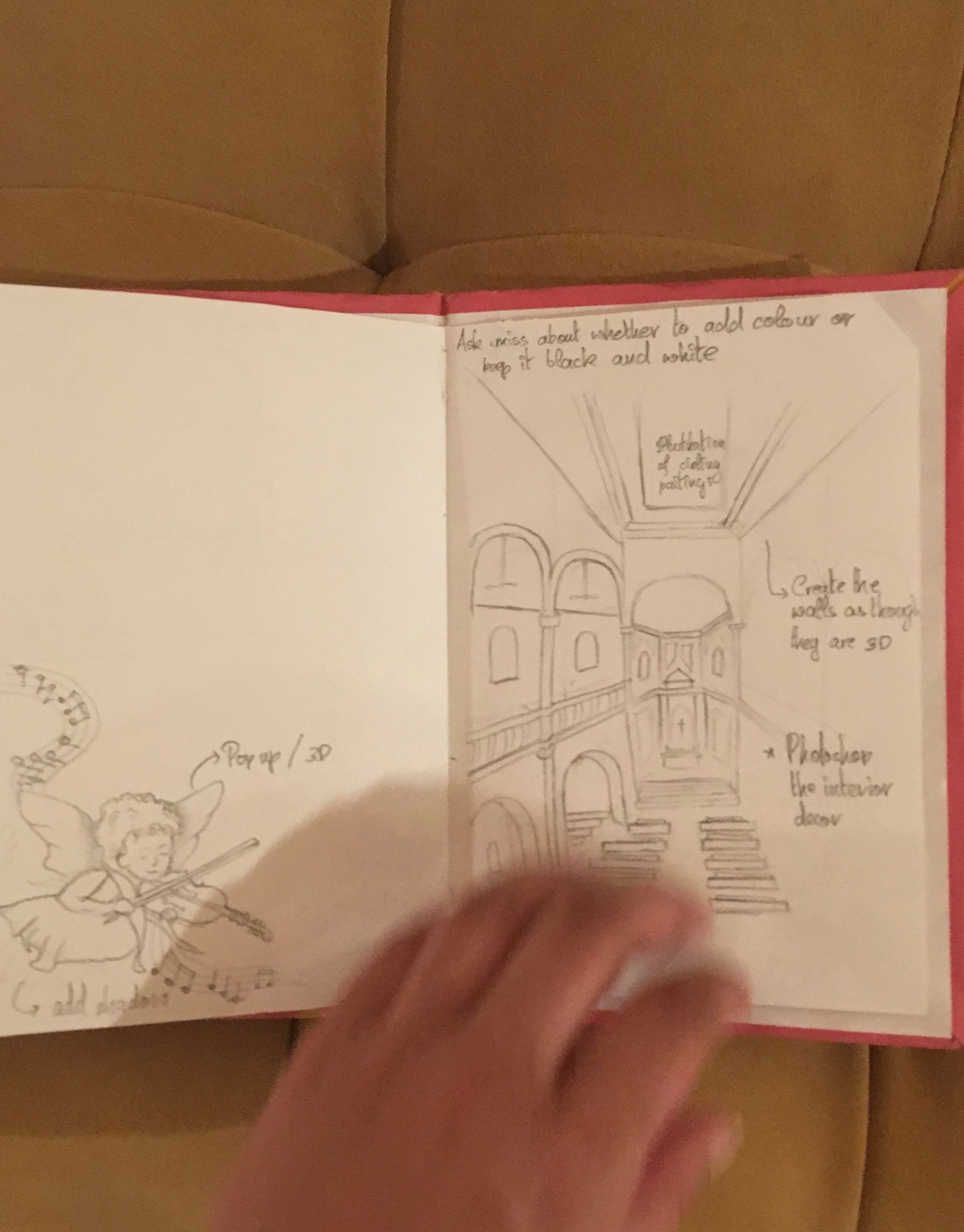
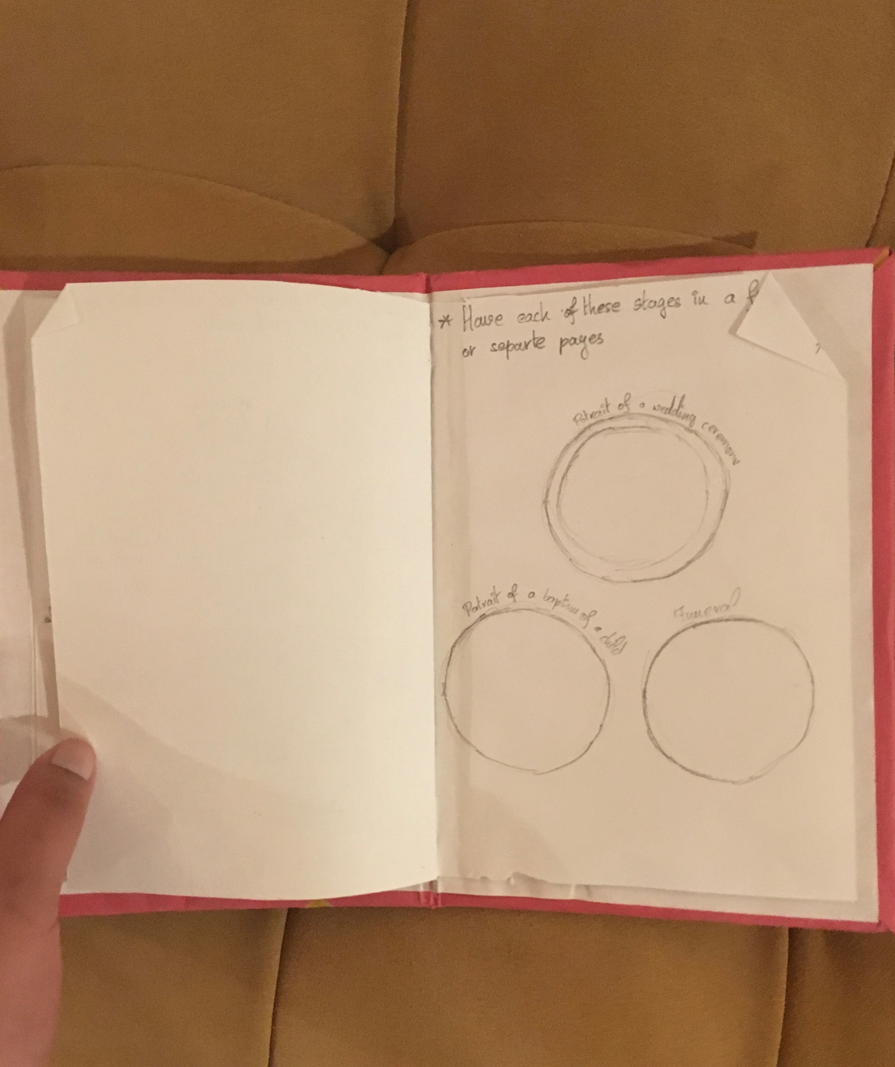
In order to help developing our concept we were then required to create a mood board that shows our visual concepts in relation to our story. This process helped in identifying how we could merge each image to the text. Hence, in this step I decided to create my mood board in the form a rough draft book. The book showcased rough sketches, how many pages I would like and side notes.
I then started sketching out the final drawings. The sketches were made in black ink on paper and were then scanned in order to printed on the final paper.
Once I had my images and texts ready, I began formatting my layout using InDesign a software application that helped in placing my images and texts wherever required and work on the spacing.
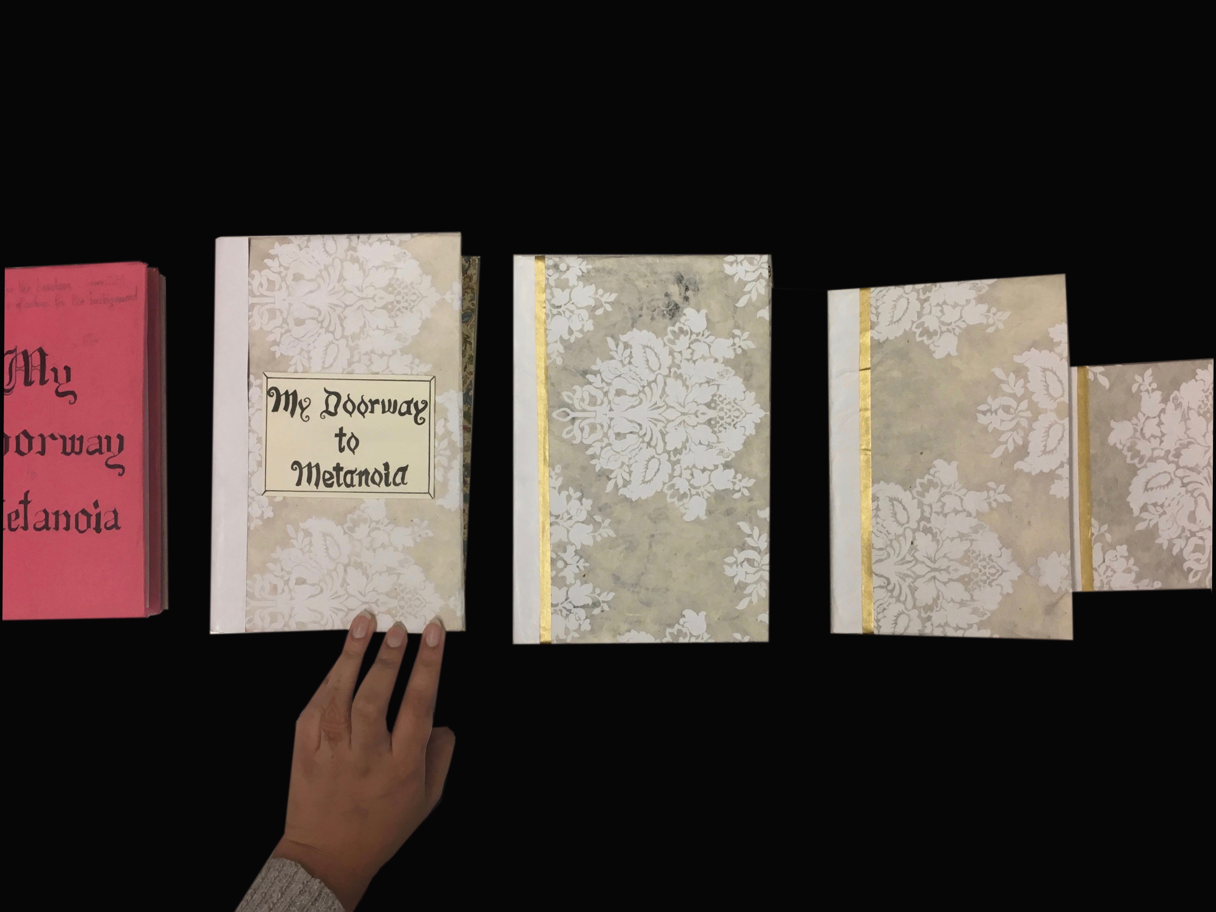
The next critical step was creating a prototype of our final project. Here I first created a small scaled version of the final book. This process helped in identifying if the text were aligned in the right spaces, the prototype also helped in recognising an unexpected error where the scanned images were printed in dark blue hue rather than in black.
The above image illustrates the different types of prototypes that we created before the final book was made.
As portrayed in the above images some of the sketches in the book were created in such a way that images appeared to pop out. This was done by having another cut out print out of the same sketch that was placed on top using double sided tape.
The pages were also taped together in order to help having it being layed out as seen in the image below. This format helped in providing more than one reader to look through the book at a time.
Reflection:
This project really helped in understanding the basics of using InDesign as I had never worked with this software. It also helped in learning about the fundamentals of making a book from creating a bounded exterior to something as simple as choosing the right font.
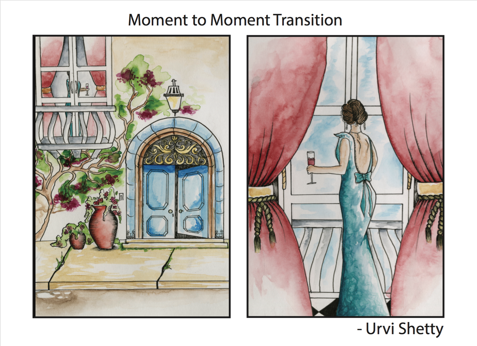
Clearly depicting a transition in a story is a critical element in comic illustrations, as this helps the reader connect the meaning behind the two frames. With this said, for this project we focused on creating two transitional comic like panels that represent two different types of transitions that encompasses the topic of Time.
Materials Used:
Mount Board
Glue
Water colour
Ink
Paper
Process:
In order to understand the basic concepts of transitional panels, we began by reading “Understanding Comics” by Scott McCloud. The reading unraveled for this projects the six different types of transitional panels and how they are illustrated. For the next step, we then had to select two types of transition panels and discussing possible ideas that we could illustrate based on the type of panels we would like to illustrate.
Once I was certain on what I wanted to illustrate I began sketching out the drawings in a frames. I decided to work around “Moment to Moment Transition” & “Scene to Scene Transition.” Using a micro inked pen I outlined the sketches and erased of the pencil lines. I then began painting the background using water colours and slowly working my way towards the central figures.
For the final step we scanned and drawings and had them laser print. The print was then carefully mounted on to a board.
The above panel illustrates a women gazing out a balcony door as she appreciates the little things in life. She is shown holding a glass of wine as the drink is often associated to celebration.The above panel is an illustration that signifies that sometimes you have to let go of the things you love but are toxic in order to make yourself stronger. The panels also suggest that with time all wounds heal
The purpose of this project was to find a topic that was personally important and challenging for us. However, the topic needed to build a relation to our understanding of Visual Culture. We were also required to create a printed matter like a zine or poster in relation to our studio work.
Context:
On March 30th 2017 students at the New school protested for a safe space for students of colour (SOC). The safe space was to place in which students of colour had jurisdiction over a largely white populated gaze. Now being a student of colour I could recognise how apparent the issue is and that there needs to be some sort of affirmative action to be taken place. However, in my opinion having a space only for students colour may not necessarily be the right path of addressing the issue. With this in mind I decided to focus on the portrayal of minority ethnic groups.
Going to a school like Parsons that is quite art driven and has an emphasis in fashion I wanted to create an illustration of people of colour walking the runway. This is because diversity in fashion is tremendously, critically important. Whitewashing in industries like the fashion world extends far beyond the runway as it plays a critical role in on society at how we see things. If we all become inclusive, we start seeing things in a different way, and it’s actually a better feeling. According to https://jezebel.com/new-york-fashion-week-diversity-talks-but-white-faces-1522416724 a online blog Unfortunately, the comparison too the number of white models on a runway show to that of coloured is quite distinct, there hasn’t been a drastic difference on the runways.
Hence I decided to create a piece that showcases people of colour from different cultural backgrounds who have walked the runway with pride. For which I create a hologram in which we could see models of colour walking. The purpose of creating an transparent glass hologram is used to symbolise that of the space protested in the university for students of colour. Juxtaposing this idea that the glass model encompasses the people from breaking boundaries and stepping outside of this safe space and also is a form of self segregation. In the background I also had the song “Imagine” by John Legend. The hologram was also placed in top of three drawing books, this stood as a metaphor for using ones artistic nature to bing about change societies perception through design.
Materials:
Plexi Glass
Glue
Adobe photoshop
Primier Pro
Cardboard box
Adobe illustrator
Paper
Laser printer
Black ink pen
Blanket
Books
Process:
I first began by watching runway clips of famous brands and looking for models in their show that had models of colour, A lot of these clips were from youtube as seen in the image below.
Interestingly, there were very few models of colours from bigger brands and their appearance on screen was shorter compared to their colleges. I then started looking into smaller designers this step was also a bit difficult because I had to select images from the same angle and size. When I finally found a couple videos that I knew I could use I then took a screenshot of every step.
Once I was able to collect a set of images the next step was to crop out the background using the pen tool on adobe photoshop and then saving it as a PNG, this step helped in having the just the figure appear as visible in the images below.
This step was repeated with several times
Using these images wit photoshop I created a GIF form the images in order to illustrate the models moving.
I then focused on building the hologram using plexi glass. As I planned on using an Ipad to illustrate the figures I was able to calculate the exact size of how big I wanted to make my hologram by using the template as seen in the image below.
Each of the sides were converted into inches and the dimensions were remeasured accordingly to the size of the IPad.
I then created the final video using Primier Pro in order to merge and edit the videos as a video for creating a hologram is also quite different as it requires the image to be placed in all four sides. Hence, this required a lot of touch up in order to get the final video as portrayed below.
As the project was to be showcased in a park outside I had to figure a way to showcase my piece. This pushed me to make the piece more interactive, where I put together a cardboard box and individual how to climb into the box and cover the portion of their body in order to create a dark room. This step also stood as a symbol and means for everyone to recognise the suffocation that causes in creating a segregated space. The following link illustrates what the final project looked like.
In terms of the zine I took a different approach in support on the topic of the portrayal of minority groups. Through this part of the project I wanted to showcase that women from minority groups do not need to change themselves in order to meet social standards rather they should embrace their ethnic beauty. Hence, I created the titled “You are who you are” that sketched out fashion figure drawings of women from different ethnic backgrounds wearing their traditional clothes with positive writings in different scriptures. Several of the sentences are repeated in order to emphasise on the idea of how important it is to love oneself and their culture. I also kept my focus on women since we are often targets that are criticised in terms of beauty standards.
I also used different shades of paper to represent people of all colour.
Reflection:
With this project I was able to push my boundaries in terms of working with digital media. It give me a platform to explore a new medium and how two mediums could be manipulated to create one piece. This was something that I worked with that was out of comfort zone as the topic that I focused on is quite controversial.
The basic context of this piece was exploring a new spiritual endeavour after an unforeseen event.
On October 2016, I met in a car accident, fortunately for me I had no life threatening injuries. However, passed several days lead to an unraveling of unfortunate events. Events that took a tole on my well being. There were days that were really rough and there days that were just quite. The event encompassed me I questioned myself who am I? Why am I here? With all these questions in my mind I didn’t know what to do or why I felt what I was feeling. It was then one day, when I got back to walking normally that I caught the smell of something I recognised, back from home. The scent was an incense stick from a shop close by it reminded of something my grandmother told as I child – “When all hope is lost try and talk to god.”
Now I was raised Hindu and have lived around different religious practices but I never really believed in any of it due to the fact that religion has been tied to politics where I’m from. However, I wanted to see if I could build a connection between the religious beliefs that I was brought up with, and the course topic Avatar. The concept of avatar is rooted in the secular practices of Hinduism. In the philosophical or theological context an avatar means a manifestation of God upon earth in corporeal form, which can be that of any living being. As an incarnation, God lives upon earth, goes through the same lifecycle as other living beings to resolve some fundamental problems of existence. It is always to set things right, to resolve some problem, or destroy evil. In a way you may consider it an intervention or micromanagement when we collectively fail or when gods fail us to put our world in order.
Buddhism for me was one of the the religions that I always found quite interesting and it was one particular quote by Gautam Buddha that made create avatars of him specifically i.e “In the end these things matter most: How well did you love? How fully did you live? How deeply did you let go?”
In an ideal situation I would like to recreate this piece in an enclosed public space in order to bring about the sense of serenity. I would also like the light in the middle as seen in image above to be lit and apparent all day. Hence, this would require an enclosed dark space.
Foam Board: This material was used to create a raised platform in which the final figure would be placed.
Hand crafted paper: This material was used to create a flower like object. It was also used to control extensive lighting and create a sense of delicacy by having it wrapped around the top most platform.
Gold Paint: This material was used in order to create flow like movement that comes out from the red hand crafted paper onto the black platform. Here, I used a sharpie to create the outlines and then filled them in.
Plexi Glass: With the helps a laser cutter I created cut outs from plexi glass of the figures to create 2D figure.
Torch: This material was used as symbol of spiritual enlightenment where I placed a torch in the middle of the structure .
Glue: I used special acrylic glue in order to place stick plexiglass surfaces and normal glue to wrap the foam board.
I knew that for this project I was deeply influenced by my culture and ethnicity. The work reminded me a lot about several Buddhist Monasteries and temples that I visited in my early childhood, due to the fact that most of the temples had several engravings and sculptures. I also walked around the city and documented the way buddha was represented in different avatars around stores in NYC.
For our final project we were open to focus on our choice of materials and methods explored through this course syllabus. The assignment was open to interpretation and self expression, however we were required to select two artists from our visit to “The Long Run” exhibition at the MoMA. Who’s work that we felt was most loathing.
Materials & Tools Used:
Plexi Glass
Vinyl Sticker
Black Foam
Double sided tape
Adhesive spray
Gold paint
Wrapping Paper
Etching Needle
Adobe Illustrator
About the Piece:
History, is a sculpture that ignites and motivates the idea of women empowerment, with a focus on women of colour. It explores the idea of growth and transformation of women from colonial times to todays modern and futuristic generation. This being said our generation is largely driven by pop culture. Hence, I wanted to focus on a women of colour who inspires our current generation through pop culture.
As I did my research it was evident that Beyoncé Giselle Knowles-Carter was one of the most influential woman worldwide. I decided to create my work around her with the statement of the change she made in her appearance at the 2018 Coachella music festival. Her appearance at this festival was quite critical as she was not only the first African American women to headline the the festival performance, but has artfully represented through musicality and performance, the richness in cultural blackness and aesthetics with a commitment to showcase feminism and freedom. She also inaugurated her appearance with the black national anthem regardless of the lack of diversity in the audience population. The artist also celebrated Black history with a focus on a college theme where she made references to historically-black fraternities and sororities simply through her clothing and music. She also played quotes from Civil Right activist Malcolm who acclaimed black women as band played melodies from Nigerian legendary anti-colonial singer Fela Kuti, who criticised colonialism.
This being said after my research on her biography and performance being a women of colour and a student currently in an arts based college, it inspired me to show case that every single girl can make a change. A change that can make an impact and bring about a legacy of oneself regardless of what type of field their in, they can change History.
Process:
After the visit to the exhibit we had write a written responses in order to identify the artists who’s work we didn’t enjoy and how we further plant to develop an final project idea. Attached here is the document to the response Response to Artwork-1jely6w
Once we had our final ideas completely sorted through, the next step was to create a rough sketch of a prototype. For which I drew a pencil sketch as seen in the image below. I focused on creating my figure in relation to the costume worn on during the Grammys performance in 2018.
Figure 1
For the next step I began sketching the final version of the figure and text. Here I decided to have the figure position itself similar to that of Virgin Mary as resembled in the image next to the sketch.
Figure 2Figure 3
Figure 4
The font that I used to create the sticker was a hand drawn gothic styles sketch that was drawn with black ink, as illustrated in Figure 4. This style of font was show to resemble the overthrown idea of women in colonial times.
For my next step I began transforming the above sketches into an Illustrator drawing. This step was done in order to cut my figure out of a plexiglass and also to make the sticker of the text
Figure 5 Drawing the sketch with the pen tool on Illustrator
On the plexiglass of the model since I wanted it to have more dimension to it, I etched several parts of the details on the figure. This was done in oder to create a sense of interaction with the audience to look deeper into the figure.
Once these details were completed I began working on the base of the model. As I wanted my figure elevated I created a three tiered staircase using black foam board which also represents the growing awareness and unity of the rise of women of colour. The foam board was delicately wrapped a with a black and gold hand made paper which can be seen in the image below. In order to have tI also created a back support with the same foam board, for the black plexi sheet in order to have the sheet standing straight, which is evident in the image below
Figure 6 Sideview of the board supporting the plexi glass
From the base I started fixing the piece together, where I began by aligning the stickers that were quite delicate due to its how thin and intricate they were. In order to do so I first placed a T-square horizontally ato identify the base line at which the text is to be aligned. The next step was to carefully remove the stickers from the sheet and place it onto the plexi glass which don with the help of a sharp blade.
Figure 7 Placing the previous three steps together
Once I placed all the pieces together the final model looked as present as in the images below
Figure 8 Side view of the Final ProjectFigure 9 Front view of the projectFigure 10 Close up on the details and hidden symbols through the etching
Purpose of Material Choice & Symbolism:
Foam Board: Women are often associated with being gentle and soft. Now, a foam board has a similar characteristic and I personally feel that being soft isn’t necessarily a bad thing. In fact I feel its an important attribute for a person to have because this attribute signifies that of strength. Gentleness breeds peace and calmness which brings about a clear mind in decision making, whether this may be in business or home like environment. Being gentle also helps in gaining a trust with another individual which is another critical element in life because if you want to growth in any form of relationship in individual should be able to feel the sense of trust.
Hand made wrapping paper: This paper that is made from Nepal is used to support women labourers who are underpaid but yet their product brings about a sense of delicacy, another positive attribute that is often connotated with women.
Plexi Glass: For this project I used black and transparent plexi glass in order to create a more futuristic minimal sensation. A glimpse into a future for people who look at the piece. I used transparent plexi glass so that people could look at this empowering women Icon recognise her legacy and then look through it, to see themselves. The black wall like plexi glass is used as mirror (As seen in the image below.) to have young girls like myself look at themselves and then look up to the stickers and identify that they can make a change.
Figure 11 A reflection of a person through the black plexi glass
Design Choice for the figure: Coming from Indian/ Hindu ethnicity surrounded by catholics. I wanted figure out some way resemble a combination of these two religious ideologies. Hence, I decided to focus on her 2018 Grammys outfit. That signified Mother Mary and Durga, the Hindu Goddess and Mother of the Universe. I also choose this outfit because the artist was pregnant at the time. Often women are pinned down and are told that they cannot do their work well, while they are pregnant and I wanted to illustrate that they completely underestimate the strength of a women.
Reflection:
The project provided me the opportunity to unravel an expressive part of me that has been in me for a while but wasn’t really given a platform to showcase this thought. It was interesting to see how this came about from from picking the two random artists who’s work I disliked. With this project I was also able to go back and overcome technical troubles that I had with my previous work in regards to labs that we used for this course.
In this assignment we focused on different mediums and ways in printed matter. We are also required to create the designs through illustrating ideas that cam to our mind while reading about an ancient Myths or Legends. We began by focusing on monotype prints, then moved onto mixed media prints influenced by original moprints and then moved on to etching and drypoint prints.
Process:
From the given readings, we were required to select three of the short readings and create an illustration for it. However, for this we required to use three basic monoprint colours; Magenta, Yellow and Blue. For which I used a combination of water colours and ink.
The above illustration represents King Midas and the Gold- Story Description: After doing a good deed for a Satyr, Midas was granted a wish by the God of Wine, Dionysus. Midas asked that all he touched be turned to gold. His wish was hesitantly granted. Midas proceeded to change many items around him to gold. Soon Midas became hungry. When he picked up a piece of food he could not eat it for it had quickly turned to gold in his hand. His daughter came to comfort him and when she put her arms around her father she immediately turned to gold. “The golden touch is no blessing,” cried Midas. He went to the river and wept. The sand of that river turned as yellow as gold for it is there that King Midas washed away the curse of the golden touch with his own tears.The above illustrations represents the myth of Pandoras Jar Story Description: In her beginnings Pandora was the Great Goddess, provider of the gifts that made life and culture possible. Pandora was taught not to open a clay vessel bestowed upon her as a dowery after her marriage to Epimetheus. She was inquisitive and rebellious and could not resist opening the lid. When she does so all evils are released and proceed to torture mankind in eternity.The above illustration represents the legend of Halycon Description: The goddess Halcyon was a seabird and the daughter of Aeolus, the ruler of the winds. Zeus ordered that Halcyon would lay her eggs only in winter. Her nest was near the shore and the stormy waves kept sweeping away her eggs. Crying and praying endlessly, Halcyon finally managed to touch Zeus’s heart. Encouraged by the other Gods as well, Zeus decided to give her 14 days of good and calm weather in the middle of winter. During these days Halcyon’s father would keep the winds calm on the sea.
Once we created our three basic sketches we were then required to create a mixed media illustration of using on of the above created sketches. For the mix media I wanted use explore different mediums in order to bring about different texture which would in turn bring about a variety of responses.
I decided to use the pieces influenced by Pandoras box. I recreated the basic sketch and have it popped out f the paper using double sided tape in order to create an illusion that makes it appear that she coming out of the frame as she opens he box.
For the background I used charcoal as a shading effect and splatters of black ink with a tooth brush to create a more mythical feeling. Using a mono print flat paint roller I was able to combine and layout an interesting texture using the same colour combination as seen below.
I also wanted to explore and focus on using simple middle school materials like glitter, a highlighter and a golden washy tape.I was able to adapt these materials in minimally into the piece to avoid it from being to loud but at the same time help emphasise on the figure.
The next correlated project was the dry point print. This technique was like using a a pen without an ink, it involved creating a an impression of a sketch by tracing over it using an etching pen tool. that is a sharp metal pen like tool. The tool helps in creating method that involves scratching an image into a plate, for which we used acrylic sheet. These lines create a burr that holds ink once the process of applying the paint was completed, a damp paper was brought and placed on top of the sheet and passed through a roller. The paper and the sheet are compressed together as they pass through the roller. This process allowed the paper absorb the paint and create an impression of the original etched out sketch as visible in the image below.
The process had to be repeated several times in order to generate the right quantity of paint that needed to be applied onto the acrylic sheet. This was caused an error mostly because if the there was to much paint then the details would disappear and if there was not enough paint applied then the paint would not completely transform an impression on to the sheet.
Reflection:
I think that the project provided a unique opportunity to focus back on print making. I also felt like this was an interesting topic to focus on, as with the rise of technology hand printed matter is slowly drifting away. Having the basic tools and ideas of how to hand print something brings about not only provides one with a new skill but also brings about a a different perspective to the art style.
Over the course of the spring semester we worked on two journals where we explored different topics in relation to sustainability and climate change.
The first one was feild action journal, consisting of research and reflection based notes through feild trips that took place during class. Attached below are the links to the following documents.
The second one that we focused one was the Studio Journal, in this journal we documented all the models and work that we made over the course of this class.
Attached below are the links to the following documents.