The Riser, Dance Studio Design

Overview:

The Final Studio project focused on designing a 100,000square feet Dance Center in New York City that is committed to the performing arts. The center would also be a space that advocates the education and history of dance

The structure also required the following set program

  • Small theatre with minimum 50 seats
  • Main Auditorium with 150 seats
  • Small recording studio
  • Library with small archive
  • Lounge space for dancers
  • 4 studios for rehearsal
  • 3 class rooms
  • Restrooms
  • Staircase

Materials:

  • Chipboard
  • Bristol Paper
  • Double side tape
  • Glue
  • synthetic plastic sheets

Process:

The body is a vessel. It contains our organs (the infrastructure) held up by a skeleton (structure) and wrapped by a skin (envelope). Buildings are vessels for bodies and therefore the human body has always been in the center of interest for architects. Since we are focusing on creating a dance studio, its critical to understand the body movement in relation to space.
Part.1
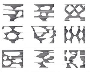
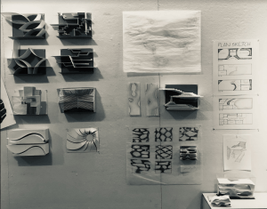
Hence, we began the project by constructing a catalog of forms and diagrams that describe the body through selecting a particular dance form. The goal is to make yourself familiar with scale and proportion of the human body and in extension space.
Part.2
We then moved on to create possible iterations for the subdivision for the infrastructure.
  
Part.3
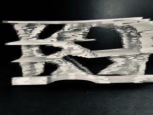
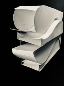
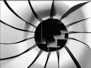
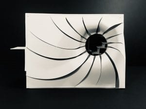
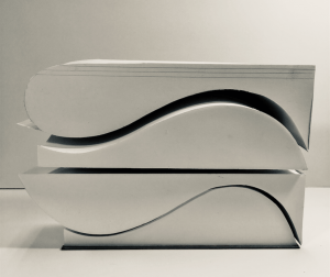
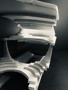
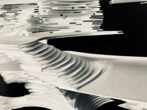
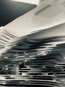
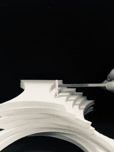
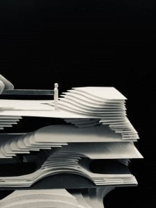
Once we figured out our infrastructure we moved on to work on designing a wrapper. As bachata and salsa was one of the dance forms that I looked into while sketching my figure drawings I tried to adapt building structures that showcased a wave like movement as seen in the close up images below.
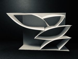
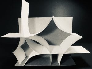
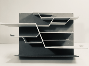
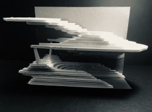
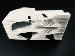
Images of the entire structure
 
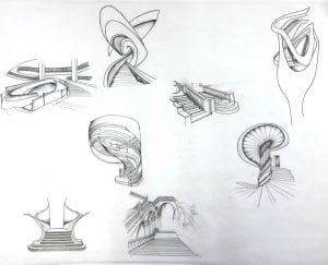
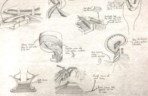
However, I was not quite queen with interior. Hence, I started focusing on the basic idea of what is dance. Dance is the process of rhythmic choreographed movement, now when I relate this to architecture one of the core elements that choreographs our movement in a structure our staircases. “Modern society thrives on performance. Our lives are public on social media and on display. Performance is a grand staircase.”  Further on, I then decided to understand and investigate staircases, through borrowing from historic references like the Baux Art staircase and analyse interpret more staircases and comprehend how I would translate this element into an occupy-able space.
Through the above investigation, with the use of rhythmic patters, curvilinear structures and repetition. I further was exposed to the idea of topography and tried to adapt and understand how I could use it. With these factors, I began building small sketch models for the circulation.
The above images of the sketch models helped in identifying that that the staircase itself would not only be a means through which one could move, sit or use. But would also play a major factor in being part of the envelope of the structure.
Using my initial iterations I then focused on creating a spacial system which is ideally my sectional drawing for my final model, as seen in the image below.
Once the above steps were completed, the next step was to build the final model.
In terms of material when I started working with foam, however as I completed working with a sketch model using foam, it came to my notice that material was to thick for the scale which we were creating the sketch model.
 
After looking into several different materials, I decided to use paper and double sided tape (to create the thickness)
 
This material not only helped in gaining the right scale for my model but also helped in focusing on creating a visual balance throughout my structure.
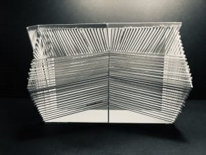
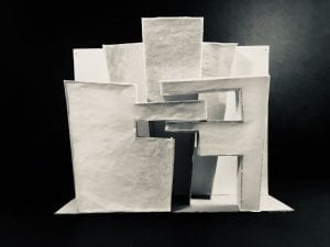
Final model with the wrapper


Close up on the stairs for the third floor
Tops view of the model


View of what the ceiling would look like

Final Layout:

Final Visual Culture Project

Overview:

The purpose of this project was to find a topic that was personally important and challenging for us. However, the topic needed to build a relation to our understanding of Visual Culture. We were also required to create a printed matter like a zine or poster in relation to our studio work.

Context:

On March 30th 2017  students at the New school protested for a safe space for students of colour (SOC). The safe space was to place in which students of colour had jurisdiction over a largely white populated gaze. Now being a student of colour I could recognise how apparent the issue is and that there needs to be some sort of affirmative action to be taken place. However, in my opinion having a space only for students colour may not necessarily be the right path of addressing the issue. With this in mind I decided to focus on  the portrayal of minority ethnic groups.

Going to a school like Parsons that is quite art driven and has an emphasis in fashion I wanted to create an illustration of people of colour walking the runway. This is because diversity in fashion is tremendously, critically important. Whitewashing in industries like the fashion world  extends far beyond the runway as it plays a critical role in on society at how we see things. If we all become inclusive, we start seeing things in a different way, and it’s actually a better feeling.  According to https://jezebel.com/new-york-fashion-week-diversity-talks-but-white-faces-1522416724 a online blog Unfortunately, the comparison too the number of white models on a runway show to that of coloured is quite distinct, there hasn’t been a drastic difference on the runways.

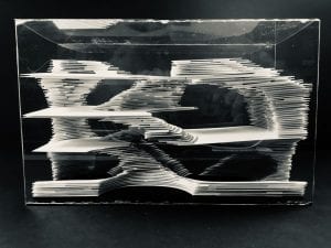
Hence I decided to create a piece that showcases people of colour from different cultural backgrounds who have walked the runway with pride. For which I create a hologram in which we could see models of colour walking. The purpose of creating an transparent glass hologram is used to symbolise that of the space protested in the university for students of colour. Juxtaposing this idea that the glass model encompasses the people from breaking boundaries and stepping outside of this safe space and also is a form of self segregation. In the background I also had the song “Imagine” by John Legend. The hologram was also placed in top of three drawing books, this stood as a metaphor for using ones artistic nature to bing about change societies perception through design.

Materials:

  • Plexi Glass
  • Glue
  • Adobe photoshop
  • Primier Pro
  • Cardboard box
  • Adobe illustrator
  • Paper
  • Laser printer
  • Black ink pen
  • Blanket
  • Books

Process:

I first began by watching runway clips of famous brands and looking for models in their show that had models of colour, A lot of these clips were from youtube as seen in the image below.


Interestingly, there were very few models of colours from bigger brands and their appearance on screen was shorter compared to their colleges. I then started looking into smaller designers this step was also a bit difficult because I had to select images from the same angle and size. When I finally found a couple videos that I knew I could use I then took a screenshot of every step.

Once I was able to collect a set of images the next step was to crop out the background using the pen tool on adobe photoshop and then saving it as a PNG, this step helped in having the just the figure appear as visible in the images below.


This step was repeated with several times

Using these images wit photoshop I created a GIF form the images in order to illustrate the models moving.

I then focused on building the hologram using plexi glass. As I planned on using an Ipad to illustrate the figures I was able to calculate the exact size of how big I wanted to make my hologram by using the template as seen in the image below.

Each of the sides were converted into inches and the dimensions were remeasured accordingly to the size of the IPad.

I then created the final video using Primier Pro in order to merge and edit the videos as a video for creating a hologram is also quite different as it requires the image to be placed in all four sides. Hence, this required a lot of touch up in order to get the final video as portrayed below.

Video.1 -vxo7l3

Final project:

As the project was to be showcased in a park outside I had to figure a way to showcase my piece. This pushed me to make the piece more interactive, where I put together a cardboard box and individual how to climb into the box and cover the portion of their body in order to create a dark room. This step also stood as a symbol and means for everyone to recognise the suffocation that causes in creating a segregated space. The following link illustrates what the final project looked like.


https://youtu.be/gvO877p_Mcs

In terms of the zine I  took a different approach in support on the topic of the portrayal of minority groups. Through this part of the project I wanted to showcase that women from minority groups do not need to change themselves in order to meet social standards rather they should embrace their ethnic beauty. Hence, I created the titled “You are who you are” that sketched out fashion figure drawings of women from different ethnic backgrounds wearing their traditional clothes with positive writings in different scriptures. Several of the sentences are repeated in order to emphasise on the idea of how important it is to love oneself and their culture. I also kept my focus on women since we are often targets that are criticised in terms of beauty standards.


I also used different shades of paper to represent people of all colour.

Reflection:

With this project I was able to push my boundaries in terms of working with digital media. It give me a platform to explore a new medium and how two mediums could be manipulated to create one piece. This was something that I worked with that was out of comfort zone as the topic that I focused on is quite controversial.
Deconstructing Previous Work

Selected work: Serinitya

The basic context of this piece was exploring a new spiritual endeavour after an unforeseen event.

On October 2016, I met in a car accident, fortunately for me I had no life threatening injuries. However, passed several days lead to an unraveling of unfortunate events. Events that took a tole on my well being. There were days that were really rough and there days that were just quite. The event encompassed me I questioned myself who am I? Why am I here? With all these questions in my mind I didn’t know what to do or why I felt what I was feeling. It was then one day, when I got back to walking normally that I caught the smell of something I recognised, back from home. The scent was an incense stick from a shop close by it reminded of something my grandmother told as I child – “When all hope is lost try and talk to god.”

Now I was raised Hindu and have lived around different religious practices but I never really believed in any of it due to the fact that religion has been tied to politics where I’m from. However, I wanted to see if I could build a connection between the religious beliefs that I was brought up with, and the course topic Avatar. The concept of avatar is rooted in the secular  practices of Hinduism. In the philosophical or theological context an avatar means a manifestation of God upon earth in corporeal form, which can be that of any living being. As an incarnation, God lives upon earth, goes through the same lifecycle as other living beings to resolve some fundamental problems of existence. It is always to set things right, to resolve some problem, or destroy evil. In a way you may consider it an intervention or micromanagement when we collectively fail or when gods fail us to put our world in order.

Buddhism for me was one of the the religions that I always found quite interesting and it was one particular quote by Gautam Buddha that made create avatars of him specifically i.e “In the end these things matter most: How well did you love? How fully did you live? How deeply did you let go?”

In an ideal situation I would like to recreate this piece in an enclosed public space in order to bring about the sense of serenity. I would also like the light in the middle as seen in image above to be lit and apparent all day. Hence, this would require an enclosed dark space.

Foam Board: This material was used to create a raised platform in which the final figure would be placed.

Hand crafted paper: This material was used to create a flower like object. It was also used to control extensive lighting  and create a sense of delicacy by having it wrapped around the top most platform.

Gold Paint: This material was used in order to create flow like movement that comes out from the red hand crafted paper onto the black platform. Here, I used a sharpie to create the outlines and then filled them in.

Plexi Glass: With the helps a laser cutter I created cut outs from plexi glass of the figures to create 2D figure.

Torch: This material was used as symbol of spiritual enlightenment where I placed a torch in the middle of the structure .

Glue: I used special acrylic glue in order to place stick plexiglass surfaces and normal glue to wrap the foam board.

I knew that for this project I was deeply influenced by my culture and ethnicity. The work reminded me a lot about several Buddhist Monasteries and temples that I visited in my early childhood, due to the fact that most of the temples had several engravings and sculptures.  I also walked around the city and documented the way buddha was represented in different avatars around stores in NYC.


Avatar Studio Bridge. 5

Project Description:

Instead of having a project sheet handed to us we had a rather interesting assignment where we were asked to create a project sheet -> Final Bridge Project Sheet_-1lzq7oo where we were asked to create a project and model based on one material, class or object that we liked and disliked working with.

Materials Used:

Paper, glue, plexiglass, foam board, plastic, gold paint and

Reflection:

In occurrence of an unexpected event that took place recently in my life my view on everything changed. When all hop was lost I was asked to look into  this idea of an existence of a spiritual higher being. Something that I’ve had practice of before but never truly believed in it. I wanted to create a connection between this spiritual idea of whether I believe in it and my avatar class. With this idea in mind I thought about how spiritual beings have different avatars. For the next step  I picked one spiritual being that is known to all, where I chose Buddha and read its beliefs and morals and decided to create a 3D representation  of the different Avatars.

In order to gain an idea of the different representations of buddha I walked around the city and entered different stores that had a sculpture of Buddha. I photographed some of them as seen below.

This process also helped me explore different materials used and the texture it brings out, that I could adapt into my final project.

I then began sketching out the avatars of Buddhas from the ones I had seen around.


I wanted use plexiglass for my final model to create the buddha sculptures. However in order to create the piece I had to first trace the sketch on adobe using the pen tool to create the outline so I could then cut them out and then have repeated parts of the sketch outlined separately in order to gain a 3D feature as seen in the image below.

However, the biggest task with this project was not just finding the right dimensions but figuring out how to stick plexiglass onto plexiglass. Once i researched I figured out that the fastest and only possible way was through using a special acrylic glue or acrylic cement.

Final Project Photographed


Avatar Studio Bridge. 4

Project Description:

For this project we were required to create a zine, a self articulated piece of work. The zine is to be created by identifying a social issue from a selected movie and taking a stand on a social issue, where by a multitude of people are affected. The zine is to have both textual and visual content with six pages, including a front and back cover.

Materials Used:

Digital media, paper and ink pen

Reflection:

The first step of identifying the social issue was by re-watching the movie, I realised how critical this step was in order to identify and take notes on how the social issue, for which I choose objectification of women, is illustrated in the movie( Ex Machina notes-1alih90 ). Once I was able to identify my story plot I began to focus on the colours that I wanted to use. I choose shades of pink and purple in order to represent feminism for the cover and last page. As a symbol that feminism is not lost amidst this sort of brutality, where as the pages inside are only black and white that represents the loss of innocence within all this darkness in the world. This process helped in understanding how critical every element is in creating a piece of artwork. The size of the zine is also used to illustrate how such a big issue is often overlooked at.

Photographs of Final Zine


Avatar Studio Bridge.2

Project Description:

The bridge two project makes us explore sides of our twitter avatars created. However, here we tried to convert this virtual characters into 3D objects. For my character ‘Felicia Lee’ I used paper, wire and tape to create my 3D object.

Reflection:

This project was a bit complex as the topic was quite wide. Hence, I began by going back to the Avatars childhood looking at her background and picking out on things that were not obvious through the twitter account. Once I figured out the base idea for my object and what I wanted to portray I began picking up materials that connected to the object, from its texture to its purpose. Even through the use of colours I wanted to create symbolic role to the object as a whole. In conclusion, I found the project quite interesting as we also discussed ways in which the artist could have portrayed the objects better or what was wrong while trying to depict something.