Project #5 – Image and Text (Drawing, Digital Images, and Illustrator)
Description: Letters and words are shapes, integrations of positive and negative space often depicted in simple black and white. But they convey meaning far beyond their aesthetic nature because of their association with language and, therefore, thought. The viewer does not see the shape of the text alone, but automatically interprets the denotation. Can this complement an image or does it detract?
Combine photos of drawings and images of figure and space and objects with words to create a meaningful dialogue. Things to consider: what do words convey? Do you have to speak the same language to create meaning? How do words convey different ideas from images?
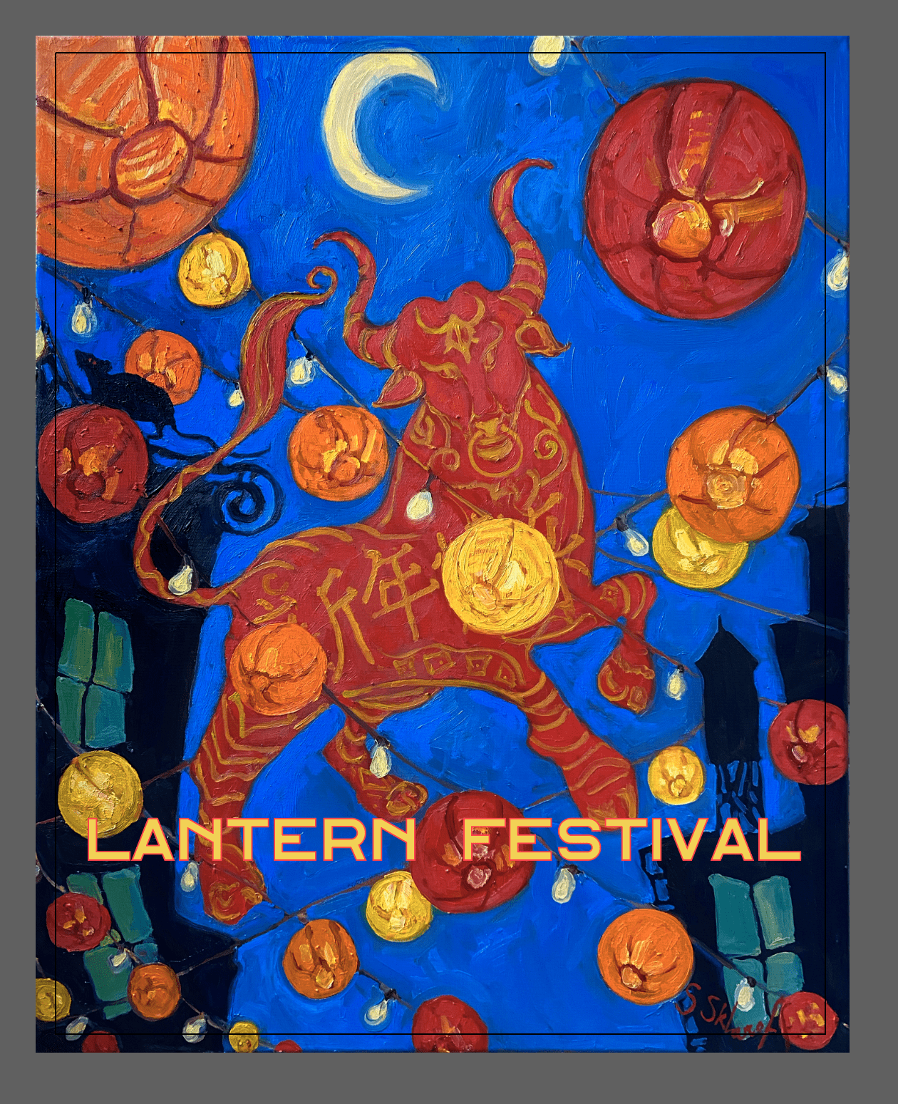
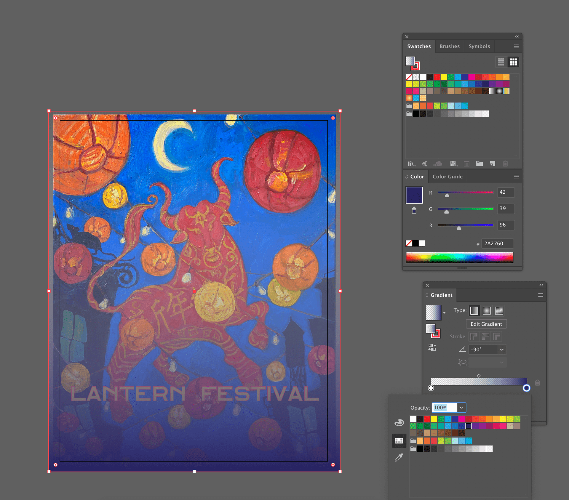
Instructions: Choose a “mom and pop” shop in NYC (or in the town where you reside) that has been rumored to be having financial trouble. Take your own photos or use a photo found on the internet or on social media as visual reference. You can recreate this photo as a drawing and/or manipulate it in Illustrator. Combine text (name of the shop, owner, items or services for sale) with the drawing/photograph and create a visually intriguing statement about the shop that needs help. Design this announcement for Instagram or another social media platform to help raise awareness for this business. Please refer to @newyorknico on Instagram for inspiration.
Skill Sets: Text Tool, Path Tools for Art, Merging, Brush Tool, Making of Brushes, pattern making and creating swatches.
References/Artists: Shepard Fairey, Mira Schor, Chuck Connelly, Jasper Johns, Jenny Holzer, Mariah Fee, Glenn Ligon, Ancient Egyptian painting and hieroglyphs.
Materials: digital photos and drawings, Illustrator
STEP BY STEP GUIDE:
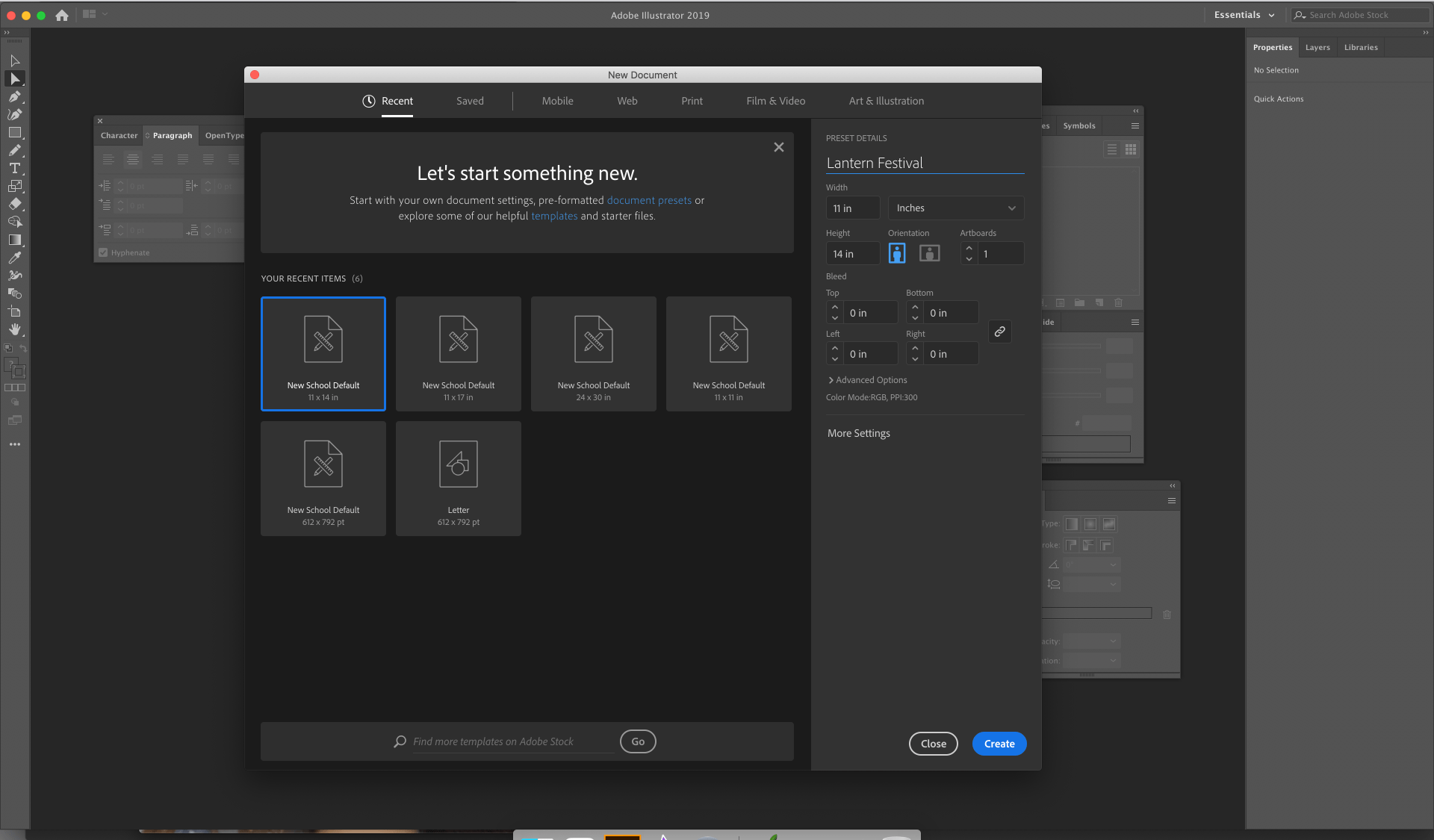
Step 1: Create a new project. File format should be 11×14 and RGB.
Step 2: Place your image from File -> Place. Click and drag the image to cover the entire canvas.

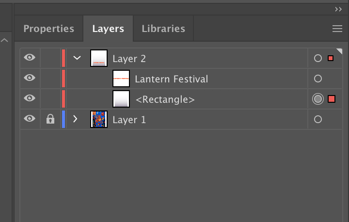
Step 3: Lock your image layer by clicking the empty space to the right of the eye icon in the layers panel. Create a new blank layer on top of it.

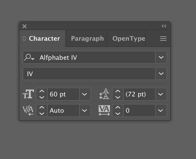
Step 4: Using the type tool, click on you poster where you would like to place your text. Once you have written what you want your poster to say, change your tool to the selection tool. Then you can use the Character Panel to adjust the font, size, and kerning. To change the color and the stroke, use the paint chips on the bottom of the tool bar. Make sure to choose colors and fonts that make sense for your poster.
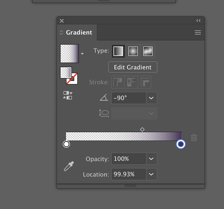
Step 5: If your text is blending into your busy background, a good way to make it stand out is to create a gradient overlay over your background art. To do this you will need to use the rectangle tool (on the toolbar) to create a rectangle that covers your entire image.
Then, with the fill color swatch on top, you will click on the gradient button which can be found underneath the paint chips. Once you click that, your fill will turn to a gradient which will be editable in the gradient panel that should open up. If it doesn’t open up, you can find it by going to window -> gradient.
You can change the colors and opacity of your gradient by double clicking on the little circles on the bar in the gradient window.
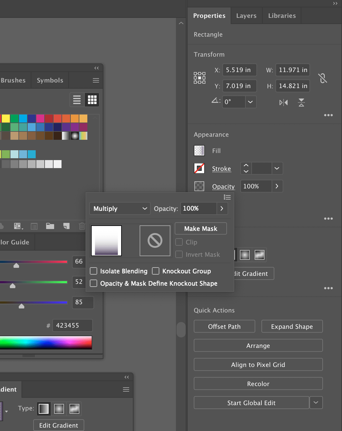
Once you are happy with the colors you have chosen (and I recommend staying fairly dark and neutral for this) you will go to the properties panel. That is located by the layers panel. With the properties panel you can then change the blend mode to multiply or color burn or any other blending mode that allows your text to shine. To access the blending mode, double click on the underlined opacity button.
Then go back to the layers panel and move the shape layer to the bottom.

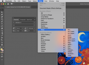
Step 6: Getting fancy with text! If you want to play with the robust text tools of Illustrator even further, you should look into the warp tool.
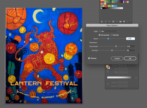
First place some text on your canvas, and adjust the color and font settings as you like. Once you have something you like, go to Effect -> Warp. Under this menu you will find a dozen different forms. Each of these can warp your text into different shapes. When you select one, a modifying window will pop open. Use the sliders to make your warped text the exact shape you need.
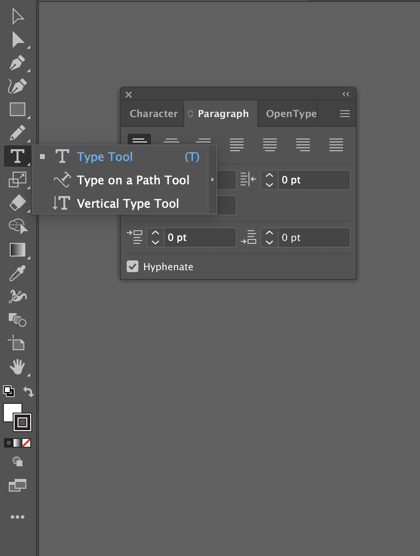
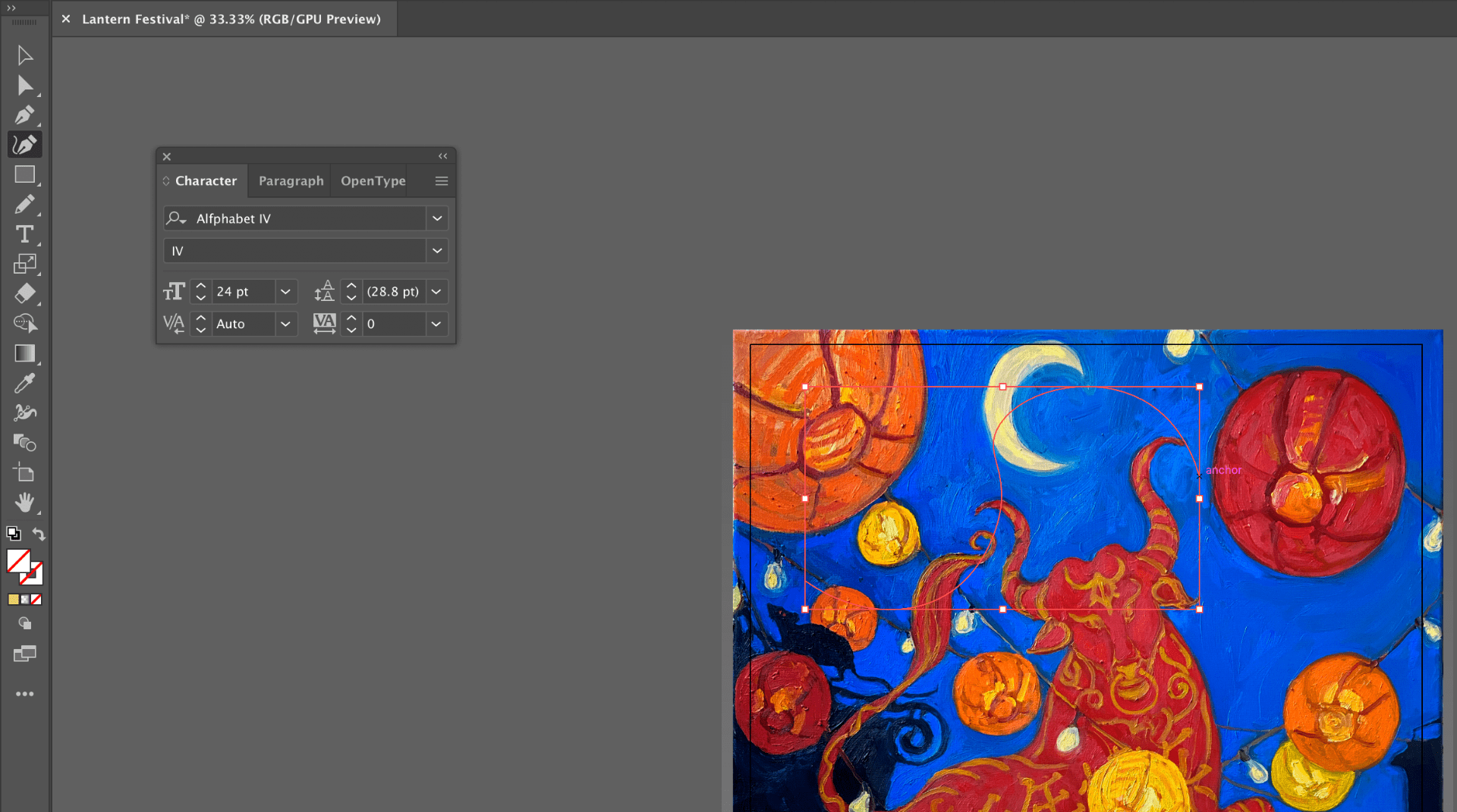
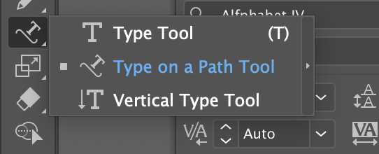
The other tool you can play with is the Type on a Path tool. To use it you first must create a path. This can either be a shape path, such as a circle, or a freeform line made with the curvature pen tool. With the Path selected you can use the Type on a Path tool which is accessible by long clicking on the type tool. You will use your cursor to click on the path and when you type, it will follow the preset path.
Step 7: Save your file.
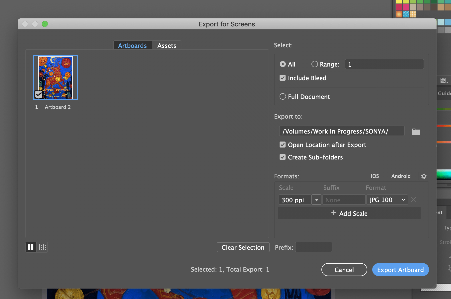
To save your file, go to Export -> Export for Screens. For your settings use JPG and 300 DPI as shown below. Have fun!