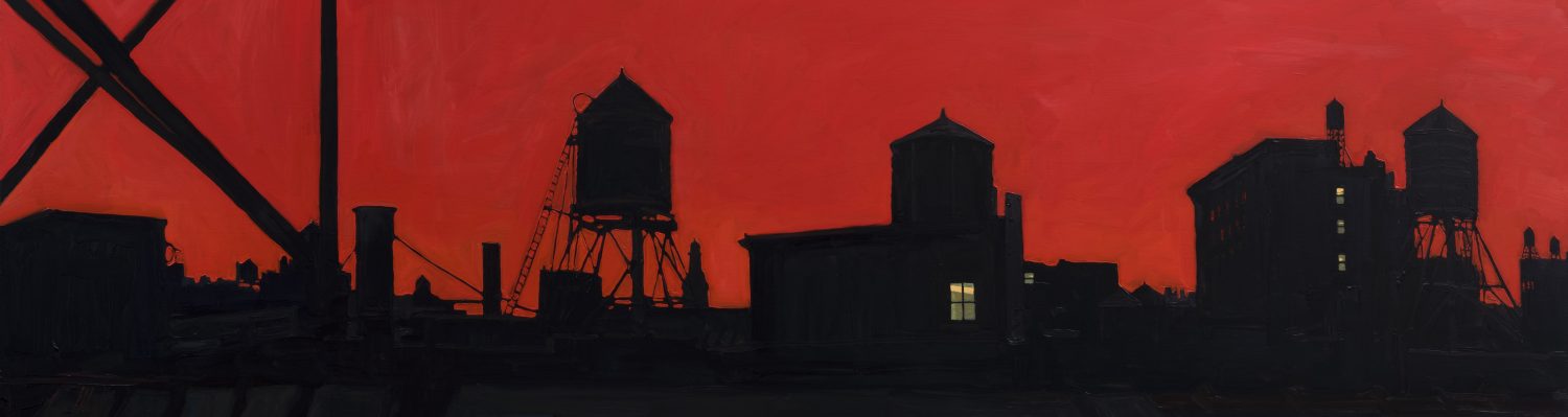
Project #3 – Architectural Color study (Drawing and Illustrator)
The geometry of negative space balances that of positive space. Colors also balance
one another, affecting the viewer’s perception of neighboring colors. By linking these
two critical aspects of an image, the artist visualizes the intrinsic interconnectedness of
shape and color.
Import your favorite sketch done at Grand Central Station concentrating on one and two-point
perspective into Illustrator. Represent all aspects of positive and negative spaces in
color forms focusing on your study of hue, intensity, temperature, saturation, light and
shadow.
Illustrator Skill Sets: Interface, Preferences, Page set up, Art Board, Menus,
Grid/Rulers, Navigation, Zoom, Input/Output, Paths – pen tool/Shape tool/pencil tool,
Bezier handles, Adding and Deleting anchor points
Drawing and Observational Skill Sets: One point and two-point perspective,
architectural form and space, color theory vocabulary (hue, value, intensity, saturation,
light value), simplifying shape, value reduction, positive and negative space, vanishing
point, horizon line.
References and Artists: Piet Mondrian, Wassily Kandinsky, Richard Diebenkorn,
Fairfield Porter, Jacob Lawrence.
Materials: sketchbook drawings of Grand Central (sketchbook, pens, pencils), Illustrator
(laptop computers)
STEP 1
 Create a new project, ready for print. Must be 11”x17”, make sure the color mode is set to CMYK.
STEP 2
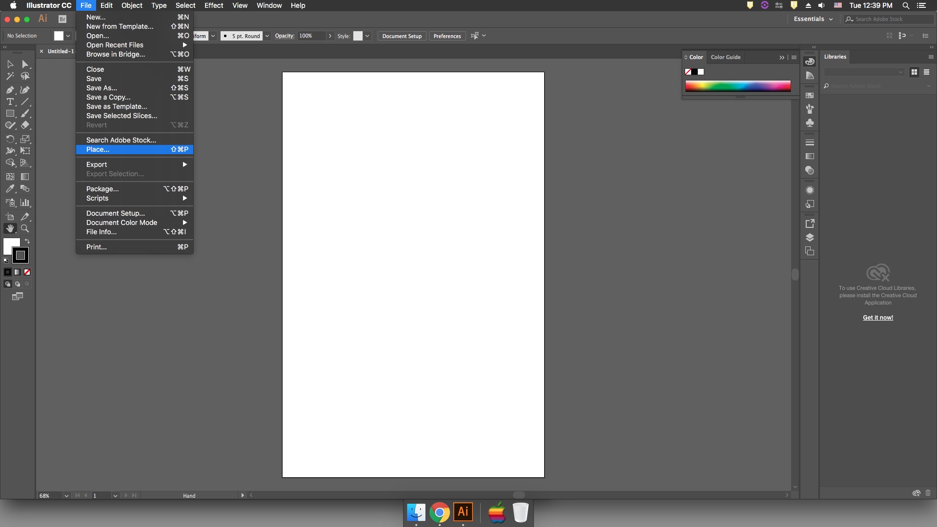 Go to File -> Place to open up finder. Navigate to your image, and hit Place. Then click to place your image.
STEP 3
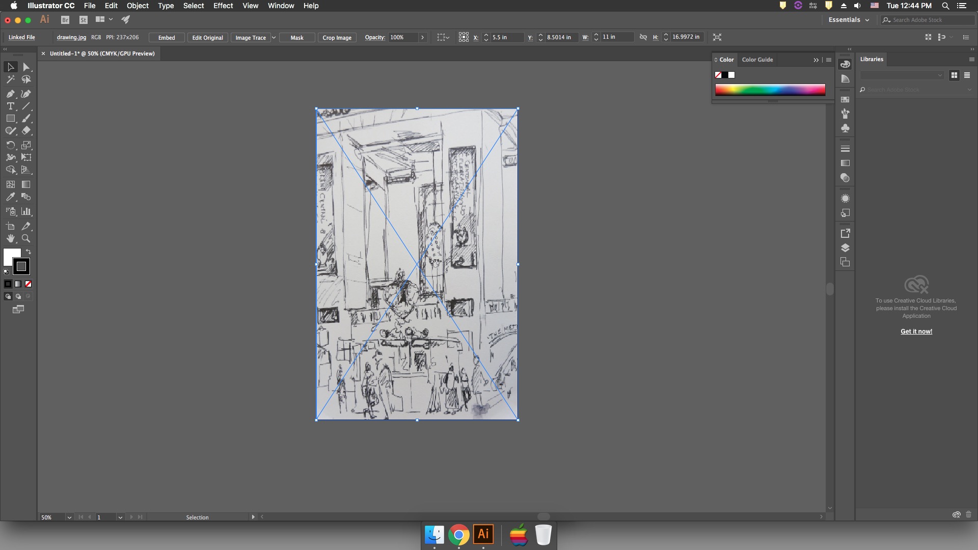 Resize your drawing to fit artboard. Make sure you are set to the selection tool (hotkey V). Click on the anchor and hold shift while you drag it to size. Snap one corner to the corner of your artboard, then do the same with the diagonally opposite corner.
STEP 4
 Lock down the drawing layer. The layer menu can be found by going to the tool bar next to the library panel and selecting the icon that looks like two squares on top of each other.
To lock the layer click the space between the eye icon and the layer name. Create a new empty layer by clicking the folded piece of paper at the bottom of the layers panel.
STEP 5
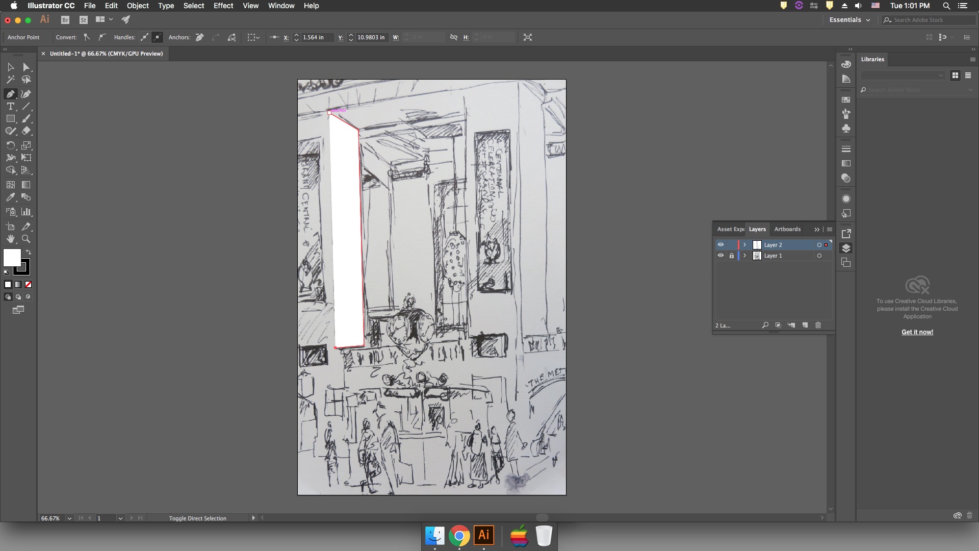 Select the pen tool to make a shape. To do this, you click to drop an anchor point. Click again elsewhere to make a second anchor point. The line between these is called a path. Continue to drop anchor points until you have outlined the shape you want.
To draw a shape next to another shape, make sure you snap your anchor points. If you don’t, you will have white space between the shapes. If you are having trouble snapping, make sure to check and see if your snapping is on. Go to View -> Snap to Point. If there is not a check mark next to it, it is off. Click on it to turn it on.
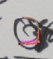 To make a curved shape you will need to activate your handles. To do so, you simply need to drag while you are clicking to drop your anchor point. This can be difficult to get right at first but I have some resources on my blog that I recommend for practice.
STEP 6
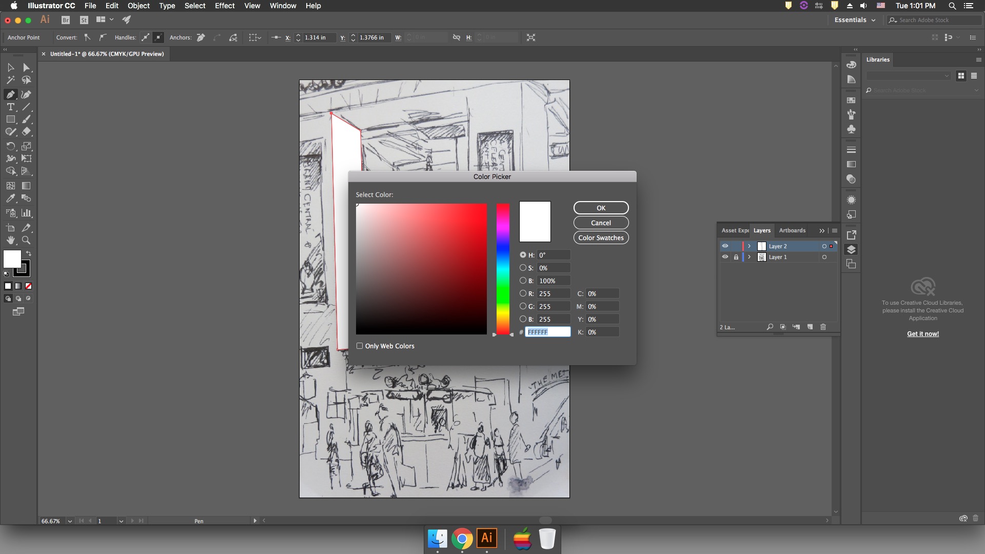 To change the color of your shape, select the solid color chip to open up the color picker. Then select the color you want your shape to be. This is called the Fill color. To change the outline of your shape, also known as the Stroke, select the color chip with the square in the middle.
If you want to remove the fill or the stroke from your shape, you can select the square with the red line through it below the color chips.
STEP 7
 To edit a shape, you will need to go to the direct selection tool, which is the white arrow. This tool will allow you to change the position of anchor points and handles, so you can make your shape exactly how you want it.
STEP 8
Repeat 5 through 7 until complete.
For this project please cover the entire canvas with color. No white spaces.
STEP 9
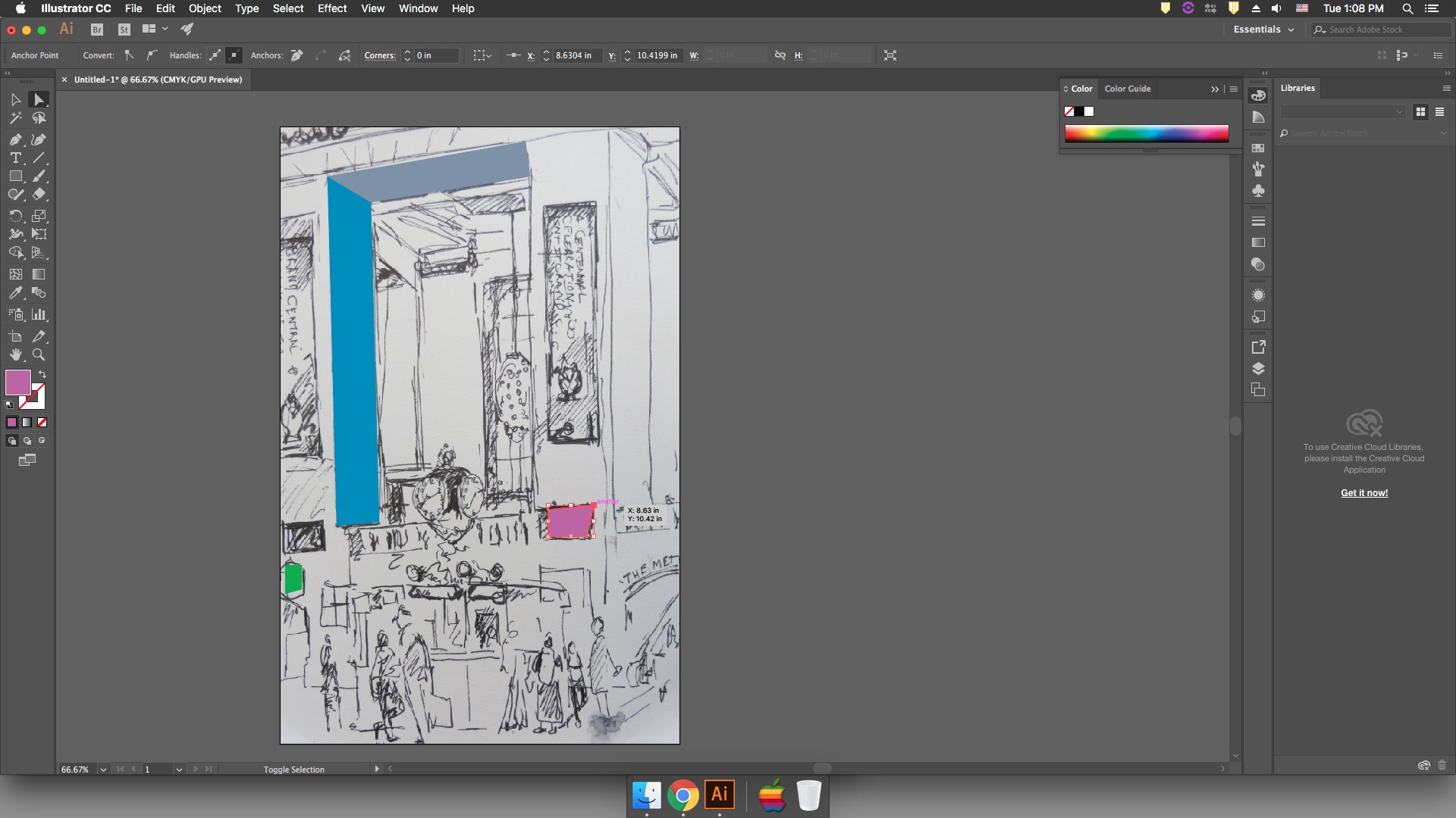
To save project go to File -> Export -> Export for Screens. This window will pop up.
Please save as 2 different formats, one for print, one for digital use.
Digital:
Scale – 0.5x
JPG
For Print:
Scale 1x
PNG
Then, Export Artboard
Step 10
Print at 11×17 – please allow 2 days to process
Step 11
Submit a 50% resolution format to Sklaroff’s Google Drive Folder with the name of the file: LastNameFirstNameProj4.jpg
submit here:
https://drive.google.com/drive/folders/1dp_KeM2SJB_2F6puDJspUwFRCBlW-LiM
Some other tools you might want to look at include:
The Hand Tool which allows you to move your project around
The Shape Tool which creates exact shapes
The Eyedropper Tool which changes the color of selected shapes to the color the eyedropper is on
The Pencil Tool and the Paintbrush tool which freeform draws paths
The Eraser Tool which freeform erases selected objects.