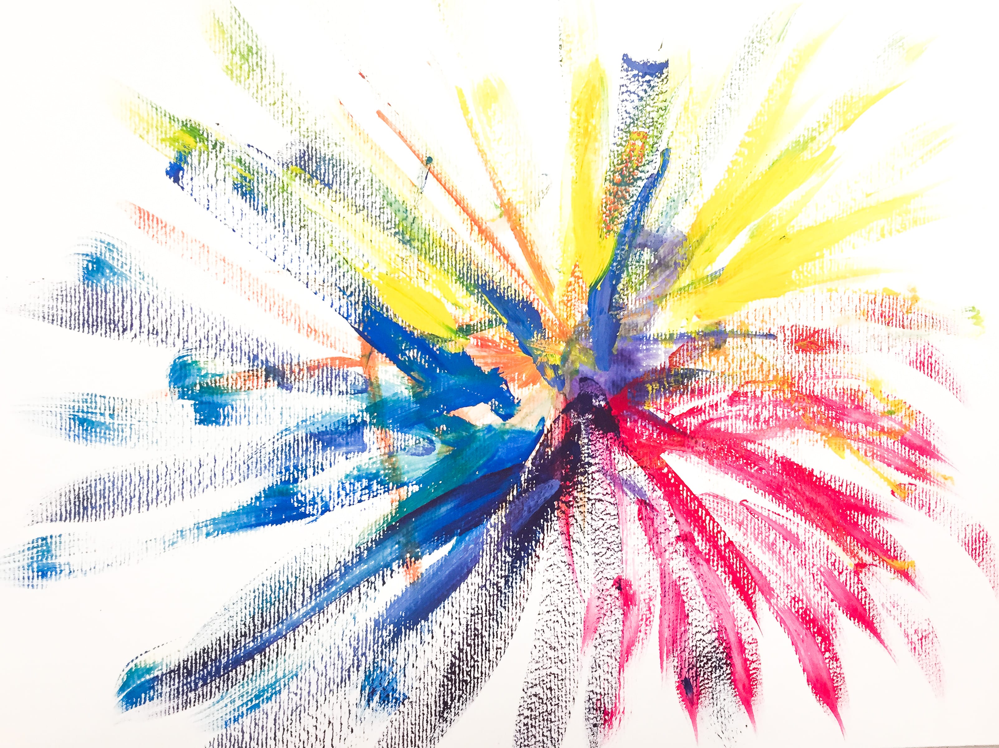
EXPLOSION:
This painting represents a color explosion. I used a lot of colors coming from a same spot as if they were fireworks to represent this word.
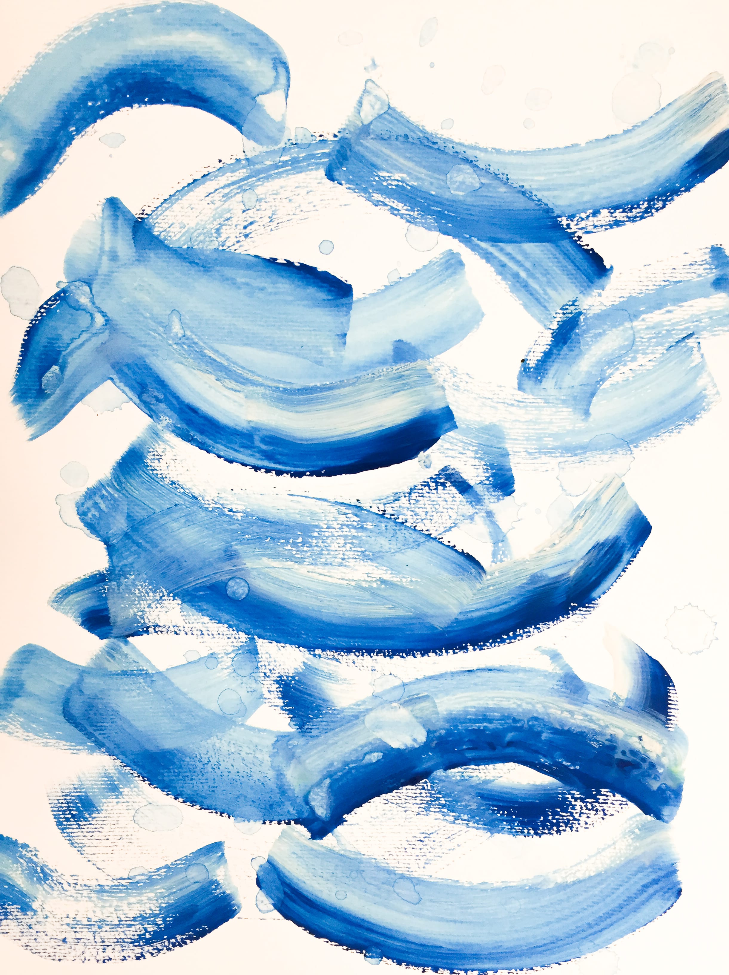
WET:
For this word I used the color blue since what is normally wet is water and water is blue. Also, the lines are not rough, they are soft and mellow which makes it look like water waves. Also, I dropped drops of blue water. I really wanted to show a clear representation of water.
HOT:
I personally connect hotness to triangles. Maybe because flames have a triangular shape, they are pointy. The color palette is filled with reds, yellow and oranges: colors we identify with warmness.

SERIOUS:
What I did in this painting was try and make a very serious, academic-like painting. I only used prime colors so that the painting was not too colorful and grey, to give it a serious tone and base.
