For the first couple of weeks in the Product/Packaging/Promotion the goal was to pick a product that we think functions well, come up with three packaging concepts and then make these concepts into a tangible item.
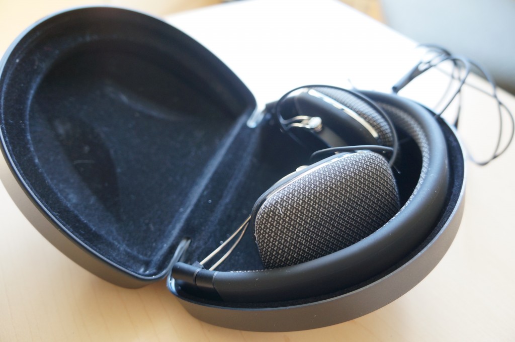
For my product I had decided to pick a pair of headphones:
The reason this had become my item of choice are the following:
- The headphones are foldable, which make them more compact and skinny so that they are easy to carry around.
- I prefer headphones over ear buds. Although, ear buds may be more portable, I enjoy the sound quality coming from over the ear head phones better. They are also still transportable even if they are slightly bigger.
- They have a more sleek design on B&W headphones in comparison to other companies’ headphones such as VModa
- They are customizable in color
- Although item I displayed was B&W P3 headphones, B&W offers another design called the P5, and instead of collapsible earpieces, they have rotatable ones for the comfort of the user.
- Memory foam ear pieces allow added comfort due to the pieces being able to morph to the shape of the user’s ear
- You can switch the cable easily if the cord breaks by removing magnetic ear pads from the headpiece and easily replacing them.
- B&W has a more open sound so it doesn’t completely block out all the noise coming from the outside such as traffic, people talking, etc.
- P3 has better sound quality than a lot of head phones which typically push forwards on the bass of the music, where as these headphones focus on the vocals.
The first project was to test typography and create three different concepts and only use Black and White in the design (no colors or grey scale). Another catch to the project is that we may not be able to say what the product is or the company on the box.
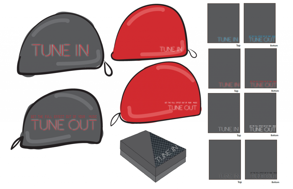
I had decided to create three different box designs as well as a bag design to be created by fabric.
- bag with no belly wrap
- bag with belly wrap
- Box
- Box Inside
- Box Outside
The next part of this assignment was to start adding in color and patterns into the design. I had decided at the time to go with something simple and have the boxes and bags a dark grey and the typography color reflect the customizable color options the P3 offers. My other choice was to have the Box or bag different colors and the type face white.
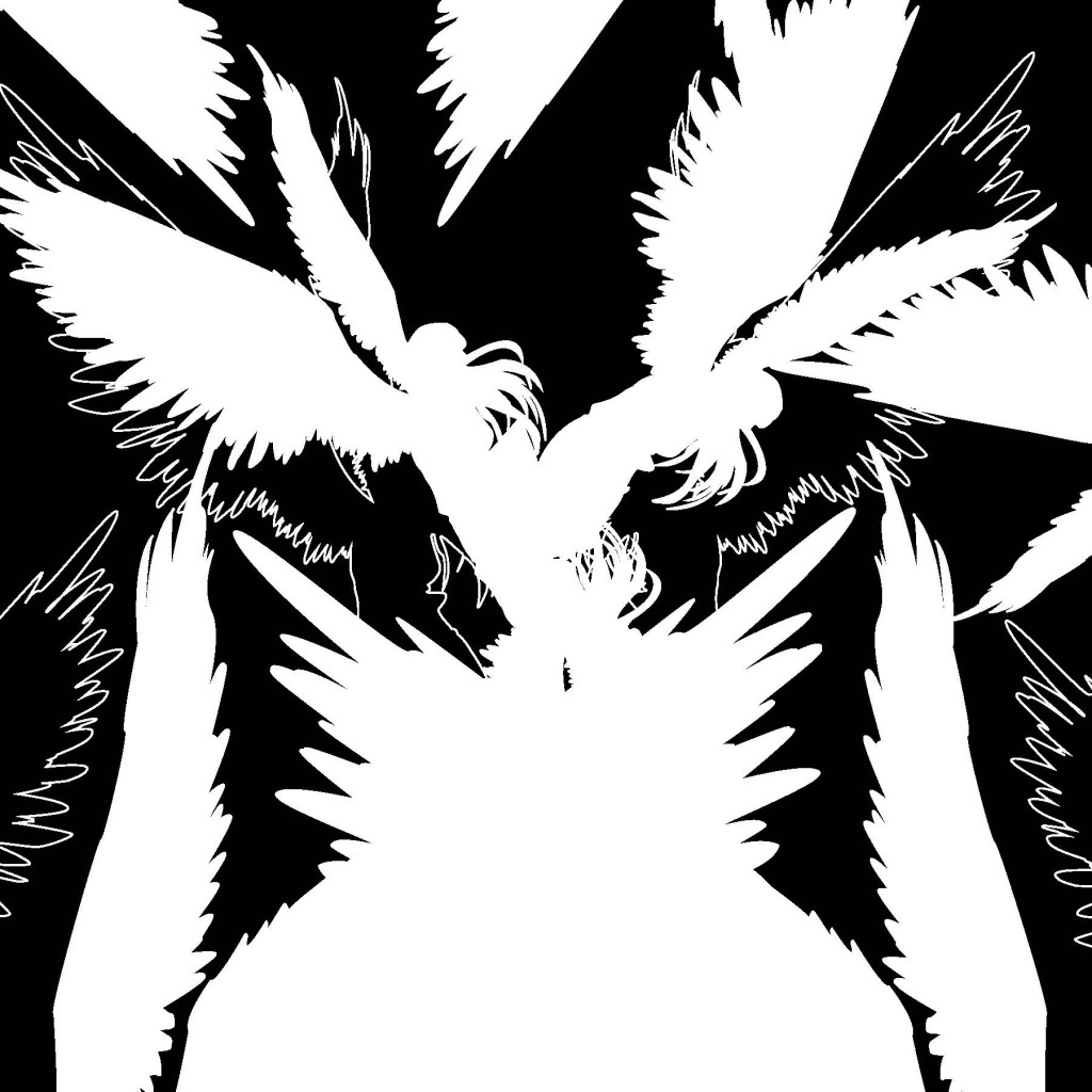
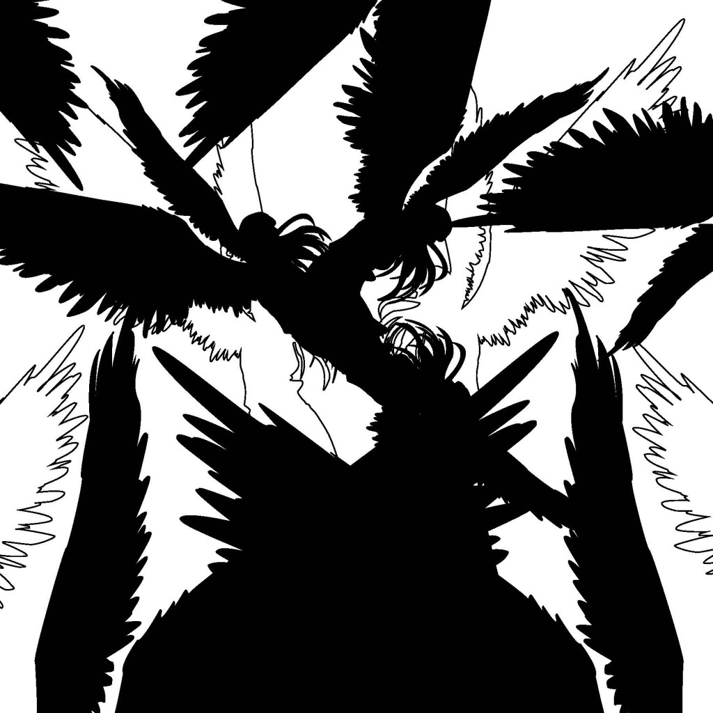
The last concept before the final was to play around with imagery. I did not like how this outcome came out, so I created only one design with this. Instead I decided to continue playing around with color and patterns.
For the mock designs I had created both the bag and the second box design. When creating the bag I intended to print the typography straight onto the bag, but due the messy process, I instead created a belly wrap for the packaging.


