Mask

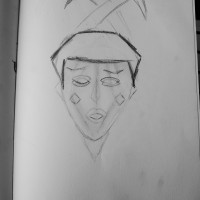
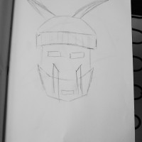
In Studio our assignment was to create a mask using chipboard or cardboard to create plane like structures.

Sketches prior to construction. Some of the sketches were ideas of how I was going to construct my own mask and some were of masks I saw at The Metropolitan Museum of Art I drew for inspiration.


First Semester Reflection

This semester I have learned a lot about myself from the first Body Map Project to the area around me from the various mapping project based on places I travelled to both with the class and individually.

This course has mainly taught me how to cut noise and find organization even in a mass of chaos. We also were taught how to create a visual piece that sends a message without using our words.

For each field trip I used the same process to identify similarities within an area I would target and map out. I would always finish the day with hundreds of photos in my camera library to sort through and look for a common motif within them and then find a way to highlight these similarities. Sometimes I also would find a similarity while the class was walking around and take note of that and focus on those objects within the area we were shooting while also keeping my eyes peeled for other symbols of the neighborhood.

Most of my outcomes were produced digitally into a collage or some sort of layout. I do wish I had created more hand work and found different mediums instead. I definitely enjoyed the Brooklyn Waterfront project the most because the assignment was a surprise, which tested the class to feel a lot more immersed within the experience. Instead of searching and being so focused on the project, instead everyone engaged more with the trip and the location felt more personal.

I also enjoyed working on the artist book and reflecting on my works from before and after I had arrived to college and how much my work has changed. Before most of my art didn’t really seem to have a meaning behind it. They were just pictures I liked to sketch or paint. However, since coming to The New School, this semester has challenged me to really create a meaning and purpose for my pieces. I also learned how to keep revising these ideas.

This course also seemed to connect pretty well with other classes I had taken this semester. For instance, in Sustainable Systems we had worked on a project to find a company that reflected Manzini’s principle’s. What I learned through that process really helped me research more on what the team could do to find locations of improvement and think of solutions to improve the area.

I definitely think this single semester has made me dig deeper on my projects than I had ever done before and I am excited to see how else my processes will evolve in the upcoming years.

Civic Center Map – Government Buildings

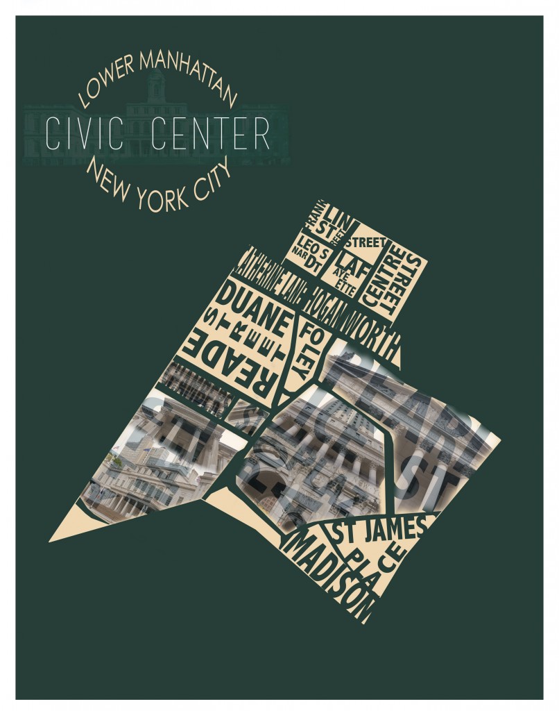
This week’s mapping assignment was to get lost somewhere in the city and map it out. I chose to go further downtown to Civic Center. This location holds buildings such as the Supreme Court building and City Hall. I wanted to map these buildings that had a particular architecture. Some government buildings like police headquarters had architecture that wasn’t as intricate, which is why I decided to not include them.

Here is the map I created with the buildings laid out on them.

Civic Center

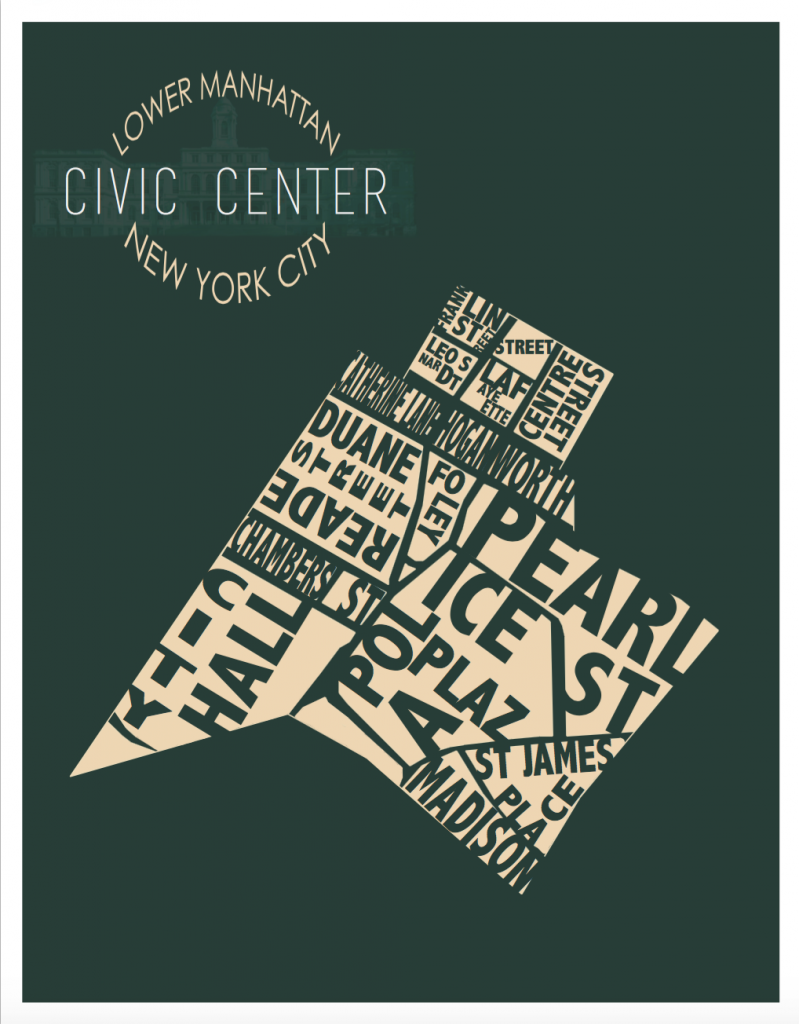
This is the layout without the buildings.Screen Shot 2015-10-27 at 8.41.28 PM


Paper Doll Family

Processed with VSCOcam with f2 preset

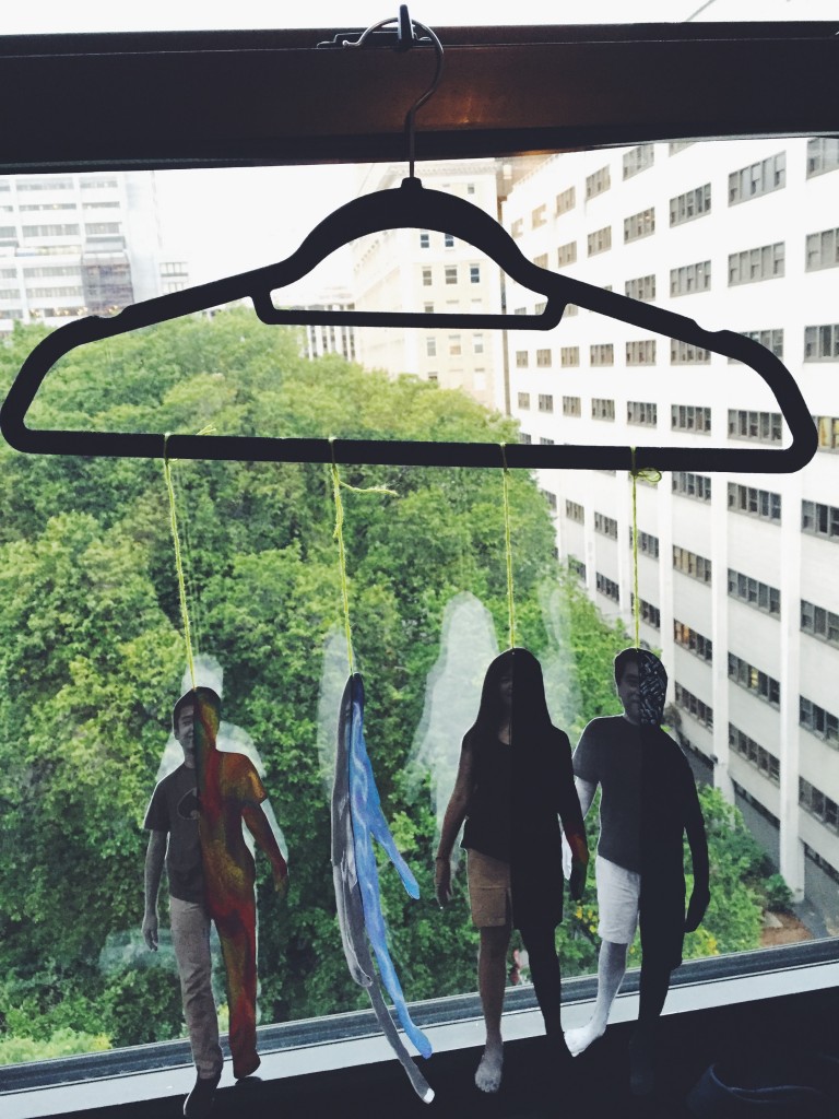
For my family’s paper dolls, I decided to keep them all on the same size scale. Every person in my family holds a great amount of importance, we move together, and we stay in tact. This is also why the members are all strung equally to a clothing hook. Similar to a marionette, when one family moves, the rest of them follow. My family is very close and tightly knit together which is why I chose to display it this way.

This idea correlates to the idea presented in my paper. I told the story of my great-grandfather passing away because it is the story my father told me to teach the importance of keeping the family together before I left for college.
Processed with VSCOcam with t1 preset

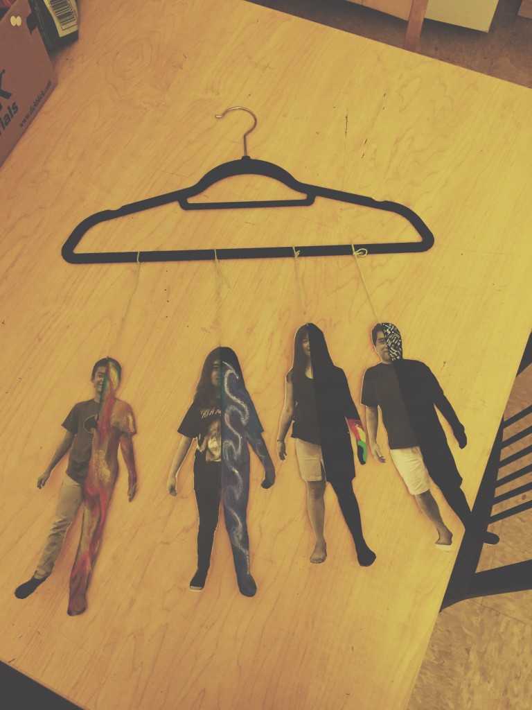
The next part of the dolls I illustrated was each of my family’s personalities. I chose to portray both a realistic and abstract image.

On my parents I painted each one of them black. They tend to be strict and overprotective, so this represents a sort of power or overshadowing they hold. I also made sure to paint it in black with clean strokes to make their skin appear thicker to display that protective layer as well as they like everything to be very simple and straightforward.

For the personalities, I chose to show the polar opposites of my mom versus dad as well as my brother versus me. My dad tends to be on the tech side. He is good with numbers, majored in engineering and management, and loves computers. My mom is a little more laid back, but her side of the family is mostly composed of artists.

The last two personalities are that of my brother and I. Instead of showing our backgrounds, I thought to present how we tend to deal with things. My brother tends to take on a lot of my dad’s traits. He loves math, computer science, video gaming, and fencing. He tends to be very aggressive and swift in situations. To represent this, I used pastel to draw flames of fire. For me, I tend to be a lot more laid back. In situations I take a while to really analyze and think about the situation until I got it perfectly. In harmony to my brother, my personality is a bit more calm which is why I chose the water symbol for myself.

To contrast my brother and I from my parents, I also decided to differentiate the mediums I used in my illustration. For my parents I used paint because when it dries it is clean and doesn’t budge much. Where as my brother and I are still developing and we plenty of mistakes along the way. We also tend to rub off on each other a lot because we are close which is why I used pastel which tends to spread easily.

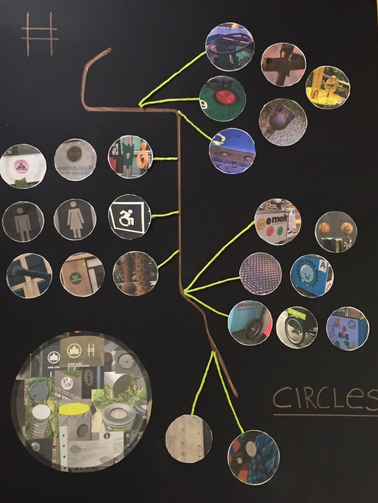
Highline Mapping: Circles

New York City is an interesting place, mainly because of its intriguing architecture. Many of its buildings lack the basic shapes we know such as rectangles, squares, triangles. A simplified version of the structure might feature these types of shapes as well as some modern buildings, but most buildings are then intensified by its complex forms. So, for my project I decided to map out circular objects found throughout the structure of the Highline.

IMG_1140

Body Map

I debated whether so certain concepts should be included in this piece. It is hard to think of adjectives about yourself because you never know whether you should be more modest about yourself and downplay your characteristics or boast about all the wonderful attributes you have. Within this piece I attempted to balance out the two.

Full Body Portrait

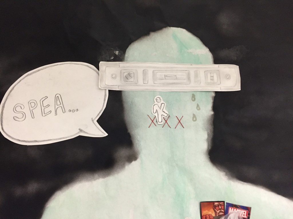
Starting from top to bottom, the first part about me I decided to include was level-headed. I can get emotional about certain things, but when a situation gets tough I know that I typically like to deal with things straight forward and solve things properly. So to depict this part about me I used a level tool to balance where my brain might be.

The next piece represents two sides to me. My shy and quiet side versus the part of me that just wants to talk. That is why I have the word Speak trying to come out of my mouth, but the K is still getting caught in between the lips. I also included the mouth sewn shut to represent the part of me that tends to keep my mouth shut when I am nervous.

Head Portrait

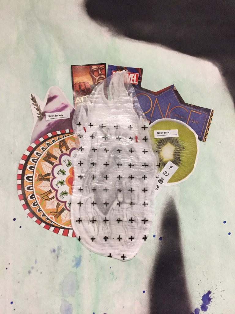
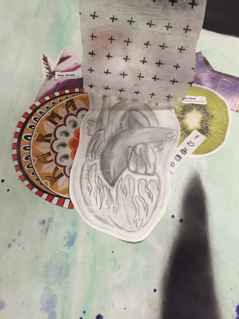
The heart is another piece that represents several different parts to me. First we got a protection over it which is why there is a sort of plastic film over it to shield the heart from getting hurt. Like many others I had gone through a lot during high school. The shield also kind of represents a lack of trust. However, even with this I included positive signs all over the protective sheet to display that I do try to still look at the brighter side of things. But the positive signs don’t cover the entire film because there are times where I let my pessimism get the best of me. The third part of the heart is meant to show a warm heart because I do try to be courteous and kind to others.

As a new addition, I came up with a new concept during class for my own personal interests. I centered things I liked and enjoyed around my heart because I wanted to emphasize that they are things I really care for.

  • I added a bath bomb because I love the shop Lush. I am also usually rushing around so much, so when I get some downtime,  I love it when I can just relax.
  • Kiwis are my favorite fruit.
  • I placed two contradicting interests because a part of me loves fairy tales and romantic comedies because I am a sucker for love and a hopeless romantic. Although, there is a second side where I love to kick back and watch action movies, especially with my family.
  • There are social media icons because I spend a majority of my day online.
  • The karma sign is significant because during the college application process I used to joke with my dad that I had bad karma if I didn’t get into a school.
  • The last piece is New York vs New Jersey. I love my new home just as much as I love the old one.

Protected Heart

Warm Heart


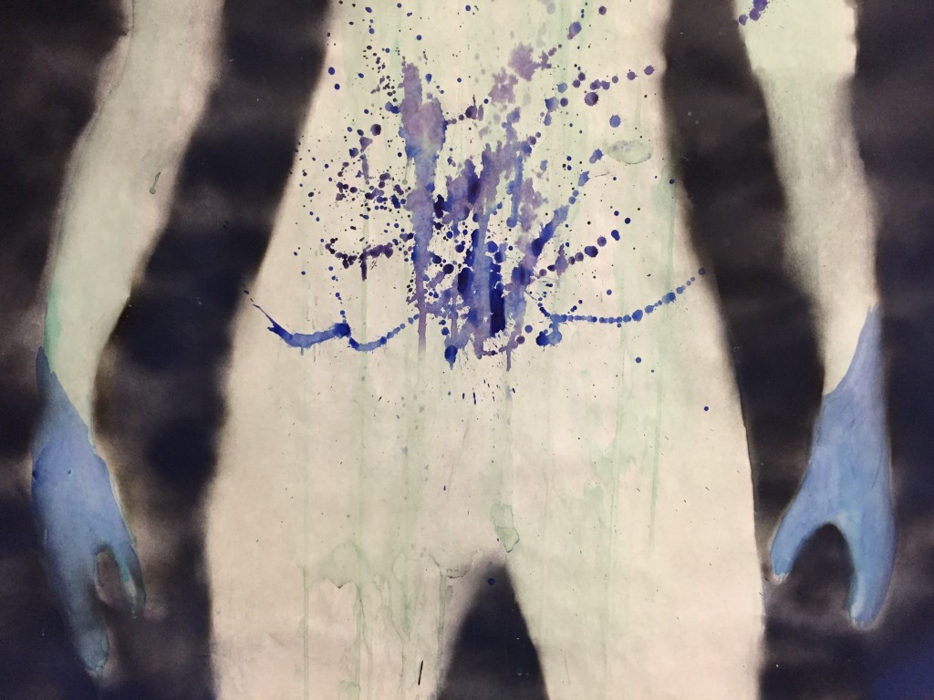
The last part of this piece is meant to represent nervousness. I have a paint splatter in my stomach to show a chaotic type of scene for when my stomach gets a dropping feeling when I don’t feel well about something. I also painted the hands blue because they tend to get clammy when I am scared.

Nervous Stomach

I wanted some sort of motif throughout this piece so I decided to incorporate sewing. I used thread in all places that represented adjectives as well as any place when I have visible scars to relate back to the writing piece we did in Seminar.


Featured image source: http://theyogalunchbox.co.nz/the-yoga-body-myth-my-late-30s-body/