A Less Effective Web Site
I was a bit disappointed when I went through my Financial Management syllabus to look for the textbook I would be using this year. My teacher had provided a link to purchase the textbook from in which the site offers various options to read your book. As printouts, on their website, or as delivered as a hard copy. In my opinion, this site is not the most user-friendly when it comes to reading online. Especially when compared to other websites available for purchasing online books such as Kindle.
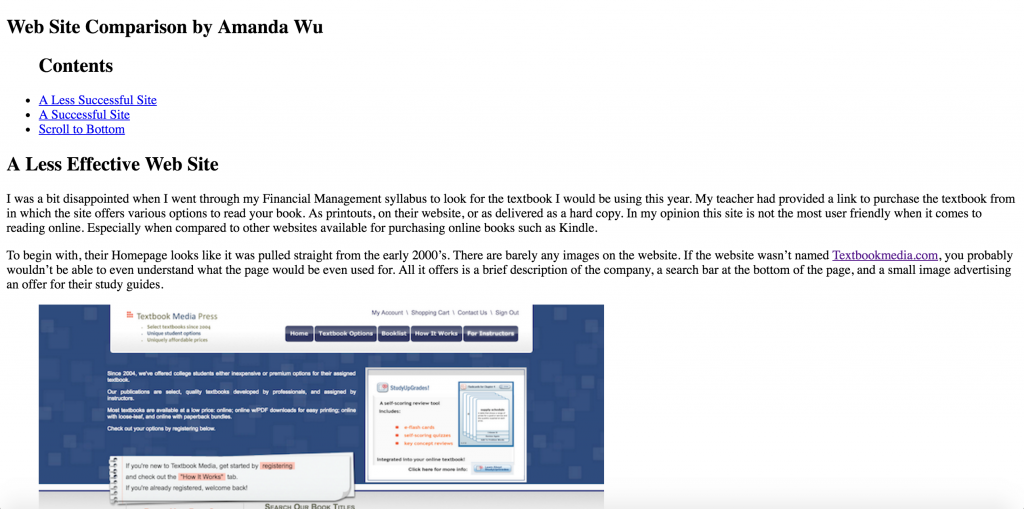
To begin with, their Homepage looks like it was pulled straight from the early 2000’s. There are barely any images on the website. If the website wasn’t named Textbookmedia.com, you probably wouldn’t be able to even understand what the page would be even used for. All it offers is a brief description of the company, a search bar at the bottom of the page, and a small image advertising an offer for their study guides.
This site also has a long “How it Works” page with information clumped together and poor choice of font colors. On this page, there is also a random image of a man in black and white that is probably about an inch in width that seems to hold no real purpose.
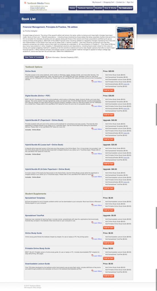
Moving onto their product listing page there are no images of the books, quick browsing options, or even pricing ranges, so the only way you can view what book you are selecting is by actually going to the individual product pages. Then on the product page itself, there are no reviews of the books and the site doesn’t do much to simplify the books information.
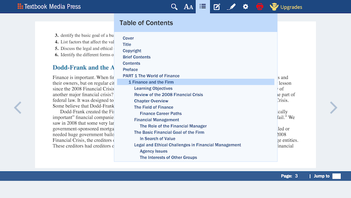
The thing I dislike the most is the websites, ways of actually reading the book. You can’t scroll through the pages, instead, you are forced to click on two arrow buttons that are placed very far apart from each other. You can download PDFs of the book, but that option isn’t very clear as that option only appears when you click on a printer button. Then the table of contents is sort of sloppily placed together and hard to read.
Overall, in terms of usability, I don’t think the site is hard to learn or memorize. However, its biggest problems are efficiency, errors, and satisfaction. The website does not simplify a lot of the tasks that need to be done by the user. It looks very dated and the graphics seem to have a very low resolution as well.
A Well-Designed and Effective Web Site
Now when it comes to a shopping website, it is best to keep things as clean and simple as possible in my opinion. Shopping is usually (not always) a reward for some people. They work really hard for their money, and now they enjoy the pleasures of spending their money on something new. Because of this, many shoppers won’t have the patience if a store is too cluttered with information, or there is not enough information. So it is the company’s job to make the shopping experience as enjoyable as possible for the buyers or else they will just end up frustrated and leave the shop empty handed.
There are some eCommerce sites that are phenomenal when it comes to web design. They’ll play around with the graphics and animation of features to make the website look lively and bring their store character, but for today I am just going to focus on a simple shop that I think works well even without all the frills.
Romwe.com is a clothing store that I occasionally like to buy from. It may not offer textbooks like my bad website example, but it’s essentially also a shopping platform that you can buy things off of.
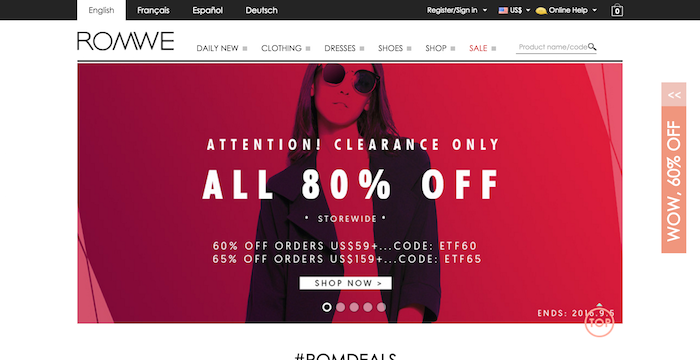
The front page has a nice carousel with different trends and outfits from their shop as well as any deals and promotions they currently offer as well as the coupons and spread throughout the site if you somehow miss the homepage.
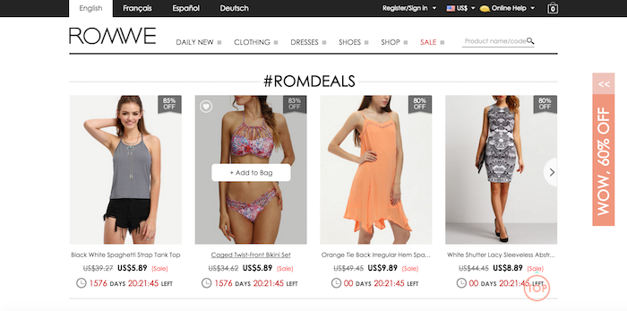
The thing I love most about their homepage is that they have deals on certain items in their store with the old price and mark-down price as well as a counter for how much longer the deal will last. You can also save items to your wishlist instead of going straight to cart. Also, if you hover over the item you would like there is an option to add to cart without even having to go to the product page. Then on their product list pages, there is a scroll to top button to make the page easier to use for their customers.

On the bottom of their homepage, they also have images gathered from social media when users write a certain hashtag when posting about their pieces.
I really like this website because they are able to deliver as much information about a product possible while also keeping the sites design as clean as possible which also makes it easy to navigate around.
